Chapter 21 Small Data
It’s common for data scientists to work with data frames with hundreds, thousands, or millions of rows and with dozens or hundreds of variables. Techniques such as cross-validation, bootstrapping, modeling with many explanatory variables, machine learning and even direct graphical display of data exploit the wealth of data and the availability of modern computing.
Yet there are important situations where, even with a devoted attempt, minimal amounts of data can be collected. Examples include bench-top lab labwork involving a handful of scarce samples, psychology experiments using a few dozen subjects, initial clinical evaluation of cancer chemotherapy drug “cocktails” involving a few patients, and so on. Historically, such small data was the norm. Lab measurements were made by laborious hand and eye work.
21.1 Example: The speed of light
Consider one of the most important physics experiments in the history of science, the Michelson-Morley assessment of the speed of the orbiting Earth in 1887. Einstein’s theory of special relativity, published in 1905, was based on the conclusions reached by Michelson and Morley.
Figure 21.1: Perspective drawing of the experimental apparatus used in Michelson and Morley’s 1887 experiment to measure the speed of the Earth’s revolution around the sun. Optical equipment is mounted on a massive stone (edge length 1.5 meters) floating in a bath of mercury contained in a circular cast-iron trough. Michelson and Morley (1887).
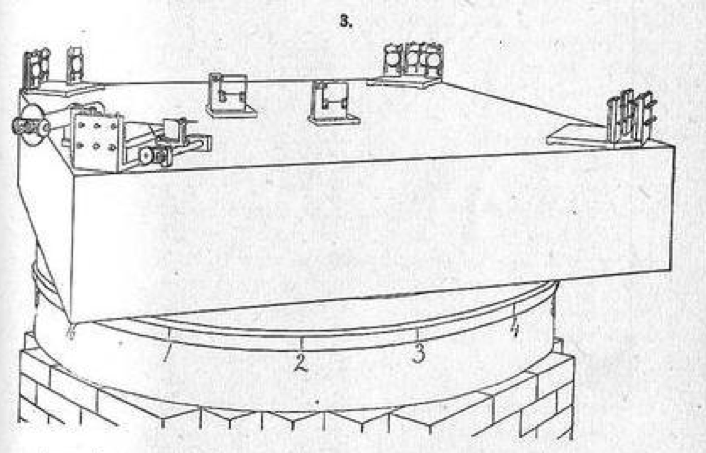
Figure 21.1 shows the apparatus built for the experiment, which was designed to measure very precisely the shift in light that would be created if light travelled at different speeds in different directions.
The experiment was motivated by a hypothesis that light waves travel in ether through which the Earth passes. By rotating the stone very slowly and smoothly, shifts in light due to relative motion could be detected.
| row | mark | dist | time | row | mark | dist | time | row | mark | dist | time | ||
|---|---|---|---|---|---|---|---|---|---|---|---|---|---|
| 1 | 16 | 0.784 | noon | 7 | 6 | 0.715 | noon | 13 | 3 | 1.081 | evening | ||
| 2 | 1 | 0.762 | noon | 8 | 7 | 0.692 | noon | 14 | 4 | 1.088 | evening | ||
| 3 | 2 | 0.755 | noon | 9 | 8 | 0.661 | noon | 15 | 5 | 1.109 | evening | ||
| 4 | 3 | 0.738 | noon | 10 | 16 | 1.047 | evening | 16 | 6 | 1.115 | evening | ||
| 5 | 4 | 0.721 | noon | 11 | 1 | 1.062 | evening | 17 | 7 | 1.114 | evening | ||
| 6 | 5 | 0.720 | noon | 12 | 2 | 1.063 | evening | 18 | 8 | 1.120 | evening |
Data from the Michelson-Morley experiment
Eighteen rows of data leading to a revolution in science. Small data isn’t necessarily small in impact.
21.2 Analyzing the Michelson-Morley data
Michelson and Morley were working in the 1880s before the construction of most of the concepts used in 20th-century statistics. As an illustration, we’ll undertake a 20th-century analysis of their data, even though only some of the mathematical steps and almost none of the vocabulary was available to them. For simplicity, we’ll use only the noon data.
As physicists, and given their hypothesis about the effects of the ether on the speed of light, Michelson and Morley would recognize an appropriate model to use for their data:
disp ~ cos(2*pi*mark/8) + sin(2*pi*mark/8)
This model – the background for which is unimportant for understanding the example – gives disp as an oscillating function of mark. Michelson and Morley’s interest was in the amplitude of that oscillation. Using the model to describe the data indicates an amplitude of about 0.03 wavelengths of light, whereas the ether theory indicated an amplitude of 0.40 wavelengths. They concluded that:
“It appears, from all that precedes, reasonably certain that if there be any relative motion between the earth and the luminiferous ether, it must be small; quite small enough entirely to refute [the ether theory].” Michelson and Morley (1887), p. 341
Using mathematics unavailable in 1887, we can calculate that a 95% confidence interval on the amplitude of the oscillation is 0.03 ± 0.04 wavelengths. This interval contains zero but not 0.40, which would lead, in 20th century terms, to a failure to reject the null hypothesis that the amplitude is zero.
In calculating the interval 0.03 ± 0.04, I’ve used a mathematical framework developed during the first half of the 20th century, some of which will be described in the next sections. This framework enables a formal statistical statement to be made about the situation.
21.3 No bootstrapping, please
Suppose Michelson and Morley trained a “calculator” (that is, in the meaning before 1945, a person who does mathematical calculations) to find, by hand, the amplitude of oscillation. For an expert calculator and a small data frame like Table ??, this calculation might take, say, 30 minutes.
And suppose, fantastically, that you were transported back to 1887 (but without any electronics) to advise Michelson and Morley about the formal statistical analysis of their data. Based on earlier chapters of this book, your advice might be to bootstrap, that is, to calculate the amplitude from many resamples of the data and calculate the summary interval of the results. Doing this would require about a full week’s work. That’s within the realm of feasibility.
There is a problem, however. Bootstrapping is not reliable for very small data. The situation here with n = 7 qualifies as small.
21.4 A theory for small data
Statisticians in the early 1900s were familiar with small data and took it for granted that much scientific work might involve n = 3 or 4 or a dozen. In 1908, William Gosset, publishing under the name “Student,” uncovered how much uncertainty is created in very simple models trained with a handful of data points. (Student 1908). This later become known as the student t distribution. Using the t distribution involves calculations only with the actual data and not any form of randomization such as involved in bootstrapping. That was good in part to simplify the calculations but mainly because the idea of using randomization wouldn’t emerge for more than 40 years and even then was treated with skepticism.
Let’s see how the calculations for small n work. Most introductory statistics textbooks demonstrate the theory using an approach similar to that Ronald Fisher first published in 1925. (The 14th edition was published in 1962, reflecting the profound impact this work had on statistical thinking.) Instead, I’ll explain the method using a more general method introduced later by Fisher.
We need three values, two of which will be familiar and one probably not so familiar:
- The value of R2 calculated from our model on the training data. For the Michelson-Morley example, R2 = 0.23
- The number of rows n in the training data. In the Michelson-Morley example, this is n = 9.
- The number of parameters in the model. We haven’t introduced this concept of counting parameters in a model. You can calculate it by counting in the model formula. For the Michelson-Morely example, the model formula
disp ~ cos(2*pi*mark/8) + sin(2*pi*mark/8)has two terms on the right-hand side of the modeler’s tilde, so the number of parameters is p = 2.
The classical, small-data calculation concerning whether to reject or fail to reject the null hypothesis is based on the value of R2. The basic idea is that the larger R2, the less likely it is to be produced by explanatory variables that have nothing at all to do with the response variable. Now when the explanatory variables are unconnected with the response (that is, under the null hypothesis), you might reasonably expect R2 to be zero. In reality, any accidental alignment between response and explanatory variables will produce a non-zero, but small positive value for R2. Fisher gave a precise definition for “small R2.” His definition is based on a quantity called F (in honor of Fisher):
\[F = \frac{(n - 1) - p}{p}\frac{R^2}{1 - R^2} .\]
Fisher discovered that F = 1, on average when the response and explanatory variables are unconnected. Even better, Fisher tabulated values such that there is only a 5% chance of an accidental alignment producing an \(F\) that big or bigger. Figure 21.2 shows part of the table published by Fisher and Yates (1953). (To use the table, set \(n_1 = p\) and \(n_2 = n - p\).)
Figure 21.2: The F table published by Fisher and Yates (1953). This is one of several very similar tables. This one is for p = 0.05 (which corresponds to a 95% interval level). There are others for p = 0.10, 0.02, 0.01, and 0.001.
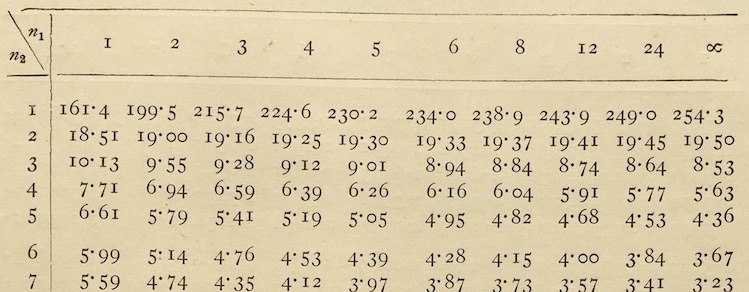
For instance, in the Michelson-Morley example, R2 = 0.23, n = 9, p = 2, so F = 0.92. This should be compared to the entry in the table at \(n_1 = 2\), \(n_2 = 6\), which is \(F_{table} = 5.14\). If F is bigger than the entry, the conclusion is “reject the null hypothesis.” In our case, F = 0.92 is less than the entry. Conclusion: “fail to reject the null hypothesis.”
This procedure, which must always result in one of the two possible outcomes “reject the null” or “fail to reject the null” hypothesis is called hypothesis testing.
Often, the result of hypothesis testing is put in the form of a number, called the p-value. The process is almost exactly the same, but replacing the F table with a large collection of tables, one for each of the entries in the F table. You would look up the F distribution table, a small example of which is shown in Table The result will be the p-value that corresponds to the observed value of F (0.92 in our example).
Table 21.1: F-distribution table for n_1_=2, n_2_=6
| F | p_value | conclusion |
|---|---|---|
| 0.78 | 0.5 | Fail to reject null |
| 1.07 | 0.4 | Fail to reject null |
| 1.48 | 0.3 | Fail to reject null |
| 2.13 | 0.2 | Fail to reject null |
| 3.46 | 0.1 | Fail to reject null |
| 5.14 | 0.05 | Reject null |
| 10.90 | 0.01 | Reject null |
| 14.50 | 0.005 | Reject null |
| 27.00 | 0.001 | Reject null |
| 34.80 | 0.0005 | Reject null |
| 61.60 | 0.0001 | Reject null |
F = 0.92 falls between the first two rows of Table producing a p-value between 0.4 and 0.5. By convention, when the p-value is less than 0.05 the result of the hypothesis test is to “reject the null.”
21.5 Confidence intervals
Recall that an effect size with respect to an explanatory variable is the ratio of the change in output of a model to a one-unit change of input in that explanatory variable. We use confidence intervals to describe the range of uncertainty in the effect size due to the random nature of sampling.
In previous chapters, we’ve used bootstrapping to estimate effect sizes. But, as described before, bootstrapping may not be reliable when the sample size n is small.
Traditionally, the term effect size was not used. Effect sizes in small data models were instead described by phrases such as “the difference in group means” or “the difference in two proportions” or “the slope of a regression line.” Even today you will find these phrases in most introductory statistics books, typically with a chapter devoted to each. Still, they are all effect sizes and all of them have the same logic for calculating confidence intervals.
To illustrate, let’s consider the difference in mean height between females and males, using the mosaicData::Galton data frame. (That difference corresponds to the effect size with respect to sex of the model height ~ sex.) In the Galton data, n = 898. In the model, p = 1, which is much the same as saying we are looking at only one difference. The effect size is 5.12 inches with women shorter (on average) than men. With n = 898 we can reliably bootstrap the confidence interval on the difference in mean heights. The classical calculation of confidence intervals uses the F statistic, just as in hypothesis testing. For our model, F = 930.
As before, we’ll compare the F from the model to the F from the null-hypothesis table. With \(n_1 = 1\) and \(n_2 = 896\), the value is \(F_{table} = 3.84\).
As in hypothesis, we are concerned with the relative size of F and \(F_table\) which we can quantify with the ratio \(F_{table} / F = 3.8 / 930 = 0.0041\). The confidence interval on the effect size is
\[\underline{\mbox{effect size}} \left( 1 \pm \sqrt{\frac{F_{table}}{F}}\right)\] For the difference in heights, this is
\[5.12 (1 \pm \sqrt{0.0041}) \ \ \ \ =\ \ \ \ 5.12 \pm 5.12 \sqrt{0.0041} \ \ \ \ =\ \ \ \ 5.12 \pm 0.33\]
The quantity following ± is called the 95 percent margin of error. That is
\[ \underline{\mbox{95 percent margin of error}} = \pm\ \underline{\mbox{effect size}} \sqrt{\frac{F_{table}}{F}} .\]
21.6 F is n as much as R2
GO BACK TO THE FORMULA, point out the n in it. As the amount of data increases, F becomes large.
THE ISSUE IS NOT WHETHER WE WOULD GET THE SAME RESULTS IF WE DID THE SAME THING, the issue is how robust our estimate of effect size is to the model structure or architecture or parameters such as the flexibility.
21.7 Cross tabulations
The above small-data methods apply whenever the response variable is quantitative or can be meaningfully converted to a quantity. This includes when the response is categorical with two levels, which can, without loss of information, be treated as zero and one.
The situation in which the methods do not apply is when the response variable is categorical with multiple levels, for instance color with levels purple, green, fuscia, ….
Modern machine-learning techniques represent such a situation by constructing a function of the explanatory variable that returns a probability for each of the levels of the response variable. Effect sizes for each such probability describe how the output responses to a unit change in one of the explanatory variables.
Table 21.2: A cross tabulation of passenger survival versus travel class on the Titanic. The entries in the table are counts of passengers. For example, there were 323 passengers traveling first class, of whom 200 survived.
| First | Second | Steerage | TOTAL | |
|---|---|---|---|---|
| died | 123 | 158 | 528 | 809 |
| survived | 200 | 119 | 181 | 500 |
| TOTAL | 323 | 277 | 709 | 1309 |
In the era before modern computers, only the simplest data wrangling operations could be undertaking, typically a count of the number of cases at each level of one or two variables. For instance, the US Census tabulation attempts to count every person living in the US. In those settings where data was plentiful, say in the US Census tabulations that attempt to count every person living in the US. By 1880, the US population had reached 50 million people and hand tabulations became impractical. For the 1880 Census equipment developed to aid with billing for railroad shipments (see Figure 21.3) was adapted to speed up the counting.
Figure 21.3: A Hollerith punch card from the 1890 US census.
Counting, whether by hand or machine, was used to produce a cross-tabulation relating two categorical variables. To illustrate, consider the passenger list of the ship Titanic, launched and sunk in 1912. For each of 1309 passengers travelled either first class, second class or steerage. Some survived the sinking. A cross tabulation of the variable class and survived produces the counts shown in Table 21.2.
In table 21.2 there are 12 numbers, each of which is a count of passengers. The numbers in the column and the row labeled “Total” are the sums of the corresponding column or row, and are called marginals, simply because they are often written in the margin. It’s the six number in the core of the table – that is, excluding the marginals – that display the relationship between the two variables being cross tabulated.
Table 21.3: The counts in Table 21.2 displayed as a proportion of each column.
| First | Second | Steerage | |
|---|---|---|---|
| died | 0.38 | 0.57 | 0.74 |
| survived | 0.62 | 0.43 | 0.26 |
The cross tabulation is not an analysis of the data. Instead, it’s a summary or condensation of the data, reducing 1309 rows to six numbers. The appropriate form of analysis depends on what question you want to address from the condensed data. For instance, many people are interested to know whether survival depending on the class of travel. This can be addressed by considering the numbers in each column as a proportion of the total of that column, like Table 21.3.
Comparing first-class to steerage passengers in Table 21.3 shows first-class passengers had a much higher survival rate: 62% in first class compared to 26% in steerage.
An important concern is whether the varying rows of Table 21.3 show a systematic difference in survival among classes, or whether they are consistent with a random selection process indifferent to class. This matter was addressed in a 1900 paper by statistical pioneer Karl Pearson verbosely entitled “On the Criterion that a given System of Deviations from the Probable in the Case of a Correlated System of Variables is such that it can be reasonably supposed to have arisen from Random Sampling.”(F.R.S. 1900)
The method introduced by Pearson is called chi-squared and pivots on a number summarizing the “deviations from the probable” of the entries in the cross tabulation (Table 21.2). The “probable” is that set of counts which would have occurred if the two variables being were utterly unconnected.
Imagine a cross tabulation in which the ratio of yes-to-no counts were the same in every column, consistent with a null hypothesis of survival not depending on class. And, construct the cross tabulation such that the marginal numbers are exactly the same as in the cross-tab of the actual data. It turns out not to be difficult to do this; one sets the two counts in each column to add up to the marginal for that column and arrange the ratio of the two counts to be the same as in the right-hand marginals of the table (namely, 809 and 500). Figure 21.4 shows the null-hypothesis table consistent with the Titanic data.
Table 21.4: A tabulation consistent with the Titanic data for survival and class individually, but showing no relationship between the two variables.
| First | Second | Steerage | TOTAL | |
|---|---|---|---|---|
| died | 199.6 | 171.2 | 438.2 | 809 |
| survived | 123.4 | 105.8 | 270.8 | 500 |
| TOTAL | 323.0 | 277.0 | 709.0 | 1309 |
In the chi-squared test, one looks at the square of the difference between the actual counts and the null-hypothesis counts, just as in regression one examines the residual between the actual values and the model values.
Table 21.5: Square of difference between actual counts (Table 21.2) and null counts (Table 21.4)
| First | Second | Steerage | |
|---|---|---|---|
| died | 5871.14 | 174.08 | 8067.17 |
| survived | 5871.14 | 174.08 | 8067.17 |
Dividing this table of square differences of counts by the table of null-hypothesis counts results in a new table, shown below. Summing the numbers in that new table produces a quantity called chi-squared.
Table 21.6: Square differences in Table 21.5 divided by null counts in Table 21.4
| First | Second | Steerage | |
|---|---|---|---|
| died | 29.41 | 1.02 | 18.41 |
| survived | 47.59 | 1.65 | 29.79 |
Pearson realized that the chi-squared number can be appropriately compared to a known theoretical probability distribution, also called Chi-squared. (This is reminiscent of the way F is compared to the theoretical F-distribution in Fisher’s table (Figure 21.2.) For the Titanic data, chi-squared is 127.86. The critical value from the Chi-squared is 5.99. Since 127.86 is greater than 5.99, the appropriate conclusion is to reject the null hypothesis that class is unrelated to survival.
21.8 Old and new methods
The Fisher methods related to R2 and F are very much in use today. With very small data, they are preferred to bootstrapping. But even with data that is not small, the Fisher methods can readily be used. So why use bootstrapping at all?
One answer is that bootstrapping can give reliable results with a larger set of modeling methods and circumstances than the Fisher methods can be applied to.
Another answer is that people not trained in mathematical statistics find it easier to understand bootstrapping than Fisher methods. And, being easier to understand, bootstrapping results are more likely to be accepted by non-specialists than a quantity emerging from an obscure equation and the equally obscure table of Figure 21.2. In fact, one way to demonstrate the appropriateness of the Fisher methods is to compare their results to the results from bootstrapping. Since about 2010, it’s become mainstream to teach introductory statistics based on bootstrapping, leaving the Fisher methods to more advanced courses for specialists.
Fisher himself was aware that the underlying logic of statistical inference is about randomization and not formulas. In 1936, Fisher, struggling to explain statistical inference to a group of researchers who were engaged in what we now call “cargo cult” statistics, outlined the process of randomization. The mechanical calculators of the time were not suited to randomization and bootstrapping and Fisher pointed this out:
Actually, the statistician does not carry out this very simple and very tedious process [of randomization], but his conclusions have no justification beyond the fact that they agree with those which could have been arrived at by this elementary method. (Fisher 1936)
Chi-squared is also taught and used today. But this is hard to justify. You may have noticed that the Titanic data shown as a cross tabulation in Table 21.2 is not small. The data covers all 1309 passengers.
n = 1309 is much, much larger than needed for bootstrapping to be reliable. The use of the chi-squared statistic reflects the unavailability in 1900 (and, indeed through the 1970s) of computing capacity to carry out the bootstrap. Indeed, the chi-squared approach is not considered reliable for small data, sometimes defined as having counts of 5 or less in the cross-tabulation.
In another sense, though, cross tabulation is a small data method because, however many rows a data frame contains, interpreting a cross tabulation is straightforward only with two variables at a time. It is possible to cross tabulate three or more variables, but the complicated sets of tables that result are difficult to interpret. So, a researcher trying to sort out the extent to which survival from the Titanic is a matter of class, or age, or sex may find it impossible to figure out what’s what. In contrast, the contemporary method of building multi-variable probability models can provide considerable insight easily and in a way that can be communicated effectively to others.
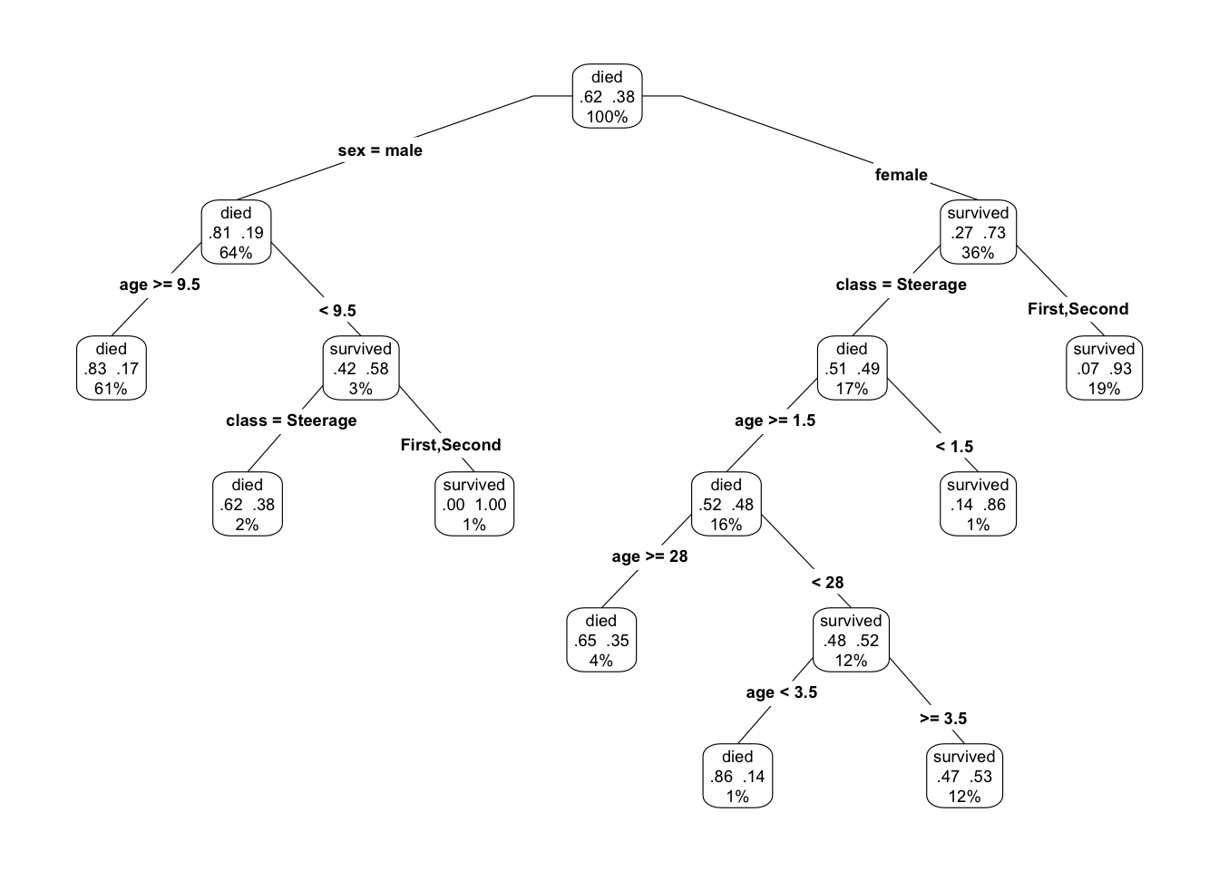
As an example, consider a tree model (Figure 21.4) of survival using the model formula survived ~ age + sex + class. According to the model, the big determinant of survival was whether the passenger was male or female. 73% of females survived, compared to 19% of males. Among the males, class only mattered for children younger than 10. Among females, the vast majority of first- and second-class passengers survived. For the females in steerage, 48% survived, much larger than the 19% among all males.
Figure 21.4: A tree model of survival from the Titanic. The percent number at each node shows the fraction of passengers represented at that node. The two proportions are, respectively, the fraction who died and who survived. The label died/survived simply identifies the larger fraction.
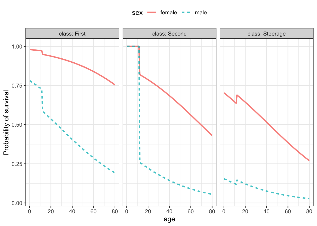
A probability model shown in Figure 21.5 tells a story more clearly. Because class was used for faceting in the graphic, it’s particularly easy to compare females to males, and the decline in survival with age is shown more gradually. Unlike the tree model, which learned from the data that children were more likely to survive than others, breaking out children in the probability model required specifying in the model formula to treat children differently.
Figure 21.5: A probability model survived ~ age + sex + class trained on the Titanic passenger data.
21.9 Perspective and culture
Much of the change from old methods to new reflects the dramatic change in the availability of computing over the last forty years. Another impetus to change is the emergence of interest and ability to study complex systems. For instance, Galton’s 1880s study of heritability focused not on genes themselves but on the easily measured phenotype of height. Today, researcher’s carry out genome-wide association studies that seek to identify specific genes among the roughly 20,000 in the human genome that relate to specific medical conditions.
But there are many other forces that have shaped, for good or bad, the kinds of statistics that are used or mis-used. An important case is that of the p-value. In the era of small data, scarce data meant it could be a challenge to identify any effect at all, let alone to quantify an effect size. Understandably, therefore, small-data statistical methods were often oriented around a yes-or-no answer to the question, “Is there anything going on at all?” The concept of the Null Hypothesis reflects the hypothesis that nothing is going on. The p-value became the accepted way to quantify the plausibility of the Null Hypothesis.
The particular choice of p = 0.05 as a threshold between “fail to reject the null” and “reject the null” is deeply embedded in history and, to some extent, personality. The p = 0.05 threshold is often attributed to Fisher (again, Fisher!) who wrote (Fisher 1926):
… it is convenient to draw the line at about the level at which we can say: “Either there is something in the treatment, or a coincidence has occurred such as does not occur more than once in twenty trials.”… If one in twenty does not seem high enough odds, we may, if we prefer it, draw the line at one in fifty (the 2 per cent point), or one in a hundred (the 1 per cent point). Personally, the writer prefers to set a low standard of significance at the 5 per cent point, and ignore entirely all results which fail to reach this level. A scientific fact should be regarded as experimentally established only if a properly designed experiment rarely fails to give this level of significance. Fisher’s use of the words “convenient,” “seem,” “prefer,” and “low standard” correctly indicate that the one-in-twenty threshold is a rough working value for scientists to move forward in their work. Note also that Fisher did not say that p < 0.05 in one experiment is sufficient to “experimentally establish” a fact. For such establishment of fact, he refers to the multiple replication of experiments giving consistent results.
When Fisher wrote, statistics was not established as a mainstream approach in any major branch of science. Fisher was engaged in outreach to bring statistical methods to a few branches of science, as with his 1925 book Statistical Methods for Research Workers (Fisher 1925). Even a “low standard” would have helped in avoiding spurious results since statistics was otherwise absent from the scene. As well, would be confined for some decades to a few areas of research. Statistics was not applied to what we now know as the social sciences, or to medicine, business, industrial production, etc. From 1925 to today, statistics has grown from a small enterprise involving perhaps 1000s of research workers to a ubiquitous feature of the work of ten million researchers worldwide. Even if adopting p = 0.05 in the 1920s was sufficient to reduce the number of spurious results to something manageable, it hardly suffices as a screen in a world with so many studies being done and with the ability to cut data many different ways in search of p < 0.05 as described in Gelman and Loken (2014). And, while p < 0.05 is recognized as a criterion for publication of results, the more important “multiple replication of experiments giving consistent results” is not a widely enforced standard.
In 2016, recognizing a 50-year history of professional statisticians critique of the uninformed use of p-values, the American Statistical Association (Wasserstein and Lazar 2016) published a statement on p-values and statistical significance focussing on misconceptions that erode the utility of the methods, “While the p-value can be a useful statistical measure, it is commonly misused and misinterpreted. … No single index should substitute for scientific reasoning.”
One reason why p-values continue to be at the core of most introductory statistics courses is culture. Introductory courses are taught mainly by mathematicians. The culture of mathematics is deductive proof, not induction from data. Other aspects of the culture of mathematics are a quest for “exact” answers, and the selection of problems that are susceptible to proof and exactitude, even if those problems do not reflect the actual goals and needs of wider society. The statement of a null hypothesis and the calculation of probabilities in the hypothetical world of the null hypothesis is a class of problems for which there are exact answers. The null hypothesis can meaningfully be stated in simple terms: variables are unrelated to one another, nothing is going on. It is not a scientific hypothesis and does not call on any expertise in any field of science. But it can be framed as a mathematical problem that can be solved.
Data scientists need to be responsible to the goals and needs of others. Exact solutions to at best marginally related problems are not relevant. It’s worth repeating a remark of statistician John Tukey (1915-2000):
Far better an approximate answer to the right question, which is often vague, than an exact answer to the wrong question, which can always be made precise.
References
Fisher, Ronald A. 1925. Statistical Methods for Research Workers. Oliver; Boyd. http://psychclassics.yorku.ca/Fisher/Methods/.
Fisher, Ronald A. 1926. “The Arrangement of Field Experiments.” Journal of the Ministry of Agriculture of Great Britain 33: 503–13.
Fisher, Ronald A. 1936. “The Coefficient of Racial Likeness.” Journal of the Royal Anthropological Institute of Great Britain and Ireland 66: 57–63.
Fisher, Ronald A, and Frank Yates. 1953. Statistical Tables for Biological, Agricultural and Medical Research. Oliver; Boyd.
F.R.S., Karl Pearson. 1900. “X. On the Criterion That a Given System of Deviations from the Probable in the Case of a Correlated System of Variables Is Such That It Can Be Reasonably Supposed to Have Arisen from Random Sampling.” The London, Edinburgh, and Dublin Philosophical Magazine and Journal of Science 50 (302). Taylor & Francis: 157–75. https://doi.org/10.1080/14786440009463897.
Gelman, Andrew, and Eric Loken. 2014. “The Statistical Crisis in Science.” American Scientist 102 (6). https://doi.org/10.1511/2014.111.460.
Michelson, Albert A, and Edward W Morley. 1887. “On the Relative Motion of the Earth and the Luminiferous Ether.” American Journal of Science 34: 333–45. http://spiff.rit.edu/classes/phys314/images/mm/mm_all.pdf.
Student. 1908. “The Probable Error of a Mean.” Biometrika 6 (1): 1–25. https://doi.org/10.1093/biomet/6.1.1.
Wasserstein, R. L., and N. A. Lazar. 2016. “The Asa’s Statement on P-Values: Context, Process, and Purpose.” The American Statistician 70. http://dx.doi.org/10.1080/00031305.2016.1154108.