Chapter 10 Modeling functions
In Chapter 4 we divided the task of summarizing data into two parts:
- Every row of the training data is assigned to a non-overlapping group, or stratum. The strata (plural of stratum) are defined by discrete levels of the selected explanatory variables.
- For each of the strata separately, a statistical summary of the response variable in the form of a summary interval (for quantitative response variables) or a probability of each level (for categorical response variables).
This divide-and-conquer strategy can work well when the explanatory variables are categorical. It can even be made to work when one or more explanatory variable is quantitative. This is done by dividing the range of the quantitative variable into discrete intervals, that is, making the quantitative variable into a categorical one. For example, rather than using the quantitative variable age, you might break the range of ages into, say, four intervals: “child” (15 and younger), “young adult” (16-25), “adult” (26-65), “elderly” (66 and up). Or, you might prefer to break age into more categories, for instance age decades. Or fewer: young and old.
This chapter introduces widely used methods to use quantitative explanatory variables directly, instead of having to split the number line into discrete intervals. There are several important reasons to … well, it seems obvious if you say it … treat quantitative variables quantitatively. The reason that this chapter emphasizes is continuity.
10.1 Continuity
Continuity is the idea that a small change in input will produce a small change in output. Did the price of diesel fuel for trucks go up by 5%? You’d hardly expect shipping costs to go up by more than 5%. Did your aunt just turn 50? There’s little reason to think that her risk of an illness, for instance, shingles, has suddenly gone up sharply.
With a categorical variable, say age given as the two levels “young” and “old”, there’s no such thing as a small change. Your age might change by one year, but you’re still in the “young” group: no change at all. Or, that same one year change in age might push you over into the “old” group. After that, fortunately, you’ll stay old forever!
You’ll sometimes hear about sharp-sounding boundaries in a quantitative variable. For instance, the US Centers for Disease Control recommends the shingles vaccine for people aged 50 and up. Are the 49-year olds immune from shingles? Not at all, 49-year olds have at most only a very slightly lower risk than 50-year olds. The reason for the sharp boundary is not immunological but administrative. It’s just easier to state recommendations as a sharp cut-off.
For a data scientist, it’s important to keep in mind the continuous nature of the relationship between quantities. Decision makers may find it best to translate the continuous relationship into a threshold (for instance, 50-year olds and the shingles vaccine), but in your statistical work try to avoid creating a false impression that there is a sharp, discontinuous change at some single value rather than a gradual, continuous relationship between quantitative variables.
“It is the last straw that breaks the camel’s back.” The proverb is about a discontinuous response to a small change in input. Such circumstances are remarkably rare, especially compared to how often people claim they exist. In the unhappy category of animal tragedies, I’d recommend the fable of the two frogs. One, dropped into boiling water, jumps out immediately; the other, placed in tempid water stays in as the water is heated to boiling. The first frog felt a large change in temperature and reacted strongly. The second felt only small, gradual changes and didn’t react at all. When it comes to modeling camel loading, each additional straw increases the probability of spinal failure by a small amount. And so do many other factors: fatigue, terrain, a misplaced hoof, a gust of wind.
10.2 Representing continuity
How do we represent continuous relationships? Consider the relationship between time (in years) and the “global average temperature.”8 The main goal of the recent Paris Agreement is to hold “the increase in the global average temperature to well below 2 °C above pre-industrial levels.” In concept, we hardly expect a global average to change much over the course of an hour or a day or even a year: small changes in time lead to small changes in temperature. That’s a continuous relationship. Figure 10.1 shows such a continuous relationship based on temperature data collected by NASA.
Figure 10.1: Global average temperature versus year as estimated from year-by-year records. The relationship between temperature and year is continuous, even if the data used to estimate the relationship is not.
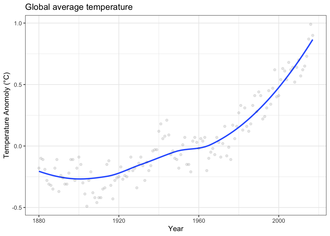
A smooth curve such as in Figure 10.1 is a good way to display a continuous relationship to a person. In speaking of the curve mathematically, we would call it the graph of a function and say that global average temperature is a function of time.
A mathematical function is a mechanism that takes inputs and produces a corresponding output. To use the graph as a mechanism requires a human: put a pointer at a point at the input on the x-axis, trace vertically up to the function, then trace horizontally to read off the output. Since much of our work is done with computers (including drawing graphs!), it’s important to have other ways to represent functions.
One way to represent a function is with a formula using arithmetic. Likely, much of your high-school mathematics education was given over to studying such formulas. For instance, here is a function named \(f()\) based on the formula for a straight line.
\[f: x \rightarrow 3 x + 2\] The function \(f()\) will turn an input of 4 into the output \(3 \times 4 + 2 = 14\). In this notation, the symbol \(x\) stands for the input, \(f\) names the function and \(x \rightarrow 3 x + 2\) describes the exact mechanism of the function: how it turns the input into the output.
To see the continuous nature of \(f()\), try another input close to 4, say 4.01. The corresponding output will be 14.03. The small change in input – from 4 to 4.01 – results in a small change in output from 14 to 14.03. Of course, whether the change in output of 0.03 is “small” depends on how you want to define “small”. For continous functions, for any choice of “small”, say 0.0003, there is a corresponding small change in input – 0.0001 in this case – that will produce the “small” change in output.
Mathematical functions used in statistics are different from the sort most frequently encountered in high-school math in several ways:
- Often, statistical model functions have more than one input, not just \(x\). Sometimes they have several, dozens, hundreds, or even thousands of inputs.
- Generally, inputs to statistical model functions are not named \(x\), \(z\), and so on but given names that signify the data variable represented by input, for instance,
age,occupation,wage,height. - Although inputs are often numbers, they can also be categorical levels, e.g. words.
To illustrate, consider a function g(weather) which takes as input any of the set of words “freezing”, “cold”, “mild”, “warm”, “hot”. Given such an input, g(weather) generates an output. For instance:
g("freezing")\(\rightarrow\) 10g("cold")\(\rightarrow\) 30g("mild")\(\rightarrow\) 50g("warm")\(\rightarrow\) 70g("hot")\(\rightarrow\) 90
The function g() is not continuous. Suppose we choose “small” to mean a change in output of 0.1. There is no way to change the input to produce a change in output that small.
Functions can have multiple inputs. Each input can be either numerical or categorical. For instance, consider the function h(age, sex), for which a few possible inputs and corresponding outputs are shown.
h(6, "female")\(\rightarrow\) 98h(6, "male")\(\rightarrow\) 97h(18, "male")\(\rightarrow\) 180h(21, "female")\(\rightarrow\) 170
The function h(age, sex) can be continous with respect to its numerical input, age, but not with respect to the categorical input sex.
10.3 Functions as software
Increasingly, the functions used in modeling are forms that cannot be written easily as arithmetic or algebraic formulas. Ironically, these “advanced” functions are in some ways much easier to use than the familiar functions of algebra. How come? Because rather than writing out the function as symbols in algebraic notation, the function is created and stored as a software program.
The essential operation of such software functions is evaluation: taking inputs and using the software to generate an output. This is denoted in a way that follows tradition: the inputs are written in parentheses (like (age) or (age, sex)) and the function itself, rather than always being given a single-letter name (like f()), is named for the software that implements the function.
10.4 Example: Dose-response curve
Environmental toxins and carcinogens are a major public health concern. After the discovery of radioactivity in the 1890s, and before the health effects of radiation were understood, researchers and workers could be exposed to large doses of radiation and suffer cancer and other ailments. Although it was clear that large doses were harmful, there was a question of whether there was a “safe level” of radiation. If you’ve had an X-ray picture taken, you may have noticed that the medical technician steps behind a safety shield before triggering the X-ray beam. So why is it acceptable for you to be exposed but not for the technician? The reason has to do with the cumulative effect of radiation. An individual might get a dozen or so X-rays over the course of a life. The technician, however, is exposed to thousands.
The relationship between total exposure and cancer is an example of a dose-response relationship. Figure 10.2 shows some data on the prevalence of bone sarcomas among some early radiation workers, people painting watch dials with radium (so that the watch can be read in the dark). For every 1000 workers who collected the highest doses, there were about 10 extra cases each year. Lower doses produced lower rates of extra cases.
Figure 10.2: Excess cases of bone sarcomas as a function of dose of radiation for radium watch painters. Two possible shapes are shown for the function giving of extra cases versus dose. (From Zeise, Wilson, and Crouch (1987), p. 284)
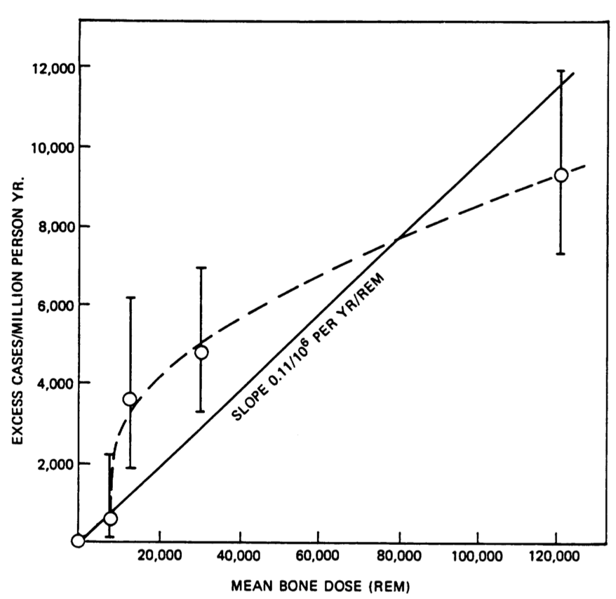
Researchers collect data one person at a time relevant to the relationship between dose and response. But, conceptually, there is a continuous function that takes dose as an input and produces the expected rate of extra cases as an output. Figure 10.2 shows two possible shapes for a continous function corresponding to the data: a straight-line function and a flexible-curve function.
10.5 Families of functions
In order to construct a mathematical function that will condition a response variable on one or more explanatory variables, you, the modeler, need to make some choices:
Pick a response variable and explanatory variables. This choice is usually motivated by the purpose behind your model building. You want to study how wages are affected by experience, education, and sex? Then wage is a sensible reponse variable and the others will be explanatory variables. You want to explore the risk of heart disease as a function of diet and exercise? Then the response variable should indicate the heart-disease status. Perhaps it could be a simple yes-no recording whether the person was treated for cardiac symptoms in a five-year follow-up period or the outcome of a treadmill stress test.
Pick a family of functions to use to represent the relationship between the explanatory variables and the response variable. This section will introduce you to the idea of “families of functions.”
Once you’ve made the choices in (1) and (2), the actual construction of the function using the available data is an entirely automatic process that can be carried out by the computer without further human intervention.
Don’t be put off by the need to choose a family of functions. While it’s true that some families can be better suited for your purpose than others, often the method used to make the choice is to try several families and check which gives the best prediction performance, that is, the smallest prediction error.
Think of choosing a model family as choosing something for dinner. You can, of course, go through volumes of cookbooks to get ideas, look for the freshest foods at the market, and so on. And, if you’re concerned about optimizing your dinner choice, you may want to go through this effort. But rather than being paralyzed by the prospect of all this work and judgment, much of the reason why you eat dinner can be satisfied simply by choosing something convenient. For many people, the easy, convenient, good-enough choice is macaroni and cheese, even if that’s not exactly high dining.
What is the macaroni-and-cheese of modeling? We’ll use the family of functions where underlying formula is a proportional combination of inputs. (Mathematicians call this a linear combination. It would be appropriate to think of the formulas as a kind of modeling clay: you can shape them flexibly to build many shapes of model.
One reason the proportional combination family of models is so useful is that the mathematics of such combinations are well understood, the subject is called linear algebra. Even in the days before modern computers, it was possible to calculate by hand the constants that go into small formulas such as \(m x + b\) or \(a + bx + cy + d xy\). With computers, much larger formulas can be handled easily and can produce an amazing variety of shapes of functions.
The most famous example of a proportional combination is the straight-line model familiar from high-school mathematics whose formula is \(m x + b\). For this formula, the single quantitative explanatory variable \(x\) is translated into a set of two inputs \(\{x, 1\}\). The formula comes from multiplying the inputs by a set of fixed constants (“proportions”), \(\{m, b\}\), giving two quantities \(\{m x, b\}\). Then add up (“combine”) the quantities, producing the formula \(m x + b\). For the formula \(a + b x + c x^2\), the inputs are \(\{1, x, x^2\}\) and the constants are \(\{a, b, c\}\). Still another example is the formula \(a + b x + c y + d xy\), which has two explanatory variables but four inputs: \(\{1, x, y, x\times y\}\).
Figure 10.3 shows a few examples of the kinds of shapes that can be generated by proportional combinations of a single explanatory variable \(x\).Some of them show a steady increase with x, some a steady decrease, and some have sections going up alongside sections going down.
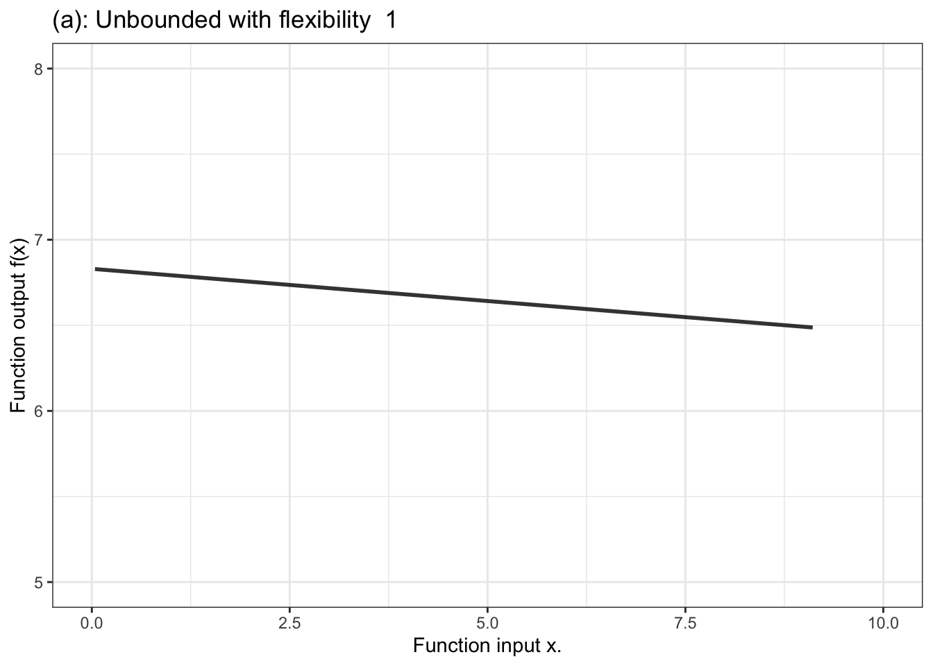
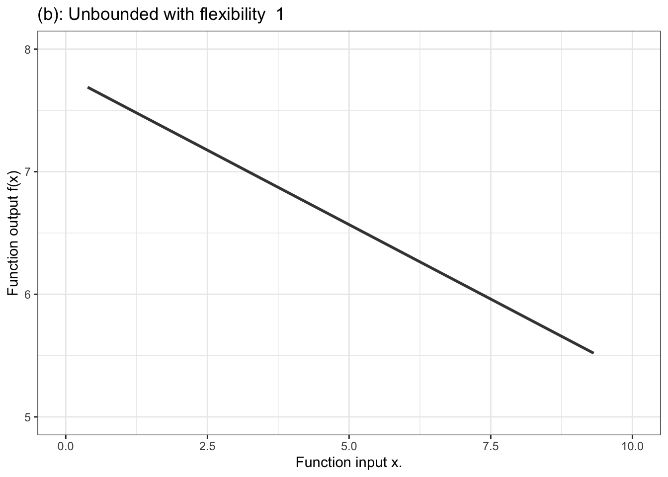
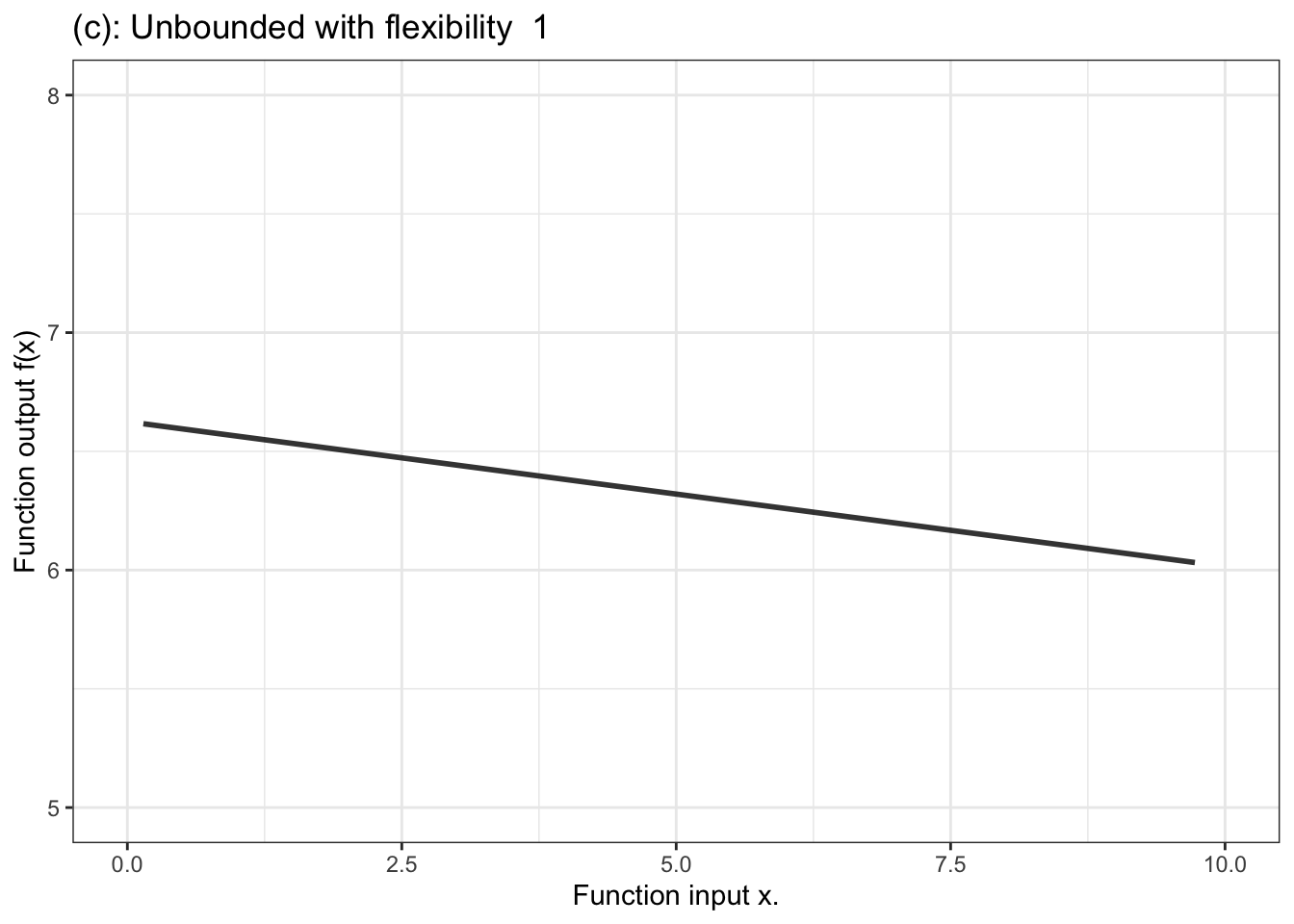
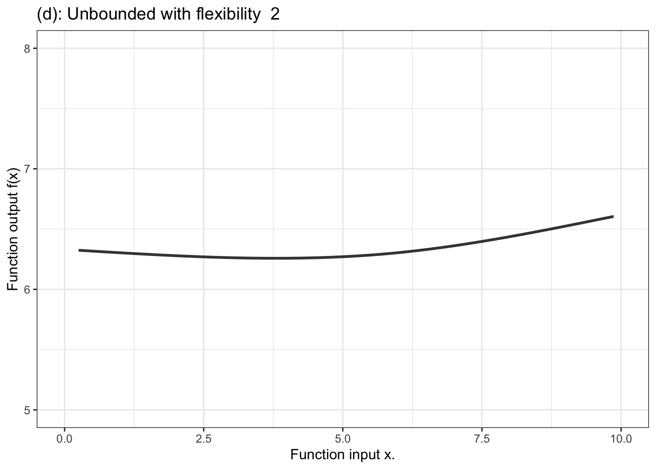

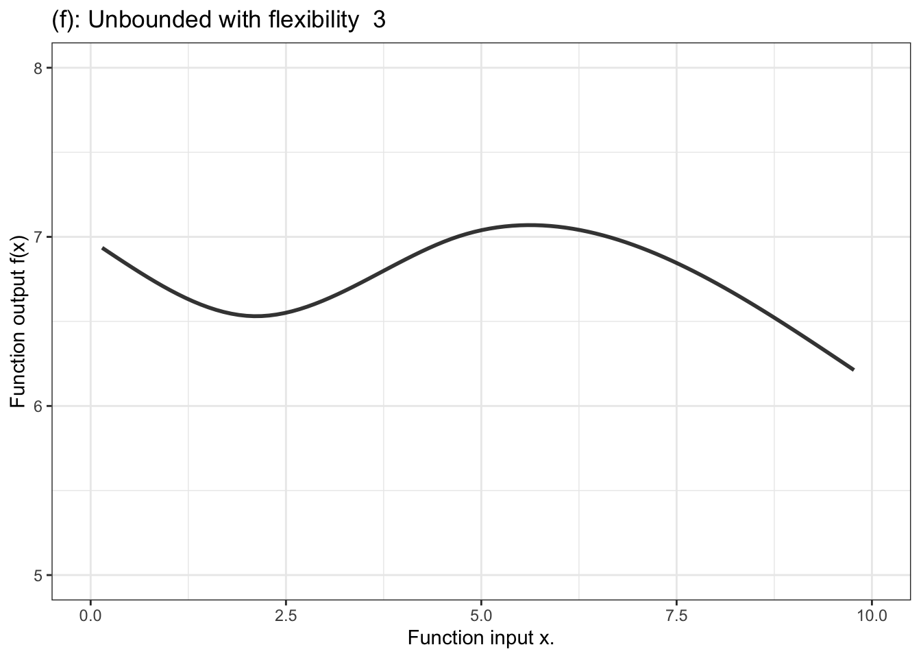
Figure 10.3: Six members of the family of proportional combinations of a single explanatory variable \(x\).
Providing inputs to the proportional combinations formula produces a number, that can potentially take any value from \(-\infty\) to \(\infty\): the entire number line. For a quantitative response variable, the output from proportional combinations can be used directly as the model output.
In contrast, for a categorical response variable, the output needs to be a probability, that is, a number limited contained in the range 0 to 1. The unbounded output of the formula is fed into another stage that squeezes down the infinitely long number line into the bounded segment 0 to 1. Figure 10.4 displays a handful of examples of shapes of bounded functions.
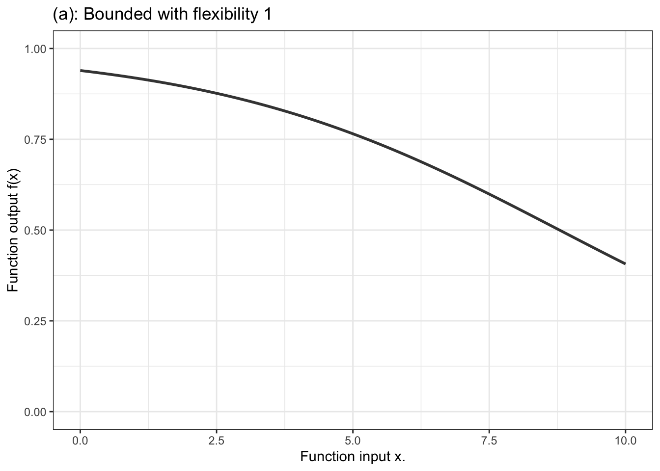
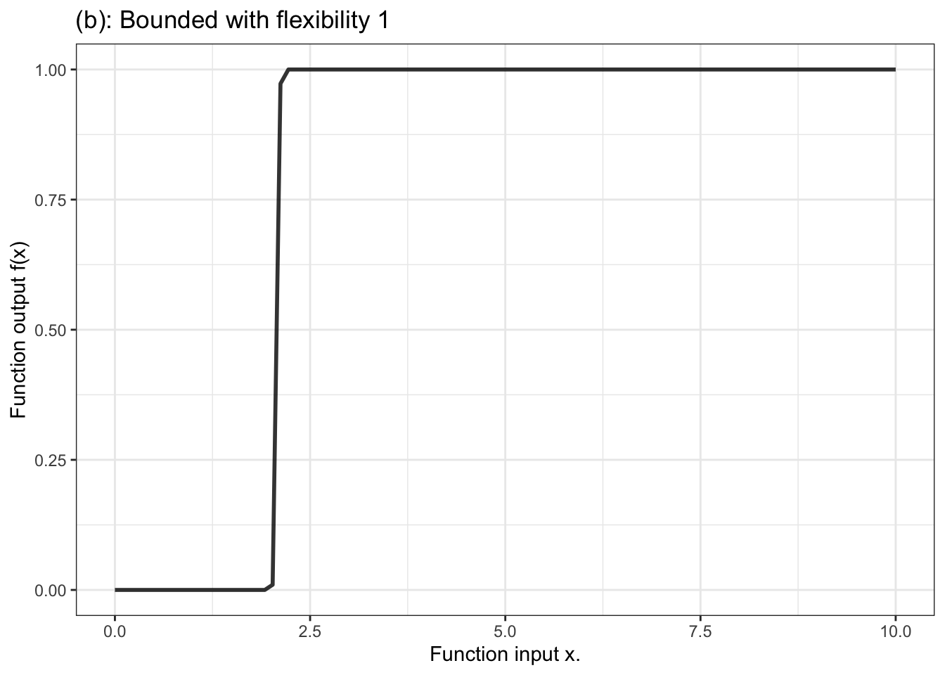
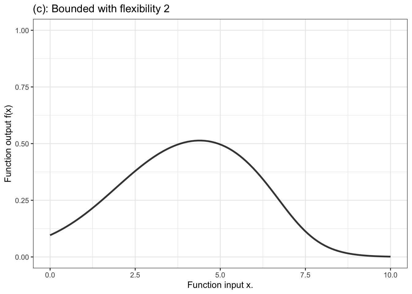
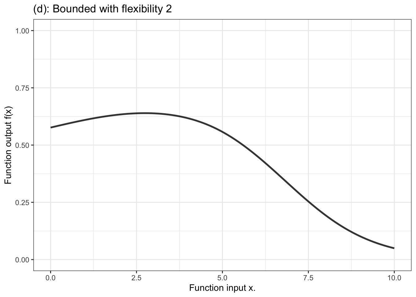
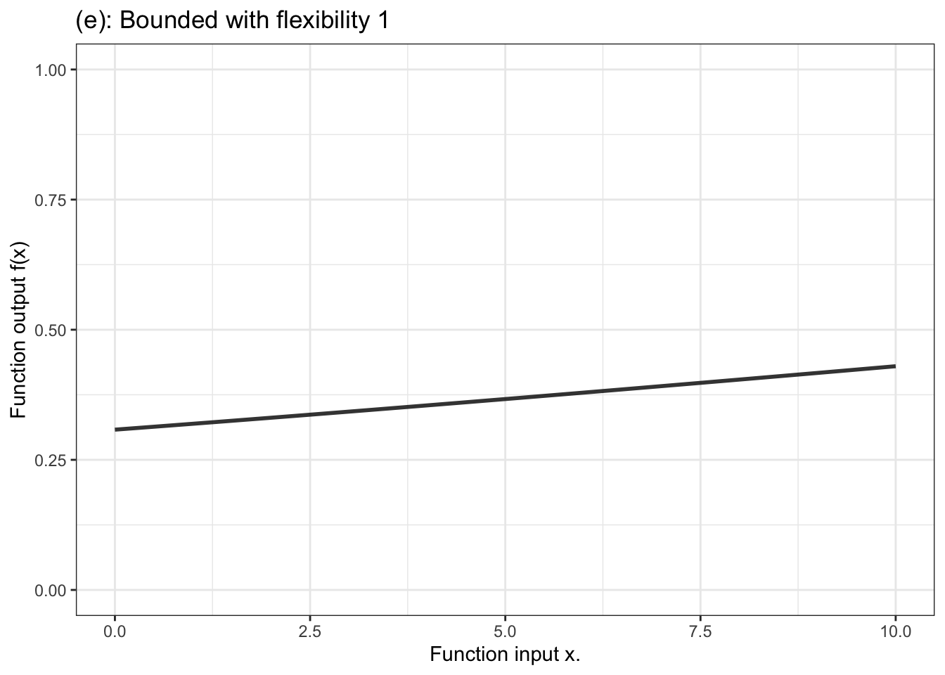
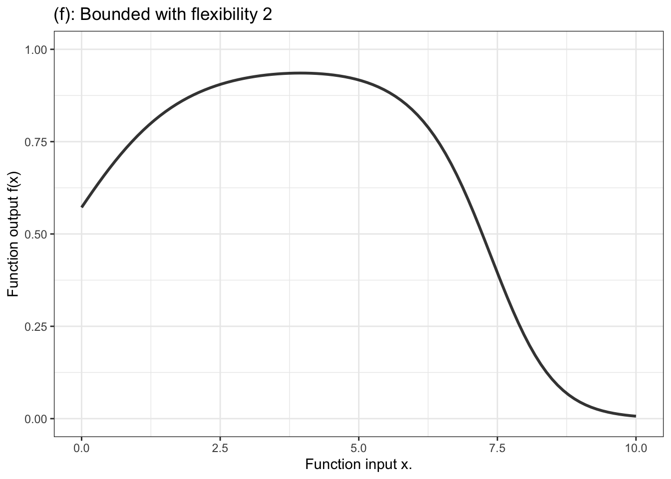
Figure 10.4: Six members of the family of bounded functions. Note that the function is constrained to have outputs between zero and one. Thus the output can be interpreted as a probability.
The majority of statistical work is done with the proportional-combination family of functions, either unbounded for a quantitative response variable, or bounded for a categorical response. Many researchers never have a need to use other families, although this is likely to change with the increasing use of machine learning functions. The next chapter will introduce another family of models – tree models – but these are valuable mainly as a tool for generating ideas for choosing explanatory variables.
Another aspect of modeler’s choice is the flexibility or stiffness incorporated in the model. We’ll describe flexibility by an integer: 1, 2, or 3. (Higher numbers are available, but not often used.) For unbounded functions, a low flexibility, 1, means that the slope of the model function has only one value. That’s a straight-line model. A flexibility of 2 means that the slope can vary, as does the surface of a smooth hill. Flexibility 3 functions are more sinuous, for instance going up, down, and up again as the input increases. Bounded models of flexibility 1 have an S-shape owing to the compression of the number line into the interval 0 to 1. Higher flexibilities in bounded models have more complicated shapes.
10.6 Example: Will it rain?
You are familiar, I’m sure, with daily or hourly weather forecasts that give the expected temperature, chance of rain, cloud cover, and such. You hardly ever see a quantitative prediction of the quantity of rain, just whether it will rain or not. This is because quantity of rain is extremely hard to predict and varies substantially from place to place even within the area covered by a city. Consequently, forecasts are made in terms of a categorical response variable: will it rain or not?
For categorical response variables, a suitable model can be selected from the bounded proportional-combination family. To illustrate, well use detailed, hourly weather measurements for the last 25 years in Ramsey County, Minnesota, USA.
Figure 10.5: Treating air pressure as a continuous numerical variable turns the model of rain conditioned on air pressure into a smooth function. The logistic function form is appropriate for classifiers, when the function output is a probability, that is, a number between zero and one.
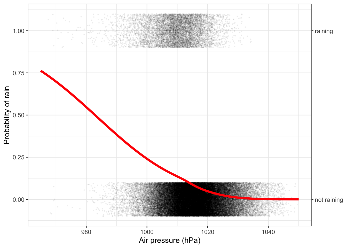
Figure 10.5 shows the model function laid over a data graphic of the weather archive. For barometric air pressure above about 1030 hPa, it hardly ever rains. Below that, the model shows a steadily increasing probability of rain.
Looking at the data layer in Figure 10.5, you can see that air pressures below 1000 hPa are uncommon, and those below 980 hPa are very rare. Except for these very rare days below 980 hPa, the probability of rain is never over 50%. Yet, depending on where you live, forecasts of 60%, 70%, 80% or even 90% probability of rain are not uncommon. How do the weather forecasters manage to have such high probabilities? Part of the reason is that weather forecasters have access to much more information about the state of the weather than just barometric pressure. Two different days with air pressure at 1000 hPa look the same when conditioning just on air pressure, but they can look very different when the model has additional explanatory variables. In actual weather forecasting, these additional factors include season (spring and fall can have very different weather), wind direction, detailed weather-map information showing the location of fronts, etc. and knowledge of the typical patterns with which weather moves across the oceans and continents.
10.7 Graphing functions with multiple inputs
The functions illustrated in Figures 10.3 and 10.4 take a single explanatory variable as the input. Such functions are common, but it’s also common to have the input include multiple explanatory variables.
In this book, we draw functions as an interval graphic layer. One input to the function will be represented by the horizontal axis. Other inputs will be represented with color and or faceting.
To illustrate, consider the function h(age, sex) defined earlier in this chapter. Table 10.1 displays a small data frame that relates function inputs to an output.
Table 10.1: A data frame relating inputs to output for the \(h(age, sex)\) function. This data frame is equivalent to the “function notation” used in Section @ref(mathematical_functions)
| sex | age | output |
|---|---|---|
| female | 6 | 98 |
| male | 6 | 97 |
| male | 18 | 180 |
| female | 21 | 170 |
If we were plotting the data itself, the response variable (output) would go on the vertical axis. The horizontal axis could be either of the two explanatory variables, and we could use either color or faceting to display the second explanatory variable. Various possibilities are shown in Figure 10.6.
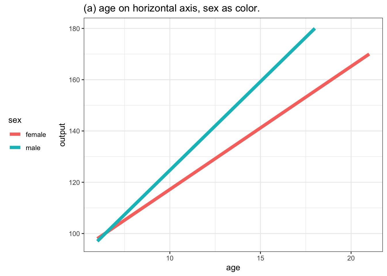
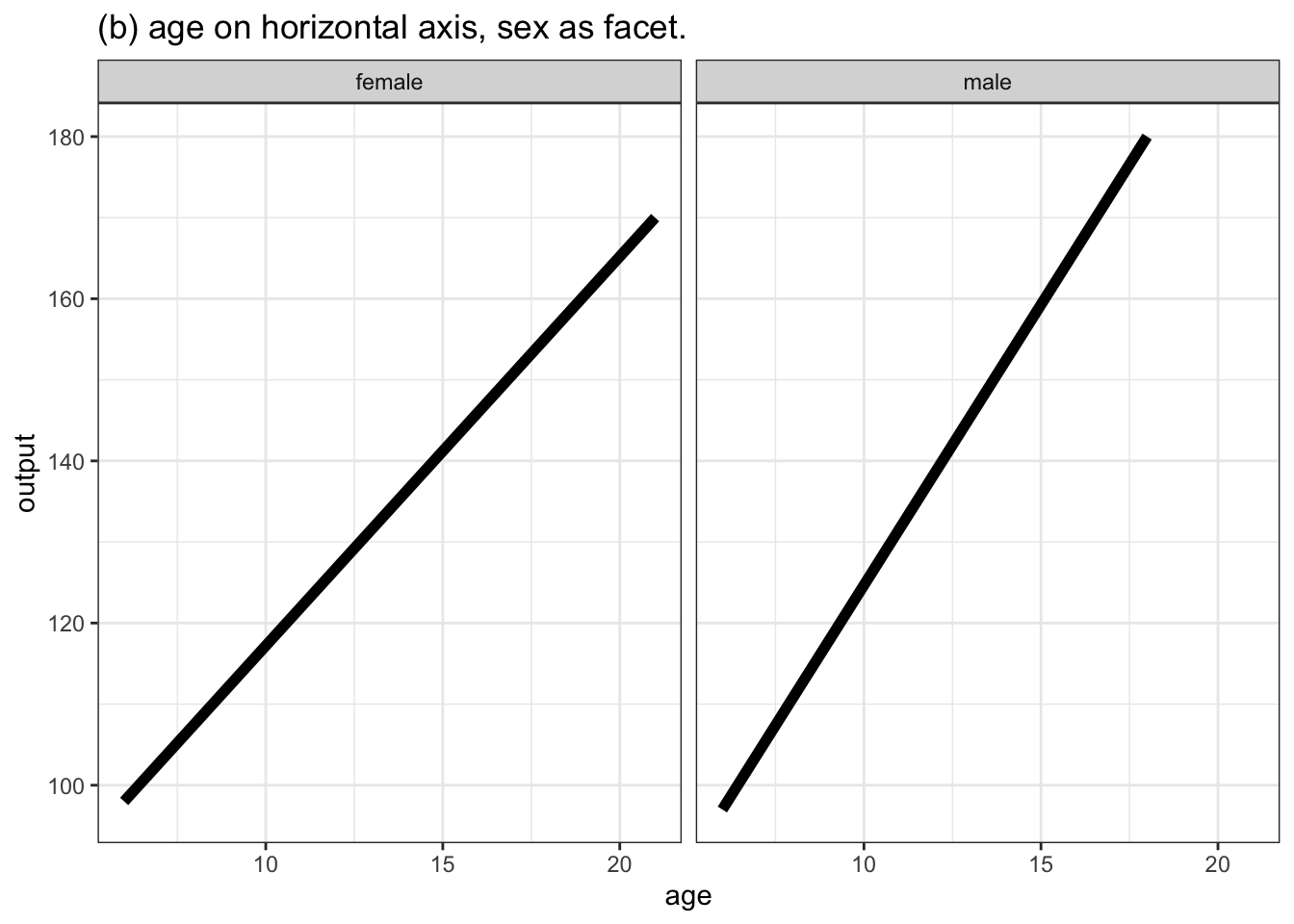
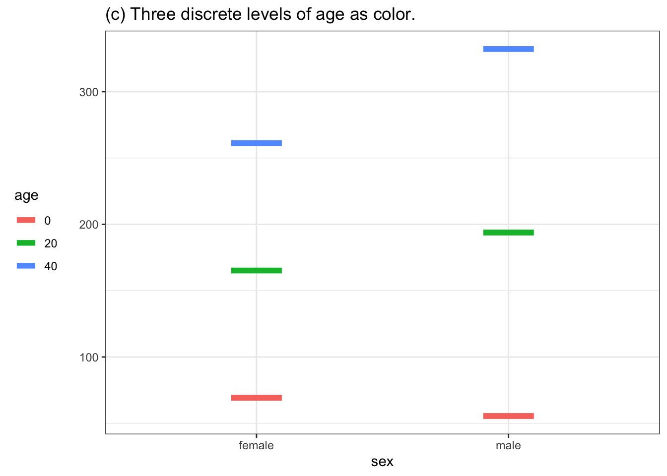
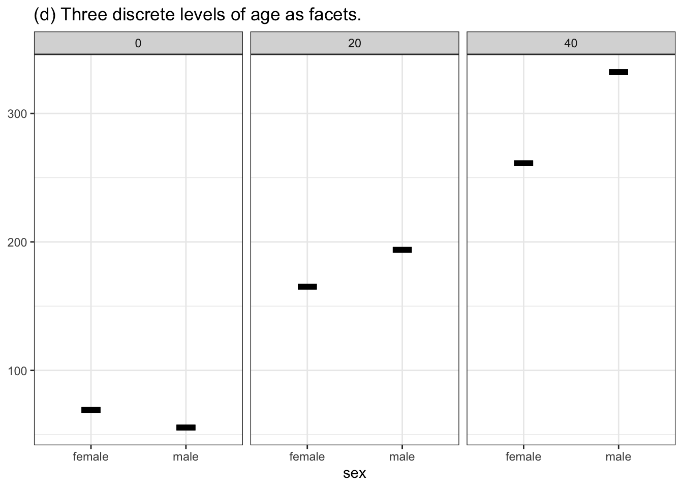
Figure 10.6: Four ways of graphing the function h(age, sex). (a) and (b) put the quantitative variable age on the horizontal axis and depict sex either with color or facet position. Graphs (c) and (d) use the horizontal axis for sex. Using color or facet for age means that a few discrete values of age must be selected.
Although any of the four choices shown in Figure 10.6 are possible, for many people graph (a) would be most effective and (d) the least. A good rule of thumb for mapping variables to aesthetics is this:
- As always, use the vertical axis to depict the model output.
- If there is a quantitative input, use the horizontal axis for that.
- Use color for a second input for which you want to compare the levels one to another.
- Use faceting for a third (or even a fourth) explanatory variable.
What to do if the variable used for color or for facet is quantitative? Rather than showing the function output for a continuous range of that variable, pick a handful of discrete values from that range, as in Figures 10.6(c) and (d).
10.8 Example: Graphing functions with two quantitative inputs
Consider some data about Fell running, also called Hill running, a style of cross-country running. The data frame Hill_racing records the winning times for males and females in more than 1000 Scottish hill racing events from 2005 to 2017. For each race, the total distance (in km) and total climb (in meters) is also recorded.
Not surprisingly, the race time is related to the total distance, as seen in Figure 10.7. Longer-distance is associated with longer time.
Figure 10.7: Winning time versus distance in Scottish Hill races from 2005 to 2017. A straight-line model of time ~ distance is displayed.
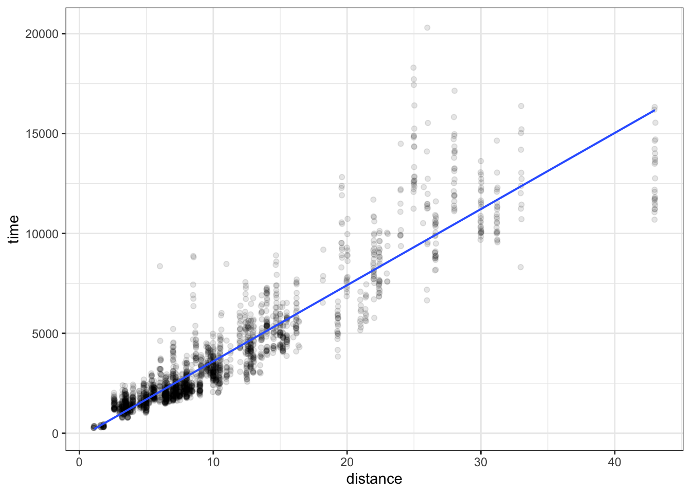
In the function shown Figure 10.7, there is only one explanatory variable, distance.
Alternative and additional explanatory variables can also be used. Figure 10.8 shows a model time ~ distance + climb + sex.
Figure 10.8: A model time ~ distance + climb + sex of winning time from the Scottish Hill running races.
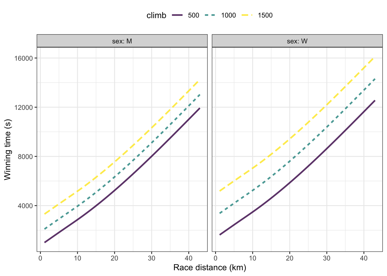
In Figure 10.8 the function has separate branches for males and for females shown in separate facets. Although the function is continuous with respect to climb, only three discrete levels of climb have been graphed: 500m, 1000m, and 1500m. Notice that races with a shorter climb have faster winning times … naturally!
10.9 Example: More variables for predicting rain
Previously, in Section 10.6, we created a simple model to predict rain or not based on the barometric pressure. Now, still using the logistic regression family of functions, let’s incorporate some additional possibly relevant weather variables: temperature, wind speed, and wind direction.9 Keep in mind that this model, like the previous ones, is based on data from Ramsey County, Minnesota, USA.
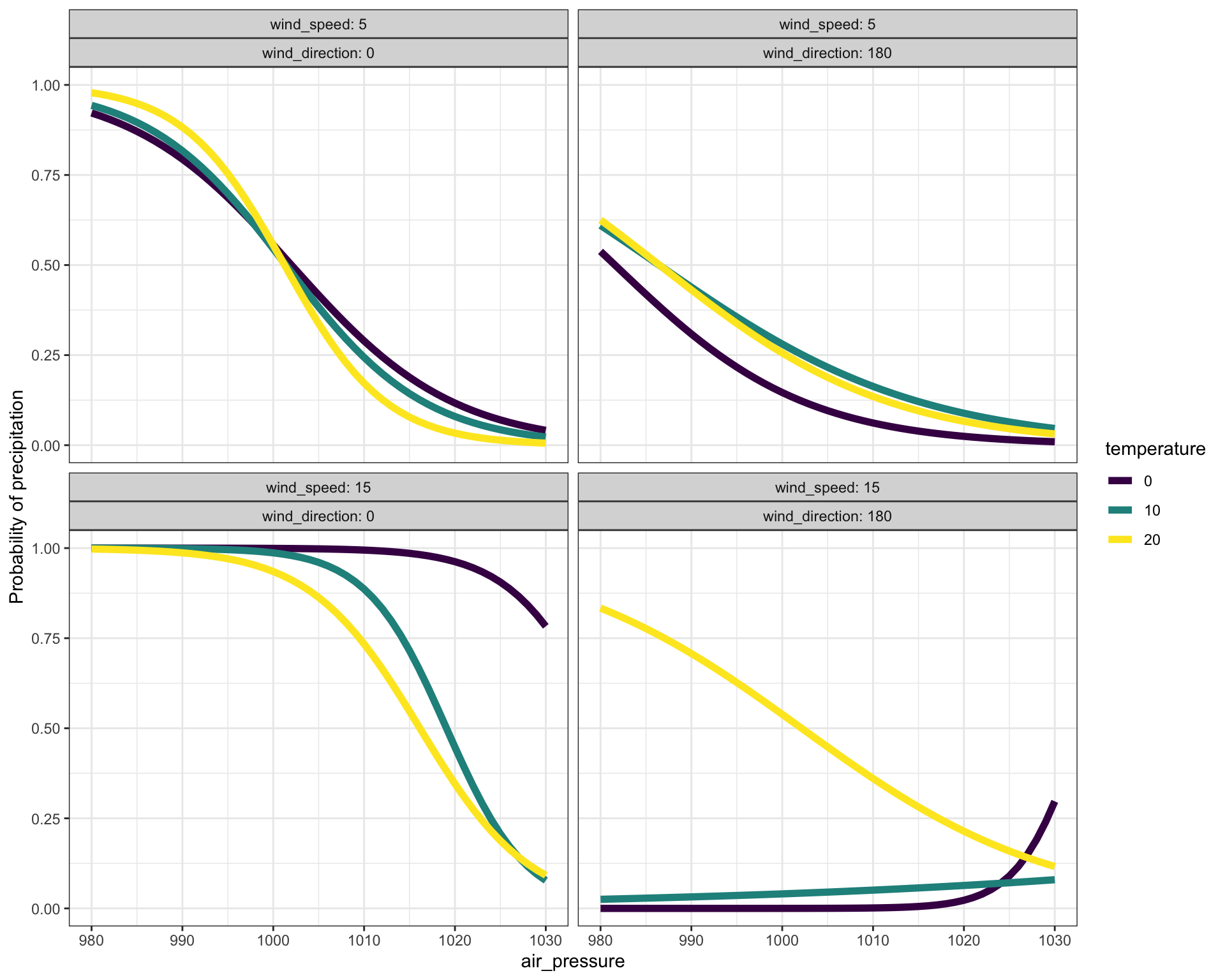
Figure 10.9: A function showing the probability of precipitation (in Ramsey County, MN, USA) as a function of four explanatory variables: air pressure, temperature, wind speed, and wind direction.
In Figure 10.9, some of the model outputs are close to 100%. This contrasts with the model of Figure ?? where the model outputs are hardly ever larger than 50%. By including several explanatory variables in Figure 10.9, we’re able to pull apart occasions that have the same barometric pressure but are different in other ways. This lets Figure 10.9 be more specific, since the pulling apart successfully separates rainy occasions from the non-rainy ones.
10.10 Intervals on functions
It might seem odd that we have said that graphics for functions are an instance of an interval layer. After all, the function output is a single number, not an interval, so the graph of the function is a thin line.
But insofar as the modeling function is meant as a summary of the data, we should be explicit about how much the data ranges above and below the value of the particular modeling function we selected.
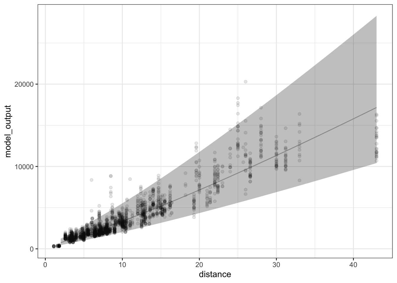
To illustrate, consider a model of winning times in Scottish fells racing, where different race events have different distances and climbs, and where males and females run in different divisions. To keep things simple, let’s consider winning time as a function only of race distance (even though it obviously depends on other variables such as climb and sex). Figure 10.10 shows the fells data and a flexible unbounded model of winning time versus race distance.
Figure 10.10: The Scottish fells racing data and a flexible unbounded model of winning time versus race distance. The two highlighted data points are each about 5000 seconds from the model value. The typical distance for the other points is somewhat smaller than that.
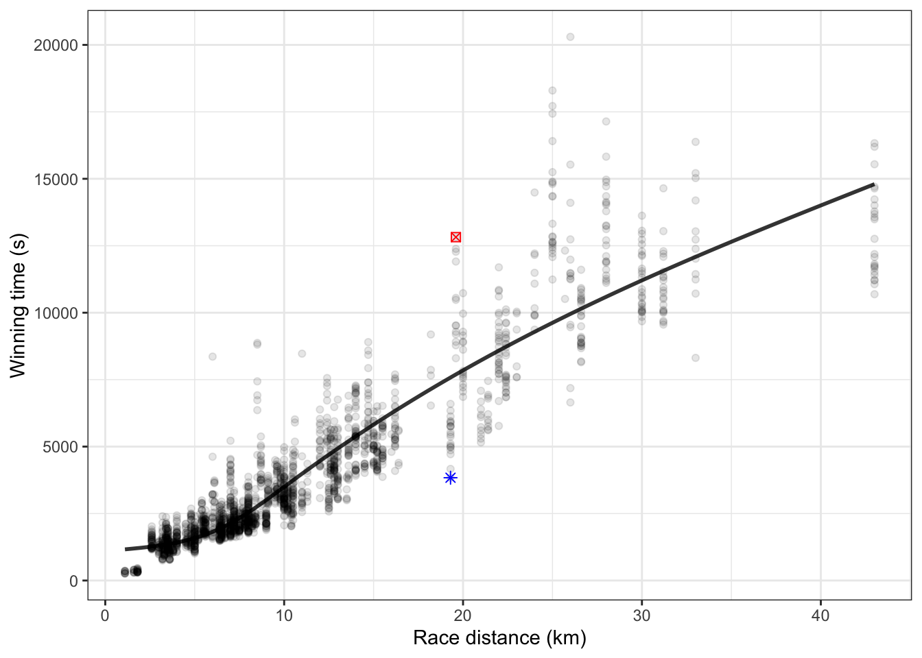
For any of the data points where the point falls exactly on the graph of the model function, the model error is zero. For data points above the model function, the model error is positive. For instance, for the one highlighted point where the winning time was about 13000 seconds, the model error is roughly +5000 seconds, the distance (in the units on the vertical axis) of that point from the model error given that race’s distance. For the other highlighted point, which is below the model function, the model is below the model function, so the model error for that point is negative, about -4000 seconds.
Each individual data point has a model error. Some are large, some small. Some are positive, some are negative. A summary interval for the model function itself can be constructed by marking bounds above and below the model function that are wide enough to include 95% of the set of model errors for all the individual points. (Figure 10.11)
Figure 10.11: The model function from Figure 10.10 shown with its 95% prediction intervals.
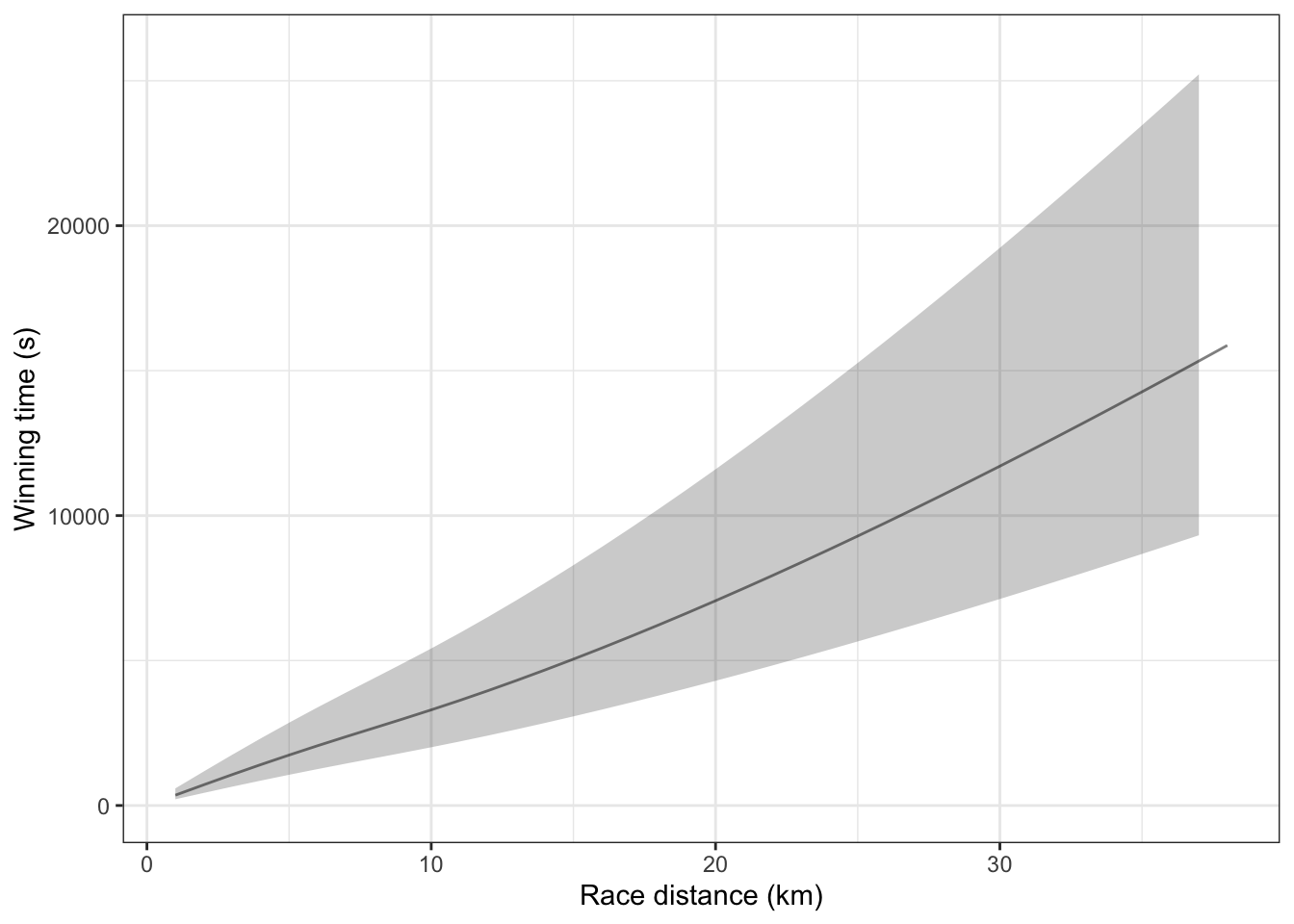
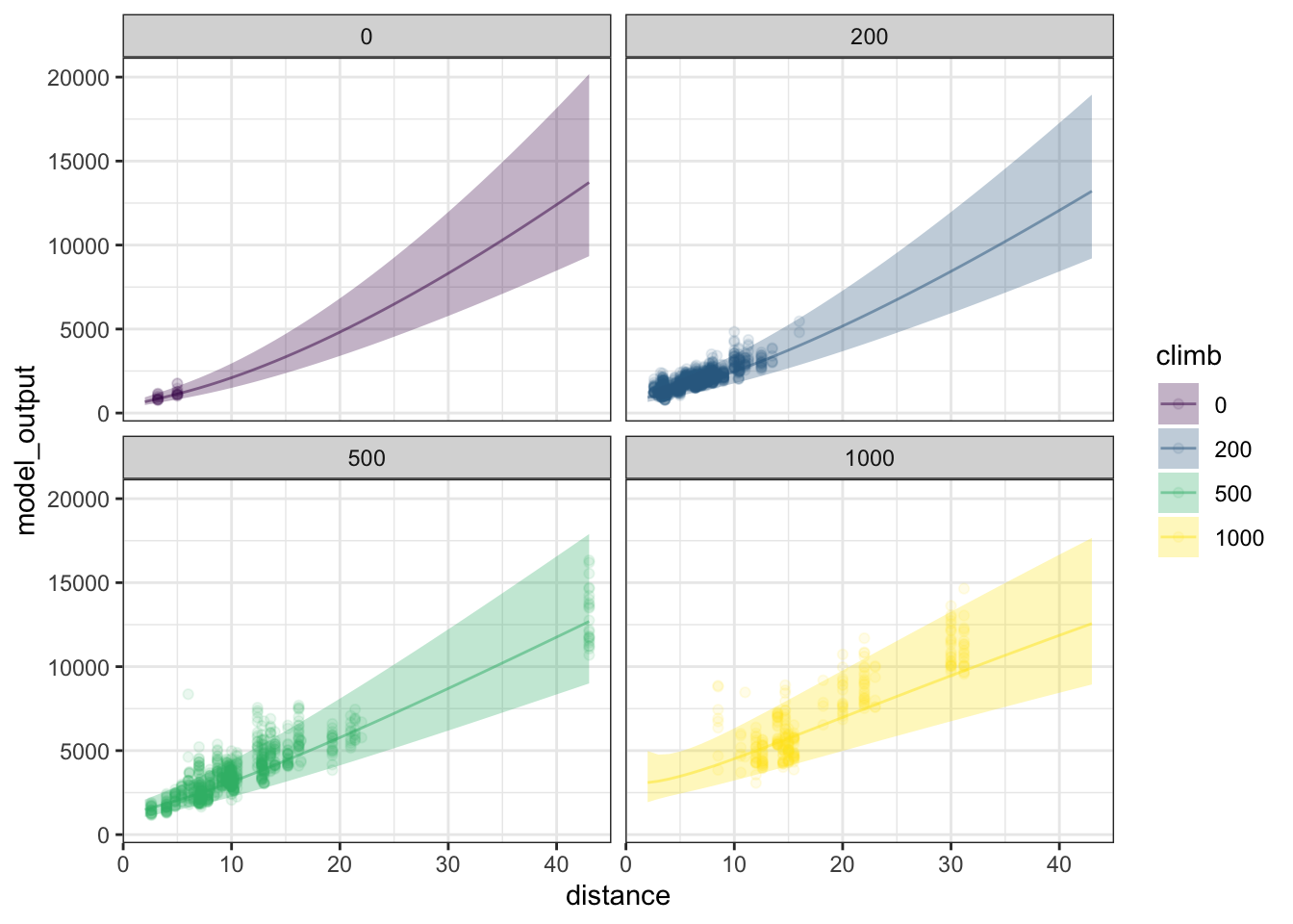
Of course, one of the goals in building a model is to make the model interval as narrow as possible while still being faithful to the data. Figure 10.12 shows 95% summary intervals for a model that includes climb and the sex of the runner along with distance as explanatory variables.
Figure 10.12: A model function and summary band for the winning times in Scottish fells race using distance and climb and sex as explanatory variables.
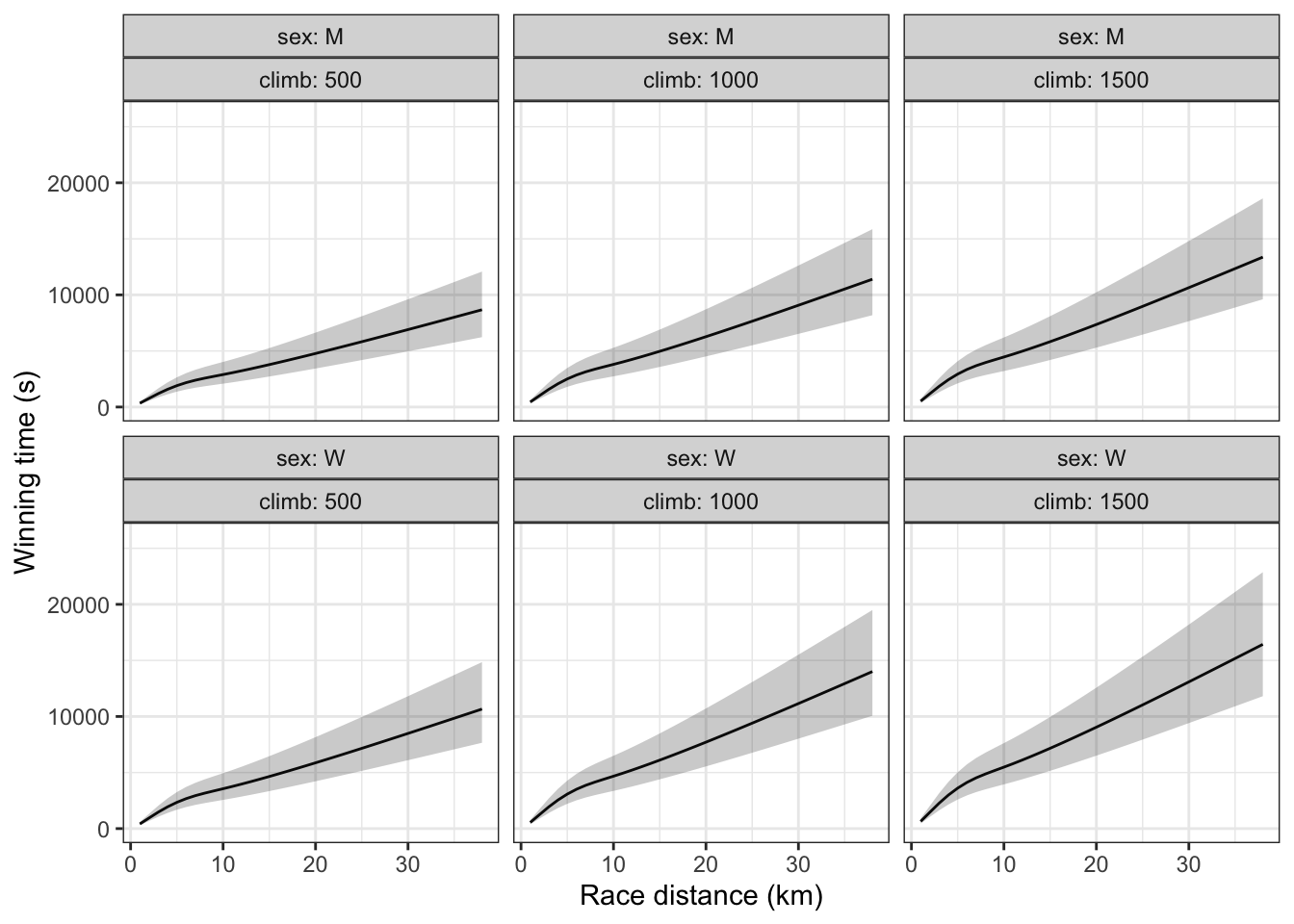
Notice that in Figure 10.12, the difference between the top and bottom of each summary interval – there are separate ones for the two sexes and each distance – is about 2500 seconds. This is about half as wide as the confidence interval in Figure 10.11. The reason? Climb and sex are accounting for variation in race time that isn’t accounted for when distance is the only explanatory variable.
10.11 Example: Rising sea levels
Modeling functions are used not just to summarize data, but to predict outcomes yet to come. Although the output of the modeling function is a single number, we recognize that the outcome we seek to predict is likely to differ from the model output. To describe the range of likely outputs, we use a prediction interval or, for a range of inputs, a prediction band. A prediction interval is much like a summary interval, but rather than summarizing the range of data, it summarizes the range of possible outcomes of the quantity to be predicted.
Sea levels across the globe have been rising for the past 130 years or so, according to historical records, tide gauge measurements and, most recently, satellite measurements. Figure 10.13 shows a presentation of the historical record along with predictions of sea level over the next 80 years. These predictions are presented in the form of prediction intervals. That is, there is a range of plausible outcomes for each future year, depending on the amount of greenhouse-gas warming of the atmosphere and the details of how ocean water absorbs this heat. (Water expands slightly as it’s heated, which is one mechanism for raising sea levels.)
Figure 10.13: Historical records, current observations, and predictions of global sea level. (Source: National Climate Assessment 2014 report site)
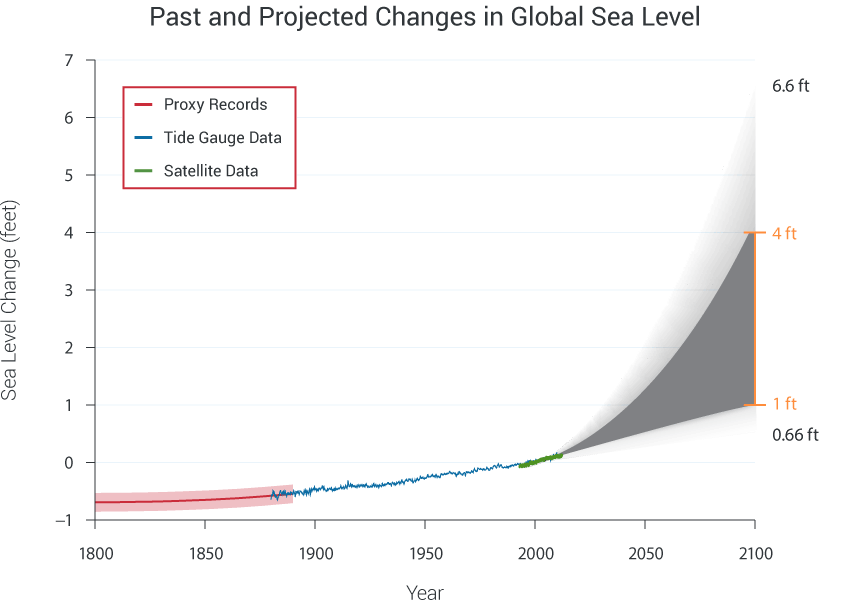
In interpreting the prediction intervals, it’s fair to pick any point in the gray zone, say at 1 foot rise by 2050, and call that a plausible outcome. But it would be wrong to think that the actual sea-level rise will fluctuate from the low to the high level in the gray zone. The future track of sea level will presumably look something like the historical record, showing only slight fluctuations around the trend. The prediction interval is about the trend itself. A trend such as the curve defining the bottom of the interval is plausible, as would a trend such as the curve defining the top of the interval, or any similarly shaped trend in between.
Figure 10.13 actually shows two (overlapping) intervals. The dark gray interval is based on the mechanism of warming sea water. The light gray interval incorporates additional possible mechanisms, such as glacial melting. There is more uncertainty in the science behind these mechanisms and so the authors of the report chose to highlight that uncertainty, perhaps to aid comparison to predictions made by other agencies. But so far as the sea level itself, the prediction band spans both the dark and light gray zones.
10.12 Exercises
Problem 10.1 The following three graphs each show a function time ~ climb trained on the Scottish hill racing data. Each function was trained with a specified degree of curviness.
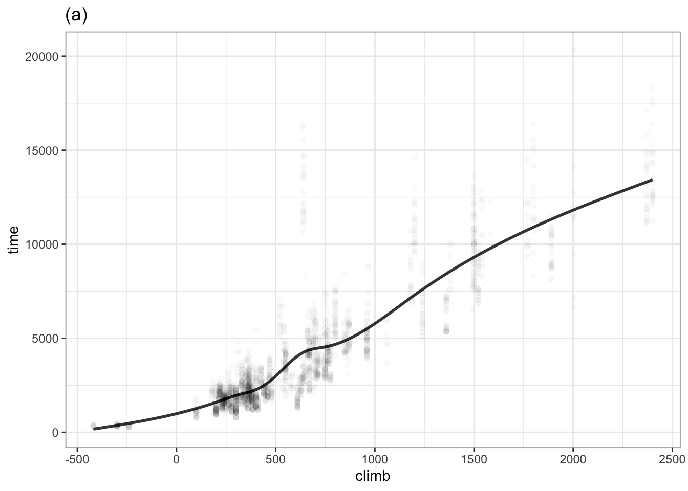
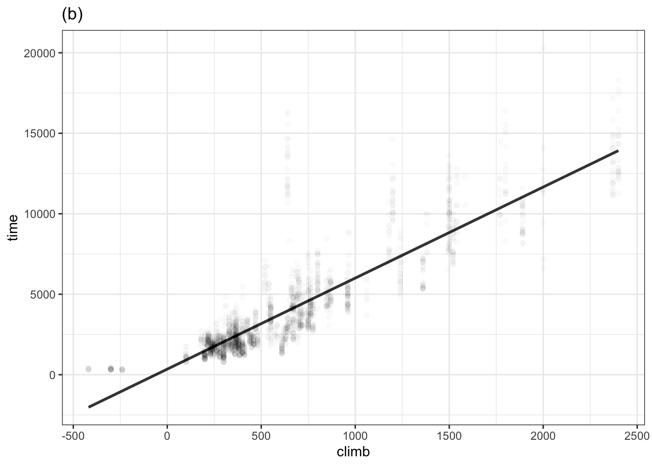
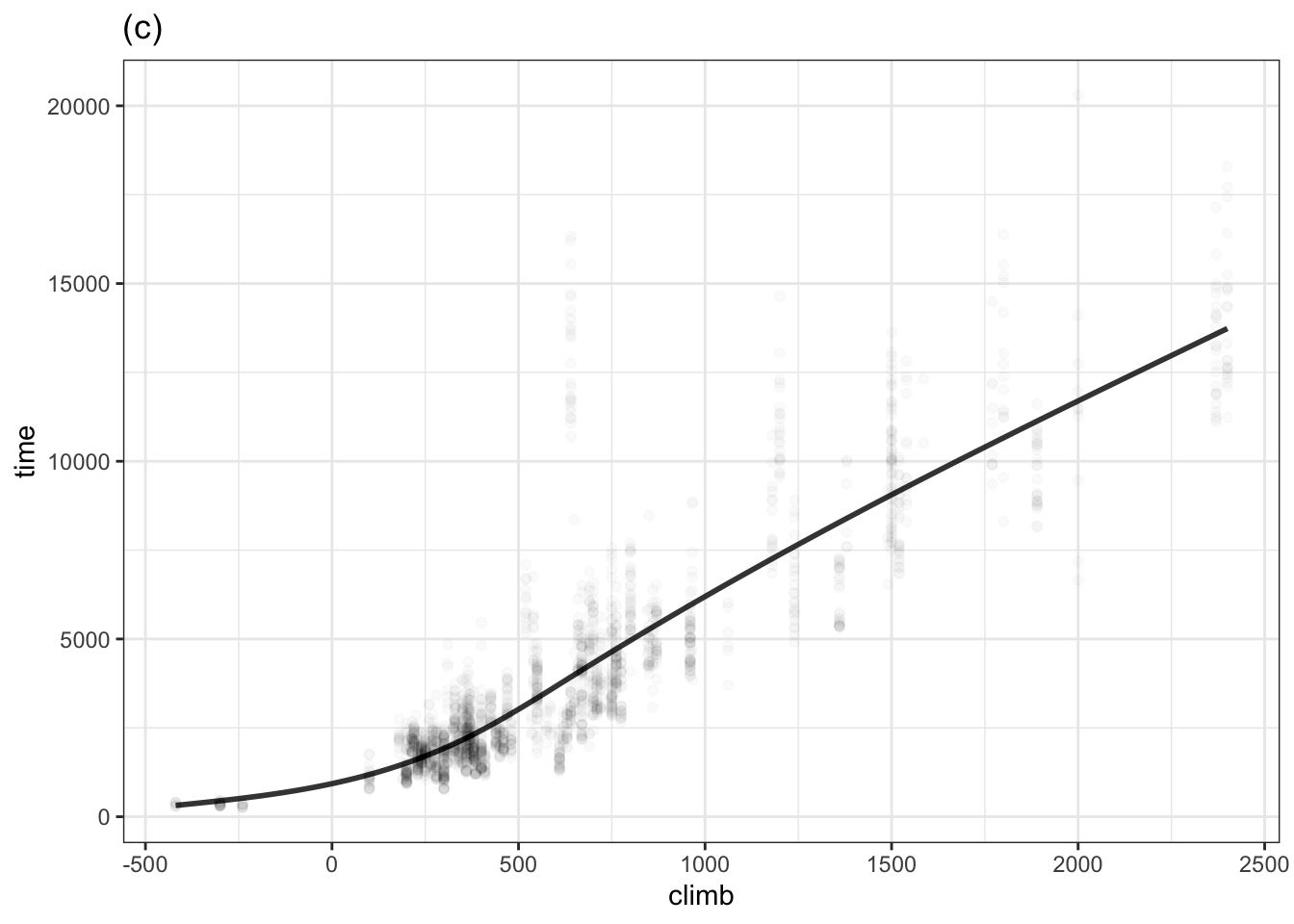
List the graphs from least curvy to most.
Four of the races are downhill and have negative “climbs”. One of the functions has an unrealistic behavior for climb less than zero. Which function is it and what is unrealistic about it?
Problem 10.2 The data in Figure 1 is the temperature of hot water in a cup as the water cools over time to room temperature. (The data frame is mosaicData::CoolingWater.) Just before the measurements started, boiling water was poured into the cup so the initial temperature is near 100°C. [wagon-2013] As you can see, after about 200 minutes, the water has cooled to about 25°C (77°F): room temperature.
Figure 10.14: Figure 1: The temperature of initially boiling water as it cools over time in a cup. The thin lines show functions fitted to the data: a stiff unbounded model and a flexible unbounded model.
- Which of the two models fits the data better?
- There are places along the time-axis where the output of the stiff model is larger than the actual temperatures and places where it is smaller. For what values of time is the stiff model higher than the data?
- For the graphic, the points in the data layer have been drawn as circles. A perfect match of the model function with the data will have the function go right through the middle of the dots. Find a range of time for which the flexible model is lower than the data. Similarly find a range of time where the function is higher than the data.
Note: If you’ve studied calculus, the data in Figure 1 may remind you of exponential decay. The proportional-combinations family of functions doesn’t include general exponential functions. Other model architectures, particularly “nonlinear least squares” can handle such situations.
Problem 10.3
The two graphs below show the same data: whether or a person survived for 20 years after the initial interview in the Whickham survey. A value of 1 on the vertical axis means that the person survived, a value of 0 means they didn’t. Note that vertical jittering is being used to avoid overplotting. All of the people in the upper band survived and those in the lower band didn’t.
Figure 10.15: Two simple models of survival versus age and smoking status.
One of the plots shows an unbounded model of the probability of survival versus age. The other shows a bounded model.
- Which graph shows the unbounded model, (a) or (b)? How can you tell?
- Which of the models is better suited to represent a probability of survival? Explain why?
- What does the bounded model have to show about the relationship between smoking and survival that is not shown in the unbounded model?
Problem 10.5 ask student to say what’s different about the model shapes:
A support vector machine (SVM) is a mathematically sophisticated apparatus for modeling that allows potentially complex relationships to be described, and giving the experienced modeler many model options to govern smoothness, shape of the function, and so on. Figure @ref(fig:w_svm) shows a support vector machine model of survival in the Whickham data. The SVM function generated is practically identical to that found by logistic regression. (Compare Figure @ref(fig:w_logistic).)
## Setting default kernel parametersFigure 10.16: (ref:w-svm-cap)
The shape of support vector machine functions can depend sensitively on the choices the modeler makes for various somewhat esoteric parameters such as the kernel or the cost of boundary violations.
Problem 10.6 This exercise will be about log transformations, e.g. Many quantities are bounded to be above zero, but can take on any positive value. Examples: height, weight, power of an engine, … The bounded proportional-combination functions are too harsh: they restrict both the highest and lowest outputs of the modeling function. For half-bounded quantities, one strategy is to model not the response variable itself, but the logarithm or square root, or another power of the response variable.
Allometrics. Find power law relationships among the engine parameters. Body mass index as the result of an allometric relationship: height^2 is proportional to weight.
Problem 10.9 Look at weight versus age in the NHANES data. A stiff linear model implies that older people are heavier. That’s completely misleading for adults, where weight is more or less independent of age.
Adding some flexibility to the model allows it to track the actual pattern more realistically. Using the smoothing app (in its original form, with the model flexibility), show how with lots of data and high flexibility, the curve shows very little dependence of weight on age for adults. With little data and a curve of order 2 or 3, the curve oscillates up and down for adults, but this is because of the stiffness of the curve, not the data. Increase the order of the curve to 5 or 6. Still see oscillations, but these damp out when lots of data is used.
Objectives:
- Show that oscillations may be the result of the model order rather than revealing the data.
- Highly flexible models with little data show a lot of model variance.
- To keep both variance and bias low, use lots of data.
Problem 10.10 DRAFT Logistic and linear and tree models to predict bodyfat
Example drawn from http://www.users.miamioh.edu/fishert4/sta363/model-selection.html#best-subsets
Do this for stratification, logistic regression, models that learn, …
Problem 10.11 A prediction function takes values for explanatory variables as inputs and, as output, produces corresponding values for the prediction interval. Typically, the 95% prediction interval is shown. The graphic below shows both the 50% interval and a 95% interval for a model of winning time versus distance trained on the Scottish hill racing data.
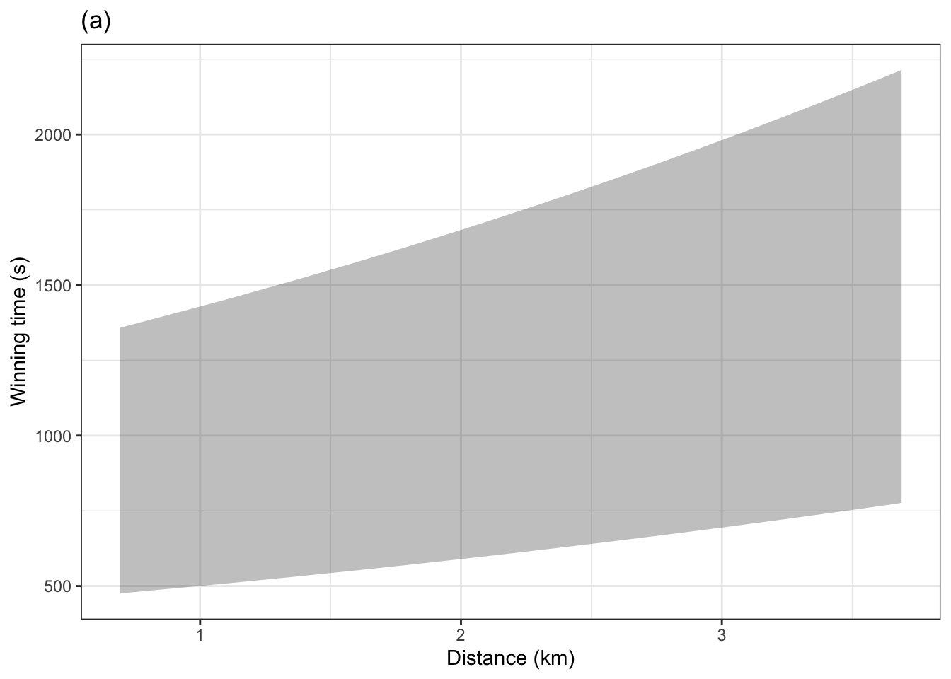

Which graph, (a) or (b), corresponds to the 50% interval.
Judging by eye in (a) and (b), give the top and bottom of the 95% prediction interval and the 50% prediction interval when the distance is 10 km.
Drawing the prediction intervals as bands gives the misleading idea that any value between the top and bottom of the band is equally likely. But values toward the center of the band are much more likely than those toward the edges or outside of the band.
The following graphic gives a better idea of the relative probability of each outcome by overlaying several prediction bands: 25%, 50%, 75%, 95%. The darker regions are more likely than the lighter regions.
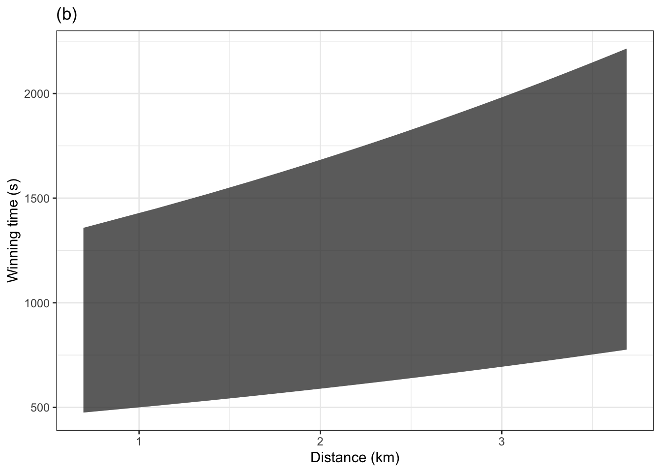
About how much wider is the 95% band than the 75% band?
What is the probability of an individual outcome being somewhere inside the 95% band, but outside the 75% band?
Problem 10.12 ?? presented stratifications of the Scottish hill race winning running times as a function of race distance, climb, and sex of the winner. In this exercise, you’ll use the same explanatory variables, but treat the numerical distance and climb as continuous variables rather than the discrete versions in the earlier exercise.
The figure below shows the 95% prediction interval as a continuous function of distance. (The interval layer is drawn with a ribbon rather than discrete error bars as in ??.)
YOU WERE WORKING ON THIS. Maybe it should be about extrapolation?
Problem 10.13
Problem 10.14 A problem using quantile regression? See https://statisticaloddsandends.wordpress.com/2019/02/01/quantile-regression-in-r/
References
Zeise, Lauren, Richard Wilson, and Edmund A. C. Crouch. 1987. “Dose-Response Relationships for Carcinogens: A Review.” Environmental Health Perspectives 73 (Aug): 259–306.