Chapter 14 Causal networks
Interest in data often stems from a desire to anticipate the consequences of an intervention. Is a new polio vaccine effective? Will increasing the consumption of organic food improve health generally? Does giving bed nets to poor people in malaria-prone regions reduce the incidence of malaria?
The previous chapters introduced techniques for modeling a response variable as a function of explanatory variables. Each model is a machine for turning inputs into outputs. Change the input and the output will change correspondingly. But this does not mean that nature works in the same way. Changing an input in the real world – administering polio vaccine, eating organic food, providing bed nets to the poor – may not cause the same change in the response variable as happens when you change the input to a model.
The key word here is “cause”.
Statisticians are careful to distinguish between two different interpretations of relationship: correlation and causal. Every successful prediction model Y ~ X is a demonstration that there is a correlation between the response Y and the explanatory variable X.13 “Successful” means that the prediction performance of the model is better than the performance of a no-input model. But the performance of the model does not itself tell us that X causes Y in the real world. There are other possible configurations that will produce a correlation between X and Y. For instance, both X and Y may themselves have a common cause C without X being otherwise related to Y. In such a circumstance, a real-world intervention to change X will have no effect on Y. To put this in the form of a story, consider that the start of the school year and leaves changing color are correlated. But an intervention to start the school year in mid-winter will not result in leaves changing color. There’s a common cause for the school year and colorful folliage that produces the relationship: the end of summer.
This chapter considers simple networks of causality involving three variables, generically called X, Y, and C. Always, we’ll imagine that the modeler’s interest is in anticipating how an intervention to change X will create to a change in Y. To accomplish this, the modeler has two basic choices for structuring a model, either
Y ~ X, orY ~ X + C.
It’s surprising to many people that models (1) and (2) can have utterly different, even contradictory implications for how a change in model input X will produce a change in the model output Y. To the modeler trying to capture how the real world works, there’s a fundamental choice to be made between using model (1) or model (2) to anticipate the consequences of a real-world intervention on X.
This chapter is about ways to use our hypotheses about how the world works in order to make the right choice of model.
14.1 Hypotheses
It will be worthwhile to be clear what we mean in this book by a hypothesis. My preferred definition is along the lines of that in the Oxford Dictionaries:
Hypothesis: “A proposition made as a basis for reasoning, without any assumption of its truth.”
This short definition lays out the role of a hypothesis: a starting point for reasoning. The definition also correctly warns about reading too much into a hypothesis: you shouldn’t assume that a hypothesis is true or likely to be true or even worth a great deal of consideration or even that a hypothesis is something we hope to prove true.
Another reasonable definition of hypothesis is from the Merriam-Webster dictionary:
Hypothesis: “A tentative assumption made in order to draw out and test its logical or empirical consequences.”
I don’t think that the word “tentative” in this definition is adequate to dispel the misconception that a hypothesis must be a reasonable statement about the world. So let’s be clear: hypotheses that are believed to be absolutely false can be useful for the purposes of reasoning and debate.
14.2 Hypothetical causal networks
Consider this hypothesis: “It’s harder to learn to drive as you move into your 20s.” The hypothesis might or might not be true. The way such hypotheses are formed is often by anecdote. Say, you’re having dinner when the conversation turns to a friend who has been learning to drive in her 30s. She explains that even after taking many lessons last year, she failed her driving test twice. Others at the table, who started driving in their teens, learned in a much shorter amount of time.
The hypothesis suggests a practical recommendation: It will be easier to learn to drive when younger, so better to start young. Such recommendations to take an action are always rooted in causality: starting young will cause you to have less difficulty learning to drive. A diagram, or graphical causal model, representing the causal hypothesis is seen in Figure 14.1.

Figure 14.1: A simple graphical causal model expressing the hypothesis that age when learning to drive is the causal factor for the difficulty of learning to drive.
The direction of the arrow in Figure 14.1 is a crucial feature. The diagram asserts that a person’s age when learning to drive causes difficulty, as opposed to the other way around.
So, does learning to drive when young make it easier to succeed? You might collect some data, perhaps a survey asking people at what age (if ever) they learned to drive (X) and how difficult it was (Y). Suppose you build a successful model Y ~ X. This establishes a correlation X and Y (and vice versa), confirming the dinner table anecdote.
If you were undertaking serious study of the hypothesis, you should consider how other factors might influence the situation. For instance, it might be that people who learn to drive in their 30s were more anxious about driving when in their teens. That anxiety is why they didn’t learn in their teens. The anxiety might also influence the drivers perception of the difficulty learning. Such a situation is expressed in the graphical causal models in Figure 14.2.
Figure 14.2: Two possible graphical causal models of the hypothesis, “Age causes difficulty learning to drive,” which do not incorporate a direct link from age to difficulty learning. Left: Anxiety itself leads to people deferring learning to drive, and to increased difficulty when learning. Right: Age is causally linked to difficulty, but the issue is really the diminished support available to older learners.

Another possibility is that older learners have busier lives and less support for learning to drive. (Figure 14.2(right)) It’s harder for older learners to schedule opportunities to practice or to find car owners who can help them learn.
There is nothing inevitable about graphical causal networks. We can, and often do, intervene in ways that alter the causal flow. For example, 14.3 shows the network when a later-in-life friend steps in to support a mature student.
Figure 14.3: Intervening in a system can change the structure of the graphical causal network. Here, a friend has stepped in to provide the support needed to learn to drive, severing the link that previously connected age when learning to support. (That link – now severed – reflects the kind of learning support often available to teenage students of driving, but not to older learners.)

Graphical causal models are a way of making explicit our understanding or beliefs about how the world works. They might be accurate representations of reality or not. Merely drawing a graphical causal model does not make it true.
Such causal models can be elaborate involving dozens of factors. But let’s start with the most simple causal models.
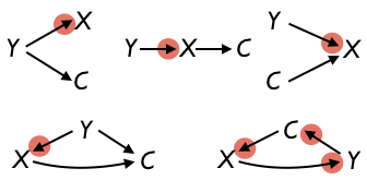
We’ll warm up with a question that has a trival answer: What are the possible graphical causal models that can be drawn that relate only two variables: X and Y? Figure 14.4 shows the three possible graphical causal models that connect the variables:
Figure 14.4: The three configurations for connecting X and Y with causal arrows. The last one involves a cycle.

Needless to say, if you are interested in knowing how X affects Y, you are denying that the appropriate causal hypothesis is Y \(\rightarrow\) X.
For more subtle reasons, any hypothetical network that includes a cycle, like X \(\rightleftharpoons\) Y, is excluded from consideration. Part of the problem with these cycles is that they violate a common-sense criterion for causation, that the cause preceed in time the effect. X and Y cannot both preceed one another. This exclusion of cycles in the graphical causal cycles is not to say that there are never feedback loops in nature. But such feedback relationships involve time and should look like “X at time 1 causes Y at time 2 causes X at time 3 causes ….” This network should be drawn \(X_1 \rightarrow Y_2 \rightarrow X_3 \rightarrow \cdots\), not as a loop.
That leaves us with only one valid hypothetical causal network for depicting a possible causal relationship from X to Y, sensibly enough written X \(\rightarrow\) Y.
Now let’s look at the much richer possibilities for connecting causally three variables: X, Y, and C. As with the two-variable case, we won’t allow any configuration that involves a loop. We’ll also insist that Y not directly or indirectly cause X. Finally, we will only consider configurations where every variable is connected to at least one other variable.
It’s not obvious, but there are only ten valid configurations. These are shown in Figure 14.5.
Figure 14.5: The ten valid configurations involving three nodes.

There are other ways to draw arrows among X, Y, and C, but each of them is invalid because it involves a cycle or Y directly or indirectly causing X.
Figure 14.6: Five invalid graphical causal networks. The circles around the arrowheads indicate which connections are invalid, either because Y is directly causing X or because there is a causal cycle.
14.3 Stories and graphical causal networks
The differences among the valid configurations for graphical causal networks only become apparent when you link them to a story and see how different networks correspond to different stories. To illustrate, imagine a simplistic world where educational outcomes Y are related to school expenditures X as well as to the parents’ involvement in their children’s education. Of course this leaves out many factors at play in the real world; the example is intended just to show the correspondence between stories and graphical causal networks.
As you read the five stories that follow, some will seem more likely than others. Try to imagine which ones might appeal to people with different points of view, such as a teacher’s union advocate, a politician wanting to cut taxes, or a parent sympathetic to home schooling.
| Network | Story |
|---|---|
 |
1. Parent involvement (as in voting) C influences school expenditures X which in turn influence educational outcomes Y. But parent involvement (as in reading to young children) doesn’t directly influence educational outcomes. |
 |
2. Parent involvement C determines school expenditures X and it also determines educational outcomes Y directly. The spending does not have any actual connection to outcomes. |
 |
3. Expenditures X determine both educational outcomes Y and parent involvement C, since the parents are more motivated to get involved when schools have better facilities, etc. But the parent involvement doesn’t actually have an effect of educational outcomes. |
 |
4. Parent involvement C determines expenditures X, and also influences educational outcome directly Y. Expenditures also contribute to educational outcomes. |
 |
5. Expenditures X influence parent involvement C, since parents are more enthusiastic when schools are well funded. Expenditures also influence educational outcomes Y. But parent involvement also has a direct impact on educational outcomes. |
14.4 Data, models, and stories
Suppose now that you have some data on educational outcomes Y, school expenditures X, and parent involvement C. The unit of observation is, say, a school district. The educational outcome data might come from standardized testing. Parent involvement might be the records of what fraction of parents attend their student’s quarterly teacher conferences. You, the modeler, work for the national government. You’ve been asked to figure out what will be the effect on educational outcomes of an intervention where the national government will give additional funding to schools.
For the purpose of anticipating the impact of a change in X on Y, either of two models might be appropriate: either Y ~ X or Y ~ X + C. Those two models will, by and large, give different answers from the same data. One will be right and the other will be wrong. But which is which? It turns out to depend on the actual causal network. So, depending on our beliefs about the actual causal network, we can choose the right model.
| Network | Correct model |
|---|---|
|
Y ~ X |
|
Y ~ X + C |
|
Y ~ X |
|
Y ~ X + C |
|
Y ~ X |
In (ref:chapter-simulations), we’ll introduce simulation techniques that can let you show for yourself that the above claims are right. Chapter ?? will introduce a method which allows you to read off the correct model from the graphical causal network, whatever its size or complexity.
For now, consider the dilemma that you, the modeler, face. Different people may lean toward different stories of the actual causal mechanism. The answer to the question will depend on whether you use Y ~ X or Y ~ X + C. Consequently, the answer to the question depends on what a person believes about the actual causal mechanism. In other words, the answer is subjective.
Of course, data scientists, like other kinds of scientist, prefer answers to be objective. There are two main approaches to giving objective answers:
- Figure out which story is correct. Or, at least, make a persuasive argument to the decision makers that one story is to be preferred to the others so that you can use the right model for that story.
- Don’t give a single answer. Instead, for each of the stories that the decision makers consider plausible, give an answer corresponding to that story. The decision makers might end up arguing among themselves and perhaps will undertake work to understand better the actual causal mechanisms, for example by more careful reading of the research literature or undertaking new studies.
14.5 Experiment
Albert Einstein is reputed to have said:
A theory is something nobody believes, except the person who made it. An experiment is something everybody believes, except the person who made it.
A graphical causal network is a kind of theory. As a theory, it’s natural for people to be skeptical about results stem from the theory. Experiments are more persuasive. Let’s consider what an experiment looks like when represented by a graphical causal networks.
In an experiment, you have some real-world system and a means to intervene physically on at least one of the variables in that system and to read out the response of the system to the intervention. You don’t necessarily know much about the actual structure of the real world system. In Figure 14.7 the real-world system is shown in the rounded box. The intervention is on X and the output is Y.

Figure 14.7: An experiment is a system in which there is an intervention and an output.
Note that in Figure 14.7 X is, potentially, affected by other variables in the system.
Ideally, the experiment is set up to eliminate all other effects on X except the intervention as in Figure 14.8. And the intervention is done in a way that none of the variables in the system can have any effect on it, for instance by assigning the intervention using a computer random-number generator. The lovely thing about this configuration is that the correct model to capture the effect of X on Y is simply Y  X. Whatever different people might believe about the real-world mechanism doesn’t matter. The correct model is always Y X. This is why Einstein’s statement, “An experiment is something everybody believes,” is justified.

Figure 14.8: An ideal experiment is one where the only influence on X is the intervention. Any effect on X or the intervention of the other variables in the system has been eliminated.
But there is another part to Einstein’s statememt: “… except the person who made it.” Why shouldn’t the experimenter believe her own experiment? The experimenter might know that she didn’t or couldn’t conduct an ideal experiment. She wasn’t actually able to eliminate the arrows D \(\rightarrow\) X and C \(\rightarrow\) X. The other variables in the system might also be influencing X as in Figure 14.7. In this situation, the right model may not be Y X. In fact, for the particular system shown in Figure 14.7 the correct model would be Y X + C + D. But how could the experimenter know this for sure if she didn’t know all about the real-world mechanism?
It turns out that for either of the causal systems in Figures 14.7 or 14.8 there is always a correct model to show the link between the intervention and output: Output Intervention. Rather than modeling the output by the physical quantity X, model the output by the random numbers generated by the computer that were used to set the intervention. This modeling approach is called intent to treat.
Typically, experiments are done using a specially constructed system that is thought to resemble the system on which the intervention will actually be done. Insofar as the experimental system does resemble the real-world system, the experimental results will anticipate the effect of the real-world intervention. But often it’s hard to establish that the experimental system is a match to the system on which the real-world intervention will be applied. As such, subjective belief is still a factor in accepting that the experiment will be informative about the real-world systems we work with.
14.6 Exercises
Problem 1: Translate this causal diagram into a traditional rhyming couplet for children:

Problem 2: For each of these graphical causal networks, say whether the network is valid. Recall that the rules require
- All variables be connected, directly or indirectly, to all the other variables.
- Y not cause X directly or indirectly.
- There are no cycles.
For each of the networks 1 to 4, determine from the rules whether the network is invalid as a hypothetical causal network. If so, say which rule(s) are being violated.


Problem 3: In the graduate school admissions data for UC Berkeley in 1973 we encountered a disagreement in the implications of two ways of stratifying.
Comparing admissions rates for women and men (Table A) clearly showed that women were admitted at a much lower rate than men.
Table 14.1: (A) Probability of being admitted (%)
| group | female | male |
|---|---|---|
| All applicants | 30.4 | 44.5 |
Stratifying the data by the department being applied to (Table B) tells a different story.
Table 14.2: (B) Probability of being admitted (%)
| dept | female | male |
|---|---|---|
| A | 82.4 | 62.1 |
| B | 68.0 | 63.0 |
| C | 34.1 | 36.9 |
| D | 34.9 | 33.1 |
| E | 23.9 | 27.7 |
| F | 7.0 | 5.9 |
Both Tables (A) and (B) are accurate depictions of the graduate admissions data (SDSdata::UCB_applicants); it’s not that one is right and the other is wrong. The difference between the two tables is the choice of covariates used. Which choice is right for the purposes of examining the possibility of sex discrimination depends on what is meant by “sex discrimination.”
Network ?? shows a simple hypothetical causal network representing a possible mechanism of sex discrimination in which the discrimination comes into play (to the extent that there is discrimination) in making the admit/reject decisions for individual applicants.

(NOTE IN DRAFT: “Discrimination in admissions?” should be a label on the link, not a node.)
Although Network ?? is simple and concise, it is too simple to account for the data. Looking at Table B, you can see that the overall admissions rate differs markedly between departments. Dept. A has an overall rate around 70%, Dept C an overall rate of about 35%, and Dept. F and overall rate of about 6%. There’s nothing in Network ?? that would produce such a pattern.
To fix things, we can add a new node, “department”, linked to “admission rate”, as in Network ??. We’ll imagine that the different admissions rates across departments are related to the relative funding by the university of those departments. For example, department F has very low admissions, suggesting that the funding for F is low compared to the demand for the subject. Department A has high admissions compared to demand for the subject: it clearly has higher funding than F compared to the extent of interest in the subject.
A mechanism that involves such funding provides a new route for discrimination: are the funding decisions discriminatory?

Network ?? can account for the different overall admissions rates across departments, but there is nothing that relates that discrimination to sex. For that, we need to add a causal link between sex and department, indicating that depending on the sex of the applicant, some departments are more popular than others. This is Network ??

Using the rules for choosing covariates based on hypothetical causal networks …
- In Network ?? will the relationship between sex and admission rate seen in the data depend on whether department is included as a covariate?
- In Network Network ?? will the relationship between sex and admission rate seen in the data depend on whether department is included as a covariate?
- To study the total effect of sex on admissions rate (through all causal pathways), should department be included as a covariate when modeling the relationship between sex and admissions rate?
- Based on the results in Tables A and B, is there discrimination in admissions?
- Based on the results in Tables A and B, is there discrimination in funding?
Problem 4: Figure ?? shows one way of describing how the age at first sex has decreased, on average, for people born over the decades from 1940 to 1990. But this is not the only way of describing how age at first sex has changed over the years. For instance, if our concern is that more people are having sex at too young an age, we will want to define what “too young” means and state the model in terms of that definition.
For the sake of discussion, let’s define “too young” to be fifteen years old. We can construct a model of the probability that a person born in a given year had sex at that age or younger.
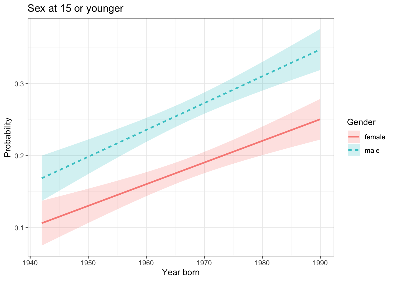
What is the effect size of year born on the probability of having first sex at 15 or younger?
Is there compelling evidence for an interaction between year born and gender?
Problem 5: A short report from the British Broadcasting Company (BBC) was headlined “Millennials’ pay ‘scarred’ by the 2008 banking crisis.”
Pay for workers in their 30s is still 7% below the level at which it peaked before the 2008 banking crisis, research has suggested. The Resolution Foundation think tank said people who were in their 20s at the height of the recession a decade ago were worst hit by the pay squeeze. It suggested the crisis had a lasting “scarring” effect on their earnings.
The foundation said people in their 30s who wanted to earn more should move to a different employer. The research found those who stayed in the same job in 2018 had real wage growth of 0.5%, whereas those who found a different employer saw an average increase of 4.5%.
The word “should” in the second paragraph of the report suggests causation. The recommendation to change jobs would make sense if the causal network were like this:

But another possible hypothetical causal network is this:

Consider this second network.
- Does the network create the observed correlation between higher wage and moving to a new job?
- Does the networks suggest that a frustrated employee who follows the Resolution Foundation recommendation will end up with a higher wage?
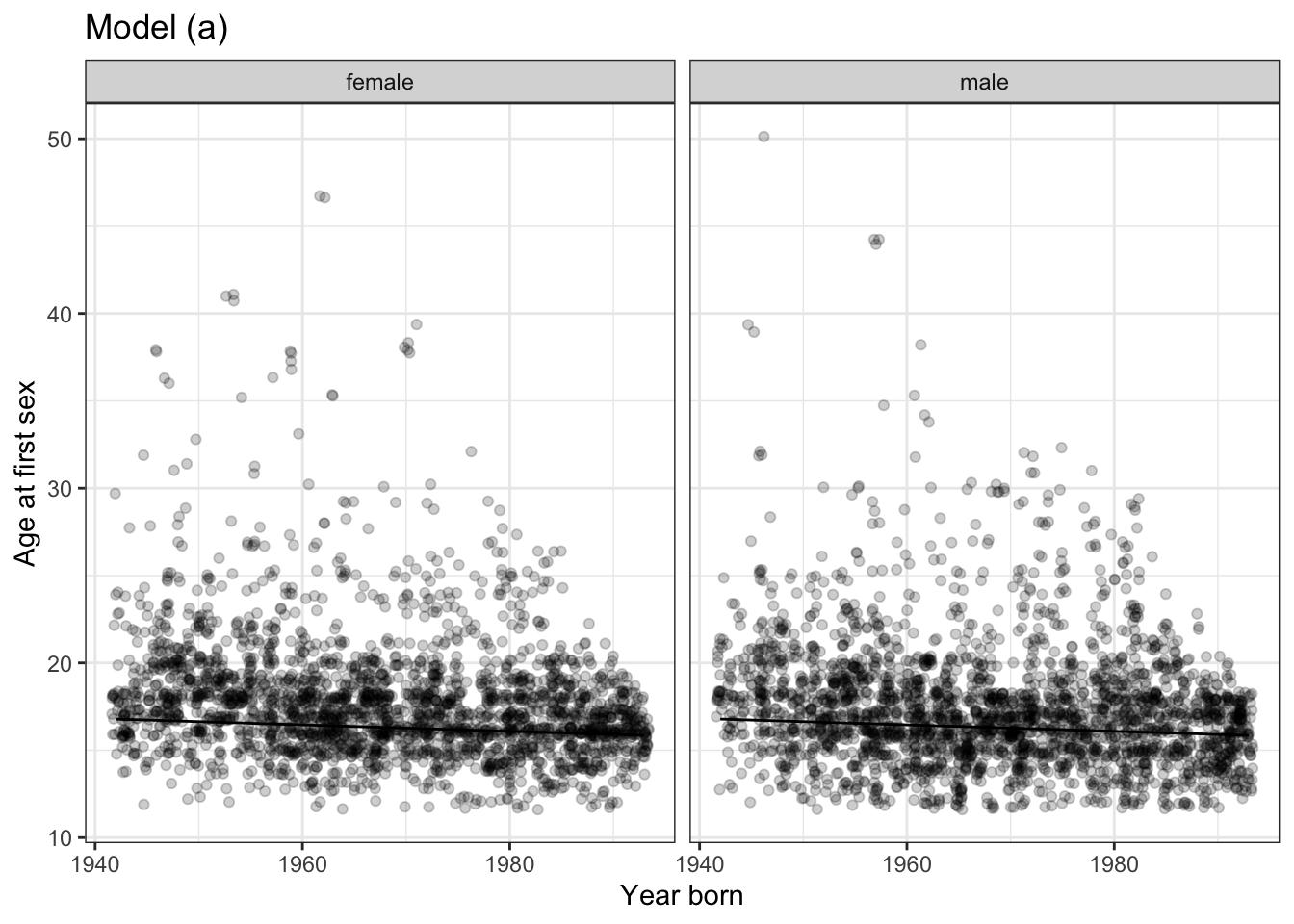
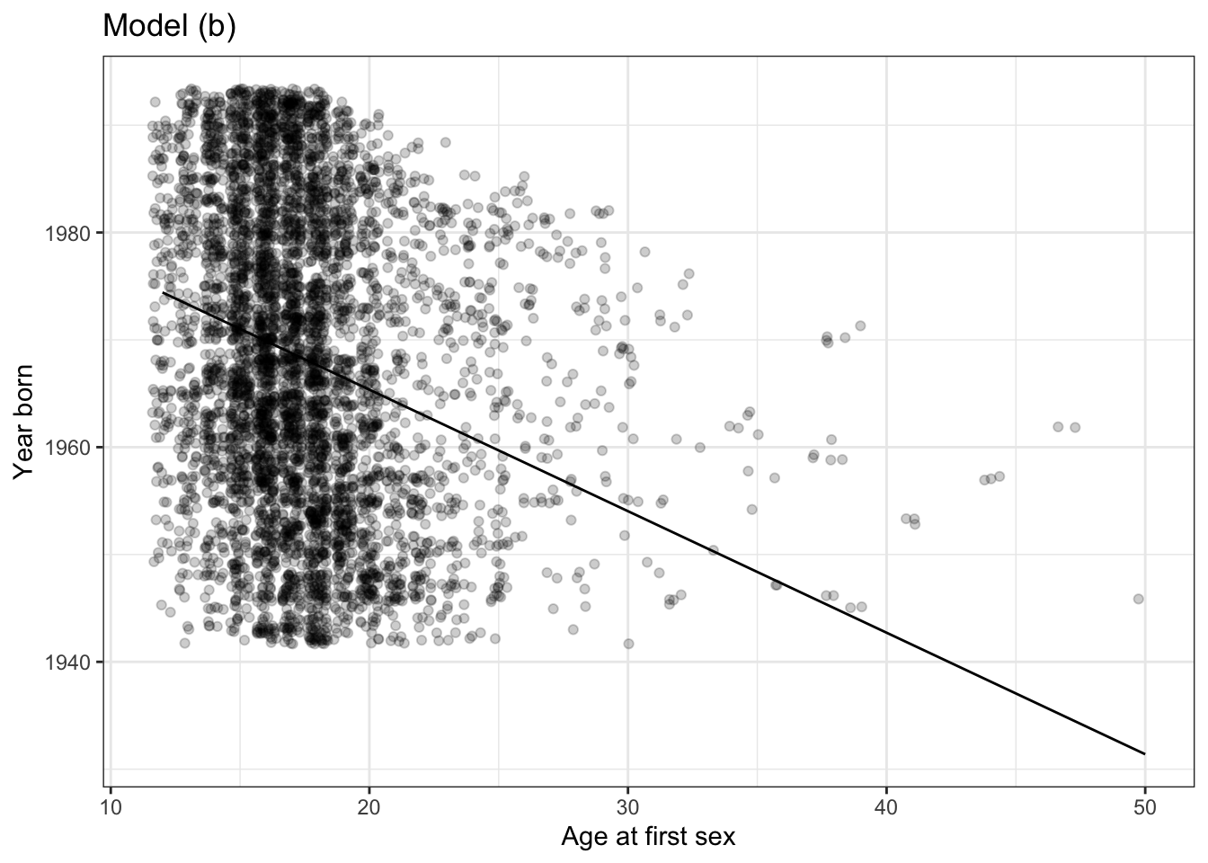
Problem 6: The two figures below show the relationship between the age of respondants to the National Health and Nutrition Evaluation Survey and the self-reported age at which they first had sex. Also shown are two models:
AgeSex ~ Year_born
Year_born ~ AgeSex
The data is the same in both plots.
Do the models
Age ~ Year_born + GenderandAgeSex ~ Year_borntell the same story? Explain the reasoning behind your answer.Is there a common sense explanation for the
AgeSex ~ Year_bornmodel? If so, what is it?Is there a common sense explanation for the
Year_born ~ AgeSexmodel? If so, what is it?- Consider two possible hypothetical causal networks:
Year_born\(\rightarrow\)AgeSexYear_born\(\leftarrow\)AgeSexExplain which direction of causation makes more sense.
Problem 7: Here are two different hypothetical causal networks describing possible relationships between school expenditures, standardized test scores (SAT state-wide average), and the fraction of students taking the standardized test.

Suppose you want to understand how an intervention that changes expend will cause a change in the standardized test score.
In the left network, should
fracbe included as a covariate?In the right network, should
fracbe included as a covariate?
Problem 8: The SDSdata::Vaccine_sim data frame contains the results of a simulation that relates four variables:
Vaccination: the probability that an individual receives a vaccination.Flu: the probability that the individual gets the flu.Death: the probability that the individual dies.Health: the probability that the person was in poor health before the flu season and the availability of flu vaccine.
Health: equally likely to be poor or notVaccination ~ 1.73 - 3.47 * HealthFlu ~ log(.21/.79) + (log(.2/.8) - log(.21/.79)) * VaccinationDeath ~ -4.595 + 0.704*Flu + 2.86*Health - 0.3*Health*Flu
You might be tempted to think of Death as the probability of someone dying from the flu. But death does not come with a label of flu or not flu. The variable Death is the probability of death from all causes.
- Draw the hypothetical causal network implemented by the simulation.
- Using stratification, calculate the probability of getting the flu conditional on whether the person received a vaccination. According to the simulation, does receiving the vaccine substantially reduce the probability of getting the flu?
- In practice, it can be hard to know if a person got the flu, since many cases are not reported or recognized as being the flu. Equally, many non-flu illnesses are mis-identified as being the flu. One solution is to use a proxy variable which is easy to measure. All-cause mortality is one such proxy for determining whether a treatment helps. Using stratification, calculate the probability of death conditional on whether the person received a vaccination.
- Repeat (2) and (3), but using
Healthas an additional explanatory variable. - Write an answer in everyday English explaining how it can be that the vaccine has little or no effect on death, even though vaccinated people are much less likely to die than unvaccinated.
Alternative version of problem 8: Consider a controversy about flu vaccines. As you know, people are encouraged to get vaccinated before flu season. This recommendation is particularly emphasized for older adults, say, 60 and over. There’s broad concensus that this is a good recommendation. The flu vaccine is safe and effective. It’s helpful to be able to measure how effective. Knowing this can, for instance, inform public health officials when deciding whether it’s important to develop new forms of vaccine that might be more effective.
The benefits of the flu vaccine have been extensively studied. In 2012, the Lancet, a leading medical journal, published a systematic examination and comparison of many previous studies. (Osterholm et al. 2012) Such a study of earlier studies is called a meta-analysis. The Lancet article describes a hypothesis that existing flu vaccines may not be as effective as was originally found.
A series of observational studies undertaken between 1980 and 2001 attempted to estimate the effect of seasonal influenza vaccine on rates of hospital admission and mortality in [adults 65 and older]. Reduction in all-cause mortality after vaccination in these studies ranged from 27% to 75%. In 2005, these results were questioned after reports that increasing vaccination in people aged 65 years or older did not result in a significant decline in mortality. Five different research groups in three countries have shown that these early observational studies had substantially overestimated the mortality benefits in this age group because of unrecognised confounding. This error has been attributed to a healthy vaccine recipient effect: reasonably healthy older adults are more likely to be vaccinated, and a small group of frail, undervaccinated elderly people contribute disproportionately to deaths, including during periods when influenza activity is low or absent.*
A graphical causal model for the “healthy vaccine recipient” hypothesis might look like Figure 14.9. The model shows health as a factor in causing both mortality and the likelihood of getting a vaccine. The graph itself doesn’t specify the details of the relationship.

Figure 14.9: (ref:flu-healthy-recipient-cap)
Here are some assumptions consistent with the hypothesis expressed in the Lancet review:
- Flu vaccine slightly reduces the likelihood of getting the flu.
- Health strongly affects mortality.
- Healthy people are much more likely to get the vaccine.
- Flu somewhat increases mortality.
Each of these assumptions can be put in the form of a table showing one variable conditioned on another. For instance Health ➔ Vaccine might be a table like this:
| Health | proportion getting vaccine |
|---|---|
| Good | 0.85 |
| Bad | 0.15 |
The causal links Health ➔ Death ← Flu might be represented with a conditional table like this:
| Health | Flu | proportion dying |
|---|---|---|
| Good | Yes | 0.02 |
| Poor | Yes | 0.20 |
| Good | No | 0.01 |
| Poor | No | 0.15 |
Similarly, the hypothesized relationship between vaccination and getting the flu might be specified this way, which represents an effectiveness of about one part in 20, or 5%:
| Vaccination | prob of getting Flu |
|---|---|
| Yes | 0.20 |
| No | 0.21 |
Taken together, the tables provide the details needed to construct structural causal model for the graphical causal model in Figure 14.9. Structural causal models can be used to generate simulated data. The simulation is run in a manner analogous to a board game played with dice. To play the game, the conditionals tables are implemented as computer software. The computer throws the proverbial dice and moves according to the rules. Each play of the game produces one row of simulated data: how healthy was the person, whether the person got a vaccine, whether the person got the flu, whether the person died. The game can be played over and over again, producing simulated data on many people, as illustrated in Table 14.3.
Table 14.3: (ref:simulated-flu-1-cap)
| Health | Vaccination | Flu | Death |
|---|---|---|---|
| o | Received | o | o |
| Poor | o | o | o |
| o | Received | o | o |
| o | Received | Yes | o |
| Poor | o | o | Died |
| Poor | o | o | Died |
| o | Received | o | o |
| Poor | o | o | o |
| o | Received | o | o |
| Poor | o | o | o |
| … and so on for 10,000 rows altogether. |
There might or might not be data supporting such the conditional tables used in the structural causal model. They are assumptions made for the purpose of the simulation. Still, we know for sure that those assumed conditional tables are exactly the way the simulation was carried out. Knowing this allows you to compare the results of statistical tabulation of the data with the known mechanism behind the simulation. For instance, what do the data have to say about the relationship between receiving the flu vaccine and mortality? That’s a simple conditional tabulation: death ~ vaccination
Table 14.4: (ref:simulated-flu-2-cap)
| Vaccination | prop_dying |
|---|---|
| o | 0.0674 |
| Received | 0.0167 |
Simulations such as this enable you to explore various strategies for statistical modeling to help you identify one that tells you what you want to know. For instance, here the actual interest is in the performance of the vaccine: how much it reduces the chances of getting the flu. The studies cited in the Lancet that were done in 1980-2001 measured “all-cause mortality” rather than the incidence of flu. The reason is practical: it’s much easier to collect data on deaths than to determine whether people got the flu.
With the simulated data in hand, and knowing what was the actual mechanism linking vaccination to the risk of flu, you can see whether Flu ~ Vaccination gives a better indication of the actual effectiveness of the vaccine. If you find that it does, this might suggest re-doing the studies to use flu incidence rather than mortality as the measure of efficacy of the vaccine.
Some draft exercise ideas: Exercise: From the figure 14.9, is there a backdoor pathway from Vaccination to Flu. (Answer: no. Mortality is a collider on the pathway.)
14.7 Breastfeeding
Look at the number of theories proposed in this paper. Turn this into an exercise on what covariates to control.
Exercise B Broken-heart phenomenon. See https://www.ncbi.nlm.nih.gov/pmc/articles/PMC1982801/pdf/brmedj02024-0030.pdf for a study of the increased death rate of widowers in the first few months after the death of their wife.
Diet/Environment/Smoking -> death of wife   ----v
      v-----------------> death of husband <----| broken-heart hypothesis
References
Osterholm, Michael T, Nicholas S Kelley, Alfred Sommer, and Edward A Belongia. 2012. “Efficacy and Effectiveness of Influenza Vaccines: A Systematic Review and Meta-Analysis.” The Lancet, 36–44. https://doi.org/10.1016/S1473-3099(11)70295-X.