Chapter 6 Simulation
An important part of the statistical way of thinking is to ask (and answer) “What if?” questions. A sort of question that comes naturally to mind for most people is this: “If the data show [some particular pattern], what must the world look like?” After all, we have the data in hand and we’d like to know what that means in terms of the state or workings of the world. The process of reasoning represented by such a question is “data implies world,” or in symbols, data \(\implies\) world.
Even though data \(\implies\) world is the way we want to reason, it is not the way things work. It is not the data that determine the world, but the other way round: world \(\implies\) data. The state and workings of the world cause or determine the data.
In order to respect how things actually work – world \(\implies\) data – while answering the question that we want to ask about what our data says about the world, we must take special care in our logical reasoning. The methods of logical reasoning that statistics as a field has developed over the last 250 years are counter-intuitive and therefore difficult. To describe them in a nutshell, the process is to construct statements of how the world might work. These statements might or might not be true or useful, so we’ll call them hypotheses. Part of each hypothesis is a description of what the data would look like if the world really worked in the hypothesized way.
To illustrate, here’s a hypothesis of significant current relevance: If humans adding CO_2_ (and other greenhouse gasses) to the atmosphere is warming the world, then data on CO_2_ concentration and temperatures around the world should show a pattern of parallel increase over time.* And, in fact, the data do show such an increase. This makes the mechanism described in the hypothesis – that anthropogenic CO_2_ warms the world – more plausible.
This simple example is not meant to be a thorough description of climate change. There are many other hypotheses that bear on the matter. Some are not so specific, e.g. “Even without CO_2_ and it’s possible effects, the Earth shows cycles of warming and cooling. If it’s these cycles at work, then the temperature data might show a pattern of increase over time.” Some are very specific, for instance, “Incorporating the large amount we know about the physical forces that drive regional temperature differences into a computer simulation, the addition of CO_2_ to the atmophere will produce warming effects at the poles that are twice as high as in temperate regions.” Again, that’s what the data show, which makes more plausible the hypothesis that CO_2_ is behind the observed changes.
This chapter describes the kinds of simulations widely used in statistics to embody how a hypothesis, if true, would play out in the data. The simulations won’t be as detailed and complicated as computer climate models, but even so they can be helpful in guiding our reasoning about the relationship between the world and our observed data.
An important lesson about how common sense can lead us astray in thinking about data \(\implies\) world, comes from the early days, about 130 years ago, when the first statistical methods for relating variables were being invented. The mistake made then – hardly obvious even to well-educated people – is still being made today.
In February 1877, Francis Galton reported to the Royal Institution of Great Britain the results of an experiment in genetics.7 Gregor Mendel’s 1866 report on his pathbreaking work cross-breeding peas was unknown until its rediscovery around 1900. In brief, Galton measured the diameter of sweet pea seeds, planted them, harvested the offspring seeds produced, and measured the diameter of the offspring seeds. He wrote, “[T]he offspring did not tend to resemble their parent seeds in size, but to be always more mediocre than they – to be smaller than the parents, if the parents were large; to be larger than the parents, if the parents were very small.” (Galton 1886) He called his relationship between parents and children regression to mediocrity. (Today, it’s called regression to the mean.)
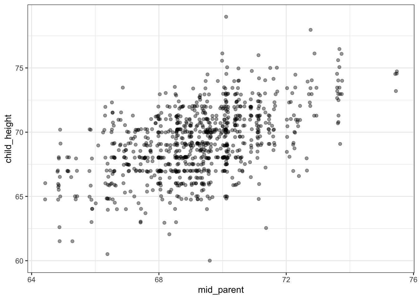
Over the next decade, Galton continued to work on the question of heritability. Part of this work was the collection of data on heights of human parents and their adult offspring, available as the data frame mosaicData::Galton. Galton saw the same pattern of regression to mediocrity. In publishing his results, Galton wrote, “My object is to place beyond doubt the existence of a simple and far-reaching law that governs … hereditary transmission,” as summarized in Figure 6.1.
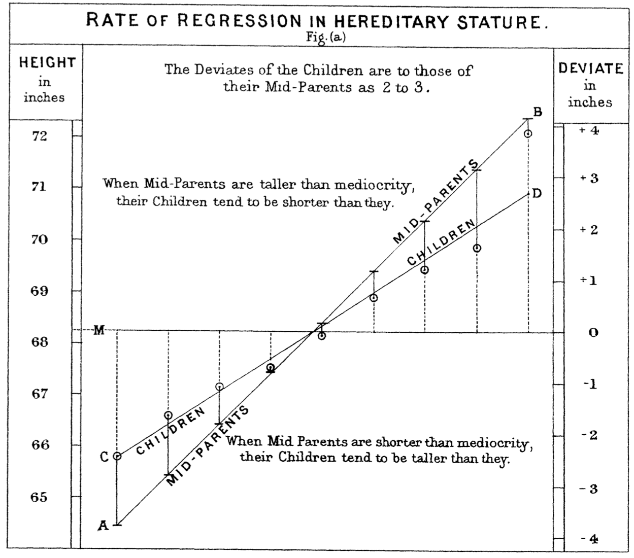
Figure 6.1: (ref:galton-1886-cap)
Figure 6.2: The same data as in Figure 6.1 in a contemporary style. (Data available as with mosaicData::Galton.)
For more than a decade, Galton thought that the observed regression was a product of biology. Eventually he came to realize that it’s a product of the statistical summary alone, with no biological component. We’ll use simulations to show how this can be.
6.1 Data and simulation
There are many ways to construct a simulation. The one emphasized here mimics the process of collecting data. Data collection is centered around the unit of observation, a person, event, or whatever it is that is represented by a single row of a data frame. In collecting data, for each individual unit of observation the various variables are measured. The data frame is composed of the measurements from multiple units of observation, each stacked one on top of another, row by row.
In a simulation, rather than measuring the values of variables for an individual unit of observation, they are generated as random variables and by arithmetic and other mathematical combinations of random variables. At the start of a simulation of a data frame with n rows, a computer random number generator is used to create a sequence of n values. This sequence corresponds to one variable in the simulated data frame. Other variables are then created using additional random number generators and arithmetic using the variables that have already been generated. In contrast to data collection, where all the variables are created are created one at a time and the resulting rows are stacked to make a data frame, in simulation one variable at a time is created for all of the rows. Then the variables are placed side by side to build up the data frame.
IMAGE SHOWING ROW BY ROW process and comparing it to the COLUMN by COLUMN process of simulation,
In statistical simulations, there is usually at least one variable where the row-to-row variation is entirely produced by a random number generator. The process of generating such random values is call i.i.d., standing for Independent and Identically Distributed. It’s helpful to think of a random number generator with a mechanical analogy. Many, many slips of paper, each having written upon it one of the possible values for the variable, is placed in a hat. Then a robot hand reaches into the hat, randomly stirs and mixes the slips, and grabs one. This value of this slip is read and copied into the first row of a one-column spreadsheet. Then the robot hand returns the slip to the hat, stirs and mixes again, and grabs another slip. This value on this slip is read and recorded into the next row of the one-column spreadsheet. This process of grabbing and recording is repeated until there are n rows in the spreadsheet. The result is a data table with one i.i.d. random variable.
The rows of the variable are independent because the robot hand picked them one at a time from a randomly mixed set of slips. But even though each value is independent of the others, at each round of the picking process, exactly the same set of slips was in the hat and available to be picked. This implies that the values being identically distributed even if they are different from one another.
Traditionally, the result of the process of random picking is named with a lower-case Greek letter, for example “epsilon” (\(\epsilon\)) or “mu” (\(\mu\)). Such random variables are sometimes called exogenous, since they are seen as coming from outside. (The word “indigenous” means “native”: part of the system. Replacing “in” with its opposite “exo” and contracting produces “exogenous.”)
With a first variable epsilon in place, a second simulated variable can be created. Sometimes the second variable is also a purely random one, but generally it is created to be some arithmetic combination of a random variable and the first variable. For this example, imagine that the second variable is created in the same manner as epsilon, by random selection from the same hat (or some other hat filled with slips). Call this second random variable, say, \(mu\). To continue the example, imagine creating a new variable \(x\) that is an arithmetic function of epsilon, say,
x = 65 + 9.2 * epsilon.
And another variable, y, defined as
y = 3.1 * x - 10.3 + 6 * mu.
Table 6.1: A data frame generated from the example simulation described in the text.
| epsilon | mu | x | y |
|---|---|---|---|
| -0.33 | 0.27 | 62.00 | 183.51 |
| 0.55 | -0.59 | 70.08 | 203.40 |
| -0.67 | 2.13 | 58.79 | 184.75 |
| 0.21 | 1.17 | 66.97 | 204.35 |
| 0.31 | 0.75 | 67.86 | 204.54 |
| 1.17 | -0.23 | 75.80 | 223.30 |
| … and so on for 100 rows altogether. |
An example of a data frame with n = 100 rows generated from this example simulation is shown in Table 6.1 and graphed as y ~ x in Figure 6.3.
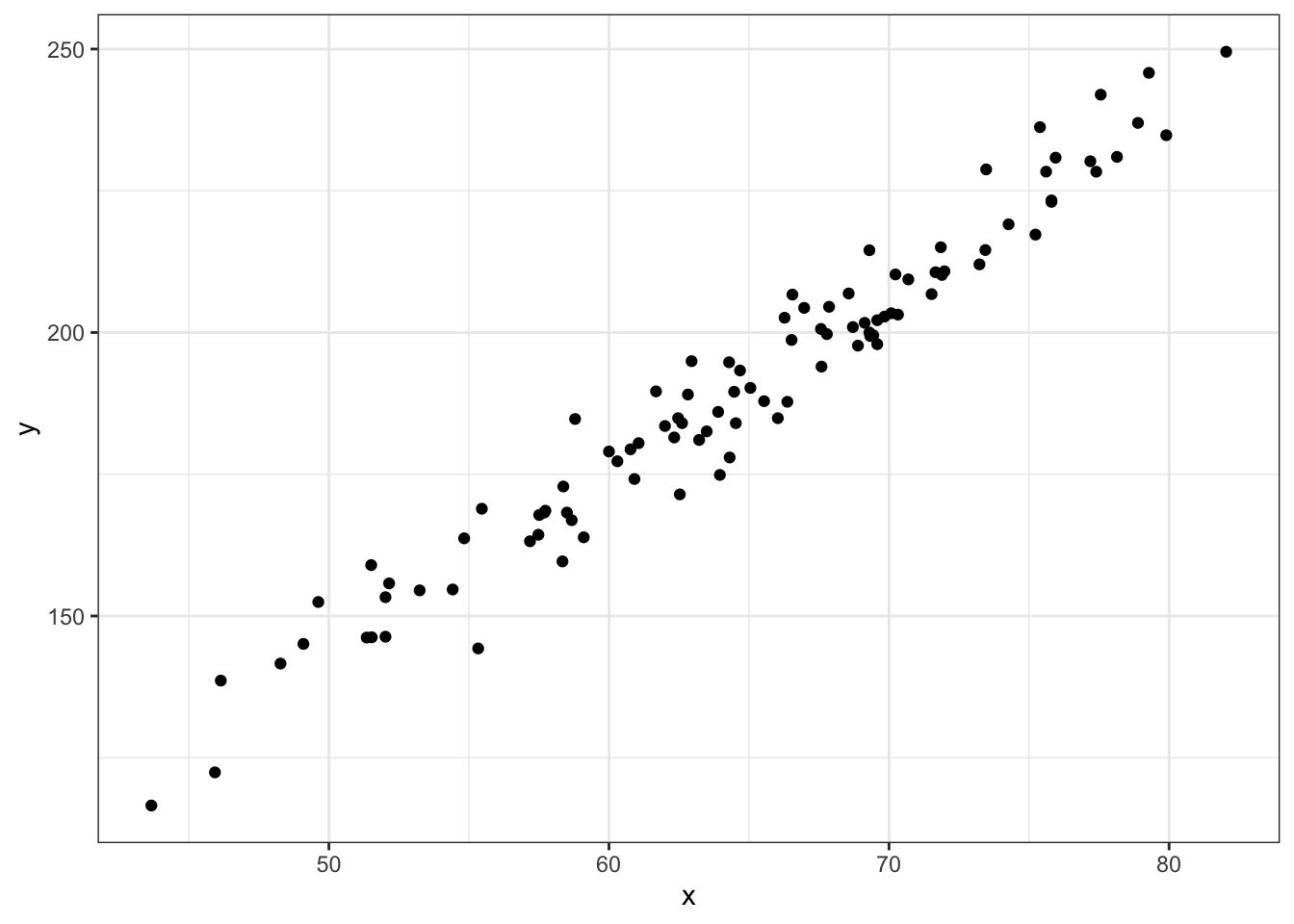
Figure 6.3: The data in Table ?? graphed as x ~ y.
6.2 Formulas and diagrams for simulations
To represent the simulation in the previous section more concisely, you can write a series of formulas:
The formulas for x and y are ordinary arithmetic. The formulas for the epsilon and mu are about the process of random number generator. The name of the hat from which epsilon is being picked is rnorm. As you can see, mu is being picked from the same hat. The parentheses after rnorm indicate the action “pick from.” This, as it were, activates the robot hand to do its job. Even though epsilon and mu have exactly the same expression on the right side of the formula, they result from different robot-hand picking sessions. This means that epsilon and mu are different from one another, just as a sequence of flips of your lucky coin yesterday will be different from a new sequence of flipping the same coin today.
The simulation formulas lay out the structure of the simulation, what variables are related to what. The formulas describe the origin of the exogenous variables epsilon and mu, as well as the variables constructed from epsilon and mu.

Figure 6.4: A causal diagram of the simulation.
Often it’s easier to see the structure of relationships of variables by drawing a diagram. Figure 6.4 shows the diagram corresponding to the formulas above. Such diagrams are called graphical causal networks because they indicate which variables in the simulation (network) cause which. For instance, epsilon causes x, while both x and mu cause y.
It’s crucial to keep in mind that the formulas you create for a simulation may not reflect the actual causal mechanisms in the real world. Instead, your simulations are hypotheses, ideas about how the world might work.
Each graphical causal network contains two different kinds of entities: nodes and edges. The edges are the one-headed arrows that connect two nodes. In Figure 6.4, there are three edges: one that points from \(\epsilon\) to \(x\), another that points from \(x\) to \(y\), and a third pointing from \(\mu\) to \(y\).
Sequences of edges create paths. For instance, in Figure ?? there is a path from \(\epsilon\) to \(y\). The path goes through \(x\).

Figure 6.5: A network containing a loop that connects a node to itself is not a legitimate causal network.
In order to be consistent with causality, a graphical causal network cannot have any path that connects a node to itself. For instance, the network shown in 6.5 is not a legitimate graphical causal network, because there is a path that connects \(x\) to itself.
Each graphical causal network represents a network of connections between nodes. In mathematical terminology, a network is called a graph even when it is not being depicted as a diagram. Causal networks are often called directed acyclic graphs (DAGs). The word “directed” is appropriate because each edge in a DAG has an arrow at one end or the other. As you’ll see in Chapter XXXX correlations XXXX, edges with arrows at both ends are neither allowed nor needed to describe causality. Confusingly, the word “graph” in DAG refers to mathematical terminology: a “graph” in mathematics is a network, not a drawing. Finally, because DAGs do not include loops, they are “acyclic.”
Often, DAGs include include nodes that are not measurable quantities, but that represent concepts useful in how we think about the connections among the variables that can be measured. Such unmeasured and unmeasurable quantities are called latent variables. The word “latent” comes from the Latin for “being hidden.” Examples of latent variables include “intelligence,” “happiness,” and “health.” There are quantities that can be measured that may be related to a latent variable. For instance “performance on a test” is related to intelligence and the dilation of the eye’s pupil may be related to happiness. But there are other things that affect the measurable quantities: Did you get a good sleep the night before the intelligence test? Are you outside in bright sunshine?
6.3 Example: Inheriting height
Nowadays, it’s possible to sequence a person’s genome. By comparing the parents’ genomes to that of their child, it’s possible to figure out the genetics of the situation. Even so, it’s not always known how specific genes contribute to an observable trait, say, height.
The word “gene” was first used in 1909. In the 1880s, Francis Galton, who invented fingerprinting, attempted to figure out mathematically the extent to which the height of parents influenced their children. Of course, Galton knew that height was inherited from both the mother and father, but the mathematics of the time was not up to the problem of combining two sources of an effect. So Galton conceptualized the “mid-parent” height, an average of the two parent’s heights. Similarly, Galton didn’t have a mathematical means to examine simultaneously the influence of the mid-parent height and the child’s sex on the child’s height. And so he “transmuted” females’ heights into males’ heights by multiplying by 1.08.
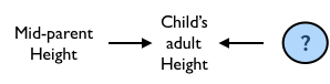
Figure 6.6: A simple hypothesis about the causal influences on a child’s adult height.
The relationship that Galton first supposed between mid-parent height and their adult child’s height corresponds to a simple DAG, shown in Figure 6.6.
In order to test his theory, Galton collected data on the parents and adult children in about 200 families in Victorian-era London. One graph he made is shown in Figure 6.1 along with a graph in a more modern format.
Galton was famous also for building physical simulations of random phenomena, so it’s tempting to imagine that a modern-day Galton might have constructed a simulation along the lines of Figure 6.6, perhaps implementing it with the following formulas, which say that a child inherits his or her mid-parent’s height exactly, but some random deviation (nutrition? health?) is added.
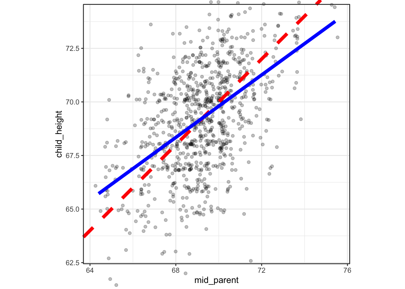
Figure 6.7: Point plots of Galton’s actual data on parents’ and their adult children’s heights along with simulated data from the DAG in Figure 6.6. The black line shows points where the parents’ height exactly equals the child’s height. The colored lines shows the relationship actually indicated by the data.
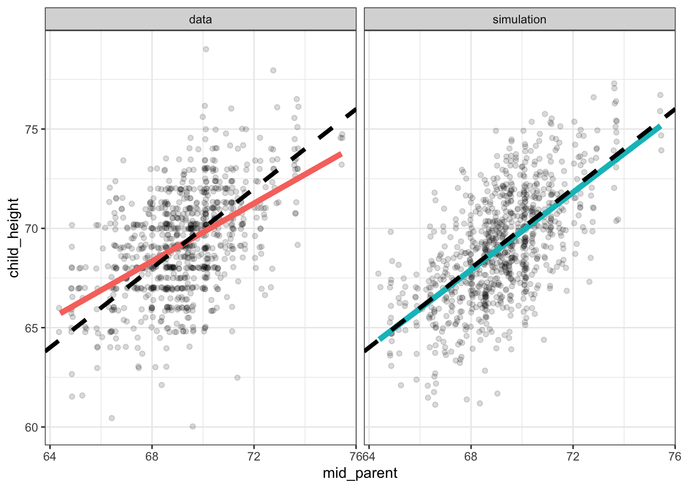
Each panel in Figure 6.7 is annotated with two lines. The dashed black line is the line of equality, the points where child_height is exactly equal to mid_parent. The broader, colored lines show what’s called the “best least-squares line” which is the description of a relationship that Galton eventually settled on.
You can see in Figure 6.7 that for the actual data, the least-squares line is less steep than the line of equality, while for the simulation the two lines are essentially the same. Galton noticed the discrepancy between the least-squares line and the line of identity for the data. He described this pattern by noting that the children of tall parents were, on average, shorter than their parents. Similarly, the children of short parents were, on average, taller than their parents.
Because the simulation does not produce the same pattern in the data as was observed, we can conclude that the mechanism behind the simulation is not the mechanism in the real world. For Galton, this suggested that the real-world mechanism had some additional component, a biological process that he called “regression to mediocrity.” He even invented a new measure of the slope called the correlation coefficient which was constrained mathematically to be less than one.
We could construct a simulation where the child’s height is influenced according to the biological-process hypothesis. But perhaps, as Galton eventually realized, another theory for the heritability of height could do the job without invoking a biological process. In this theory, both mid-parent’s height and child’s height are set by a latent variable which we can call genetics along with separate random influences for the mid-parent height and the child’s height, as in the DAG shown in Figure 6.8.
Figure 6.8: Another theory for the relationship between mid-parent’s height and child’s height.
The formulas implementing the theory of Figure 6.8 might be written like this:
genetics ~ 69.2 + 2.27 * rnorm()
epsilon ~ rnorm()
mu ~ rnorm()
mid_parent ~ genetics + 1.25 * epsilon
child_height ~ genetics + 1.25 * mu
Figure 6.9: Simulated data from the DAG of of Figure 6.8 compared to the actual Galton data.
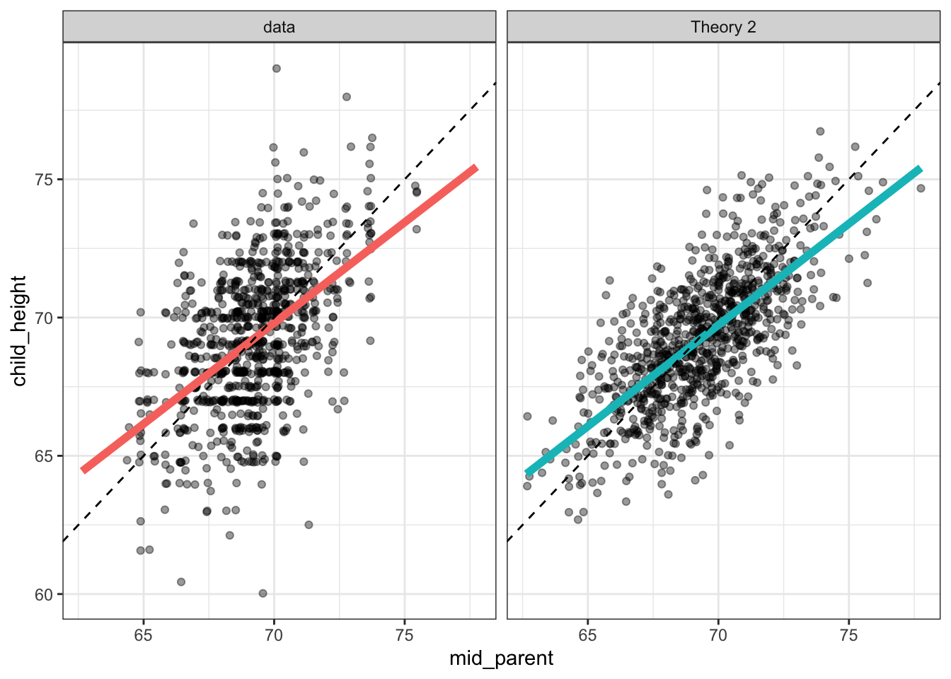
Figure 6.9 shows that the latent variable theory is fully able to account for the observed “regression,” without any biological process. In itself, this does not rule out the biological-process theory; it merely shows that there is an alternative.
In the end, two things led to the rejection of the biological process theory in favor of the latent-variable theory: 1) it’s entirely reasonable to suppose that both the parents’ and the children’s height are influenced by factors other than genetics; and 2) plotting out the parents’ height versus the children’s heights – that is reversing the response and explanatory variables – shows that the parents of a tall child tend to be shorter than the child, and that the parents of a short child tend to be taller than the child. Such a finding suggests that children are “un-regressing” from their parents rather than regressing. The same data can be plotted to show both regression and un-regression, suggesting that they are an artifact of the way the graph is constructed rather than the workings of biology.
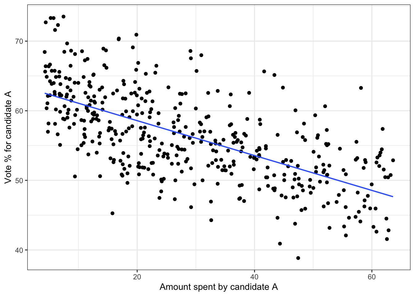
6.4 Example: Simulating votes
Consider the following hypothesis regarding spending by political candidate A. Suppose that variable spend is the amount spent on advertising, etc, and that competitive indicates how competitive the election will be, for instance, how popular is the candidate’s opponent. The higher the value of competitive, the lower the proportion of votes for A. But the more A spends, the higher the proportion of votes for A. And the more competitive the election, the more money A will work to raise and spend. We want to simulate a data frame, with one row for each of many elections (e.g. the 435 elections for the US House of Representatives), that will show the relationship between spending and vote outcome. Here’s one possible set of functions implementing the above:
Table 6.2: Results from a simulation of election spending and vote outcomes in n = 5 election campaigns.
| competitive | spending | proportion |
|---|---|---|
| 0.34 | 12 | 63.0 |
| 0.50 | 25 | 55.2 |
| 0.75 | 56 | 51.8 |
| 0.41 | 17 | 56.4 |
| 0.29 | 8 | 67.7 |
| … and so on for 435 rows altogether. |
competitive ~ uniform(min = 0.2, max = 0.8)spending ~ 100 * competitive^2proportion ~ 70 - 30 * competitive + spending / 20 + gaussian(sd = 5))
Figure 6.10 shows the relationship between spending and vote outcome for n = 435 simulated elections. To look at the graph, you would understandably conclude that higher spending is associated with lower vote percentage. But we know, because it’s written in the formulas used for the simulation, that the opposite is true. An important theme of the rest of this book is how to avoid such paradoxes.
Figure 6.10: The simulation of campaign spending and election results.
6.5 Distributions
The simulations described in previous sections made use of random number generators (RNGs) of three sorts: rnorm(), runif() and from_data(). There are many others, each of which can be useful for modeling.
We’ll start with what’s considered to be the most basic form of random number generator, the runif RNG. This sort of generator was used in the vote simulation in Section ??. Suppose you have a range of numbers, each of which is equally likely to appear, as would happen with a randomly spun spinner. The possible angles from a spinner are 0 to 360 degrees. For a uniform RNG you specify the low and highpoint of that range. The output of the RNG is equally likely to be any number in that range.
Let’s build a simulation using the uniform RNG. The simulation will be about when random events happen, e.g. earthquakes, heart attacks, shooting stars. Suppose we are watching the dark sky on a clear night. We plan to record every meteorite we see flashing across the sky. But we suppose that such an event is equally likely at any instant, even if that probability is small. The simulation will involve generating a sequence of times – say spaced by one second – and for each of these times generating a random yes or no to indicate whether a meteorite was visible. We could make yes or no equally likely, but this would generate far more events than actually happen. So, we’ll make the probability of a yes 1 percent and of a no 99 percent. This can be accomplished by generating a uniform random number between 0 and 100, then turning this into an event when the random number is greater than 99. There will be one row in the data frame for every second between 10pm and 4am: a total of 6 hours times 3600 seconds, or 21,600 rows. Figure 6.11 shows the events simulated between 10pm and 11pm.
second ~ seq(0, 21600)event ~ runif(min = 0, max = 100) > 99
Figure 6.11: Simulated times of meteorites. Each event is one spike.
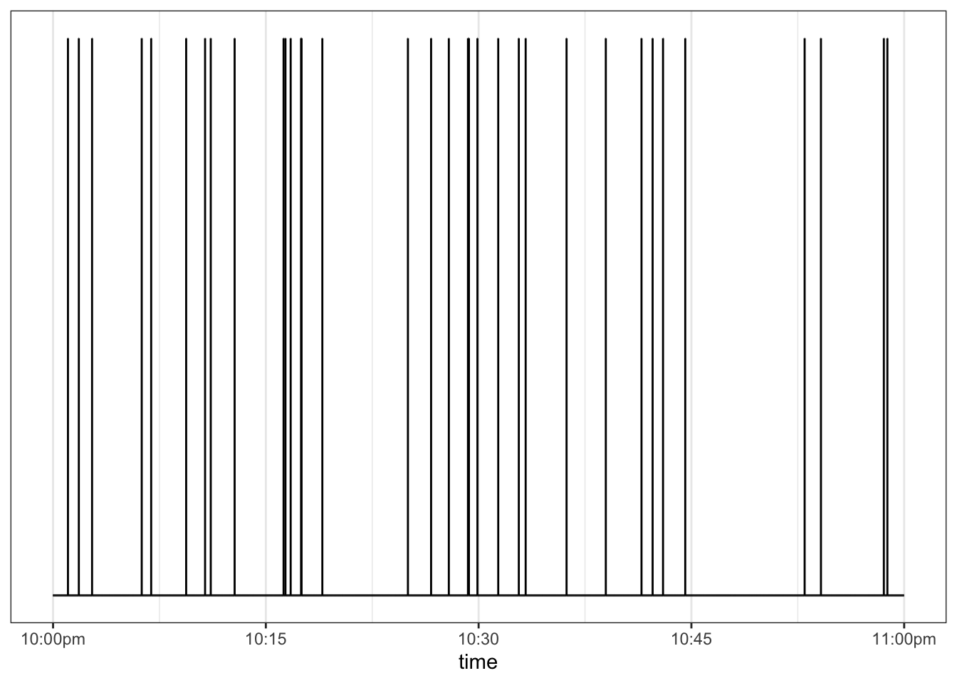
The events in Figure 6.11 are spread out in a satisfyingly random way, sometimes with short intervals between events and sometimes long intervals. The time spacing between successive events is shown in Figure 6.12.
Figure 6.12: The times (in seconds) between successive meteorites. Both the individual intervals and a density violin are shown. The mean interval, shown as a blue bar, is the reciprical of the probability of the event at any given second.
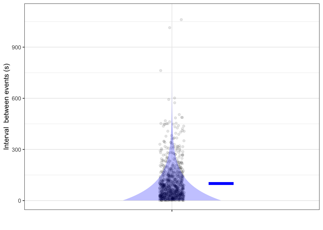
Even though the probability of an event at any time is the same, the times between events are far from uniform. Very short times (say, < 1 minute) are very likely, but occasionally there will be very long times (say, 15 minutes or more). This sort of distribution is called an exponential distribution, reflecting the exponential shape of the density.
When constructing a simulation about the intervals between random events, an exponential RNG is an appropriate mechanism. This takes a single parameter, the rate, which is probability of an event happening at any one time.
Another important model used in simulations is the Poisson distribution (named after mathematician Siméon Denis Poisson, 1781-1840) which describes the counts of events happening in specified intervals. To illustrate, let’s count the number of events in 5-minute intervals. Occasionally, watching the sky for five minute will not produce any events, occasionally one event, sometimes two events, and so on. The lucky 5-minute observer of shooting stars might see several events. Dividing the simulation of random events into 5-minute segments, counting the number of events in each segment, and then counting how many segments have 0 events, have one event, and so on, we find the following:
| count | n_segments |
|---|---|
| 0 | 25 |
| 1 | 48 |
| 2 | 78 |
| 3 | 70 |
| 4 | 61 |
| 5 | 30 |
| 6 | 14 |
| 7 | 6 |
| 8 | 1 |
| 9 | 1 |
There were 25 segments in which no events occurred, 48 with one event, 78 with two events, and so on. Hardly any show 7 or more events. The poisson distribution has a parameter which amounts to the mean number of counts across all segments.
6.6 The Null Hypothesis
Some hypotheses are more plausible than others. Consider this one: The world is set to boil away at 2:22 in the morning on 22 February 2222. Under this hypothesis, it makes sense that as we near that day, the world is getting warmer. And the world is getting warmer. Does that mean the boiling hypothesis is rendered plausible by the data?
An important style of reasoning about hypotheses and data involves assigning a plausibility to each of the hypotheses under consideration. Concerning climate change, we might assign a high plausibility to the CO_2_ hypothesis, reflecting two centuries of science demonstrating that CO_2_ is a greenhouse gas, the known molecular properties for the absorption of infra-red light, and so on. The 22 February 2222 hypothesis, not being built out of widely accepted mechanisms, and having a component, the time and date, which is not simultaneously meaningful worldwide, would be assigned a low plausibility. Note that this plausibility measure is very much in the spirit of the World Cup probabilities discussed in Section ??. As in that section, this initial plausibility can be called the prior, since it reflects what we know before looking at the available data.
The next step in this style of reasoning is to examine each hypothesis with an eye to judging whether a simulation would generate the similar patterns in data as those actual observed. For example, simulations based on global climate physics can generate a range of predictions for the degree and spatial distribution of warming, depending on the values assigned to parameters built in to the model. The observed warming falls well into this range. The expression used by statisticians is that the observed data have a considerable likelihood to be generated from the simulations. The Feb 2222 hypothesis isn’t specific enough to make detailed predictions of what would be observed, so there is no reason to give a particularly high likelihood, under that hypothesis, of the actual observations.
The final step is to combine the initial judgement of plausibility of each hypothesis with the likelihood of seeing the actual observations if that hypothesis were true. “Combine” is a little vague. There’s good reason to measure plausibility in the same way as probability, and the same with likelihood. The combination method used in practice is simple: multiply the two probabilities for each hypothesis. The multiplication produces a posterior plausibility, which again, we can put on the 0 to 1 scale for probability.
This style of reasoning involving \[\mbox{prior plausibility} \times \mbox{likelihood} \rightarrow \mbox{posterior plausibility}\] is called Bayesian. It’s widely accepted by statisticians how to compute a likelihood from a hypothesis and that the Bayesian procedure is the right way to combine a prior and a likelihood to get a posterior.
But there is strong feeling that the prior itself is subjective and arbitrary. The prior seems like a shakey foundation for logical reasoning. And so another style of reasoning, with a basis similar to likelihood, has been strongly promoted and used for decades. In this style of reasoning, called null hypothesis testing, there is only a single hypothesis put forward. (Since there’s only one hypothesis, there’s no need to worry about it’s plausibility with respect to other hypotheses, as with the Bayesian prior.)
That single hypothesis, called the null hypothesis is constructed in an ingenious way that makes it easy to simulate. Putting things in the context of stratification, the null hypothesis is that the response variable has absolutely no real-world connection to the explanatory variables. A simulation of the null hypothesis, that is, generating random data sets consistent with the hypothesis is done merely by copying the actual data and modifying the response variable. The modification is to shuffle the order of values of the response variable, leaving the explanatory variables exactly as they are. Then, apply exactly the same statistical method to the simulated data as was applied to the actual data. This works best if the statistical method generates a single number, which perhaps explains the interest in test statistics such as the difference in means between two stratification groups or the correlation coefficient between two quantitative values.
The shuffling simulation and the calculation of the test statistic on the result is repeated many times, giving a distribution of values for the test statistic. To finish, one assesses how close the actual observed value on the actual, unshuffled data to the mass of values in the shuffling distribution of the test statistic. Usually this is done not with the likelihood but with a different measure of closeness: In what fraction of the simulations is the test statistic further from the center than the actual observed value. This fraction is called a p-value.
If the p-value is small, typically taken as less than 5%, you are entitled, according to the logic of null hypothesis testing to announce that you “reject the null hypothesis.” If the p-value is not small, you don’t get to say much of anything except “I can’t reject the null hypothesis.” But you are never entitled to say, “I accept the null hypothesis.”
Whether null hypothesis testing is useful depends on the context. If conventional wisdom is that the response variable is unrelated to the explanatory variables, then rejecting the null hypothesis can help move the discussion along. But if there was good reason prior to the data to think the null is not a plausible hypothesis, being entitled to “reject the null” is nothing special or informative.
In one specific context, null hypothesis testing is undeniably useful. The dominant standard for accepting a scientific claim for publication is that the null hypothesis be rejected. Many scientific publications require this as a matter of course, and thus the careers of scientists are tied to the logic of null hypothesis testing. This situation has been strongly criticized by some because there are many ways, intentionally or incidentally, to hack p-values to get to a point where some null hypothesis can be rejected, even if other closely related ones cannot. The defense of null hypothesis testing is weak, along these lines: “It has serious problems and is often mis-understood and mis-applied, but do you have something better to offer as a gate-keeper for scientific publication?”
For the data scientist, whose interest is often in guiding a decision, the matter of whether work is publishable through the conventional research channels is hardly relevant. Still, p-values and hypothesis testing are part of the language of statistics and you should take care to understand and not be misled by them.
6.7 Exercises
Problem 1: DRAFT Build a simulation of the Israeli pilot training summarized by Kahneman. First, make praise and punishment have no effect and show that praise is seen to hurt performance and punishment to help it. Then give praise a little positive value and punishment a little negative value.
Problem 2: High-school mathematics is full of problems like this one involving the solution of simultaneous equations:
\[\begin{matrix} 6 x & - & 2 y & = & 4\\ 3 x & + & 5 y & = & 7\\ \end{matrix}\]
Let’s consider a simulation-based technique to solve this equation. To make it more realistic, let’s also assume that the parameters 6, 2, 4, etc. are not known exactly, but only to a precision of \(\pm 0.1\). Here’s the strategy:
- Generate random values for the parameters.
- Pick, at random, possible values for \(x\) and \(y\).
- Generate the quantities in the equations
- Keep only those rows of the simulated data which correspond closely to the equations.
NOTE IN DRAFT. I used very rough bounds to zoom in on the likely region for x and y, and then refined the initial guess.
Problem 3:
This is another graph from Galton’s 1886 reportFigure 6.13: (ref:eagle-let-clock83431-1-cap)
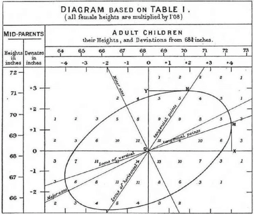
EXERCISE: Compare the two graphs. What did Galton do differently than in the modern plot. 1) no jittering. 2) grouped heights into integer bins and displayed the number at the center of each bin. 3) since children inherit from their parents and not vice versa, child_height is plotted as the response variable and mid_parent as the explanatory variable.
(Galton didn’t know about jittering, so he dealt with overplotting by labelling each position in the graph with the number of points found there.)
Galton annotated his graph with various mathematical shapes such as an ellipse. He was exploring various ways to describe the shape of a cloud of data points.
Problem 4: @ref[exer:panda-win-linen] was about a publisher’s summary of the distribution of royalties earned by its authors:
- Average: $4,094
- 25% Quartile: $1,221
- 50% Quartile: $2,519
- 75% Quartile: $3,980
We’re often curious about the extremes of a distribution. In this case, that amounts to finding out what the highest earners receive as royalties.
- Explain what’s insufficient about the summaries above to determine the royalties of the highest-earning author.
It often happens that we are asked to make an estimate even though the data are insufficient. A good practice is to answer, “I can’t know for sure, but I suspect xxx is in the ballpark.” In that spirit, let’s investigate some possibilities.
We have worked with three very common mathematical distributions used for modeling:
- the uniform distribution.
- the gaussian (bell-shaped) distribution.
- an exponential distribution.
There are many other possibilities, but let’s work with these three since they are familiar already.
- At first glance, the uniform distribution seems a good candidate. Why? About a quarter of the authors earn between 0 and $1300, another roughly a quarter makes between $1300 and $2600, and still another quarter make between $2600 and $3900. That is, equal width dollar intervals contain equal numbers of authors.
- If the distribution were approximately uniform, following the pattern $0, $1300, $2600, $3900 for the 0th, 25th, 50th, and 75th percent quantiles, where would the 100 percent quantile be located.
- Explain why such a uniform distribution could not possibly generate another aspect of what’s observed in the data, specifically that the mean is greater than the 75th percent quantile.
Explain why the gaussian (bell-shaped or “normal”) distribution cannot be consistent with the available royalty data.
It turns out that the exponential distribution can produce values similar to the data. Recall that the exponential distribution has a parameter called the “rate.” Find a value for the rate such that an RNG will generate values consistent with the data.
- The are about 100 authors in the set described by the data. Generate several simulations of an exponential distribution with the rate set as in (4). Each distribution will produce a single largest value. Compare the largest value from each of the several distributions and answer these two questions:
- Do the several distributions each produce the same value?
- Give a meaningful summary of what you found for the values in (a). Turn this into a ballpark estimate of what the best-paid author earns.
6.8 PROPOSED
- RNG: Uniform rng and graph, similar for others
- POISON AT DIFFERENT RATES.
- LOGNORMAL by successively breaking sticks at random points?
References
Galton, Francis. 1886. The Journal of the Anthropological Institute of Great Britain and Ireland 15: 246–63. http://www.jstor.org/stable/2841583.