Chapter 3 Data graphics
(ref:chapter-data_graphics) Chapter 3
Statistical graphics constitute a fundamental way of turning data into information, transforming large, hard-to-read tables of data into a visual presentation that can often be easily assimilated by eye. This chapter introduces a set of basic graphical conventions to govern the process of translating the contents of data frames into representative and telling images. Knowing about these conventions will help you construct statistical graphics and, equally important, it will help you make sense of graphics produced by others.
3.1 Overview
Statistical graphics consist of two complementary components: marks and the space in which the marks are to be drawn. The marks, which we will call glyphs, represent data or a model for interpreting data. The fundamental aspect of a glyph is its position in space. The space in which glyphs are drawn is called a graphics frame. A graphics frame is defined by two (or more) variables, typically in the form of an x-y coordinate system. The coordinates of any point designate specific values for the variables defining the frame.
To repeat: A statistical graphic consists of glyphs placed within a frame. Glyphs often have a simple shape such as a dot or line segment, allowing us to focus our attention on position. Sometimes glyphs have additional attributes such as color, size, and shape that also can represent quantities or categories in the data. Figure 3.1 shows three of the most useful glyphs for constructing statistical graphics: a dot to represent a row in a data frame, a bar to represent an interval of values, and a “density violin” to show which values are more and less common.
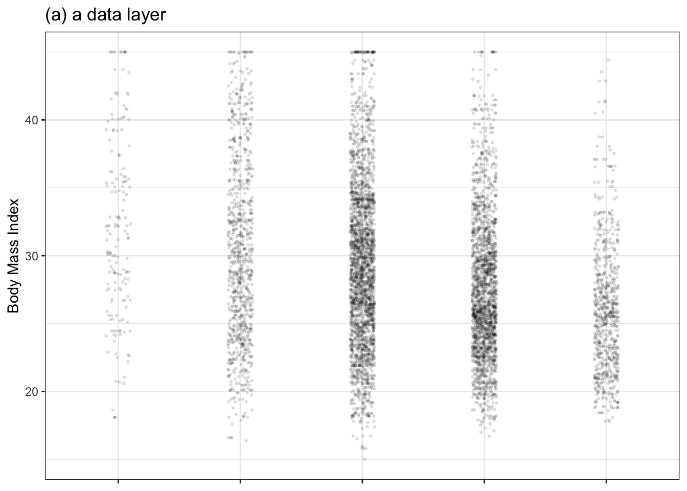
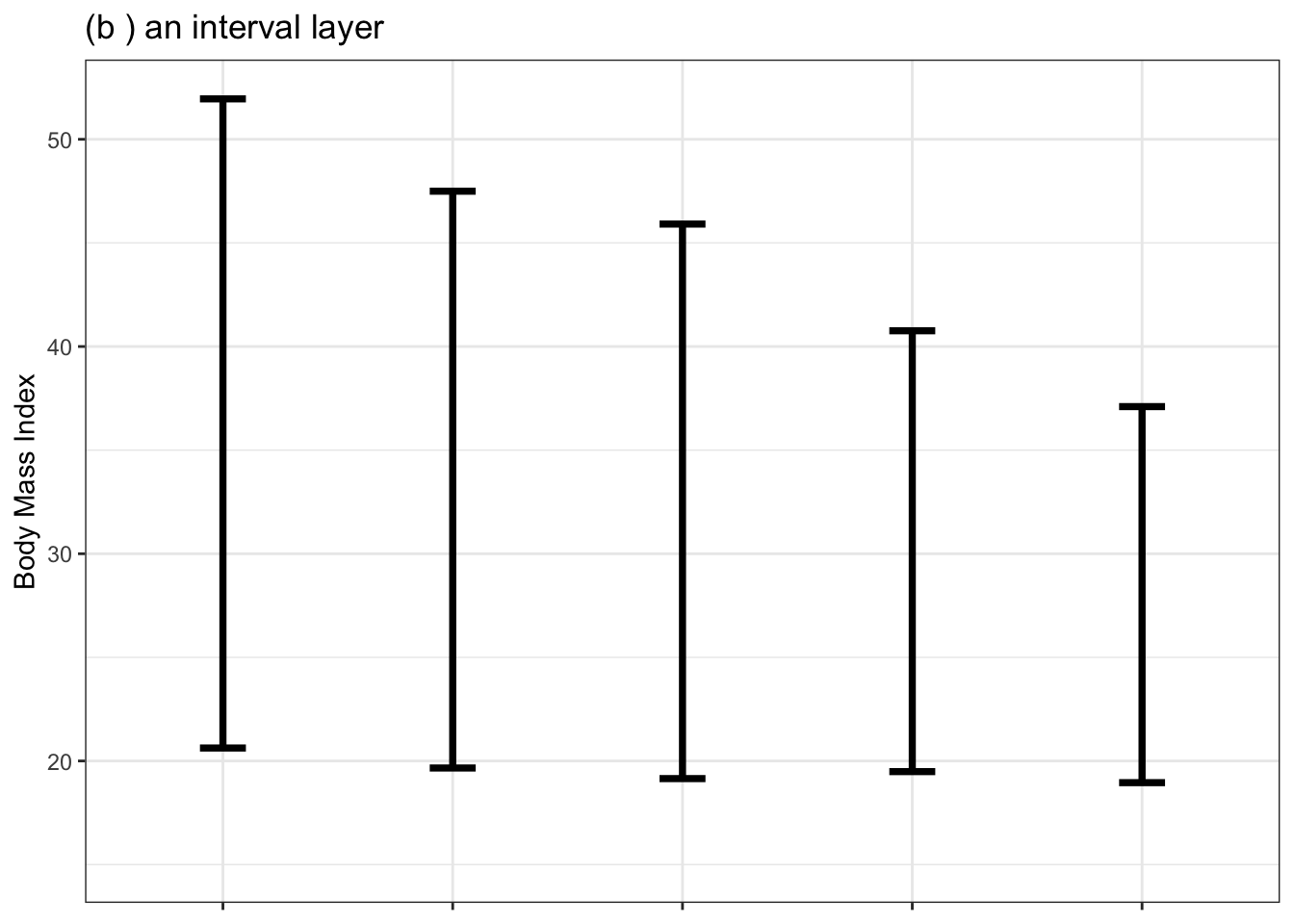
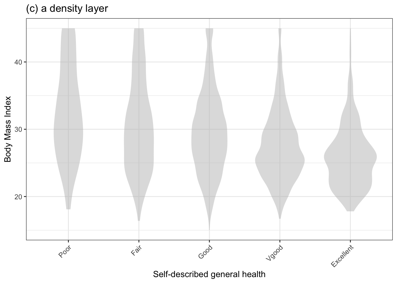
Figure 3.1: Three types of layers and their associated glyphs: point dots, interval bars, and density violins.
3.2 Types of layers
Each of the three graphics in Figure 3.1 can be considered a layer of graphics. In building statistical graphics, you will often stack one layer on top of another so that the different parts of the story told by each layer can be seen in reference to one another. But for the moment, let’s consider the layers in Figure 3.1 in isolation.
- In a data layer, each row of a tidy data frame is represented by a simple glyph such as the ● in Figure 3.1(a).
- An interval layer, often drawn using an I-shaped glyph, conveys uncertainty with a vertical range.
- A density layer shows which values are relatively more common. In this book, we will use violin glyphs. A wide violin at a given level of the response variable indicates that that value is relatively common.
3.3 The graphics frame
Recall from (ref:chapter-tidy_data) that data frames are the basic structure for storing tidy data. Analogously, a graphic frame is the structure for organizing statistical graphics. You encountered graphic frames throughout your mathematical education under names such as “Cartesian coordinates” or “x-y axes.”
Figure 3.2: The graphics frame used in Figure 3.1. In English, this frame is described as BMI versus general health, faceted by sex.
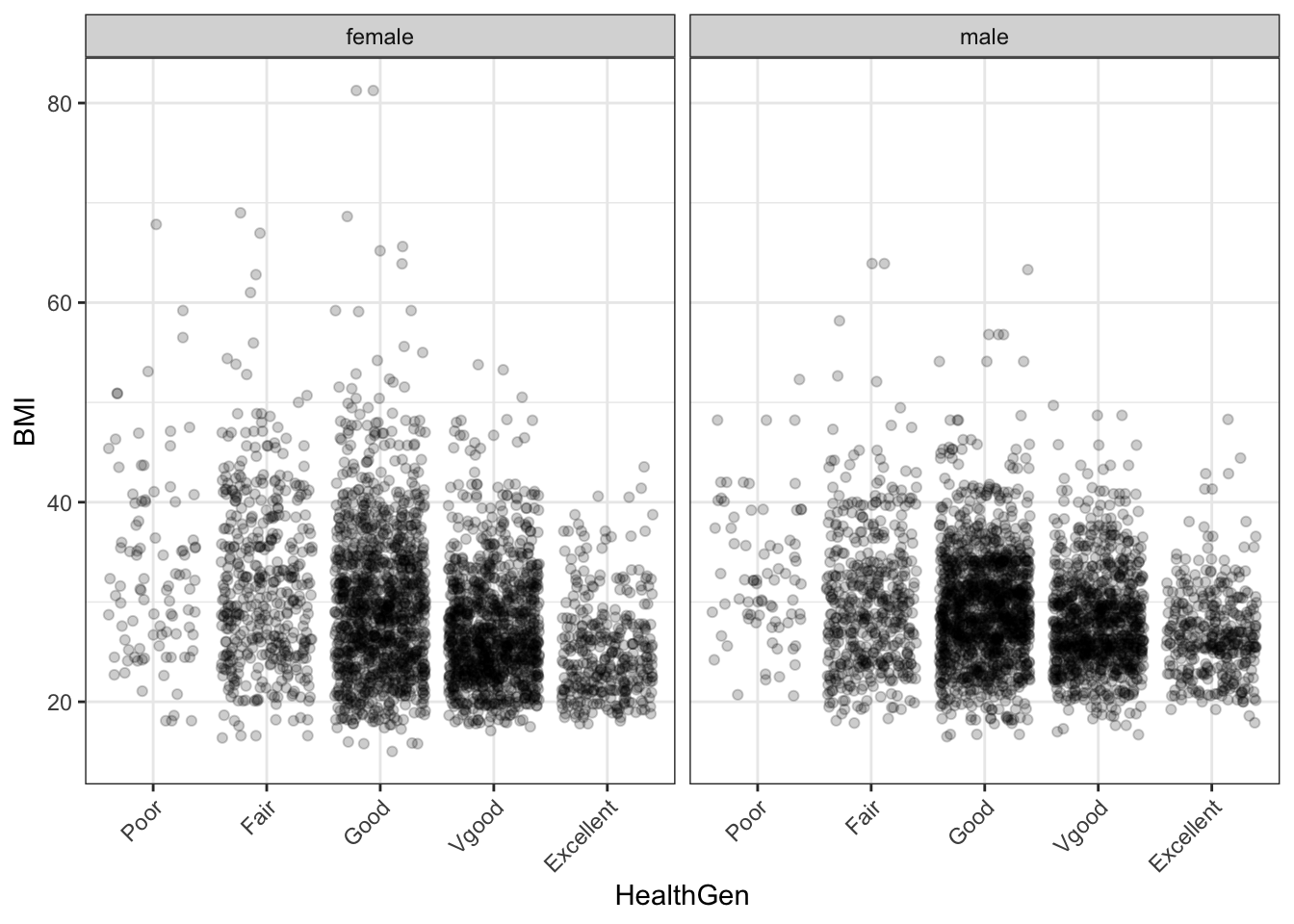
In this book, graphics frames will almost always be defined by two variables from a data frame. The vertical variable is called the response variable. The horizontal variable is the explanatory variable. For the frame in Figures 3.1 and 3.2, the response variable is “body mass index” (BMI). The explanatory variable is “self-described general health.” Altogether, the frame used in those figures is pronounced with the phrase “BMI versus general health.”
The graphics frame is just the empty space defined by the response and explanatory variables. The tick marks and labels along each axis help to identify the meaning of any point in the frame.
Either or both of the variables defining a graphics frame can be categorical or quantitative. In Figure 3.2 the response variable is quantitative. The explanatory variable, “general health,” is categorical.
When a categorical variable is used in a frame, each discrete level of the variable is assigned to its own region of the frame. For instance, in Figure 3.1 the explanatory variable is “general health” and the space is split up by the levels of that variable; the left-most region of the frame is assigned to the level “poor,” the next region is assigned to “fair,” and so on.
The space between the levels can be used for other purposes. For instance, in Figure 3.1(a) the space is being used to offset the data points a little horizontally, to avoid plotting one point right on top of another. This is called “jittering.” The specific horizontal offset is selected at random and has nothing to do with the data itself.
In Figure 3.1(b), the space is used to draw the little horizontal end cap at the top and bottom of each I-glyph. The width of this end cap has no particular meaning.
The violin glyphs in Figure 3.1(c) use the space between categorical levels to convey information about what values of the response variable are most common. Think of the violin as a vertical stripe of varying width. The width at any given value of the response variable shows how commonly that value occurs. For instance, the violin for the “excellent” level of general health, is widest at a BMI of about 25. This means that 25 is the most common BMI for people in excellent health. The long tail on the violin, which becomes very thin at a level of 40 for BMI, means that such values do occur, but are rare. In contrast, the poor-health violin is thin near BMI 20, but is wider for higher BMI. That means the bigger BMI values are more common.
3.4 Jittering and transparency
The data layer of Figure 3.1(a) has so many dots that they overlap in many places and can’t be easily distinguished from one another. The technique of jittering and the use of transparency help to minimize the impact of such overlap or overplotting.
Figure 3.3 shows the same BMI versus general health data in three different ways: without jittering or transparency, with jittering, and combining jittering with transparency. The unjittered dots (Figure 3.3(a)) are being plotted in such close proximity that they fully overlap: it’s hard even to get an idea how many dots are at each level. Jittering helps but, unless transparency is used, it’s to see at a glance how many dots pile up in one place. By using appropriate jittering and transparency, a more informative graphic can be made.
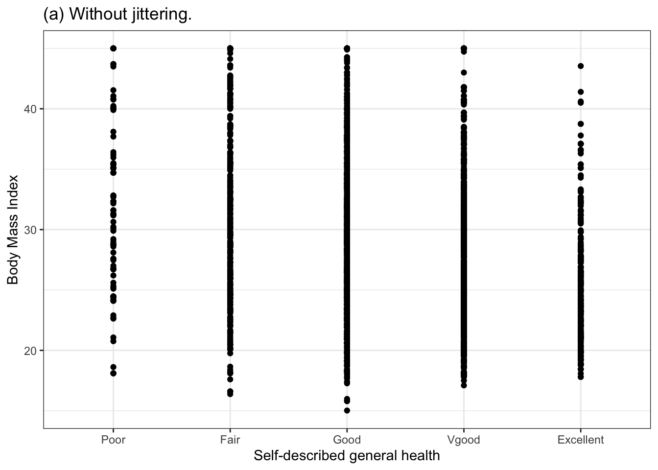
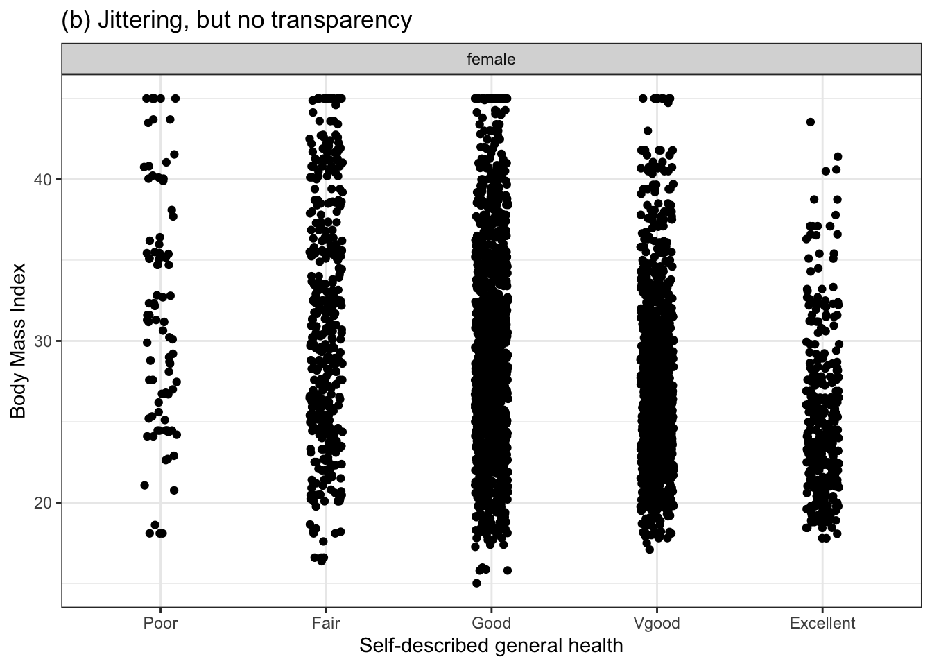
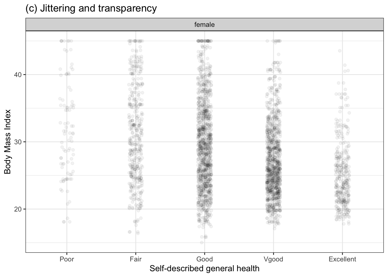
Figure 3.3: BMI versus general health data displayed without jittering (a), with jittering (b), and with both jittering and transparency (c).
3.5 Example: Don’t waste a dimension
Recall that a graphics frame is defined by two variables: the vertical position is used to show values of the response variable, horizontal position shows values for the explanatory variable. Thus, the data are displayed in two dimensions.
There’s a long tradition in statistics of graphics such as histograms in which only one dimension is used for data values. Figure 3.4(left) shows such a histogram. Since the sharp boundaries between bars in the histogram can be distracting, often a smoothed version, shown in Figure 3.4(right) is preferred. The smoothed version is called a density plot
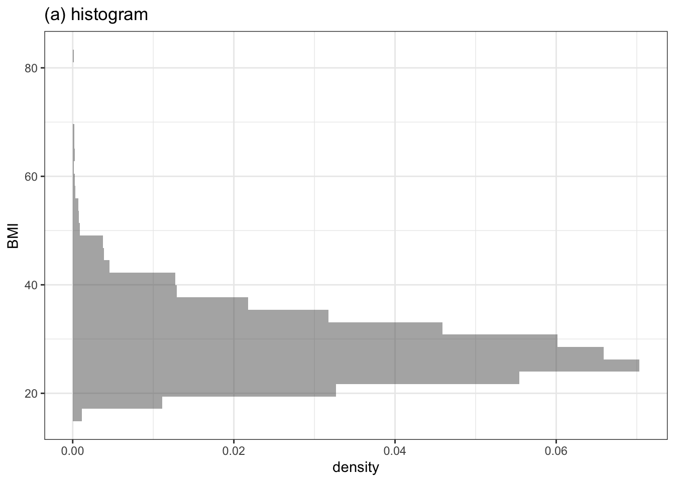
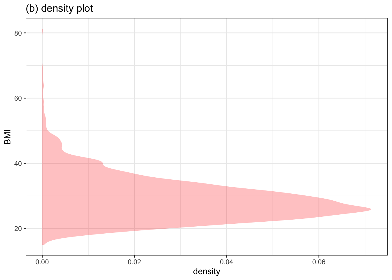
Figure 3.4: A histogram and a density plot of the same variable. Only one data variable is used in the frame. Although traditional, these style of graphic waste an axis, since the ticks on the horizontal axis are rarely referred to.
Notice that the horizontal axis Figure 3.4 is not showing a data variable. There’s only one variable in the plot: BMI. The horizontal dimension is used to display how common the BMI values are. Typically, the units on the horizontal axis are not used by the person reading the graph. So there’s no need for tick marks and labels; the shape tells you what you need to know.
The violins in a violin plot are more or less back-to-back density plots. But, since the quantitative scale is rarely used in histograms or density plots, the violin format is able to save an axis, allowing it to be used for a second data variable. In Figure 3.1, that second variable, the explanatory variable, is “general health.”
In data science, you will almost always be working with multiple variables. Using both axes for data variables lets you show relationships. There’s plenty of room in the space between levels of a categorical explanatory variable for you to see the density; you don’t have to waste an axis on a scale you will not use.
3.6 Faceting and color
The graphics frame, as we’ve described it, allows you to display a pair of variables. Often, it’s appropriate to display three or more variables in the same graph. Two techniques for accomplishing this involve color and/or faceting.
Faceting refers to using several small frames side-by-side. Each of these small frames has the same meaning for the x-y coordinate system. But each small frames represents a subset of data based on the levels of a third variable. Figure 3.5 gives an example in which the BMI versus general health coordinate system is augmented by a third variable, sex. The subset of the data where sex is female is displayed in the facet labelled female; the other facet is for males.
Figure 3.5: Using faceting to add a third variable to the graphics frame.
Another way to add a third variable to a graph is through color. All the glyphs are drawn in the same frame, but each glyph is colored according to the value of the third variable.
3.7 Data-graphics choices
Designing a data graphic involves making choices. In a well-designed data graphic, these choices should of course be made with an eye to how well the graphic tells the story that the designer has in mind. Less obviously perhaps, the graphic should impose a low cognitive load on the viewer. Research into how well people can assimilate graphics has identified the perceptual tasks that are easier and harder for people. (Cleveland and McGill 1984) As a rule, people find it effortless to perceive difference in position. This is why point plots are so important. People are also extremely good at perceiving differences in length.
More difficult perceptual tasks involve distinguishing between different shapes, sizes, colors, and transparencies of glyphs. Experience with statistical graphics has shown that the most effective graphics – that is, the ones most easily assimilated to the human eye – use glyphs with very simple shapes such as a filled circle or triangle. The eye is also good at distinguishing between discrete, distinct colors. However, size and transparency are harder for the eye to process.
There are some simple guidelines for designing effective graphics that are worth committing to memory. These guidelines help in deciding which variables presented in the graphic will be represented by position in the frame, and which by other graphical properties. The frame is of fundamental importance.
- Guideline 1. The response variable should always be represented by the vertical axis in the frame. This is true regardless of whether the response variable is quantitative or categorical.
- Guideline 2. If there is just one explanatory variable, it should be represented by the horizontal axis.
When there is more than one explanatory variable, choices need to be made. The most important of these choices is which explanatory variable to use on the horizontal axis, and which to represent by other means.
- Guideline 3. If one of the explanatory variables is quantitative, use that for the horizontal axis.
- Guideline 4. For the remaining explanatory variables, use color and faceting.
To illustrate the possibilities, let’s use data on world-record times in the butterfly swim event. We’ll take the record time as the response variable. Among the explanatory variables, we’ll consider the swimmer’s sex as well as two variables that characterize each event: swimming distance and the number of lengths the race distance is divided into. We also want to include the date of the world record, perhaps with an eye to showing how records have improved over the years (and how they might improve in the future).
Using Guideline 1, record time will be represented by the vertical axis.
As regards the four explanatory variables, the first task is to identify which are quantitative and which are categorical. Dates are very much like numbers; they come in a well-defined order. The other explanatory variables are either categorical (sex) or are quantitative with just a handful of possible values and, as such, can be thought of as categorical. Since there is just one quantitative explanatory variable, following Guideline 3, that goes on the horizontal axis.
Figure 3.6 shows a data graphic of the world-record records. Color is being used to represent sex. The race distance and the number of lengths in the race are each used to define individual facets. The upper-left facet, for example, represents 100m races where the swimmers go just two lengths. (Presumably, the pool is 50m long, so the two lengths covers 100m.)
Figure 3.6: Record time in the butterfly swimming event versus date, sex, distance, and lengths for the butterfly-style swim event.
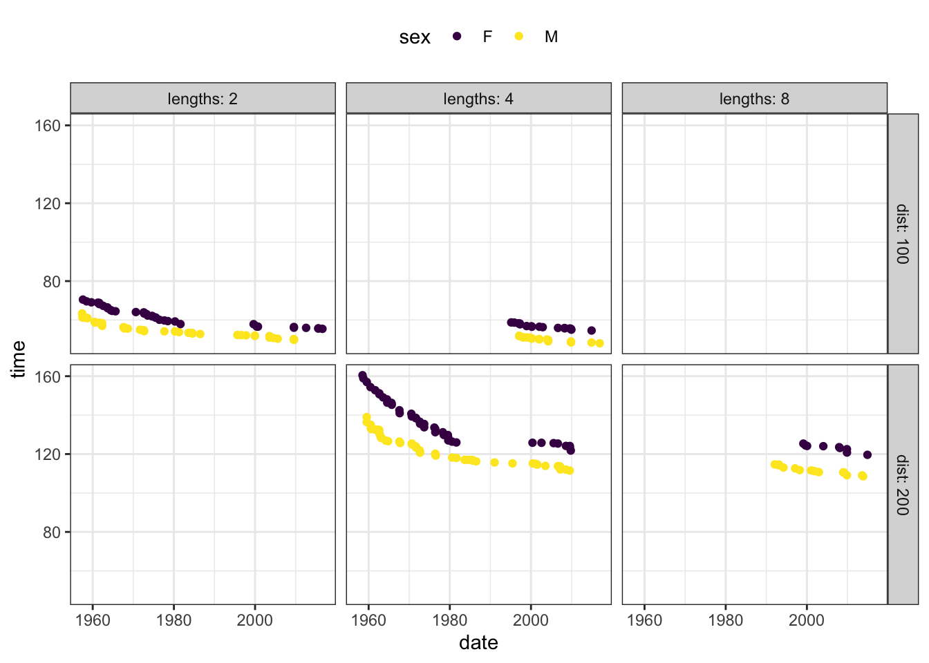
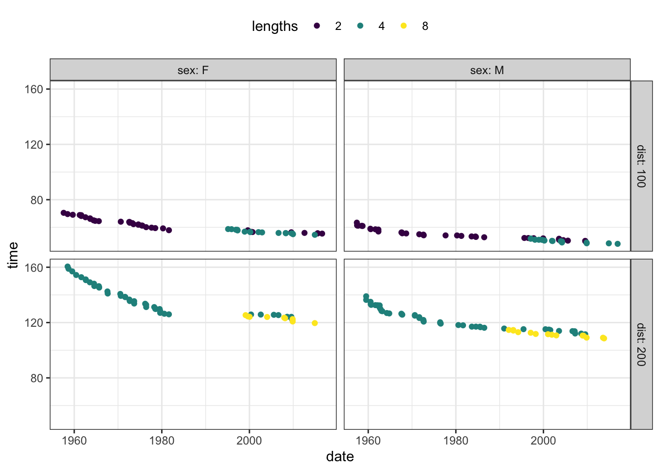
Using color for sex makes it very easy to compare the two sexes. (You can see that women’s record times are roughly ten seconds longer than men’s.) It’s more difficult to compare the different race distances and lengths. But if you wanted to tell a story about how the number of lengths effects the record time, you might want to use color to represent lengths, as in Figure 3.7. With this arrangement of the explanatory variables, it’s pretty easy to see that the number of lengths affects record time by a very small amount; races with more lengths are perhaps a little faster.
Figure 3.7: The butterfly swim data using color to represent the the number of pool lengths in the race. The effect of number of lengths is small, while the other explanatory variables – sex and race length – have a strong effect on the outcome. It’s hard to see small effects when having to compare one facet to another. Using color for the number of pool lengths allows the comparison to be made within each facet.
Using color and faceting gives you the ability to represent up to four explanatory variables (and the response variable, which is always on the vertical axis.) A graphic with more than four explanatory variables is extremely hard for the viewer to assimilate. Consequently, avoid using size, shape or transparency to represent an explanatory variable. Rely on color and faceting.
Also, consider whether a explanatory variable is contributing to the story. If the story is about comparing races with different numbers of lengths, you obviously will want to include lengths as an explanatory variable. But if the story is about how the sexes compare, or how the distances compare, then consider excluding lengths in the graphic, which will simplify it.
As you design a data graphic with multiple explanatory variables, make the graph, then try changing the graphical roles of the explanatory variables. Sometimes you’ll be able to identify the best arrangement by picking out the one that works best for your eye. And sometimes you’ll find that an explanatory variable that you originally thought was important doesn’t contribute much to the story told by the graphic. In such cases, consider simplifying your graphic by excluding that not-so-important variable.
3.8 Exercises
Problem 1: The graph below is a violin plot. Using a pencil and your intuition, add a few dozen dots to the graphic as they would appear in a data layer superimposed on the violin layer. The dots should be jittered and be consistent with the shape of the violins.
Problem 2: This website has some excellent examples of how small choices can affect the intelligibility of a graphic: https://medium.economist.com/mistakes-weve-drawn-a-few-8cdd8a42d368. Figure out an activity based on it, perhaps showing pairs of graphics and asking students to say which is better and why.
Problem 3: The graphic compares carbon-dioxide emissions and fuel use for hybrid and non-hybrid passenger vehicles.
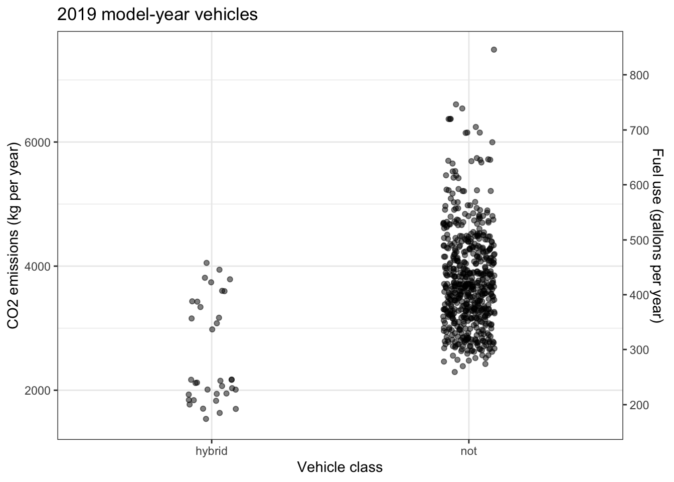
How much less CO-2- is emitted by the hybrid cars than by a conventional cars? Since CO-2- emission is exactly proportional to fuel burned, there are two vertical axes on the graph.
- Glancing at the dots in the graphic, quickly form an impression and circle the number of these that seems right.
Circle the right number: A typical hybrid car emits about … 10%, 25%, 50%, 75%, 100% … as much CO-2- as a conventional car.
- Now look carefully at the vertical axis and, if necessary, revise your answer in (1).
Revise your answer to (1): A typical hybrid car emits about … 10%, 25%, 50%, 75%, 100% … as much CO-2- as a conventional car.
For many people, perhaps including you, the answers to (1) and (2) are different. Typically the answer to (1) is smaller than the (correct) answer to (2).
Figure out a way to revise the graphic so that a quick glance (as in (1)) will suffice to reach a correct conclusion.
Problem 4: Consider this data frame:
| HealthGen | Age | SleepHrsNight |
|---|---|---|
| Vgood | 28 | 9 |
| Vgood | 27 | 8 |
| Vgood | 17 | 6 |
| Good | 43 | 7 |
| Good | 27 | 6 |
| Excellent | 36 | 8 |
| Good | 29 | 6 |
| Good | 80 | 6 |
| Excellent | 22 | 8 |
| Good | 54 | 7 |
| … and so on for 569 rows altogether. |
Here is a plot of the data – all 569 points. The identifying labels for the axes and facets have been stripped off for the purpose of this exercise.
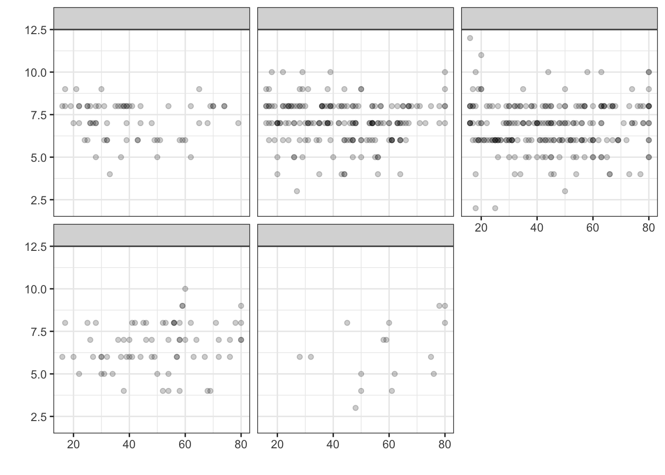
- What is the variable used for facetting?
- What is the variable on the horizontal axis?
- What is the variable on the vertical axis?
- Is this plot jittered?
Problem 5 With reference to the graphics frame shown below, indicate whether the variable on each axis is quantitative or categorical.
- Horizontal axis: quantitative or categorical
- Vertical axis: quantitative or categorical
Problem 7 It’s important to avoid statistical graphics which are misleading. This can happen even when the quantities shown in the graph are factual. Figure 3.8 shows a type of graph that, though commonplace, can be misleading. The data involved are BMI versus general health; the quantities are factually correct.
Figure 3.8: (ref:hamster-sit-scarf83405-1-cap)
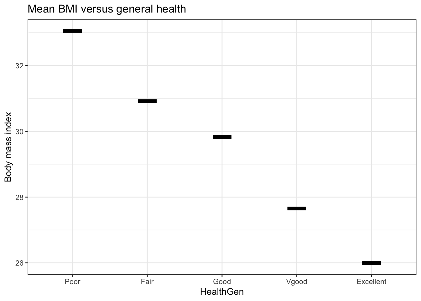
- Consider this possible summary of the relationship between BMI and general health suggested by Figure 3.8: “People with higher body mass index tend to have poorer general health.” Does this interpretation sound reasonable? Say why or why not.
- According to official definitions, a person with a BMI of 30 and higher is considered “obese.” Consider this statement that includes a causal claim: “An obese person should try to reduce his or her weight in order to improve health.” Do you think this statement is justified by the graph? Explain why or why not, taking care to say what it is about the graph itself that would justify or refute the causal claim.
- Why do you think the statement in (1) includes the qualifying phrase “tend to?” Is there anything shown in the graph that calls for weakening the claim with the use of “tend to?”
- Which of the three types of glyphs referred to in the chapter does Figure 3.8 contain.
Figure 3.8 shows the mean body mass index of the people in each group. But it gives no context for how that mean relates to the range of BMI values for those people. Figure 3.9 shows two layers: a density violin and a point plot. The point plot shows the mean BMI value for each group while the density violin shows the variation in BMI within each group.
Figure 3.9: (ref:hamster-sit-scarf83405-2-cap)
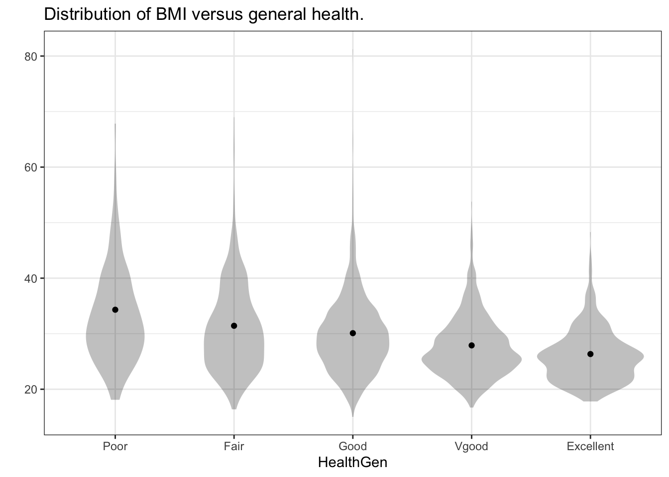
- Taking Figure 3.9 into consideration, what do you think about the claim that lowering BMI might lead to better general health? Is there anything about the graph that challenges the earlier statement (in (2)) that “An obese person should try to reduce his or her weight in order to improve health.”
THIS WILL BECOME AN INTERACTIVE LEARNR TUTORIAL
Problem 8 An earlier exercise (GIVE CROSS-REFERENCE) presented data on the sensitivity to light in 54 locations on the retina in a glaucoma patient. The measurements were made repeatedly at each site for nine visits. The complete set of 9x54 measurements are contained in the Sensitivity data frame, displayed here.
| location | day | visit | sensitivity |
|---|---|---|---|
| 1 | 0 | 1 | 25 |
| 1 | 126 | 2 | 23 |
| 1 | 238 | 3 | 23 |
| 1 | 406 | 4 | 23 |
| 1 | 504 | 5 | 24 |
| 1 | 588 | 6 | 21 |
| 1 | 756 | 7 | 21 |
| 1 | 868 | 8 | 24 |
| 1 | 938 | 9 | 22 |
| 2 | 0 | 1 | 25 |
| 2 | 126 | 2 | 23 |
| 2 | 238 | 3 | 23 |
| … and so on for 486 rows altogether. |
In addition to the Sensitivity data frame, there is a Locations data frame that gives the (x, y) coordinates on the retina of each location. It’s displayed below:
| location | x | y |
|---|---|---|
| 19 | 1 | 4 |
| 28 | 1 | 5 |
| 11 | 2 | 3 |
| 20 | 2 | 4 |
| 29 | 2 | 5 |
| 37 | 2 | 6 |
| … and so on for 54 rows altogether. |
Create a graphic showing where in the x-y plane each location is situated. Hint: Rather than using
gf_point()to create the data layer, usegf_text(). Giving an additional argument,legend = ~[varname] will let you specify which variable is to be used as the text.Plot out the
sensitivity ~ dayat each location. Usegf_line()and facet the plot bylocation. The plot will show all 54 locations, but the facets will not be arranged according to the (x, y)` position of each location.Create a new data frame that is much like
Sensitivity, but which includesxandyvariables giving the (x, y) position on the retina of each location. That is, for each row ofSensitivity, add a columnxand a columnythat corresponds to thelocationfor that row. Such data operations, called “joins” are very commonly used in data science. Here’s how:Now use
gf_line()to plotsensitivity ~ dayfacetting by bothxandy. To create a grid of facets based on two variables, use the syntaxsensitivity ~ day | vary ~ varx. Of course, replacevarxandvaryby the actual names of the variables you want to use for faceting.Looking at the retinal map you’ve made, and noting that low light sensitivity is a sign of damage to the retina, where is the main damage to the retina? At the center, left, right, top, bottom?
Problem 9 The figure, from https://www.holiday-weather.com/cornwall/averages/, shows average daily high and low temperatures in Cornwall, England.
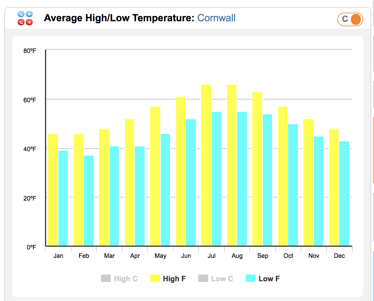
Part A
- What glyph is being used?
- Is this an interval graphic?
- What’s the significance (if any) of putting the baseline level at 0°F?
Part B: Sketch out a better graphic using a more appropriate glyph
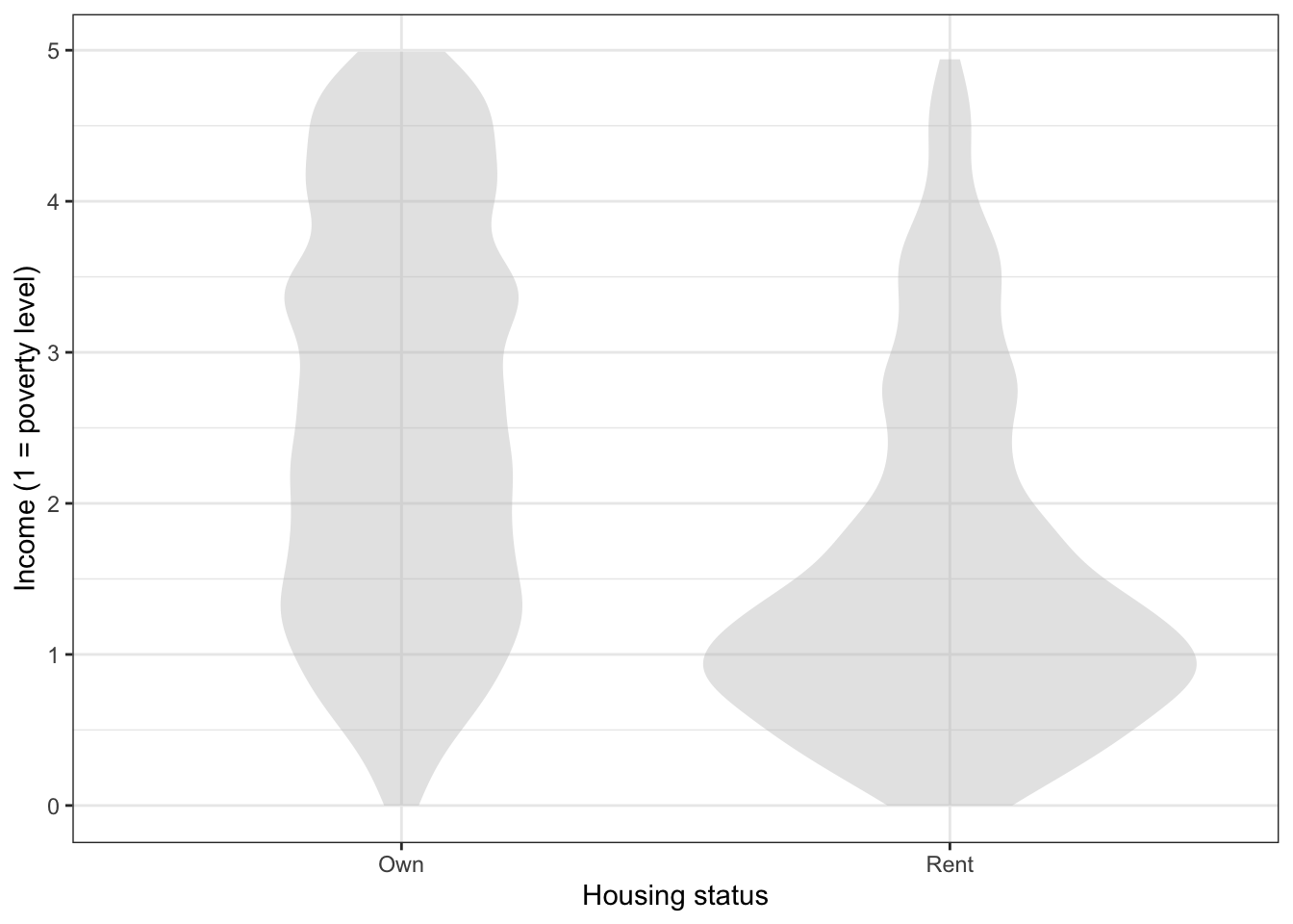
Problem 11
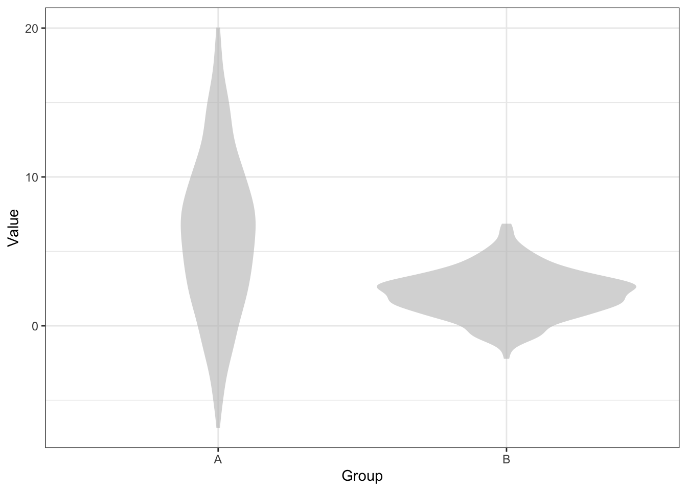
Based on the graphic above, which group, A or B, has the larger number of instances in the data? Select one
- Group A has more instances.
- Group B has more instances.
- The two groups have about the same number of instances.
- Violin plots don’t show this information.
Activity 1 This website has some excellent examples of how small choices can affect the intelligibility of a graphic: https://medium.economist.com/mistakes-weve-drawn-a-few-8cdd8a42d368. Figure out an activity based on it, perhaps showing pairs of graphics and asking students to say which is better and why.
Activity:
- child-draw-pan
References
Cleveland, William S., and Robert McGill. 1984. “Graphical Perception: Theory, Experimentation, and Application to the Development of Graphical Methods.” Journal of the American Statistical Association 79 (387): 531–54. https://www.jstor.org/stable/2288400.