Chapter 19 Covariates
Our strategy for modeling a real-world system is to identify a single response variable and treat that variable as a function of one, several, or many explanatory variables. Effect size (Chapter @ref(effect_size)) lets you focus attention on an individual explanatory variable and how changes in that explanatory variable correspond to changes in the response variable.
Insofar as the logic of effect size is to isolate a single explanatory variable of interest, you might wonder why not build a model that conditions the response variable just on that one explanatory variable? As you’ll see, this is generally the wrong way to go about things. The role of each explanatory variable takes place in a context set by other explanatory factors.
The context-setting factors are called covariates. In the sense of data, covariates are perfectly ordinary variables. They are called covariates only to highlight the role of these variables for putting in context some other explanatory variables of particular interest to the modeler.
19.1 Example: Covariates and context in educational outcomes
To illustrate how covariates set context, consider an issue of interest to public policy-makers in many societies: How much money to spend on children’s education? In the United States, for instance, educational budget policy is set mainly on a state-by-state level. State lawmakers are understandably concerned with the quality of the public education provided, but they also have other concerns and constraints and constituencies who give budget priority to other matters.
In evaluating the various trade-offs they face, lawmakers would be helped by knowing how increased educational spending will shape educational outcomes. What can available data tell us? Unfortunately, there are various political constraints that work against states adopting and publishing data on a common measure of genuine educational outcome. Instead, we have high-school graduation rates, student grades, etc. These have some genuine meaning but also can reflect the way the system is gamed by administrators and teachers and which cannot be easily compared across states. At a national level, we have college admissions tests such as the ACT and SAT. Perhaps because these tests are administered by private organizations and not state governments, it’s possible to gather data on test-score outcomes on a state-by-state basis and collate these with public spending information.
Figure 19.1 shows average SAT score in 2010 in each state versus expenditures per pupil in public elementary and secondary schools. Laid on top of the data is a flexible linear model (and its confidence band) of SAT score versus expenditure. The overall impression given by the model is that the relationship is negative, with lower expenditures corresponding to higher SAT scores. But the confidence bands are broad and it is possible to find a smooth path through the confidence band that has almost zero slope. Either way, the conventional wisdom that higher spending produces better school outcomes is not supported by this graph.

Figure 19.1: State by state data (from 2010) on average score on the SAT college admissions test and expenditures for public education.
There are other factors that play a role in shaping education outcomes: poverty levels, parental education, how the educational money is spent (higher pay for teachers or smaller class sizes? administrative bloat?), and so on. Modeling educational outcomes solely by expenditures ignores these other factors.
At first glance, it’s tempting to ignore these additional factors. We may not have data on them. And insofar as our interest is in understanding the relationship between expenditures and education outcomes, we are not directly concerned with the additional factors. This lack of direct concern, however, doesn’t imply that we should totally ignore them but that we should do what we can to “hold them constant”.
To illustrate, let’s consider a factor on which we do have data: the fraction of eligible students (those in their last year of high school) who actually take the test. This varies widely from state to state. In a poor state where few students go to college the fraction can be very small (Alabama 8%, Arkansas 5%, Mississippi 4%, Louisiana 8%). In some states, the large majority of students take the SAT (Maine 93%, Massachusetts 89%, New York 89%). In states with low SAT participation rates, the students who do take the test are applying to schools with competitive admissions. Such strong students can be expected to be get high scores. In contrast, the scores in states with high participation rates reflect both strong and weak students; they will be lower on average than in the low-participation states.
Putting the relationship between expenditure and SAT scores in the context of the fraction taking the SAT can be done by using fraction as a co-variate, that is, building the model SAT ~ expenditure + fraction rather than just SAT ~ expenditure. Figure 19.2 shows a model with fraction taken into account.

Figure 19.2: The model of SAT score versus expenditures, including as a covariate the fraction of eligible students in the state who take the SAT.
Note that the effect size of spending on SAT scores is positive when the expenditure level is less than $10,000 per pupil. And notice that when the fraction taking the SAT is near 0, the average scores don’t depend on expenditure. This suggests that among elite students, expenditure doesn’t make a discernable difference: it’s the students, not the schools that matter.
The relationship shown in Figure 19.1 is genuine. So is the very different relationship seen in Figure 19.2. How can the same data be consistent with two utterly different displays? The answer, perhaps unexpectedly, has to do with the connections among the explanatory variables. Whatever the relationship between each individual explanatory variable and the response variable, the appearance of that relationship will depend on how explanatory variables are connected to each other.
19.2 Connections among explanatory variables
To demonstrate that the apparent relationship between an explanatory variable and a response variable – for instance, school expenditures and education outcomes – depends on the connections of the explanatory variable with other explanatory variables, let’s move away from the controversies of political issues and study some systems where everyone can agree exactly how the variables are connected. We’ll look at data produced by simulations where we specify exactly what the connections are.
A simulation implements a hypothesis: a statement about that might or might not be true about the real world. As a starting point for our simulation, let’s imagine that education outcomes increase with school expenditures in a very simple way: each $1000 increase in school expenditures per pupil results in an average increase of 10 points in the SAT score: an effect size of 0.01 points per dollar. Thus, the imagined relationship is:
\[\mbox{sat} = 1600 + 0.01 * \mbox{dollar expenditure}\]
Let’s also imagine that the fraction of students taking the SAT test also influences the average test score with an effect size of -4 sat points per percentage point. Adding this effect into the simulation leads to an imagined relationship of
\[\mbox{sat} = 1600 + 0.01 * \mbox{dollar expenditure} - 4 * \mbox{participation percentage} .\]
And, of course, there are other factors, but we’ll treat their effect as random with a typical size of ± 50 points.
To complete the simulation, we’ll need to set values for dollar expenditures and participation percentage. We’ll let the dollar expenditures vary randomly from $7000 to $18,000 from one state to another and the participation percentage vary randomly from 1 to 100 percentage points.
Notice that in this simulation, both participation percentage and expenditures affect education outcomes, but there is no connection at all between the two explanatory variables. That is, the graphical causal network is that shown in Figure 19.3.
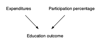
Figure 19.3: A graphical causal network relating expenditures, participation percentage, and education outcome, where there is no connection between expenditures and participation.
Using the techniques introduced in Chapter 11, we can generate simulated data and use the data to train models. Figure ?? shows the data and two different models.


Figure 19.4: (ref:school-data-1-cap)
(ref:school-data-1-cap) Data and models of the relationship between expenditures and education outcomes from a simulation in which expenditures and participation rate are unconnected as in Figure 19.3.
* (a) The model outcome ~ expenditure
* (b) The model with participation as a covariate: outcome ~ expenditure + participation
Both models (a) and (b) show the same effect size for outcome with respect to expenditure.
The relationship between outcome and expenditure can be quantified by the effect size, which appears as the slope of the function. You can see that when the explanatory variables are unconnected, as in Figure 19.3, the functions have the same slope.
Now consider a somewhat different simulation. Rather than expenditures and participation being unconnected (as in the causal diagram shown in Figure 19.3), in this new situation we will posit a connection between the two explanatory variables. We’ll image that there is some broad factor, labeled “culture” in Figure 19.5, that influences both the amount of expenditure and the participation in the tests used to measure education outcome. For instance, “culture” might be the importance that the community places on education or the wealth of the community.
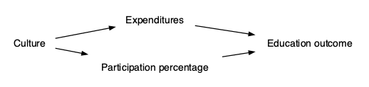
Figure 19.5: (ref:school-sim-2-cap)
Again, using data from this simulation, we can train models:
outcome ~ expenditures, which has no covariates.
outcome ~ expenditures + participation, which includes participation as a covariate.
Figure ?? shows the data from the new simulation (which is the same in both subplots) and the form of the function trained on the data. Now model (a) shows a very different relationship between expenditures and outcome than model (b).


Figure 19.6: Similar to Figure 19.4 but using the simulation in which the explanatory variables – expenditure and participation – are connected by a common cause. The two models show very different relationships between outcomes and expenditures. Model (b) matches the mechanism used in the simulation, while that mechanism is obscured in model (a).
Since we know the exact mechanism in the simulation, we know that model (b) matches the workings of the simulation while model (a) does not.
Why the dramatic difference in the effect size of expenditures on outcome seen in models (a) and (b) shown in Figure ??? This is a matter of the data itself and the choice of explanatory variables we use for conditioning (or, to use another word, stratification).
Recall Chapter 5 where we divided the rows of a data frame into distinct groups based on the values of explanatory variables. For the last several chapters, we’ve been using modeling techniques that involve training functions rather than explicit stratification. But there is a very strong overlap between the two approaches.
With the tools of simulation, we can illustrate that overlap. In particular, we can turn down the random influence on the response variable so that the link between the explanatory variables and the response is more readily seen by eye. At the same time, we’ll use stratification rather than function fitting. Often, stratification is too limited a framework to display relationships clearly, but with the simulation we can make the relationship so evident that even stratification will be adequate.
First, look at Figure 19.7 showing the data generated from the simulation where expenditure and participation are unconnected (Figure 19.3). This same data is being plotted in two different ways. In Figure 19.7(a) the data are plotted with a frame that stratifies education outcome only on expenditure, while in Figure 19.7(b) the stratification is based on both expenditures and participation. To help you see the relationship between the two different stratifications, Figure 19.7(a) uses color to show the value of participation.


Figure 19.7: Data from a simulation of the causal network in Figure 19.3 shown with two different graphical frames. In part (a), the frame does not include participation. (Instead, participation is shown as color.) In part (b), the frame is facetted by participation. Exactly the same data is shown in parts (a) and (b); only the graphical frame is different.
Focus first on part (b) in 19.7. Each of the three facets displays an evident positive relationship between outcome and expenditure: the band of data points slopes upward to the right. So a model of outcome versus expenditure stratified by participation shows a positive effect size for expenditure on outcome.
Now look at part (a) of 19.7. If you pay attention to the color (which displays participation), you’ll see that part (a) is simply bringing the three frames from part (b) into one place, with the bands from part (b) layered like ice-cream on top of one another. If you can ignore the color in part (a), which is visually hard to do, and see the overall shape of the band of points regardless of color, you can see that the overall shape slants up and two the right, just as the individual bands in part (b). This is why the model outcome ~ expenditure – the model that captures the overall shape (regardless of color) in part (a) – has the same effect size for expenditure on outcome as the shape of the individual bands in part (b).
Figure 19.7 contains the same type of graphical display but for the simulated data where participation and expenditure share a common cause. (This is the causal network of seen in Figure 19.5.) Again, looking at part (b), you see in each facet a band of points sloping up and to the right. And, again, you can see that part (a) puts those layers all in one frame; it’s exactly the same data in part (a) and part (b).


Figure 19.8: Similar to Figure 19.7 but using data from a simulation where expenditures and participation share a common cause.
The causal connection between expenditure and participation is visible as the horizontal location of the bands in part (b). This is simply the pattern that the points corresponding to a low participation rate tend to be at low levels of expenditure, while the points corresponding to a high participation rate tend to be at high levels of expenditure.
If you ignore the color in Figure 19.7(a), the overall shape of the points is not a sloping band, but a flat band. So in the model does not stratify by participation – that is, the model outcome ~ expenditure – the effect size of expenditure on outcome is practically zero.
For the simulation where expenditure and participation share a common cause, failing to stratify on participation – that is, looking at the points in 19.7(a) but ignoring color – gives an utterly different result than if the stratification includes participation.
19.3 Always include covariates?
It might be tempting at this point to conclude that your models should always include covariates. After all, for both simulations the model that included participation as a covariate gave the correct effect size of expenditures on outcomes.
As you saw in Chapter @ref(causal_networks), whether to include a covariate or not depends on the configuration of the graphical causal network. You can use simulations, just as we did for the education outcomes example, to demonstrate that these claims are right. Even better you can always figure out the right thing to do – include a covariate or exclude a covariate – by a straightforward examination of the various pathways contained in the graphical causal network.
[NOTE IN DRAFT: Include the rules for this examination? In another chapter?]
19.4 Causality & Correlation
Causality is about relationships among entities in the world, e.g. the immunological properties of the drug acetaminophen lead to a reduction in fever. Correlation is about relationships that are evident in data, which might or might not be due to direct causal connections. For example, people who take acetaminophen tend to have fever, but this is not because acetaminophen causes fever. Instead, people who are unwell, and perhaps have fever, are more likely to take acetaminophen than those who are asymptomatic.
In demonstrating that a correlation exists between variables X and Y, it’s sufficient to build a model of Y ~ X (or vice versa) and find that the effect size of X on Y (or vice versa) is not zero and too large to be the plausible result of sampling variation, for instance that zero is not within the confidence interval on the effect size.
An effect size can also be used to quantify causality, but the calculation itself should not be sufficient to convince a well-meaning skeptic that the effect size is about a causal relationship rather than a mere correlation. This situation leads to the well known aphorism, “Correlation is not causation.”
But don’t overdo it. Correlations are properly part of the evidence to support a claim or quantification of causation. Indeed, whenever there is a correlation between two variables, it’s likely that there is some chain of causal connections that links the two variables, even if that chain is not directly from one variable to the other. For instance, taking the flu vaccine is correlated with reduced mortality. Some of this correlation is due to the immunological properties of the vaccine itself. But some of the correlation results from healthy people being more likely to take the vaccine than sick people, and healthy people having a lower mortality than sick people.
Seen as a pessimist, this chapter can help you understand some of the ways that correlations can be present without a direct causal pathway, and how you can be badly mislead if you rely purely on data without any causal theory of the way your system works in the real world.
Seen as an optimist, this chapter is about ways of calculating effect sizes from data that allow you to incorporate knowledge of the causal connections amongst the variables in your data.
The field of statistics comprises both optimists and pessimists. Perhaps to oversimplify, the pessimists think the proper domain of statistics is data and stylized mathematical models, and ought not include speculative notions of causal connections in the real world. The only sort of causal connection that the pessimists will accept is that of the experimenter who sets the values of inputs, for example by giving one treatment group of patients a drug and another control group a placebo. This has been a highly productive attitude in statistics, resulting in the development of clever designs for experiments that give the most information with the least laboratory effort. Unfortunately, the no-causation-without-experimentation philosophy leaves us without recourse when working with a system where a controlled experiment is not feasible.
Perhaps the outstanding historical example of the limits of the no-causation-without-experimentation philosophy relates to the health effects of smoking. Nowadays, the morbidity and mortality caused by tobacco smoking is mainstream knowledge. Among the other proofs of the causal relationship is the decline in mortality due to lung cancer amoung populations where smoking became much less popular. Until the mid 1960s, however, some statisticians were in the vanguard of challenging the idea of a causal connection between smoking and, e.g., lung cancer. Notably, Ronald Fisher, generally considered to be the leading statistical figure of the 20th century, vehemently and influentially criticized the evidence for the causal connection.
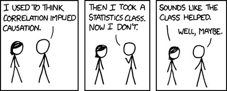
Figure 19.9: Insisting that “correlation is not causation” can interfere with making useful judgements, as interpreted by Randall Munroe in his XKCD cartoon series.
The optimists, again to oversimplify, believe it is possible to make useful statements (e.g. “the class helped” in Figure 19.9) about the causal connections that underlie data. They emphasize that statistics can support decision making even when knowledge of causation is incomplete and uncertain.
The optimists and the pessimists use the same set of mathematical and statistical tools for data analysis, particularly the calculation of effect sizes. The difference between them is the range of legitimate conclusions that can be drawn. The pessimists place in the center the idea that “correlation is not causation” and that only controlled experiment can be a justification for making causal conclusions. The optimists also see the difference between correlation and causation: correlation is a mathematical property, causation is a physical one. And the optimists accept that controlled experiment is an excellent way to form strong conclusions. But they accept other sources of knowledge or theoretical speculations as potentially useful, and use effect-size calculations in a way that, contingent on that knowledge or speculation, creates through the process of data analysis situations analogous to those created in the laboratory by careful experimentation.