Chapter 1 Statistics and variability
Variability is an ever-present feature of our world. From one person to another, for instance, you see differences in each of many characteristics: earnings, height, sex, athletic endurance, susceptibility to illness, age, level of education, household size, coverage by health insurance, diet, and on and on. For any one individual, we can easily record each such characteristic.
Sometimes it is important to look not just at a single individual but a group of individuals. Taking the characteristics one at a time, say earnings to start, we will see variability from one person to another. One common task in basic statistics is to summarize the overall pattern of the characteristic. For example, the mean earnings is one such summary. The median earnings is another. Still other summaries tell us about the amount of variability. For instance, we might summarize the variability by the interval from lowest to highest earnings. Another traditional summary of the amount of variation is the dreadfully named standard deviation.
We often encounter summaries without recognizing what they are. For instance,the news magazine The Economist had an article in April 2018 entitled “How to cut the murder rate.” The article reported a summary of the situation in 2016, that there were 560,000 violent deaths around the world. Such summaries are often called “statistics.”
The 560,000 murders-per-year statistic surprisingly tells us nothing at all about how to cut the murder rate, what are the causes of high and low murder rates. For that, instead of refering to a summary we need to examine the variability itself. For example, we might look at the variation from country to country of the number of murders per year, as in Table 1.1.
| murders |
|---|
| 2596 |
| 253 |
| 63 |
| 235 |
| 8 |
| 1007 |
| 164 |
| 73 |
| 57250 |
| 235 |
| … and so on for 289 rows altogether. |
The variation from country-to-country in the number of murders is huge. Just by scanning the 10 values displayed, you can see the range is at least 8 to 57,250. The high end of the range is 7000-times larger than the low end.1
It’s natural when looking at data like Table 1.1 to try to account for the variation, to explain why some values are so large and others so small. For data to give us any traction in accounting for variation, we need more data – not necessarily more countries but more information about each country. Table 1.2 identifies the countries by name.
| country | murders |
|---|---|
| Argentina | 2596 |
| Australia | 253 |
| Austria | 63 |
| Azerbaijan | 235 |
| Bahrain | 8 |
| Belarus | 1007 |
| Belgium | 164 |
| Bosnia and Herzegovina | 73 |
| Brazil | 57250 |
| Bulgaria | 235 |
| … and so on for 289 rows altogether. |
If you are familiar with the various countries, you may start to form hypotheses about the variation. For instance, Brazil is very large in both area and population, while Bahrain is small. There are many other possible explanations. The Economist article listed a few: “fragile government; guns and fighters left over from wars; families broken up and forced into the city by rural violence and poverty; drugs and organised crime that police cannot or will not confront; and large numbers of unemployed young men.” These explanations are not mutually exclusive. Each factor might contribute in its own way.
An important statistical task in data science is untangling the various influences so that they can be examined individually. For this, we need to know additional characteristics of each country, for instance population, land area, and so on. These additional characteristics with which we seek to explain the country-by-country variation in the number of murders are called explanatory variables. The characteristic that we are trying to explain, in this example the annual number of murders, is called the response variable. The word “variable” refers to the characteristic showing variability. Unlike mathematical algebra, where a variable means an “unknown” (e.g. x) whose value is to be found, in statistics, a variable is a characteristic to be measured and stored as data.
Table 1.3 shows the number of murders in each country along with the country’s population and surface area (in square km). As would be expected, both the population and surface area vary from country to country. In accounting for the variation in murders, we want to look at the covariation of the response variable (murders) and the explanatory variables (here, population and surface area).
| country | murders | population | surface_area |
|---|---|---|---|
| Argentina | 2596 | 38728778 | 2780400 |
| Australia | 253 | 19985475 | 7741220 |
| Austria | 63 | 8196624 | 83870 |
| Azerbaijan | 235 | 8466304 | 86600 |
| Bahrain | 8 | 807989 | 730 |
| Belarus | 1007 | 9695791 | 207600 |
| Belgium | 164 | 10492643 | 30530 |
| Bosnia and Herzegovina | 73 | 3825872 | 51210 |
| Brazil | 57250 | 186116363 | 8514880 |
| Bulgaria | 235 | 7742740 | 111000 |
| … and so on for 289 rows altogether. |
Later chapters will introduce many techniques for looking at covariation between response and explanatory variables. Here, we’ll look at two simple methods.
First, we’ll adjust the number of murders for the population size. Here, the adjustment is as simple as dividing the number of murders by the population, to get the “murder rate” per person. This number will be very small – thankfully only a very small fraction of the population is murdered! So, as a matter of convention, we’ll report the murder rate as the number of murders per 100,000 population.
| country | murders | population | surface_area | murder_rate |
|---|---|---|---|---|
| Argentina | 2596 | 38728778 | 2780400 | 6.70 |
| Australia | 253 | 19985475 | 7741220 | 1.27 |
| Austria | 63 | 8196624 | 83870 | 0.77 |
| Azerbaijan | 235 | 8466304 | 86600 | 2.78 |
| Bahrain | 8 | 807989 | 730 | 0.99 |
| Belarus | 1007 | 9695791 | 207600 | 10.39 |
| Belgium | 164 | 10492643 | 30530 | 1.56 |
| Bosnia and Herzegovina | 73 | 3825872 | 51210 | 1.91 |
| Brazil | 57250 | 186116363 | 8514880 | 30.76 |
| Bulgaria | 235 | 7742740 | 111000 | 3.04 |
| … and so on for 289 rows altogether. |
Clearly the murder rate also varies from country to country. And while it’s common sense that the number of murders depends in some sense on the population size, it’s helpful to have a way to quantify the extent to which population does (or does not) explain the number of murders. One way to do this is to look at the variation in the murder rate. Among countries with a population of at least a million, the lowest murder rate in 2004 is 0.2 per 100,000 people (Cyprus) and the highest rate is 85.7 per 100,000 people (Colombia). Thus, the highest rate is more than 400 times bigger than the smallest rate. This also is a huge amount of variation, but its much less variation than shown by the murder count, where the high rate was more than than 7000 times as large as the small rate. The reduction in variation with population adjustment is a statistical sign that population does indeed account for at least some of the variation in the number of murders. (If population accounted for all of the variation, the murder rate would be the same in all countries. It’s obviously not.)
Consider another technique for examining the covariation of a response and explanatory variable. In this example, we’ll look at whether a surface area helps to account for the variation in murder rate. One of the panels in Figure 1.1 shows the murder rate graphed against surface area. Each country is one dot in the graph.
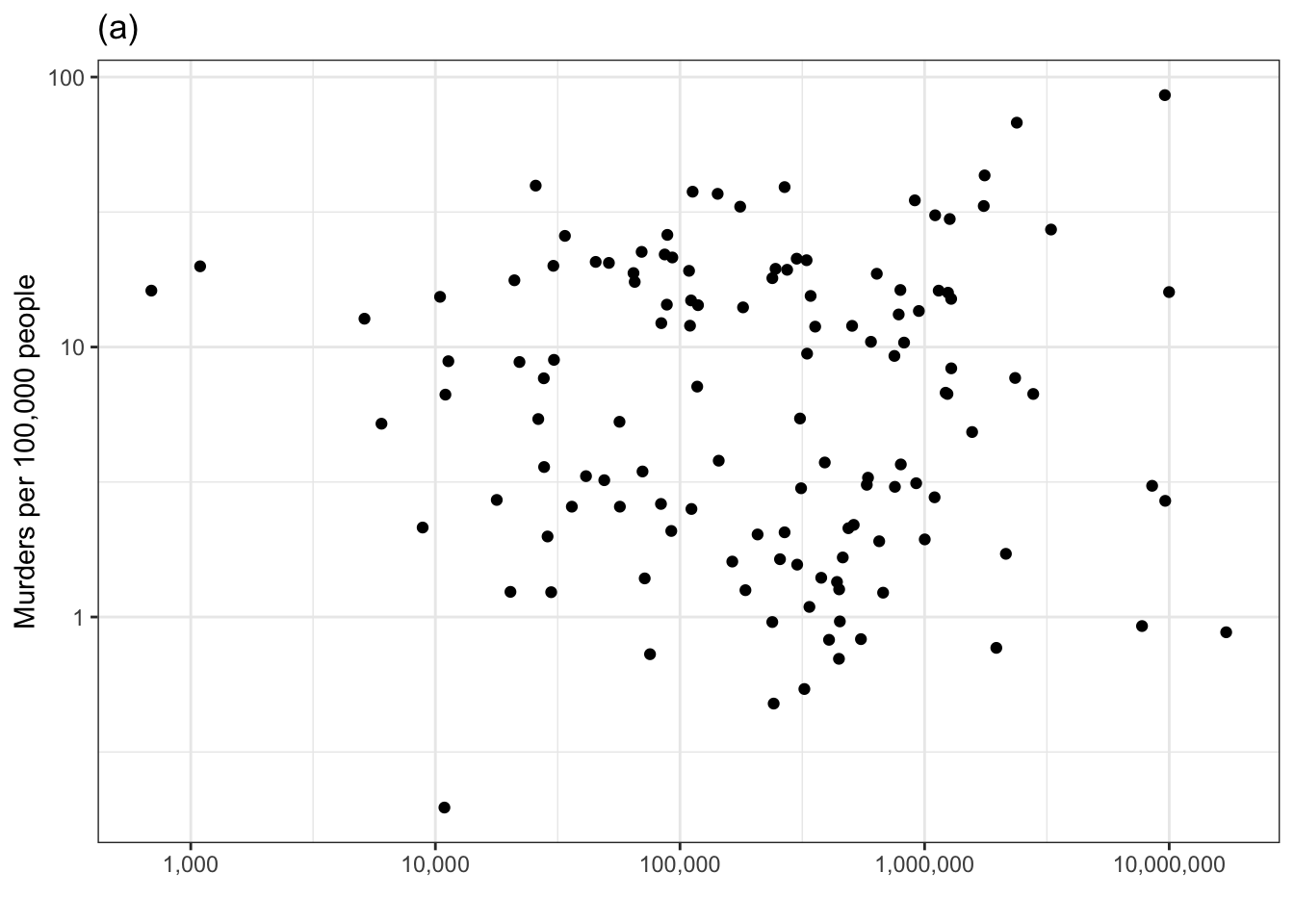
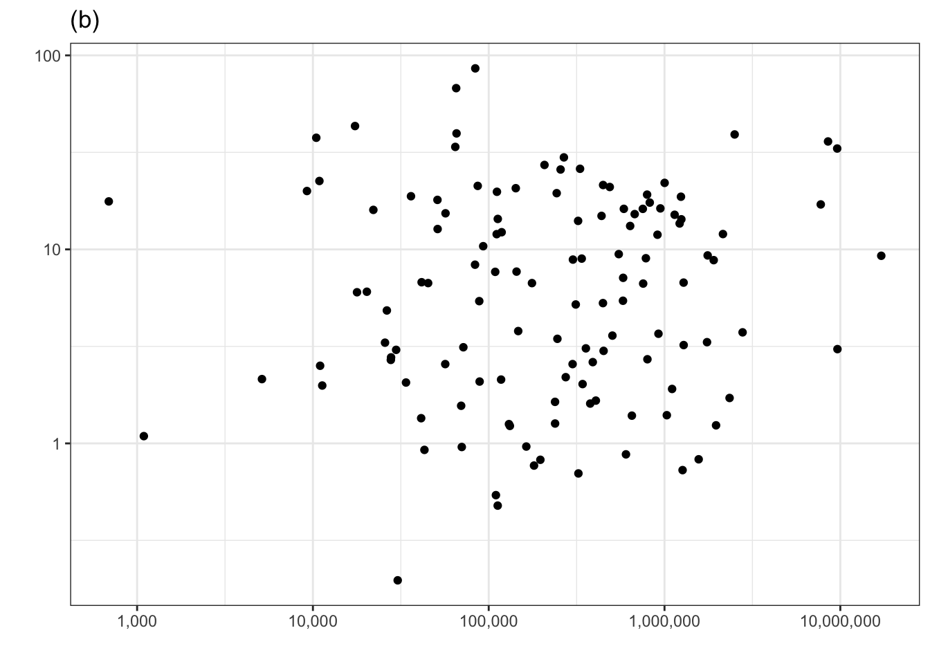
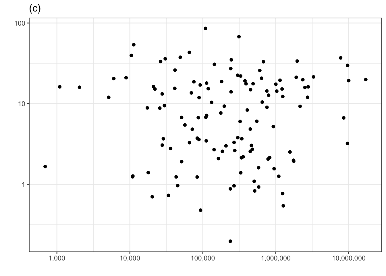
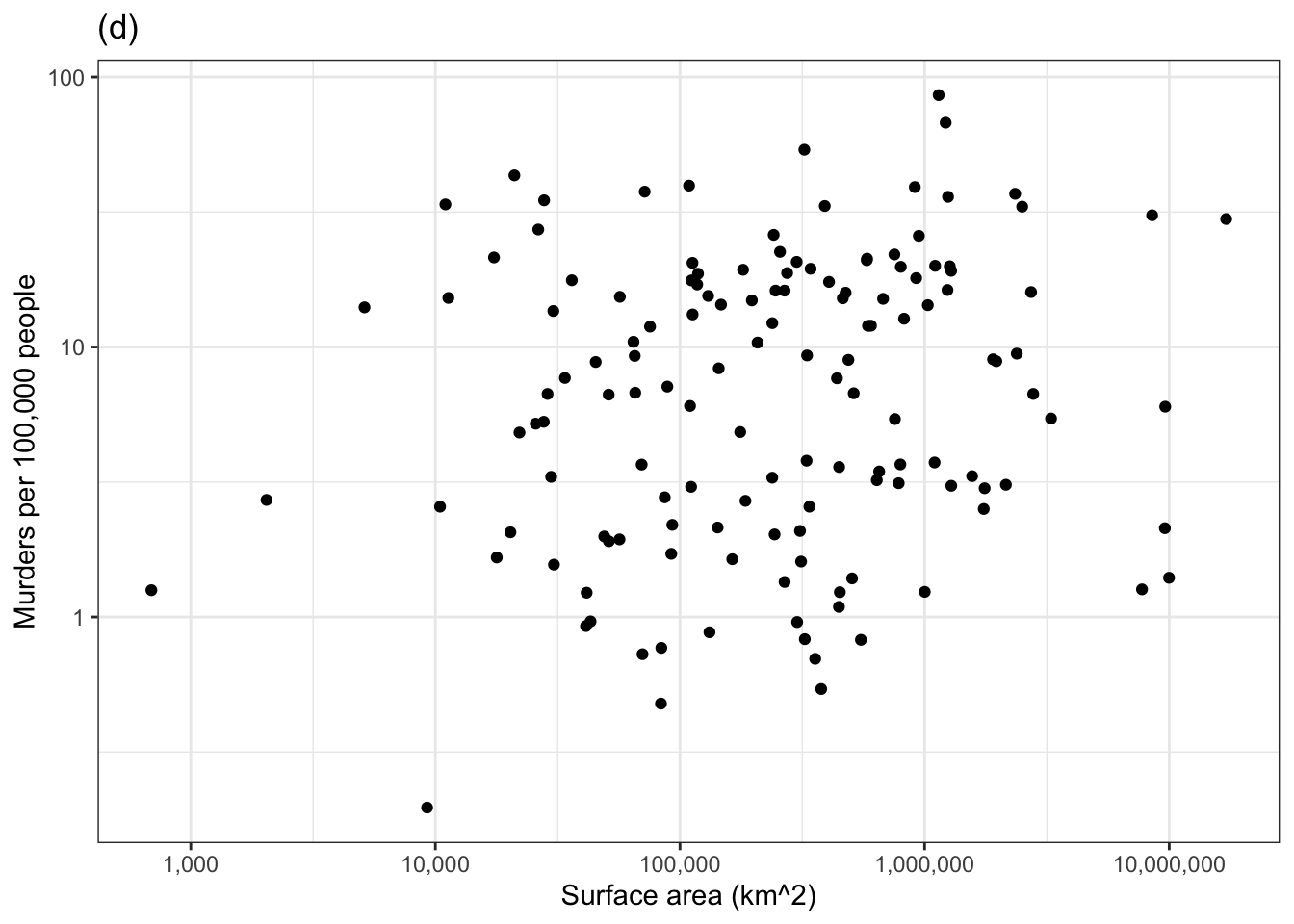
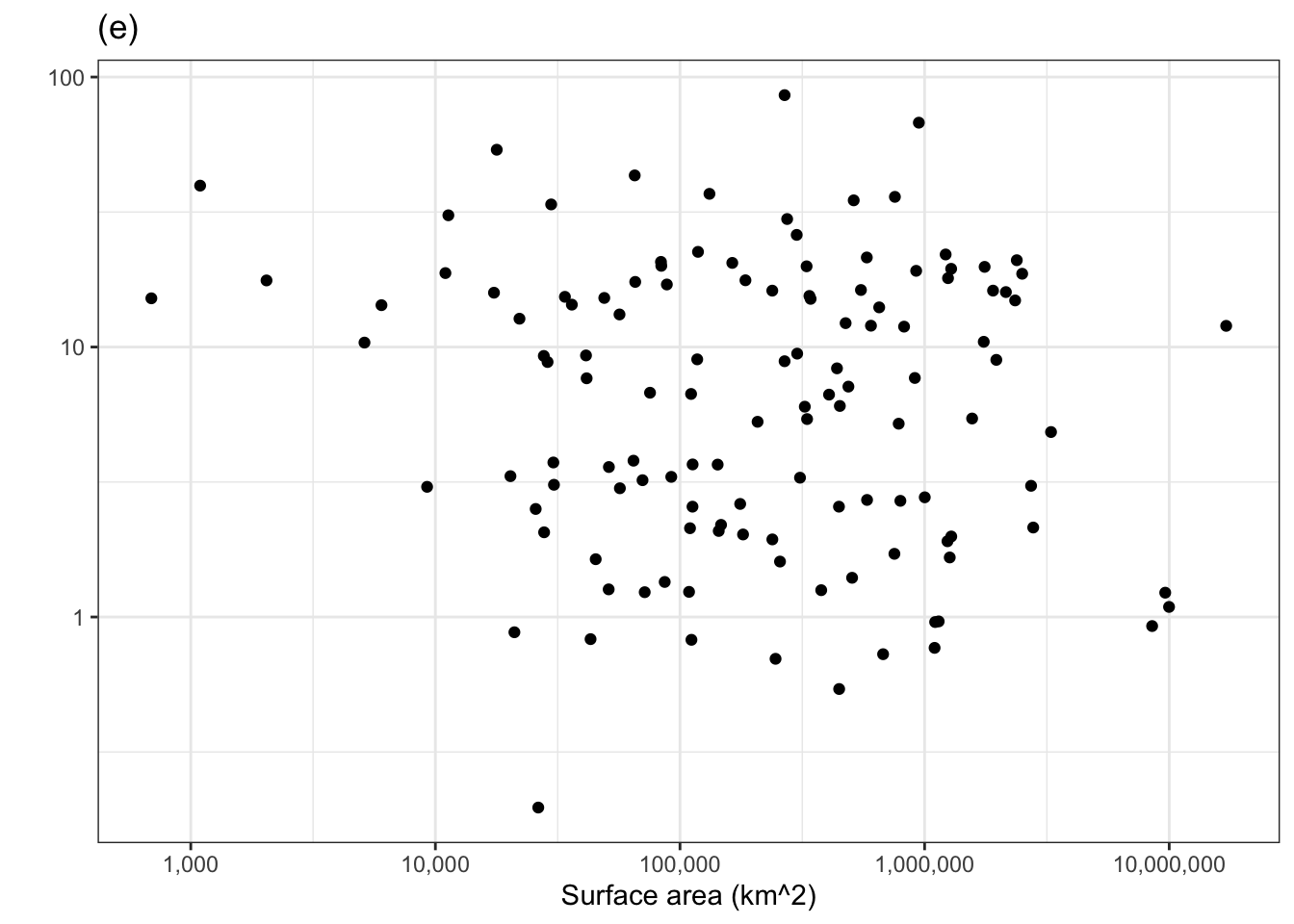
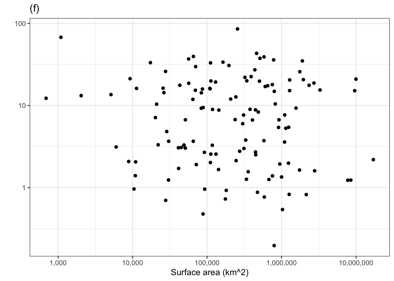
Figure 1.1: Murder rate versus country surface area. One of the panels shows the actual data. The others show shuffled data with no systematic covariation between murder rate and surface area. Can you pick the actual data out of the line-up?
The other five panels in Figure 1.1 show the same data, but makes use of a statistical technique called permutation. In permutation, the data are shuffled in a specific way: the response variable is shuffled and the explanatory variables are not. This shuffling breaks any possible relationship between the response and explanatory variables. To use Figure 1.1 to examine covariation, look for a pattern in the cloud of dots in each panel. Five of the panels, showing shuffled data, have no obvious pattern.
If there is significant covariation in the actual data, the panel showing the actual data will show a clear pattern and you will be able to pick that panel out from the other five. Can you? If you can’t, that’s a sign the covariation in the actual data is not any larger than created by the luck of the draw in the shuffled data. (Curious which is the actual data? It’s the panel on the lower left.)
Let’s look again at the relationship between number of murders and population that we examined earlier using the technique of adjustment. Now we’ll plot number of murders vs population and judge whether there is covariation in the actual data by whether we can pull the corresponding panel out of the line-up in 1.2.
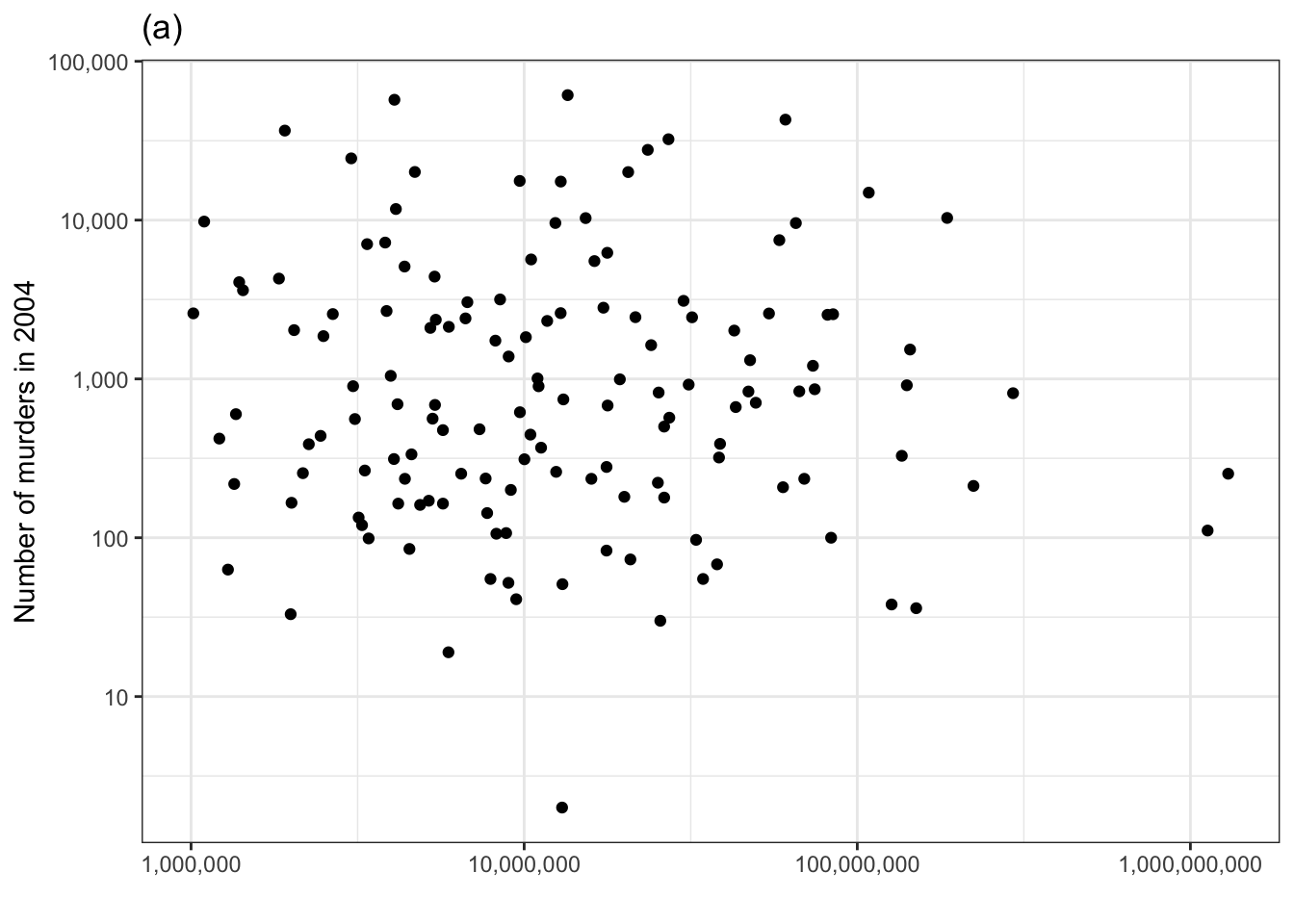
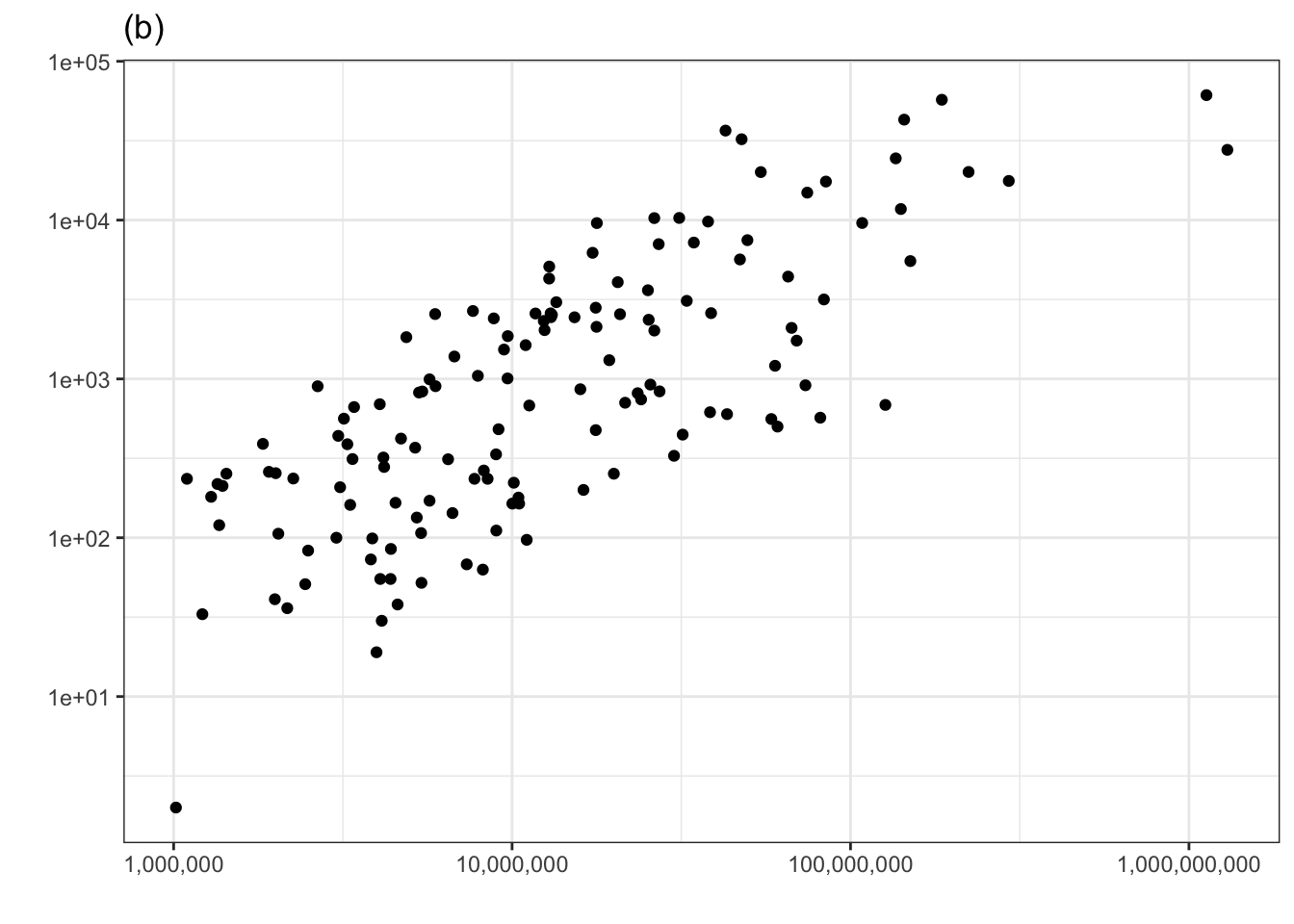
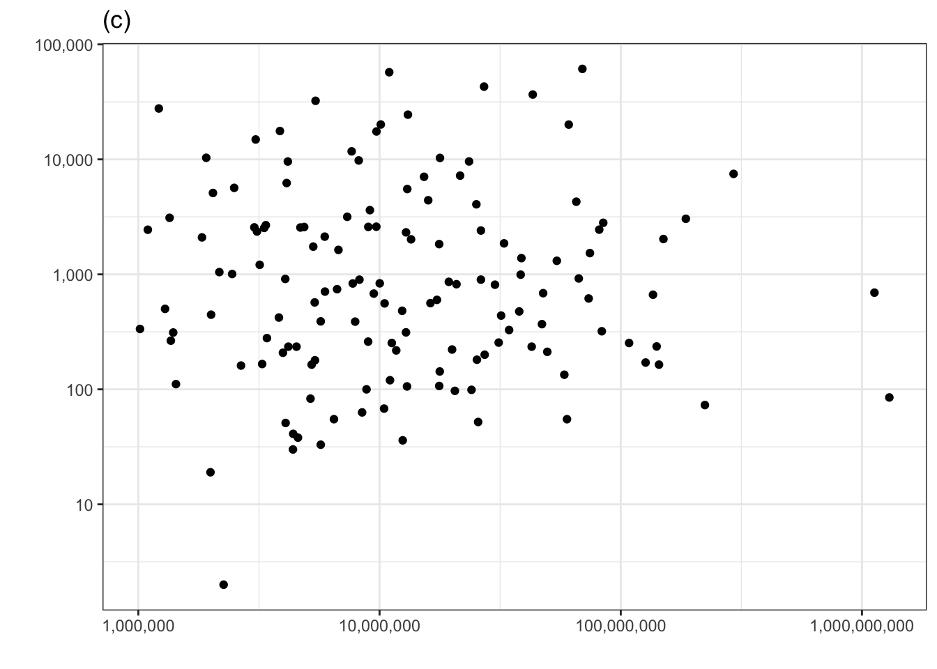
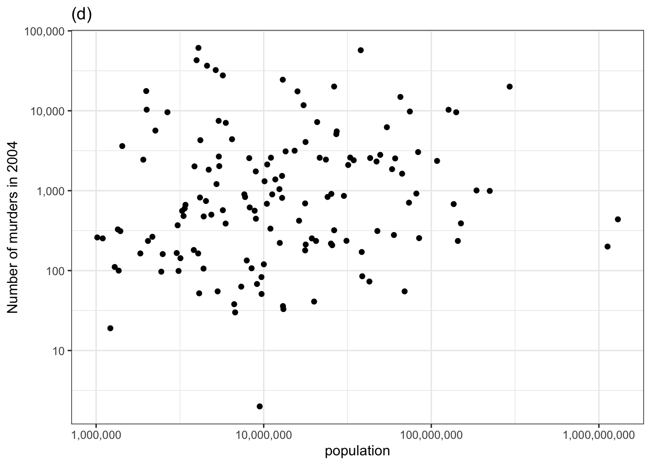
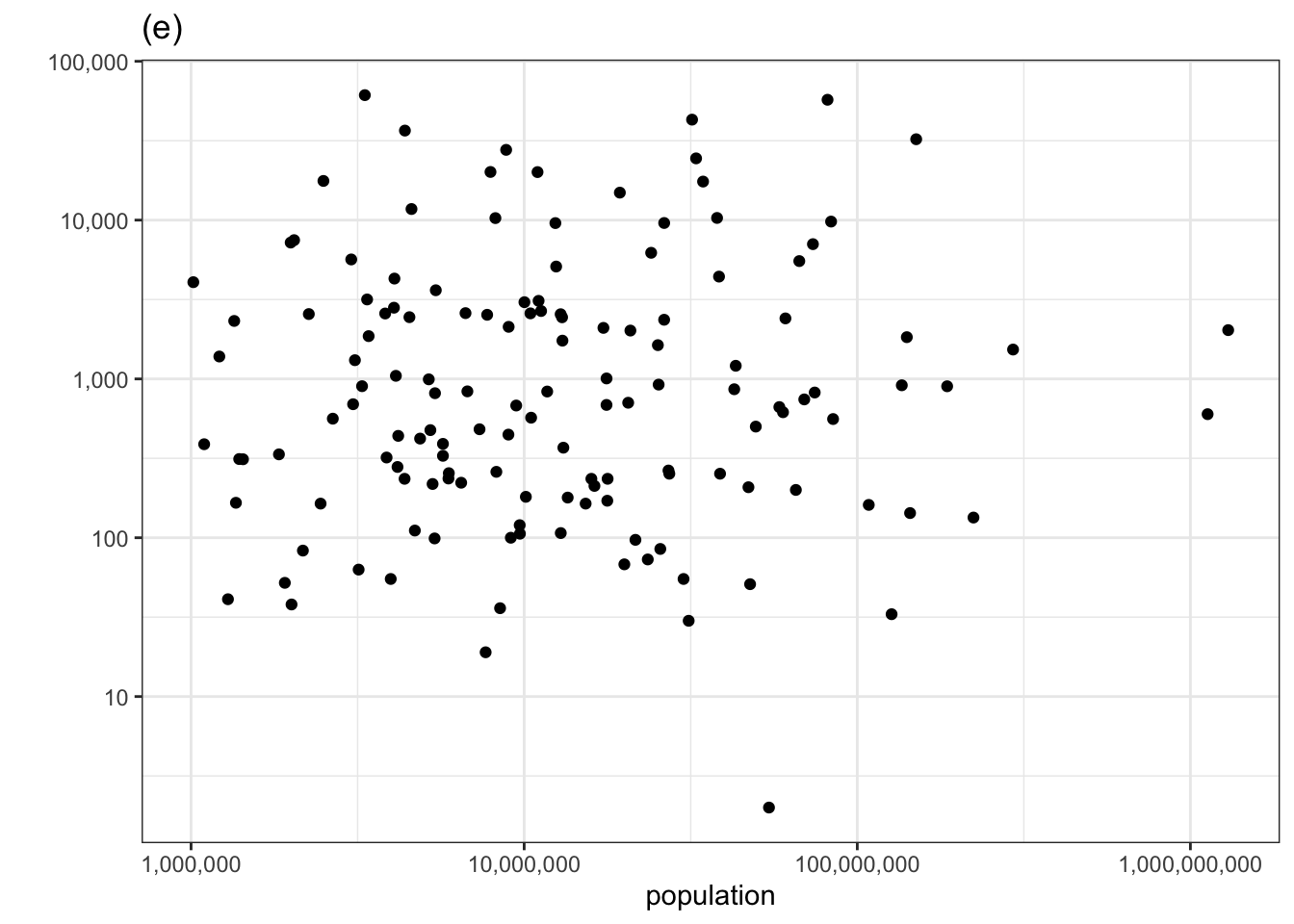
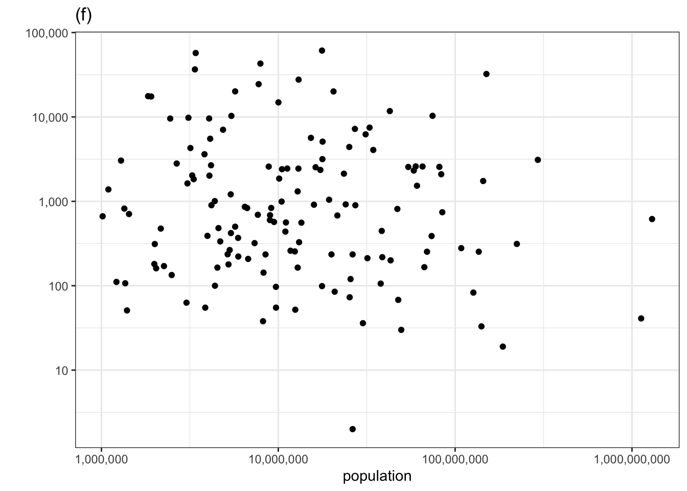
Figure 1.2: Checking for covariation in the number of murders versus population using the permutation method.
The actual data is in the top row, center panel. If you could spot this easily, then you have identified covariation between the number of murders and the population size.