Chapter 4 Summary and prediction
As we’ve seen, a data frame is a collection of variables. This chapter puts the focus on variables individually, ignoring for the moment their relationship with other variables in the frame.
We call them “variables” because the values vary from row to row. With graphics, we can visualize the full range of possible values and, at the same time, show which values are more common than others. The relevant graphical techniques include jittered point plots and density violins, as shown in Figure 4.1.
Figure 4.1: Two versions of systolic blood pressure in the National Health and Nutrition Evaluation Survey data. Left: blood pressure as a quantitative variable. Right: blood pressure divided into three clinical categories.
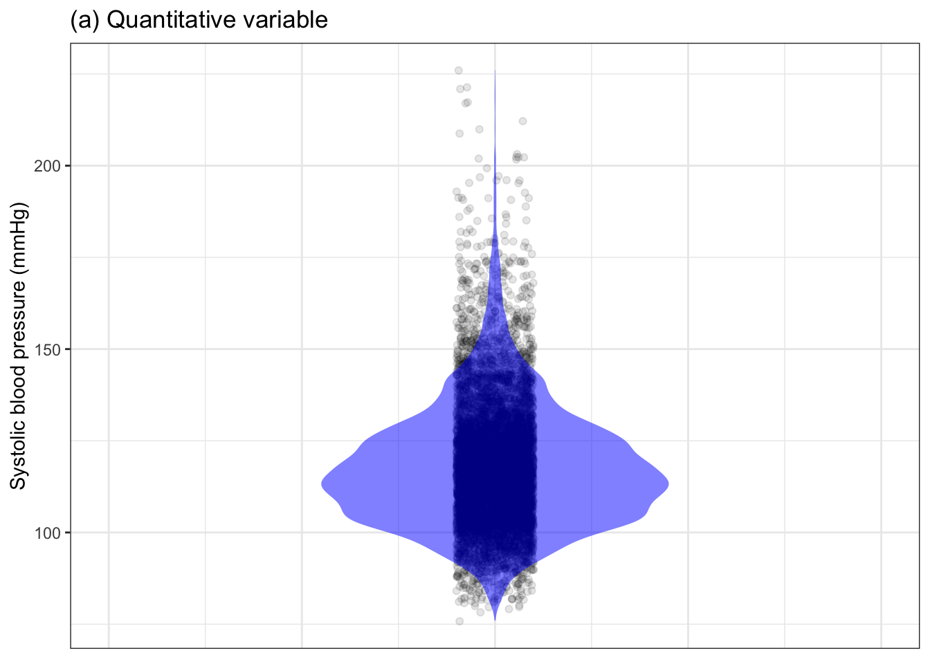
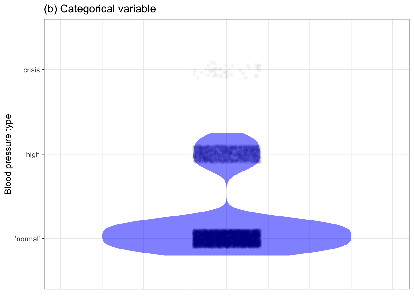
Note that we can, in principle, use the same graphics styles to represent either a quantitative variable or a categorical variable. Yet the display in Figure 4.1(b) is not satisfactory; it takes up a lot of space and doesn’t convey any more information than the simple summary, for example the table of percentages in Table 4.1.
Table 4.1: The proportion of people (in the National Health and Nutrition Evaluation Survey data) with normal, high (> 130 mmHg), and dangerously high (> 180 mmHg) blood pressure.
| ‘normal’ | high | crisis |
|---|---|---|
| 79.1% | 20.4% | 0.5% |
The point of this chapter is to introduce some styles for summarizing a quantitative variables and a different style for categorical variables.
4.1 Concise, but not too concise
The merit of a summary is that it presents information in a way that’s easily assimilated by a person. The demerit is that some summaries leave out important detail. In selecting a style of summary, you can take conciseness too far.
Generations of statistics students have been taught to summarize a quantitative variable with the mean (or its close cousin, the median). For the systolic blood pressure data in Figure 4.1, that’s 118 mmHg. This summary has too little detail for the kinds of purposes for which blood-pressure data is relevant. To judge from the mean, the “average person” has normal blood pressure.
Similarly, sometimes categorical variables are summarized by the mode, the level that is more common than the other levels. Again, for blood pressure, this is the level “normal.”
It may be comforting to hear that the imaginary “average person” has normal blood pressure, but for any real purpose we need more detail. For a categorical variable, the listing of proportions for each level is concise and tells you everything there is to know from that variable (when taken in isolation). That’s a good style for summarizing a categorical variable. Problem solved.
For quantitative variables, we have more work to do. One way to summarize a quantitative variable is to do what works for categorical variables: give a proportion for each possible level. This is the role of the violin plot: the width of the violin gives the proportion of each possible value relative to the other possible values.
Still, there is a lot of detail in the violin plot that may not be needed and may be distracting. Sometimes people summarize the shape of distributions like those displayed in violin plots. For instance, the long-tailed stingray shape of the violin in Figure 4.1 is described as “skew.” Other words to summarize distributions are “symmetrical,” and “bimodal” (which refers to the distribution having two distinct peaks). Whether this reduction to a handful of words is more telling than simply displaying the distribution is questionable, but it does come in handy when a display is not possible, as in a conversation.
Another choice for summarizing quantitative variables is to pick discrete levels and report that fraction of rows that have values less than each of those levels. Consider, for instance, describing the interval between busses at a bus stop. On a route that runs frequently, the bus might come in 6 minutes, or a second later, or the second after that, and so on. To avoid this endless detail, prediction probabilities for quantitative variables are often stated in a less-than or cumulative format, as in Table 4.2.
Table 4.2: A probability prediction of when the next bus will come. Each assigned probability covers a range of outcomes.
| when | probability |
|---|---|
| 3 min or less | 0.02 |
| 4 min or less | 0.08 |
| 5 min or less | 0.21 |
| 6 min or less | 0.48 |
| 7 min or less | 0.63 |
| 8 min or less | 0.79 |
| 9 min or less | 0.91 |
| 10 min or less | 0.97 |
| eventually | 1.00 |
In Table 4.2 the probabilities do not add up to one. Instead, the certainty that the bus will come sometime is reflected in the probability of “eventually” being 1. Note that the probabilities in Table 4.2 do not decrease from one row to another. That’s because, for instance, the probability of the bus coming in less than five minutes encompasses the possibility that the bus will come in less than four minutes.
Another, somewhat more concise convention for summarizing quantitative variables draws on the distinction between common and rare outcomes. In such a summary, one specifies an interval – a range of values – which encompasses 95% of the rows in the data. For the times between busses, the 95% summary interval is about 3 to 10 minutes. For systolic blood pressure, the 95% summary interval is 91 to 159 mmHg.
The usual statistical practice is to define a summary interval to cover a range that’s highly likely to contain the any randomly picked value of the variable. Convention dictates 95% as the precise meaning of “highly likely.” For instance, the 95% prediction interval for the bus is that it will arrive in between 3 and 10 minutes.
Calculating an interval for simple prediction is straightforward. For a 95% interval, find the two numbers, low and high, such that about 2.5% of values of the response variable are lower than the low value and another 2.5% of values are higher than the high value. In Table 4.2, that low value is approximately 3 minutes. The high value is 10 minutes. That’s why the 95% summary interval is 3 to 10 minutes.
Intervals are commonly written in two ways: a bottom-to-top format or a plus-or-minus format. For instance, the summary interval for times between busses might be written 6.5 ± 3.5 minutes. Whether the plus-or-minus format or the bottom-to-top format most effectively communicates with the human making use of the information depends on the situation (and perhaps who that human is). Still, the two formats are mathematically equivalent.
Note that the choice of 95%, while conventional, is not the only possibility. Section 4.5 describes a situation where a sensible summary interval was at 80% instead of 95%.
There’s always a trade-off between the ease of assimilation of a concise summary and the detail needed to make informed decisions. But it’s much better to give at least two numbers describing the range of likely outcomes. For instance, being that the mean time between bus arrivals is 6 minutes is a very weak basis for making decisions. How much time should you allocate to make sure that you’ll get to work on time? The 10-minute upper bound of a 95% interval is much more helpful to know than the 6-minute mean. Even if you are making a long-term choice between, say, the bus with a mean inter-arrival time of 6 minutes and a train, with a subway with a mean inter-arrival time of 3 minutes, you will want to be sure that the subway is at least as reliable as the bus. The 95% summary interval is informative here.
4.2 Example: Nice weather
The average outdoor temperature in my home town is about 47°F.
Suppose the purpose at hand is to pick a suitable wardrobe. 47° suggests a light jacket and perhaps a sweater. Gloves and cap optional.
Such clothing would hardly prepare you to live in my city of St. Paul, Minnesota in the northern US. The temperature ranges from -30° to 105°. The mean annual temperature doesn’t convey the information needed for making sensible choices. On the other hand, the complete temperature range is misleading. The arctic weather of -30° is rare, happening about once a decade.
Weather records are often shown in more detail by giving a month-to-month breakdown, as in Figure 4.2. (Dividing up data in this way is called stratification, and is the subject of the next chapter.)
Figure 4.2 contains three graphs giving different amounts of detail about the outdoor temperature. Consider these two questions one might seek to answer with weather data.
- When can I plant my vegetable garden? I need to avoid frost.
- Is there any hope that an October or November day will be as warm as a summer day?
Figure 4.2: Monthly outdoor temperatures in St. Paul, Minnesota. (a) shows the mean temperature. (b) shows both the mean high and low temperatures. (c) gives 95% summary intervals on the high and low. The horizontal line indicates the temperature of freezing.
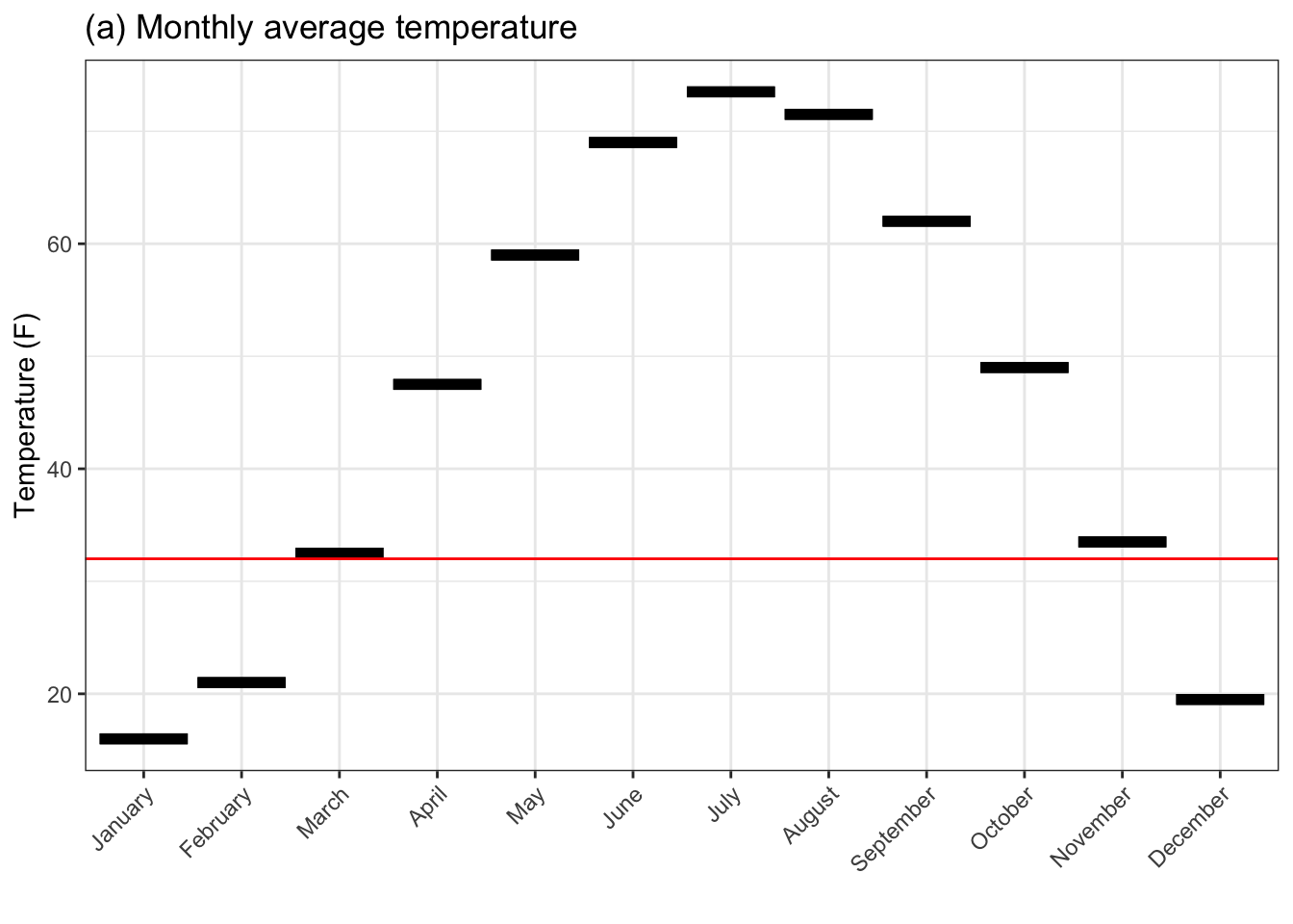
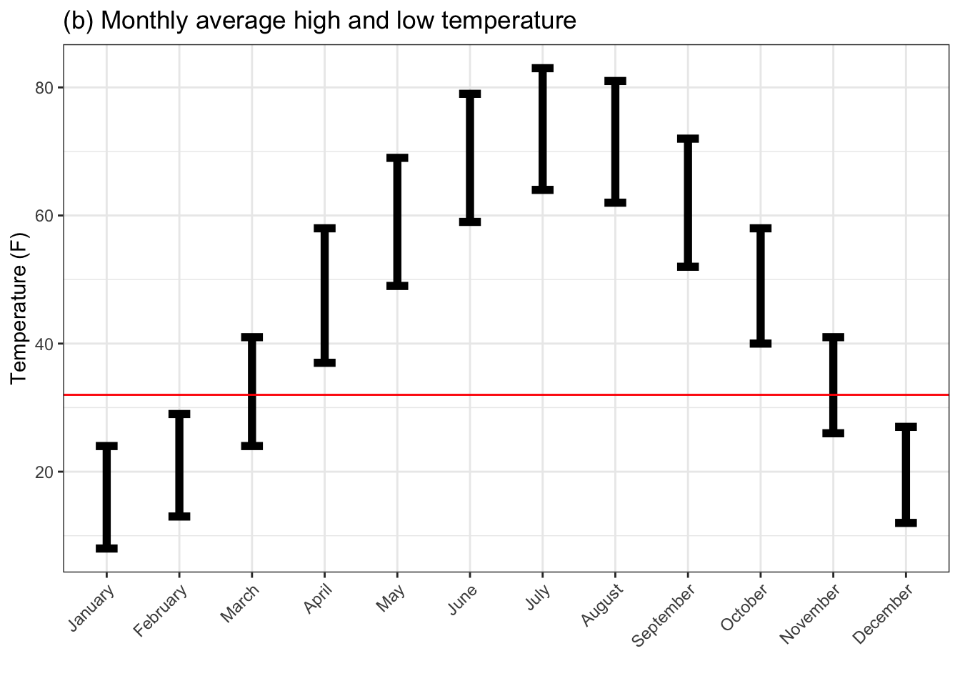
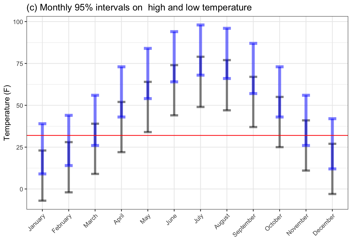
Figure (a), showing the average temperatures, suggests that March and November are pretty close to freezing, so plant in April and expect to harvest by October. October is 20° colder than summer temperatures. (Even September is substantially cooler than summer.)
Figure (b) shows the average high and low temperatures which seems to be the format favored by web sites. April and October temperatures are above freezing, so good for gardening. As regards summer in October, the daytime October temperature is below the summer nighttime temperature, so you won’t see summer in October.
Figure (c) gives a 95% range for daily high and low temperatures. The conclusions drawn from it differ than those suggested by (a) and (b). Even May and September get close to frosty. And an October day may well reach the level of the summer months.
Summary intervals give a much better basis for making realistic choices. Means fail to display the variability that is a ubiquitous feature of our world.
4.3 Example: Mean stereotypes
Many of our beliefs about the world are shaped by means and a mistaken belief that a “typical” value is representative. Are men taller than women? In the US, the mean adult male height is 180cm (5 ft 9) while the mean female height is 162cm (5 ft 4). Summaries like this sometimes get translated into phrases like “the average woman is 5 ft 4.” Of course there’s no such thing as the average woman or the average man; women differ from one another and men differ from one another. And many women are taller than many men.
Stereotypes fallaciously condense diversity into typecast labels and force people into pigeonholes that are too tight to contain them. Consider this stereotype: boys are better at math than girls. Such beliefs are reinforced by data, but only if you hide the actual distributions. For instance, the headline “2016 SAT test results confirm pattern that’s persisted for 50 years — high school boys are better at math than girls” source is followed by a graphic showing in detail how math scores for men have stayed higher than those for women over the last fifty years. In 2016 the mean score was 527 for males and 496 for females. (I won’t reproduce the graphic here since to avoid a careless reader concluding that such a presentation of means is a good practice. Nonetheless, it is unfortunately a common practice.)
I was able to track down a rough description of the distribution of SAT math scores by sex. source It would be easy for the relevant organization to publish a complete list of test scores, person-by-person, while maintaining the confidentiality of the test-taker. Perhaps the reason they don’t is that surprisingly few people are inclined to look at distributions rather than means. (I’m hoping you, dear reader, will turn out differently!)
Figure 4.3 shows what the person-by-person SAT math score data would look like if it had been published.
Figure 4.3: The distribution of scores on the SAT mathematics test, reconstructed from summary data published by the College Board.
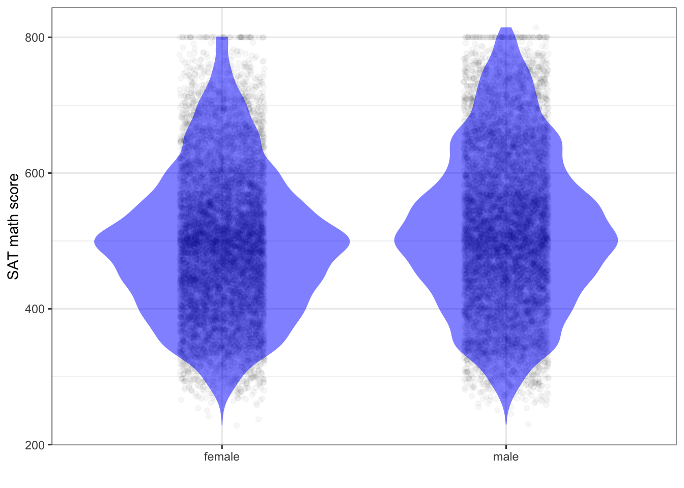
The differences between the distributions for males and females are small. The first sentence of any accurate summary of Figure 4.3 is that males and females are basically the same.
4.4 Presenting predictions
We’re understandably informal about predictions in everyday life. Such informal predictions usually take the form of a best guess of the most likely outcome, which often is misinterpreted as a statement of fact. For instance:
- “The economy will grow by 1.2% this year.”
- “The next train will come in 6 minutes.”
- “Germany will win the World Cup.”
Recognize that each of these sentences report the prediction as a single number or a single level of a categorical variable (“Germany”). Just as we should use an interval to summarize a variable, quantitative predictions should be framed not as single numbers but as intervals. So say that the train is expected to come in 3 to 10 minutes, or that the economy is likely to grow by 0.7 to 1.6%.
As for predictions of categorical variables, like the winner of the World Cup, use the same format as for summarizing a variable: a list of probabilities for each possible level of the variable. For the World Cup, this would look like Table 4.3.
Table 4.3: A prediction of the World Cup winner in the form of probabilities for each possible outcome. Apologies to those fans whose team is being lumped under “Other.”
| team | probability |
|---|---|
| Argentina | 0.10 |
| Belgium | 0.10 |
| Brazil | 0.10 |
| Chile | 0.02 |
| Croatia | 0.01 |
| England | 0.05 |
| France | 0.05 |
| Germany | 0.20 |
| Poland | 0.07 |
| Portugal | 0.10 |
| Peru | 0.02 |
| Other | 0.15 |
| Wales | 0.03 |
Common sense can tell you how to condense the mathematically ideal probability format into something more easily digested by human decision makers. For instance, you might frame your prediction this way: “Most likely, the World Cup winner will be one of Germany, Portugal, Brazil, Poland, France, or England.” Or, “There’s a 15% chance that some completely unexpected country will win!”5 This almost happened in 2018, when Croatia was the runner up. Which format is best depends on what the prediction is for.
4.5 Example: Communicating with intervals
For several years I was responsible for the data science analysis of admissions and financial aid for the college at which I have worked for more than two decades. One of my duties was to report to the college president, treasurer, housing administrator, etc. how many students would be in the new first-year class. This number is the result of a somewhat random process wherein students admitted to the college decide whether they actually will attend the college.6 I’m not saying that a student’s decision is made at random. But the factors that influence the decision are unknown to the people at the college, so the actual decision is treated mathematically as random.
My job was to build a model to predict class size, so that administrators could judge the consequences of proposed admissions decisions. The admissions office made a decision about an individual applicant and referred to the model to find out the expected class size based on the decisions made so far. As more and more decisions are made, the model output gets closer and closer to the target class size set by the college administration. When things reach a point where the collection of decisions already made leads to the model output hitting the target, the admissions decision-making comes to a stop.
As a statistician, I knew that the uncertainty in the model output ought to be part of the decision-making process. So I calculated prediction intervals at the conventional 95% level and presented them as part of my report. For the sake of specificity, let’s imagine that the target class size was 450 students, and my 95% prediction interval was 400 to 500 students.
How did the decision makers interpret this prediction interval? They understood that the actual outcome would likely differ from the target level of 450 students. What was mystifying to many of the decision makers was that there is a mathematical and statistical process for describing the level of uncertainty, and indeed few had any detailed understanding of what a description of uncertainty means. Many interpreted my prediction and interval as meaning, “We might have 450 students, or we might have 400 or 500.” These three outcomes were seen as more or less equally likely. And so the administrators did the appropriate thing: check whether a class of size 400 or of 500 would work for the college. Would there be enough tuition revenue to run the college? Would there be space in the dormitories and classes for the students.
The answer was “no.” At 400 students, the shortfall in revenue would necessitate laying off some faculty and staff and taking other undesirable economy measures. At 500 students, not enough dorm rooms would be available. As such, the situation was unacceptable and something needed to be done to make sure that neither the 400- or the 500-student outcome occurred. But what should that be?
Having considerable experience with prediction intervals, I understood that while the 400- or 500-student outcomes were possible, they were not very likely. According to the mathematics of prediction intervals, there is only a 2.5% chance that the class size would be 500 or larger, and a similar 2.5% chance that the class size would be 400 or smaller.
A 2.5% chance corresponds to 1-in-40. It turns out that the administrators were not excessively concerned with an event that might happen one out of 40 years. They worry about things that might happen twice within, say, a five-year period. Rare events, the one-year-in-40 occurance, are treated as “accidents.” They fall outside the range of normal planning. There are special mechanisms to deal with rare events. Similarly, the rare budget underflow can be handled by special means, for example, drawing from the college’s saving investments. (The people who oversee the college, the board of trustees, would not accept a normal planning process that anticipates such a draw from savings. But they also know that accidents happen, for example a crash in the stock market.)
In order to make a report useful for the decision makers, I needed to understand what the decision makers thought was the meaning of “rare” events, something that can be addressed by special measures rather than anticipated in the normal budgeting process. The decision makers were comfortable with rare meaning one in ten, a 10% chance. This led me to reformulate the model prediction interval as an 80% interval, rather than a 95% interval. The mathematics of these things means that while the 95% interval was 400 to 500, the 80% interval was much narrower, 418 to 482. It turned out that both ends of this interval were within the range that the administrators could deal with through normal sorts of arrangements.
I’m not suggesting that you should use 80% intervals, just that when communicating with decision makers you consider how their interpretation of intervals may differ from that of a professional statistician. One kind of statement that might help is not to report a single interval at 95% but to say, “There’s a roughly one-in-ten chance that the class will be smaller than 418, and one-in-forty that it will be smaller than 400.”
When the use of your prediction by a decision maker would be better served by an interval other than 95%, you risk confusing people who are expecting a 95% interval. To avoid this risk, some suggestions:
- Always report the 95% interval.
- If, in addition, you report the interval for another level, clearly label that interval, e.g. 156 - 182 at 80%.
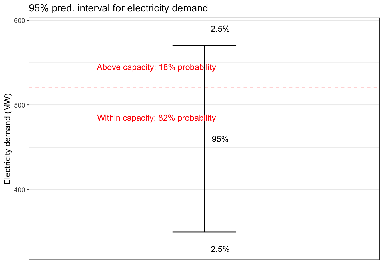
- Often, in terms of the decision being made, there is a range of acceptable outcomes and of unacceptable outcomes. For instance, if a prediction is being made of demand for electrical energy, a demand higher than the capacity of the generator systems is unacceptable. So indicate the probability, which can be calculated from your predictive model, that this capacity will be exceeded, as in Figure 4.4.
Figure 4.4: A possible graphical format for displaying a prediction interval with annotations to indicate the probability of acceptable and unacceptable outcomes.
4.6 For exercises??
4.7 Tabulation
Data from John Snow, On the mode of communication of cholera First edition, p. 24
1849 outbreak with data on water supply and value of room, On the mode of communication of cholera Second edition, pp. 62-3