
25 Confounding
“Economic’s reputation for dismality is a bad rap. Economics is as exciting as any science can be: the world is our lab, and the many diverse people in it are our subjects. The excitement in our work comes from the opportunity to learn about cause and effect in human affairs.”—Joshua Angrist and Jorn-Steffen Pischke (2015), Mastering Metrics: The path from cause to effect
Many people are concerned that the chemicals used by lawn-greening companies are a source of cancer or other illnesses. Imagine designing a study that could confirm or refute this concern. The study would sample households, some with a history of using lawn-greening chemicals and others who have never used them. The question for the study designers: What variables to record?
An obvious answer: record both chemical use and a measure of health outcome, say whether anyone in that household has developed cancer in the last five years. For simplicity in the presentation, we will suppose that the two possible levels of grass treatment are “organic” or “chemicals.” As for illness, the levels will be “cancer” or “not.”
Here are two simple DAG theories:
\[\text{illness} \leftarrow \text{grass treatment}\ \ \ \ \text{ or }\ \ \ \ \ \text{illness} \rightarrow \text{grass treatment}\]
The DAG on the left expresses the belief among people who think chemical grass treatment might cause cancer. But belief is not necessarily reality, so we should consider alternatives. If only two variables exist, the right-hand DAG is the only alternative.
Section 24.3 demonstrated that it is not possible to distinguish between \(Y \leftarrow X\) and \(X \rightarrow Y\) purely by modeling data. Here, however, we are constructing theories. We can use the theory to guide how the data is collected. For example, one way to avoid the possibility of \(\text{illness} \rightarrow \text{grass treatment}\) is to include only households where cancer (if any) started after the grass treatment. Note that we are not ignoring the right-hand DAG; we are using the study design to disqualify it.
The statistical thinker knows that covariates are important. But which covariates? Appropriate selection of covariates requires knowing a lot about the “domain,” that is, how things connect in the real world. Such knowledge helps in thinking about the bigger picture and, in particular, possible covariates that connect plausibly to the response variable and the primary explanatory variable, grass treatment.
For now, suppose that the study designers have not yet become statistical thinkers and have rushed out to gather data on illness and grass treatment. Here are a few rows from the data (which we have simulated for this example):
| grass | illness |
|---|---|
| organic | not |
| chemicals | not |
| chemicals | not |
| chemicals | not |
| organic | not |
| organic | not |
| organic | not |
| organic | not |
| chemicals | cancer |
| organic | not |
Analyzing such data is straightforward. First, check the overall cancer rate:
We are using linear regression where the intercept for
illness ~ 1 equals the proportion of specimens where the illness value is one.# overall cancer rate
Cancer_data |>
mutate(illness = zero_one(illness, one="cancer")) |>
model_train(illness ~ 1, family = "lm") |>
conf_interval()| term | .lwr | .coef | .upr |
|---|---|---|---|
| (Intercept) | 0.01612 | 0.026 | 0.03588 |
In these data, 2.6% of the sampled households had cancer in the last five years. How does the grass treatment affect that rate? First, train a model…
mod <- Cancer_data |>
  mutate(illness = zero_one(illness, one="cancer")) |>
  model_train(illness ~ grass, family = "lm")
mod |> model_eval(skeleton = TRUE)| grass | .lwr | .output | .upr |
|---|---|---|---|
| organic | -0.277035 | 0.0350584 | 0.3471519 |
| chemicals | -0.299753 | 0.0124688 | 0.3246907 |
For households whose lawn treatment is “organic,” the risk of cancer is higher by 2.3 percentage points compared to households that treat their grass with chemicals. We were expecting the reverse, but the data seemingly disagree. On the other hand, there is sampling variability to take into account. Look at the confidence intervals:
mod |> conf_interval()| term | .lwr | .coef | .upr |
|---|---|---|---|
| (Intercept) | -0.0031034 | 0.0124688 | 0.028041 |
| grassorganic | 0.0024692 | 0.0225896 | 0.042710 |
The confidence interval on grassorganic does not include zero, but it comes close. So, might the chemical treatment of grass be protective against cancer? Not willing to accept what their data tell them, the study designers finally do what they should have from the start: think about covariates.
This is not an endorsement of the “keep searching until you find what you expected” research style. We will return to the negative consequences for the reliability of results from adopting this style in Lesson 29.
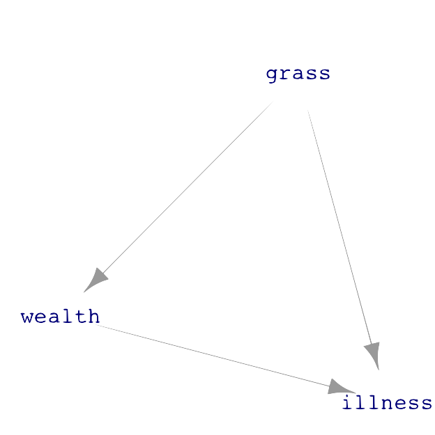
One theory—just a theory—is this: Green grass is not a necessity, so the households who treat their lawn with chemicals tend to have money to spare. Wealthier people also tend to have better health, partly because of better access to health care. Another factor is that wealthier people can live in less polluted neighborhoods and are less likely to work in dangerous conditions, such as exposure to toxic chemicals. Such a link between wealth and illness points to a DAG hypothesis where “wealth” influences how the household’s grass is treated and wealth similarly influences the risk of developing cancer. Like this:
A description of this causality structure is, “The effect of grass treatment on illness is confounded by wealth.” The Oxford Languages dictionary offers two definitions of “confound.”
- Cause surprise or confusion in someone, especially by acting against their expectations.
- Mix up something with something else so that the individual elements become difficult to distinguish.
This second definition carries the statistical meaning of “confound.”
The first definition seems relevant to our story since the protagonist expected that chemical use would be associated with higher cancer rates and was surprised to find otherwise. Nevertheless, the statistical thinker does not throw up her hands when dealing with mixed-up causal factors. Instead, she uses modeling techniques to untangle the influences of various factors.
Using covariates in models is one such technique. Our wised-up study designers go back to collect a covariate representing household wealth. Here is a glimpse at the updated data.
| wealth | grass | illness |
|---|---|---|
| 1.4283990 | organic | not |
| 0.0628559 | chemicals | not |
| 0.4382804 | chemicals | not |
| 0.6084487 | chemicals | not |
| 0.8033695 | organic | not |
| -0.9367287 | organic | not |
| 0.6664468 | organic | not |
| -1.2445977 | organic | not |
| -1.3194594 | chemicals | cancer |
| -1.6162391 | organic | not |
Having measured wealth, we can use it as a covariate in the model of illness. We use logistic regression for this model with multiple explanatory variables to avoid the out-of-bounds problem introduced in Section 21.3.
Cancer_data |>
  mutate(illness = zero_one(illness, one="cancer")) |>
  model_train(illness ~ grass + wealth) |>
conf_interval()| term | .lwr | .coef | .upr |
|---|---|---|---|
| (Intercept) | -5.95 | -4.75 | -3.820 |
| grassorganic | -2.16 | -1.02 | 0.222 |
| wealth | -2.92 | -2.25 | -1.670 |
With wealth as a covariate, the model shows that (all other things being equal) “organic” lawn treatment reduces cancer risk. However, we do not see this directly from the grass and illness variables because all other things are not equal: wealthier people are more likely to use chemical lawn treatment. (Remember, this is simulated data. Do not conclude from this example anything about the safety of the chemicals used for lawn greening.)
Example: The flu vaccine
As you know, people are encouraged to get vaccinated before flu season. This recommendation is particularly emphasized for older adults, say, 60 and over.
In 2012, The Lancet, a leading medical journal, published a systematic examination and comparison of many previous studies. The Lancet article describes a hypothesis that existing flu vaccines may not be as effective as originally found from modeling mortality as a function of vaccination.
A series of observational studies undertaken between 1980 and 2001 attempted to estimate the effect of seasonal influenza vaccine on rates of hospital admission and mortality in [adults 65 and older]. Reduction in all-cause mortality after vaccination in these studies ranged from 27% to 75%. In 2005, these results were questioned after reports that increasing vaccination in people aged 65 years or older did not result in a significant decline in mortality. Five different research groups in three countries have shown that these early observational studies had substantially overestimated the mortality benefits in this age group because of unrecognized confounding. This error has been attributed to a healthy vaccine recipient effect: reasonably healthy older adults are more likely to be vaccinated, and a small group of frail, undervaccinated elderly people contribute disproportionately to deaths, including during periods when influenza activity is low or absent.
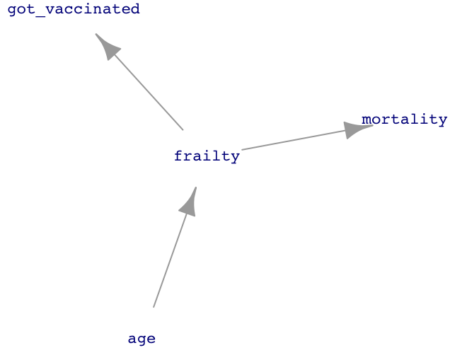
Figure 25.1 presents a network of causal influences that could shape the “healthy vaccine recipient.” People are more likely to become frail as they get older. Frail people are less likely to get vaccinated but more likely to die in the next few months. The result is that vaccination is associated with reduced mortality, even if there is no direct link between vaccination and mortality.
Such a study of earlier studies is called a meta-analysis.
Block that path!
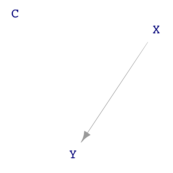
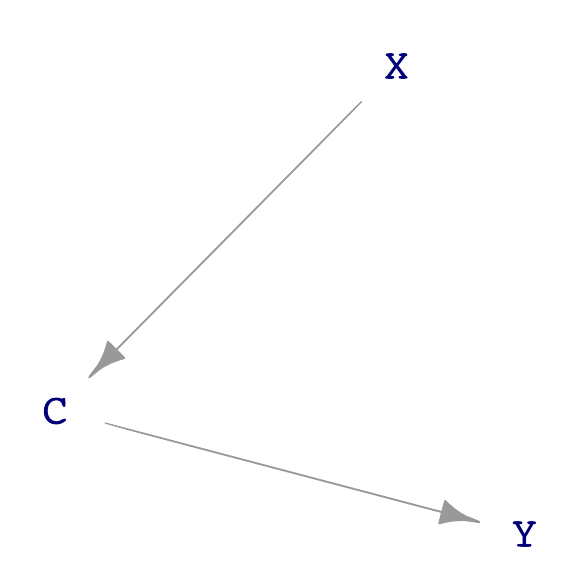
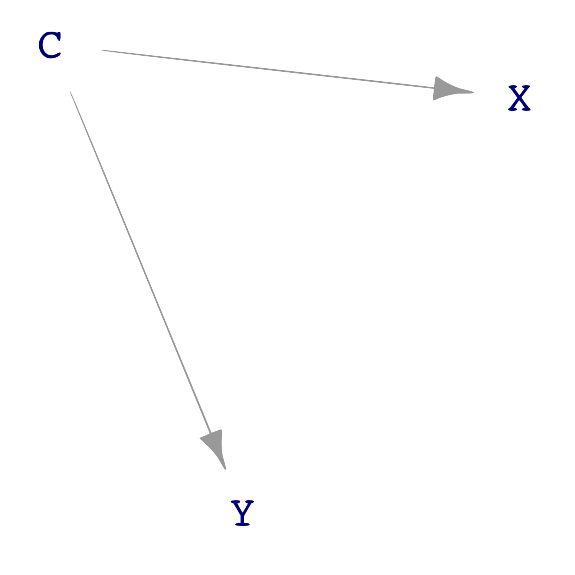
Let us look more generally at the possible causal connections among three variables: X, Y, and C. We will stipulate that X points causally toward Y and that C is a possible covariate. Like all DAGs, there cannot be a cycle of causation. These conditions leave three distinct DAGs that do not have a cycle, as shown in Figure 25.2.
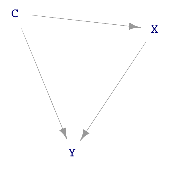
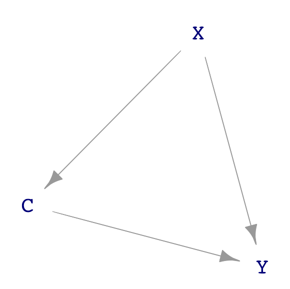
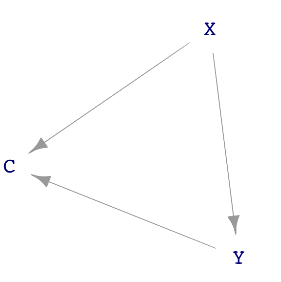
C plays a different role in each of the three dags. In sub-figure (a), C causes both X and Y. In (b), part of the way that X influences Y is through C. We say, in this case, “C is a mechanism by which X causes Y. In sub-figure (c), C does not cause either X or Y. Instead, C is a consequence of both X and Y.
In any given real-world context, good practice calls for considering each possible DAG structure and concocting a story behind it. Such stories will sometimes be implausible, but there can also be surprises that give the modeler new insight.
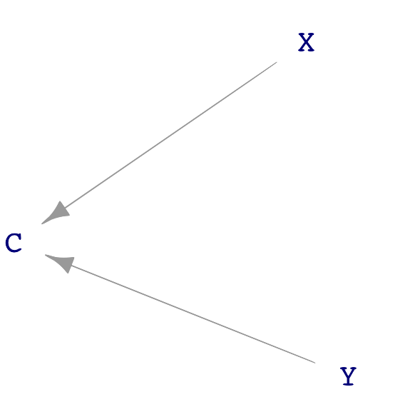
Chemists often think about complex molecules by focusing on sub-modules, e.g. an alcohol, an ester, a carbon ring. Similarly, there are some basic, simple sub-structures that often appear in DAGs. Figure 25.3 shows four such structures found in Figure 25.2.
A “direct causal link” between X and Y. There are no intermediate nodes.
A “causal path” from X to C and on to Y. A causal path is one where, starting at the originating node, flow along the arrows can get to the terminal node, passing through all intermediate nodes.
A “correlating path” from Y through C to X. Correlating paths are distinct from causal paths because, in a correlating path, there is no way to get from one end to the other by following the flows.
A “common consequence,” also known as a “collider”. Both X and Y are causes of C and there is no causal flow between X and Y.
Look back to Figure 25.2(a), where wealth is a confounder. A confounder is always an intermediate node in a correlating path.
Including a covariate either blocks or opens the pathway on which that covariate lies. Which it will be depends on the kind of pathway. A causal path, as in Figure 25.3(b), is blocked by including the covariate. Otherwise, it is open. A correlating path (Figure 25.3(c)) is similar: the path is open unless the covariate is included in the model. A colliding path, as in Figure 25.3(d), is blocked unless the covariate is included—the opposite of a causal path.
Where do the blocking rules come from?
To understand these blocking rules, we need to move beyond the metaphors of ants and flows. Two variables are correlated if a change in one is reflected by a change in the other. For instance, if a specimen with large X tends also to have large Y, then across many specimens there will be a correlation between X and Y. There is a correlation as well if specimens with large X tend to have small Y. It’s only when changes in X are not reflected in Y, that is, specimens with large X can have either small, middle, large values of Y, that there will not be a correlation.
We will start with the situation where C is not used as a covariate: the model y ~ x.
Perhaps the easiest case is the correlating path (Figure 25.3(c)). A change in variable C will be propagated to both X and Y. For instance, suppose an increase in C causes an increase in X and separately causes an increase in Y. Then X and C will tend to rise and fall together from specimen to specimen. This is a correlation; the path X \(\leftarrow\) C \(\rightarrow\) is not blocked. (We say, “an increase in C causes an increase in X” because there is a direct causal link from C to X.)
For the causal path (Figure 25.3(b)), we look to changes in X. Suppose an increased X causes an increased C which, in turn, causes an increase in Y. The result is that specimens with large X and tend to have large Y: a correlation and therefore an open causal path X \(\rightarrow\) C \(\rightarrow\) Y.
For a common consequence (Figure 25.3(c)) the situation is different. C does not cause either X or Y. In specimens with large X, Y values can be small, medium, or large. No correlation; the path \(X \rightarrow\) C \(\leftarrow\) Y is blocked.
Now turn to the situation where C is included in the model as a covariate: y ~ x + c. As described in Lesson 12, to include C as a covariate is, through mathematical means, to look at the relationship between Y and X as if C were held constant. That’s somewhat abstract, so let’s put it in more concrete terms. We use modeling and adjustment because C is not in fact constant; we use the mathematical tools to make it seem constant. But we wouldn’t need the math tools if we could collect a very large amount of data, then select only those specimens for analysis that have the same value of C. For these specimens, C would in fact be constant; they all have the same value of C.
For the correlating path, because C is the same for all of the selected specimens, neither X nor Y vary along with C. Why? There’s no variation in C! Any increase in X from one specimen to another would be induced by other factors or just random noise. Similarly for Y. So, when C is held constant, the up-or-down movements of X and Y are unrelated; there’s no correlation between X and Y. the X \(\leftarrow\) C \(\rightarrow\) Y path is blocked.
For the causal path X \(\rightarrow\) C \(\rightarrow\) Y, because C has the same value for all specimens, any change in X is not reflected in C. (Why? Because there is no variation in C! We’ve picked only specimens with the same C value.) Likewise, C and Y will not be correlated; they can’t be because there is no variation in C even though there is variation in Y. Consequently, among the set of selected specimens where C is held constant, there is no evidence for synchronous increases and decreases in X and Y. The path is blocked.
Look now at the common consequence (Figure 25.3(c)). We have selected only specimens with the same value of C. Consider the back-story for each specimen in our selected set. How did C come to be the value that it is in order to make it into our selection? If for the given specimen X was large, then Y must have been small to bring C to the value needed to get into the selected set of specimens. Or, vice versa, if X was small then Y must have been large. When we look across all the specimens in the selected set, we will see large X associated with small Y: a correlation. Holding C constant unblocks the pathway that would otherwise have been blocked.
For simplicity, we’ll walk through those situations where specimens with large X tend to have large Y. The other case, specimens with large X having small Y, is much the same. Just change “large” to “small” when it comes to Y.
Often, covariates are selected to block all paths except the direct link between the explanatory and response variable. This means do include the covariate if it is on a correlating path and do not include it if the covariate is at the collision point.
As for a causal path, the choice depends on what is to be studied. Consider the DAG drawn in Figure 25.2(b), reproduced here for convenience:
grass influences illness through two distinct paths:
- the direct link from
grasstoillness. - the causal pathway from
grassthroughwealthtoillness.
Admittedly, it is far-fetched that choosing to green the grass makes a household wealthier. However, for this example, focus on the topology of the DAG and not the unlikeliness of this specific causal scenario.
There is no way to block a direct link from an explanatory variable to a response. If there were a reason to do this, the modeler probably selected the wrong explanatory variable.
But there is a genuine choice to be made about whether to block pathway (ii). If the interest is the purely biochemical link between grass-greening chemicals and illness, then block pathway (ii). However, if the interest is in the total effect of grass and illness, including both biochemistry and the sociological reasons why wealth influences illness, then leave the pathway open.
Don’t ignore covariates!
In 1999, a paper by four pediatric ophthalmologists in Nature, perhaps the most prestigious scientific journal in the world, claimed that children sleeping with a night light were more likely to develop nearsightedness. Their recommendation: “[I]t seems prudent that infants and young children sleep at night without artificial lighting in the bedroom, while the present findings are evaluated more comprehensively.”
This recommendation is based on the idea that there is a causal link between “artificial lighting in the bedroom” and nearsightedness. The paper acknowledged that the research “does not establish a causal link” but then went on to imply such a link:
“[T]he statistical strength of the association of night-time light exposure and childhood myopia does suggest that the absence of a daily period of darkness during early childhood is a potential precipitating factor in the development of myopia.”
“Potential precipitating factor” sounds a lot like “cause.”
The paper did not discuss any possible covariates. An obvious one is the eyesight of the parents. Indeed, ten months after the original paper, Nature printed a response:
“Families with two myopic parents, however, reported the use of ambient lighting at night significantly more than those with zero or one myopic parent. This could be related either to their own poor visual acuity, necessitating lighting to see the child more easily at night, or to the higher socio-economic level of myopic parents, who use more child-monitoring devices. Myopia in children was associated with parental myopia, as reported previously.”
Always consider possible alternative causal paths when claiming a direct causal link. For us, this means thinking about that covariates there might be and plausible ways that they are connected. Just because a relevant covariate wasn’t measured doesn’t mean it isn’t important! Think about covariates before designing a study and measure those that can be measured. When an essential blocking covariate wasn’t measured, don’t fool yourself or others into thinking that your results are definitive.