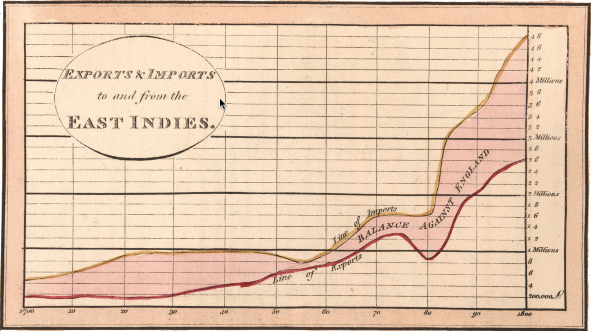
The statistical thinker seeks to identify patterns in data, such as possible relationships between variables. But it is not easy to do this by direct examination of a data frame, such as Table tbl-playfair-trade.
Table 2.1: Annual exports and imports in the trade between England and the East Indies between 1700 and 1800. (Choose “Show 100 entries” to show the entire dataframe at once.)
Translating a data frame into graphical form—data graphics—is essential for revealing or suggesting patterns. Figure fig-playfair gives a clear view of the trade pattern over the 100-year period at a glance.
Making pictures of data is a relatively modern idea. William Playfair (1759-1823) is credited as the inventor of novel graphical forms in which data values are presented graphically rather than as numbers or text. To illustrate, consider the data from the 1700s (Table tbl-playfair-trade) that Playfair turned into a picture.
Playfair’s innovation, as in Figure fig-playfair, was successful because it was powerful. A pattern that may be obscure in the data frame becomes visually apparent to the human viewer. For example, consider the graphic in Figure fig-playfair displaying data on trade between England and the East Indies in the 1700s. The graphic lets you look up the amount of trade each year, but it also shows patterns, such as the upward trend across the decades.
Data graphics can also make it easy to see deviations from trends, for instance, the dip in exports and flattening of imports during 1775-1780.
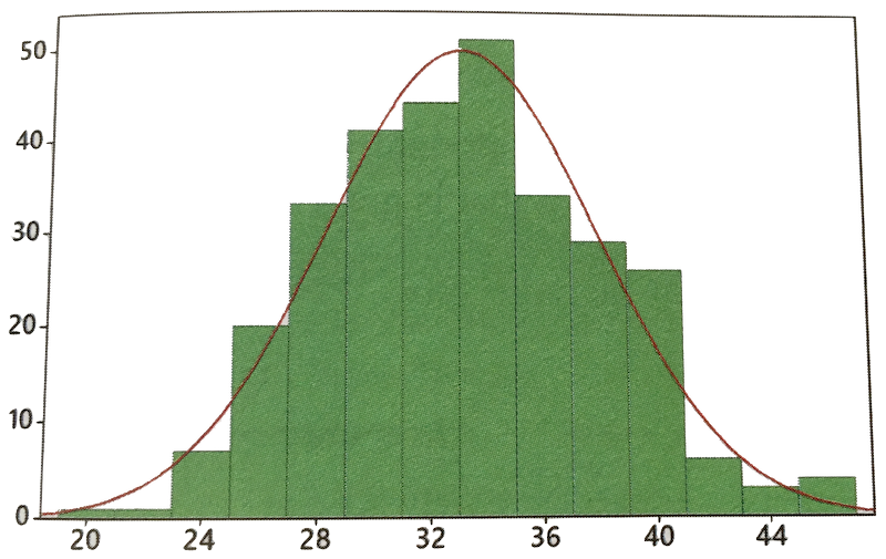
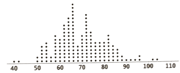
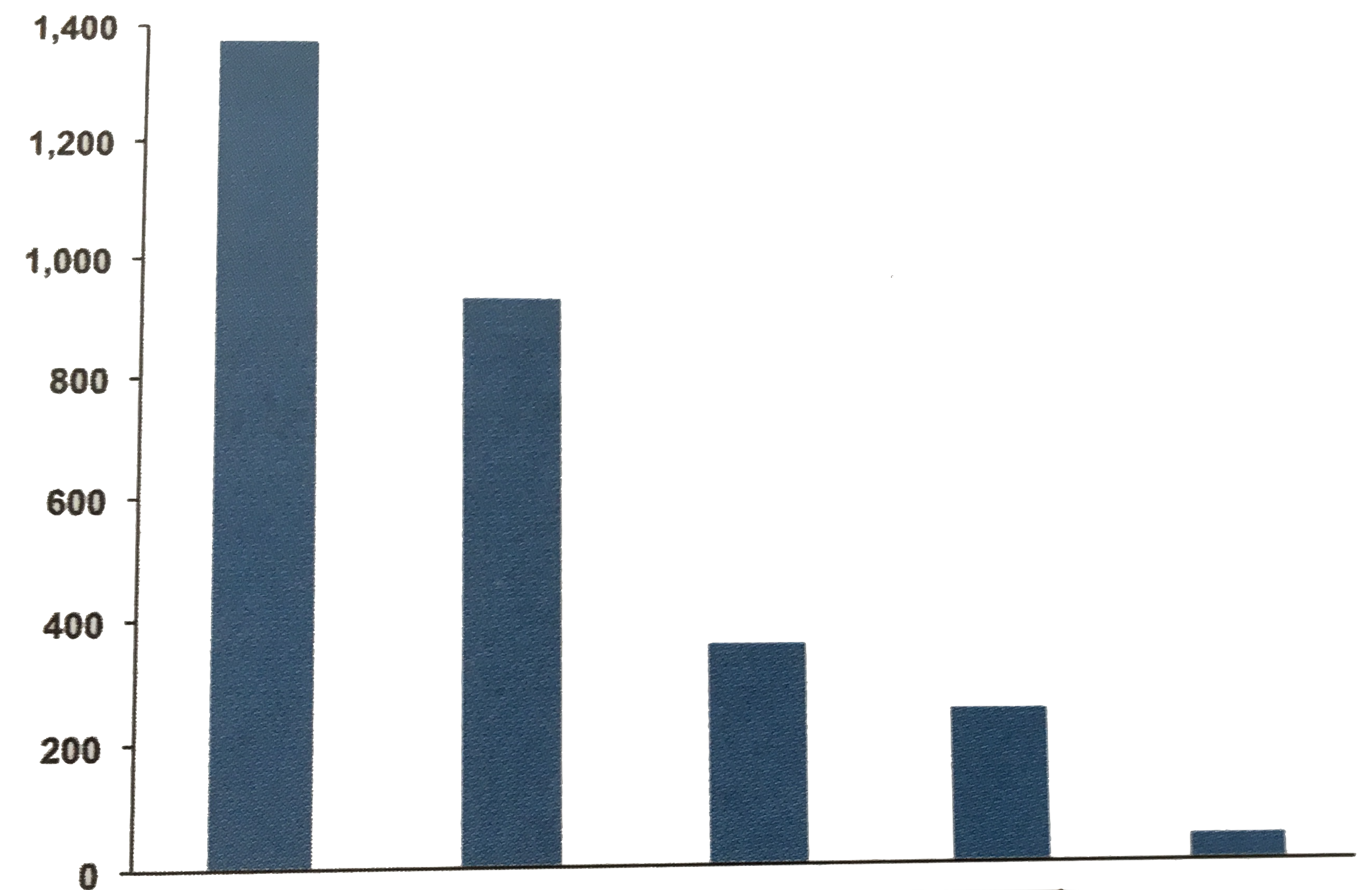
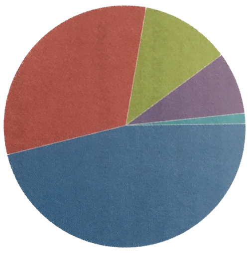
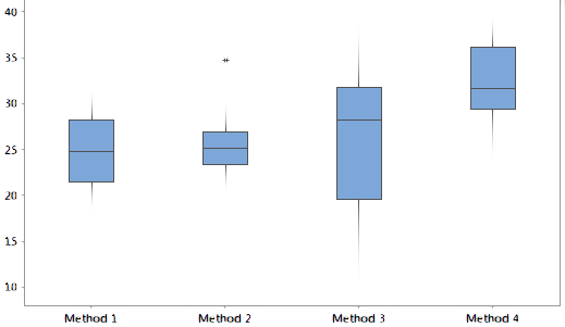
Students often encounter various types of data graphics as they progress through elementary and high school. Figure fig-textbook-graphs shows a few examples commonly found in textbooks. Remarkably, it’s rare to encounter such textbook graphic types outside of a statistics course.
Histogram
Dot plot
Bar chart
Pie chart
Boxplot
Stem-and-leaf plot
Figure 2.2: Some of the graphics styles often featured in statistics textbooks.
We won’t use such graphical variety in these Lessons. Instead, we will use a single basic form of graphic—the “annotated point plot”—capable of displaying multiple variables simultaneously and which can combine into one view both the raw data and a summary of the patterns found in the data.
A point plot contains a simple mark—a dot—for each row of a data frame. In its most common form, a point plot displays two selected variables from the data frame. One variable is depicted as the vertical coordinate, and the other as the horizontal coordinate.
A “point plot” is also known as a “scatter plot.”
To illustrate how a point plot relates to the underlying data frame, consider Table tbl-world-cities, where the unit of observation is a city. (The data frame is available in R as maps::world.cities.)
Table 2.2: Basic data on cities in the maps::world.cities data frame
name
country.etc
pop
lat
long
capital
Shanghai
China
15017783
31.23
121.47
2
Bombay
India
12883645
18.96
72.82
0
Karachi
Pakistan
11969284
24.86
67.01
0
Buenos Aires
Argentina
11595183
-34.61
-58.37
1
Delhi
India
11215130
28.67
77.21
0
Manila
Philippines
10546511
14.62
120.97
1
… and so on for 10,000 cities
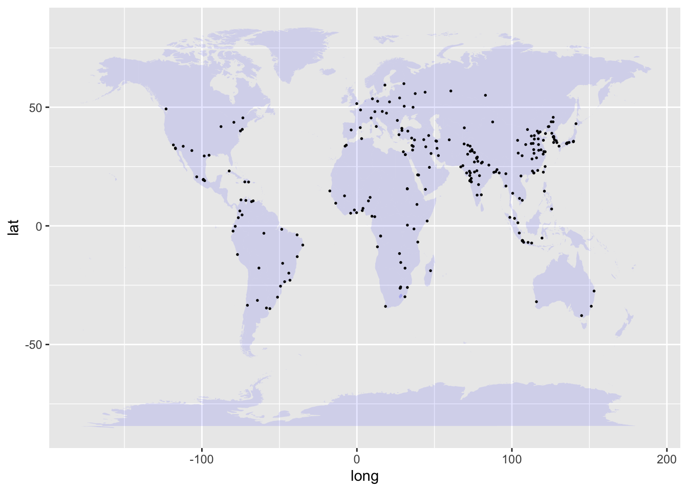
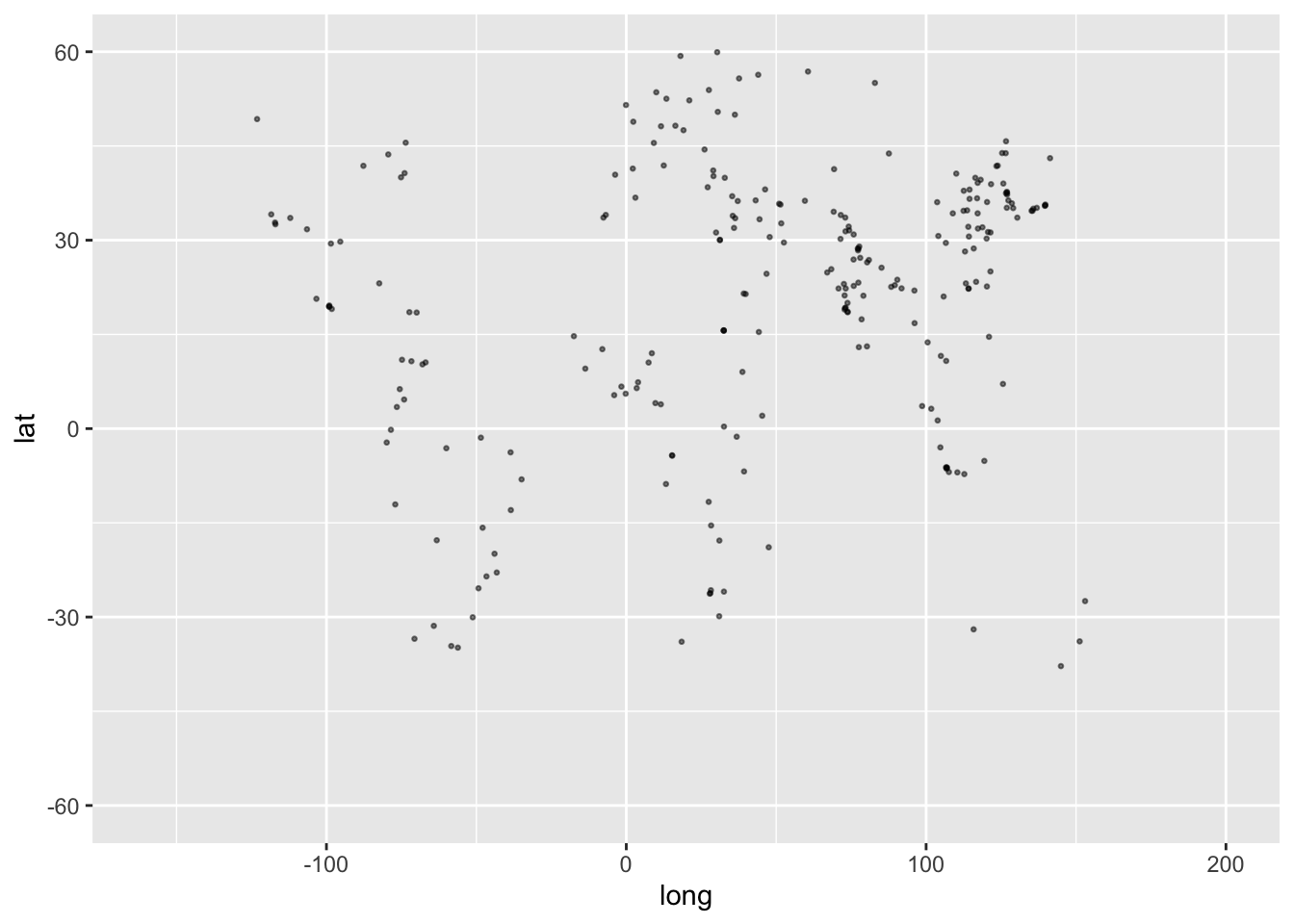
Since world.cities contains several variables, many possible pairs of variables could be shown in point-plot form. For instance, suppose we choose the lat and long variables, which specify each city’s location in terms of latitude and longitude. Figure fig-world-cities shows a point plot of latitude versus longitude for world cities. By convention, the word “versus” in the phrase “latitude versus longitude” marks the role of each variable in the point plot: latitude on the vertical axis and longitude on the horizontal axis.
Figure 2.3: A point plot of the latitude versus longitude of the world’s 250 largest population cities.
The dots in Figure fig-world-cities hint at some geographical patterns you learned about in geography class. In general, the purpose of a point plot is to hint at patterns in data.
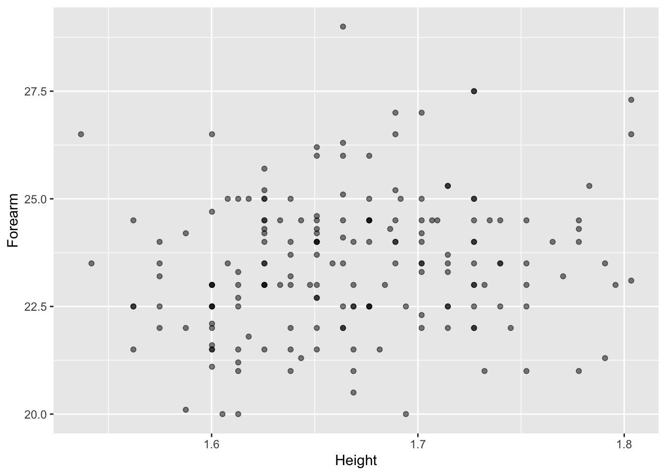
To show how to construct a point plot, we will work with data on human body shape. The Anthro_F data frame records nineteen different measurements of body shape for each of 184 college-aged women. (See Table tbl-wrist-ankle2)
Table 2.3: Some selected variables from the Anthro_F data frame.
Wrist
Ankle
Knee
Height
Neck
Biceps
Waist
BFat
18.4
23.5
37.5
1.6637
34.0
32.0
84.3
27.30
13.5
18.0
32.3
1.6002
27.1
23.2
60.2
17.62
18.0
22.5
38.5
1.6510
32.5
28.2
80.1
30.42
19.0
24.5
41.5
1.6637
35.0
34.5
90.0
34.24
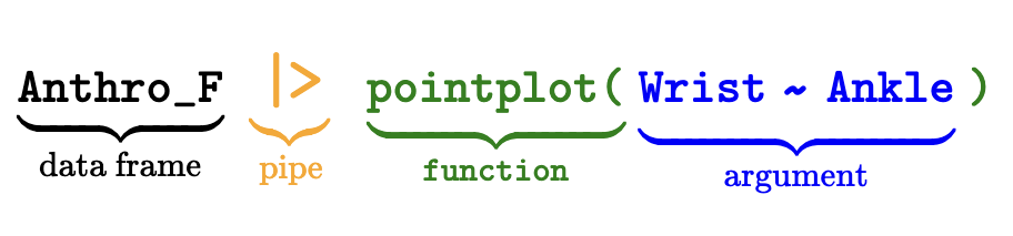
In making a point plot of Anthro_F, we have to choose two variables to display. One variable will determine the vertical position of the dots, the other variable will set the horizontal position. For instance, in Figure fig-wrist-ankle we choose Wrist for the vertical position and Ankle for the horizontal position. In words, the plot is “wrist versus ankle,” that is, “vertical versus horizontal.” (The codebook for Anthro_F—available via the R command ? Anthro_F—tells us that Ankle is measured as the circumference in centimeters, and similarly for Wrist.)
Figure 2.4: A point plot of wrist versus ankle circumference. (Press “Run Code” to see the plot.)
The pattern seen in Figure fig-wrist-ankle can be described as an upward-sloping cloud. We will develop more formal descriptions of such clouds in later Lessons. But for now, focus on the R command that generated the point plot.
The point of an R command is to specify what action you want the computer to take. Here, the desired action is to make a point plot based on Anthro_F using the two variables Wrist and Ankle. Look carefully at the command for Figure fig-wrist-ankle:
Anthro_F |> point_plot(Wrist ~ Ankle)
The command includes all four of the names involved in the plot:
The data frame Anthro_F
The action point_plot
The variables involved: Wrist and Ankle
These names are separated from one another by some punctuation marks:
|>, the “pipe”
(), a pair of parentheses
, called “tilde”
Don’t be daunted by this punctuation, strange though it may seem at first. You will get used to it, since almost all the commands you use in these Lessons will have the same punctuation.
Highlighting in color helps to identify the different components of the Figure fig-wrist-ankle command:
Most commands in these Lessons start with a data frame named at the start of the command. This is followed by the pipe, which indicates sending the data frame to the next command component. That next component specifies which action to take. By convention, “Function” is used rather than “action.” You use differently named functions to carry out different kinds of actions.
You will need only a handful of function for these Lessons, for instance, point_plot, model_train, conf_interval(), mutate(), summarize(). This Lesson introduces point_plot(). The others will be introduced in later Lessons as we need them.
The function name is always followed by an opening parenthesis. Any details about what action to perform go between the opening and the corresponding closing parentheses. In computer terminology, such details are called “arguments.” The detail for the Figure fig-wrist-ankle point_plot is the choice of the two variables to be used and which one goes on the vertical axis. This detail is written as a “tilde expression.” The tilde expression given as the argument to point_plot() is Wrist ~ Ankle, which can be pronounced as “wrist versus ankle” or `wrist tilde ankle,” as you prefer.
Learning check 2.1
Fill in the names of variables in the correct place to make a dot plot like Figure fig-wrist-ankle but with Waist on the hortizontal axis and Ankle on the vertical axis.
As you substitute the variable names in the slots named ..vert.. and ..horiz.., make sure not to erase the tilde character that separates the names. The tilde is essential.
The variable named on the left-hand side of the tilde expression will be used for the vertical axis. The right-hand side variable will on the horizontal axis.
Take note that both names Waist and Ankle start with a capital letter.
Learning check 2.2
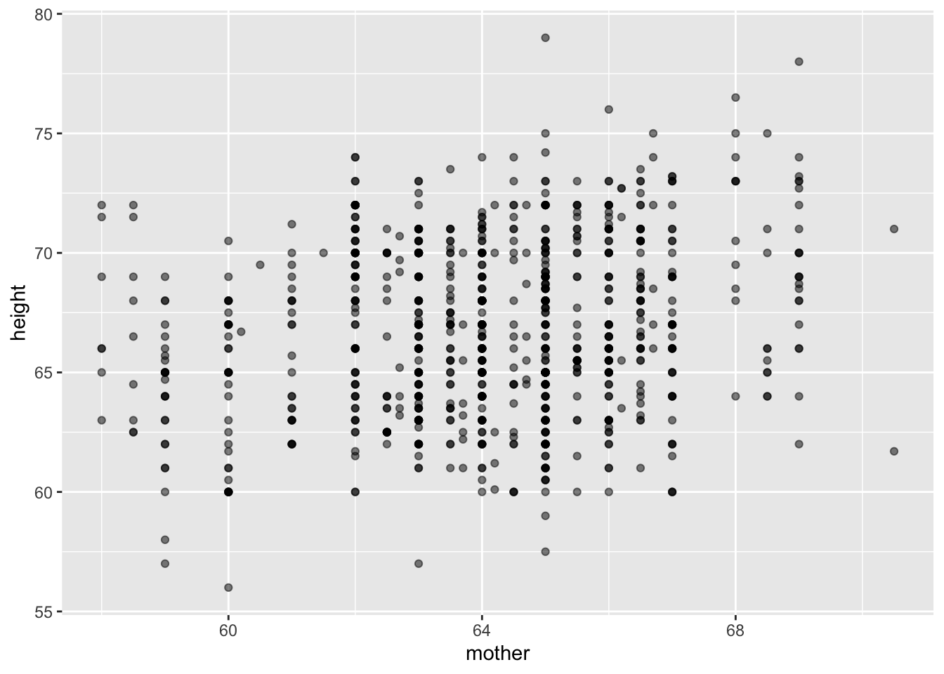
Reproduce this plot, based on the Galton data frame.
The labels on the axes tell which variables are being plotted.
Construct a tilde expression that relates the vertical variable to the horizontal variable.
Remember the tilde character between the variable names!
Response and explanatory variables
Another pronunciation for is “… as a function of ….” So, Wrist ~ Ankle means “wrist circumference as a function of ankle circumference.” In mathematics, functions are often written using a notation like \(f(x)\). In this notation, \(x\) is the input to the function f(). The word “input” is used in so many different contexts that it’s helpful to use other technical words to highlight the context.
In computer notation, such as f(x) or point_plot(Wrist ~ Knee), an expression inside the parentheses is called an argument. In f(x), the function is f() and the argument is x. In point_plot(Wrist ~ Knee), the function is point_plot() and the argument is the tilde expression Wrist ~ Knee.
In statistics, in the word phrase “wrist circumference as a function of ankle circumference” or, equivalently, the computer expression Wrist ~ Knee referring to the Anthro_F data frame, we say that Knee is an explanatory variable and Wrist is the response variable. In graphics, such as Figure fig-wrist-ankle, convention dictates that the response variable is shown along the vertical axis and the explanatory is shown along the horizontal axis.
In Figure fig-wrist-ankle, why did we choose Ankle as the explanatory variable and Wrist as the response variable for this example? No particular reason. We could equally well have chosen any of the Anthro_F variables in either role, depending on our interest. Typically, the statistical thinker will examine several different pairs to gain an understanding of how the various variables are related to one another.
Learning check 2.3
We use the structure provided by tilde expressions to tell the computer which variable to use as the response and which ones to use as the explanatory variable(s).
Which of these tilde expressions puts Height in the role of the response variable and Age as the explanatory variable?
Age ~ Height
Height ~ Age
Categorical variables and jittering
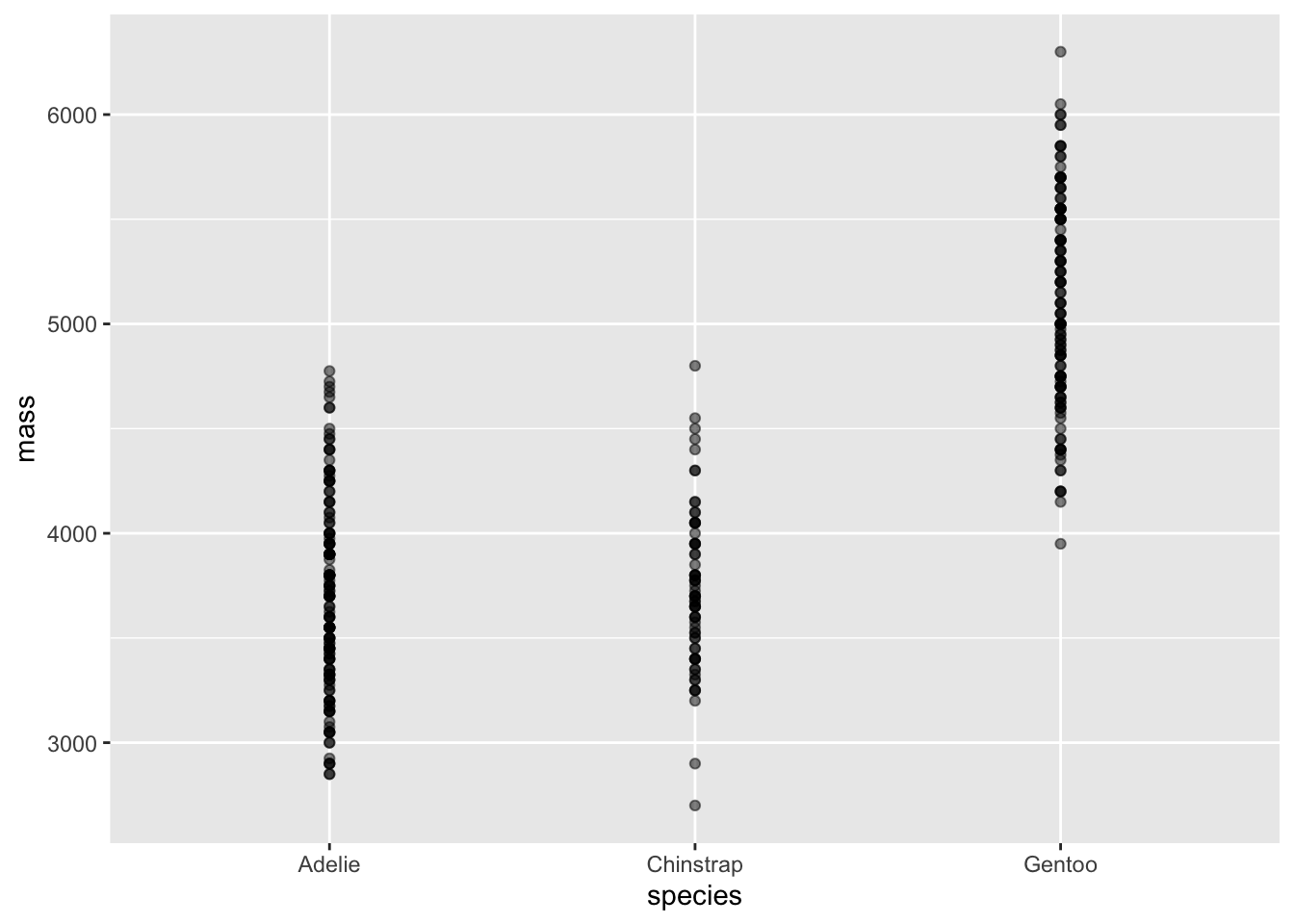
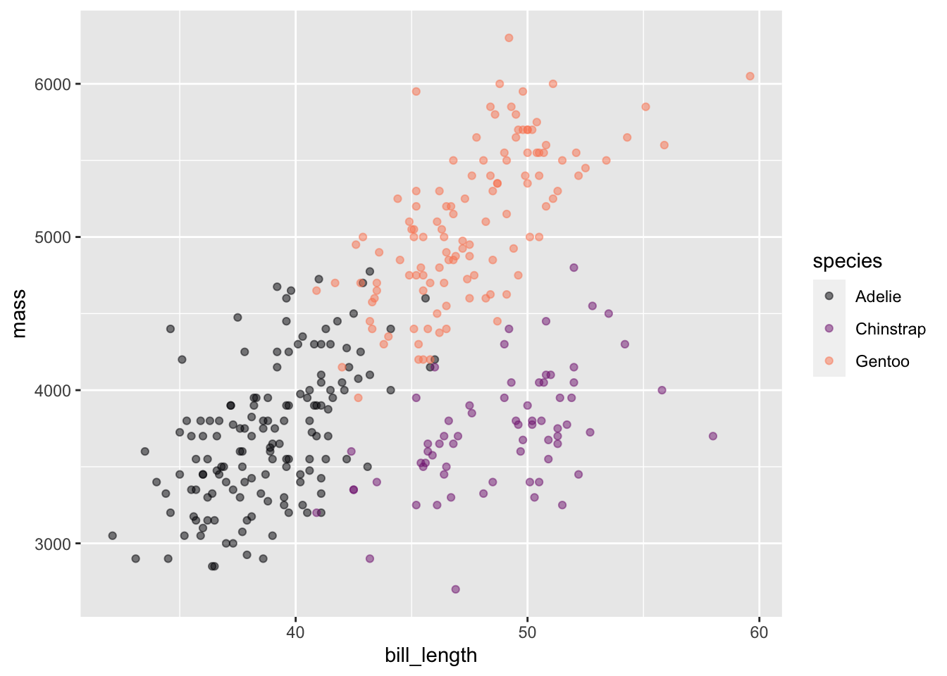
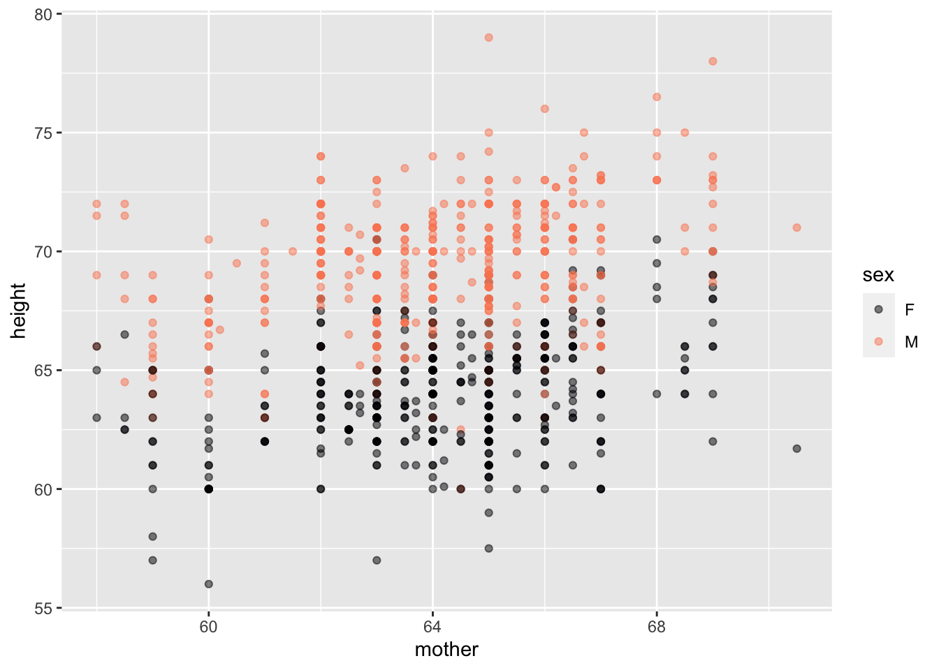
In the previous example, the point_plot of WristversusAnkle, both variables are quantitative: the respective joints’ circumference (in cm). point-plots are also suited to categorical variables. For example, Figure fig-mass-species shows a pair of point plots made from the Penguins data frame. The unit of observation is an individual penguin. The selected explanatory variable, species, is categorical. The response variable, mass, is quantitative.
Without jittering
With jittering
Figure 2.5: The body mass of individuals of different species of penguins.
When a categorical variable is used in a plot, the positions on the axis are labelled with the levels of the variable. “Adelie,” “Chinstrap,” and “Gentoo” in the explanatory variable of Figure fig-mass-species.
When an axis represents a quantitative variable, every possible position on that axis refers to a specific value. For instance, the Adelie penguins range between 2850 and 4775 grams. On the vertical axis itself, marks are made at 3000 and 4000 grams, but we know that every position in between those marks corresponds proportionately to a specific numerical value.
In contrast, when an axis represents a categorical variable, positions are marked for each level of that variable. But positions in between marks are not referring to fictitious “levels” that do not appear in the data. For instance, the position on the horizontal axis in Figure fig-mass-species that’s halfway between Adelie and Chinstrap is not reserved for individual penguins whose species is a mixture of Adelie and Chinstrap; every value of a categorical variables is one of the levels, which are discrete. There are no such penguins! (Or, at least, the concept of “species” doesn’t admit of such.)
Using a coordinate axis to represent discrete categories makes common sense, but we are left with the issue of interpreting the space between those categories. In Figure fig-mass-species (left) the point plot has been made ignoring the space between categories. Every specimen is lined up directly above the corresponding level. The graphical result is that it’s hard to identify a single specimen since the dots are plotted on top of one another..
“Jittering” is a simple graphical technique that uses the space between the levels to spread out the dots at random, as in Figure fig-mass-species (right). This dramatically reduces overlap and facilitates seeing the individual specimens. Recognize, however, that the precise jittered position of a specimen does not carry information about that specimen. All of the specimens in the column of jittered dots above “Adelie” are the same with respect to species, even though they may have different mass.
The point_plot() function automatically uses jittering when positioning in graphical space the values of categorical variables.
Learning check 2.4
Here is a place for you to construct some graphics in order to answer the following questions.
Which of the variables in apgar5 ~ eclampsia is being jittered?
eclapsia is a categorical variable so the data points are jittered horizontally. apgar5 is numerical, so not jittered. Note that at each value of apgar5 the points are arranged in a horizontal line; there is no vertical spread
Is jittering used when plotting weight ~ meduc?
meduc is a categorical variable and therefore jittered. Weight, a quantitative variable, is not jittered.
Which of the variables in induction ~ fage is being jittered?
induction is jittered. The data points are scattered vertically in a band around each of the categorical levels, “Y”, “N”, and NA.
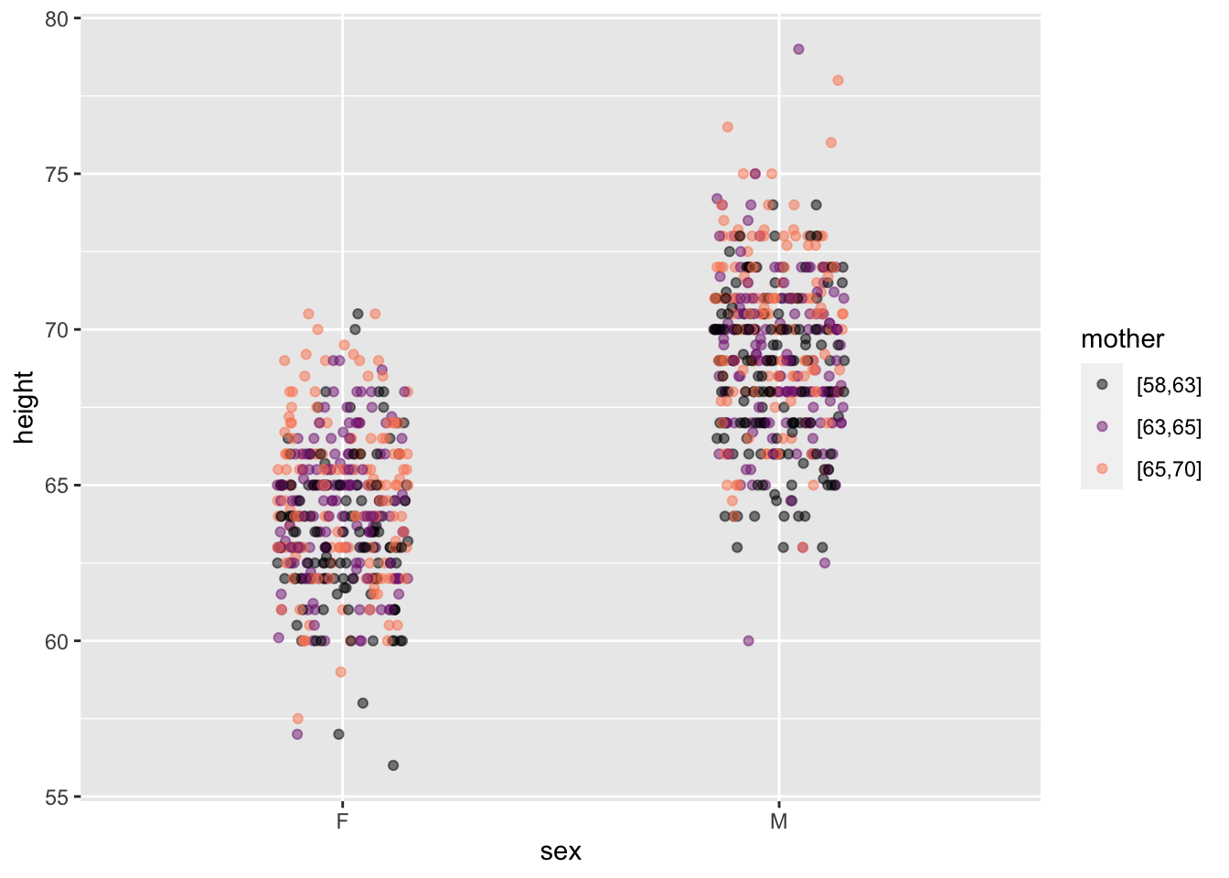
Color and faceting
Often, there will be more than one explanatory variable of interest. A penguins mass might not just be a matter of species; there are bigger and smaller individuals within any species. Perhaps, for instance, the body shape—not just size—is different for the different species. One way to investigate this possibility is to display body mass as explained by both species and, say, bill_length.
To specify that there are two explanatory variables, place their both their names on the right-hand side of the tilde expression, separating the names with a + or a *. Figure fig-mass-bill-species(a) shows a point plot made with two explanatory variables.
Figure 2.6: Point plots involving multiple explanatory variables.
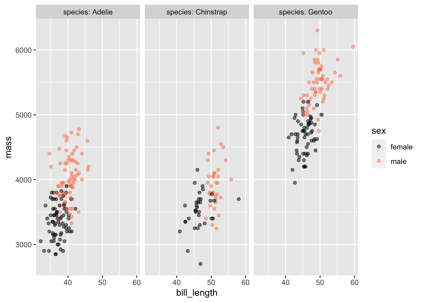
Figure fig-mass-bill-species(b) involves three variables. Consequently each dot has three different graphical attributes:
position in space along the vertical axis. This is denoted as y.
position in space along the horizontal axis. This is denoted as x.
color, denoted, naturally enough, as color.
In order to avoid long-winded sentences involving phrases like “the horizontal axis represents ….” we use the word mapped . For instance, in Figure fig-mass-bill-species, mass is mapped to y, bill_length is mapped to x, and species is mapped to color. Each mapping has a scale that translates the graphical property to a numerical or, in the case of color, categorical value.
point_plot() has been arranged so that the order of variable names in the tilde expression argument, mass ~ bill_length + species, exactly determines the mappings of variables to graphical properties. The response variable—that is, the variable named on the left-hand side of the tilde expression—is always mapped to y. The first variable on the right-hand side—bill_length in Figure fig-mass-bill-species—is always mapped to x. The second variable named on the right-hand side is always mapped to color.
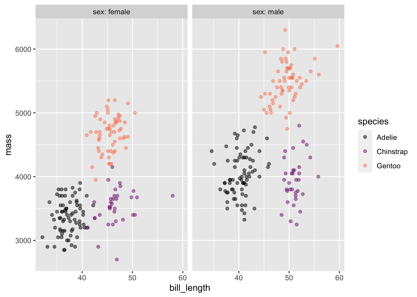
In Figure fig-mass-bill-species(right), four variables are shown: the response mass as well as the three explanatory variables bill_length, species, and sex. Each variable needs to be mapped to a unique graphical property. point_plot() maps the third explanatory variable (if any) to a property called “facet.” Facets are drawn as separate sub-panels. The scale for the mapping to facet consists of the labels at the top of each facet.
With point_plot(), different but closely related graphs of the same data can be made by swapping the order of variables named in the tilde expression. To illustrate, Figure fig-mass-bill-species-sex2 reverses the mappings sex and species compared to Figure fig-mass-bill-species(right). The data are the same in the two plots, but the different orderings of explanatory variables emphasize different aspects of the relationship among the variables. For instance, in Figure fig-mass-bill-species-sex2 it’s easier to see that the sexes of each species differ in both mass and bill length. Chinstrap males and females have bill lengths that are the most distinct from one another.
Penguins |>point_plot(mass ~ bill_length + sex + species)
Figure 2.7: The same data as in Figure fig-mass-bill-species(b), but with sex mapped to color and species mapped to facet. This changes the visual impression created.
Learning check 2.5
When there are multiple explanatory variables, the mappings to x, color, and facet strongly influence the interpretability of a point plot. In the following chunk, based on Figure fig-mass-bill-species-sex2, try several different arrangements of the explanatory variables. Pick the one you find most informative. (You need only to edit line three of the chunk. Leave the response variable as mass.)
Graphical annotations
We can enhance our interpretion of patterns in the dots of a point plot by adding “notes” to the graphic, in other words, “annotating” the graphic. Lessons sec-variation-and-distribution and sec-model-annotation introduce different formats of statistical annotations that highlight different features of the data.
Here, to illustrate what we mean by a graphical annotation, we will use a familiar non-statistical annotation. Figure fig-cities-with-continents replots the locations of world cities with an annotation showing continents and islands.
Figure 2.8: The latitude and longitude of the world’s 250 biggest cities annotated with a map of the continents and major islands.
Data shown without an annotation (Figure fig-world-cities) may suggest a pattern. Adding an appropriate annotation enables you to judge the existence with the intuited pattern with much more confidence or, conversely, reject the pattern as a cloud-like illusion.
Exercises
Exercise 2.1 Make this plot:
Each dot reflects one row of the Anthro_F data frame and is placed at coordinate (Ankle, Wrist). Here are three rows selected from Anthro_F.
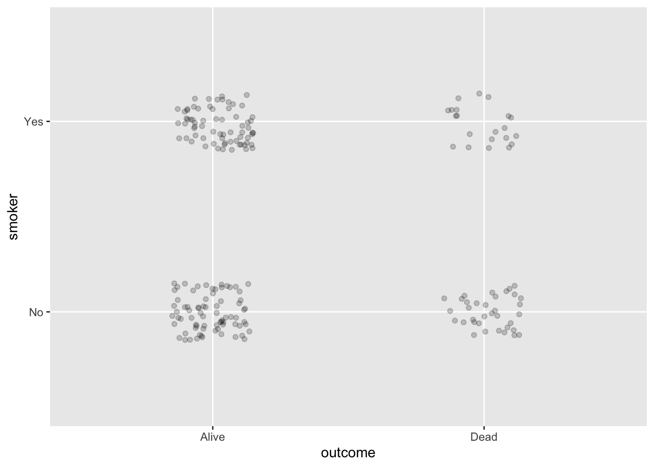
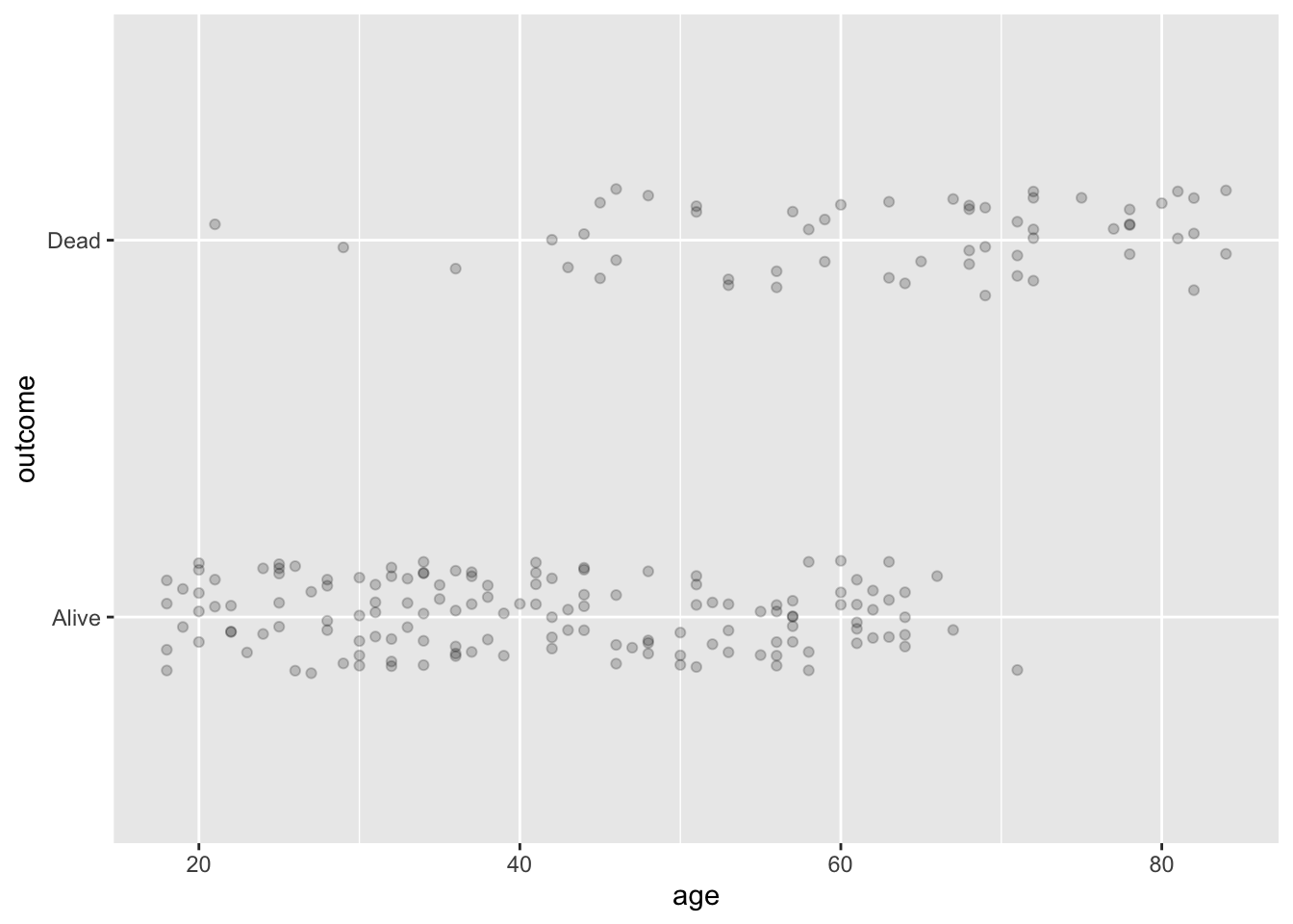
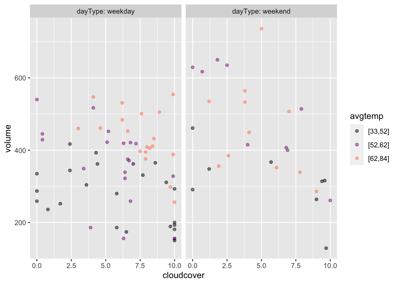
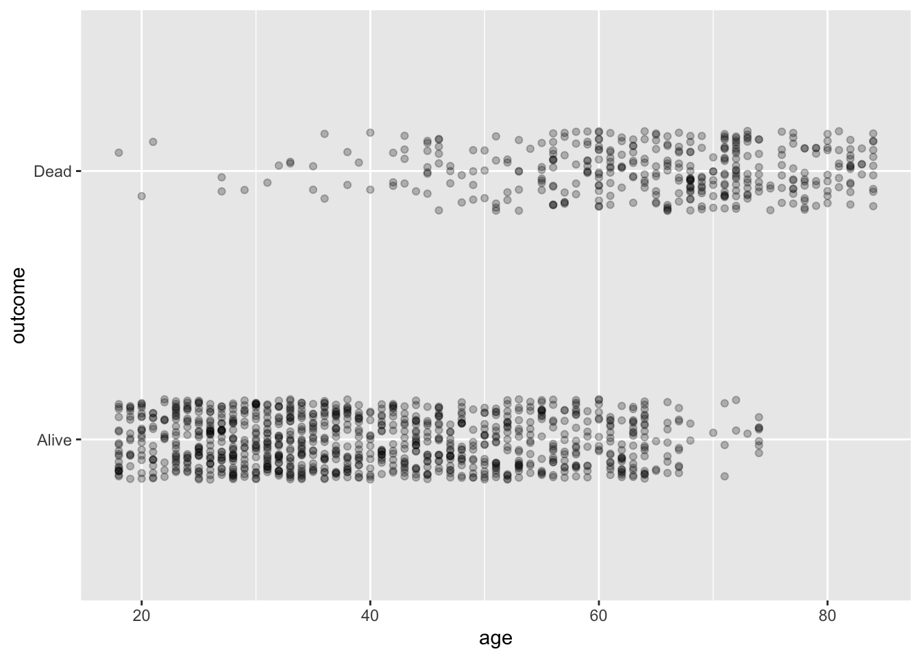
Exercise 2.3 Consider these two point plots, both constructed from 200 rows sampled from the Whickham data frame. (Note: It’s sensible to look up the codebook/documentation for the frame using the command ?Whickham.)
Figure 2.10: Two views of the Whickham data. Click to enlarge.
In Plot (a), there are four clumps of dots. What about the variables being mapped to x and y is responsible for creating the four clumps. Answer: Both variables, smoker and outcome are categorical, therefore point_plot() uses jittering to display them. Each variable happens to have two levels, so there are four different combinations of the values of smoker and outcome. Hence, four clumps.
In Plot (a), the clump on the upper right includes the fewest specimens. What do all the specimens in that clump have in common? Answer: All of them were smokers who had died by the time of the follow-survey.
In Plot (b), there are two bands of dots. What about the variables involved produces this pattern? Answer: The outcome variable, mapped to y, is categorical, so jittering is used to place the dots. outcome has two levels, leading to the dots being broken up into two groups along y. But age is quantitative, and the specimens are broadly spread from ages 20 to 80. So the dots in each of the outcome groups gets spread out along x.
Plot (b) shows an association between age and and outcome that reflects a well known feature of human mortality. What is that feature? Answer: outcome records whether the person, interviewed in the 1970s, had died by the time of a 20-year follow-up survey. As a rule, older people are more likely to die in the next 20 years.
Plot (a) does not hint at the association betweem age and outcome seen in Plot (b). Give the simple reason why. Answer: Plot A does not display age.
Here is a point plot. We won’t tell you the name of the data frame.
There’s no clear pattern to the dots, but that’s not the point of this exercise. Instead …
Write out on paper a few rows of an imagined data frame that could be the source of this graphic. You should get the variable names right, but the values you write for each numerical variable need merely be somewhere in the right range. For categorical variables, however, the levels should be exactly those shown in the graph.
Exercise 2.5 Reproduce each of the following graphs by construct an appropriate tilde expression. The data frame is named Whickham, and you are welcome to look at the documentation, but all the information you need to figure out the tilde expression is already in the graphs. (You can enlarge a graph by clicking on it.)
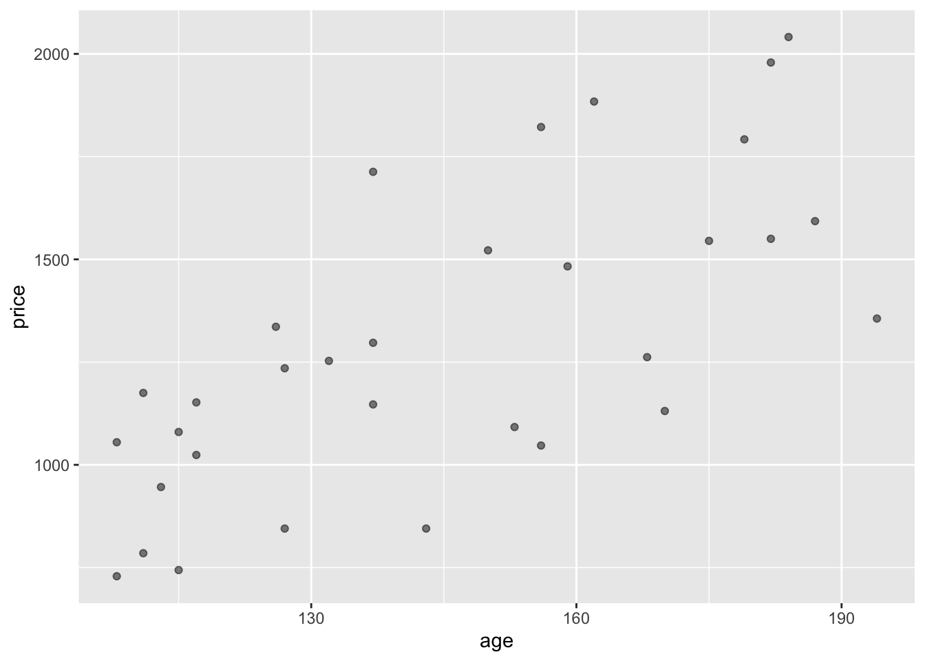
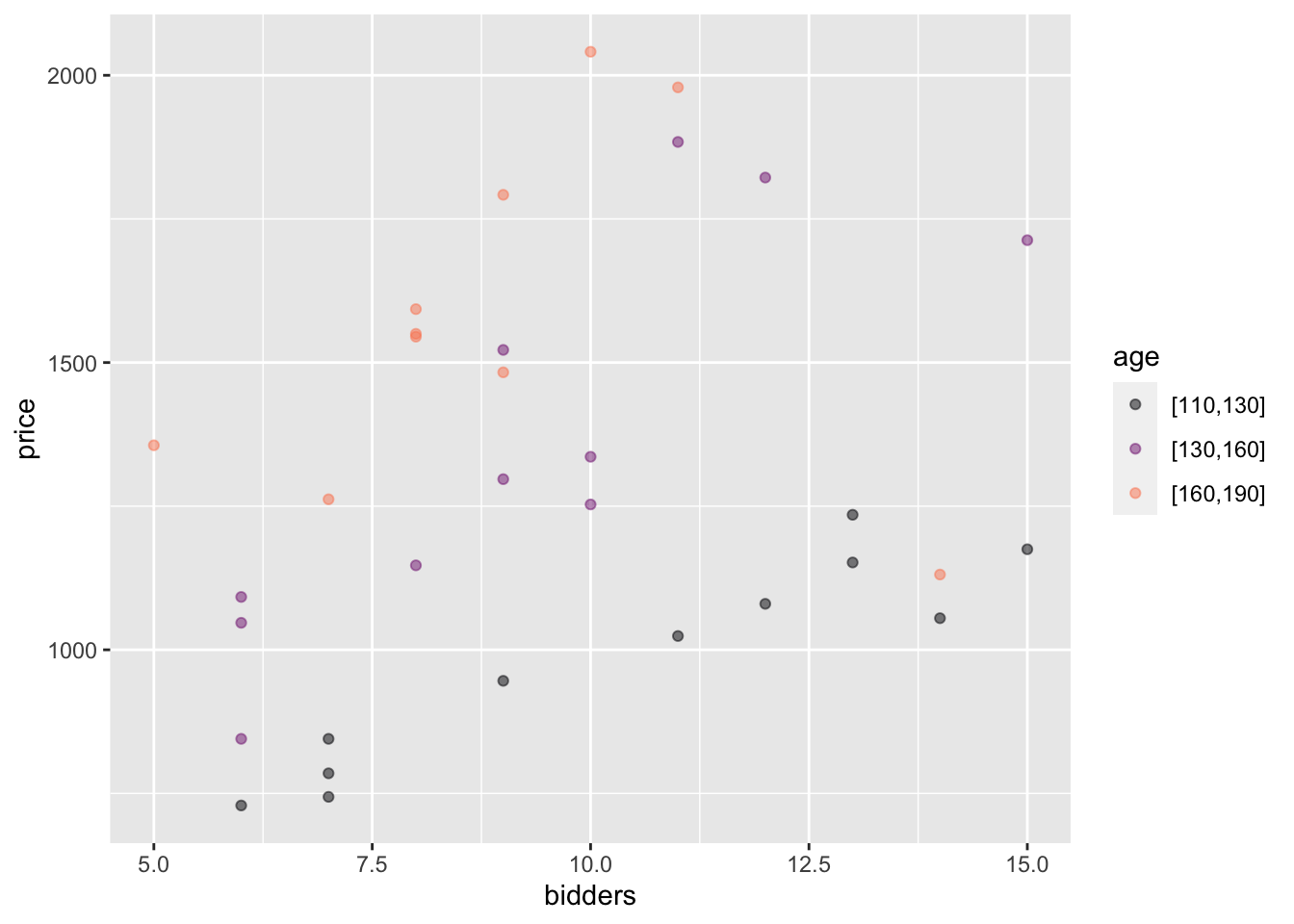
Exercise 2.6 Consider the following two point plots, both made from the same data frame. The unit of observation is an antique grandfather clock sold at auction.
Figure 2.12: Two views of the Clock_auction data frame
How many rows are their in the data frame? Answer: There is one dot for each row. Counting the dots gives 32.
Which variable is mapped to y? Which to x? Answer: price is mapped to y, age to x.
Which is the response variable? Answer: price. You can tell because the response variable is always mapped to y.
For each variable, say whether it is quantitative or categorical? Answer: Both age and price are quantitative.
In Plot B, how many explanatory variables are there? What are their names? Answer: The two explanatory variables are age and bidders.
Which variable is mapped to x? Which to color? Answer: bidders is mapped to x, age to color.
From Plot A we could see that age is quantitative. (It’s the age of each of the clock.) But in Plot B, the color scale is divided into three categories? What are the names of the levels of the color categories? Answer: The names are “[110-130]”, “[130-160]”, and “[160 to 190”]
Note: The point_plot() function was written so that when a quantitative variable is mapped to color, the variable is displayed broken up into categories, each of which covers a range of numerical values, such as 110-130.
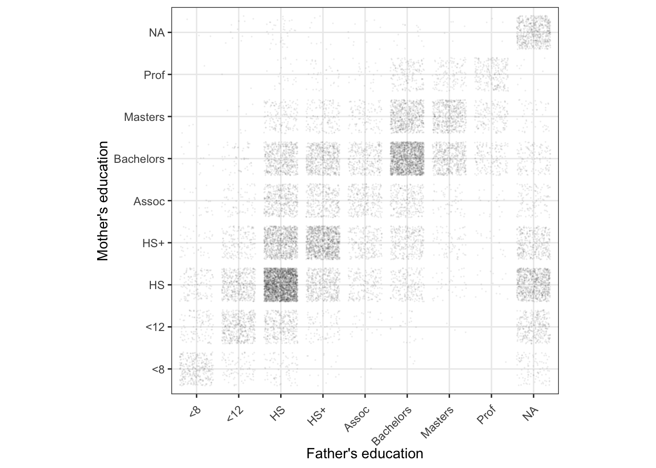
The Births2022 data frame records a random sample of 20,000 births in the US in 2022. Two of the variables, meduc and feduc, give the educational level of the mother and father respectively. The levels of these categorical variables correspond to “eighth grade or less”, “twelfth grade or less”, “high-school graduate,” “high-school graduate plus some college (but no degree),”associate’s degree,” “bachelor’s degree,” “master’s degree,” and “professional degree” (such as a PhD, EdD, MD, LLB, DDS, JD). Educational data is missing (“NA”) for about 5% of mothers and 15% of fathers.
The graph is a point plot of the mother’s education level versus the father’s.
Is this a jittered point plot? Explain briefly how you can tell. Answer: Yes, it’s jittered both horizontally and vertically. The axis tick marks correspond to discrete categorical levels, but the points themselves are spread out a little bit around the discrete levels.
Is transparency used? Explain briefly how you can tell. Answer: Yes. In the blocks with a low number of points, each dot is not a solid color.
In principle, there are 9 \(\times\) 9 = 81 possible combinations of the mother’s and father’s education. Which combination is the most common? What’s the second most common combination? Answer: Most common: HS for both mother and father. Second most common: Bachelors for both mother and father.
Is it more common for a woman with a Bachelor’s degree to marry a man with a high-school degree or vice versa? Answer: The square at mother=bachelors, father=HS is much darker than the similar square on the other side of the diagonal, that is, at father=bachelors, mother=HS
What would the graphic look like if jittering had not been used? Answer: There would be a single dot at each of the populated intersections, rather than the square cloud of dots seen in the actual graph.
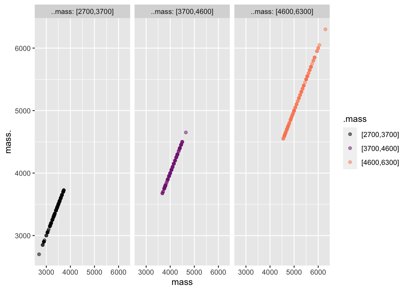
Exercise 2.8 Here’s a point_plot() variable mapping that you would never see in practice, but which may help you better understand the use of color and facets.
Explain why the graph consists of lines of dots in different locations and different colors in each of the panels. Answer: The variable mass is being mapped to all four graphical properties: x, y, color, and facet. Since each dot has the same x and y coordinate, the dots all appear on the same diagonal line in each facet. Likewise, each facet corresponds to one color.
The “body mass index” (BMI) is a familiar way of defining overweight. (Whether it is useful medically is controversial, but it is widely used.) BMI is an arithmetic combination of height and weight. Using the data in Anthro_F, make plots showing the relationship between BMI, Height, and Weight. There are six different ways of defining the graphics frame from three variables, e.g., Height ~ BMI + Weight or Weight ~ Height + BMI, and so on.
Make a list of the tilde expressions corresponding to the six different graphical frames using these variables.
Plot each one of the six possible graphical frames. From these choose one—whichever you like best—and use it to explain in graphical, everyday terms, how BMI is related to height and weight.
Enrichment topic 2.1: Proper labels for graphical scales
It’s very easy to use point_plot() to draw a graph, but the resulting graph often violates standards for good communication. For instance, make this graph:
The y-axis is labeled “price”, the x-axis “bidders,” and the color scale “age.”
It’s good practice to label axes so that the units of the quantity are shown clearly. Referring to the documentation for Clock_auction, the units of price are US dollars, the units of age are years, and bidders is a count of the number of people who put in bids for the particular clock. A good choice for the labels in the plot would be: y-axis: “Price (USD)” x-axis: “Number of bidders” color: “Clock age (yrs)”
The add_plot_labels() function allows you to enforce your own choices of labels. To see it in action, modify your code in the previous chunk to look like this:
Clock_auction |>point_plot(price ~ bidders + age) |>add_plot_labels(y ="Price (USD)", x ="Number of bidders", color ="Clock age (yrs)")
The examples in these Lessons tend not to apply the accepted conventions for labels. Instead, we typically use simply the name of the variable. That makes it easier for you to figure out how any particular graph was made. And you can always look at the documentation to find out about units, etc. That might be appropriate in the context of these Lessons. But, more generally, when communicating with people, labels on scales ought to be more informative than just the variable name.
Enrichment topic 2.2: More control over point plots
Consider the relationship between the duration of pregnancy and the birth weight of the baby. Here’s a basic plot:
The cloud of points resembles a fish. The long tail corresponds to extremely to moderately pre-mature babies.
Notice that duration has not been jittered. That’s because it is a quantitative variable. But jittering would be appropriate because the vertical stripes are an artifact of round duration to the nearest week.
You can force point_plot() to jitter the variable mapped to x by adding this argument to the command: jitter = "x". (Note the quotes around "x".) Try it!
Even with jittering, there is a lot of overplotting. The effect is to make it difficult to see what weight/duration values are most common.
A good way to deal with the over-plotting is by making the dots transluscent. Do this by adding yet another argument, point_ink = 0.1. The number refers to the degree of translucency: 0 means completely transparent, 1 means completely opaque. There are so many data points that a point_ink value of 0.1 is actually quite large. Try making it smaller until you can easily see which value of duration is most common.
The “best” choice of transparency depends on what you are focusing on. To see the most common duration, a very low value of point_ink is called for. But such a low value would be counter-productive if the interest is in pre-mature babies.
Now consider the issue of twins. The plurality variable records such information.
Conventional wisdom is that wwins tend to be lower in birth weight than singletons. Twins also tend to be born somewhat earlier than singletons. Can we see this in the data?
Here’s a possible graphic:
We had to increase point_ink to 0.5 in order to see the twins individually. But how do we know if the high-weight twins are hidden by the singletons, who are the vast majority.
Let’s try improving the plot by showing the different pluralities side by side. You can do this by modifying the tilde expression for point_plot() to weight ~ duration + 1 + plurality. This may look odd, but when you try it, you’ll see immediately why it makes sense.
With the twins drawn separately, you can afford to make point_ink smaller so that you can tell what are the most common values of weight and duration for each group. Do this until you can answer these questions:
Do twins tend to be lighter at birth and/or have shorter duration of pregancy?
Looking at, say, 37 weeks duration for both singletons and twins, are the twins birth weights still discernably lower? This sort of examination is usually described as “holding constant” a variable. “Holding constant” will be a major theme of these Lessons.
We will return to the question of how best to display these data in Exercise exr-06-900. We will need some new tools.
 , called “tilde”