Galton data frame.
From the start of these Lessons, we have talked about revealing patterns in data, particularly those that describe relationships among variables. Graphics show patterns in a way that is particularly attuned to human cognition, and we have leaned on them heavily. In this Lesson, we turn to another form of description of relationships between variables: simple mathematical functions.
We will need only the most basic ideas of mathematics to enable our work with functions. There won’t be any algebra required.
In mathematics, a function is a relationship between one or more inputs and an output. In our use of functions for statistical thinking, the output corresponds to the response variable, the inputs to the explanatory variables.
In mathematical notation, functions are conventionally written idiomatically using single-letter names. For instance, letters from the end of the alphabet—\(x\), \(y\), \(t\), and \(z\)—are names for function inputs. The convention uses letters from the start of the alphabet as stand-ins for numerical values; these are called parameters or, equivalently, coefficients. These conventions are almost 400 years old and are associated with Isaac Newton (1643-1727).
Not quite 300 years ago, a new mathematical idea, the function, was introduced by Leonhard Euler (1707-1783). Since the start and end of the alphabet had been reserved for names of variables and parameters, a convention emerged to use the letters \(f\) and \(g\) for function names.
To say, “Use function \(f\) to transform the inputs \(x\) and \(t\) to an output value,” the notation is \(f(x, t)\). To emphasize: Remember that \(f(x, t)\) stands for the output of the function. Statistics often uses the one-letter name style, but when the letters stand for things in the real world, it can be preferable to use names that remind us what they stand for: age, time_of_day, mother, wrist, prices, and such.
Mathematical functions are idealizations. Importantly, they differ from much of everyday experience. Every mathematical function may have only one output value for any given input value. We say that mathematical functions are “single valued. For instance, the mathematical value \(f(x=3, t=10)\) will be the same every time it is calculated. In everyday life, a quantity like cooking_time(temperature=300)might vary depending on other factors (like altitude) or even randomly.
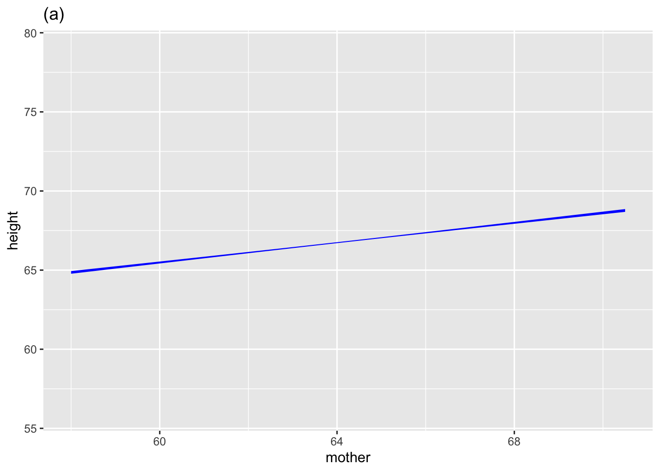
When functions are graphed, the single-valued property is shown using a thin line for the function value, as it depends on the inputs. (See Figure fig-single-valued.)
| Function type | Algebraic | Math names | Statistics names |
|---|---|---|---|
| Straight-line | \(f(x) \equiv a x + b\) | \(a\) is “slope” | \(a\) is coefficient on \(x\) |
| . | . | \(b\) is “intercept” | \(b\) is “intercept” |
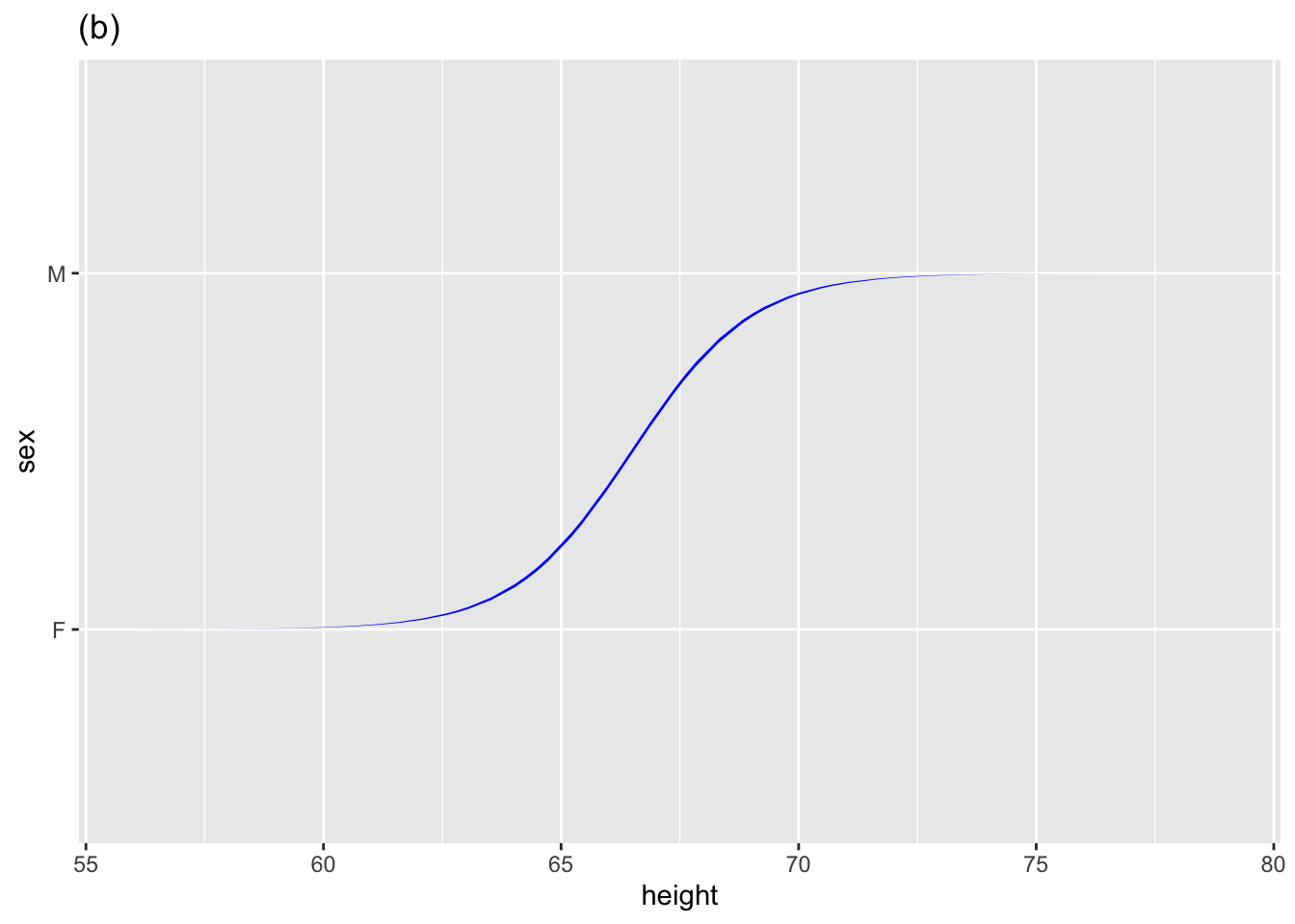
| Sigmoid | \(f(x) \equiv S(a x + b)\) | \(a\) is “steepness” | \(a\) is coefficient on \(x\) |
| . | . | \(b\) is “center” | \(b\) is “intercept” |
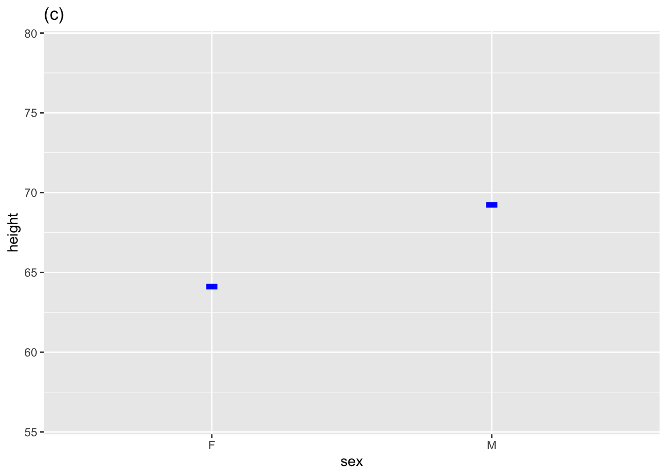
| Discrete-input | \(f(x) \equiv b + \left\{\begin{array}{ll}0\ \text{when}\ x = F\\a\ \text{when}\ x=M\end{array}\right.\) | \(b\) is intercept | \(b\) is “intercept” |
| . | . | . | \(a\) is “sexM coefficient” |
In all three cases, the \(a\) coefficient quantifies how the function output changes in value as the input \(x\) changes. For the straight-line function, \(a\) is the slope. Similarly, \(a\) is the steepness halfway up the curve for the sigmoid function. And for the discrete-input function, \(a\) is the amount to add to the output when the input \(x\) equals the particular categorical level (M in the above example).
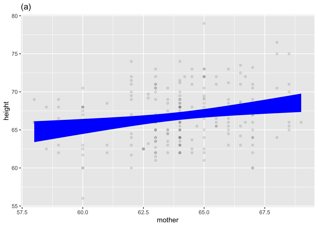
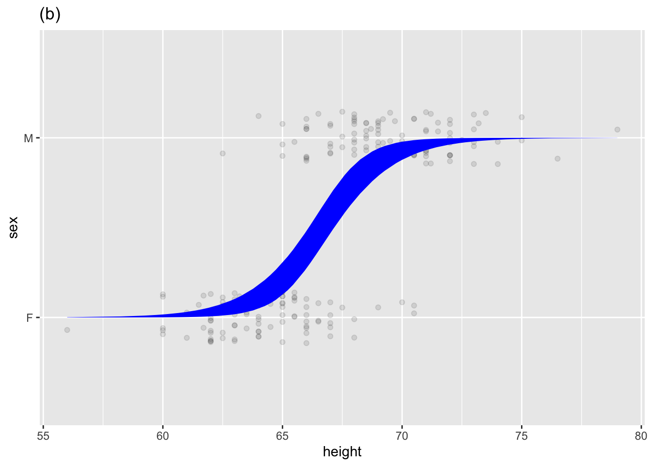
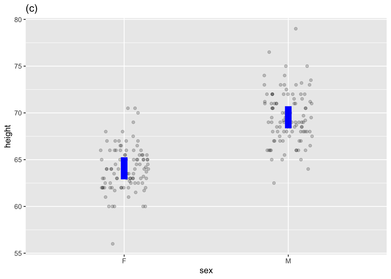
Many mathematical functions are used in statistics, but to quantify a relationship among variables rooted in data, statistical thinkers use models that resemble a mathematical function but are bands or intervals rather than the thin marks of single-valued function graphs. Figure fig-some-model-annotations shows three such statistical models, each of which corresponds to one of the mathematical functions in Figure fig-single-valued.
Galton data frame.
Quantifying uncertainty is a significant focus of statistics. The bands or intervals—the vertical extent of the model annotation—are an essential part of a statistical model. In contrast, single-valued mathematical functions come from an era that didn’t treat uncertainty as a mathematical topic.
To draw a model annotation, the computer first finds the single-valued mathematical function that passes through the band or interval at the mid-way vertical point. We will identify such single-valued functions as “model functions.” Model functions can be written as model formulas, as described in sec-math-function-basics.
Another critical piece is needed to draw a model annotation: the vertical spread of the statistical annotation that captures the uncertainty. This is an essential component of a statistical model. Before dealing with uncertainty, we will need to develop concepts and tools about randomness and noise as presented in Lessons sec-signal-and-noise through sec-sampling-variation.
For now, however, we will focus on the model function, particularly on the interpretation of the coefficients. We won’t need formulas for this. Instead, focus your attention on two kinds of coefficients:
the intercept, which we wrote as \(b\) when discussing mathematical functions. In statistical reports, it is usually written (Intercept).
the other coefficient, which we named a to represent the slope/steepness/change, always measures how the model function output changes for different values of the explanatory variable. If \(x\) is the name of a quantitative explanatory variable, the coefficient is called the “\(x\)-coefficient. But for a categorical explanatory variable, the coefficient refers to both the name of the explanatoryry variable and the particular level to which it applies. For example, in Figure fig-some-model-annotations(c), the explanatory variable is sex and the level is M, so the coefficient is named sexM.
The model annotation in an annotated point plot is arranged to show the model function and uncertainty simultaneously. To construct the model in the annotation, point_plot() uses another function: model_train().
model_train() has nothing to do with miniature-scale transportation layouts found in hobbyists’ basements.Now that we have introduced model functions and coefficients, we can explain what model_train() does:
model_train()finds numerical values for the coefficients that cause the model function to align as closely as possible to the data. As part of this process,model_train()also calculates information about the uncertainty, but we put that off until later.)
Use model_train() in the same way as point_plot(). A data frame is the input. The only required argument is a tilde expression specifying the names of the response variable and the explanatory variables, just as in point_plot().
As you know, the output from point_plot() is a graphic. Similarly, the output from wrangling functions is a data frame. The output of model_train() is not a graphic (like point_plot()) or a data frame (like the wrangling functions). Instead, it is a new kind of thing that we call a “model object.”
Galton |> model_train(height ~ mother)A trained model relating the response variable "height"
to explanatory variable "mother".
To see relevant details, use model_eval(), conf_interval(),
R2(), regression_summary(), anova_summary(), or model_plot(),
or the native R model-reporting functions.Recall that printing is default operation to do with the object produced at the end of a pipeline. Printing a data frame or a graphic displays more-or-less the entire object. But for model objects, printing gives only a glimpse of the object. This is because there are multiple perspectives to take on model objects, for instance, the model function or the uncertainty.
Choose the perspective you want by piping the model output into another function, two of which we describe here:
model_eval() looks at the model object from the perspective of a model function. The arguments to model_eval() are values for the explanatory variables. For instance, consider the height of the child of a mother who is five feet five inches (65 inches):
Galton |>
  model_train(height ~ mother) |>
model_eval(mother = 65)| mother | .lwr | .output | .upr |
|---|---|---|---|
| 65 | 60.2 | 67 | 73.9 |
The output of model_eval() is a data frame. The mother column repeats the input value given to model_eval(). .output gives the model output: a child’s height of 67 inches. There are two other columns: .lwr and .upr. These relate to the uncertainty in the model output. We will discuss these in due time. For the present, we simply note that, according to the model, the child of a 65-inch tall mother is likely to be between 60 and 74 inches
conf_interval() provides a different perspective on the model object: the coefficients of the model function.
Galton |> model_train(height ~ mother) |> conf_interval()| term | .lwr | .coef | .upr |
|---|---|---|---|
| (Intercept) | 40.0 | 50.0 | 50.0 |
| mother | 0.2 | 0.3 | 0.4 |
The form of the output is, as you might guess, a data frame. The term value identifies which coefficient the row refers to; the .coef column gives the numerical value of the coefficient. Once again, there are two additional columns, .lwr and .upr. These describe the uncertainty in the coefficient. Again, we will get to this in due time.
There are two major kinds of statistical models: regression models and classifiers. In a regression model, the response variable is always a quantitative variable. For a classifier, on the other hand, the response variable is categorical.
These Lessons involve only regression models. The reason: This is an introduction, and regression models are easier to express and interpret. Classifiers involve multiple model functions; the bookkeeping involved can be tedious. (We’ll return to classifiers in sec-risk.)
However, one kind of classifier is within our scope because it is also a regression model. How can that happen? When a categorical variable has only two levels (say, dead and alive), we can translate it into zero-one format. A two-level categorical variable is also a numerical variable but with the numerical levels zero and one.
When the response variable is zero-one, we can use regression techniques. Often, it is advisable to use a custom-built technique called logistic regression. model_train() knows when to use logistic regression. The sigmoidal shape is a good indication that logistic regression is in use. (See, e.g. Figure fig-some-model-annotations(b))
“Regression” is a strange name for a statistical/mathematical technique. It comes from a misunderstanding in the early days of statistics, which remains remarkably prevalent today. (See Enrichment topic enr-11-01.)
The ideas of model functions and coefficients apply to models with multiple explanatory variables. To illustrate, let’s return to the Galton data and use the heights of the mother and father and the child’s sex to account for the child’s height.
The printed version of the model doesn’t give any detail …
Galton |>
  model_train(height ~ mother + father + sex)
A trained model relating the response variable "height"
to explanatory variables "mother" & "father" & "sex".
To see relevant details, use model_eval(), conf_interval(),
R2(), regression_summary(), anova_summary(), or model_plot(),
or the native R model-reporting functions.… but the coefficients tell us about the relationships:
Galton |>
  model_train(height ~ mother + father + sex) |>
conf_interval()| term | .lwr | .coef | .upr |
|---|---|---|---|
| (Intercept) | 9.9535161 | 15.3447600 | 20.7360040 |
| mother | 0.2601008 | 0.3214951 | 0.3828894 |
| father | 0.3486558 | 0.4059780 | 0.4633002 |
| sexM | 4.9433183 | 5.2259513 | 5.5085843 |
There are four coefficients in this model. As always, there is the intercept, which we wrote \(b\) in sec-math-function-basics. But instead of one \(a\) coefficient, each explanatory variable has a separate coefficient.
The intercept, 15.3 inches, gives a kind of baseline: what the child’s height would be before taking into account mother, father and sex. Of course, this is utterly unrealistic because there must always be a mother and father.
Like the \(a\) coefficient in sec-math-function-basics, the coefficients for the explanatory variables express the change in model output per change in value of the explanatory variable. The mother coefficient, 0.32, expresses how much the model output will change for each inch of the mother’s height. So, for a mother who is 65 inches tall, add \(0.32 \times 65 = 20.8\) inches to the model output. Similarly, the father coefficient expresses the change in model output for each inch of the father’s height. For a 68-inch father, that adds another \(0.41 \times 68 = 27.9\) inches to the model output.
The sexM coefficient gives the increase in model output when the child has level M for sex. So add another 5.23 inches for male children.
There is no sexF coefficient, but this is only a matter of accounting. R chooses one level of a categorical variable to use as a baseline. Usually, the choice is alphabetical: “F” comes before “M,” so females are the baseline.
There is perennial concern with voter participation in many countries: only a fraction of potential voters do so. Many civic organizations seek to increase voter turnout. Political campaigns spend large amounts of money on advertising and knock-on-the-door efforts in competitive districts. (Of course, they focus on neighborhoods where the campaign expects voters to be sympathetic to them.) However, civic organizations don’t have the fund-raising capability of campaigns. Is there an inexpensive way for these organizations to get out the vote?
Consider an experiment in which get-out-the-vote post-cards with messages of possibly different persuasive force were sent randomly to registered voters before the 2006 mid-term election. The message on each post-card was one of the following:
The “Neighbors” message listed the voter’s neighbors and whether they had voted in the previous primary elections. The card promised to send out the same information after the 2006 primary so that “you and your neighbors will all know who voted and who did not.”
The “Civic Duty” message was, “Remember to vote. DO YOUR CIVIC DUTY—VOTE!”
The “Hawthorne” message simply told the voter that “YOU ARE BEING STUDIED!” as part of research on why people do or do not vote. [The [name comes from studies](https://en.wikipedia.org/wiki/Hawthorne_effect] conducted at the “Hawthorne Works” in Illinois in 1924 and 1927. Small changes in working conditions inevitably increased productivity for a while, even when the change undid a previous one.]{.aside}
A “control group” of potential voters, picked at random, received no post-card.
The voters’ response—whether they voted in the election—was gleaned from public records. The data involving 305,866 voters is in the Go_vote data frame. Three of the variables are of clear relevance: the type of get-out-the-vote message (in messages), whether the voter voted in the upcoming election (primary2006), and whether the voter had voted in the previous election (primary2004). Other explanatory variables—year of the voter’s birth, sex, and household size—were included to investigate possible effects.
It’s easy to imagine that whether a person voted in primary2004 has a role in determining whether the person voted in primary2006, but do the experimental messages sent out before the 2006 primary also play a role? To see this, we can model primary2006 by primary2004 and messages.
Go_vote data frame.
| sex | yearofbirth | primary2004 | messages | primary2006 | hhsize |
|---|---|---|---|---|---|
| male | 1941 | abstained | Civic Duty | abstained | 2 |
| female | 1947 | abstained | Civic Duty | abstained | 2 |
| male | 1951 | abstained | Hawthorne | voted | 3 |
| female | 1950 | abstained | Hawthorne | voted | 3 |
| female | 1982 | abstained | Hawthorne | voted | 3 |
| male | 1981 | abstained | Control | abstained | 3 |
However, as you can see in Table tbl-go-vote-preview, both primary2006 and primary2004 are categorical. Using a categorical variable in an explanatory role is perfectly fine. But in regression modeling, the response variable must be quantitative. To conform with this requirement, we will create a version of primary2006 that consists of zeros and ones, with a one indicating the person voted in 2006. Data wrangling with mutate() and the zero_one() function can do this:
Go_vote <- Go_vote |>
  mutate(voted2006 = zero_one(primary2006, one = "voted"))
After this bit of wrangling, Go_vote has an additional column:
| sex | yearofbirth | primary2004 | messages | primary2006 | hhsize | voted2006 |
|---|---|---|---|---|---|---|
| female | 1965 | abstained | Control | abstained | 2 | 0 |
| male | 1944 | voted | Neighbors | voted | 2 | 1 |
| female | 1952 | voted | Civic Duty | voted | 4 | 1 |
| female | 1947 | voted | Neighbors | abstained | 2 | 0 |
| female | 1943 | abstained | Control | voted | 2 | 1 |
| female | 1964 | voted | Civic Duty | abstained | 2 | 0 |
| male | 1970 | abstained | Hawthorne | voted | 2 | 1 |
| female | 1969 | abstained | Hawthorne | abstained | 2 | 0 |
No information is lost in this conversion; voted2006 is always 1 when the person voted in 2006 and always 0 otherwise. Since voted2006 is numerical, it can play the role of the response variable in regression modeling.
For reference, here are the means of the zero-one variable voted2006 for each of eight combinations of explanatory variable levels: four postcard messages times the two values of primary2004. Note that voted2006 is a zero-one variable; the means will be the proportion of 1s. That is, the mean of voted2006 is the proportion of voters who voted in 2006.
Go_vote |>
  summarize(vote_proportion = mean(voted2006),
            .by = c(messages, primary2004)) |>
arrange(messages, primary2004)| messages | primary2004 | vote_proportion |
|---|---|---|
| Control | abstained | 0.24 |
| Control | voted | 0.39 |
| Civic Duty | abstained | 0.26 |
| Civic Duty | voted | 0.40 |
| Hawthorne | abstained | 0.26 |
| Hawthorne | voted | 0.41 |
| Neighbors | abstained | 0.31 |
| Neighbors | voted | 0.48 |
For each kind of message, people who voted in 2004 were likelier to vote in 2006. For instance, the non-2004 voter in the control group had a turnout of 23.7%, whereas the people in the control group who did vote in 2004 had a 38.6% turnout.
Similar information is presented more compactly by the coefficients for a basic model:
Go_vote |>
  model_train(voted2006 ~ messages + primary2004, family = "lm") |>
conf_interval()| term | .lwr | .coef | .upr |
|---|---|---|---|
| (Intercept) | 0.2330897 | 0.2355256 | 0.2379614 |
| messagesCivic Duty | 0.0130218 | 0.0180357 | 0.0230496 |
| messagesHawthorne | 0.0202803 | 0.0252950 | 0.0303096 |
| messagesNeighbors | 0.0753294 | 0.0803442 | 0.0853591 |
| primary2004voted | 0.1493516 | 0.1526525 | 0.1559534 |
It takes a little practice to learn to interpret coefficients. Let’s start with the messages coefficients. Notice that there is a coefficient for each of the levels of messages, with “Control” as the reference level. According to the model, 23.6% of the control group who did not vote in 2004 turned out for the 2006 election. The primary2004voted coefficient tells us that people who voted in 2004 were 15.3 percentage points more likely to vote in 2006 than the 2004 abstainers.
Each non-control postcard had a higher voting percentage than the control group. The manipulative “Neighbors” post-card shows an eight percentage point increase in voting, while the “Civic Duty” and “Hawthorne” post-cards show smaller changes of about two percentage points each.
The reader who has already encountered statistics may be familiar with the word “correlation,” now an everyday term used as a synonym for “relationship.” “Correlation coefficient” refers to a numerical summary of data invented almost 150 years ago. Since the correlation coefficient emerged very early in the history of statistics, it is understandably treated with respect by traditional textbooks.
We don’t use correlation coefficients in these Lessons. As might be expected for such an early invention, they describe only the simplest relationships. Instead, the regression models introduced in this Lesson enable us to avoid over-simplifications when extracting information from data.
Activity 11.1
Although “voted” and “abstained” are the only possible values of primary2004 for an individual voter, we might want to know the voting rate for a group of voters whose turnout was 50% (0.5) in the 2006 election. model_eval() can handle any values for the explanatory variables.
Convert primary2004 to a zero-one variable, voted2004, observe that the coefficients are the same as for the model using primary2004, and calculate the model output when voted2004 is at 50%.
Note that we could have seen this from the coefficients themselves.
Turn this into a find-the-model-output from the regression coefficients exercise.
Consider the model gestation ~ parity. In the next lines of code we build this model, training it with the Gestation data. Then we evaluate the model on the trained data. This amounts to using the model coefficients to generate a model output for each row in the training data, and can be accomplished with the model_eval() R function.
Model <- Gestation |>
  model_train(gestation ~ parity)
Evaluated <- Model |> model_eval()| gestation | parity | .lwr | .output | .upr | .resid |
|---|---|---|---|---|---|
| 262 | 5 | 245.1 | 276 | 308 | -14.40 |
| 273 | 1 | 248.9 | 280 | 311 | -7.21 |
| 269 | 4 | 246.1 | 277 | 309 | -8.38 |
| 282 | 2 | 248.0 | 279 | 311 | 2.74 |
| 261 | 1 | 248.9 | 280 | 311 | -19.20 |
:::
Activity 11.2
Activity 11.3
Activity 11.4
Activity 11.5
Another exercise: model coefficients don’t tell us the residuals. Emphasize that the residual refers an individual specimen, the difference between the response value and the model output (which does come from the coefficients.)
A model typically accounts for only some of the variation in a response variable. The remaining variation is called “residual variation.”
Activity 11.7
MAKE SOMETHING OF THIS: Measuring coefficients from the graph, or figuring out features of the graph from the coefficients.
RE-WRITE THIS TO SHOW BOTH COEFFICIENTS and corresponding graph.
To illustrate the use of model_train() we will remake the models from sec-two-explanatory-variables and graph the models (on top of the training data) using model_plot().
Two categorical explanatory variables as in Figure fig-cat-cat.
Mod1 <- Whickham |> model_train(age ~ smoker + outcome)
model_plot(Mod1)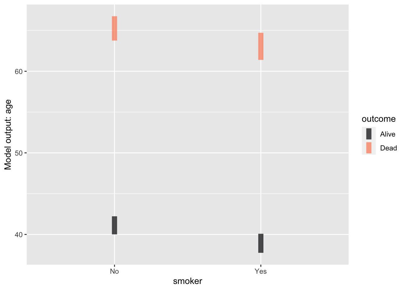
Categorical & quantitative as in Figure fig-cat-quant.
Mod2 <- Galton |> model_train(height ~ sex + mother)
model_plot(Mod2)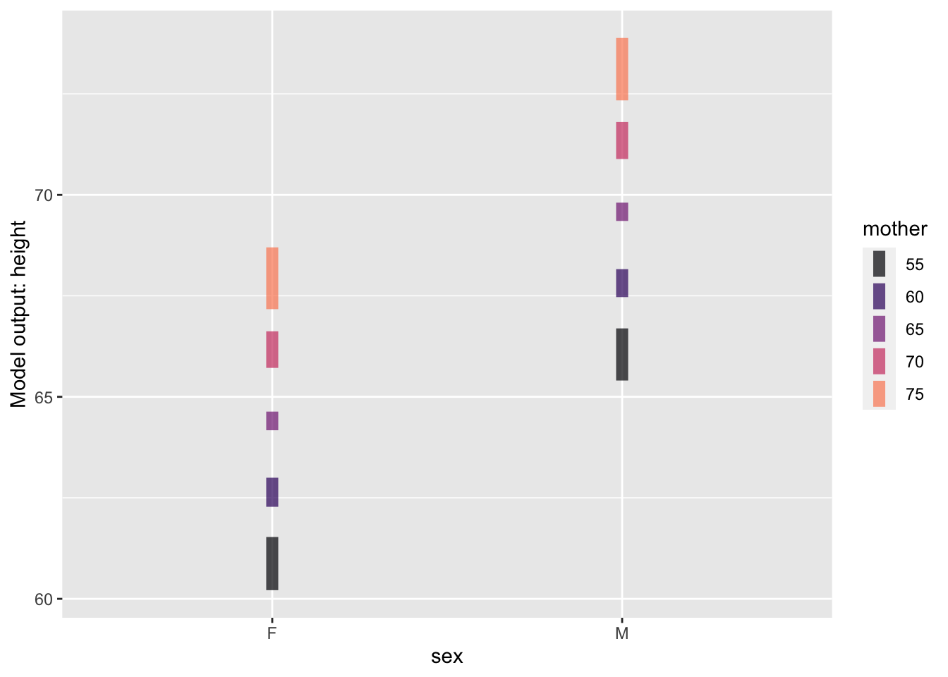
Quantitative & categorical as in Figure fig-quant-cat.
Mod3 <- Galton |> model_train(height ~ mother + sex)
model_plot(Mod3)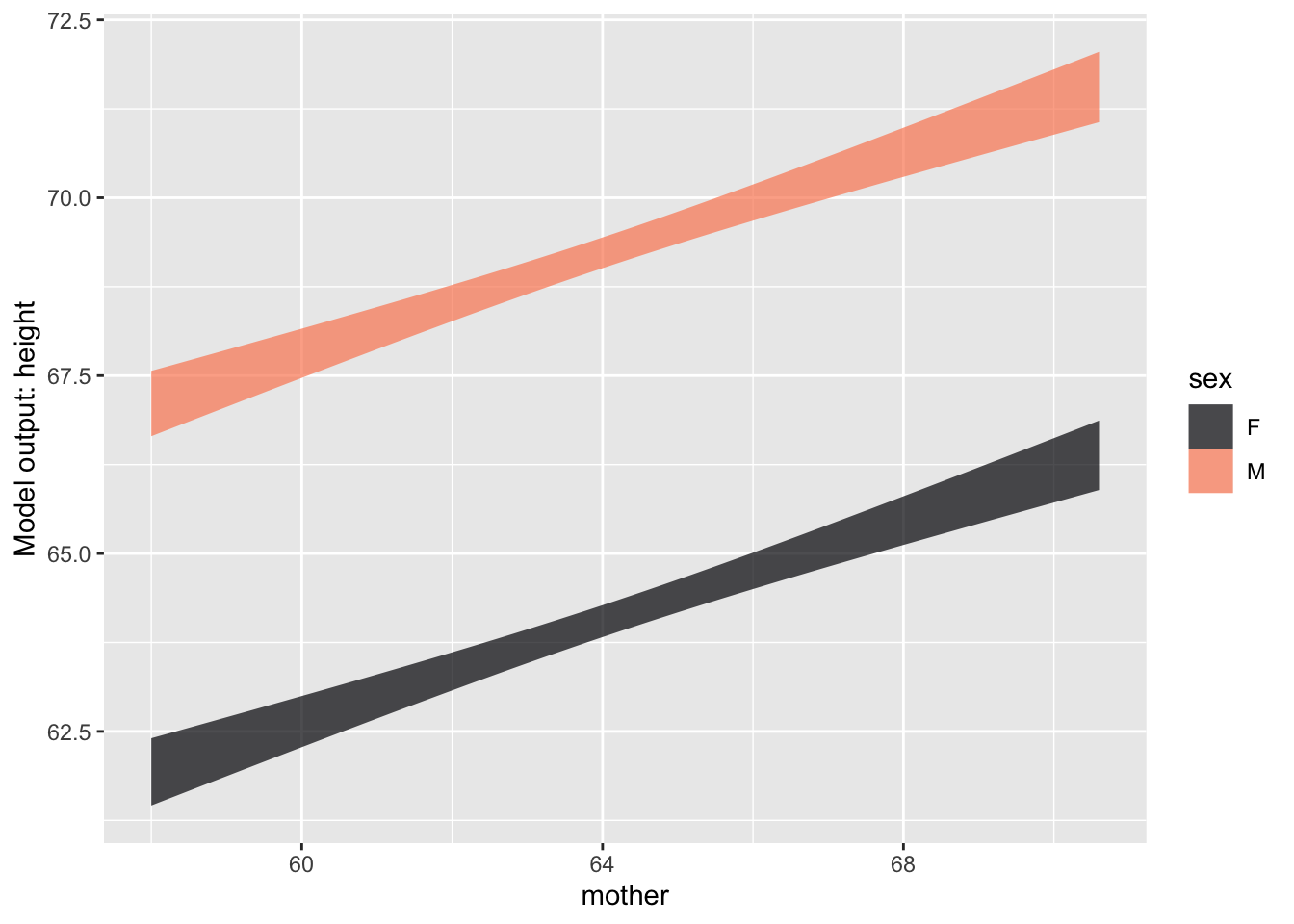
Quantitative & quantitative as in Figure fig-quant-quant
Mod4 <- Galton |> model_train(height ~ mother + father)
model_plot(Mod4)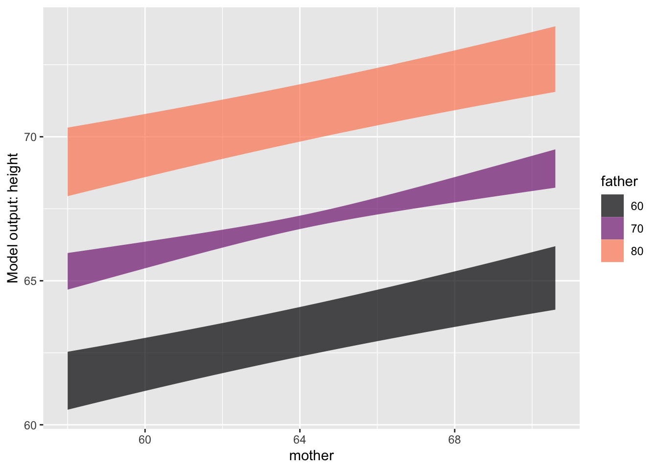
Activity 11.8
CALCULATE MODEL VALUES using model_eval(). Focus on c(58, 72) kinds of values.
Maybe use the Go_vote case study, adding new terms.
Activity 11.9
CALCULATE MODEL VALUES using model_eval(). Have them make a one-unit increase in the explanatory variable and verify that the resulting change in output is the same as the respective coefficients.
The correlation coefficient, introduced as a unitless form of simple regression.
Nonlinear terms in regression, e.g. splines:ns()
Perhaps involve “Anscombe’s Quintet” to show that the nonlinear techniques point out the differences that are ignored by the correlation coefficient.
Google NGram provides a quick way to track word usage in books over the decades. Figure fig-ngram shows the NGram for three statistical words: coefficient, correlation, and regression.
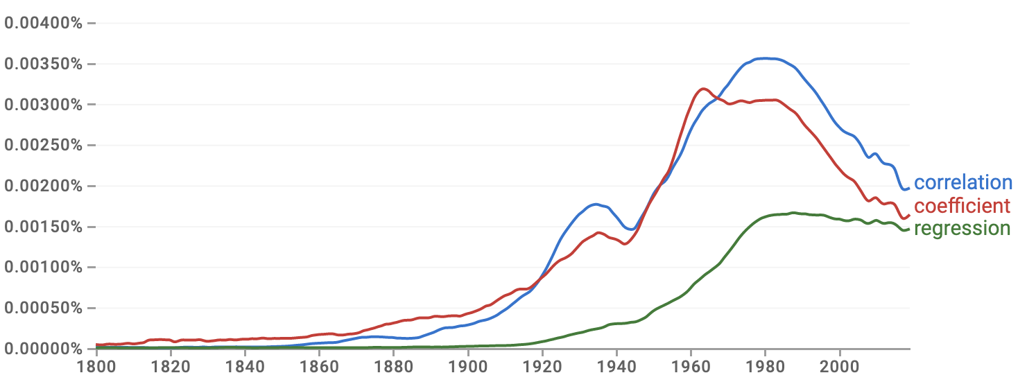
The use of “correlation” started in the mid to late 1800s, reached an early peak in the 1930s, then peaked again around 1980. “Correlation” is tracked closely by “coefficient.” This parallel track might seem evident to historians of statistics; the quantitative measure called the “correlation coefficient” was introduced by Francis Galton in 1888 and quickly became a staple of statistics textbooks.
In contrast to mainstream statistics textbooks, “correlation” barely appears in these lessons (until this chapter). There is a good reason for this. Although the correlation coefficient measures the “strength” of the relationship between two variables, it is a special case of a more general and powerful method that appears throughout these Lessons: regression modeling.
Figure fig-ngram shows that “regression” got a later start than correlation. That is likely because it took 30-40 years before it was appreciated that correlation could be generalized. Furthermore, regression is more mathematically complicated than correlation, so practical use of regression relied on computing, and computers started to become available only around 1950.
Correlation
A dictionary is a starting point for understanding the use of a word. Here are four definitions of “correlation” from general-purpose dictionaries.
“A relation existing between phenomena or things or between mathematical or statistical variables which tend to vary, be associated, or occur together in a way not expected on the basis of chance alone” Source: Merriam-Webster Dictionary
“A connection between two things in which one thing changes as the other does” Source: Oxford Learner’s Dictionary
“A connection or relationship between two or more things that is not caused by chance. A positive correlation means that two things are likely to exist together; a negative correlation means that they are not.” Source: Macmillan dictionary
“A mutual relationship or connection between two or more things,” “interdependence of variable quantities.” Source: [Oxford Languages]
All four definitions use “connection” or “relation/relationship.” That is at the core of “correlation.” Indeed, “relation” is part of the word “correlation.” One of the definitions uses “causes” explicitly, and the everyday meaning of “connection” and “relation” tend to point in this direction. The phrase “one thing changes as the other does” is close to the idea of causality, as is “interdependence.:
Three of the definitions use the words “vary,” “variable,” or “changes.” The emphasis on variation also appears directly in a close statistical synonym for correlation: “covariance.”
Two of the definitions refer to “chance,” that correlation “is not caused by chance,” or “not expected on the basis of chance alone.” These phrases suggest to a general reader that correlation, since not based on chance, must be a matter of fate: pre-determination and the action of causal mechanisms.
We can put the above definitions in the context of four major themes of these Lessons:
Correlation is about relationships; the “correlation coefficient” is a way to describe a straight-line relationship quantitatively. The correlation coefficient addresses the tandem variation of quantities, or, more simply stated, how “one thing changes as the other does.”
To a statistical thinker, the concern about “chance” in the definitions is not about fate but reliability. Sampling variation can lead to the appearance of a pattern in some samples of a process that is not seen in other samples of that same process. Reliability means that the pattern will appear in a large majority of samples.
The unlikeliness of the correlations on the website is another clue to their origin as methodological. Nobody woke up one morning with the hypothesis that cheese consumption and bedsheet mortality are related. Instead, the correlation is the product of a search among many miscellaneous records. Imagine that data were available on 10,000 annually tabulated variables for the last decade. These 10,000 variables create the opportunity for 50 million pairs of variables. Even if none of these 50 million pairs have a genuine relationship, sampling variation will lead to some of them having a strong correlation coefficient.
In statistics, such a blind search is called the “multiple comparisons problem.” Ways to address the problem have been available since the 1950s. (We will return to this topic under the label “false discovery” in Lesson sec-NHT.) Multiple comparisons can be used as a trick, as with the website. However, multiple comparisons also arise naturally in some fields. For example, in molecular genetics, “micro-arrays” make a hundred thousand simultaneous measurements of gene expression. Correlations in the expression of two genes give a clue to cellular function and disease. With so many pairs available, multiple comparisons will be an issue.
Some of the spurious correlations presented on the eponymous website can be attributed to methodological error: using inapproriate statistical methods.
The methods we describe in this Lesson to summarize the contents of a data frame have a property that is perhaps surprising. The summaries do not change even if you re-order the rows in the data frame, say, reversing them top to bottom or even placing intact rows in a random order. Or, seen in another way, the summaries are based on the assumption that each specimen in a data frame was collected independently of all the other specimens.
There is a common situation where this assumption does not hold true. This is when the different specimens are measurements of the same thing spread out over time, for instance, a day-to-day record of temperature or a stock-market index, or an economic statistic such as the unemployment rate. Such a data frame is called a “time series.”
The realization that time series require special statistical techniques came early in the history of statistics. The paper, “On the influence of the time factor on the correlation between the barometric heights at stations more than 1000 miles apart,” by F.E. Cave-Browne-Cave, was published in 1904 in the Proceedings of the Royal Society. Perhaps one reason for the use of initials by the author relates to an important social problem: the failure to recognize properly the contributions of women to science. “Miss Cave,” as she was referred to in 1917 and 1921, respectively by eminent statisticians William Sealy Gosset (who published under the name “Student”) and George Udny Yule, also offered a solution to the problem. Her solution is a historical precursor of “time-series analysis,” a contemporary specialized area of statistics.
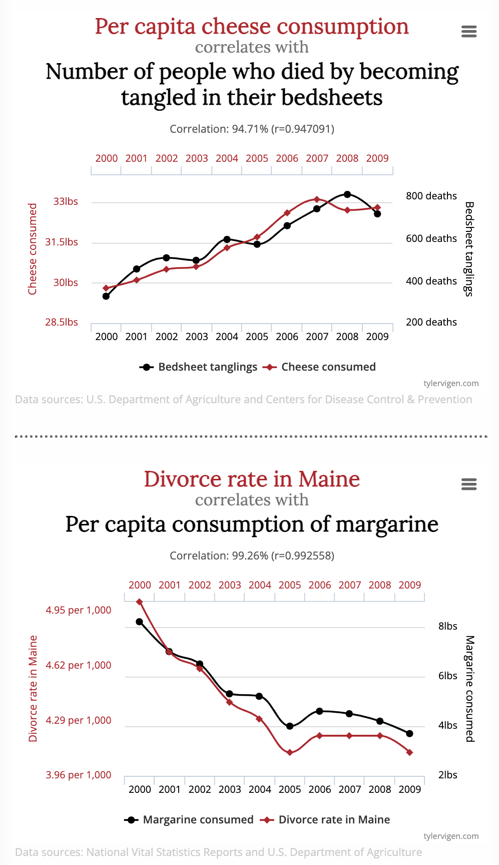
The “Spurious correlations” website http://www.tylervigen.com/spurious-correlations provides entertaining examples of correlations gone wrong. The running gag is that the two correlated variables have no reasonable association, yet the correlation coefficient is very close to its theoretical maximum of 1.0. Typically, one of the variables is morbid, as in Figure fig-spurious-correlation.
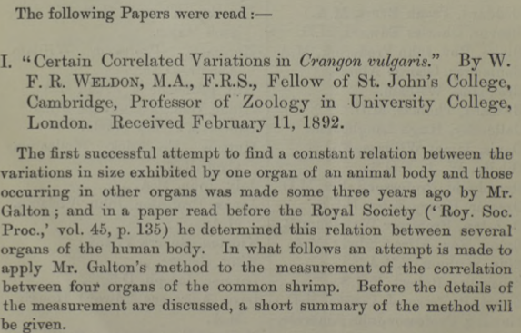
According to Aldrich (1995)^[John Aldrich (1994) “Correlations Genuine and Spurious in Pearson and Yule” Statistical Science 10(4) URL the idea of spurious correlations appears first in an 1897 paper by statistical pioneer and philosopher of science Karl Pearson. The correlation coefficient method was published only in 1888, and, understandably, early users encountered pitfalls. One very early user, W.F.R. Weldon, published a study in 1892 on the correlations between the sizes of organs, such as the tergum and telson in shrimp. (See Figure fig-telson-tergum.)
Pearson noticed a distinctive feature of Weldon’s method. Weldon measured the tergum and telson as a fraction of the overall body length.
Figure fig-shrimp-dag shows one possible DAG interpretation where telson and tergum are not connected by any causal path. Similarly, length is exogenous with no causal path between it and either telson or tergum.
shrimp_sim <- datasim_make(
  tergum <- runif(n, min=2, max=3),
  telson <- runif(n, min=4, max=5),
  length <- runif(n, min=40, max=80),
  x <- tergum/length + rnorm(n, sd=.01),
  y <- telson/length + rnorm(n, sd=.01)
)
# dag_draw(shrimp_dag, seed=101, vertex.label.cex=1)
knitr::include_graphics("www/telson-tergum.png")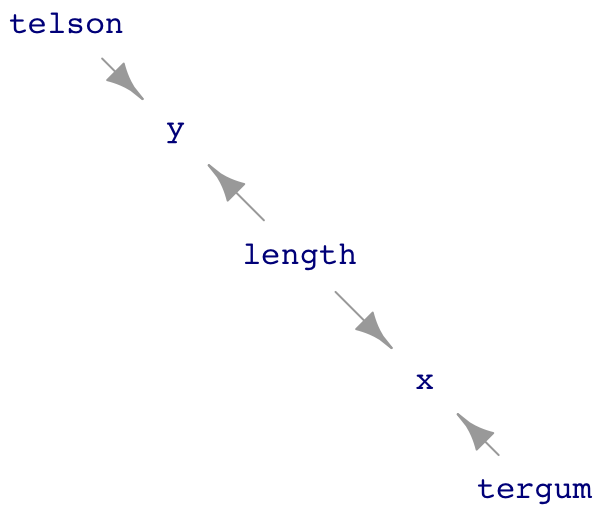
The Figure fig-shrimp-dag shows a hypothesis where there is no causal relationship between telson and tergum. Pearson wondered whether dividing those quantities by length to produce variables x and y, might induce a correlation. Weldon had found a correlation coefficient between x and y of about 0.6. Pearson estimated that dividing by length would induce a correlation between x and y of about 0.4-0.5, even if telson and tergum are not causally connected.
We can confirm Pearson’s estimate by sampling from the DAG and modeling y by x. The confidence interval on x shows a relationship between x and y. In 1892, before the invention of regression, the correlation coefficient would have been used. In retrospect, we know the correlation coefficient is a simple scaling of the x coefficient.
Sample <-take_sample(shrimp_sim, n = 1000)
Sample |> model_train(y ~ x) |> conf_interval()| term | .lwr | .coef | .upr |
|---|---|---|---|
| (Intercept) | 0.0457665 | 0.0490190 | 0.0522715 |
| x | 0.6147549 | 0.6856831 | 0.7566114 |
Sample |> summarize(cor(x, y))| cor(x, y) |
|---|
| 0.514812 |
Pearson’s 1897 work precedes the earliest conception of DAGs by three decades. An entire century would pass before DAGs came into widespread use. However, from the DAG of Figure fig-shrimp-dag] in front of us, we can see that length is a common cause of x and y.
Within 20 years of Pearson’s publication, a mathematical technique called “partial correlation” was in use that could deal with this particular problem of spurious correlation. The key is that the model should include length as a covariate. The covariate correctly blocks the path from x to y via length.
Sample |> model_train(y ~ x + length) |> conf_interval()| term | .lwr | .coef | .upr |
|---|---|---|---|
| (Intercept) | 0.1507687 | 0.1571398 | 0.1635108 |
| x | -0.0362598 | 0.0235473 | 0.0833543 |
| length | -0.0013975 | -0.0013241 | -0.0012508 |
The confidence interval on the x coefficient includes zero once length is included in the model. So the data, properly analyzed, show no correlation between telson and tergum.
In this case, “spurious correlation” stems from using an inappropriate method. This situation, identified 130 years ago and addressed a century ago, is still a problem for those who use the correlation coefficient. Although regression allows the incorporation of covariates, the correlation coefficient does not.
Lesson sec-regression introduced the odd-sounding name of statistical models of a quantitative response variable: “regression models.”
The Oxford Dictionaries gives two definitions of “regression”:
- a return to a former or less developed state. “It is easy to blame unrest on economic regression”
- STATISTICS a measure of the relation between the mean value of one variable (e.g. output) and corresponding values of other variables (e.g. time and cost).
The capitalized STATISTICS in the second definition indicates a technical definition relevant to the named field. The first definition gives the everyday meaning of the word.
Why would the field of statistics choose a term like regression to refer to models? It’s all down to a mis-understanding ….
Francis Galton (1822-1911) invented the first technique for relating one variable to another. As the inventor, he got to give the technique a name: “co-relation,” eventually re-spelled as “correlation” and identified with the letter “r,” called the “correlation coefficient.” It would seem natural for Galton’s successors, such as the political economis Francis Ysidro Edgeworth (1845-1926), to call the generalized method something like “correlation analysis” or “complete correlation” or “multiple correlation.” But Galton had drawn their attention to another phenomenon uncovered by the correlation method. He called this “regression to mediocrity,” although we now call it “regression to the mean.”
The data frame Galton contains the measurements of height that Galton used to introduce correlation. It’s easy to reproduce Galton’s findings with the modern functions we have available:
Galton |> filter(sex == "M") |>
  model_train(height ~ father) |>
model_eval(father = c(62, 78.5))| father | .lwr | .output | .upr |
|---|---|---|---|
| 62.0 | 61.20051 | 66.01928 | 70.83806 |
| 78.5 | 68.55421 | 73.40712 | 78.26003 |
Galton examined the (male) children of the fathers with the most extreme heights: 62 and 78.5 inches in the Galton data. He observed that the son’s were usually closer to average height than the fathers. You can see this in the .output value for each of the two extreme fathers. Galton didn’t know about prediction intervals, but you can see from the .lwr and .upr values that a son of the short father is almost certain to be taller than the father, and vice versa. In a word: regression.
Galton interpreted regression as a genetic mechanism that served to keep the range of heights constant over the generations, instead of diffusing to very short and very tall values. As genetics developed after Galton’s death, concepts such as phenotype vs genotype were developed that help to explain the constancy of the range of heights. In addition, the “regression” phenomenon was discovered to be a general one even when no genetics is involved. Examples: A year with a high crime rates is likely to be followed by a year with a low crime rate, and vice versa. Pilot trainees who make an excellent landing are likely to have a more mediocre landing on the next attempt, and vice versa.
It’s been known for a century that “regression to the mean” is a mathematical artifact of the correlation method, not a general physical phenomenon. Still, the term “regression” came to be associated with the correlation method. And people still blunder into the fallacy that statistical regression is due to a physical phenomenon.
Another example of such substitution of an intriguing name for a neutral-sound name is going on today with “artificial intelligence.” For many decades, the field of artificial intelligence was primarily based on methods that related to rules and logic. These methods did not have a lot of success. Instead, problems such as automatic language translation were found to be much more amenable to a set of non-rule, data-intensive techniques found under the name “statistical learning methods.” Soon, “statistical learning” started to be called “machine learning,” a name more reminiscent of robots than data frames. In the last decade, these same techniques and their successors, are being called “artificial intelligence.”