3 Variation and density, graphically
Variation itself is nature’s only irreducible essence. Variation is the hard reality, not a set of imperfect measures for a central tendency. Means and medians are the abstractions. —– Stephen Jay Gould (1941- 2002), paleontologist and historian of science.
The point plots introduced in Lesson sec-point-plots are designed to show relationships between variables. Much of statistical thinking involves discovering, quantifying, and verifying such relationships. We have already introduced a concept structure for talking about relationships between variables: one variable is identified as the response variable and others as the explanatory variables . In point plots, we use the vertical axis for the response variable and the horizontal axis, color, and faceting for the explanatory variables.
Our focus in this Lesson is on describing the response variable. Remember that the origin of the word “variable” is in the specimen-to-specimen variation in values. We will look at variation in two distinct ways: 1) in this Lesson, looking at the shape of the variation, and 2) in Lesson sec-accounting-for-variation, quantifying the amount of the variation.
We mean “variable” in the statistical sense. People also talk about variables in algebra, which is only distantly connected with statistics.
The “shape” of variation
We turn to a familiar situation to illustrate variation: pregnancy and the duration of gestation—the time from conception to birth. It’s well known that typical human gestation is about nine months. But it varies from one birth to another. We can describe this variation using the Births2022 data frame, a random sample of 20,000 births from the Centers for Disease Control’s census of 3,699,040 US births in 2022. The duration variable records the (estimated) period of gestation in weeks.
Figure fig-gestation-duration1(a) shows just the duration variable. It’s easy to see that durations longer than 45 weeks are rare. “Extremely preterm” births—defined as birth before the 28th week of gestation, are also uncommon. Most common are births at about 39 weeks, that is, about 9 months. The (vertical) spread of the dots shows the extent of variation in duration. The most common outcomes are at the value of duration where the dots have the most “density.”
The tilde expression used is
duration ~ 1, where 1 signifies that there are no explanatory variables.Code
Births2022 |>
  point_plot(duration ~ 1,
             # arguments specifying graphic details
             point_ink = 0.1, size = 0.2, jitter="y")
Births2022 |>
  point_plot(duration ~ 1, annot="violin",
             # graphic details
point_ink = 0.1, size = 0.2, bw=0.5, jitter="y") 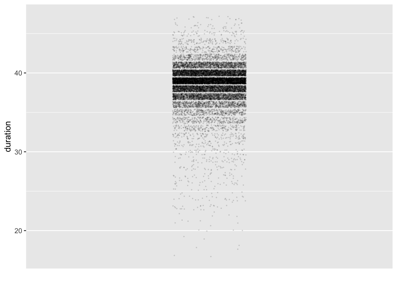

duration (in weeks) of gestation for each of 20,000 randomly selected 2022 births in the US
For many people, the dots drawn in a point plot are reminiscent of seeds or pebbles scattered across an area. Density can be high in some areas, lower in others, negligible or nil in others. The spatial density pattern is called the “distribution” of the variable.
Indeed, a popular synonym for “point plot” is “scatter-plot.”
Tip 3.1
The following R chunk will display just the duration variable from Births2022.
A. Which variable, if any, is mapped to the x axis? How does this correspond to the tilde expression duration ~ 1?
There is no variable on the x axis, the horizontal space is used purely for jittering the dots. The R notation for “no variable” is ~ 1. The character 1 is merely a placeholder.
B. Describe the visual features that justify this statement: “Births at 40 weeks duration are much more common than births at 30 weeks.”
There are many more dots at duration 40 than at duration 30. Admittedly, you can’t count the number of dots at 40, but you can see that the density of dots along the line is much higher at 40 than at 30.
C. Let’s make it a bit easier to perceive the density by jittering the dots vertically. Add the argument jitter = "y" to `point_plot(). Then, based on the resulting plot, answer these questions:
- There is a range of
durationat which you can easily see that the density of points decreases asdurationgets bigger. Roughly, what is that range? - There is a range of
durationat which it’s hard to discern changes in density as duration increases. Again, roughly, what is that range?
- From about 43 weeks upward the density decreases until the dots entirely disappear near 48 weeks.
- The answer might depend on your computer display or eyesight, but it’s fair to say that between 37 and 42 weeks, the density is more or less the same everywhere.
D. It will be easier to see the structure of density within the 37-42 week band by reducing the amount of ink used for each point. Do this by changing the point_ink argument to a value of 0.01. To judge from the resulting graph, which single value of duration has the greatest number of dots? Answer: 39 weeks
Later in this Lesson we will introduce a graphical technique that makes it even easier to see even slight changes in density.
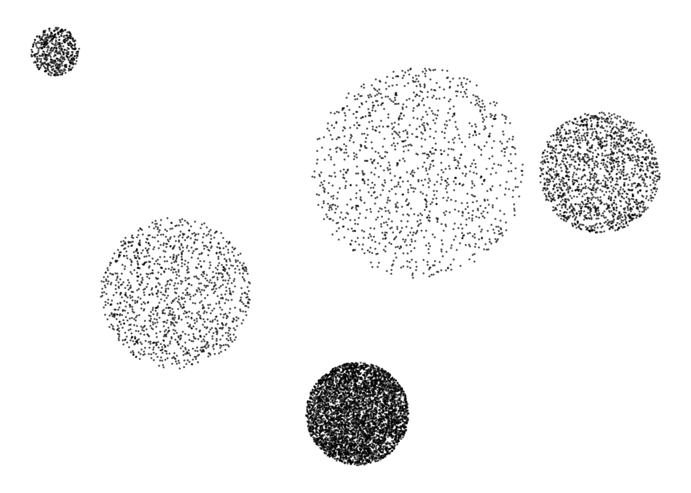
Many people can perceive density in a point plot without any need to count or calculate; it is an intuitive mode of perception. To illustrate, Figure fig-density-explain is a made-up point plot with five patches of different densities. The densities are 25, 50, 100, 200, and 400 points per unit area. Many people find it easy and immediate to point out the most dense patches and even to put the patches in order by density. However, people are hard put to qualify even the relative densities. For instance, the largest patch has a smaller density than the next largest patch, but quantifying this by eye (without being told the densities) is not really possible.
Quantifying density
Our eye gives a qualitative estimate of relative density, not a precise quantitative one. Our graphical perception is more precise when it comes to length or width. Ingeniously, designers of statistical graphics have created an annotation—called a “violin”—that shows the density in terms of width. Figure fig-gestation-duration1(b) adds a violin annotation to the point plot.
You can instruct point_plot() to add a violin annotation by using the annot = "violin" argument. (Note the quotes around "violin".) Try it!
When the variable mapped to x is categorical, you can make a separate violin for each level of the variable:
Example: Do twins take longer?
Violins can be informative when comparing two or more levels of an explanatory variable. To illustrate, consider the duration of gestation for twins versus singletons. Let’s see if the distribution of durations is different for the different kinds of birth.
Code
Births2022 |>
  filter(plurality < 3) |>
  mutate(plurality = factor(plurality, labels = c("singleton", "twin"))) |>
  point_plot(duration ~ plurality,  annot="violin",
            # the following specify graphics details
            point_ink = 0.1, size = 0.2, bw=0.5,
jitter="y", model_ink=0.5) 
duration shown separately for singletons, twins, and (a handful of) triplets.
In Figure fig-duration-plurality, the density of points is vastly different for different levels of plurality. The jitter-column of singletons is much denser than for twins. Singletons are much more common than twins.
Even though there are many more singletons than twins, the violins are roughly the same width. This is by design. The violins in Figure fig-duration-plurality tell the story of birth-to-birth variation of duration within each group. For twins, durations near 36 weeks are much more common than durations near 39 weeks. Similarly, comparing the two violins shows that premature births are much more likely for twins than for singletons. We can see this from the violins despite the fact that the large majority of premature births are of singletons.
Some simple shapes
There are infinitely many different shapes of distributions. Even so, a few simple shapes are common. These are shown in panels (a)-(d) of Figure fig-violin-shapes. Panel (e) is a more complicated shape, infrequently seen in practice. (Unless you are practicing music rather than statistics!)
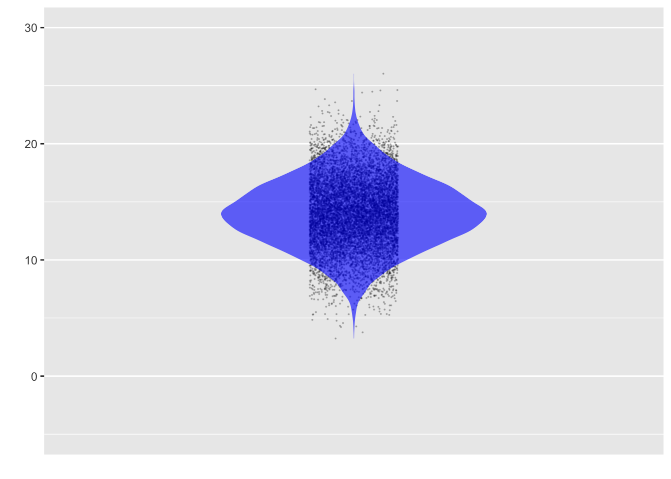


Figure fig-violin-shapes(a) is a uniform distribution, where each possible value is more or less equally likely. It’s not so common to see this in real-world data. When you do, it’s a good sign that something artificial or mathematical is behind the data-generating process.
Much more common is the so-called “normal” distribution of Figure fig-violin-shapes(b). The name given to it, “normal,” is an indication of how commonly it is seen. There is a region of highest density at middle values, with the density falling off symmetrically toward higher and lower values in a “bell-shaped” fashion.
Other common patterns in distribution have a single peak (like the normal distribution) but have “tails” that extend much further than in the normal distribution. These are sometimes called long-tailed distributions. In Figure fig-violin-shapes(c), the long tails are symmetrical around the peak, while in Figure fig-violin-shapes(d), there is only one long tail. Such one-sided, long-tailed distributions are called skew distributions. Skew distributions are particularly common in economic data such as personal or national income.
There have been society-wide consequences to ignoring skewness in favor of “well-behaved,” short-tailed distributions such as the so-called normal distribution. For instance, the 2008 “Great Recession” was partly due to mistakenly high values on mortgage-backed and other financial securities. Financial analysts used valuation techniques that would be appropriate for normal distributions of risky events, but were utterly inadequate in the face of skew distributions.
Example: Skew storms
A life-threatening setting for skew distributions concerns extreme events like large storms and fires.
Monocacy_river |>
  point_plot(precip ~ 1, annot="violin")
US_wildfires |>
  point_plot(area ~ 1, annot="violin")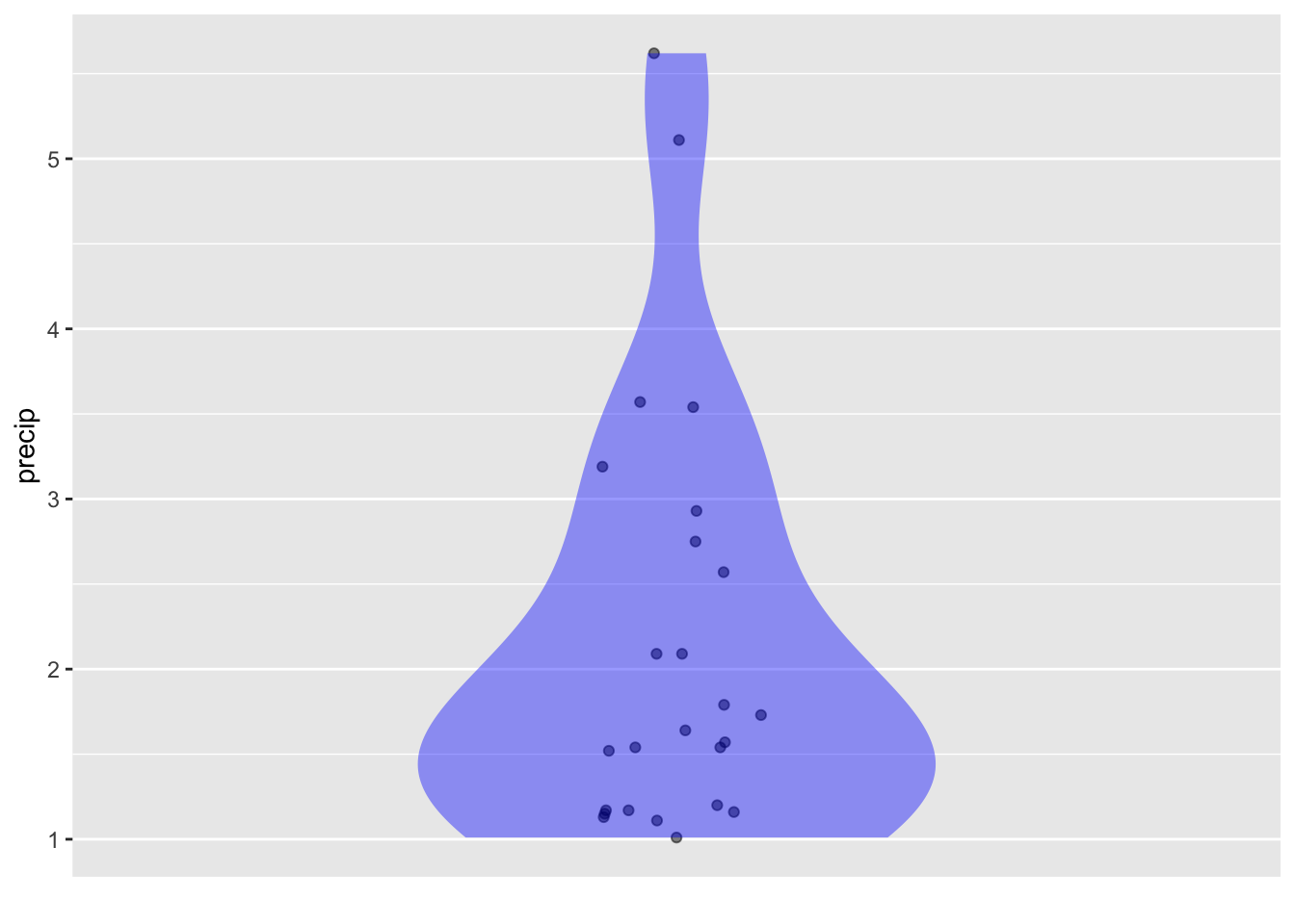

Tip 3.2
Examples is a data frame created specifically for this learning check. It has two variables: y is quantitative and shape is categorical. Run the chunk to see the different distributions for the various levels of shape.
A. At the value point_ink = 1 initially used in the chunk, it can be hard to discern the shape of the distributions. Nonetheless …
- Try to read the graph to figure out which ones of the seven shapes have normal distributions.
- Try to figure out which level of
shapehas the smallest number of specimens in the data frame.
B. Try lower values for point_ink until you find one that makes it pretty easy to answer questions (i) and (ii) from (A). What feature of the new graph signals which shape has the smallest number of specimens?
C. Add violins to the plot in (B).
- Does this make it even easier to answer the question posed in (A.i)?
- Does the violin itself make it easy to answer question (A.ii)? Explain why or why not.
There’s no hint from the violin on shape D that D has fewer specimens than the other levels of shape; the D violin is one of the fattest. Violins tell about the distribution of points within each individual level, not between levels.
In this Lesson, we have emphasized the “shape” of variation, that is, the pattern that shows which values are more common and which less common. In Lesson sec-variation we turn to another aspect of variation that is central to statistical thinking: the amount of variation. Variation can be measured numerically, just as distance or position can be measured numerically. Happily, as we will see in Lesson sec-variation, the name of the quantity often used to measure variation has a name—“variance”—that reflects exactly what it measures: variation.
Exercises
Activity 3.1
Consider this annotated point plot based on the Whickham data frame.
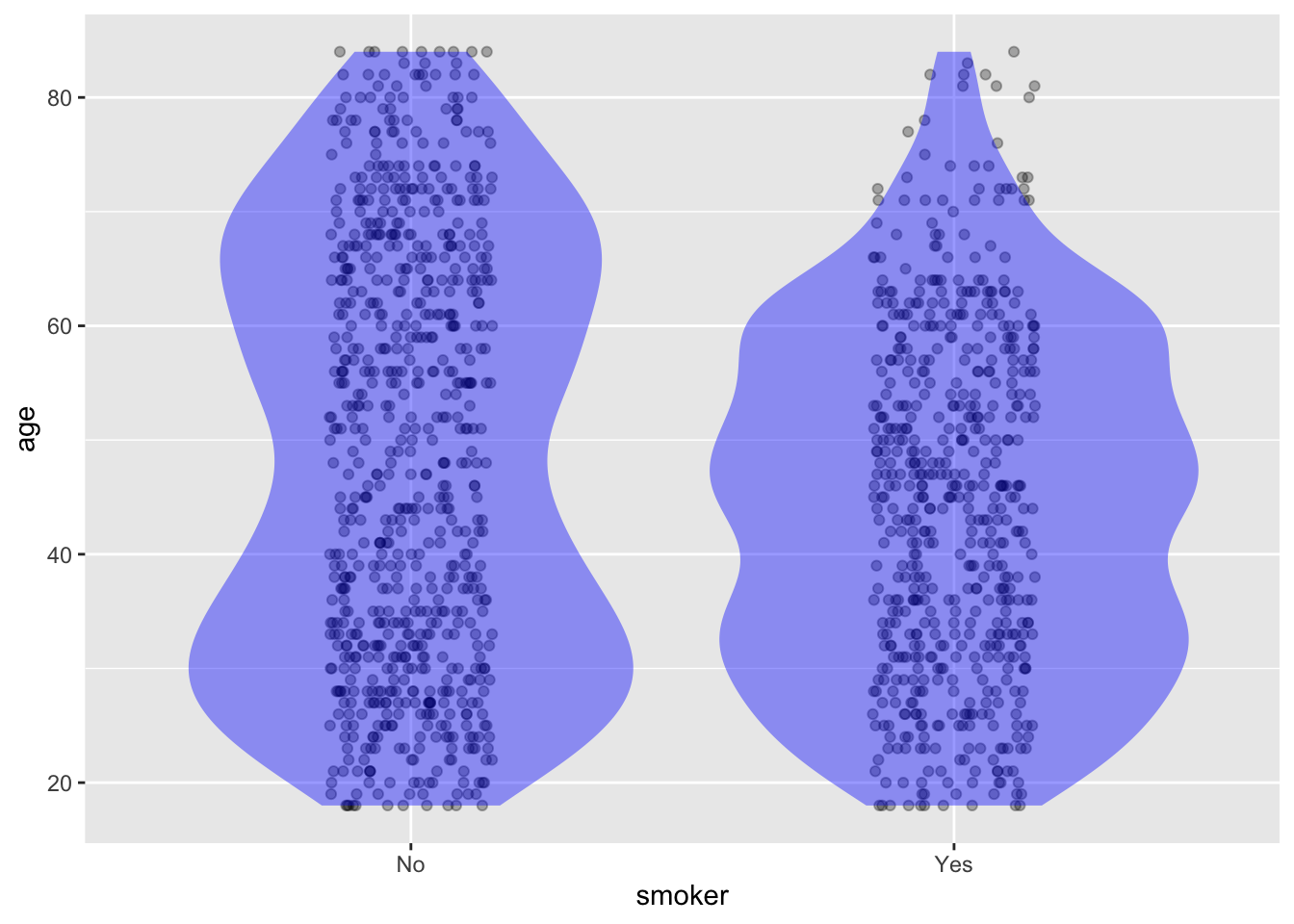
- What tilde expression was used?
- Which group, smokers or non-smokers, has a greater density of people over age 60?
Activity 3.2
Students shopping for textbooks are often surprised by extremely high prices for some books, while prices for others are moderate. In this exercise, we’ll look at one possible factor influencing book price: whether the book is hardcover or paperback.
The graph shows the list price of books (according to the moderndive::amazon_books data frame) broken down by the cover format.

A. Does the observed distribution of prices support a claim that paperbacks tend to be less expensive than hardcovers? Answer: There are both very expensive and very cheap books in each of the two cover formats. For paperbacks, however, a very large fraction are priced close to $20, while hardcovers are predominantly in the $20-30 range.
Perhaps the expensive paperback books are that way because have a lot of pages. To investigate this possibility, we can look at the number of pages in the two cover formats, as in the following graph:
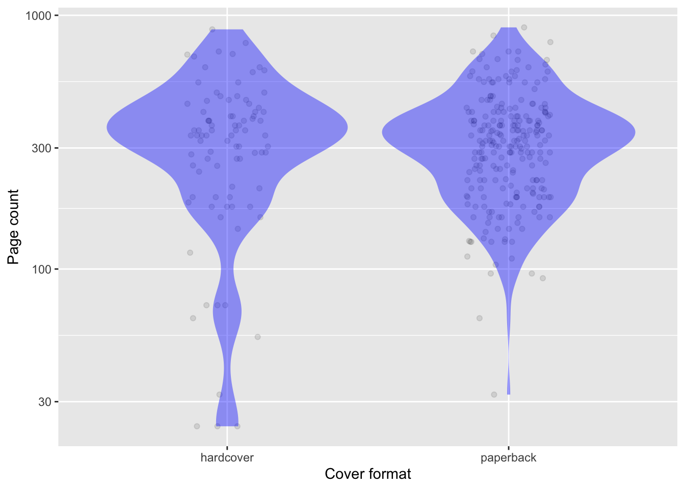
B. Briefly summarize what the graph shows about the relationship between cover format and page count. Answer: The distributions are very similar.
C. To judge from the graphic, are there more paperbacks in the moderndive::amazon_books data frame or more hardcovers? Answer: There are many more dots in the paperback column. Since there is one dot for each row of the data frame, there are more paperbacks than hardcovers.
Activity 3.3
Looking at density using the dots in a point plot involves a different cognitive process than reading off the density from a violin plot. The eye is exquisitely sensitive to small changes in length or width, making it easy to see even small changes in width as the eye moves from top to bottom along the violin. But the eye gives only a rough sense of the density of dots. The cognitive difficulty is that we read density from a violin via the width, while the dots give us a direct sense of density. To emphasize the cognitive difference, the figure shows the same data graphed in three different ways: the usual jittered dots, the violin, and a third display that we’ll comment on in a bit.
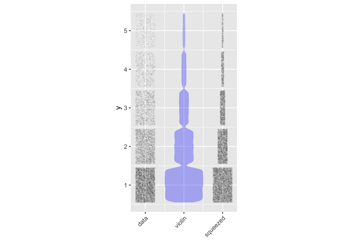
Looking at the left column of patches (labeled “data”), it’s easy to see that the patch for y=1 is denser than the patch for y=2. But it’s hard to tell exactly how much denser one patch is from the other.
In the middle column of patches (labeled “violin”) all the patches have the same intensity/density of blue ink. It’s not the darkness of the ink but the width of the patch that shows the data density.
- To judge from the violin, how dense is patch 2 compared to patch 1? How dense is patch 3 compared to patch 1? Answer: The violin is half as wide at y=2 than it is at y=1, so the y=2 patch is half as dense as the y=1 patch. Similarly, at y=3 the violin is one-quarter as wide as at y=1, so the y=3 patch is one-fourth as dense as the patch at y=1.
Graphic designers are constantly innovating to simplify the cognitive perception of data patterns. The third column (labeled “squeezed”) shows the data in a proposed format that attempts to combine the advantages of the violin and jittered formats.
- Keeping in mind that each individual dot in the “squeezed” format has a counterpart in the “jittered column”, what do you think is being done to the data points to produce the “squeezed” patches? Answer: The amount of horizontal spread in the jittering is being reduced to be proportionate to the density.
In these Lessons, I don’t use the “squeezed” format. I think there is an advantage to having two graphical modes—ink density and width—that display the local density of points.
Activity 3.4 Consider this violin plot
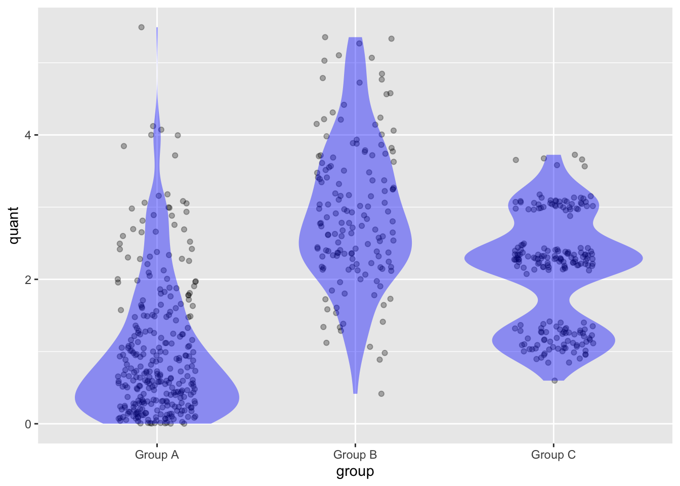
For each group, judge by eye what fraction of the data points have a value of 2 or below.
Which of the three groups has multiple peaks in its density?
Which group has the lowest median?
Activity 3.5

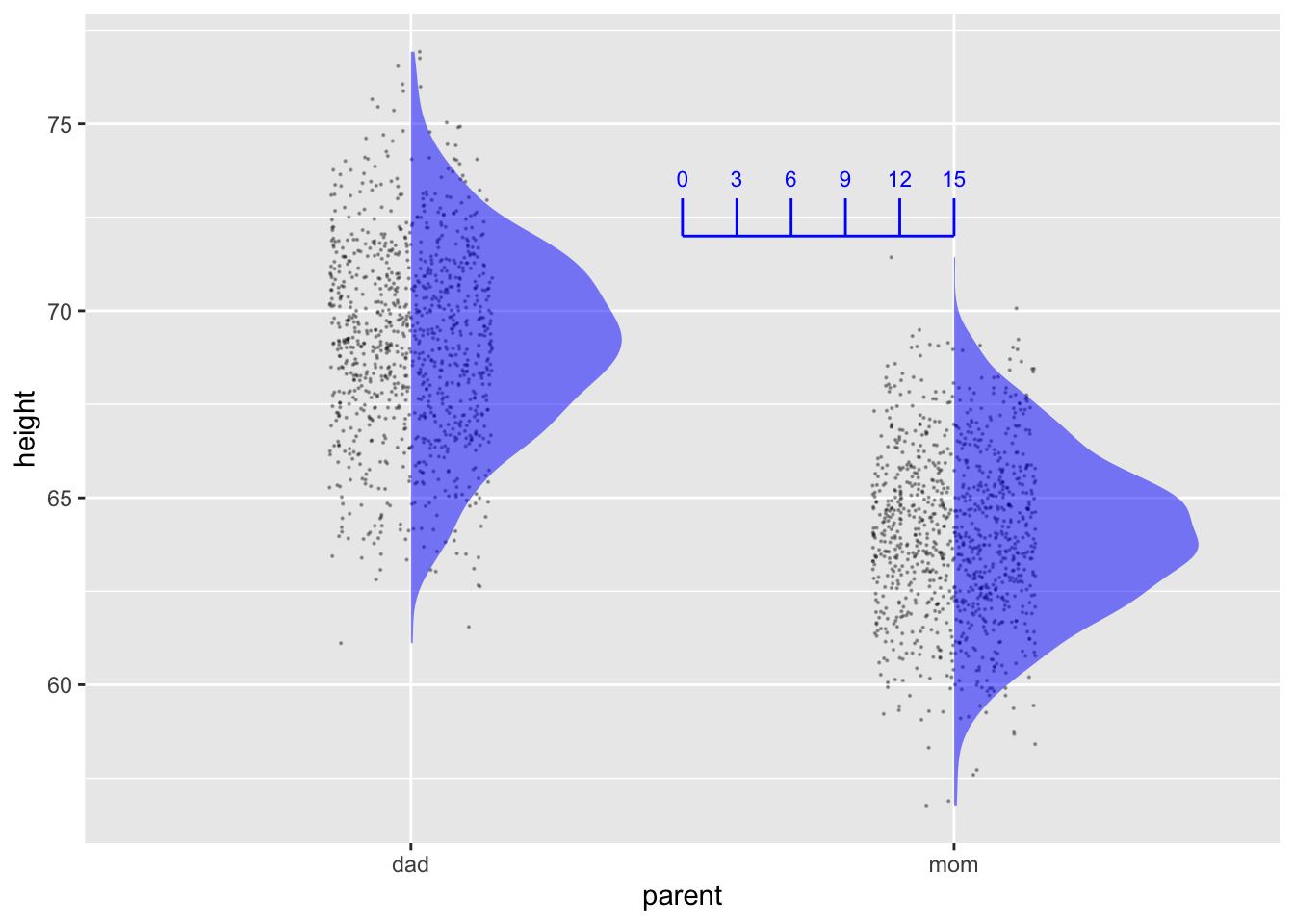
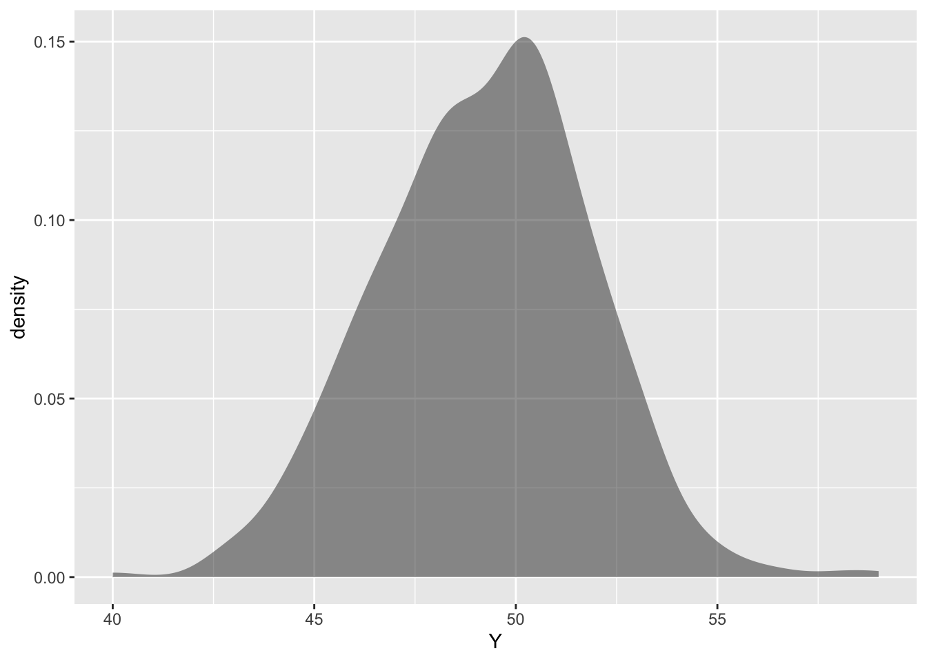
An important graphical convention in these Lessons is that the graphics frame is always about variables so that data points can be placed in it. The vertical and horizontal axes are always mapped to variables (as is color, if used). Violin plots, showing the relative density of data with respect to the vertical variable (e.g. height in Figure fig-duration-plurality) have smoothly changing widths from bottom to top: thin where there are few data points, fat where there are many.
There is another widely used convention for displaying density, which involves a graphical frame that is different. Figure fig-density-frame gives an example.
Code
gf_density(~ height, fill = ~ parent, data=Long_height)
The format of Figure fig-density-frame, let’s call it “density-as-axis,” is accepted and used by all conventional textbooks. If you continue on in statistics, you will certainly encounter that format. We don’t like the form because it breaks the cardinal rule that variables should be mapped to each of the three components of the graphics frame: x-axis, y-axis, color.
The density-as-axis format shows the same information as the violin format. To see the relationship, let’s redraw the violin format with two simple changes:
- Only the left half of each violin will be shown.
- The horizontal and vertical axes will be flipped.

Here is a point plot showing the distribution variable Y as a function of variable X.
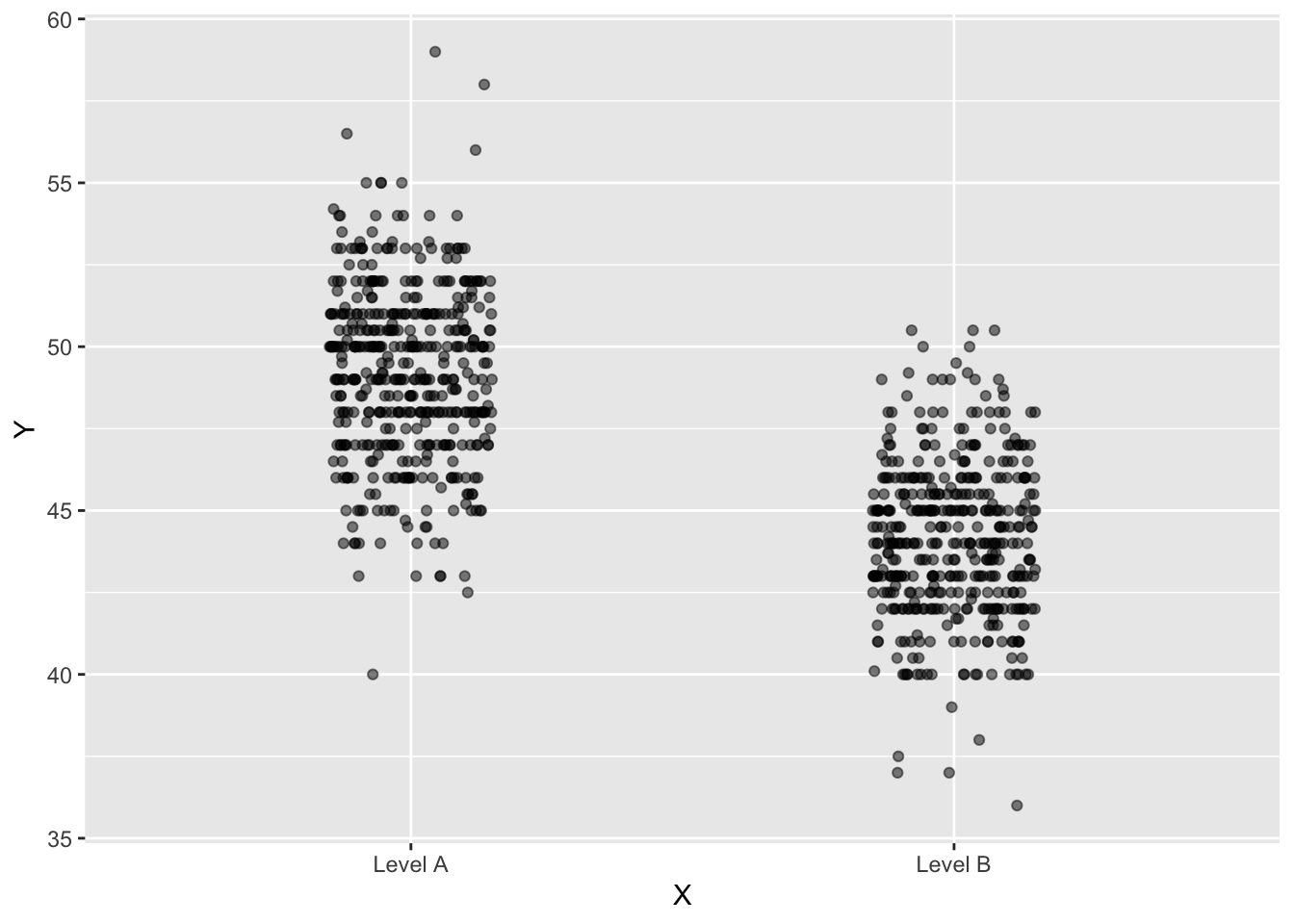
- As best you can, draw violin annotations that corresponds to the density of dots.
Answer:
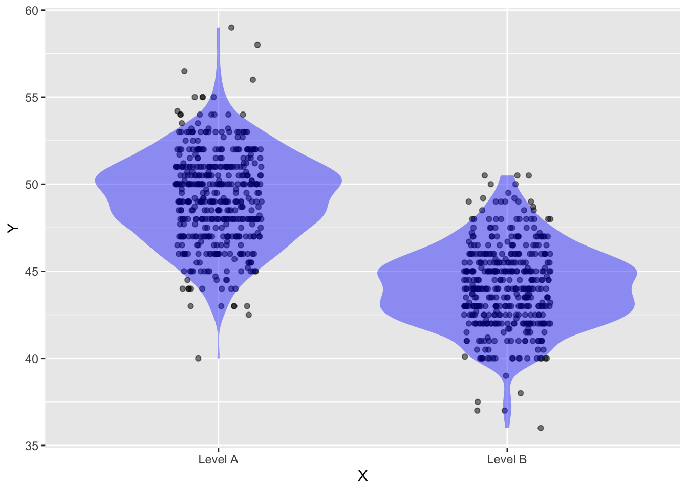
- Make another drawing showing the “density-as-axis” format for the Level-A dots.
Answer:
- In the “density-as-axis” format, how would you show both the Level-A and the Level-B densities in the same graphics frame?
Answer:
Here’s one possibility:
