Extended_grades <- Grades |>
  left_join(Sessions) |>
  left_join(Gradepoint) |>
select(sid, iid, sessionID, gradepoint)12 Adjustment
The phrase “all other things being equal” is a critical qualifier in describing relationships. To illustrate: A simple claim in economics is that a high price for a commodity reduces the demand. For example, increasing the price of gasoline will reduce demand as people avoid unnecessary driving or purchase electric cars. Nevertheless, the claim can be considered obvious only with the qualifier all other things being equal. For instance, the fuel price might have increased because a holiday weekend and the attendant vacation travel has increased the demand for gasoline. Thus, higher gasoline prices may be associated with higher demand unless holding constant other variables such as vacationing.
The Latin equivalent of “all other things being equal” is sometimes used in economics: “ceteris paribus”. The economics claim would be, “higher prices are associated with lower demand, ceteris paribus.”
Although the phrase “all other things being equal” has a logical simplicity, it is impractical to implement “all.” So instead of the blanket “all other things,” it is helpful to consider just “some other things” to be held constant, being explicit about what those things are. Other phrases along the same lines are “adjusting for …,” “taking into account …,” and “controlling for ….”
Groupwise adjustment
“Life expectancy” is a statistical summary familiar to many readers. Life expectancy is often the evidence provided in debates about healthcare policies or environmental conditions. For instance, consider this pull-quote from the Our World in Data website:
“Americans have a lower life expectancy than people in other rich countries despite paying much more for healthcare.”
| Country | Female | Male |
|---|---|---|
| Japan | 87.6 | 84.5 |
| Spain | 86.2 | 80.3 |
| Canada | 84.7 | 80.6 |
| United States | 80.9 | 76.0 |
| Bolivia | 74.0 | 71.0 |
| Russia | 78.3 | 66.9 |
| North Korea | 75.9 | 67.8 |
| Haiti | 68.7 | 63.3 |
| Nigeria | 63.3 | 59.5 |
| Somalia | 58.1 | 53.4 |
The numbers in Table tbl-life-expectancy faithfully reflect the overall situation in the different countries. Yet, without adjustment, they are not well suited to inform about specific situations. For example, life expectancies are usually calculated separately for males and females, acknowledging a significant association of life expectancy with sex, not just the availability of medical care. We will call such a strategy “groupwise adjustment” because it’s based on acknowledging difference between groups. You’ll see similar groupwise adjustment of life expectancy on the basis of race/ethnicity.
Over many years teaching epidemiology at Macalester College, I asked students to consider life-expectancy tables and make policy suggestions for improving things. Almost always, their primary recommendations involved improving access to health care, especially for the elderly.
But life expectancy is not mainly, or even mostly, about old age. Two critical determinants are infant mortality and lethal activities by males in their late teenage and early adult years. If we want to look at conditions in the elderly, we need to consider elderly people separately, not mixed in with infants, children, and adolescents. For reasons we won’t explain here, with life expectancy calculations it’s routine to calculate a separate “life expectancy at age X” for each age year. Table tbl-life-expectancy-at-70 shows, according to the World Health Organization, how many years longer a 70-year old can expect to live. The 30-year difference between Japan and Somalia seen in Table tbl-life-expectancy is reduced, for 70-year olds, to about a decade. The differences between males and females are similarly reduced
| Country | Female | Male |
|---|---|---|
| Japan | 21.3 | 17.9 |
| Canada | 18.0 | 15.6 |
| Spain | 17.0 | 14.0 |
| United States | 18.3 | 16.3 |
| Russia | 16.2 | 12.2 |
| Bolivia | 13.6 | 13.0 |
| Haiti | 12.9 | 12.1 |
| Somalia | 11.6 | 9.7 |
Adjustment with per
The previous example demonstrated adjustment by comparing similar subgroups. Here, we focus on adjustment by converting quantities into rates . For instance, “10 miles” is a quantity of distance. But “10 miles per hour” is a rate that compares the distance travelled to the time taken for the trip. Rates are always quotients, one quantity divided by another.
Often, the denominator of a rate—recall that quotients consist of a “numerator” divided by a “denominator”—is often a duration of time, but not always. Some examples:
- “Dollars per gallon” for gasoline prices.
- “Pounds per square inch” as in measuring air pressure.
- “Euros per dollar” for expressing an exchange rate between two currencies.
- “Children per woman” is a way of expressing fertility rates.
- “Percent per year” is a common way of expressing a rate of growth, as with interest accumulating on a student loan.
In everyday speech, the word per is used to identify the quantity as a rate and serves grammatically to separate the numerator of the quotient from the denominator.
Rates are sometimes confusing to the unpracticed ear. For instance, some rates are constructed with two divisions. Physics students learn to express acceleration as “meters per second per second.” Similarly, a country’s birth rate can be expressed by “births per year per 1000 population.”
In economics and governance, rates often involve taking a total quantity and dividing it by the size of the population. For instance, total yearly spending on chewing gum in the US is estimated to be 2.4 billion dollars. The size of the population in the US is about 340 million people. Expressed as a rate, chewing-gum spending is about 7 dollars per person.
Very often, such “per person” rates are expressed using Latin: per capita.
“In 2020, children (0-18) accounted for 23 percent of the population and 10 percent of personal health care (PHC) spending, working age adults (19-64) accounted for 60 percent of the population and 53 percent of PHC, and older adults (65 and older) account for 17 percent of the population and 37 percent of PHC.”
| group | age span | population | PHC spending |
|---|---|---|---|
| children | 0-18 | 23% | 10% |
| working age adults | 19-64 | 60% | 53% |
| older adults | 65+ | 17% | 37% |
The textual presentation of data in Figure fig-CMS-spending, presents relevant information but obscures the patterns. The author would have done better by placing the numbers that are to be compared to one another next to one another. A tabular organization makes it much easier to compare the relative population sizes of the age groups. For instance, the population column of Table tbl-PHC-spending shows at a glance that the population of children and older adults are about the same.
Similarly, the table’s “PHC spending” column makes it obvious that PHC spending is much higher for working age adults than for either children or older adults.
In comparing the spending between groups, it can be helpful to take into account the differing population sizes. A per capita adjustment—spending divided by population size—accomplishes it. For instance, the per capita adjustment for children is 10% / 23%, that is, 0.43. Table tbl-per-capita-spending shows the per capita spending for all three age groups.
| group | age | population | spending | spending per capita |
|---|---|---|---|---|
| children | 0-18 | 23% | 10% | 0.43 |
| working age adults | 19-64 | 60% | 53% | 0.88 |
| older adults | 65+ | 17% | 37% | 2.18 |
Including the per capita adjusted spending in the table makes it easy to see an important pattern: older adults have much higher health spending (per person) than the other groups.
The method of adjustment by dividing one quantity by another has much broader applications. To illustrate, let’s return to the example of college grades from sec-grade-joins. There, we calculated using simple wrangling each student’s grade-point average and an instructor grade-giving average. The instructor’s grade-giving average varies so much that it seems short-sighted to neglect it as a factor in determining a student’s grade in that instructor’s courses.
An adjustment for the instructor can be made by constructing a per-type index. An instructor gave each grade, but instead of considering the grade literally, let’s divide the grade by the grade-giving average of the instructor involved.
We can consider the instructors’ iGPA to calculate an instructor-adjusted GPA for students. We create a data frame with the instructor ID and numerical grade point for every grade in the Grades and Sessions tables. First, we use “joins” to bring together the tables from the database.
| sid | iid | sessionID | gradepoint |
|---|---|---|---|
| S32418 | inst268 | session2911 | 3.00 |
| S32328 | inst436 | session3524 | 3.66 |
| S32250 | inst268 | session2911 | 2.66 |
| S32049 | inst436 | session2044 | 3.33 |
| S31914 | inst436 | session2044 | 3.66 |
| S31905 | inst436 | session2044 | 4.00 |
| S31833 | inst436 | session3524 | 3.33 |
| S31461 | inst264 | session1904 | 4.00 |
| S31197 | inst436 | session3524 | 3.00 |
| S31194 | inst264 | session1904 | 2.00 |
Next, calculate the instructor-by-instructor “grade-giving average” (gga):
Instructors <- Extended_grades |>
summarize(gga = mean(gradepoint, na.rm = TRUE), .by = iid)Show_these| iid | gga |
|---|---|
| inst436 | 3.583778 |
| inst264 | 2.973500 |
| inst268 | 3.062195 |
Three rows from the Instructors data frame.
Joining the Instructors data frame with Extended_grades puts the grade earned and the average grade given next to one another. The unit of observation is still a student receiving a grade in a class session.
With_instructors <-
  Extended_grades |>
left_join(Instructors)| sid | iid | sessionID | gradepoint | gga |
|---|---|---|---|---|
| S32310 | inst436 | session2193 | 3.66 | 3.58 |
| S31794 | inst436 | session2541 | 3.66 | 3.58 |
| S32289 | inst264 | session2235 | 4.00 | 2.97 |
| S31461 | inst264 | session1904 | 4.00 | 2.97 |
| S32211 | inst268 | session2650 | 2.33 | 3.06 |
| S32250 | inst268 | session2911 | 2.66 | 3.06 |
Joining Extended_grades with Instructors.
Make the per adjustment by dividing gradepoint by gga to create a grade index. We will then average this index for each student to create each student’s instructor-adjusted GPA (adj_gpa), shown in Table tbl-adj-gpa.
Adjusted_gpa <-
  With_instructors |>
  mutate(index = gradepoint / gga) |>
summarize(adj_gpa = mean(index, na.rm = TRUE), .by = sid)| sid | adj_gpa |
|---|---|
| S31197 | 0.958 |
| S31914 | 1.040 |
| S31461 | 1.150 |
| S32250 | 0.928 |
| S31194 | 0.998 |
| S32418 | 0.933 |
| S32049 | 0.981 |
| S32328 | 1.020 |
Adjustment by modeling
unadjusted <- FARS |> model_train(crashes ~ year) |>
  model_eval(data = FARS)

adjusted <- FARS |>
  model_train(crashes ~ year + vehicle_miles) |>
  model_eval(data = FARS |> mutate(vehicle_miles=3000))

gf_point(.output ~ year, data = unadjusted) |>
  gf_point(.output ~ year, data = adjusted, color = "blue")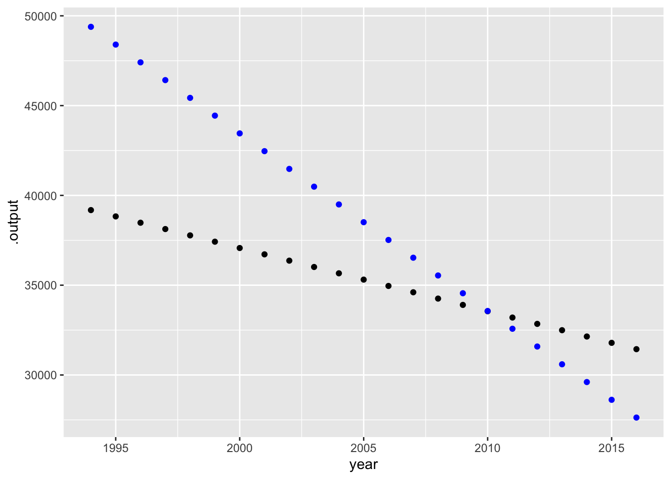
We will use the word “adjustment” to name the statistical techniques by which “other things” are considered. Those other things, as they appear in data, are called “covariates.”
“Per” adjusting for a covariate by creating an appropriate quotient is an important and somewhat intuitive technique. Less intuitive, but sometimes more powerful, is using a statistical model to accomplish the adjustment.
To illustrate, consider the data on auto traffic safety compiled by the US Department of Transportation. The data frame FARS (short for “Fatality Analysis Recording System”) records data from 1994 to 2016. Did driving become safer or more dangerous over that period?
We can look at the relationship between the number of crashes each year and the year itself, as in Figure fig-fars-by-year.
FARS |> mutate(rate = crashes / vehicle_miles) |>
  mutate(after_adjustment = rate * 2849) |>
  point_plot(after_adjustment ~ year)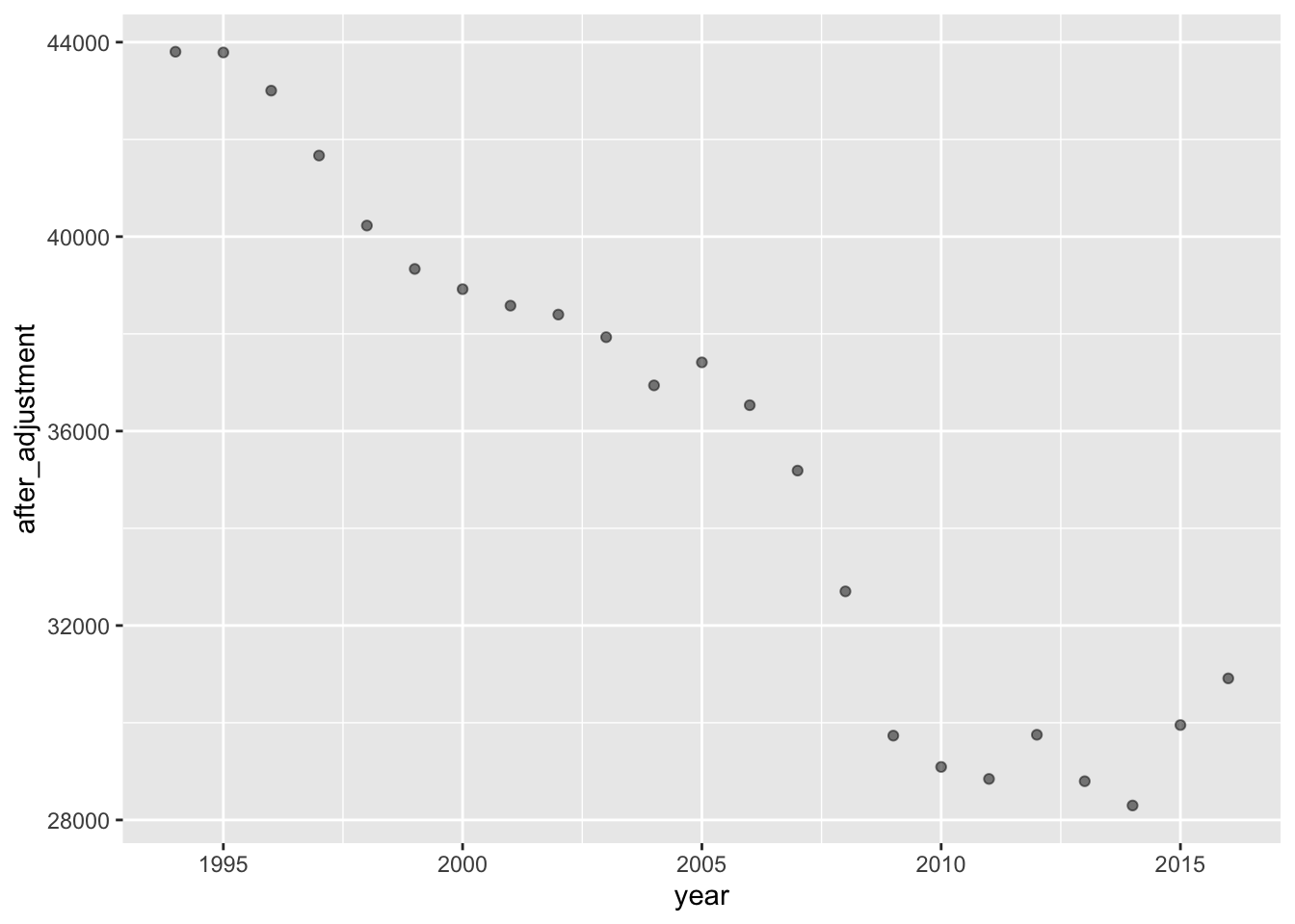
FARS |>
  point_plot(crashes ~ year, annot = "model")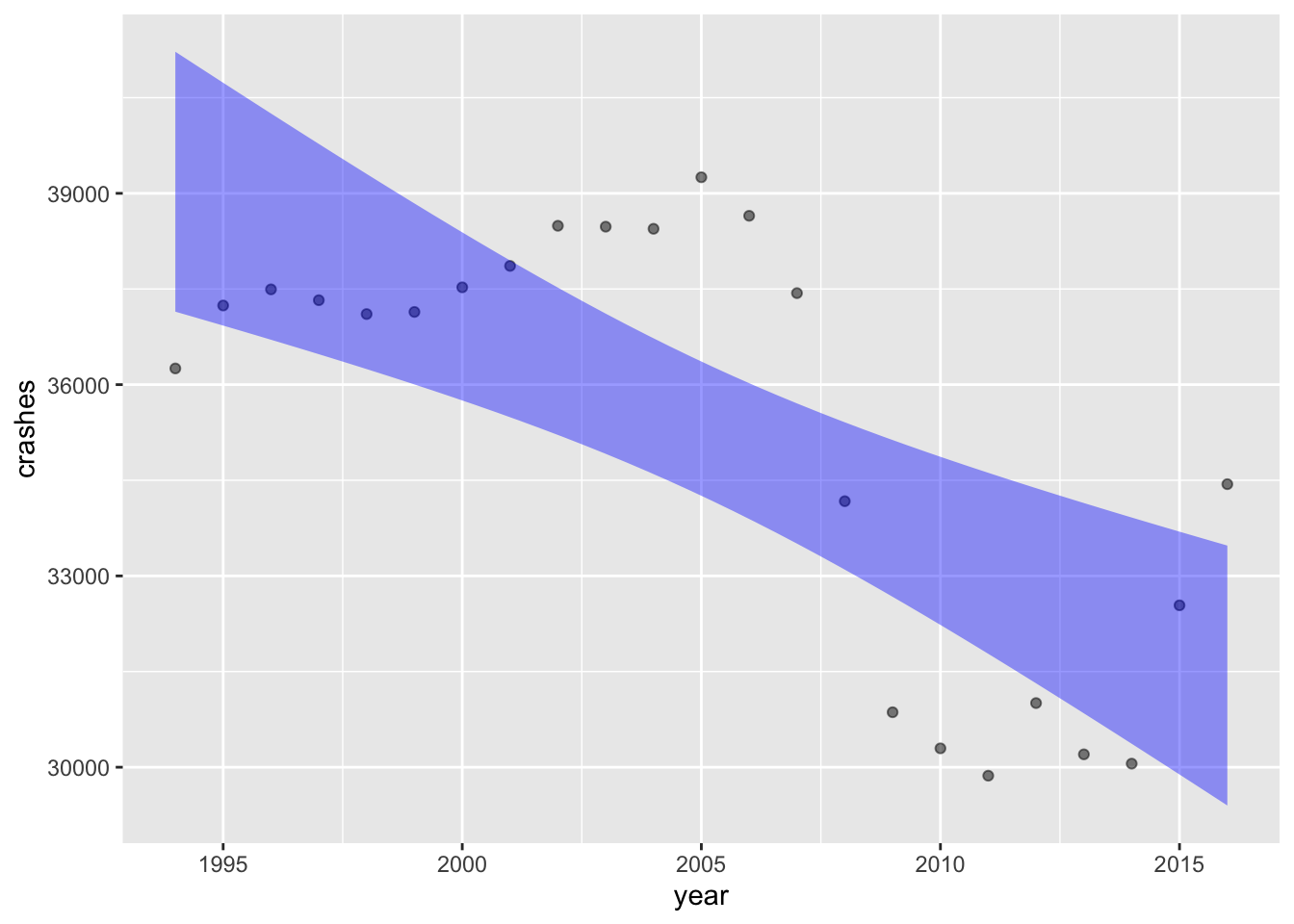
An important factor in the number of crashes in a year is the amount of driving in that year. FARS records this as vehicle_miles, as if all cars shared the same odometer. But the number of crashes might be influenced by the number of licensed drivers (more inexperienced drivers leading to more crashes?), or the number of registered vehicles (older cars still on the road leading to more crashes?). We can take all these into account by building a model and evaluating it for each year at specified values for each of the covariates. We’ll use the mean of each of the covariates for the model evaluation.
FARS |>
  summarize(miles = mean(vehicle_miles),
            vehicles = mean(registered_vehicles),
drivers = mean(licensed_drivers))| miles | vehicles | drivers |
|---|---|---|
| 2848.957 | 240101.2 | 199337.4 |
Now, to build the model:
Mod <- FARS |>
  model_train(crashes ~ year + vehicle_miles +
                registered_vehicles + licensed_drivers)
Evaluate_at <- FARS |>
  mutate(vehicle_miles = 2849,
         registered_vehicles = 240101,
         licensed_drivers = 199337)
Mod |> model_eval(data = Evaluate_at) |>
point_plot(.output ~ year) 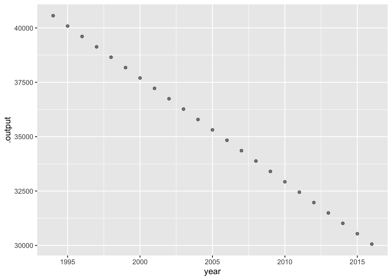
To illustrate, consider the Childhood Respiratory Disease Study which examined possible links between smoking and pulmonary capacity, as measured by “forced expiratory volume” (FEV). The data are recorded in the CRDS data frame. The unit of observation is a child. CRDS contains several variables including the “forced expiratory volume” (FEV variable) and smoker. Higher forced expiratory volume is a sign of better respiratory capacity. Knowing what we do today about the dangers of smoking, we might hypothesize that the FEV measurement will be related to smoking.
# IN DRAFT: Replace CRDS with FEV until the LSTbook package is updated.
CRDS |>
  point_plot(FEV ~ smoker, annot = "model",
             point_ink = 0.2, model_ink = 1)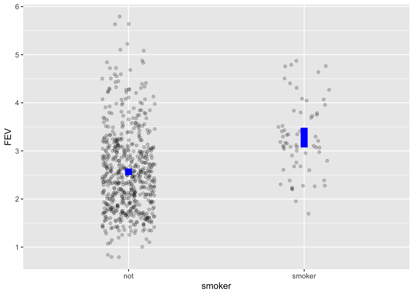
To judge from Figure fig-fev-smoking, children who smoke tend to have larger FEV than their non-smoking peers. This counter-intuitive result might give pause. Is there some covariate that would clarify the picture?
Since FEV largely reflects the physical capacity of the lungs, perhaps we need to consider the child’s age or height. “consider age or height” we mean “adjust for age or height.”
There are two phases for modelling-based adjustment, one requiring careful thought and understanding of the specific system under study, the other—the topic of this section—involving only routine, straightforward modeling calculations.
Here’s the calculation of the model .output as a function of smoker, without any adjustment. That is, smoker is the only explanatory variable.
FEV ~ smoker without any covariates.
CRDS |>
  model_train(FEV ~ smoker) |>
  model_eval(data = CRDS) |>
  select(.output, smoker) |>
unique()| .output | smoker |
|---|---|
| 2.566143 | not |
| 3.276861 | smoker |
The adjusted model involves three phases:
Phase 1: Choose relevant covariates for adjustment. This almost always involves familiarity with the real-world context. Here, we’ll use height and age, reflecting the fact that bigger kids tend to have larger FEV.
Phase 2: Build a model with the covariates from Phase 1 as explanatory variables.
adjusted_model <-
  CRDS |>
  model_train(FEV ~ smoker + height + age)
Phase 3: Evaluate the adjusted model but don’t use the actual values of the covariates. Instead, standardize the values of the covariates to constant, representative values. We’ll use age 15 and height 60 inches.
adjusted_model |>
  model_eval(
    data = CRDS |> mutate(age = 15, height = 60)
  ) |>
  select(.output, smoker) |>
unique()| .output | smoker |
|---|---|
| 2.825793 | not |
| 2.715561 | smoker |
Models highlight trends in the data, but the trends in this case are different with and without adjustment. Adjustment for age and height raises the model output for non-smokers and lowers it for smokers.
This is the core of adjustment: comparing individual specimens after putting them on the same footing, that is, ceteris paribus.
Exercises
Activity 12.1
Consider again the FARS data on the number of crashes each year. The raw data are plotted in Figure fig-fars-by-year. (Hover over the link to see the graph.) But presumably, the total number of crashes is related to the “amount of driving” in that year.
A. Here’s a graph of accidents per vehicle mile over the years.
FARS |>
  mutate(rate = crashes / vehicle_miles) |>
  point_plot(rate ~ year)
How does the year-to-year pattern of the accident rate compare to the year-to-year pattern of the raw number of accidents?
B. There are several other ways to measure “the amount of driving.” Following the per-capita style, we might want to create an crash rate that is number of crashes divided by the size of the population. Or maybe divide by the number of licenced_drivers or the number of registered_vehicles.
Create each of these rates and plot them versus year. Comment on whether they show the same pattern as in (A).
Comment: Vehicle-miles driven can change quickly from one year to the next, for example in response to the “Great Recession” of 2008. But population or the number of licensed drivers or registered vehicles can change only slowly.
Activity 12.4
Participation-adjusted school performance. Something is not working here. You’ll need to take spending into account
SAT |> model_train(sat ~ frac + expend) |> conf_interval()| term | .lwr | .coef | .upr |
|---|---|---|---|
| (Intercept) | 949.908859 | 993.831659 | 1037.754459 |
| frac | -3.283679 | -2.850929 | -2.418179 |
| expend | 3.788291 | 12.286518 | 20.784746 |
SAT |> select(state, sat, frac, expend) |>
mutate(adj_sat = sat - 0.00297*(50-frac) + 0.0127*(6 - expend))| state | sat | frac | expend | adj_sat |
|---|---|---|---|---|
| Alabama | 1029 | 8 | 4.405 | 1028.8955 |
| Alaska | 934 | 47 | 8.963 | 933.9535 |
| Arizona | 944 | 27 | 4.778 | 943.9472 |
| Arkansas | 1005 | 6 | 4.459 | 1004.8889 |
| California | 902 | 45 | 4.992 | 901.9980 |
| Colorado | 980 | 29 | 5.443 | 979.9447 |
| Connecticut | 908 | 81 | 8.817 | 908.0563 |
| Delaware | 897 | 68 | 7.030 | 897.0404 |
| Florida | 889 | 48 | 5.718 | 888.9976 |
| Georgia | 854 | 65 | 5.193 | 854.0548 |
| Hawaii | 889 | 57 | 6.078 | 889.0198 |
| Idaho | 979 | 15 | 4.210 | 978.9188 |
| Illinois | 1048 | 13 | 6.136 | 1047.8884 |
| Indiana | 882 | 58 | 5.826 | 882.0260 |
| Iowa | 1099 | 5 | 5.483 | 1098.8729 |
| Kansas | 1060 | 9 | 5.817 | 1059.8806 |
| Kentucky | 999 | 11 | 5.217 | 998.8941 |
| Louisiana | 1021 | 9 | 4.761 | 1020.8940 |
| Maine | 896 | 68 | 6.428 | 896.0480 |
| Maryland | 909 | 64 | 7.245 | 909.0258 |
| Massachusetts | 907 | 80 | 7.287 | 907.0728 |
| Michigan | 1033 | 11 | 6.994 | 1032.8715 |
| Minnesota | 1085 | 9 | 6.000 | 1084.8782 |
| Mississippi | 1036 | 4 | 4.080 | 1035.8878 |
| Missouri | 1045 | 9 | 5.383 | 1044.8861 |
| Montana | 1009 | 21 | 5.692 | 1008.9178 |
| Nebraska | 1050 | 9 | 5.935 | 1049.8791 |
| Nevada | 917 | 30 | 5.160 | 916.9513 |
| New Hampshire | 935 | 70 | 5.859 | 935.0612 |
| New Jersey | 898 | 70 | 9.774 | 898.0115 |
| New Mexico | 1015 | 11 | 4.586 | 1014.9021 |
| New York | 892 | 74 | 9.623 | 892.0253 |
| North Carolina | 865 | 60 | 5.077 | 865.0414 |
| North Dakota | 1107 | 5 | 4.775 | 1106.8819 |
| Ohio | 975 | 23 | 6.162 | 974.9178 |
| Oklahoma | 1027 | 9 | 4.845 | 1026.8929 |
| Oregon | 947 | 51 | 6.436 | 946.9974 |
| Pennsylvania | 880 | 70 | 7.109 | 880.0453 |
| Rhode Island | 888 | 70 | 7.469 | 888.0407 |
| South Carolina | 844 | 58 | 4.797 | 844.0390 |
| South Dakota | 1068 | 5 | 4.775 | 1067.8819 |
| Tennessee | 1040 | 12 | 4.388 | 1039.9076 |
| Texas | 893 | 47 | 5.222 | 893.0010 |
| Utah | 1076 | 4 | 3.656 | 1075.8931 |
| Vermont | 901 | 68 | 6.750 | 901.0439 |
| Virginia | 896 | 65 | 5.327 | 896.0531 |
| Washington | 937 | 48 | 5.906 | 936.9953 |
| West Virginia | 932 | 17 | 6.107 | 931.9006 |
| Wisconsin | 1073 | 9 | 6.930 | 1072.8664 |
| Wyoming | 1001 | 10 | 6.160 | 1000.8792 |
Examples of adjustment using the method described at the end of the last section.
Activity 12.6
MAKE AN EASY EXERCISE OUT OF THIS. NOTE THAT THE PRESENTATION OF THE AGE DISTRIBUTION IS MUCH LIKE A VIOLIN PLot.
Maybe ask what’s happening at the top of the pyramid: Is the sharp decline in population owing to death rates, or is it the passage of the teenage hump from 1972 through 50 years of aging.
The World Health Organization standard population
There is much to be learned by comparing health statistics in different countries. For example, in comparing countries with the same level of income, etc., the country with the best health statistics might have useful examples for public policy. Of course, meaningful health statistics should be adjusted for age. Adjustment is done by reference to a “standard population.” Figure fig-who-standard-population shows the World Health Organizations standard population. Following the pattern observed in most of the world, younger people predominate. A similar pattern was seen in the US many decades ago, but the US population has changed dramatically and now includes roughly equal numbers of people over a wide span of ages. Even so, the WHO standard population is valuable for comparing US health statistics to those in other countries that have a different age distribution.
NEED TO FIX THE FOLLOWING CHUNK
Comparing the World Health Organization’s standard population to the US population in 1972 and 2021. Females are shown in blue, males in green.
Activity 12.7
See rural vs. urban mortality rates at https://jamanetwork.com/journals/jama/fullarticle/2780628
From Google: According to a 2021 National Center for Health Statistics (NCHS) data brief, Trends in Death Rates in Urban and Rural Areas: United States, 1999–2019, the age-adjusted death rate in rural areas was 7% higher than that of urban areas, and by 2019 rural areas had a 20% higher death rate than urban areas. https://www.ruralhealthinfo.org/topics/rural-health-disparities#:~:text=According%20to%20a%202021%20National,death%20rate%20than%20urban%20areas.
Adjusting for age
“Life tables” are compiled by governments from death certificates.
LTraw <- readr::read_csv("www/life-table-raw.csv")Rows: 120 Columns: 7
── Column specification ────────────────────────────────────────────────────────
Delimiter: ","
dbl (7): age, male, mnum, mlife_exp, female, fnum, flife_exp
ℹ Use `spec()` to retrieve the full column specification for this data.
ℹ Specify the column types or set `show_col_types = FALSE` to quiet this message.head(LTraw)| age | male | mnum | mlife_exp | female | fnum | flife_exp |
|---|---|---|---|---|---|---|
| 0 | 0.005837 | 100000 | 74.12 | 0.004907 | 100000 | 79.78 |
| 1 | 0.000410 | 99416 | 73.55 | 0.000316 | 99509 | 79.17 |
| 2 | 0.000254 | 99376 | 72.58 | 0.000196 | 99478 | 78.19 |
| 3 | 0.000207 | 99350 | 71.60 | 0.000160 | 99458 | 77.21 |
| 4 | 0.000167 | 99330 | 70.62 | 0.000129 | 99442 | 76.22 |
| 5 | 0.000141 | 99313 | 69.63 | 0.000109 | 99430 | 75.23 |
Wrangling to a more convenient format (for our purposes):
LT <- tidyr::pivot_longer(LTraw |> select(age, male, female), c("male", "female"), names_to="sex", values_to="mortality")
LT| age | sex | mortality |
|---|---|---|
| 0 | male | 0.005837 |
| 0 | female | 0.004907 |
| 1 | male | 0.000410 |
| 1 | female | 0.000316 |
| 2 | male | 0.000254 |
| 2 | female | 0.000196 |
| 3 | male | 0.000207 |
| 3 | female | 0.000160 |
| 4 | male | 0.000167 |
| 4 | female | 0.000129 |
| 5 | male | 0.000141 |
| 5 | female | 0.000109 |
| 6 | male | 0.000123 |
| 6 | female | 0.000100 |
| 7 | male | 0.000113 |
| 7 | female | 0.000096 |
| 8 | male | 0.000108 |
| 8 | female | 0.000092 |
| 9 | male | 0.000114 |
| 9 | female | 0.000089 |
| 10 | male | 0.000127 |
| 10 | female | 0.000092 |
| 11 | male | 0.000146 |
| 11 | female | 0.000104 |
| 12 | male | 0.000174 |
| 12 | female | 0.000123 |
| 13 | male | 0.000228 |
| 13 | female | 0.000145 |
| 14 | male | 0.000312 |
| 14 | female | 0.000173 |
| 15 | male | 0.000435 |
| 15 | female | 0.000210 |
| 16 | male | 0.000604 |
| 16 | female | 0.000257 |
| 17 | male | 0.000814 |
| 17 | female | 0.000314 |
| 18 | male | 0.001051 |
| 18 | female | 0.000384 |
| 19 | male | 0.001250 |
| 19 | female | 0.000440 |
| 20 | male | 0.001398 |
| 20 | female | 0.000485 |
| 21 | male | 0.001524 |
| 21 | female | 0.000533 |
| 22 | male | 0.001612 |
| 22 | female | 0.000574 |
| 23 | male | 0.001682 |
| 23 | female | 0.000617 |
| 24 | male | 0.001747 |
| 24 | female | 0.000655 |
| 25 | male | 0.001812 |
| 25 | female | 0.000700 |
| 26 | male | 0.001884 |
| 26 | female | 0.000743 |
| 27 | male | 0.001974 |
| 27 | female | 0.000796 |
| 28 | male | 0.002070 |
| 28 | female | 0.000851 |
| 29 | male | 0.002172 |
| 29 | female | 0.000914 |
| 30 | male | 0.002275 |
| 30 | female | 0.000976 |
| 31 | male | 0.002368 |
| 31 | female | 0.001041 |
| 32 | male | 0.002441 |
| 32 | female | 0.001118 |
| 33 | male | 0.002517 |
| 33 | female | 0.001186 |
| 34 | male | 0.002590 |
| 34 | female | 0.001241 |
| 35 | male | 0.002673 |
| 35 | female | 0.001306 |
| 36 | male | 0.002791 |
| 36 | female | 0.001386 |
| 37 | male | 0.002923 |
| 37 | female | 0.001472 |
| 38 | male | 0.003054 |
| 38 | female | 0.001549 |
| 39 | male | 0.003207 |
| 39 | female | 0.001637 |
| 40 | male | 0.003333 |
| 40 | female | 0.001735 |
| 41 | male | 0.003464 |
| 41 | female | 0.001850 |
| 42 | male | 0.003587 |
| 42 | female | 0.001950 |
| 43 | male | 0.003735 |
| 43 | female | 0.002072 |
| 44 | male | 0.003911 |
| 44 | female | 0.002217 |
| 45 | male | 0.004137 |
| 45 | female | 0.002383 |
| 46 | male | 0.004452 |
| 46 | female | 0.002573 |
| 47 | male | 0.004823 |
| 47 | female | 0.002777 |
| 48 | male | 0.005214 |
| 48 | female | 0.002984 |
| 49 | male | 0.005594 |
| 49 | female | 0.003210 |
| 50 | male | 0.005998 |
| 50 | female | 0.003476 |
| 51 | male | 0.006500 |
| 51 | female | 0.003793 |
| 52 | male | 0.007081 |
| 52 | female | 0.004136 |
| 53 | male | 0.007711 |
| 53 | female | 0.004495 |
| 54 | male | 0.008394 |
| 54 | female | 0.004870 |
| 55 | male | 0.009109 |
| 55 | female | 0.005261 |
| 56 | male | 0.009881 |
| 56 | female | 0.005714 |
| 57 | male | 0.010687 |
| 57 | female | 0.006227 |
| 58 | male | 0.011566 |
| 58 | female | 0.006752 |
| 59 | male | 0.012497 |
| 59 | female | 0.007327 |
| 60 | male | 0.013485 |
| 60 | female | 0.007926 |
| 61 | male | 0.014595 |
| 61 | female | 0.008544 |
| 62 | male | 0.015702 |
| 62 | female | 0.009173 |
| 63 | male | 0.016836 |
| 63 | female | 0.009841 |
| 64 | male | 0.017908 |
| 64 | female | 0.010529 |
| 65 | male | 0.018943 |
| 65 | female | 0.011265 |
| 66 | male | 0.020103 |
| 66 | female | 0.012069 |
| 67 | male | 0.021345 |
| 67 | female | 0.012988 |
| 68 | male | 0.022750 |
| 68 | female | 0.014032 |
| 69 | male | 0.024325 |
| 69 | female | 0.015217 |
| 70 | male | 0.026137 |
| 70 | female | 0.016634 |
| 71 | male | 0.028125 |
| 71 | female | 0.018294 |
| 72 | male | 0.030438 |
| 72 | female | 0.020175 |
| 73 | male | 0.033249 |
| 73 | female | 0.022321 |
| 74 | male | 0.036975 |
| 74 | female | 0.025030 |
| 75 | male | 0.040633 |
| 75 | female | 0.027715 |
| 76 | male | 0.044710 |
| 76 | female | 0.030631 |
| 77 | male | 0.049152 |
| 77 | female | 0.033900 |
| 78 | male | 0.054265 |
| 78 | female | 0.037831 |
| 79 | male | 0.059658 |
| 79 | female | 0.042249 |
| 80 | male | 0.065568 |
| 80 | female | 0.047148 |
| 81 | male | 0.072130 |
| 81 | female | 0.052545 |
| 82 | male | 0.079691 |
| 82 | female | 0.058685 |
| 83 | male | 0.088578 |
| 83 | female | 0.065807 |
| 84 | male | 0.098388 |
| 84 | female | 0.074052 |
| 85 | male | 0.109139 |
| 85 | female | 0.083403 |
| 86 | male | 0.120765 |
| 86 | female | 0.093798 |
| 87 | male | 0.133763 |
| 87 | female | 0.104958 |
| 88 | male | 0.148370 |
| 88 | female | 0.117435 |
| 89 | male | 0.164535 |
| 89 | female | 0.131540 |
| 90 | male | 0.182632 |
| 90 | female | 0.146985 |
| 91 | male | 0.202773 |
| 91 | female | 0.163592 |
| 92 | male | 0.223707 |
| 92 | female | 0.181562 |
| 93 | male | 0.245124 |
| 93 | female | 0.200724 |
| 94 | male | 0.266933 |
| 94 | female | 0.219958 |
| 95 | male | 0.288602 |
| 95 | female | 0.239460 |
| 96 | male | 0.309781 |
| 96 | female | 0.258975 |
| 97 | male | 0.330099 |
| 97 | female | 0.278225 |
| 98 | male | 0.349177 |
| 98 | female | 0.296912 |
| 99 | male | 0.366635 |
| 99 | female | 0.314727 |
| 100 | male | 0.384967 |
| 100 | female | 0.333610 |
| 101 | male | 0.404215 |
| 101 | female | 0.353627 |
| 102 | male | 0.424426 |
| 102 | female | 0.374844 |
| 103 | male | 0.445648 |
| 103 | female | 0.397335 |
| 104 | male | 0.467930 |
| 104 | female | 0.421175 |
| 105 | male | 0.491326 |
| 105 | female | 0.446446 |
| 106 | male | 0.515893 |
| 106 | female | 0.473232 |
| 107 | male | 0.541687 |
| 107 | female | 0.501626 |
| 108 | male | 0.568772 |
| 108 | female | 0.531724 |
| 109 | male | 0.597210 |
| 109 | female | 0.563627 |
| 110 | male | 0.627071 |
| 110 | female | 0.597445 |
| 111 | male | 0.658424 |
| 111 | female | 0.633292 |
| 112 | male | 0.691346 |
| 112 | female | 0.671289 |
| 113 | male | 0.725913 |
| 113 | female | 0.711567 |
| 114 | male | 0.762209 |
| 114 | female | 0.754261 |
| 115 | male | 0.800319 |
| 115 | female | 0.799516 |
| 116 | male | 0.840335 |
| 116 | female | 0.840335 |
| 117 | male | 0.882352 |
| 117 | female | 0.882352 |
| 118 | male | 0.926469 |
| 118 | female | 0.926469 |
| 119 | male | 0.972793 |
| 119 | female | 0.972793 |
Questions:
- When were people aged 35-39 in 1972 born? Why are there so few of them?
- How old would you have to be in 1972 to be part of the “baby boom?” Can you see the echo of the baby boom in 2021?
- How many 85+ year-olds will there be in 2040?
The raw data:
Code
Pop2020 <- readr::read_csv("www/nc-est2021-agesex-res.csv",
                           show_col_types=FALSE) |>
  filter(SEX > 0, AGE<999) |>
  mutate(sex = ifelse(SEX==1, "female", "male"),
         age=AGE, pop=ESTIMATESBASE2020) |>
  select(age, sex, pop)
Pop2020 |> tail()| age | sex | pop |
|---|---|---|
| 95 | male | 132299 |
| 96 | male | 105435 |
| 97 | male | 79773 |
| 98 | male | 57655 |
| 99 | male | 43072 |
| 100 | male | 78474 |
US mortality at actual age distribution involves joining the data from these two data frames.
Overall <- Pop2020 |> left_join(LT)Joining with `by = join_by(age, sex)`head(Overall)| age | sex | pop | mortality |
|---|---|---|---|
| 0 | female | 1907982 | 0.004907 |
| 1 | female | 1928926 | 0.000316 |
| 2 | female | 1980392 | 0.000196 |
| 3 | female | 2028781 | 0.000160 |
| 4 | female | 2068682 | 0.000129 |
| 5 | female | 2081588 | 0.000109 |
The calculation is simple wrangling:
Overall |>
  summarize(mortality = 100000*sum(pop*mortality)/sum(pop),
.by = sex)| sex | mortality |
|---|---|
| female | 708.1769 |
| male | 1351.4683 |
US mortality at WHO standard age distribution:
Standard <- tibble(
  age = 0:99,
  pop = popfun(age)
)
Overall <- Standard |> left_join(LT)
Overall |>
  summarize(mortality = 100000*sum(pop*mortality)/sum(pop),
  .by = sex)
Age-adjusted death rates over time
From the SSA (p. 15)
Enrichment topics
Note 12.1: Adjusting grades
To illustrate, we return to the college grades example in sec-per-adjustment. There, we did a per adjustment of each grade by the average of all the grades assigned by the instructor (the “grade-giving average”: gga).
Now we want to examine how to incorporate other factors into the adjustment, for instance class size (enroll) and class level. We will also change from the politically unpalatable instructor-based grade-given average to using department (dept) as a covariate.
To start, we point out that the conventional GPA can also be found by modeling gradepoint ~ sid.
Joined_data <-   Grades |>
  left_join(Sessions) |>
  left_join(Gradepoint)
Raw_model <-
  Joined_data |>
  model_train(gradepoint ~ sid)
The model values from Raw_model will be the unadjusted (raw) GPA. We can compute those model values by making a data frame with all the input values for which we want an output:
Students <- Grades |> select(sid) |> unique()Now evaluate Raw_model for each of the inputs in Students to find the model value (called .output by model_eval()).
Raw_gpa <- Raw_model |>
  model_eval(Students) |>
  select(sid, raw_gpa = .output)
The advantage of such a modeling approach is that we can add covariates to the model specification in order to adjust for them. To illustrate, we will adjust using enroll, level, and dept:
Adjustment_model <-
  Joined_data |>
  model_train(gradepoint ~ sid + enroll + level + dept)
As we did before with Raw_model, we will evaluate Adjustment_model at all values of sid. But we will also hold constant the enrollment, level, and department by setting their values. For instance, Table tbl-gpa-model-adjusted shows every student’s GPA as if their classes were all in department D, at the 200 level, and with an enrollment of 20.
Inputs <- Students |>
  mutate(dept = "D", level = 200, enroll = 20)
Model_adjusted_gpa <-
  Adjustment_model |>
  model_eval(Inputs) |>
  rename(modeled_gpa = .output)
Note 12.2: DRAFT Arguing about adjustment
In sec-adjustment-by-modeling, we calculated three different versions of the GPA:
- The raw GPA, which we calculated in two equivalent ways, with
summarize(mean(gradepoint), .by = sid)and with the modelgradepoint ~ sid. - The grade-given average used to create an index that involves
gradepoint / gga. - The model using covariates
level,enroll, anddept.
The statistical thinker knows that GPA is a social construction, not a hard-and-fast reality. Let’s see to what extent the different versions agree.
MAKE THIS REFER TO THE instructor-adjusted GPA in Lesson 12. Maybe use it to introduce rank.
Does adjusting the grades in this way make a difference? We can compare the index to the raw GPA, calculated in the conventional way.
ABOUT COMPARING THE THREE DIFFERENT FORMS OF ADJUSTMENT.
The data file containing the three forms of adjusted GPA is in ../../LSTtext/www/Three-gpas.rda”
Introduce sensitivity, the idea that the result should not depend strongly on details which we don’t think should be critical. Then introduce variance of the residuals from comparing each pair.
# Convert to work with `Three_gpas`
Raw_gpa |>
  left_join(Adjusted_gpa) |>
  left_join(Model_adjusted_gpa) |>
  mutate(raw_vs_adj = rank(raw_gpa) - rank(grade_index),
         raw_vs_modeled = rank(raw_gpa) - rank(modeled_gpa),
         adj_vs_modeled = rank(grade_index) - rank(modeled_gpa)) |>
  select(contains("_vs_")) |>
  pivot_longer(cols = contains("_vs_"), names_to = "comparison",
               values_to = "change_in_rank") |>
  summarize(var(change_in_rank), .by = comparison) |>
  kable()
This is, admittedly, a lot of wrangling. The result is that the two methods of adjustment agree with one another—a smaller variance of the change in rank—much more than the raw GPA agrees with either. This suggests that the adjustment is identifying a genuine pattern rather than merely randomly shifting things around.