We have been using a core framework for interpreting data: Each variable is a combination of signal and noise. The signal is that part of the variable that can be accounted for by other variables; the noise is another component that arises independently and is therefore unrelated to any other variables.
This is not intended to be a profound statement about the inner workings of the universe. The complementary roles of signal and noise is merely an accounting convention. Often, a source of variation that we originally take to be noise is found to be attributable to another variable; when this happens, the source of variation is transferred from the noise category to the signal category. As you will see in later Lessons, things also sometimes go the other way: we think we have attributed variation to a signal source but later discover, perhaps with more data, perhaps with better modeling, that the attribution is unfounded and the variation should be accounted as noise.
In this Lesson, we take a closer look at noise. As before, the hallmark of pure noise is that it is independent of other variables. However, now we focus on the structure to noise that corresponds to the setting in which the noise is generated.
It’s likely that you have encountered such settings and their structure in your previous mathematics studies or in your experience playing games of chance. Indeed, there is a tradition in mathematics texts for using simple games to define a setting, then deriving the structure of noise—usually called probability—from the rules of the game. Example: Flipping a coin successively and counting the number of flips until the first head is encountered. Example: Rolling two dice then adding the two numerical outcomes to produce the result. The final product of the mathematical analysis of such settings is often a formula from which can be calculated the likelihood of any specific outcome, say rolling a 3. Such a formula is an example of a “probability model.”
Our approach will be different. We are going to identify a handful of simple contexts that experience has shown to be particularly relevant. For each of these contexts, we will name the corresponding probability model, presenting it not as a formula but as a random number generator. To model complex contexts, we will create simulations of how different components work together.
Waiting time
Depending on the region where you live, a large earthquake is more or less likely. The timing of the next earthquake is uncertain; you expect it eventually but have little definite to say about when. Since earthquakes rarely have precursors, our knowledge is statistical, say, how many earthquakes occurred in the last 1000 years.
For simplicity, consider a region that has had 10 large earthquakes spread out over the last millenium: an average of 100 years between quakes. It’s been 90 years since the last quake. What is the probability that an earthquake will occur in the next 20 years? The answer that comes from professionals is unsatisfying to laypersons: “It doesn’t matter whether it’s been 90 years, 49 years, or 9 years since the last one: the probability is the same over any 20-year future period.” The professionals know that an appropriate probability model is the “exponential distribution.”
The exponential distribution is the logical consequence of the assumption that the probability of an event is independent of the time since the last event. The probability of an event in the next time unit is called the “rate.” For the region where the average interval is 100 years, the rate is \(\frac{1}{100} = 0.01\) per year.
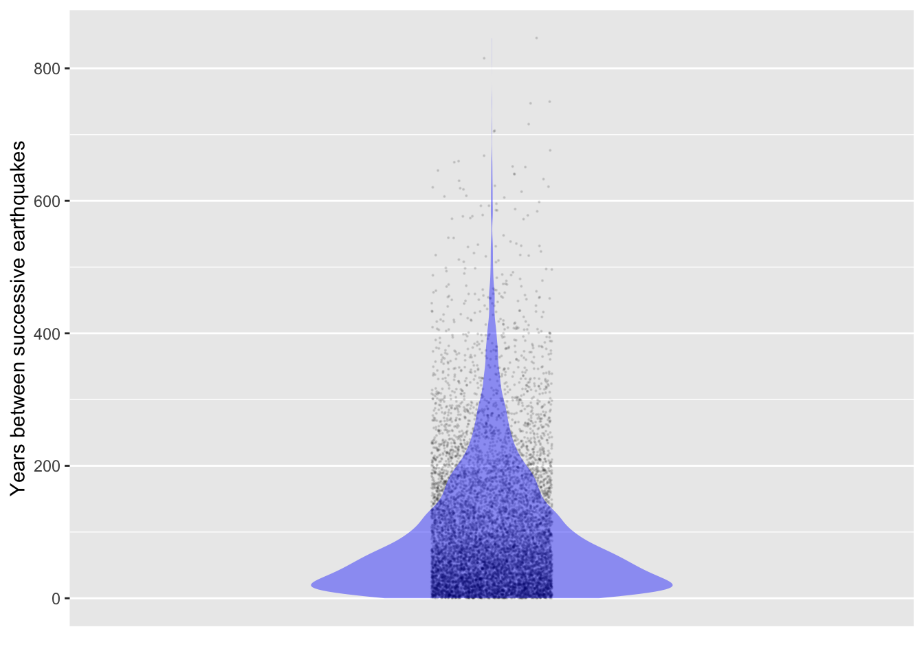
The rexp() function generates random noise according to the exponential distribution. Here’s a simulation of times between earthquakes at a rate of 0.01 per year. Since it is a simulation, we can run it as long as we like.
Figure 15.1: Interval between successive simulated earthquakes that come at a rate of 0.01 per year.
It seems implausible that the interval between 100-year quakes can be 600 years or even 200 years, or that it can be only a couple of years. But that’s the nature of the exponential distribution.
The mean interval in the simulated data is 100 years, just as it’s supposed to be.
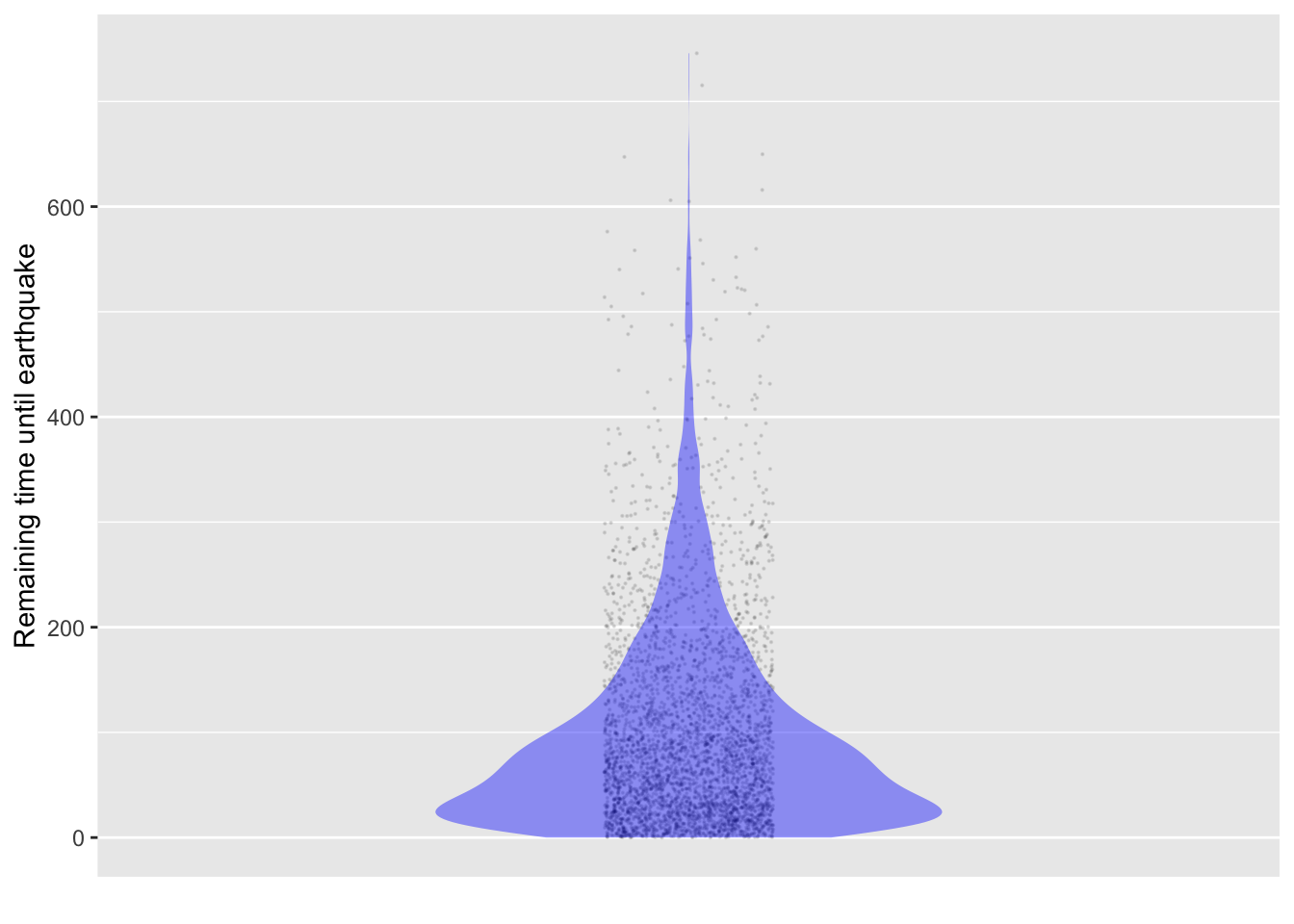
To illustrate the claim that the time until the next earthquake does not depend on how long it has been since the previous earthquake, let’s calculate the time until the next earthquake for those intervals where we have already waited 100 years since the past one. We do this by filtering the intervals that last more than 100 years, then subtracting 100 years from the interval get the time until the end of the interval.
Sim_data |>filter(interval >100) |>mutate(remaining_time = interval -100) |>point_plot(remaining_time ~1, annot ="violin",point_ink =0.1, size =0.1) |>add_plot_labels(y ="Remaining time until earthquake")
Figure 15.2: For those intervals greater than 100 years, the remaining time until the earthquake occurs.
Even after already waiting for 100 years, the time until the earthquake has the same distribution as the intervals between earthquakes.
Blood cell counts
A red blood cell count is a standard medical procedure. Various conditions and illnesses can cause red blood cells to be depleted from normal levels, or vastly increased. A hemocytometer is a microscope-based device for assisting counting cells. It holds a standard volume of blood and is marked off into unit squares of equal size. (Figure 15.3) The technician counts the number of cells in each of several unit squares and calculates the number of cells per unit of blood: the cell count.
Figure 15.3: A microscopic view of red blood cells in a hemocytometer. Source
The device serves a practical purpose: making counting easier. There are only a dozen or so cells in each unit square, the square can be easily scanned without double-counting.
Individual cells are scattered randomly across the field of view. The number of cells varies randomly from unit square to unit square. This sort of context for noise—how many cells in a randomly selected square—corresponds to the “poisson distribution” model of noise.
Any given poisson distribution is characterized by a rate. For the blood cells, the rate is the average number of cells per unit square. In other settings, for instance the number of clients who enter a bank, the rate has units of customers per unit time.
The rpois() function generates random numbers according to the poisson distribution. The rate parameter is set with the lambda = argument.
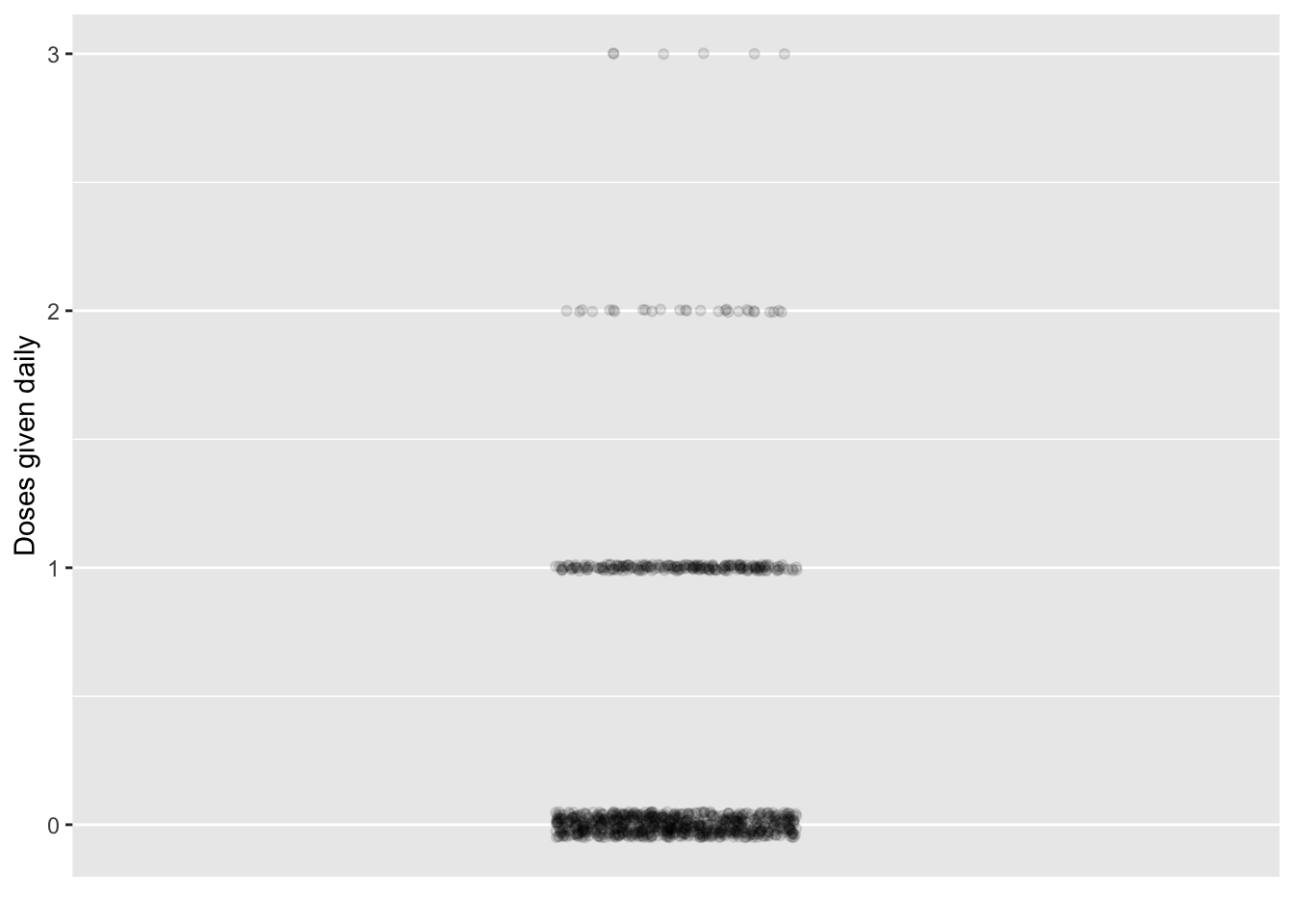
Example: Medical clinic logistics
Consider a chain of rural medical clinics. As patients come in, they randomly need different elements of care, for instance a specialized antibiotic. Suppose that a particular type of antibiotic is called for at random, say, an average of two doses per week. This is a rate of 2/7 per day. But in any given day, there’s likely to be zero doses given, or perhaps one dose or even two. But it’s unlikely that 100 doses will be needed. Figure 15.4 shows the outcomes from a simulation:
Even though, on average, less than one-third of a dose is used each day, on about 3% of days—one day per month—two doses are needed. Even for a drug whose shelf life is only one day, keeping at least two doses in stock seems advisable. To form a more complete answer, information about the time it takes to restock the drug is needed.
Adding things up
Another generic source of randomness comes from combining many independent sources of randomness. For example, in Section 14.3, the simulated height of a grandchild was the accumulation over generations of the random influences from each generation of her ancestors. A bowling score is a combination of the somewhat random results from each round. The eventual value of an investment in, say, stocks is the sum of the random up-and-down fluctuations from one day to the next.
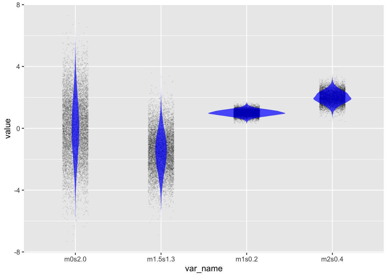
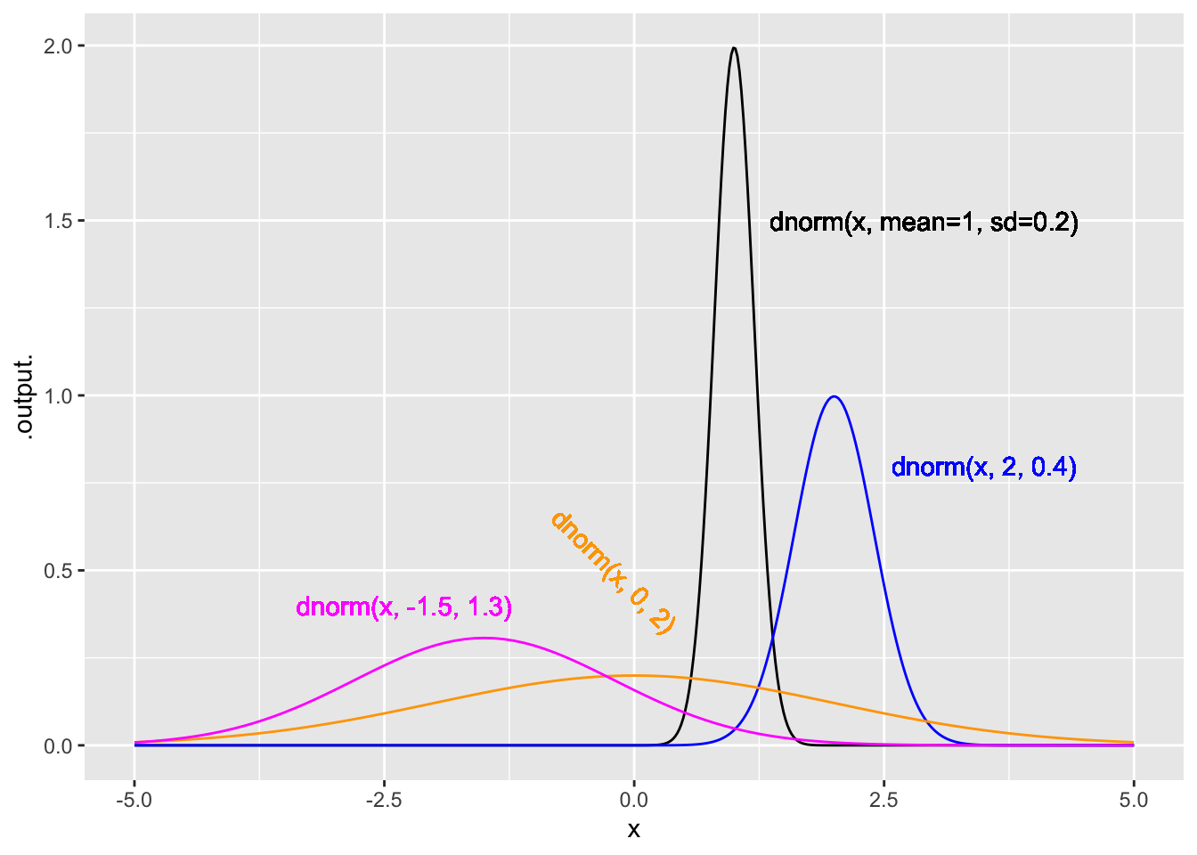
The standard noise model for a sum of many independent things is the “normal distribution,” which you already met in Lesson 14 as rnorm(). There are two parameters for the normal distribution, called the mean and the standard deviation. To illustrate, let’s generate several variables, x1, x2, and so on, with different means and standard deviations, so that we can compare them.
Sim <-datasim_make( m1s0.2<-rnorm(n, mean =1, sd =0.2), m2s0.4<-rnorm(n, mean =2, sd =0.4), m0s2.0<-rnorm(n, mean =0, sd =2.0), m1.5s1.3<-rnorm(n, mean =-1.5, sd =1.3))Sim |>take_sample(n=10000) |>pivot_longer(everything(), values_to ="value", names_to ="var_name") |>point_plot(value ~ var_name, annot ="violin",point_ink = .05, model_ink =0.7, size =0.1)
Figure 15.5: Four different normal distributions with a variety of means and standard deviations.
Other named distributions
There are many other named noise models, each developed mathematically to correspond to a real or imagined situation. Examples: chi-squared, t, F, hypergeometric, gamma, weibull, beta. The professional statistical thinker knows when each is appropriate.
Relative probability functions
The thickness of a violin annotation indicates which data values are common, and which uncommon. A noise model is much the same when it comes to generating outcomes: the noise model tells which outcomes are likely and which unlikely.
The main goal of a statistical thinker or data scientist is usually to extract information from measured data—not simulated data. Measured data do not come with an official certificate asserting that the noise was created this way or that. Not knowing the origins of the noise in the data, but wanting to separate the signal from the noise, the statistical thinker seeks to figure out which forms of noise are most likely. Noise models provide one way to approach this task.
In simulations we use the r form of noise models—e.g., rnorm(), rexp(), rpois()—to create simulated noise. This use is about generating simulation data; we specify the rules for the simulation and the computer automatically generates data that complies with the rules.
To figure out from data what forms of noise are most likely, another form form for noise models is important, the d form. The d form is not about generating noise. Instead, it tells how likely a given outcome is to arise from the noise model. To illustrate, let’s look at the d form for the normal noise model, provided in R by dnorm().
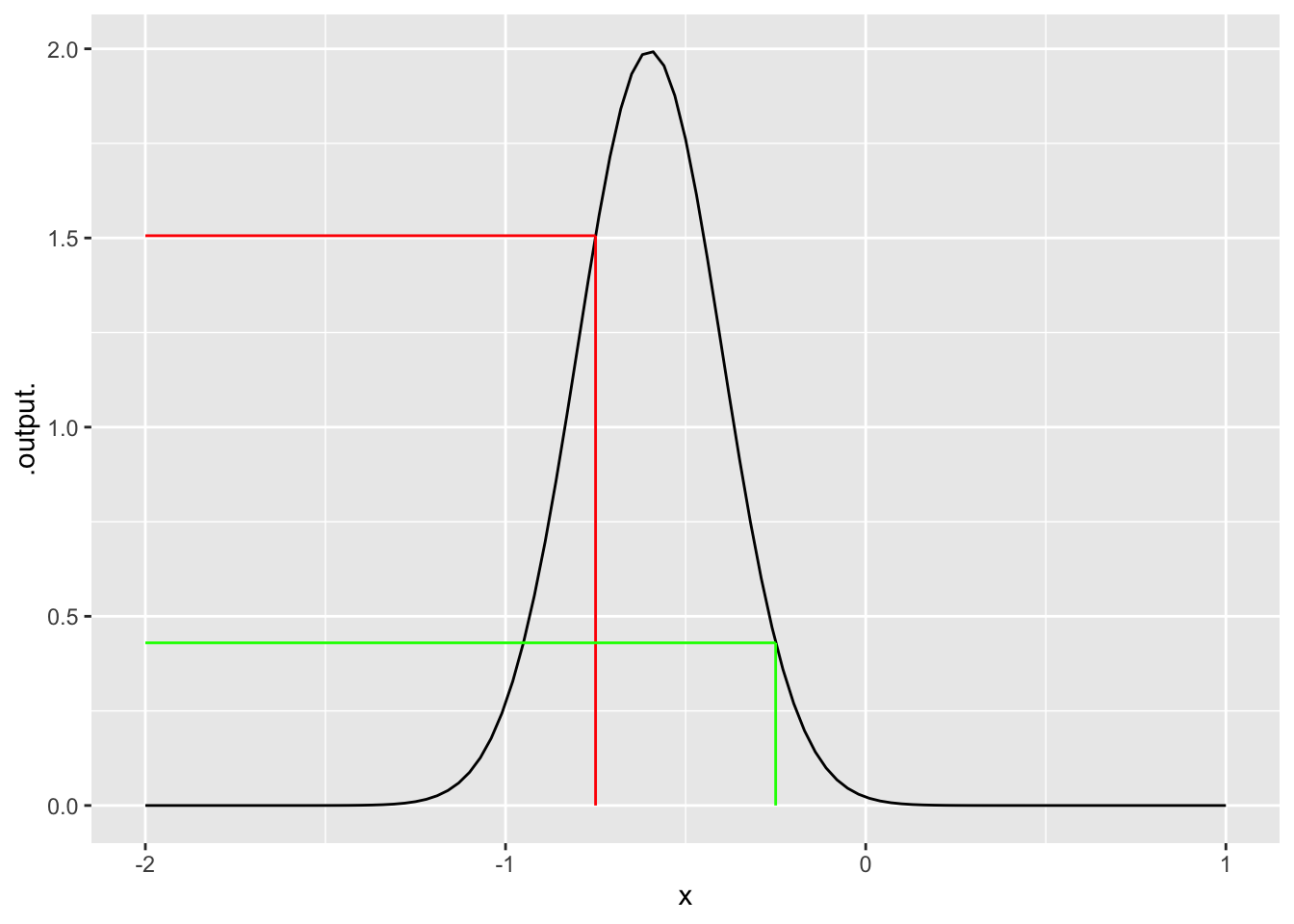
Suppose we want to know if -0.75 is a likely outcome from a particular normal model, say, one with mean -0.6 and standard deviation 0.2.. Part of the answer comes from a simple application of dnorm(), giving the -0.75 as the first argument and specifying the parameter values in the named arguments:
dnorm(-0.75, mean =-0.6, sd =0.2)
[1] 1.505687
The answer is a number, but this number has meaning only in comparison to the values given for other inputs. For example, here’s the computer value for an input of -0.25
dnorm(-0.25, mean =-0.6, sd =0.2)
[1] 0.4313866
Evidently, given the noise model used, the outcome -0.25 is less likely outcome than the outcome -0.75.
A convenient graphical depiction of a noise model is to plot the output of the d function for a range of possible inputs, as in Figure 15.6:
Figure 15.6: The function dnorm(x, mean = -0.6, sd = 0.2) graphed for a range of values for the first argument. The colored lines show the evaluation of the model for inputs -0.75 and -0.25.
This is NOT a data graphic, it is the graph of a mathematical function. Data graphics always have a variable mapped to y, whereas mathematical function are graphed with the function output mapped to y and the function input to x.
The output value of dnorm(x) is a relative probability, not a literal probability. Probabilities must always be in the range 0 to 1, whereas a relative probability can be any non-negative number. The function graphed in Figure 15.6 has, for some input values, output greater than 1. Even so, one can see that -0.75 produces an output about three times greater than -0.25.
The function-graphing convention makes it easy to compare different functions. Figure 15.7 shows the noise models from Figure 15.5 graphed as a function:
Warning: All aesthetics have length 1, but the data has 500 rows.
ℹ Please consider using `annotate()` or provide this layer with data containing
  a single row.
All aesthetics have length 1, but the data has 500 rows.
ℹ Please consider using `annotate()` or provide this layer with data containing
  a single row.
All aesthetics have length 1, but the data has 500 rows.
ℹ Please consider using `annotate()` or provide this layer with data containing
  a single row.
All aesthetics have length 1, but the data has 500 rows.
ℹ Please consider using `annotate()` or provide this layer with data containing
  a single row.
Figure 15.7: The four noise models from Figure 15.5 shown as functions.