print(sim_07) Simulation object
------------
[1] a <- rnorm(n)
[2] d <- rnorm(n)
[3] b <- rnorm(n) - a
[4] c <- a - b + rnorm(n)As a verb, to influence means to affect a person, object, or condition. Examples: The shortening days of autumn influence my mood. The teacher influences the student’s education, that is, the assimilation of facts, concepts, and methods. Education influences later job prospects.
A thing being influenced is called a consequence.
As a noun, influence refers to a capacity to influence a consequence. There are degrees of influence. At one extreme, the influence may completely determine the consequence. On the other hand, a particular influence is just one of multiple factors that shape the overall consequence. Randomness—noise—may also contribute to the consequence.
A “network is a set of elements and links that tie them together. For instance, the internet is a vast set of computers and communication channels that connect them. A causal network is a set of consequences and influences that connect them.
Causal networks provide an excellent way to envision and understand the mechanisms at work in the real world. They are essential to decision-making since decision-making aims to direct action that will have a desired consequence in the real world.
This Lesson is about the representation of causal networks by diagrams. The technical term for such diagrams is “directed acyclic graphs” (DAGs). A less offputting name is “influence diagrams.”
The first paragraph of this lesson contains three sentences describing influences. Each sentence has the form, “X influences Y.” Part of translating such a form into an influence diagram involves replacing “influences” with the symbol \(\Large\rightarrow\).
Diagrams are easier to read if we use short names for the consequences on either side of \(\Large\rightarrow\). With an eye toward our eventual use of influence diagrams to interpret data, using variable names for the consequences is helpful. But it is often desirable to include in an influence diagram a consequence that is not recorded as a variable. In the jargon of causal networks, such an unrecorded variable is called a “latent variable,” the word “latent” coming from the Latin for “hidden.”
It’s time to simplify a little. We now have three words being used for things that influence or things that are influenced: consequence, variable, and latent variable. Let’s use the short word “node” to stand for any of these three.
Here are possible translations of the sentences in the first paragraph into influence diagrams:
| Sentence | Influence diagram |
|---|---|
| “The shortening days of autumn influence my mood.” | daylight_trend \(\Large\rightarrow\) teachers_mood |
| “The teacher influences the student’s education.” | teachers_mood \(\Large\rightarrow\) student_skills |
| “Education influences later job prospects.” | student_skills \(\Large\rightarrow\) student_job_prospects |
Notice that the influence diagrams given above are not complete translations of the English sentence. Starting at the bottom, student_skills are not the only component of “education.” The other components of education may also influence job prospects directly or indirectly. The teachers_mood is hardly the only attribute of the teacher that contributes to student_skills. There is also the teacher’s experience, knowledge, sympathy, enthusiasm, articulateness.
Influence diagrams are assembled from smaller influence diagrams. For instance, a larger diagram can incorporate all three small diagrams into which we translated the sentences.
daylight_trend \(\Large\rightarrow\) teachers_mood \(\Large\rightarrow\) student_skills \(\Large\rightarrow\) student_job_prospects
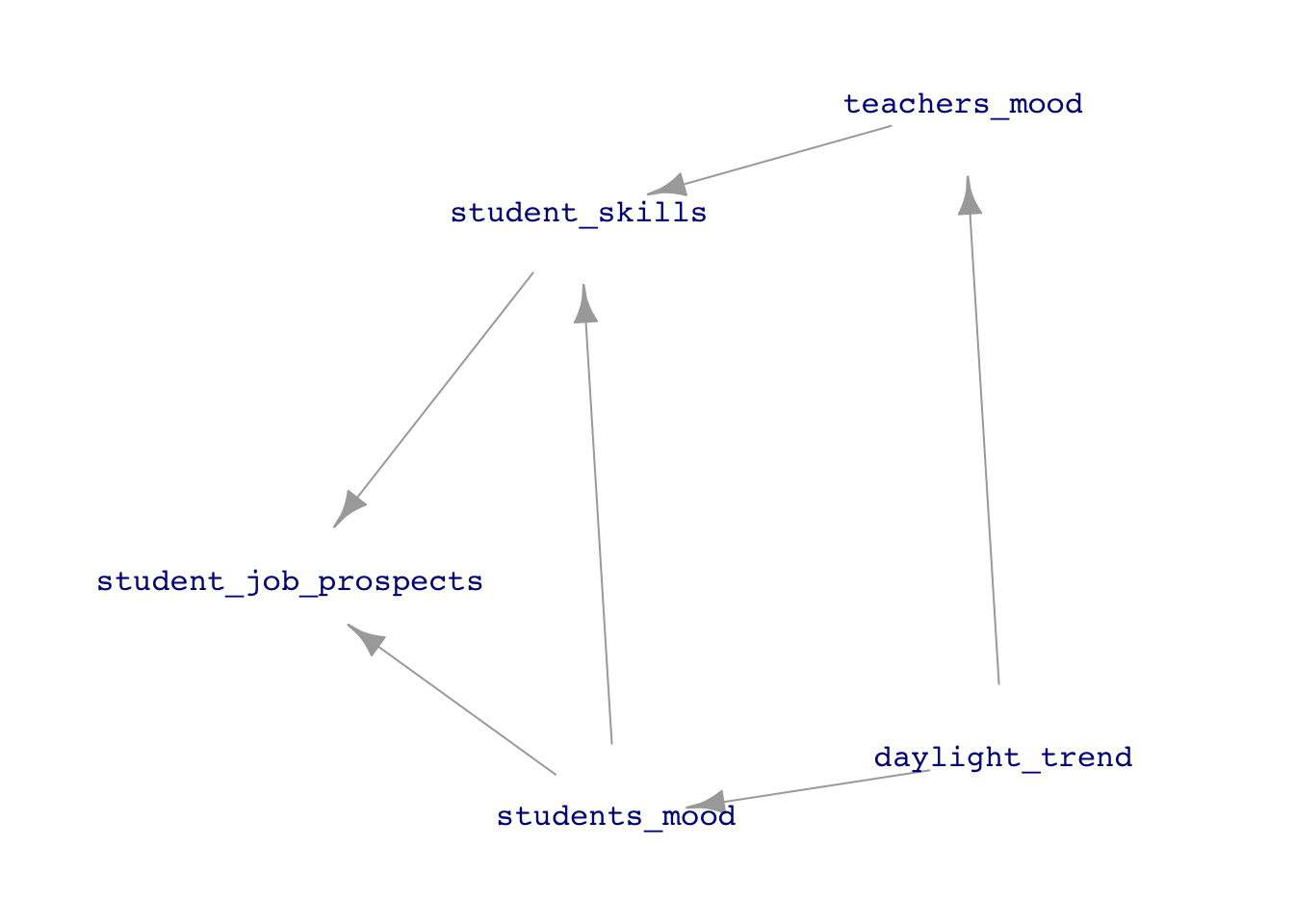
The above diagram is a chain of nodes. Other network shapes are also possible. To run with the daylight/mood/skills/prospects example, what about the student’s mood, which may also be influenced by daylight and influence the assimilation of skills and job prospects? Figure 23.1 shows one possible arrangement.
The word “influence” comes from the Latin word for “flow into,” as in fluids flowing through pipes or streams flowing into rivers and lakes. The arrows in influence diagrams show the sources, destinations, and flow directions. The diagram itself doesn’t describe what substance is flowing. I like to think of it as “causal water.” By tinting with dye the causal water coming from a node, one could track the flow from that node to the other nodes in the diagram. In Lesson 24 we will come back to the issue of such flow paths see how the choice of explanatory variables in modeling can effectively block or unblock a flow pathway. Similarly, scientific experiment can be thought of as taking control over a node, cutting off its natural inflow.
Remember that an influence diagram is a drawing; it is not the real world. At best, we can say that an influence diagram is a hypothesis about real-world connections. It’s usually best to entertain multiple hypotheses (as in Lesson 16) to help you think carefully about the paths and directions of the flow of causation. As well, many debates in science, government, and commerce can be represented as reflecting different hypotheses about the causal connections in the real world.
In an influence diagram, each node can have zero or more inputs. For example, the student_skills node in Figure 23.1 has two inputs: students_mood and teachers_mood. The daylight_trend node has no inputs shown in the diagram. This is just a convention for saying that we are not interested in the inputs upstream from daylight_trend; it might as well be pure noise so far as we are concerned. The teachers_mode has just one input, coming from daylight_trend.
Contrary to how the diagrams are drawn, every node has precisely one output. A node such as daylight_trend may be drawn with two or more outward-pointing arrows, but all the arrows originating from a node carry the same thing to their respective destinations. Sometimes, nodes are drawn with no outputs. Again, this convention says we are not concerned with any of those influences.
The node itself is drawn as a name: a label for the node. But there is something else in the node, even though it is not usually shown in the influence diagram. Every node has a mechanism that puts together the inputs (and often some noise) to produce the output.
The simulations introduced in Lesson 14 are a list of node names along with the mechanism for that node. The mechanism is expressed using R expressions. Each input to the mechanism is identified by the name of the node from which the input originates.
Consider sim_07, one of the simulations packaged with the {LSTbook} package that comes along with these Lessons. To see the nodes and the mechanism within each node, just print the simulation:
sim_07 would accomplish the same thing.print(sim_07) Simulation object
------------
[1] a <- rnorm(n)
[2] d <- rnorm(n)
[3] b <- rnorm(n) - a
[4] c <- a - b + rnorm(n)sim_07 has four nodes, uncreatively labelled a, b, c, and d. Nodes a and d do not have any inputs; they are pure noise. (The particular noise model here is rnorm(), the normal noise model. But other noise models could have been used.)
In contrast, node b has one input. The mechanism is rnorm(n) - a, which says that the output will be noise minus the value of node a. The mechanism of node c is somewhat richer; it has a and b as inputs and some random noise.
The symbol n in a simulation object is unique. It is neither a node nor an input to the mechanism. n is there just for compatibility of the simulation system with the built-in R random number generators.
To draw the influence diagram for sim_07, use the dag_draw() function.
dag_draw(sim_07)
sim_07. Note that node d has no connections to or from the other nodes.
Let’s track the calculations for a sample of \(n=1\), that is, one row from a data frame produced by sim_07.
set.seed(429)
sim_07 |>take_sample(n=1)| a | d | b | c |
|---|---|---|---|
| 0.4999627 | 0.1753615 | -1.8632 | 4.352213 |
In forming this output row, sample() looks at its input (sim_07). It evaluates the mechanism for the first node in the list. But the special symbol n is replaced by 1, like this
rnorm(1)[1] 0.4999627This value is stored under the name a, for future reference.
The simulation goes on to the next node in the list. For sim_07 this is node d. The mechanism happens to be the same as for node a, but it’s the nature of random number generators to give a different result each time the generator is used.
rnorm(1)[1] 0.1753615This value is stored under the name d.
On to the next node, b. The mechanism is evaluated to produce a value:
rnorm(1) - a[1] -1.8632Storing this result unde the name b, the simulation engine goes on to the next node. That’s the last node in sim_07, but other simulations may have more nodes, each identified by name and given a mechanism.
If we had asked sample() to generate more than one row of data, it would have repeated this process anew for each additional row, independently of the rows that have already been generated or the rows that are yet to be generated.
Because each row is independent of every other row, there is no way for a node’s mechanism to refer to the node itself. For instance, we might imagine a feedback relationship like this:
Cycle_sim <- datasim_make(
  a <- 2 - b, # Illegal!
  b <- a + b  # Illegal!
)
The datasim_make() function is designed to recognize self-referential situations and cycles where a path of arrows circles back on itself. Here’s what happens when there is such an issue:
Error in igraph::topo_sort(datasim_to_igraph(sim, report_hidden = TRUE)): At core/properties/dag.c:114 : The graph has cycles; topological sorting is only possible in acyclic graphs, Invalid valueAs is often the case, the error message contains much information that might be valuable only to a programmer. For an end-user, the critical part of the message is “The graph has cycles.” Not allowed
The standard name used in the research literature, instead of “influence diagram,” is “directed acyclic graph” (DAG for short.) From now on, we will mostly say DAG instead of influence diagram. This will help you form the habit of using the name “DAG” yourself.
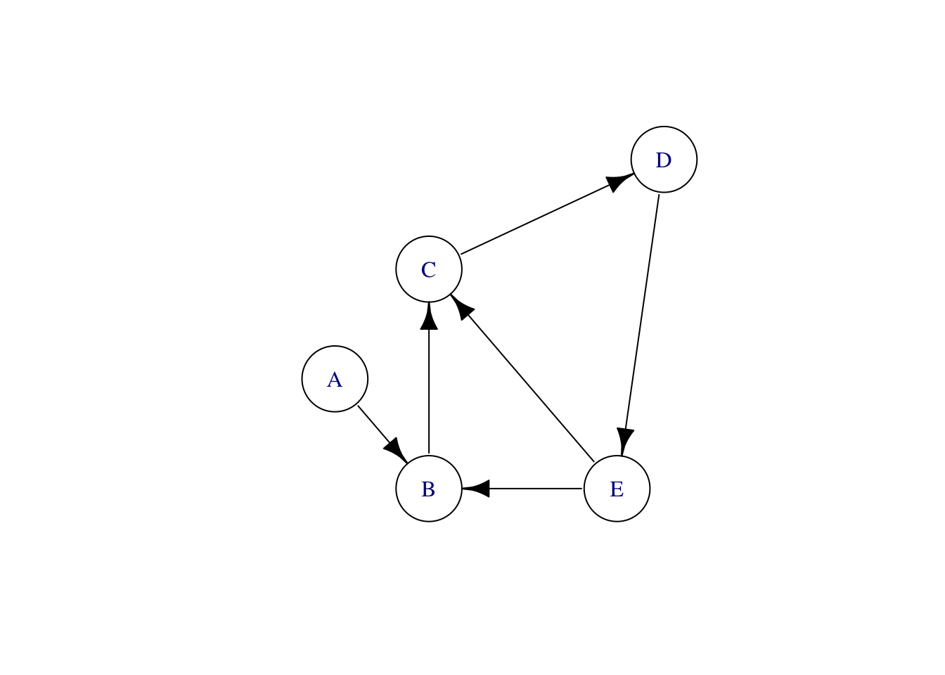
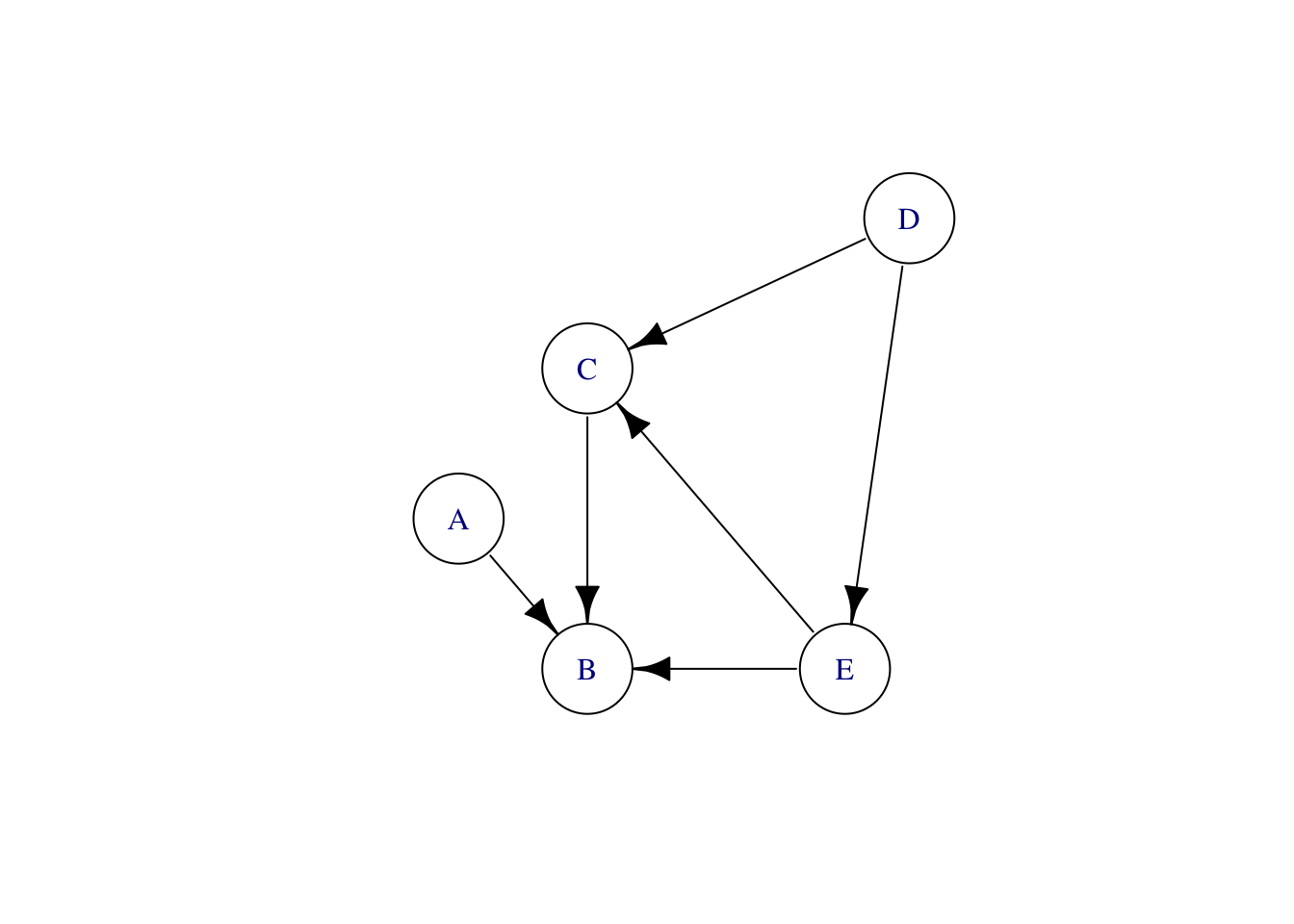
DAGs, despite the G for “graph,” are not about data graphics. The “graph” in DAG is a mathematical term of art; a suitable synonym is “network.” Mathematical graphs consist of a set of “nodes” and a set of “edges” connecting the nodes. For instance, Figure 23.3 shows three different graphs, each with five nodes labeled A, B, C, D, and E.

The nodes are the same in all three graphs of Figure 23.3, but each is different. It is not just the nodes that define a graph; the edges (drawn as lines) are part of the definition as well.
The left-most graph in Figure 23.3 is an “undirected” graph; there is no suggestion that the edges run one way or another. In contrast, the middle graph has the same nodes and edges, but the edges are directed. As mentioned earlier, an excellent way to think about a directed graph is that each node is a pool of water; each directed edge shows how the water flows between pools. This analogy is also helpful in thinking about causality: the causal influences flow like water.
Look more carefully at the middle graph. There are a couple of loops; the graph is cyclic. In one loop, water flows from E to C to D and back to E. The other loop runs B, C, D, E, and back to B. Such a flow pattern cannot exist, at least, not without pumps pushing the water back uphill! There is nothing in a DAG that corresponds to a pump.
The rightmost graph reverses the direction of some of the edges. This graph has no cycles; it is acyclic. Using the flowing and pumped water analogy, an acyclic graph needs no pumps; the pools can be arranged at different heights to create a flow exclusively powered by gravity. The node-D pool will be the highest, E lower. C has to be lower than E for gravity to pull water along the edge from E to C. The node-B pool is the lowest, so water can flow in from E, C, and A.
Directed acyclic graphs represent causal influences; think of “A causes B,” meaning that causal “water” flows naturally from A to B. In a DAG, a node can have multiple outputs, like D and E, and it might have multiple inputs, like B and C. In terms of causality, a node—like B—having multiple inputs means that more than one factor contributes to the value of that node. A real-world example: the rising sun causes a rooster to crow, but so can a fox approaching the chicken coop at night.
Often, nodes do not have any indicated inputs. These are called “exogenous factors,” at least by economists. The “genous” means “originates from.” “Exo” means “outside.” The value of an exogenous node is determined by something, just not something that we are interested in (or perhaps capable of) modeling. No edges are directed into an exogenous node since none of the other nodes influence its value.