Project: Statistics of Gene Expression
18.11 Simple Graphics for Gene Expression
In the 1980s, the National Cancer Institute developed a set of 60 cancer cell lines, called NCI60. The original purpose was for screening potential anti-cancer drugs. Here you will examine gene expression in these cell lines. More than 41,000 probes were used for each of the 60 cell lines. For convenience, the data are provided by the dcData package in two data frames NCI60 and NCI60cells.
NCI60 is somewhat large — 41,078 probes by 60 cell lines. Each of these 2,454,680 entries is a measure of how much a particular gene was expressed in one cell line.
One clue that a gene is linked to cancer is differences in expression of that gene from one cancer type to another. Figure 18.1 shows the average expression of TOP3A for the different cancer types. Here’s the wrangling involved in extracting the expression of TOP3A for each cell line.
Narrow <-
  NCI60 %>%
  tidyr::pivot_longer(cols = -Probe, names_to = "cellLine", values_to = "expression")

CellTypes <-
  NCI60cells %>%
  select(cellLine, tissue) %>%
  mutate(cellLine = gsub(pattern = "\\:", replacement = ".", x = as.character(cellLine)))

Narrow <-
  Narrow %>%
  inner_join(CellTypes)
Table 18.1: A narrow form of the expression data.
| Probe | cellLine | expression | tissue |
|---|---|---|---|
| AT_D_3 | BR.MCF7 | -7.45 | Breast |
| AT_D_3 | BR.MDA_MB_231 | -7.51 | Breast |
| AT_D_3 | BR.HS578T | -7.30 | Breast |
| AT_D_3 | BR.BT_549 | -7.37 | Breast |
| AT_D_3 | BR.T47D | -6.15 | Breast |
| AT_D_3 | CNS.SF_268 | -7.16 | CNS |
| … and so on for 2,464,680 rows altogether. |
Table 18.2: Expression in each cell line of the TOP3A Probe
| Probe | cellLine | expression | tissue |
|---|---|---|---|
| TOP3A | LE.SR | 0.53 | Leukemia |
| TOP3A | ME.M14 | -0.93 | Melanoma |
| TOP3A | BR.MCF7 | -0.37 | Breast |
| TOP3A | BR.T47D | -0.31 | Breast |
| TOP3A | CO.HT29 | -1.72 | Colon |
| TOP3A | CO.KM12 | -1.49 | Colon |
| … and so on for 60 rows altogether. |
Now, the mean expression of TOP3A in each cancer tissue type:
SummaryStats <-
  Probe_TOP3A %>%
  group_by(tissue) %>%
  summarise(mn_expr = exp(mean(expression, na.rm = TRUE)))
Table 18.3: Mean expression of TOP3A in the NCI60 cell lines.
| tissue | mn_expr |
|---|---|
| Breast | 0.9066489 |
| CNS | 0.5255377 |
| Colon | 0.3544660 |
| Leukemia | 0.6592406 |
| Melanoma | 0.5729253 |
| Non-Small Cell Lung | 0.3963112 |
| … and so on for 9 rows altogether. |
Figure 18.1 shows the mean expression data graphically. This sort of bar graph is often seen in the scientific literature, but that does not mean it is an effective presentation.
SummaryStats %>%
  ggplot(aes(x = tissue, y = mn_expr)) +
  geom_bar(stat = "identity") +
  theme(axis.text.x = element_text(angle = 30, hjust = 1))
Figure 18.1: A bar chart comparing TOP3A expression in the different tissue types.
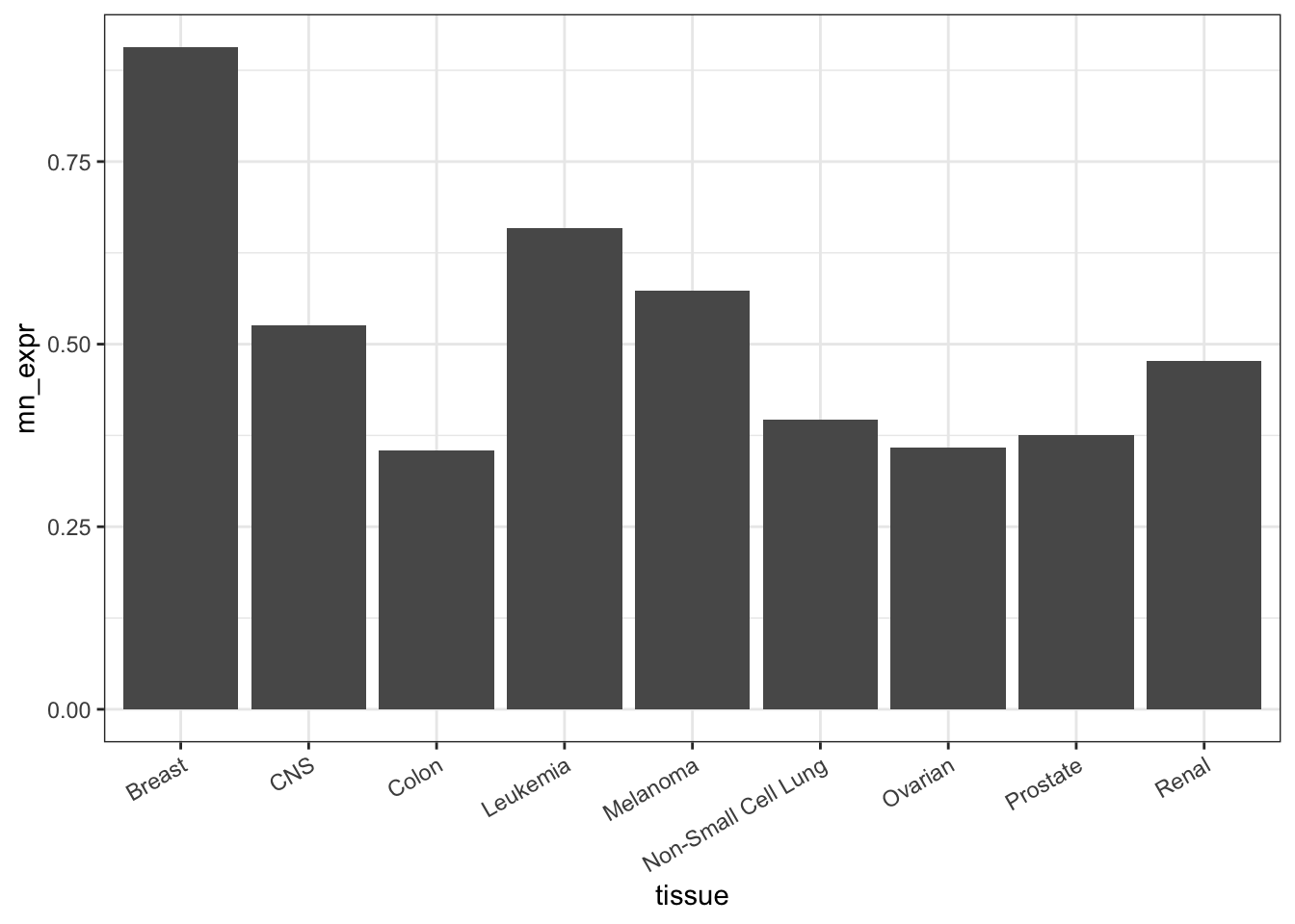
To judge from the figure, TOP3A is expressed more highly in breast cancer than in other cancer tissue types.
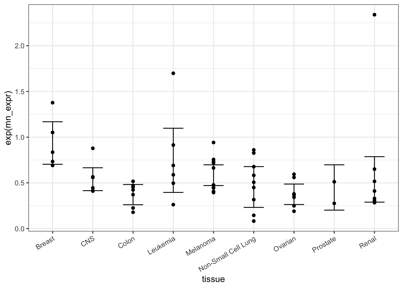
But don’t jump to conclusions. Expression differs even from one cell line to another of the same tissue type, as in Figure 18.2:
Probe_TOP3A %>%
ggplot(aes(x = tissue, y = exp(expression))) +
  geom_point() +
  theme(axis.text.x = element_text(angle = 30, hjust = 1))
Figure 18.2: TOP3A expression in the individual cells.
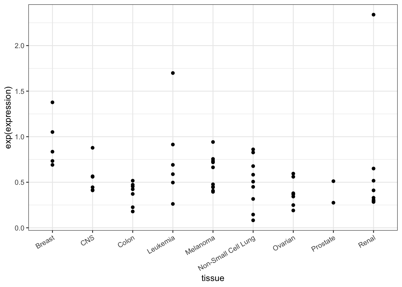
When looking at the individual cell lines, it’s not so clear that TOP3A is expressed differently in breast cancer compared to the other.
Before going on, decide what you like and don’t like about Figure 18.1. Write it down before you continue.
Remember, you shouldn’t continue until you write down your opinions about Figure 18.1.
\(...\) Ready?
\(...\) You’ve really written something?
\(...\) Then go on.
18.11.1 Bar graph critique
There are several poor features of this plot:
- Too much ink for relatively low information gain.
- The order of the levels of
tissueis alphabetical. It’s unlikely that the mechanisms of cancer consider what we call different types of cancer in English. So the x-axis order is being wasted. - The precision of the feature (mean expression) is not shown. How would the viewer know whether this spread is just the result of random variation?
Suggestions for improving the graphic might include:
Lighten up on the color. Perhaps
alpha = 0.2, or maybe a dot plot rather than a bar chart.Reorder the tissue types. When setting the value order of groups, you first create a data frame that includes the quantity for each group–as with
mn_exprinSummaryStats–and then reorder the based on that quantity (desc()can be used to reverse the order). Note thatreorder()serves a different purpose thanarrange()One way to do this is to pick a quantity that you want to dictate the order of groups. For instance, the mean expression.
Show a statistical measure of the variation.
Without going into details of a specific statistical method, a common way to present the imprecision in an estimated quantity is with a “standard error.” For quantities such as the mean, the standard error has a straightforward mathematical form that is a staple of introductory statistics textbooks.
SummaryStats <-
  Probe_TOP3A %>%
  group_by(tissue) %>%
  summarise(mn_expr = mean(expression,  na.rm = TRUE),
            se = sd(expression, na.rm = TRUE) / sqrt(n()))
Show the expression value for each of the individual cases in
Probe_TOP3Aas seen in Figure 18.2 in order to display cell variability directly.Use a different modality: e.g. a dot plot; a box-and-whiskers plot (with
notch = TRUE); a violin plot.
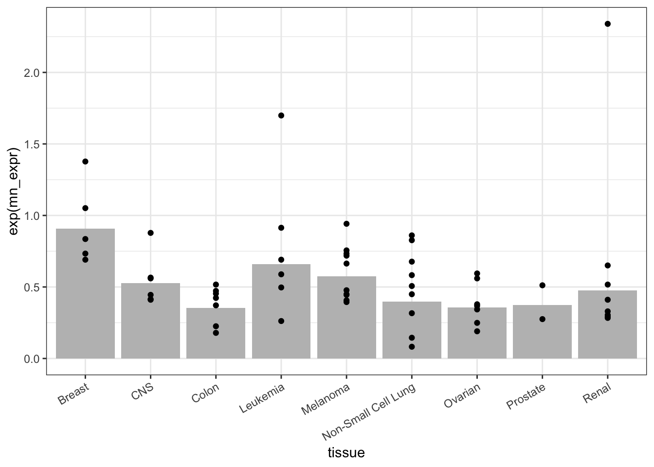
On occasion, you will want to generate two or more layers in a graphic that are based in more than one data frame. You can do this within ggplot() by specifying a data= argument for the appropriate geom. For example, Figure 18.3 is a bar plot of group means in one layer and a plot of individual cell lines in another layer:
SummaryStats %>%
  ggplot(aes(x = tissue, y = exp(mn_expr))) +
  geom_bar(stat = "identity", fill = "gray", color = NA) +
  geom_point(data = Probe_TOP3A, aes(x = tissue, y = exp(expression))) +
  theme(axis.text.x = element_text(angle = 30, hjust = 1))
Figure 18.3: A graphic with two layers. The bar chart shows the SummaryStats data frame while the scatter plot shows the Probe_TOP3A data frame. Within a geom, the data = argument is used to specify the data set to use in drawing the geom. By default, this is the data frame handed to ggplot() but it’s easy to specify something different.
The mean reflects the TOP3A expression collectively within each tissue type. As such, the mean is a statistic statistic: A calculated quantity giving a collective property for a set of cases.. In order to compare different tissues to one another, some indication must be given for the precision of the mean. Classically, this indication is provided by a confidence interval at the 95-percent level. Without going into detail, here’s a calculation and presentation of the confidence interval.
SummaryStats <-
  SummaryStats %>%
  mutate(top = mn_expr + 2 * se,
         bottom = mn_expr - 2 * se)
SummaryStats %>%
  ggplot(aes(x = tissue, y = exp(mn_expr))) +
  geom_bar(stat = "identity", alpha = 0.2) +
  geom_errorbar(aes(x = tissue,
                    ymax = exp(top),
                    ymin = exp(bottom)), width = 0.5) +
  theme(axis.text.x = element_text(angle = 30, hjust = 1))
Figure 18.4: A dynamite plot… we can do better!
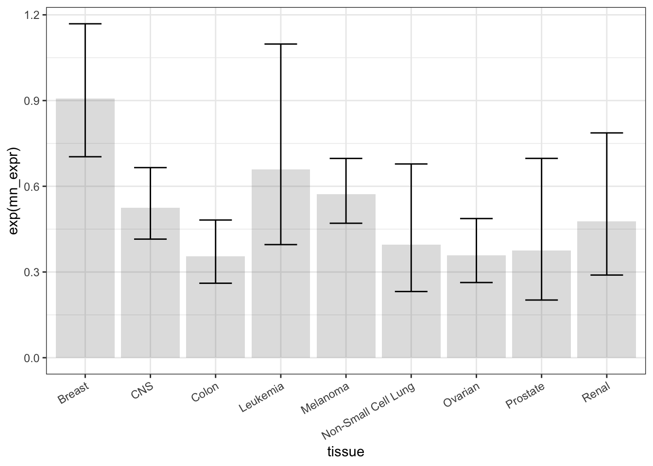
Statisticians sometimes refer to such things as “dynamite plots,” in a way intended to be pejorative. You can find a better way to present these data.1 See Classic: Belia, et al. “Researchers Misunderstand Confidence Intervals and Standard Error Bars”, Psych Methods, 2005 and Lane & Sandor: “Designing Better Graphs by Including Distributional Information and Integrating Words, Numbers, and Images”, Psych Methods, 2009 One complaint is that the bars command too much attention. Another is that it’s helpful to show the individual measurements along with the statistic, as in Figure 18.5.
Figure 18.5: Better than dynamite!
Your turn: Pick your own probe and make a figure like that of Figure 18.5.
18.12 Probing for a probe
There are 32,344 distinct probes in NCI60. TOP3A in the above example was selected literally at random. In this section, you’ll identify candidate probes that might be more closely related to tissue type than TOP3A.
It’s impractical to look through 32,344 different plots like Figure 18.5. We want a way for the computer to evaluate each probe on its own.
The \(R^2\) (pronounced “R-squared”) statistic provides one measure of how much of the variation in one variable, called a response variable, is accounted for other, explanatory variables. \(R^2\) is always between zero and one: zero means the explanatory variables account for nothing; one means that the explanatory variables account for all of the variation response.
We will use the tissue type as an explanatory variable, and use it to account for the level of expression (our response variable). The function r2() calculates \(R^2\).
# customize a user-defined function called `r2`
r2 <- function(data) {
  mosaic::rsquared(lm(data$expression ~ data$tissue))
}
One strategy for finding probes that are strongly connected with tissue type is to find the \(R^2\) for each probe. This involves a few operators you have not yet seen. The use of dplyr::do() in the following is analogous to summarise(). The unlist() function does a simple translation to put the results of do() in a form that can be graphed in the usual way.
ProbeR2 <-
  Narrow %>%
  group_by(Probe) %>%
  dplyr::do(probe_rsq = r2(.)) %>%
  mutate(r2 = unlist(probe_rsq))
Next, here are statements to pull out the 30 probes with the largest \(R^2\) and order them from largest \(R2\) to smallest.
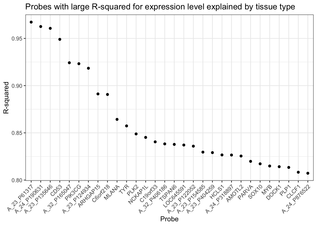
Finally, the \(R^2\) can be graphed, as in Figure ??
Actual %>%
  ggplot(aes(x = reorder(Probe, desc(r2)), y = r2)) +
  geom_point() +
  xlab("Probe") +
  ylab("R-squared") +
  ggtitle("Probes with large R-squared for expression level explained by tissue type") +
  theme(axis.text.x = element_text(angle = 45, hjust = 1))
Figure 18.6: Probes with the largest \(R^2\) for expression level explained by tissue type.
Your turn: Choose one of the probes with high \(R^2\). Plot out expression versus tissue type, just as Figure 18.5 shows it for TOP3A. Do you see a qualitative difference between the graph of your high \(R^2\) probe and Figure 18.5?
18.13 False discoveries
A major concern when selecting results from tens of thousands of possibilities (or even tens of possibilities) is the possibility of false discovery. Even if the probe expression is unrelated to tissue type, examining the probes with the highest \(R^2\) will select out those that, perhaps by chance, have a relationship. How to determine if the high \(R^2\) is due to chance selection?
You can get an idea of what sort of role chance plays by examining a situation where only chance is at play. In statistics, this sort of situation is called the . By comparing the actual statistic (in this example, $R^2) to that from the Null Hypothesis, you can determine whether the observed statistic is likely to have arisen in a world where the Null Hypothesis is true. This probability is called the . Only when this probability is small can you “reject the Null Hypothesis.”
It’s often believed that any p-value less than 0.05 calls for rejecting the Null Hypothesis. But when you are examining multiple possibilities, such as the 32,344 \(R^2\) values for the different probes, 0.05 is a poor guide. Instead, statistical tests for “multiple comparisons” need to be performed.
The first step in finding a p-value is to create a world in which the Null Hypothesis is true. For this gene-expression example, an appropriate Null Hypothesis is that gene expression is unrelated to tissue type. Of course, we aren’t able to create cancer cells where this is true, but there is a trick. Using the data at hand — which might or might not be consistent with a Null Hypothesis — you can generate new data which must be consistent with the Null. You do this by shuffling the data so that the expression levels are unrelated with tissue type.
Here’s a set of statements for shuffling the expression data (that’s what mosaic::shuffle() is doing) and finding the \(R^2\) that could be found in the Null Hypothesis world.
NullR2 <-
  Narrow %>%
  group_by(Probe) %>%
  mutate(expression = mosaic::shuffle(expression)) %>%
  group_by(Probe) %>%
  do(r2 = r2(.)) %>%
  mutate(r2 = unlist(r2))
By comparing the distributions of \(R^2\) from the actual data to the shuffled data, you can get an idea of the extent to which the actual data is different.
ProbeR2 %>%
  ggplot(aes(x = r2)) +
  geom_density(fill = "gray30", color = NA) +
  geom_density(data = NullR2, aes(x = r2),
               fill = "gray80", alpha = .75, color = NA)
Figure 18.7: Comparing the distribution of \(R^2\) for the actual data (dark gray) to that for the null hypothesis data (light gray).
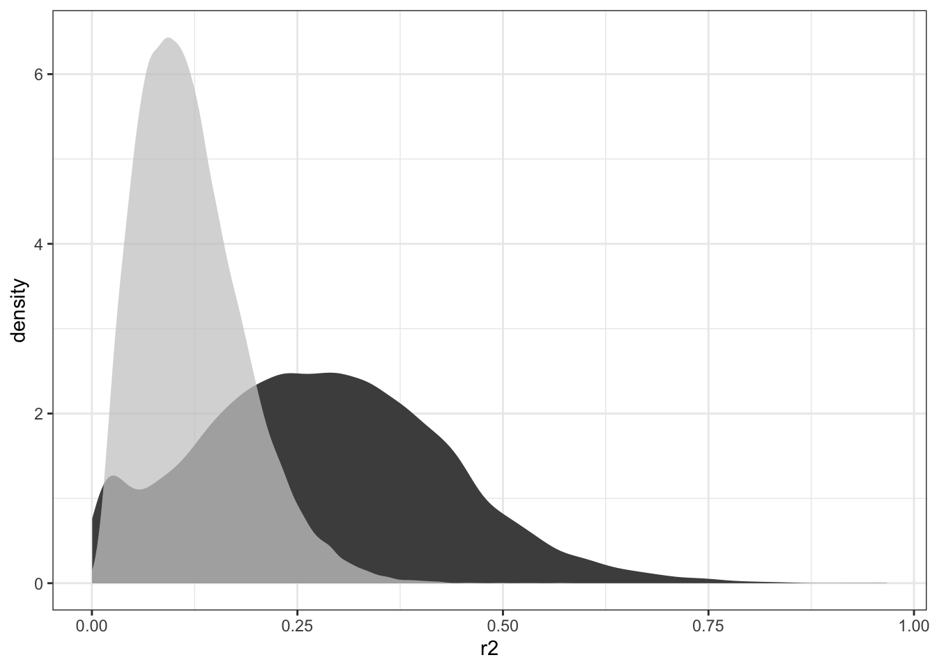
You can see from Figure 18.7 that there are hardly any null-hypothesis probes with \(R^2\) greater than 0.30. A conventional p-value would be misleadingly small for any such \(R^2\). What’s at issue is not whether the Null Hypothesis can produce \(R^2 > 0.30\), but what the highest \(R^2\) values will be when selected from 32,344 candidates. That sort of question can be answered by comparing the very highest \(R^2\) simulated probes from the Null to the highest \(R^2\) from the actual data:
Null <-
  NullR2 %>%
  arrange(desc(r2)) %>%
  head(30)

# append the 30 highest `Null` values to the `Actual` data
Actual$null <- Null$r2

Actual %>%
  ggplot(aes(x = reorder(Probe, desc(r2)), y = r2)) +
  geom_point() +
  geom_point(aes(y = null), color = "gray50") +
  theme(axis.text.x = element_text(angle = 45, hjust = 1))
Figure 18.8: Comparing the highest \(R^2\) from the actual data and the Null.
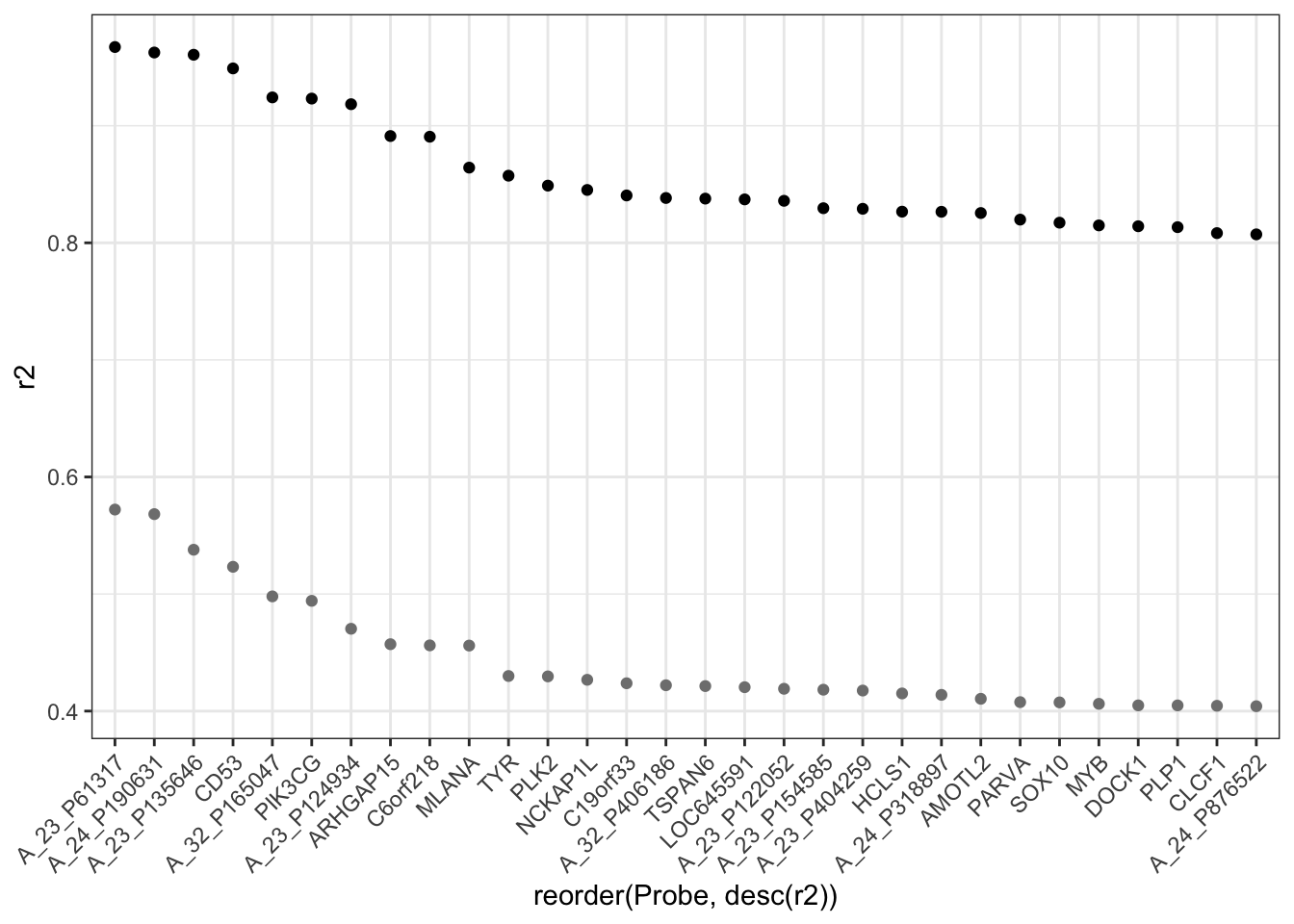
You can see that none of the top 30 \(R^2\) values for the actual data lie anywhere near those generated from the Null Hypothesis.