Chapter 5 Introduction to Data Graphics
Data graphics provide one of the most accessible, compelling, and expressive modes to investigate and depict patterns in data. This chapter presents examples of standard kinds of data graphics: what they are used for and how to read them. To start, you’ll make simple examples of graphics using an interactive tool. Later, in Chapter 6, you’ll see a unifying framework — a grammar — for describing and specifying graphics, so that you can create custom graphics types that support displaying data in a purposeful way.
There are many different genres of data graphics, and many different variations on each genre. Here are some commonly encountered kinds.
- Scatterplots showing relationships between two or more variables.
- Displays of distribution, such as histograms.
- Bar charts, comparing values of a single variable across groups.
- Maps, showing how a variable relates to geography.
- Network diagrams, showing how entities are connected to one another.
5.1 Scatter plots
The main purpose of a scatter plot is to show the relationship between two variables across several or many cases. Most often, there is a Cartesian coordinate system in which the x-axis represents one variable and the y-axis the value of a second variable.
Example: Growing up
The NCHS data frame gives medical and morphometric measurements of individual people. The scatter plot in Figure shows the relationship between two of the variables, height and age. Each dot is one case. The position of that dot signifies the value of the two variables for that case.
Figure 5.1: A scatter plot.
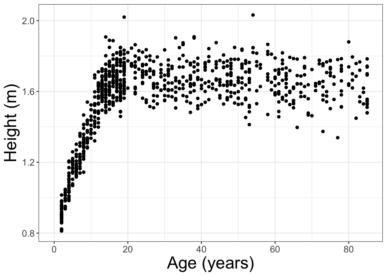
Scatterplots are useful for visualizing a simple relationship between two variables. For instance, you can see in Figure 5.1 the familiar pattern of growth in height from birth to the late teens.
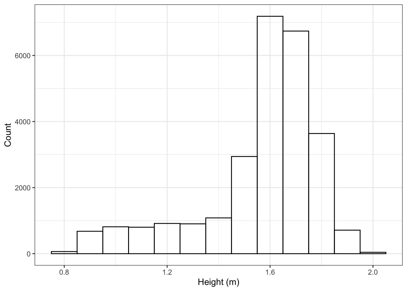
5.2 Displays of Distribution
A histogram shows how many cases fall into given ranges of the variable. For instance, Figure 5.2 is a histogram of heights from NCHS. The most common height is about 1.65 m — that’s the location of the tallest bar. Only a handful are taller than 2.0 m.
Figure 5.2: A histogram.
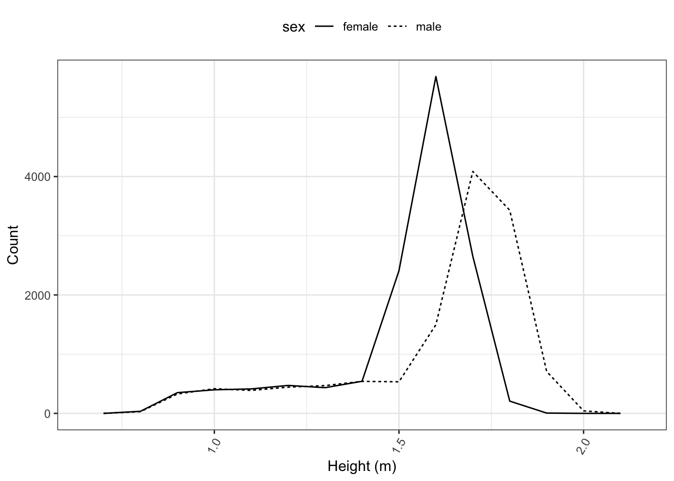
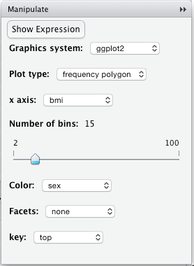
A simple alternative to a histogram is a frequency polygon. Frequency polygons let you break things up by other variables. Figure 5.3 shows the distribution of height for each sex, separately.
Figure 5.3: A frequency polygon.
5.3 Bar Charts
The familiar bar chart is effective when the objective is to compare a few different quantities.
5.4 Example: Smoking and death
Based on the NCHS data, how likely is a person to have died during the follow-up period, based on their age and whether they smoke? It’s easy to compare bars to their neighbors. From Figure 5.4, for instance, you can see that at each age, non-smokers were more likely to survive.
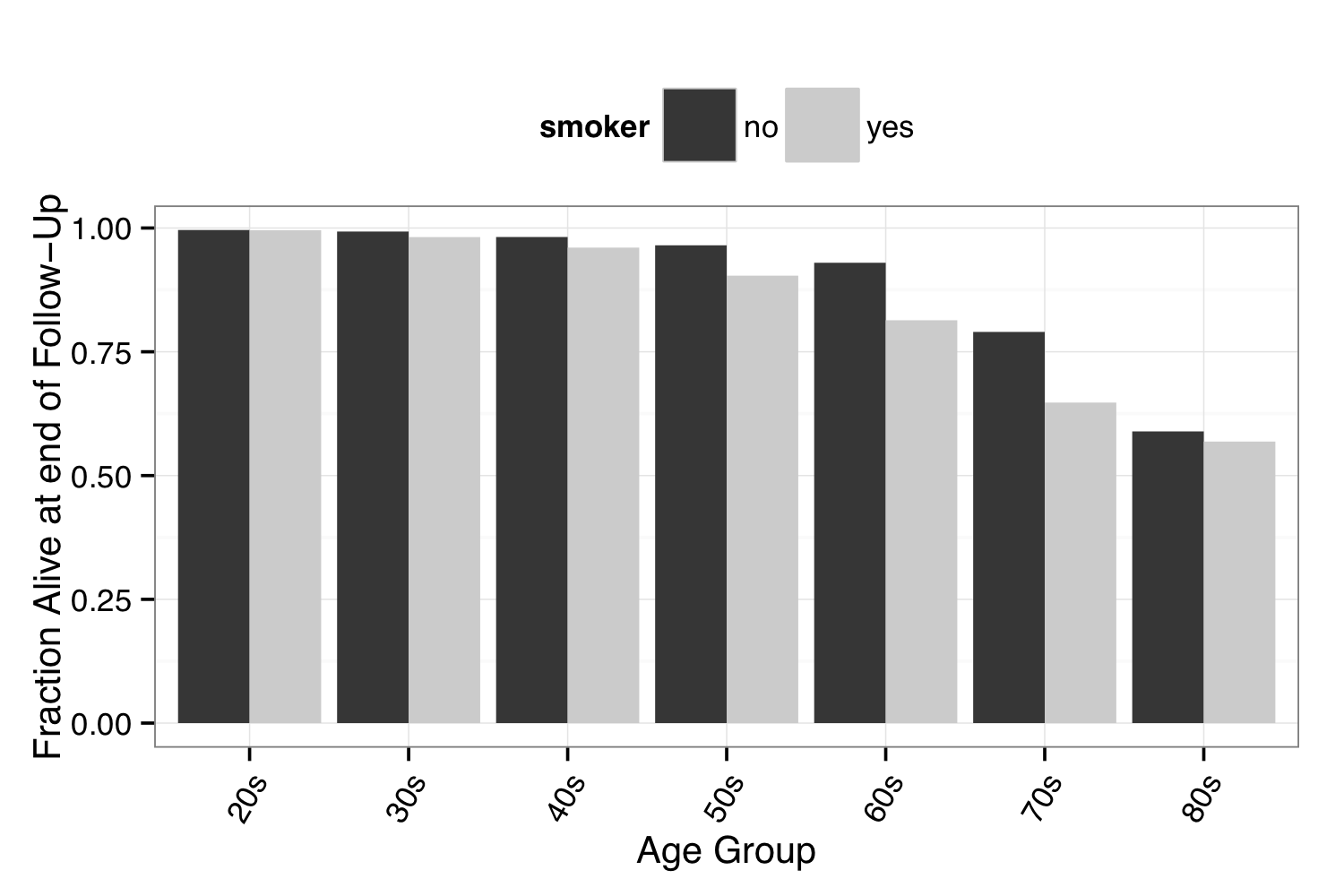 Figure 5.4: A bar chart
5.5 Maps
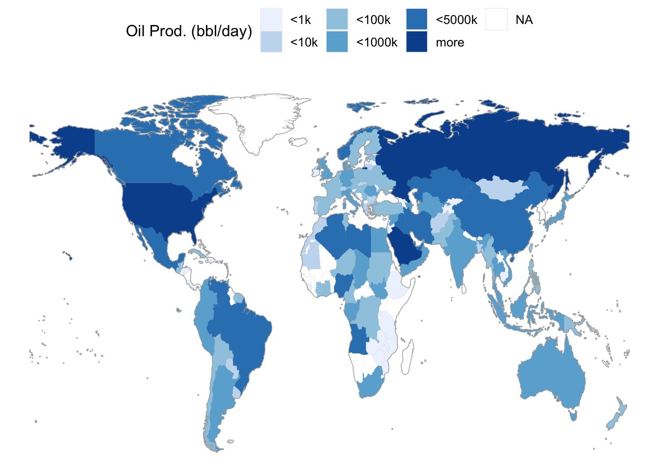
Using a map to display data geographically helps both to identify particular cases and to show spatial patterns and discrepancy. The map in Figure 5.5 shows oil production in each country. That is, the shading of each country represents the variable oilProd from dcData::CountryData. This sort of map, where the fill color of each region reflects the value of a variable, is sometimes called a choropleth map.
Figure 5.5: A choropleth map.
5.6 Networks
A network is a set of connections, called edges, between elements, called vertices. A vertex corresponds to a case. The network describes which vertices are connected to other vertices.
The dcData::NCI60 data set is about the genetics of cancer. The data set looks at more than 40,000 probes for the expression of genes, in each of 60 cancers. In the network here, a vertex is a given cell line. Every vertex is depicted as a dot. The dot’s color and label gives the type of cancer involved. These are Ovarian, Colon, Central Nervous System, Melanoma, Renal, Breast, and Lung cancers. The edges between vertices show pairs of cell lines that had a strong correlation in gene expression.
Figure 5.6: A network diagram.
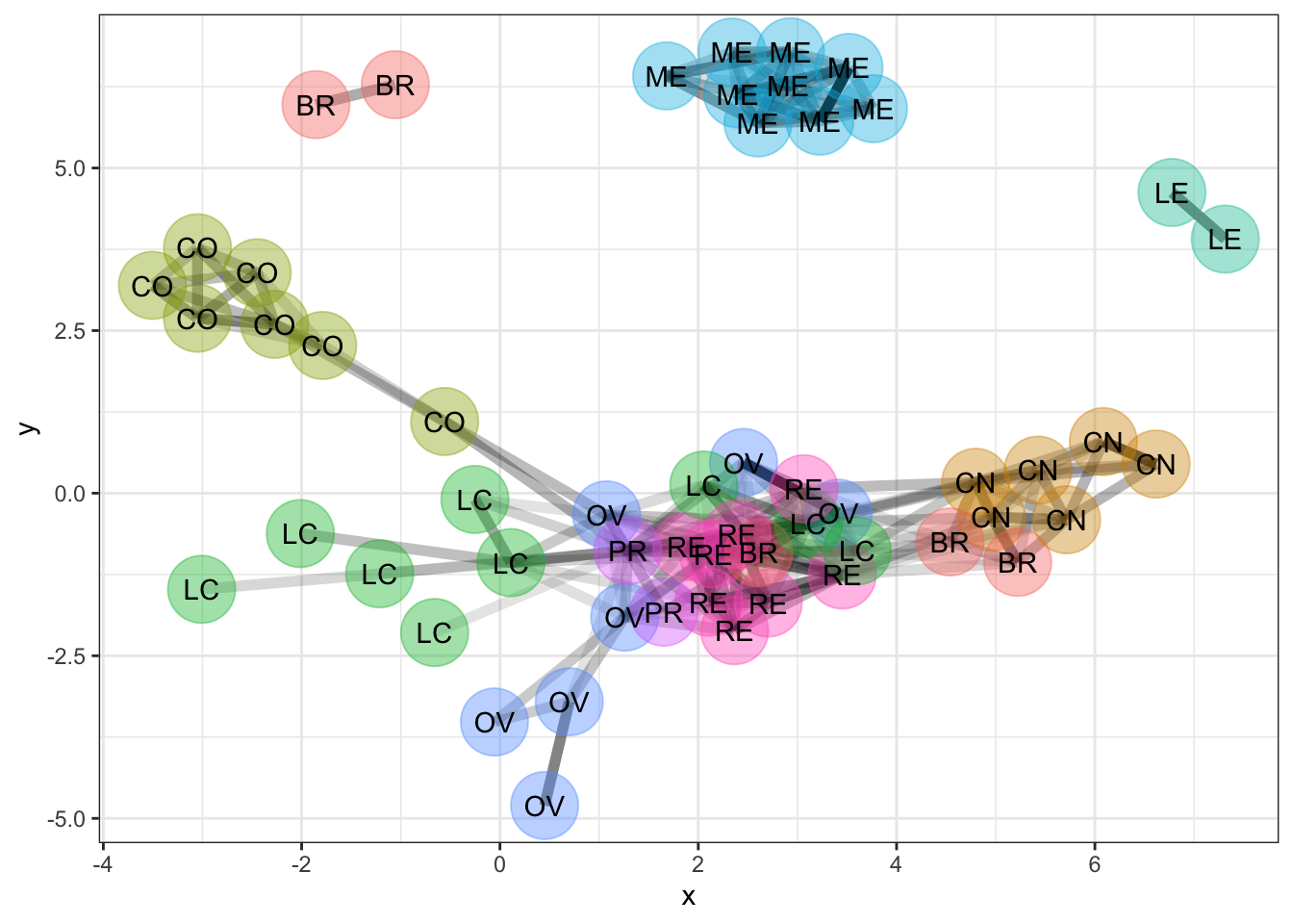
The network shows that the melanoma cell lines (ME) are closely related to each other and not so much to other cell lines. The same is true for colon cancer cell lines (CO) and for central nervous system (CN) cell lines.
5.7 Constructing Graphics Interactively
There is a simple pattern to creating a data graphic:
- Choose or create the glyph-ready data frame that will be graphed.
- Select the kind of graphic: scatterplot, bar chart, map, etc.
- Decide which variables from the data frame will be assigned to which roles in the graphic: \(x\)- and \(y\)-coordinates, bar lengths, colors, sizes, etc. This is called mapping a variable to a graphical attribute.
Chapter 8 introduces R commands such as ggplot() for drawing graphics. In this chapter, you will use interactive programs to generate the graphics and the corresponding R commands. The resulting R commands can be pasted into an R chunk in an .Rmd file.
Never put the interactive commands into an .Rmd file because there is no one to interact with the session created when compiling. Instead, use the interactive commands in the console to generate graphics commands to paste into an R chunk.
The mosaic package includes several interactive graphing functions.This chapter introduces tools included in the mosaic package, but there are among the growing number of R packages that implement user-friendly tools to generate graphics commands that can then be pasted into an R chunk. For example, the DataComputing package (installed from GitHub), esquisse (installed from CRAN), and more. They are interactive in allowing you to open a menu interface and specify which variables map to graphical attributes. The functions are:
mplot( )mWorldMap( )mUSMap( )
The first argument to each of these functions is a data frame whose cases you want to display graphically. The mplot( ) function is quite most versatile, and prompts the user to choose among several common plot types (e.g., histogram, scatter) before initializing the interactive features.Technical Note. While statistical modeling is generally beyond the scope of this text, the mplot( ) function can also be used to help evaluate how well certain types of statistical models are suited to the data (e.g., diagnostic plots).
The map-making functions also require two more arguments: key = specifies the variable in the data frame that identifies the country or state for each case. fill = specifies the variable to be used for shading each country. Drawing networks will be introduced later.
Interactive graphics commands rarely produce the polished final form of the desired data visualization. Rather, they are best used to get the process started and generate R commands for a plot that is structurally similar to the data visualization desired. Then, the R commands can be modified, refined, and extended to produce beautiful, professional-quality, data visualizations.
5.8 Scatter Plots
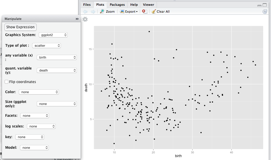
Figure 5.7: An interactive plot tab created using mplot(CountryData) for scatter plot. By default, the first two quantitative variables in a data frame are mapped to the \(x\)- and \(y\)-axes. Change this using the drop-down menu to make the scatter plot of interest to you.
Consider the relationship between birth rate and death rate among the countries in CountryData. The variables birth and death that give these rates (in births per 1000 people per year).
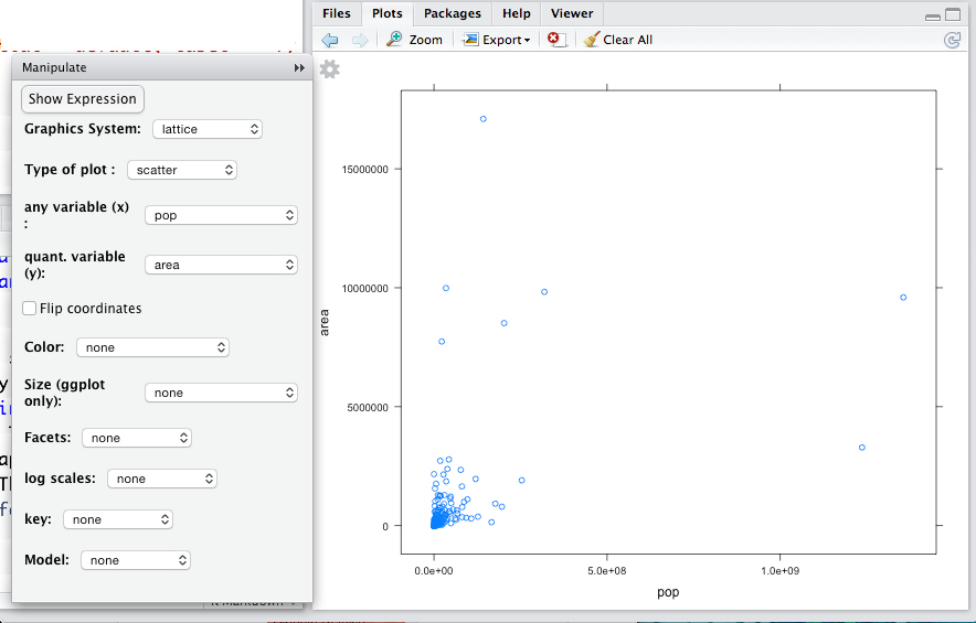
An appropriate graphic modality is a scatter plot: birth rate against death rate. To make the graph, use the software appropriate for this modality, namely we use mplot(CountryData) and indicate our intended plot type when prompted in the console as shown in Figure 5.8.
Figure 5.8: Demonstration of mplot( ) executed in the R console, and the resulting prompt for the user to select an initial plot type.
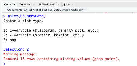
Always read warning messages like the “red text” in Figure 5.8. This was simply an alert that the number of points on the scatterplot differs from the number of cases in the data set. All “red text” (warnings and errors) deserves your attention, but “red text” is not always bad news. That one simple command gives two essential details: what data frame to use and what modality of graph to make. After giving that command, something like Figure 5.7 should appear in your “Plots” tab.
Notice three components of the plots tab:
- A coordinate grid with dots.
- A menu for mapping variables to attributes.
- A small gear icon:

If you don’t see the menu on your system, click on the gear icon. If the menu runs off the bottom of the screen, make the “Plots” tab taller. By default, the first two quantitative variables, area and pop, are being used to define the frame. Since the first two quantitative variables that R finds in the data set are somewhat arbitrary, this usually will not create the plot you really want.
Using the mplot() menu (Figure 5.9), set the frame to be death versus birth. The overall pattern is U-shaped; both low and high birth rates are associated with high death rates, while birth rates in the middle tend to have lower death rates.
Figure 5.9: Using the mplot() menu to set the variables displayed on the \(x\)- and \(y\)-axes to be birth and death rates, respectively.
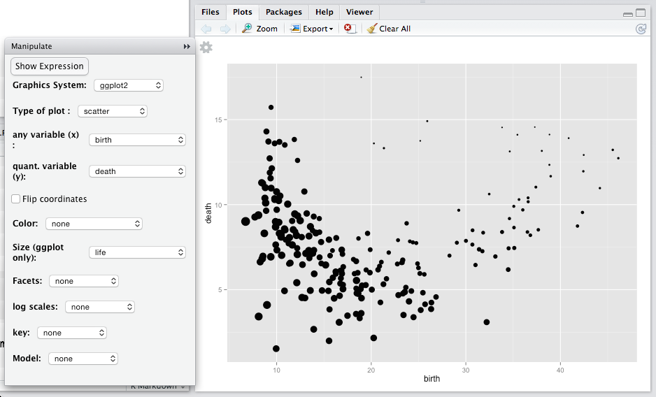
The glyphs in scatterplots — dots here — can have graphical attributes besides from their position in the frame. Standard ones include fill color, shape, size, transparency, and border color. In Figure 5.10, life expectancy is mapped to size. You can see that, for countries with high life expectancy, the death rate is high when the birth rate is low. That’s likely because when life expectancy is high and birth rate is low, the population tends to be older and older populations have higher death rates. What do you observe among countries with lower life expectancy?
Figure 5.10: Graphical attributes such as size, shape, and color can be used to represent additional variables. Here, dot size reflects a country’s life expectancy.
5.9 Distributions
Frequency polygons or histograms are appropriate for showing how the different values are distributed for a single variable.
Figure 5.11: The distribution of body mass index shown with a frequency polygon separately for each sex.
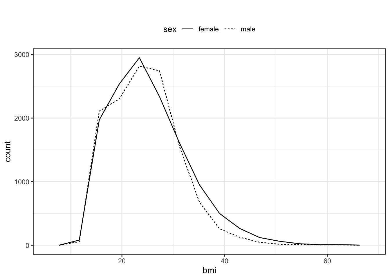
Consider, for instance, how body mass index varies across the subjects in the NCHS data. For a distribution, a single variable, the measured quantity, is mapped to the \(x\)-axis. The \(y\)-values are set by the number of cases at the corresponding \(x\)-value. In the mplot() menu shown in Figure 5.12, sex has been mapped to line type, producing the chart in Figure 5.11.
Figure 5.12: Setting the variable mappings for the frequency polygon plot in Figure 5.11 using the mplot() menu.
5.10 Bar Plots
Bar charts use a glyph whose length reflects the value to be presented. Depending on how variables are mapped to graphical attributes, the plots can tell different aspects of the story.
For instance, the individual ballot choices in the 2017 mayoral election in Minneapolis look like this:
| precinct | first | second | third | ward |
|---|---|---|---|---|
| P-07 | Jacob Frey | Tom Hoch | undervote | W-8 |
| P-06 | Tom Hoch | undervote | undervote | W-12 |
| P-06 | Jacob Frey | Tom Hoch | Betsy Hodges | W-8 |
| P-11 | Tom Hoch | L.A. Nik | Jacob Frey | W-2 |
| P-08 | Tom Hoch | Jacob Frey | Nekima Levy-Pounds | W-6 |
| P-04 | Raymond Dehn | Nekima Levy-Pounds | Aswar Rahman | W-4 |
You might be interested to make a bar chart of the number of first-choice votes that each candidate received. In this case, as is typical, a bit of data wrangling is called for to create glyph-ready data. For now, don’t worry about the following commands, which will be introduced later.
FirstPlaceTally <-
  Minneapolis2017 %>%
  rename(candidate = first) %>%
  group_by(candidate) %>%
  summarise(total = n())
Table 5.1: First place vote tallies in the Minneapolis2017 data
| candidate | total |
|---|---|
| Al Flowers | 704 |
| Aswar Rahman | 746 |
| Betsy Hodges | 18860 |
| Captain Jack Sparrow | 435 |
| Charlie Gers | 1232 |
| Christopher Zimmerman | 1 |
| … and so on for 20 rows altogether. |
There were 20 candidates in the election (!), but most got only a small number of votes. The results can be displayed effectively with a bar chart.
Figure 5.13: A bar chart showing the number of first-place votes given to each candidate.
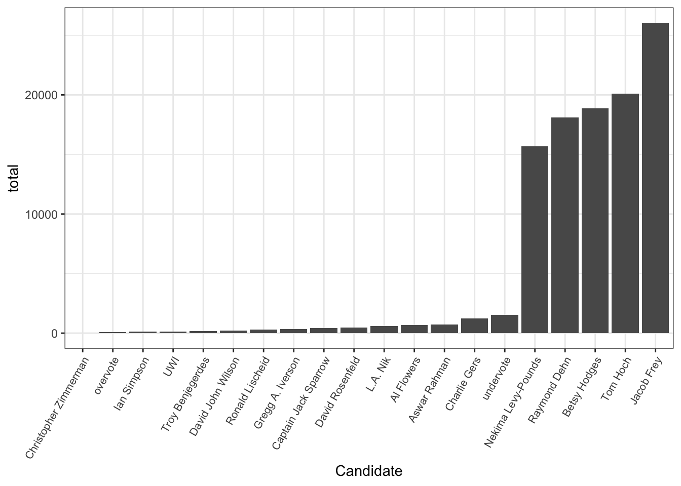
Figure 5.14: The mappings for the vote-tally bar chart in Figure 5.13
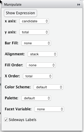
The chart shows at a glance that there are just a handful of major candidates. For this plot, the total variable was mapped to the y-axis, the candidate was mapped to the x-axis, and the candidates were ordered from lowest to highest total of votes. Look closely and you’ll see that “undervote” (meaning no candidate was chosen) apparently beat 14 of the candidates.
5.11 Making Maps
Showing a variable in a geographical map requires two data frames:
- A shape file giving latitude and longitude of points on the boundaries.
- The data frame for the variable that is to be plotted.
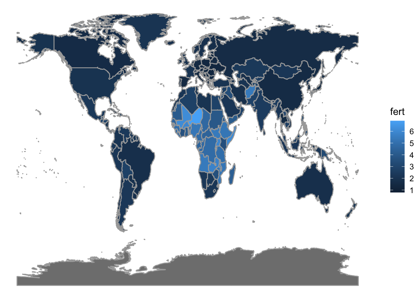
There are shape files for all sorts of geographic entities: countries, states, counties, precincts, and so on. To simplify things, the mosaic package provides two functions: mWorldMap() with country boundaries and mUSMap() with state boundaries in the US. The shape file is pre-set for these functions; you need only provide a data frame with the name of countries (or states) and the variable to be plotted. Figure 5.15 shows how fertility varies from country to country.
Figure 5.15: A choropleth map of fertility (children born per woman)
5.12 Exercises
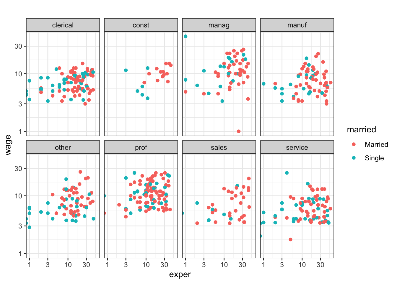
Problem 5.1: Consider this graph of the CPS85 data in the mosaicData package:
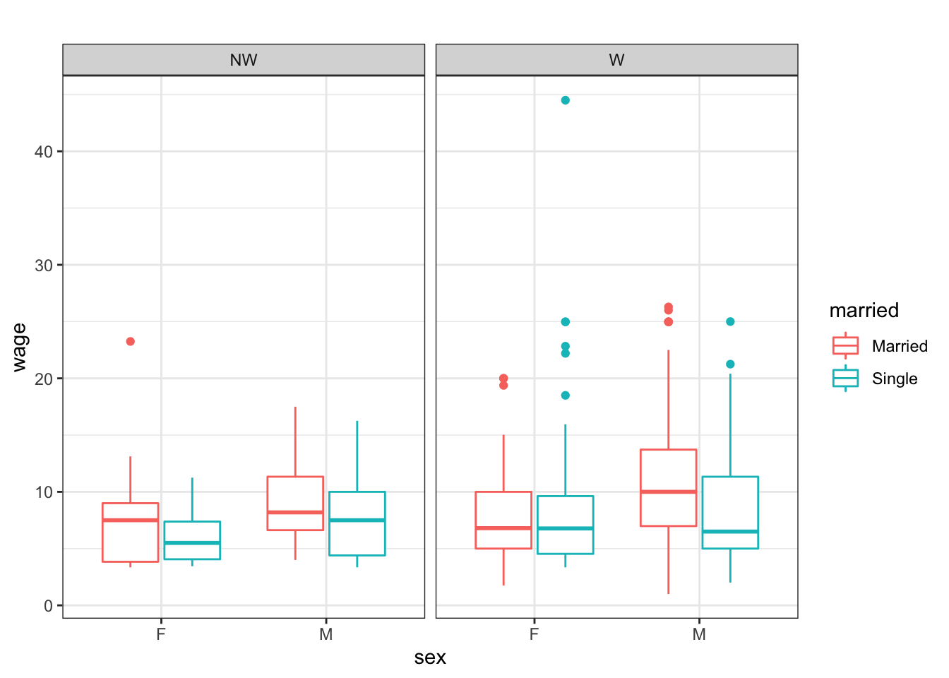
Use mplot( ) to reconstruct the graph. Start with these commands:
Problem 5.2: Make this graph from the NCHS data in the dcData package.
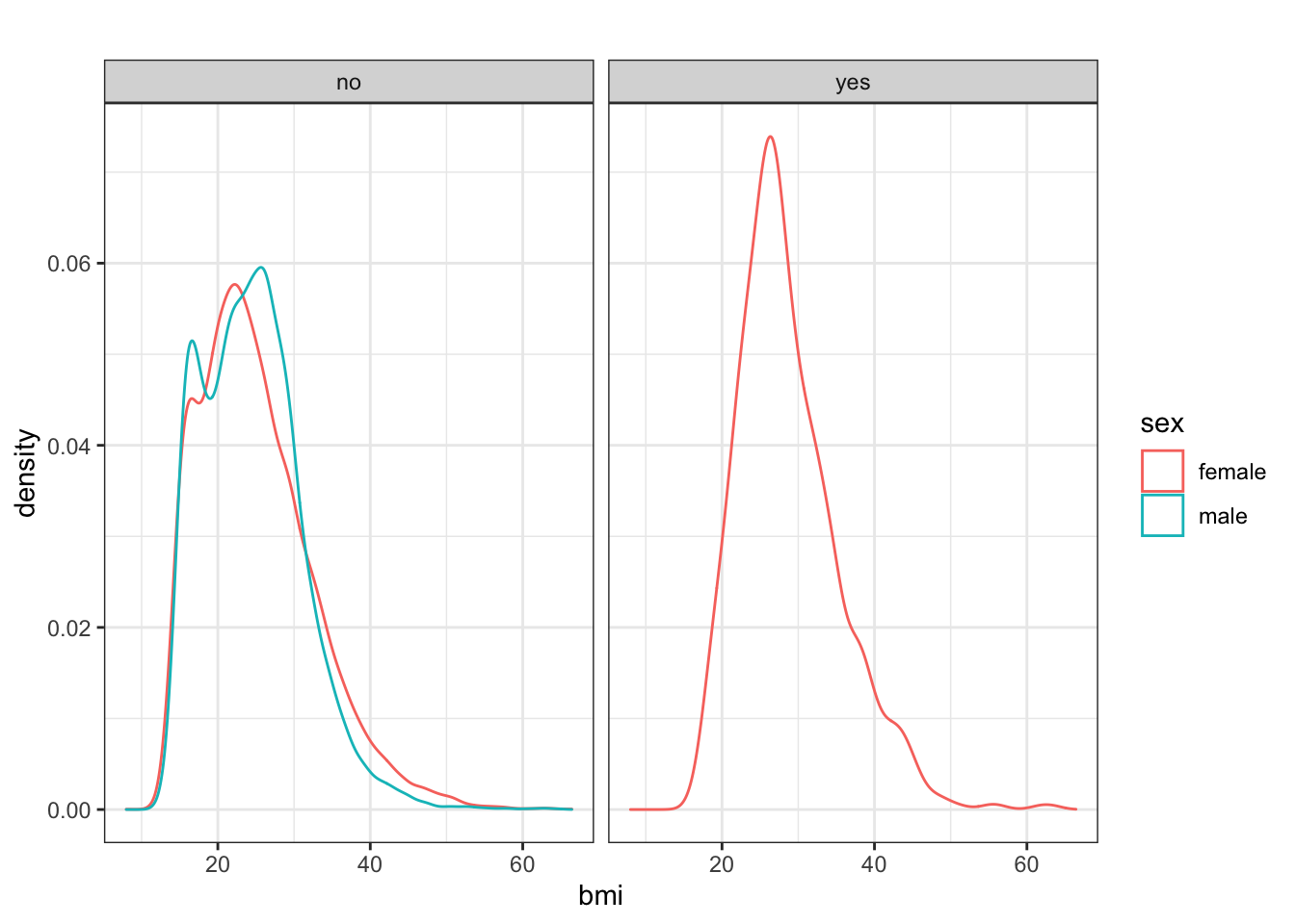
Hints: (1) Among other things, you may need to first call the mosaic library before you can begin using the relevant interactive graphing function. (2) The “yes” and “no” in the gray bars refer to whether or not the person is pregnant.
Problem 5.3: Using the CPS85 data table (from the mosaicData package), make this graphic: