Chapter 6 Frames, glyphs, and other components of graphics
Data graphics are built from parts. Chapter 5 showed the parts assembled together. This chapter looks at the parts individually.
Of course, a data frame provides the basis for drawing a data graphic. The relationship between a data frame and a graphic is simple: Each case in the data frame becomes a mark in the graph. The designer of the graphic — you — chooses which variables the graphic will display and how each variable is to be represented graphically: position, size, color, and so on. The marks themselves are called glyphs. A data graphic has one glyph for each case in the data frame.
Key Graphics Vocabulary
frame: The relationship between position and the data being plotted.
glyph: The basic graphical “unit” that represents one case. Other terms used include “mark” and “symbol.” Variables set graphical attributes of the shape: size, color, shape, and so on. The location of the glyph — location is an important graphical attribute! — is set by the two variables defining the frame.
aesthetic: Any graphical attribute of a glyph: size, location, shape, color, etc.
scale: The relationship between the value of a variable and the graphical attribute to be displayed for that value.
guide: An indication of the scale for a human viewer in order to show how a variable encodes into its graphical attribute. Common guides are x- and y-axis tick marks and color keys.
6.1 The Frame
The frame of a graphic provides the space for drawing glyphs. But there is more to a frame than a blank canvas or piece of paper. The frame defines what position means. Most often, the frame is a rectangular region and position is described in terms of the familiar \((x, y)\) Cartesian coordinate system. In creating a frame, you must decide which variable in your data will correspond to the \(x\) coordinate, and which to the \(y\) coordinate.
For instance, consider a dataset relevant to economic productivity. Table 6.1 gives per capita GDP for each country as well as some of the explanatory candidates: average educational level in the population, length of roadways per unit area, Internet use as a fraction of the population.
Table 6.1: Data relevant to economic performance. This is an excerpt from CountryData found in the dcData package.
| country | gdp | educ | roadways | net_users |
|---|---|---|---|---|
| Ethiopia | 1223.18 | 4.7 | 0.04 | >0% |
| Finland | 37105.23 | 6.8 | 0.23 | >60% |
| Gambia, The | 1910.13 | 4.1 | 0.33 | >5% |
| India | 4036.09 | 3.2 | 1.43 | >0% |
| Macau | 87904.01 | 2.7 | 14.75 | >35% |
| Yemen | 2365.57 | 5.2 | 0.14 | >5% |
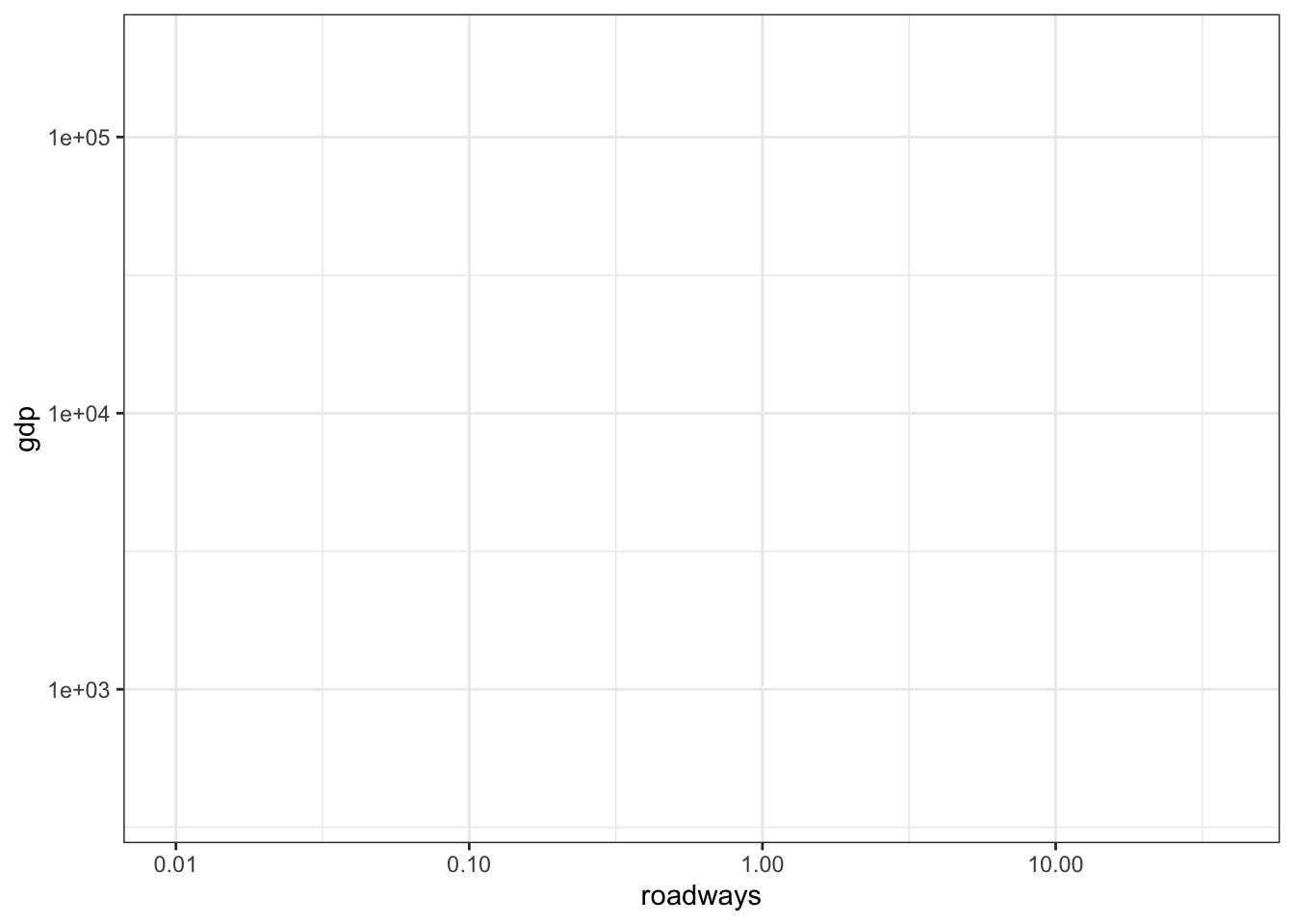
You define a frame by selecting two variables from the glyph-ready data frame. For instance, Figure 6.1 shows a frame based on GDP and length of roadways. The frame provides the meaning to location in space.
Figure 6.1: A graphics frame set by the GDP and roadway variables. No glyphs have been set in this frame.
6.2 Glyphs
The frame itself doesn’t display any of the cases. Instead, the glyphs positioned in the frame represent the cases. There will be one glyph for each case in the data frame.
The basic shape used in scatter plots is a simple glyph: a dot, a square, a triangle, an x, and so on. Figure 6.2 uses small dots. Since each case is a country, each dot represents one country.
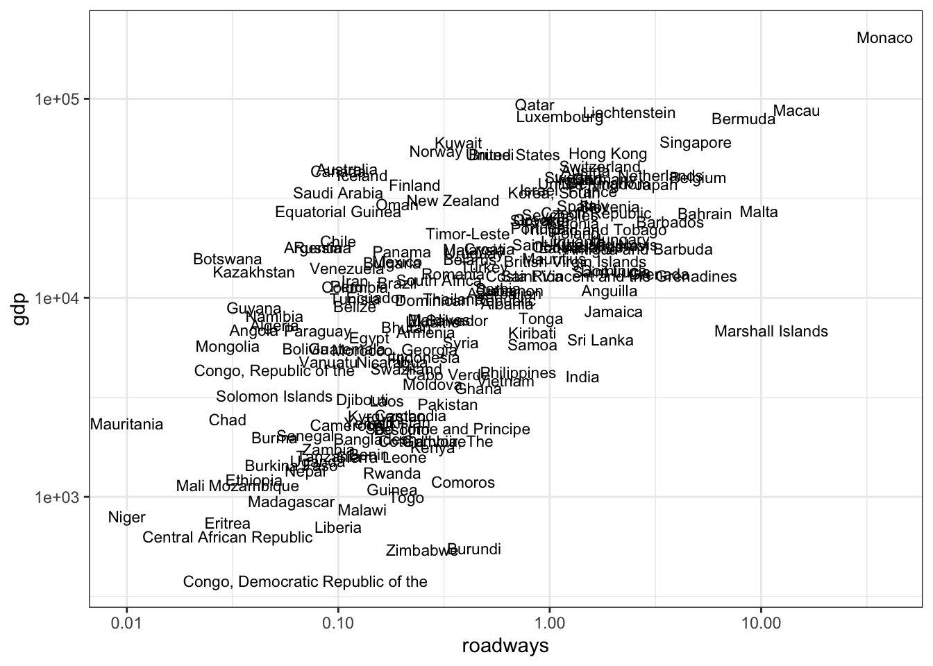
In Figure 6.2, the glyphs are simple. Only position in the frame distinguishes one glyph from another. The shape, size, etc. of all of the glyphs are identical. There’s nothing about the glyph itself which identifies the country. It’s possible to use a glyph with several attributes. Figure 6.3 location and label, mapping country name to the label.
Figure 6.2: Using only position as the aesthetic for glyphs
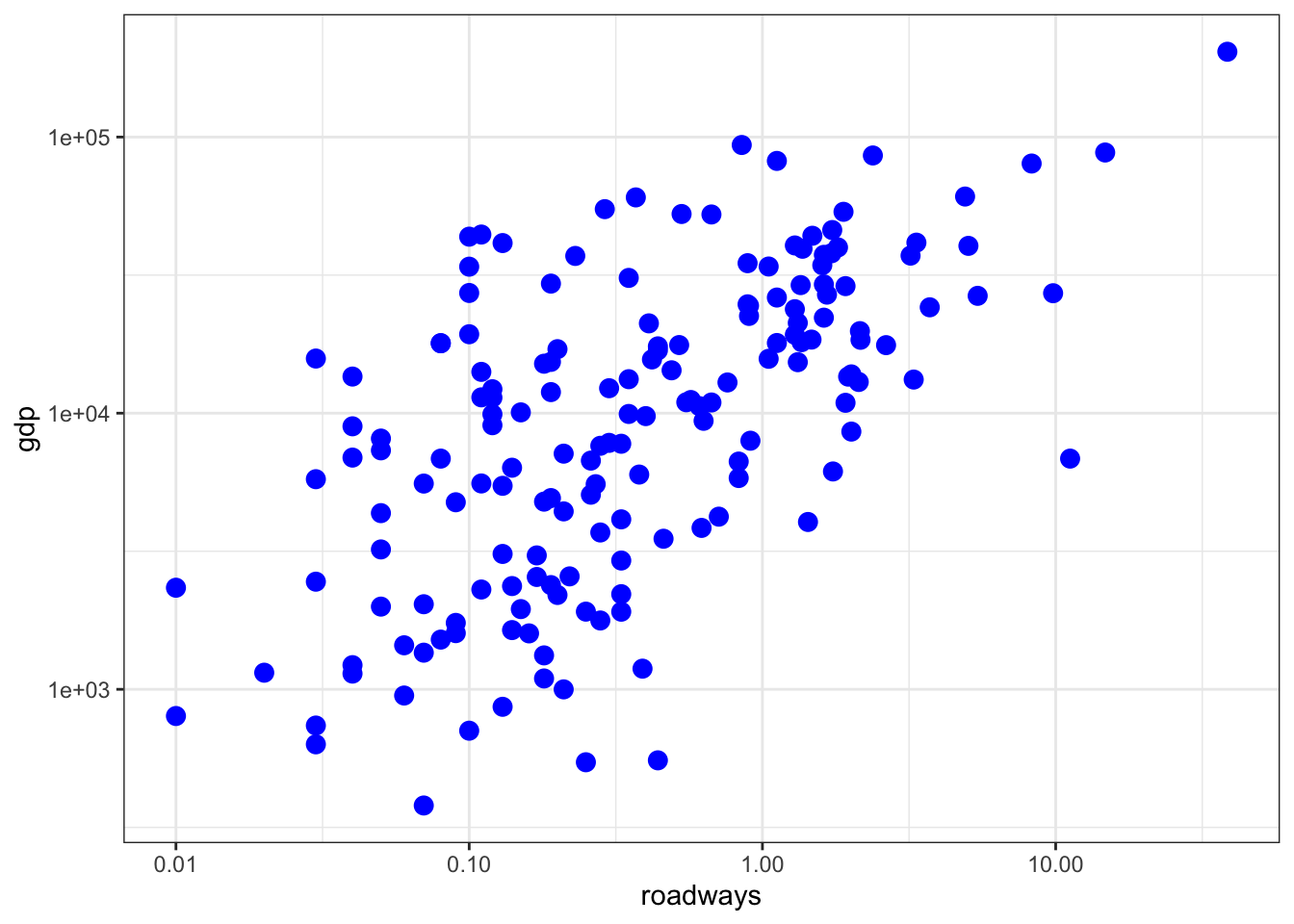
Figure 6.3: Using both location and label as aethetics
But glyphs can have several properties. The aspects of each glyph that we can perceive are called aesthetics, or equivalently graphical attributes. The word aesthetics applied in the context of glyphs is not used in the modern sense. Nowadays, most people associate aesthetics with notions of beauty and artistic taste. The earlier meaning of the word, properties relating to perception by the senses, is the one intended when it comes to glyphs.
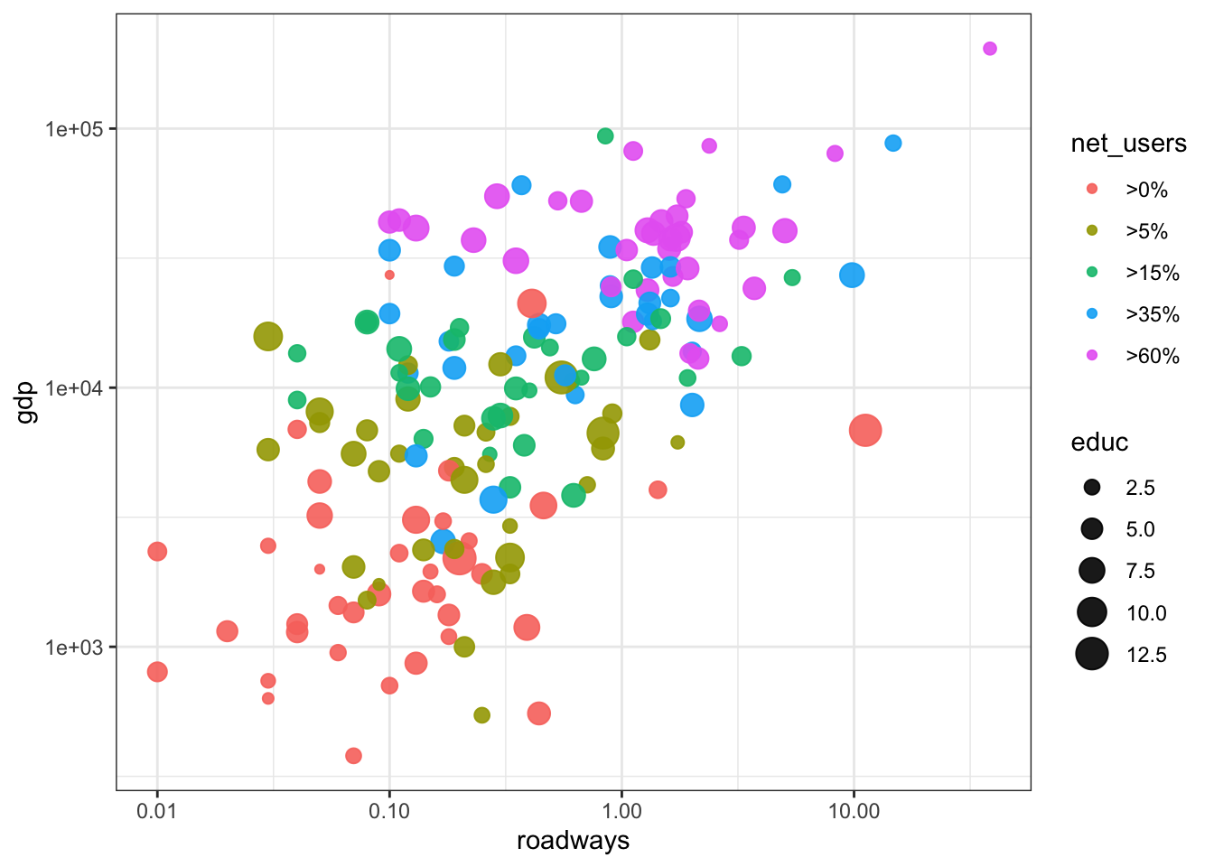
Location in the frame are the \((x, y)\) aesthetics for a glyph, but other aesthetics can display variables in the data frame. For instance, color could be used to show Internet use (as a fraction of the population), as in Figure 6.4. Another aesthetic is size. The size is fixed in 6.4; the same for every country. Figure 6.5 maps the average years of eduction onto the size aesthetic.
Figure 6.4: net_users mapped to color.
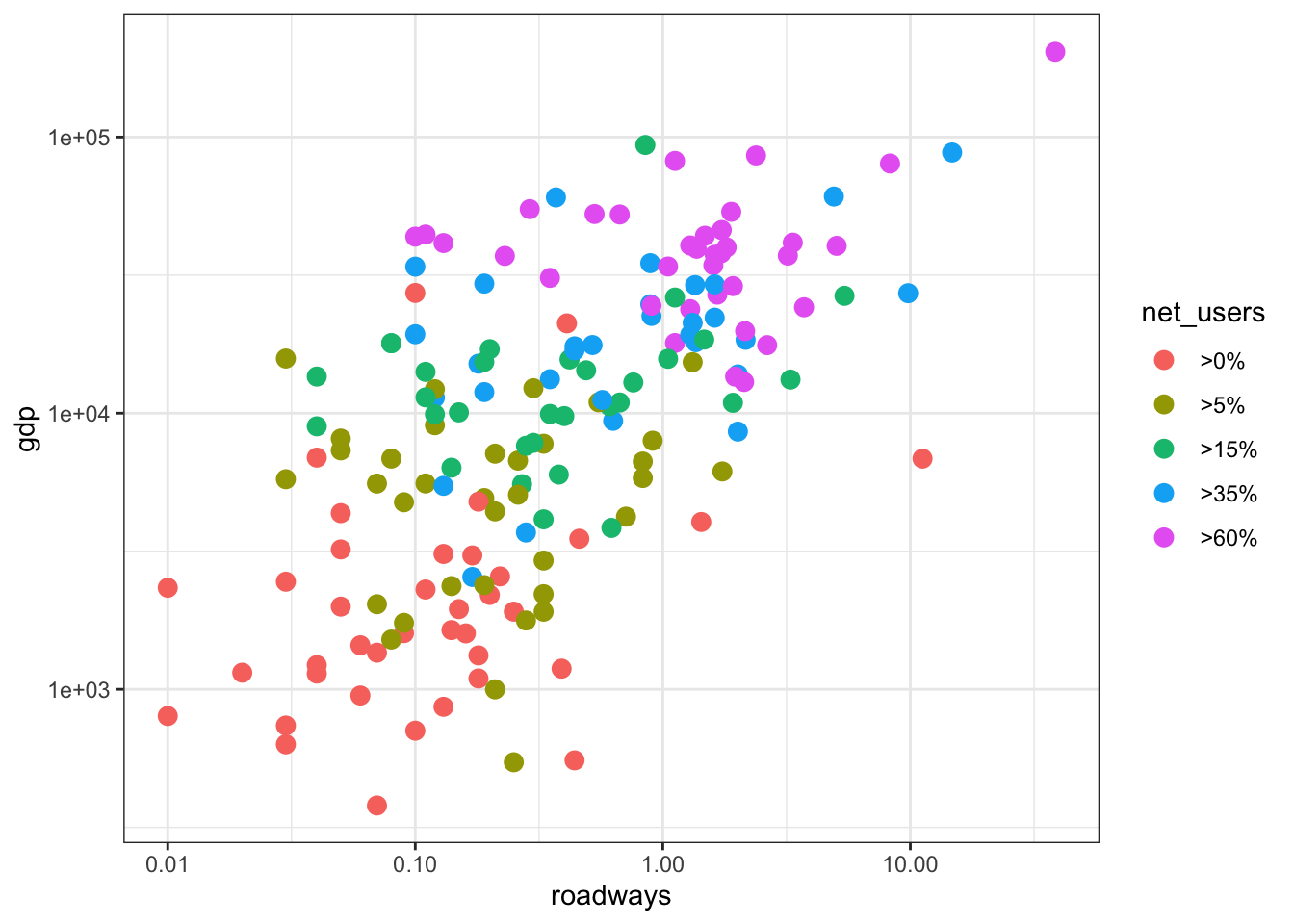
Figure 6.5: net_users mapped to color, educ mapped to size. Compare this graphic to Figure 6.6, which shows the same data using facets.
6.3 Scales and Guides
There are four aesthetics in Figure 6.5. Each of the four aethetics is set in correspondence with a variable; we say the variable is mapped to the aesthetic. Length of roadways is being mapped to horizontal position, GDP to vertical position, Internet connectivity to color, and educational attainment to size.
A scale is the relationship between a variable and the aesthetic to which it is mapped. For roadways, the scale says what value of the variable will correspond to position at the bottom of the frame, what value will correspond to the top of the frame, and where things fall inbetween.
Not all scales are about position. For instance, in Figure 6.5, net_users is translated to color. Similarly, average educational attainment (in years) is translated to size: the middle-sized dot corresponds 7½ years of education.
Scales translate values into aesthetic properties. Guides help the human reader to do the back translation. For position aesthetics, the most common sort of guide is the familiar axis with its tick marks and labels. But notice also the guide that tells how dot color corresponds to Internet connectivity. There’s still another guide telling how dot size corresponds to education.
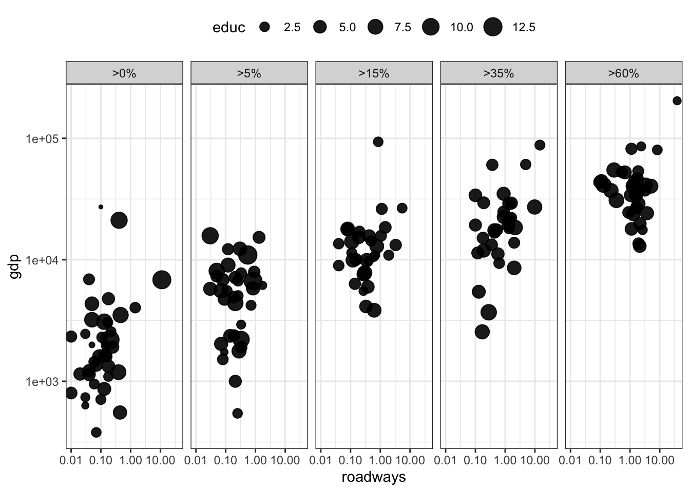
6.4 Facets
Using multiple aesthetics such as shape, color, and size to display multiple variables can produce a confusing, hard-to-read graph. Facets provide a simple and effective alternative. Figure 6.6 uses facets to show different levels of Internet connectivity, providing a better view than Figure 6.5.
Figure 6.6: Using facets for different ranges of Internet connectivity
6.5 Layers
On occasion, data from more than one data frame are graphed together. For instance, suppose you want a display of one state’s hospital providers’ charges for different medical procedures. The glyph-ready data frame for New Jersey looks like Table 6.2. The glyph-ready table can be translated to a chart (Figure 6.7 (top)) using bars to give a fair impression of the range in charges for different medical procedures in New Jersey.
Table 6.2: Glyph-ready data for the barplot layer in Figure 6.7
| drg | stateProvider | mean_charge |
|---|---|---|
| 536 | NJ | 31390.41 |
| 303 | NJ | 32371.78 |
| 310 | NJ | 33041.72 |
| 313 | NJ | 33183.08 |
| 305 | NJ | 33277.72 |
| 203 | NJ | 33886.60 |
| … and so on for 100 rows altogether. |
How do the New Jersey charges compare to those in other states? Tables 6.2 and 6.3 provide relevant data. The two data frames, one for New Jersey and one for the whole country, can be plotted with different types of glyph: bars for New Jersey and dots for the whole country as in Figure 6.8.
Figure 6.7: Average charges for medical procedures in New Jersey.
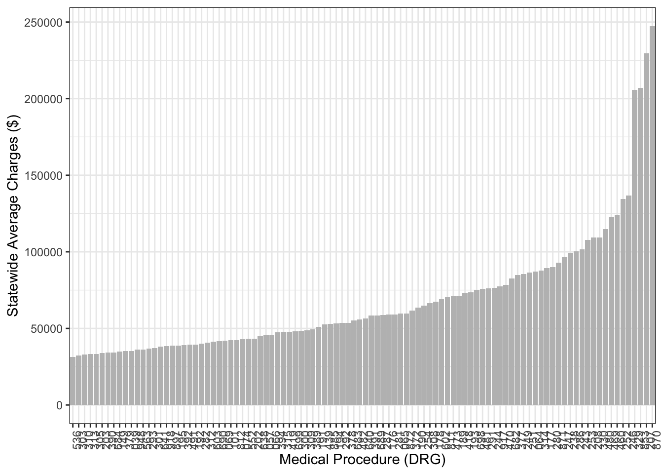
Table 6.3: Glyph-ready data frame for the scatter-plot layer in Figure 6.8
| drg | stateProvider | mean_charge |
|---|---|---|
| 039 | AK | 34805.13 |
| 039 | AL | 32044.44 |
| 039 | AR | 27463.27 |
| 039 | AZ | 33443.36 |
| 039 | CA | 56094.93 |
| 039 | CO | 35252.21 |
| … and so on for 5,025 rows altogether. |
Figure 6.8: Adding a second layer to provide a comparison of New Jersey to other states. Average charges for medical procedures in New Jersey.
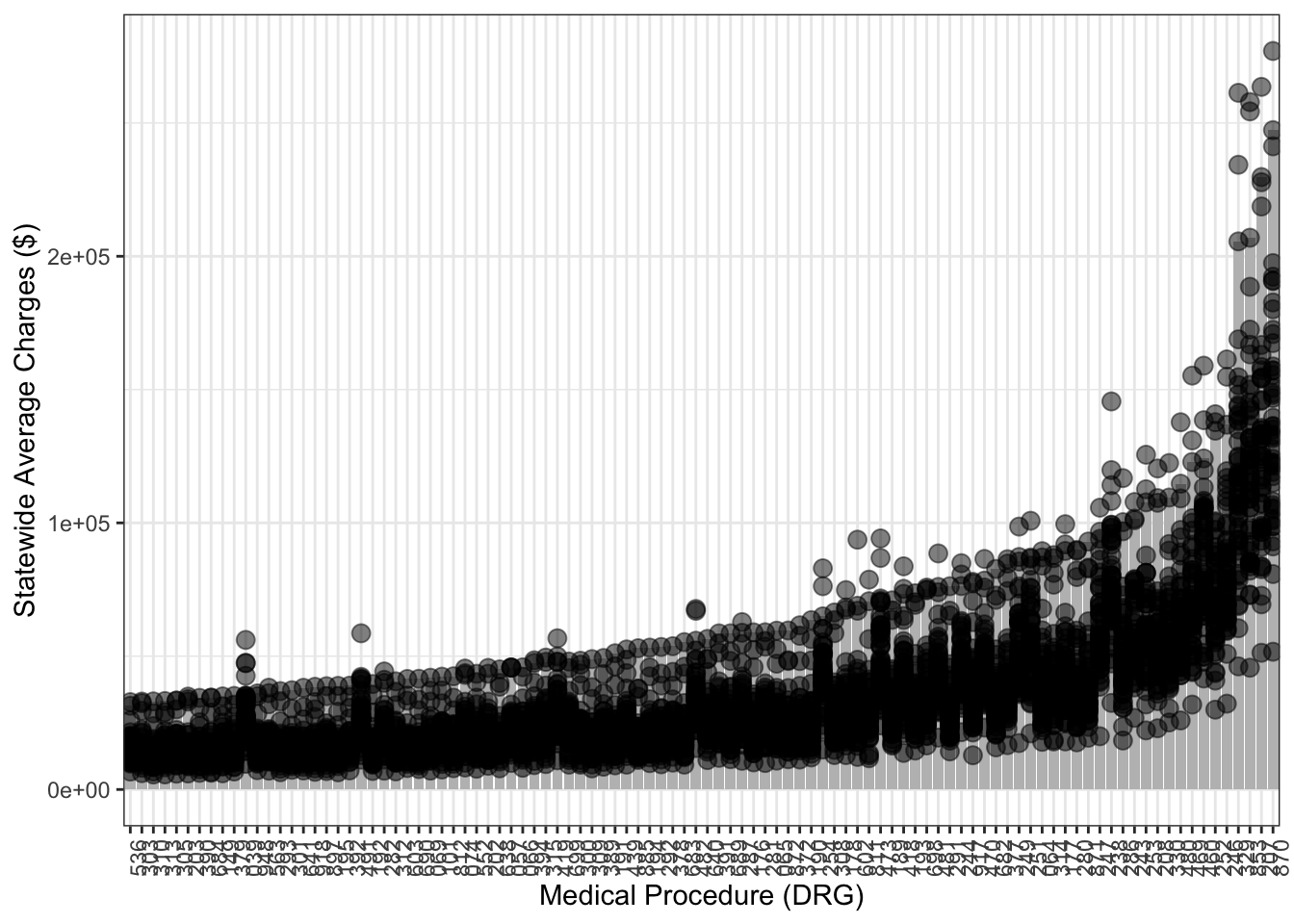
With the context provided by the individual states, it’s easy to see the charges in New Jersey are among the highest in the country for each medical procedure. (A description of each medical procedure number is given in the data frame DirectRecoveryGroups in the dcData package.)
6.6 Exercises
Problem 6.1: The following chart contains four facets. Each shows the amount of a substance in different conditions:

- when the cells are adhering to a surface
- when the cells are growing in suspension for different amounts of time
Let’s deconstruct the chart to see if it follows the conventions for facets in graphics used in this book.
- What are the labels/identifiers for the facets?
- Are the frames the same in each facet?
- There are three different glyphs shown in the frames. Describe each type in terms of its graphical properties.
Problem 6.2: Consider this graph

Here are some of the variables and their levels:
- Log enyzme
concentration: numerical \(-3\) to \(5\) target: CcpN, Uptake, Otherflux: zero or positivegene: MaeN, PtsG, DctP, …molecule: Glocose, Fructose, Gluconate, …
- List all of the guides in the graph. For each one, say which variable is being mapped to which graphical attribute.
- The basic glyph is a dot. Say what are the graphical attributes of the dot (e.g. color, size, …). For each graphical attribute found in the graph, say which variable is mapped to that attribute.
- Which two variables set the frame?
- The scaling of the horizontal variable (e.g. the translation of position to variable levels) is set by a combination of two variables. Which two?
Problem 6.3: Consider this graphic:

Suppose the glyph-ready data underlying the graphic were structured as follows:
| protein | center | low | high | polarity | signif |
|---|---|---|---|---|---|
| 1433G | 1.35 | 1.18 | 1.54 | plus | 1 |
| AMOL2 | 0.78 | 0.63 | 1.01 | minus | 2 |
| 1433F | 0.79 | 0.18 | 1.19 | plus | 0 |
| 1433E | 0.42 | -0.15 | 1.01 | plus | 0 |
| \(\vdots\) | \(\vdots\) | \(\vdots\) | \(\vdots\) | \(\vdots\) | \(\vdots\) |
Consider these two kinds of glyph present in the graph:
 and
and 
- For each of the two glyphs, list the set of graphical attributes both geometrically (e.g. “dot”) and in terms of the variable from the table that is mapped to that attribute (e.g.,
polarity). - Which variables define the frame? Give variables for both the horizontal and vertical coordinates.
- Is color an attribute of the
glyph?
- What guides (if any) are displayed?
Problem 6.4: The graph, from Google Maps, shows mass transit options on a Monday morning for getting from Orinda, CA (in the East Bay), to Palo Alto, CA (in the West Bay).

- Considering only that part of the graphic below the blue underlined bus and other modes of transportation, what is the frame?
- Describe the different types of glyphs used.
- For each different type of glyph
- What information is encoded in the shape/style of the glyphs?
- What information is encoded in the position of the glyph?
- What guides are there?
Figure accompanying Problems 6.5 through 6.9 The figure presents forecasts for the US Senate elections in Nov. 2014. The numbers or words give the forecast probability of one party’s candidate — Democrat or Republican — winning. The forecasts are made based on polls up through the end of August 2014. Individual results from several different polling organization are shown. The graphic is an excerpt from the full graphic at , which shows predictions for all 36 senate seats up for election in 2014. Source: New York Times

Problem 6.5: In the figure, what variables define the frame?
- Probability and State.
- State and Polling Organization.
- Democrats and Republicans.
- Just State
- Just Probability
Problem 6.6: In the figure, what is the glyph and its graphical attributes?
- Glyph: names of the states. Graphical attribute: font.
- Glyph: names of the polling organization. Graphical attribute: the organization’s logo.
- Glyph: Rectangle. Graphical attribute: color.
- Glyph: Rectangle. Graphical attribute: color and text.
Problem 6.7: In the figure, what sets the order of the categorical variable in the scale for the vertical variable?
- State
- Poll
- Roth poll probability for the Democratic candidate.
- NYT poll probability for the Democratic candidate.
- Date of the poll.
Problem 6.8: In the figure, which of these is a guide for the indicated graphical attribute? (Select all that apply.)
- Vertical scale: Name of state.
- Vertical scale: Name of candidate.
- Vertical scale: Name of polling organization.
- Vertical scale: color band.
- Color: color band.
Problem 6.9: The NCHS data (in the dcData package) has 31126 rows. To speed things up, work with a small subset of NCHS:
Using the data in Small, make this plot with mplot() (in the mosiac package). Then, write down the mapping between variables and graphical attributes. Note that the plot will vary slightly each time you refresh Small to draw a random sample from NCHS.
Problem 6.10: The chart below is complex. Your job is to take it apart.

There are two adjacent frames in this chart. They happen to be arranged concentrically. Call them “inner” and “outer” for the purposes of identifying them. For each of the frames:
- What kind of layer is in the frame?
- What are the scales that define the meaning of space in each frame?
Problem 6.11: Here is a figure showing the cost of college and sources of financial aid. (Source: “College, the Great Unleveler”, New York Times, 03-01-2014)

In the left-hand panel of the figure:
- What variables make up the frame?
- Fraction of family income to pay for one year of college, and year.
- What are the guides?
- Labels for the different quintiles of family income.
- A line scaling the axis, showing where the fraction of family income is 100%.
- Text to label the extent of the horizontal axis, from 1971 to 2010
- What are the glyphs?
- A line connecting the values for 1971 and 2011, with the numerical values marked.
- Write down what the glyph-ready dataframe looks like.
For the right-hand panel of the figure.
- What are the glyphs and what data do they represent?
- This is tricky. The glyphs are the segments of the circles.
- Sketch, roughly, what a stacked bar chart would look like representing the same information.
- Write down what the glyph-ready dataframe looks like.