Chapter 18 Machine Learning
Up to now, the representation of data has been in the form of graphics. Graphics are often easy to interpret (but not always). They can be used to identify patterns and relationships — this is termed exploratory analysis. They are also useful for telling a story — presenting a pattern or relationship that is important for some purpose.
But graphics are not always the best way to explore or to present data. Graphics work well when there are two or three or even four variables involved in the patterns to be explored or in the story to be told. Why two, three or four? Two variables can be represented with position on the paper or screen or, ultimately, the eye’s retina.
Figure 18.1: A display of four variables from CountryData: unemployment, migration, infant mortality, and monetary inflation.
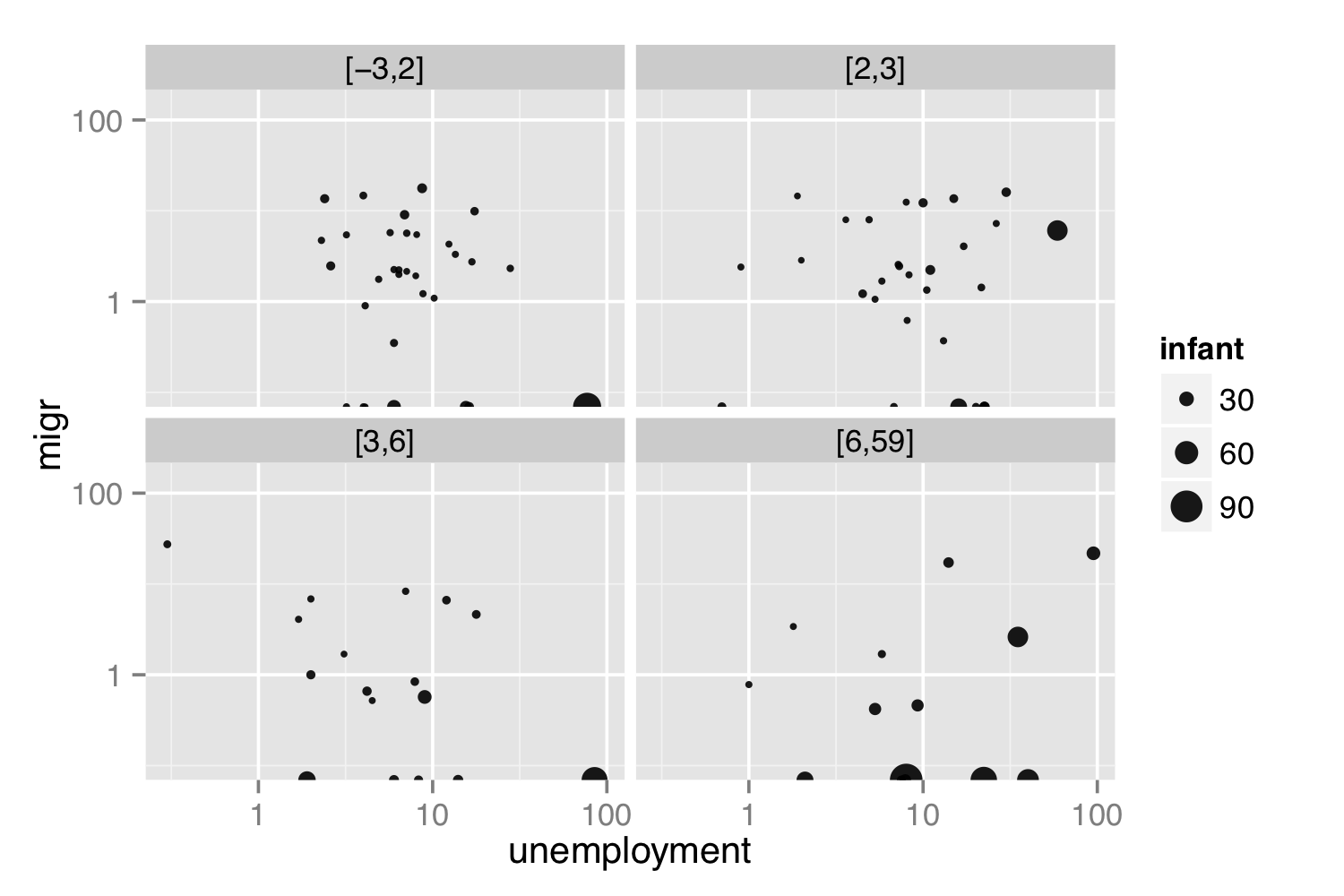
To represent a third variable, color or size can be used. In principle, more variables can be represented by other graphical aesthetics: shape, angle, color saturation, opacity, facets, etc. Doing so raises problems for human cognition; people simply don’t do well at integrating so many graphical modes into a coherent whole. The 4-variable graphic in Figure 18.1 is practically incomprehensible.
As an alternative to graphics, machine learning Machine learning: Using computer algorithms to search for and present patterns in data. can be use to identify and describe useful patterns in data.The term machine learning was coined in the 1990s to label a set of inter-related algorithmic techniques for extracting information from data. In the days before computers were invented, mathematical approaches, particularly linear algebra, were used to construct model formulas from data. These pre-computer techniques, generally called regression techniques, Regression techniques: Long-standing ways to fit model formulas to data. ought now be included as machine learning. Many of the important concepts addressed by machine-learning techniques emerged from the development of regression techniques. Indeed, regression and related statistical techniques provide an important foundation for understanding machine learning.
There are two main branches in machine learning: supervised learning Supervised learning: Finding and describing a relationship among measured variables. and unsupervised learning. Unsupervised learning: Finding ways to represent data in a compact form. This is often presented as finding a relationship between data and otherwise unmeasured features of the cases.
In supervised learning, the data being studied already include measurements of outcome variables (Regression techniques are a form of supervised learning). For instance, in the NCHS data, there is already a variable indicating whether or not the person has diabetes. Building a model to explore or describe other variables related to diabetes (weight? age? smoking?) is supervised learning.
In unsupervised learning, the outcome is unmeasured. For instance, assembling DNA data into an evolutionary tree is a problem in unsupervised learning. However much DNA data you have, you don’t have a direct measurement of where each organism fits on the “true” evolutionary tree. Instead, the problem is to create a representation that organizes the DNA data themselves.
18.1 Supervised Learning
A basic technique in supervised learning is to search for a function that describes how different measured variables are related to one another.
A function, as you know, is a relationship between inputs and an output. Outdoor temperature is a function of season: season is the input; temperature is the output. Length of the day — i.e. how many hours of daylight — is a function of latitude and day of the year: latitude and day-of-the-year (e.g. March 22) are the inputs; day length is the output. But for something like the risk of developing colon cancer or diabetes, what should that be a function of?
There is a new bit of R syntax to help with defining functions: the tilde. The tilde is used to indicate what is the output variable and what are the input variables. You’ll see expressions like this:
diabetic ~ age + sex + weight + heightHere, the variable diabetic is marked as the output, simply because it’s to the left of the tilde. The variables age, sex, weight, and height are to be the inputs to the function. You’ll also see the form
diabetic ~ .
as a syntax. The dot to the right of the tilde is a shortcut: “use all the available variables (except the output).”
There are several different goals that might motivate constructing a function:
Predict the output given an input.
It’s February, what will the temperature be? On June 15 in Saint Paul, Minnesota, USA (latitude 45 deg N), how many hours of daylight will there be.
Determine which variables are useful inputs.
We all know that outdoor temperature is a function of season. But in less familiar situations, e.g. colon cancer, the relevant inputs are uncertain or unknown.
Generating hypotheses.
For a scientist trying to figure out the causes of colon cancer, it can be useful to construct a predictive model, then look to see what variables turn out to be related to risk of colon cancer. For instance, you might find that diet, age, and blood pressure are risk factors for colon cancer. Knowing some physiology suggests that blood pressure is not a direct cause of colon cancer, but it might be that there is a common cause of blood pressure and cancer. That “might be” is a hypothesis, and one that you probably would not have thought of before finding a function relating risk of colon cancer to those inputs.
Understand how a system works.
For instance, a reasonable function relating hours of daylight to day-of-the-year and latitude reveals that the the northern and southern hemisphere have reversed patterns: long days in the southern hemisphere will be short days in the northern hemisphere.
Depending on your motivation, the kind of model and the input variables will differ. In understanding how a system works, the variables you use should be related to the actual, causal mechanisms involved, e.g. the genetics of cancer. For predicting an output, it hardly matters what the causal mechanisms are. Instead, all that’s required is that the inputs are known at a time before the prediction is to be made.
Consider the relationship between age and colon cancer. As with many diseases, the risk of colon cancer increases with age. Knowing this can be helpful in practice, for instance, helping to design an efficient screening program to test people for colon cancer. On the other hand, age does not suggest a way to avoid colon cancer: there’s no way for you to change your age. You can, however, change things like diet, physical fitness, etc.
The form or architecture of a function refers to the mathematics behind the function and the approach to finding a specific function that is a good match to the data. Examples of the names of such forms are linear least squares, logistic regression, neural networks, radial basis functions, discriminant functions, nearest neighbors, etc.
These notes will focus on a single, general-purpose function architecture: recursive partitioning. Software for constructing recursive partitioning function is available from a number of packages, including the party package:
To start, take a familiar condition: pregnancy. You already know what factors predict pregnancy, so you can compare the findings of the machine learning technique of recursive partitioning to what you already know.
The party::ctree() function builds a recursive-partitioning function. The NCHS data has a variable pregnant that identifies whether the person is pregnant.
There are different ways to look at the function contained in whoIsPregnant. An important one is the output produced for any given input. We might calculate that output when the inputs are an age of 25 (years), an income of 6 (times the poverty threshold), and sex female:
Table 18.1: According to the whoIsPregnant model, there is a 39 percent probability that a randomly selected 25-year old female in income group 6 is pregnant.
| age | income | sex | prob |
|---|---|---|---|
| 25 | 6 | female | 0.3859649 |
The input values are repeated to make it easier to compare inputs to outputs. Since the output is a yes-or-no, the output is given as the probability of each of these. So, for a 25-year-old woman with an income level of 6, the probability of being pregnant is 38.6%.
Another way to look at a recursive partitioning function is as a “decision tree”.
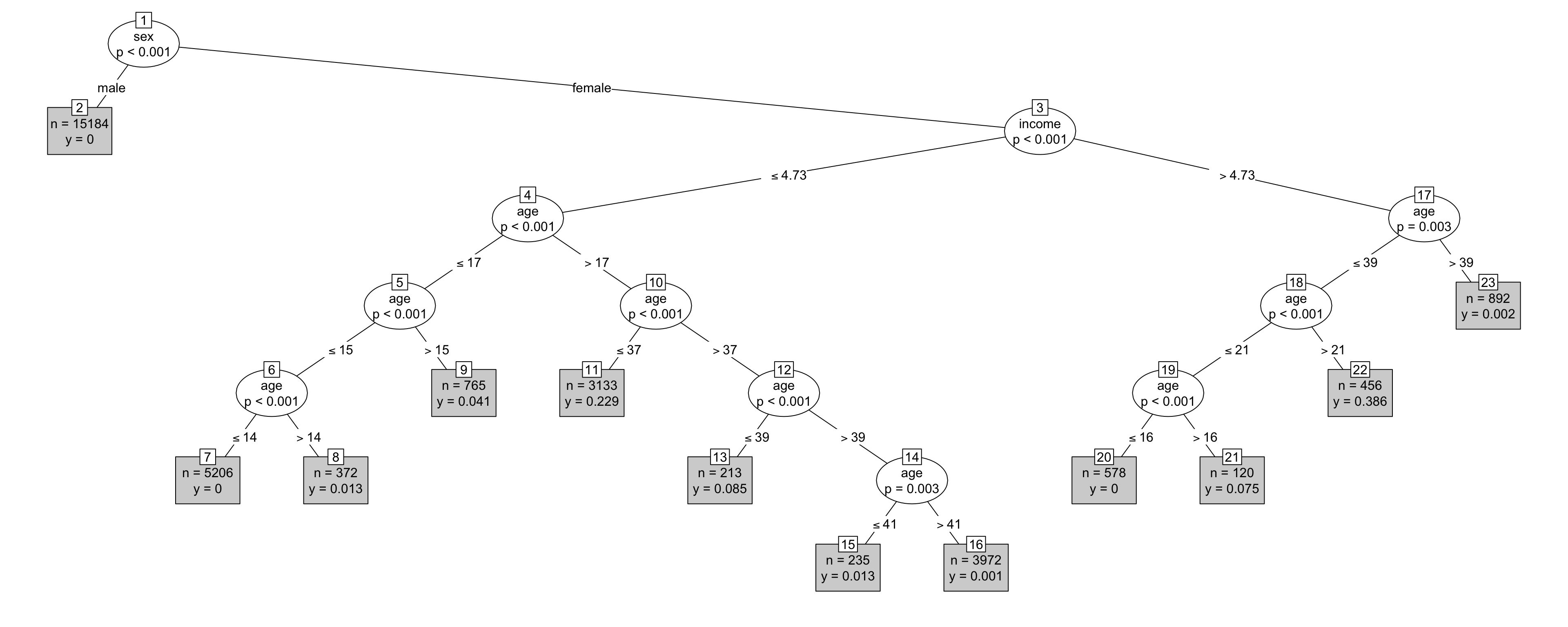
Figure 18.2: The decision tree from the whoIsPregnant model.
To read the tree in Figure 18.2, start at the top. The top vertex, drawn as an oval, specifies the variable sex. From that oval there are two branches: one labeled “male” and the other “female.” This is the partitioning of the vertex from which the branches stem. As you follow a branch, you may come to another vertex, which itself branches, or you may come to a terminal (shown in the gray box). The terminal gives the output of the model.
For the 25-year-old female with an income level of 6, the function output can be read off by following the appropriate vertices. Starting at the top, follow the “female” branch. The vertex that leads to is about the income variable; the two branches from that vertex indicate the criterion for going left or right. In this case, the threshold for branching right is an income greater than 4.73. This indicates that to find the model output for an income level of 6, branch right.
The right branch from income leads to a vertex involving age. The threshold for branching right is an age greater than 39 years. The 25-year-old does not reach the threshold, so branch left.
That left branch leads to another vertex involving age. The threshold for branching right is 21 years old. The 25-year-old meets that threshold, so branch right. The right branch leads to a terminal: the gray box marked “22”. The output for the example person – income 6, age 25, female – is 0.386. Admittedly, the format of the terminal is a bit obscure, but the information is there.
Within each vertex there is a notation like \(p < 0.001\). This is not part of the function itself. Instead, it a statistical quantity calculated during the construction of the function and was used to inform the decision about whether there is enough data to be confident that the split at this node isn’t just an artifact of the data sampling process. Low values indicate strong confidence.1 Somewhat more technically, \(p\) is the p-value from a hypothesis test. The hypothesis being tested with the data is that the observed difference between the left and right branches is merely the result of random, meaningless chance, and likely wouldn’t show up if the NCHS data were collected on a new group of people.
What has been learned in constructing this function? First, without having been told that sex is related to pregnancy, the recursive partitioning has figured out that sex makes a difference; only females get pregnant. Of course you knew that already, but the machine learned that fact from the data without any other experience with biology. The machine also identified the fact that females under 14 years old are not likely to be pregnant, and women over 40 are also unlikely to be pregnant. Again, you knew that already, but the machine learned it from the data. The machine also learned something that might be unfamiliar to you, that age patterns of pregnancy are different for low-income and high-income people.
It might be easier to see the income-related patterns by looking at the specific model outputs. Table 18.2 shows the function’s output for low-income females from 15 to 25 years old:
And for higher-income females:
Table 18.2: Probabilities of pregnancy from the whoIsPregnant model.
| age | income | sex | prob |
|---|---|---|---|
| 15 | 3 | female | 0.0134409 |
| 20 | 3 | female | 0.2288541 |
| 25 | 3 | female | 0.2288541 |
| 15 | 6 | female | 0.0000000 |
| 20 | 6 | female | 0.0750000 |
| 25 | 6 | female | 0.3859649 |
Part of the machine learning is finding out which variables appear to be useful in matching the patterns of pregnancy in the NCHS data. For instance, the following recursive-partitioning tree can make use of several more variables. To avoid rediscovering the obvious, only females will be considered.
whoIsPregnant2 <-
  NCHS %>%
  filter(sex == "female") %>%
  ctree(pregnant == "yes" ~ age + income + ethnicity + height + smoker + bmi,
        data = .)
Figure 18.3 presents the resulting tree. BMI is the body mass index, a commonly used indicator of overweight and underweight. The variables ethnicity, height, smoker, and bmi have been added to the model. A reasonable person might question why these should be associated with becoming pregnant. Nonetheless, the model indicates that the variables have some predictive value.
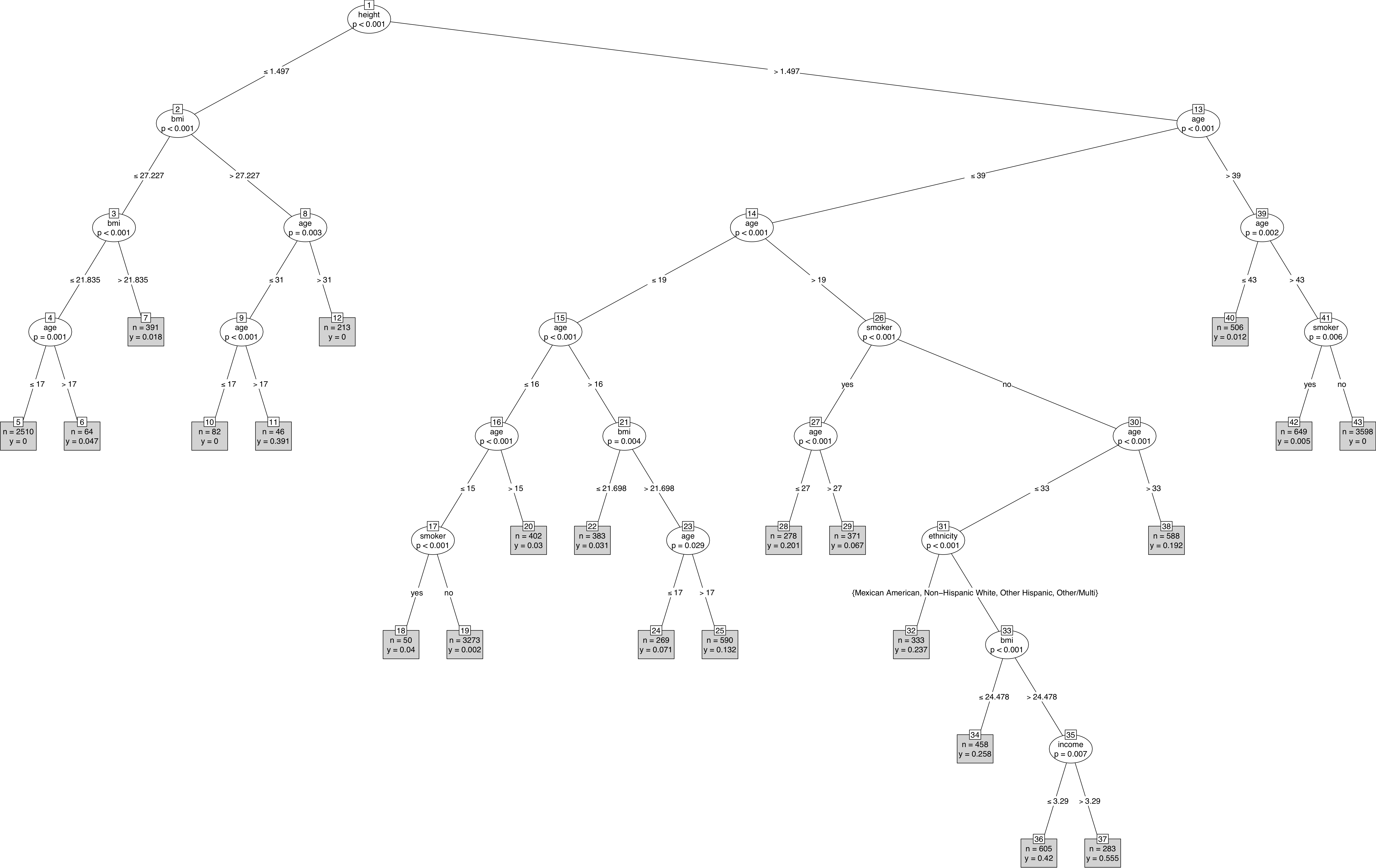
Figure 18.3: A model of which women in NCHS are pregnant.
18.2 Unsupervised Learning
Figure 18.4 shows an evolutionary tree of mammals. We humans (hominidae) are on the far left of the tree. The numbers at the branch points are estimates of how long ago — in millions of years — the branches separated. According to the diagram, rodents and we primates diverged about 90 million years ago.
Figure 18.4: An evolutionary tree for mammals. Source [wiki-mammals]
![An evolutionary tree for mammals. Source [wiki-mammals]](Images/An_evolutionary_tree_of_mammals.jpeg)
How do evolutionary biologists construct a tree like this? They look at various traits of different kinds of mammals. Two mammals that have similar traits were deemed closely related. Animals with dissimilar traits are distantly related. Putting together all this information about what is close to what results in the evolutionary tree.
The tree, sometimes called a dendrogram, is a nice organizing structure for relationships. Evolutionary biologists imagine that at each branch point there was an actual animal whose descendents split into groups that developed in different directions. In evolutionary biology, the inferences about branches come from comparing existing creatures to one another (as well as creatures from the fossil record). Creatures with similar traits are in nearby branches, creatures with different traits are in further branches. It takes considerable expertise in anatomy and morphology to know what similarities and differences to look for.
But there is no outcome variable, just a construction of what is closely related or distantly related to what.
Trees can describe degrees of similarity between different things, regardless of how those relationships came to be. If you have a set of objects or cases, and you can measure how similar any two of the objects are, you can construct a tree. The tree may or may not reflect some deeper relationship among the objects, but it often provides a simple way to visualize relationships.
18.3 Trees from Data
When the description of an object consists of a set of numerical variables, there are two main steps in constructing a tree to describe the relationship among the cases in the data:
- Represent each case as a point in a Cartesian space.
- Make branching decisions based on how close together points or clouds of points are.
To illustrate, consider the unsupervised learning process of identifying different types of cars. The mtcars data contains automobile characteristics: miles-per-gallon, weight, number of cylinders, horse power, etc.
Table 18.3: A sample from the mtcars data frame
| model | mpg | cyl | disp | hp |
|---|---|---|---|---|
| Mazda RX4 | 21.0 | 6 | 160 | 110 |
| Mazda RX4 Wag | 21.0 | 6 | 160 | 110 |
| Datsun 710 | 22.8 | 4 | 108 | 93 |
| Hornet 4 Drive | 21.4 | 6 | 258 | 110 |
| Hornet Sportabout | 18.7 | 8 | 360 | 175 |
| Valiant | 18.1 | 6 | 225 | 105 |
For an individual quantitative variable, it’s easy to measure how far apart any two cars are: take the difference between the numerical values. The different variables are, however, on different scales. For example, gear ranges only from 3 to 5, while hp goes from 52 to 355. This means that some decision needs to be made about rescaling the variables so that the differences along each variable reasonably reflect how different the respective cars are. There is more than one way to do this. The dist() function takes a simple and pragmatic point of view: each variable is equally important.
The output of dist() gives the distance from each individual car to every other car.
| car_model | Mazda RX4 | Mazda RX4 Wag | Datsun 710 | Hornet 4 Drive | Hornet Sportabout | Valiant |
|---|---|---|---|---|---|---|
| Mazda RX4 | 0 | 0 | 61 | 110 | 240 | 73 |
| Mazda RX4 Wag | 0 | 0 | 61 | 110 | 240 | 73 |
| Datsun 710 | 61 | 61 | 0 | 170 | 300 | 130 |
| Hornet 4 Drive | 110 | 110 | 170 | 0 | 140 | 37 |
| Hornet Sportabout | 240 | 240 | 300 | 140 | 0 | 170 |
| Valiant | 73 | 73 | 130 | 37 | 170 | 0 |
This point-to-point distance table is analogous to the tables that used to be printed on road maps giving the distance from one city to another, like Figure 18.5.
Figure 18.5: Distances between some US cities.
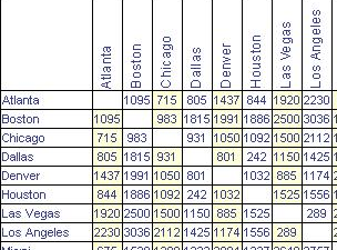
Notice that the distances are symmetrical: it’s the same distance from Boston to Houston as from Houston to Boston (1886 miles, according to the table).
Knowing the distances between the cities is not the same thing as knowing their locations. But the set of mutual distances is enough information to reconstruct the relative positions.
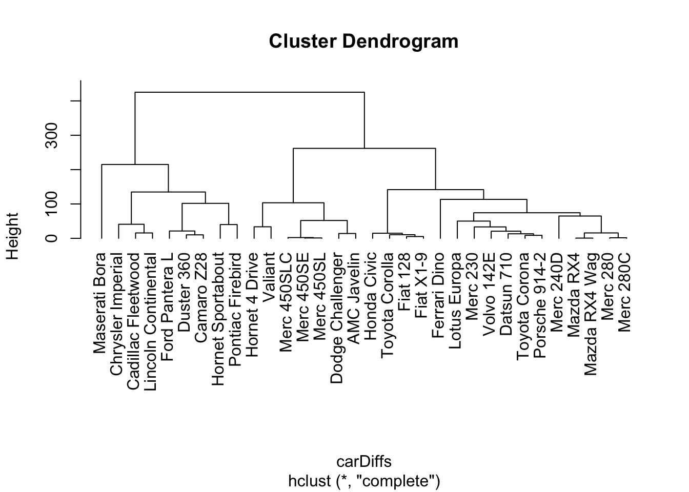
Cities, of course, lie on the surface of the earth. That need not be true for the abstract distance between automobile types. Even so, the set of mutual distances provides information equivalent to knowing the relative positions. This can be used to construct branches between nearby items, then to connect those branches, and so on to construct an entire tree. The process is called “hierarchical clustering.” Figure 18.6 shows a tree constructed by hierarchical clustering to relate car models to one another.
Figure 18.6: The dendrogram constructed by hierarchical clustering from car-to-car distances implied by the mtcars data table.
Another way to group similar cases considers just the cases, without constructing a heirarchy. The output is not a tree but a choice of which group each case belongs to.2 There can be more detail than this, for instance a probability for each group that a specific case belongs to the group.
As an example, consider the cities of the world (in WorldCities). Cities can be different and similar in many ways: population, age structure, public transport and roads, building space per person, etc. The choice of features depends on the purpose you have for making the grouping.
Our purpose is to show you that clustering via machine learning can actually learn genuine patterns in the data. So we choose features that are utterly familiar: the latitude and longitude of cities.
Now, you know about the location of cities. They are on land. And you know about the organization of land on earth; most land falls in one of the large clusters called continents. But the WorldCities data doesn’t have any notion of continents to draw upon. Perhaps it’s possible that this feature, which you are completely aware of but isn’t in the data, can be learned by a computer that never took grade-school geography.
For simplicity, consider the 4000 biggest cities in the world and their longitudes and latitudes.
BigCities <-
  WorldCities %>%
  arrange(desc(population)) %>%
  head( 4000 ) %>% select(longitude, latitude)

clusts2 <-
  BigCities %>%
  kmeans(centers = 6) %>%
  fitted("classes") %>% as.character()

BigCities <-
  BigCities %>% mutate(cluster = clusts2)

BigCities %>%
  ggplot(aes(x = longitude, y = latitude)) +
  geom_point(aes(color = cluster, shape = cluster) ) +
  theme(legend.position = "top")
Figure 18.7: Clustering of world cities by their geographical position.

As shown in Figure 18.7, the clustering algorithm seems to have identified the continents. North and South America are clearly distinguished, as well as most of Africa (sub-Saharan Africa, that is). The cities in North Africa are matched to Europe. The distinction between Europe and Asia is essentially historic, not geographic. The cluster for Europe extends a ways into what’s called Asia. East Asia and central Asia are marked as distinct. To the algorithm, the low population areas of Tibet, Siberia, or the Sarah desert look the same as a major ocean.
18.4 Dimension Reduction
It often happens that a variable carries little information that’s relevant to the task at hand. Even for variables that are informative, there can be redundancy or near duplication of variables. That is, two or more variables are giving essentially the same information; they have similar patterns across the cases.
Table 18.4: A few cases and variables from the Scottish Parliament voting data. There are 134 variables, each corresponding to a different ballot.
| S1M.1 | S1M.4.1 | S1M.4.3 |
|---|---|---|
| 1 | 0 | 0 |
| 1 | 1 | 0 |
| 1 | -1 | -1 |
| 1 | -1 | -1 |
| -1 | -1 | -1 |
| 0 | -1 | -1 |
| … and so on for 10 rows altogether. |
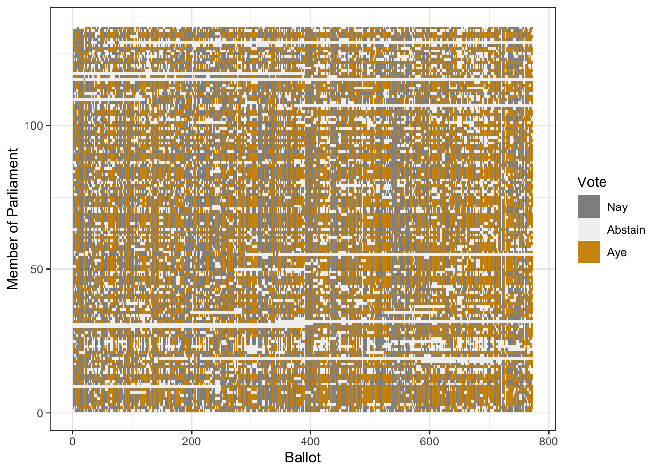
Figure 18.8: The values from the Scottish Parliament voting record displayed using a color code. Each dot refers to one member’s vote on one ballot. Order is alphabetical by member, chronological by Ballot.
Such irrelevant or redundant variables make it harder to learn from data. The irrelevant variables are simply noise that obscures actual patterns. Similarly, when two or more variables are redundant, the differences between them may represent random noise.
It’s helpful to remove irrelevant or redundant variables so that they, and the noise they carry, don’t obscure the patterns that machine learning could learn.
As an example of such a situation, consider votes in a parliament or congress. This section explores one such voting record, the Scottish Parliament in 2008. The pattern of ayes and nays may indicate which members are affiliated, i.e. members of the same political party. To test this idea, you might try clustering the members by their voting record.
Table 18.4 shows a small part of the voting record. The names of the members of parliament are the cases. Each ballot — identified by a file number such as “S1M-4.3” — is a variable. A \(1\) means an aye vote, \(-1\) is nay, and \(0\) is an abstention. There are more than 130 members and more than 700 ballots. It’s impractical to show all of the 100,000+ votes in a table. But there are only 3 levels for each variable, so displaying the table as an image might work. (Figure 18.8)
Figure 18.9: A tartan pattern, in this case the official tartan of West Virginia University.

It’s hard to see much of a pattern here, although you may notice something like a tartan structure. The tartan pattern provides an indication to experts that the data could be re-organized in a much simpler way.3 For those who have studied linear algebra: “Much simpler way” means that the matrix can be approximated by a matrix of low-rank.
As a start, Figure 18.10 shows the ballot values for all of the members of parliament for two randomly selected ballots. (Jittering is used to give a better idea of the point count at each position. The red dots are the actual positions.)
Figure 18.10: Positions of members of parliament on two ballots.
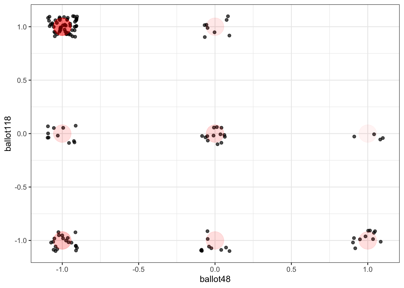
Figure 18.11: Positions of members of parliament on two ballot indices made up by the sum of groups of ballots.

Each point is one member of parliament. Similarly aligned members are grouped together at one of the nine possibilities marked in red: (Aye, Nay), (Aye, Abstain), (Aye, Aye), and so on through to (Nay, Nay). In these two ballots, eight of the nine are possibilities are populated. Does this mean that there are 8 clusters of members?
Intuition suggests that it would be better to use all of the ballots, rather than just two. In Figure 18.11, the first 336 ballots have been added together, as have the remaining ballots. This graphic suggests that there might be two clusters of members who are aligned with each other. Using all of the data seems to give more information than using just two ballots.
You may ask why the choice was made to add up the first 336 ballots as \(x\) and the remaining ballots as \(y\). Perhaps there is a better choice to display the underlying patterns, adding up the ballots in a different way.
In fact, there is a mathematical approach to finding the best way to add up the ballots, called “singular value decomposition” (SVD). The mathematics of SVD draw on a knowledge of matrix algebra, but the operation itself is readily available to anyone.4 In brief, SVD calculates the best way to add up (i.e. linearly combine) the columns and the rows of a matrix to produce the largest possible variance. Then SVD finds the best way to add up the what’s left, and so on. Figure 18.12 shows the position of each member on the best two ways of summing up the ballots.
Figure 18.12: The position of each member of Parliament using the two ‘best’ ways of summing the ballots.
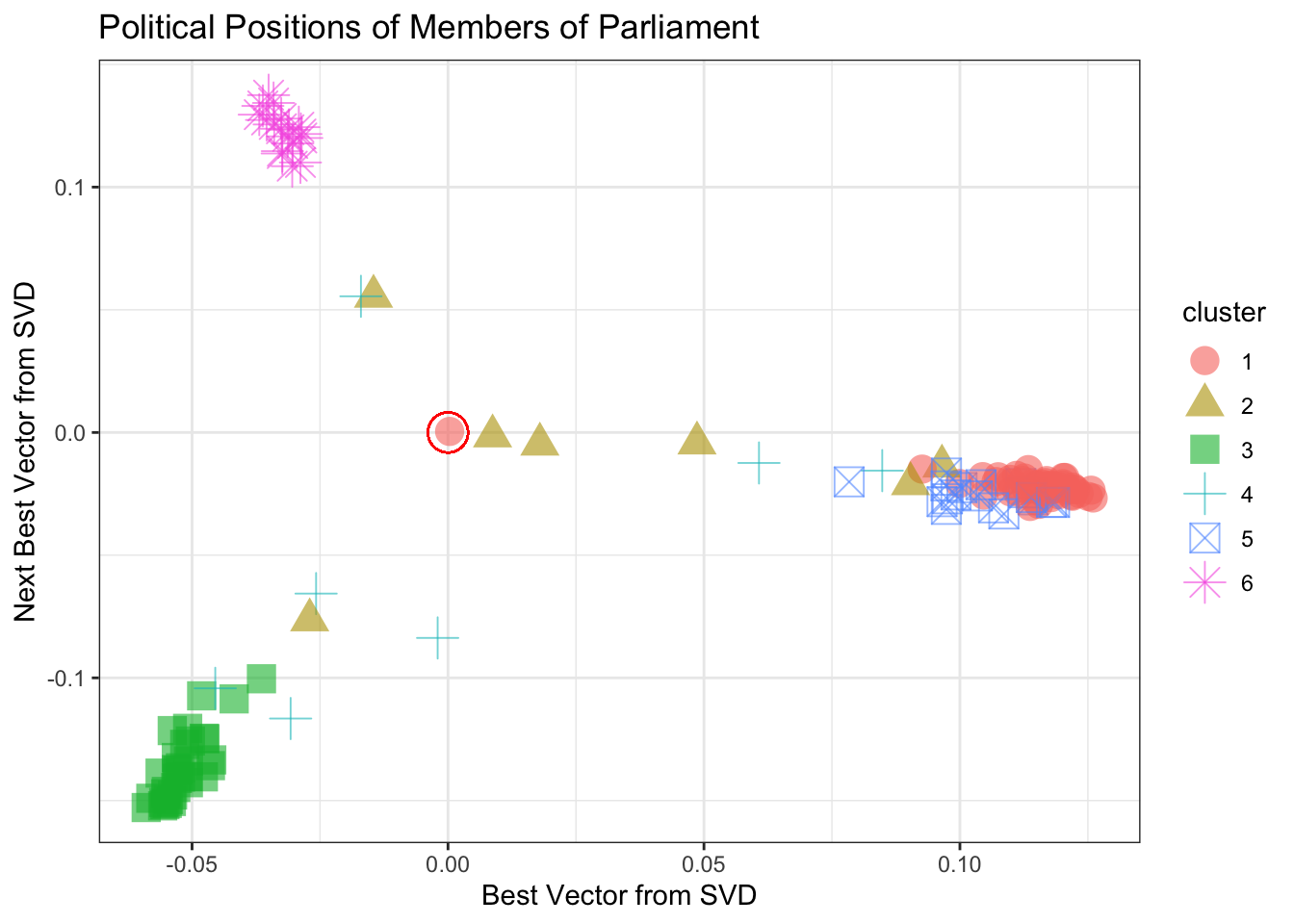
Figure 18.12 shows, at a glance, that there are three main clusters. The red circle marks the “average” member. The three clusters move away from average in different directions. There are several members whose position is in-between the average and the cluster to which they are closest.
For a graphic, one is limited to using two variables for position. Clustering, however, can be based on many more variables. Using more SVD sums enables may allow the three clusters to be split up further. The color in Figure 18.12 above shows the result of asking for 6 clusters using the 5 best SVD sums. Table 18.5 compares the actual party of each member to the cluster memberships.
Table 18.5: The correspondence between cluster membership and actual party affiliation.
| party . . . . . . . . . cluster | 1 | 2 | 3 | 4 | 5 | 6 |
|---|---|---|---|---|---|---|
| Member for Falkirk West | 0 | 0 | 0 | 1 | 0 | 0 |
| Scottish Conservative and Unionist Party | 0 | 1 | 0 | 1 | 0 | 18 |
| Scottish Green Party | 0 | 0 | 0 | 1 | 0 | 0 |
| Scottish Labour | 48 | 5 | 0 | 2 | 3 | 0 |
| Scottish Liberal Democrats | 1 | 0 | 0 | 0 | 16 | 0 |
| Scottish National Party | 0 | 1 | 34 | 1 | 0 | 0 |
| Scottish Socialist Party | 0 | 0 | 0 | 1 | 0 | 0 |
How well did clustering do? The party affiliation of each member of parliament is known, even though it wasn’t used in finding the clusters. For each of the parties with multiple members, the large majority of members are placed into a unique cluster for that party. In other words, the technique has identified correctly that there are four different major parties.
Figure 18.13: Orientation of issues among the ballots.

There’s more information to be extracted from the ballot data. Just as there are clusters of political positions, there are clusters of ballots that might correspond to such factors as social effect, economic effect, etc. Figure 18.13 a shows the position of each individual ballot, using the best two SVD sums as the x- and y-coordinates.
There are obvious clusters in Figure 18.13. Still, interpretation can be tricky. Remember that, on each issue, there are both aye and nay votes. This is what accounts for the symmetry of the dots around the center (indicated by an open circle). The opposing dots along each angle from the center might be interpreted in terms of socially liberal vs socially conservative and economically liberal versus economically conservative. Deciding which is which likely involves reading the bill itself.
Finally, the “best” sums from SVD can be used to re-arrange cases and separately re-arrange variables while keeping exactly the same values for each case in each variable. (Figure 18.14.) This amounts simply to re-ordering the members in a way other than alphabetical and similarly with the ballots. This dramatically simplifies the appearance of the data compared to Figure . With the cases and rows arranged as in Figure 18.14, it’s easy to identify blocks of members and which ballots are about issues for which the members vote en bloc.
Figure 18.14: Re-arranging the order of the variables and cases in the Scottish parliament data simplifies the appearance of the data table.

18.5 Exercises
Problem 18.1: Consider these data on houses for sale:
Here is a model of house price as a function of several other variables:

In the model tree, the terminal node, shown as a rectangle, gives information about \(n\) the number of houses included in that group and \(y\) the mean price of the houses in that group. Based on the model tree, answer these questions:
- What variables are in the model?
- For houses with a living area less than 1080 square feet, does the number of bathrooms make a difference in price?
- For houses with a living area between 1080 and 1483 square feet, how much is the typical difference in price between houses with 1 1/2 baths and houses with 2 bathrooms?
- Is having a fireplace associated with a higher house price? What other variables does this depend on?
Problem 18.2: Let’s use the NCHS data to look for risk factors associated with diabetes.
A risk factor is a characteristic associated with an increased likelihood of developing a disease or injury. In many situations, identifying risk factors provide an important means to screen those at high risk.
In large datasets with many variables, there are often some variables with much missing data. For instance, with NCHS, there are 31126 total cases, but many fewer that have no missing values. The na.omit() data verb filters out only those cases that have no missing values:
## [1] 12013If only a few variables are of interest, it can be helpful to first select out those variables when filtering out missing data to avoid omitting rows due to missingness associated with variables we did not intend to use in the first place:
CompleteCases <-
  NCHS %>%
  select(diabetic, weight, age, bmi, chol, smoker) %>%
  na.omit()

CompleteCases %>% nrow()
## [1] 22797Here is one model that considers weight and cholesterol levels as risk factors for diabetes:
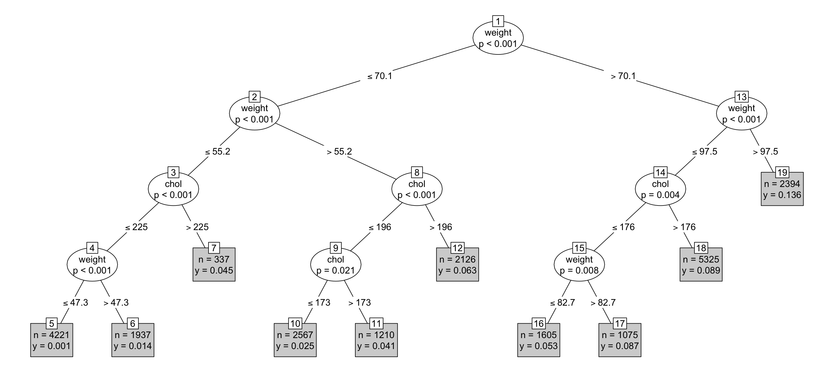
In interpreting this tree, note that each outcome node includes the quantities \(n\) and \(y\) which represent, respectively, the total number of people in the group and the proportion of people in the group with diabetes.
A useful risk factor splits the population into groups with very high and with very low probabilities of diabetes. For instance, node 19 marks a group with a 13.6% risk of diabetes. This result is substantially larger than other groups which indicates that weight greater than 97.5 kg is associated with elevated risk of diabetes according to the NCHS data. By contrast, node 5 suggests that about 0.1% of persons in the NCHS data with cholesterol below 225 and weight below 47.3 kg had been diagnosed with diabetes. Using other variables in the model, such as smoker or age might do a better job of dividing the cases into groups with high and low risk.
One way to measure the effectiveness of the model is with a quantity called the “log likelihood.” The log likelihood compares, for all cases individually, the actual outcome against the probability predicted by the model. A high log likelihood indicates a more successfully predictive model. Without going into the theory behind log likelihood, you can still calculate the value:
CompleteCases %>%
  mutate(probability = as.numeric(predict(mod1)),
         likelihood = ifelse(diabetic, probability, 1-probability)) %>%
summarise(log_likelihood = sum(log(likelihood)))| log_likelihood |
|---|
| -4450.636 |
The number itself is meaningful only in comparison to the log likelihood for other models using the same data. Note that the log likelihood calculation will always result in a negative number, so -3000 is much bigger than -4000.
Task: Explore other models for diabetes using different combinations of potential risk factors.
Find a model with a higher log likelihood than
mod1shown above.Plot your model
Interpret the outcome node from your model associated with highest risk of diabetes (as was done for node 19 of
mod1above). Your interpretation should written such that it can be easily understood by someone that has not studied statistics.Interpret the outcome node from your model associated with lowest risk of diabetes (as was done for node 5 of
mod1above). Your interpretation should written such that it can be easily understood by someone that has not studied statistics.