Project: Bicycle Sharing
Capital BikeShare is a bicycle-sharing system in Washington, D.C. At any of about 400 stations, a registered user can unlock and check out a bicycle. After use, the bike can be returned to the same station or any of the other stations.
Such sharing systems require careful management. There need to be enough bikes at each station to satisfy the demand, and enough empty docks at the destination station so that the bikes can be returned. At each station, bikes are checked out and are returned over the course of the day. An imbalance between bikes checked out and bikes returned calls for the system administration to truck bikes from one station to another. This is expensive.
In order to manage the system, and to support a smart-phone app so that users can find out when bikes are available, Capital BikeShare collects real-time data on when and where each bike is checked out or returned, how many bikes and empty docks there are at each station. Capital BikeShare publishes the station-level information in real time. The organization also publishes, at the end of each quarter of the year, the historical record of each bike rental in that time.
You can access the data from the Capital Bikeshare web site. Doing this requires some translation and cleaning, skills that are introduced in Chapter 16. For this project, however, already translated and cleaned data are provided in the form of two data tables:
Stationsgiving information about location of each of the stations in the system.
    # Tip: Scroll right if browser settings cut off the URL
    station_url <- "https://mdbeckman.github.io/dcSupplement/data/DC-Stations.csv"
Stations <- readr::read_csv(station_url)Tripsgiving the rental history over the last quarter of 2014 (Q4).
    # Tip: Scroll right if browser settings cut off the URL
    trip_url <- "https://mdbeckman.github.io/dcSupplement/data/Trips-History-Data-2014-Q4-Small.rds"
Trips <- readRDS(gzcon(url(trip_url)))- The
Tripsdata table is a random subset of 10,000 trips from the full quarterly data.
- Start with this small data table to develop your analysis commands.
- When you have your entire analysis working well for the Small data, you can access the full data set of more than 600,000 events by removing
-Smallfrom the name of thetrip_url
In this activity, you’ll work with just a few variables:
From Stations:
- the latitude (
lat) and longitude (long) of the bicycle rental station name: the station’s name
From Trips: Notice that the location and time variables start with an “s” or an “e” to indicate whether the variable is about the start of a trip or the end of a trip.
sstation: the name of the station where the bicycle was checked out.estation: the name of the station to which the bicycle was returned.client: indicates whether the customer is a"regular"user who has paid a yearly membership fee, or a"casual"user who has paid a fee for five-day membership.sdate: the time and date of check-outedate: the time and date of return
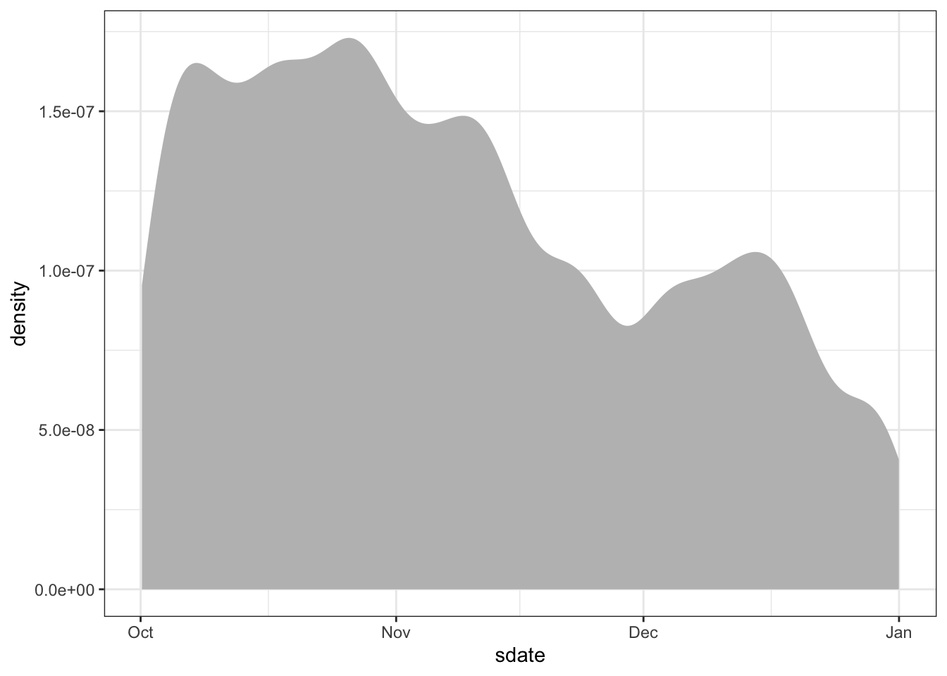
Time/dates are typically stored as a special kind of number: a POSIX date. POSIX date: A representation of date and time of day that facilitates using dates in the same way as numbers, e.g. to find the time elapsed between two dates. You can use sdate and edate in the same way that you would use a number. For instance, Figure 18.1 shows the distribution of times that bikes were checked out.
Trips %>%
  ggplot(aes(x = sdate)) +
  geom_density(fill = "gray", color = NA)
Figure 18.1: Use of shared bicycles over the three months in Q4.
18.6 How long?
Your Turn: Make a box-and-whisker plot, like Figure 18.2 showing the distribution of the duration of rental events, broken down by the client type. The duration of the rental can be calculated as:
as.numeric(edate - sdate)The units will be in either hours, minutes, or seconds. It should not be much trouble for you to figure out which one.
Figure 18.2: The distribution of bike-rental durations as a box-and-whisker plot.
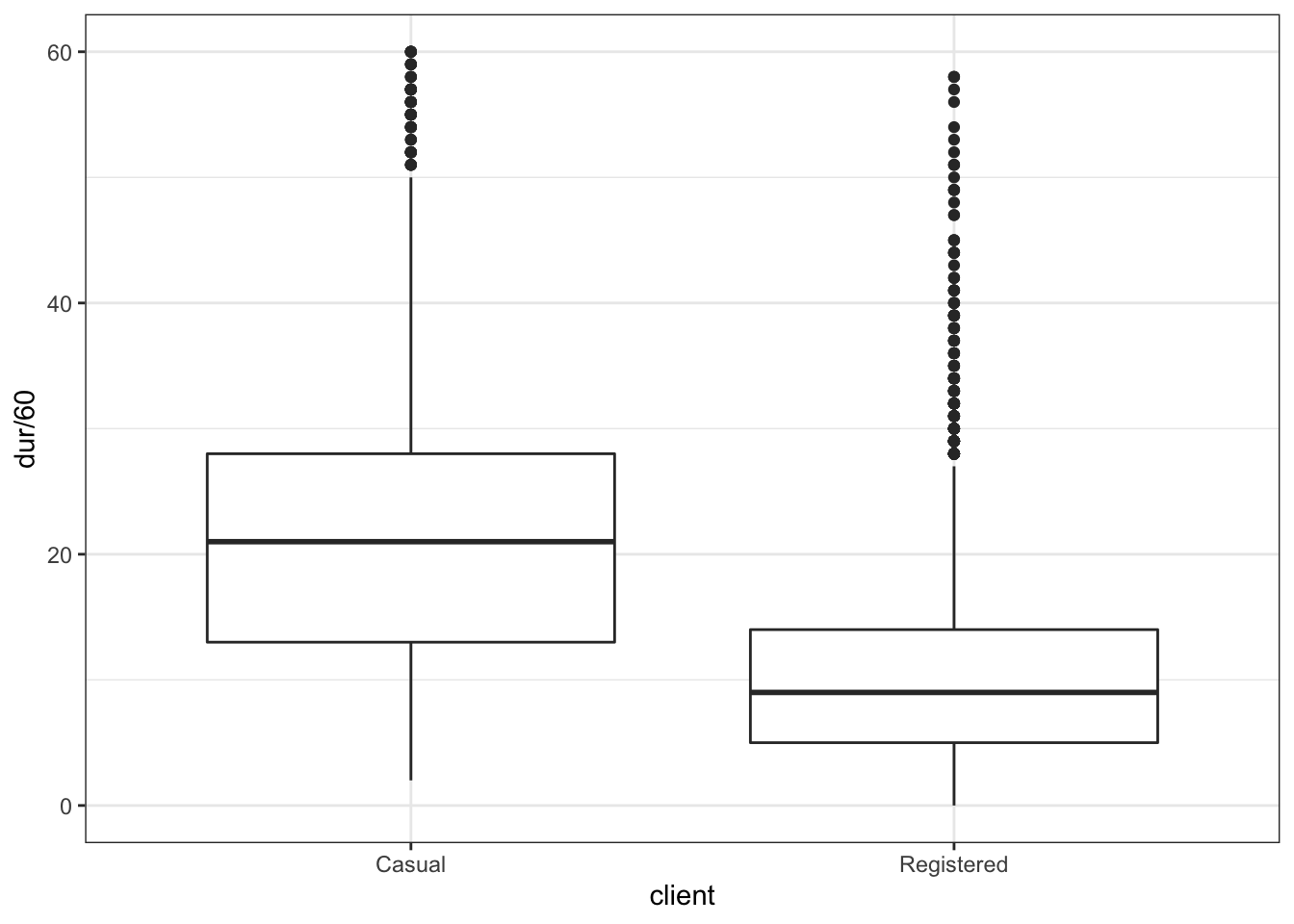
When you make your plot, you will likely find that the axis range is being set by a few outliers. These may be bikes that were forgotten. Arrange your scale to ignore these outliers, or filter them out.
18.7 When are bikes used?
The sdate variable in Trips indicates the date and time of day that the bicycle was checked out of the parking station. sdate is stored as a special
Often, you will want discrete components of a date, for instance:
| Date Component | Function (lubridate package) |
|---|---|
| Day of the year (1-365) |
lubridate::yday(sdate)
|
| Day of the week (Sunday to Saturday) |
lubridate::wday(sdate)
|
| Hour of the day |
lubridate::hour(sdate)
|
| Minute in the hour |
lubridate::minute(sdate)
|
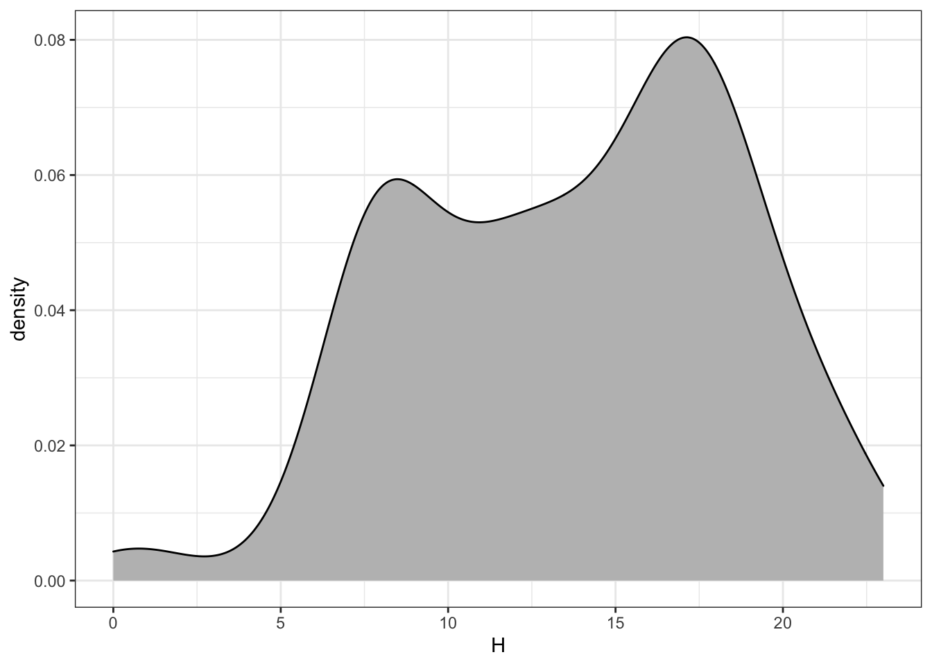
Your Turn: Make histograms or density plots of each of these discrete components. Explain what each plot is showing about how bikes are checked out. For example, Figure 18.3 shows that few bikes are checked out before 5am, and that there are busy times around the rush hour: 8am and 5pm.
Figure 18.3: Distribution of bike trips by hour of the day.
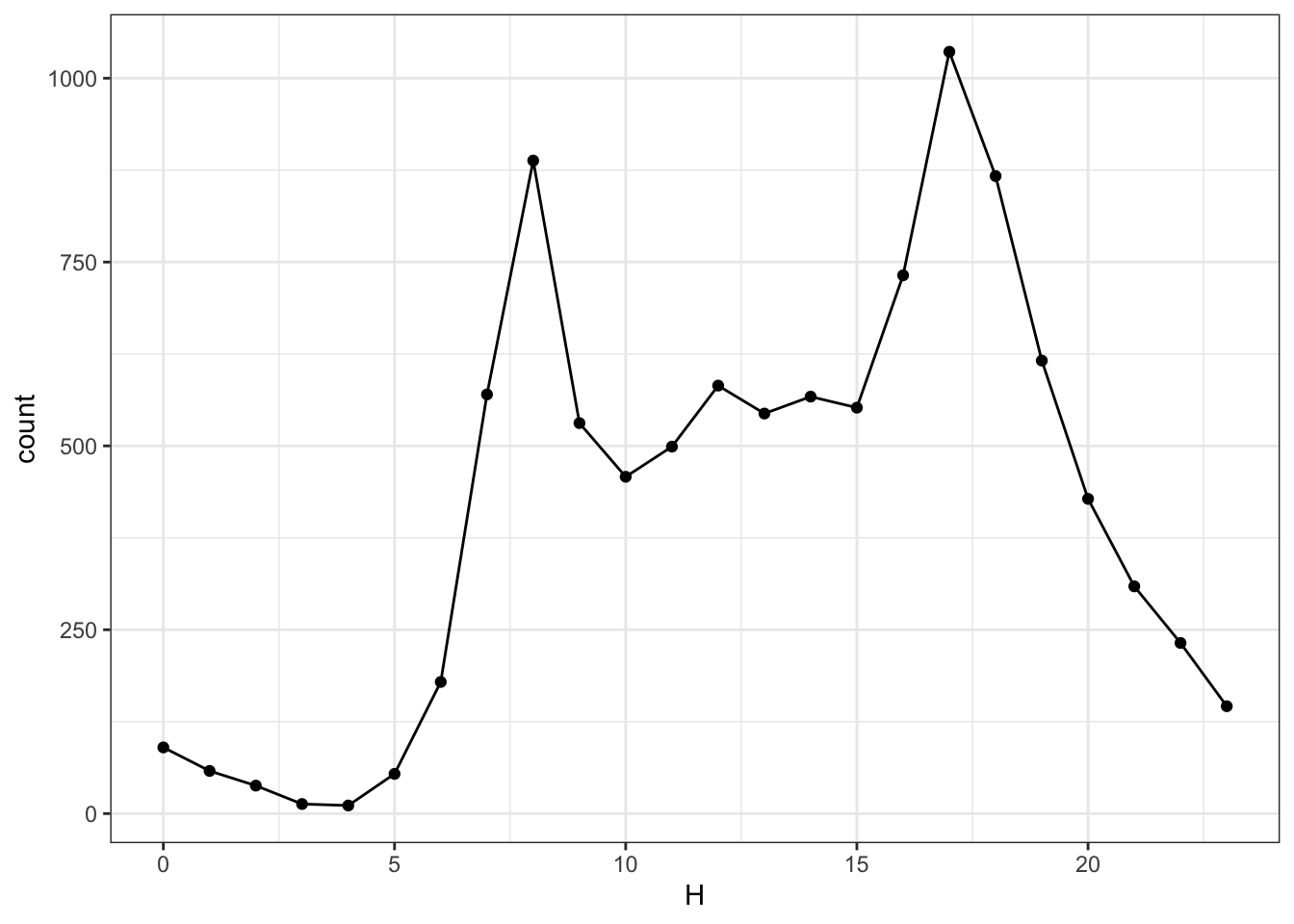
A similar sort of display of events per hour can be accomplished by calculating and displaying each hour’s count, as in Figure 18.4.
Figure 18.4: The number of events in each hour of the day. Compare to the scale in Figure 18.3. Why are the scales different?
The graphic shows a lot of variation of bike use over the course of the day. Now consider two additional variables: the day of the week and the “client” type.
Your Turn: Group the bike rentals by three variables: hour of the day, day of the week, and client type. Find the total number of events in each grouping and plot this count versus hour. Use the group aesthetic to represent one of the other variables and faceting to represent the other. Hint: utilize facet_wrap() in the plotting commands.
Your Turn: Make the same sort of display of how bike rental vary of hour, day of the week, and client type, but use geom_density() rather than grouping and counting. Compare the two displays — one of discrete counts and one of density — and describe any major differences.
18.8 How far?
Find the distance between each pair of stations. You know the position from the lat and long variables in Stations.
This is enough information to find the distance. The calculation has been implemented in the haversine() function:
source("https://mdbeckman.github.io/dcSupplement/R/haversine.R")haversine() is a transformation function. To use it, create a data table where a case is a pair of stations and there are variables for the latitude and longitude of the starting station and the ending station. To do this, join the Station data to itself. The following statements show how to create appropriately named variables for joining.
Simple <-
  Stations %>%
  select(name, lat, long) %>%
  rename(sstation = name)

Simple2 <-
  Simple %>%
  rename(estation = sstation, lat2 = lat, long2 = long)
Look at the head() of Simple and Simple2 and make sure you understand how they are related to Stations.
The joining of Simple and Simple2 should match every station to every other station. Since a ride can start and end at the same station, it also makes sense to match each station to itself. This sort of matching does not make use of any matching variables; everything is matched to everything else. This is called a full outer join. A full outer join matches every case in the left table to each and every case in the right table.
First, try the full outer join of just a few cases from each table, for example 4 from the left and 3 from the right.
merge(head(Simple, 4), head(Simple2, 3), by = NULL)Make sure you understand what the full outer join does before proceeding. For instance, you should be able to predict how many cases the output will have when the left input has \(n\) cases and the right has \(m\) cases.
- There are 347 cases in the
Stationsdata table. How many cases will there be in a full outer join ofSimpletoSimple2?
It’s often impractical to carry out a full outer join. For example, joining BabyNames to itself with a full outer join will generate a result with more than three-trillion cases. Three trillion cases from the BabyNames data is the equivalent of about 5 million hours of MP3 compressed music. A typical human lifespan is about 0.6 million hours.
Perform the full outer join and then use haversine() to compute the distance between each pair of stations.
StationPairs <- merge(Simple, Simple2, by = NULL)Check your result for sensibility. Make a histogram of the station-to-station distances and explain where it looks like what you would expect. (Hint: you could use the Internet to look up the distance from one end of Washington, D.C. to the other.)
PairDistances <-
  StationPairs %>%
  mutate(distance = haversine(lat, long, lat2, long2)) %>%
  select(sstation, estation, distance)
Once you have PairDistances, you can join it with Trips to calculate the start-to-end distance of each trip. Of course, a rider may not go directly from one station to another.
- Look at the variables in
StationsandTripsand explain whySimpleandSimple2were given different variable names for the station.
An inner_join() is appropriate for finding the distance of each ride. Watch out! the Trips data and the PairDistances data are large enough that the join is expensive: it takes about a minute.
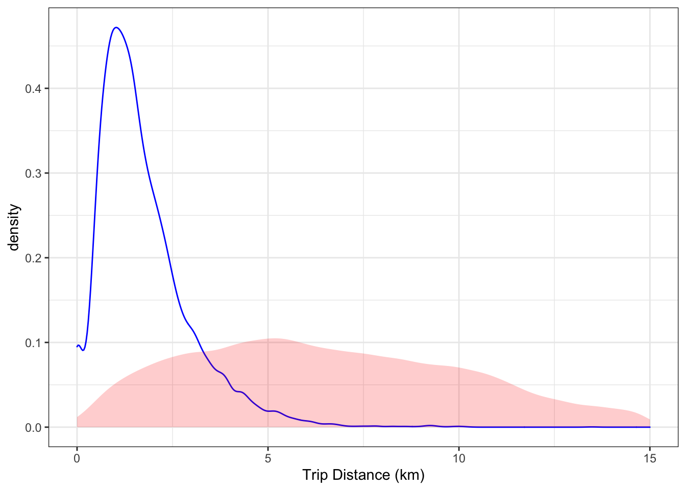
Your turn: Display the distribution of the ride distances of the rides. Compare it to the distances between pairs of stations. Are they similar? Why or why not?
Figure 18.5: The distribution of trip lengths compared to the distribution of distances between pairs of stations (shaded).
18.9 Mapping the Stations
You can draw detailed maps with the leaflet package. You may need to install it.
devtools::install_github("rstudio/leaflet")leaflet works much like ggplot() but provides special facilities for maps. Here’s how to make the simple map:
library(leaflet)
stationMap <-
  leaflet(Stations) %>%           # like ggplot()
  addTiles() %>%                  # add the map
  addCircleMarkers(radius = 2, color = "red") %>%
  setView(-77.04, 38.9, zoom = 12)
To display the map, use the object name as a command: stationMap
Figure 18.6: A map of station locations drawn with the leaflet() function in the leaflet package.
18.10 Long-distance stations
Your Turn (more challenging, but cool): Around each station on the map, draw a circle whose radius reflects the median distance covered by rentals starting at that station. To draw the circles, use the same leaflet commands as before, but add in a line like this.
addCircles(radius = ~ mid, color = "blue", opacity = 0.0001)For addCircles() to draw circles at the right scale, the units of the median distance should be presented in meters rather than kilometers. This will create too much overlap, unfortunately. So, set the radius to be half or one-third the median distance in meters. From your map, explain the pattern you see in the relationship between station location and median distance.