Chapter 8 Graphics and Their Grammar
Chapter 6 introduced the elements of a grammar for drawing graphics. The grammar helps in thinking about how a graphic is constructed by defining a meaningful taxonomy of component parts: frames, scales, guides, facets, layers, etc.
This chapter introduces an implementation of the grammar of graphics. The implementation is provided by an R package, ggplot2, that is used throughout this book. It provides functions enabling you to specify graphics in terms of their components and have the machine do the drawing for you.
8.1 Specifying a Graph
Once you know the kinds of components that make up a graphic, you’re in a position to describe the graphics you want to create. The process works like this:
- Define the frame. For example, state which variables map to the two axes.
- Describe a graphics layer. This is done by
- Choosing a glyph style.
- Mapping variables to the aesthetics available for that glyph style, e.g. color, size, shape, …
- Repeat (2) for any additional graphics layers.
The ggplot2 package provides functions for implementing each of the above steps.
ggplot()creates the frame of the graphic.- Glyphs are created by functions starting with
geom_. There are many kinds of glyphs, so there are manygeom_functions:geom_point(),geom_line(),geom_bar(),geom_boxplot(),geom_density(), and so on.- The name of the function indicates the kind of glyph.
- The mapping between variables and graphical aesthetics for is specified by the
aes()function.
- The
+symbol is used to add a layer onto the frame.
Example: Plotting Princes.
Figure 8.1 depicts the number of babies given the name “Prince” over the years.
Figure 8.1: The popularity of the name Prince over the years
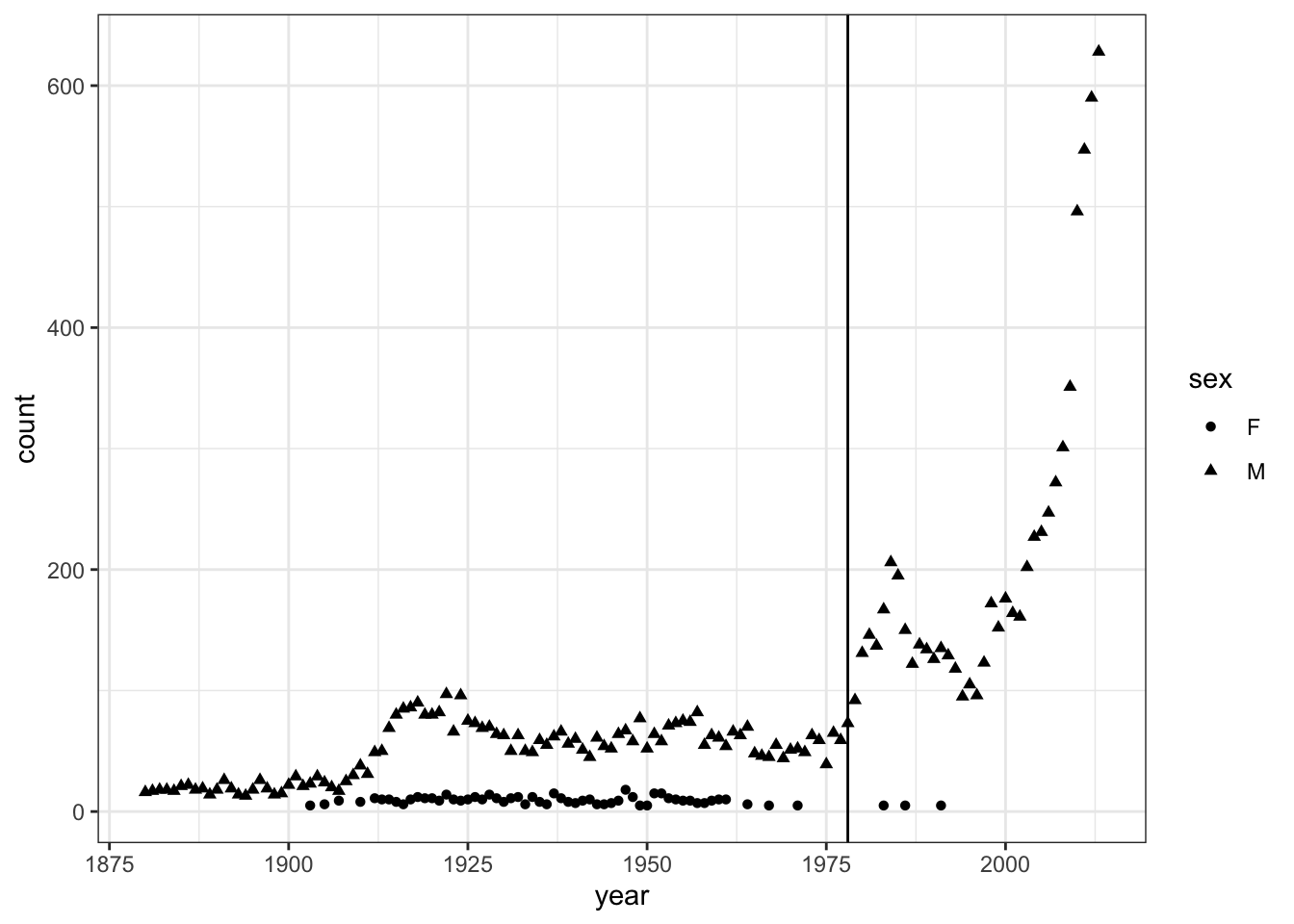
BabyNames, where the Prince data resides, is not in the form needed for this plot. That is, BabyNames is not glyph-ready for this particular graphic; there are entries in BabyNames for 92599 other names than Prince. Wrangling BabyNames to remove those other names is a straightforward but necessary step to draw the graphic. In this situation, wrangling involves only one step: As you’ll see in Chapter 10, filter() is a data verb that passes through only those cases meeting the specified criterion.
| name | sex | count | year |
|---|---|---|---|
| Prince | M | 22 | 1900 |
| Prince | M | 29 | 1901 |
| Prince | M | 21 | 1902 |
| Prince | F | 5 | 1903 |
| Prince | M | 23 | 1903 |
| Prince | M | 29 | 1904 |
| … and so on for 194 rows altogether. |
The graphic’s frame is count versus year. Frames are created with ggplot(). The mapping of the variables year and count to the x- and y-axes is specified by the aes() function.
There are two layers, one showing the number of Princes each year and one with a vertical line at the year Prince’s first album was released. In the number-of-princes layer, shape was used to distinguish between the sexes.
In the second layer, the glyph is a vertical line. This glyph is provided by the geom_vline() function:
Finally, put them all together with +
the_frame + layer1 + layer2Figure 8.2: Putting together the frame, layer 1, and layer 2 into a complete graphic.

Chaining is built in to ggplot() and the other graphics functions. This provides a way to write your graphics commands without having to specify, over and over again, the source of data and the mappings of aesthetics. To illustrate, here is another way of describing the Prince graphic: Note that the aesthetics for geom_point() are inherited from a previous layer of the graphic.
Example: Growing children
People grow in height through childhood but then stay more or less the same height as adults. Question: Is there systematic change in height during adulthood? Does it depend on smoking?
First, wrangle NCHS into a glyph-ready form to give the mean height at each age, distinguishing between the sexes.
Heights <-
  NCHS %>%
  filter( age > 20, ! is.na(smoker)) %>%
  group_by(sex, smoker, age) %>%
  summarise(height = mean(height, na.rm=TRUE))
Table 8.1: Glyph-ready data for displaying height versus age.
| sex | smoker | age | height |
|---|---|---|---|
| female | no | 21 | 1.595759 |
| female | no | 22 | 1.618918 |
| female | no | 23 | 1.614600 |
| female | no | 24 | 1.616612 |
| female | no | 25 | 1.633018 |
| female | no | 26 | 1.618016 |
| … and so on for 260 rows altogether. |
Figure 8.3 has a frame displaying height versus age. Either a point or a line could be used as the glyph. A separate line is made for each group: smokers versus non-smokers. Sex facets the graphic. Line type (dotted or not) distinguishes smokers from non-smokers smokers.
Heights %>%
  ggplot(aes(x = age, y = height)) +
  geom_line(aes(linetype = smoker)) +
  facet_wrap( ~ sex)
Figure 8.3: Height versus age for smokers and non-smokers.
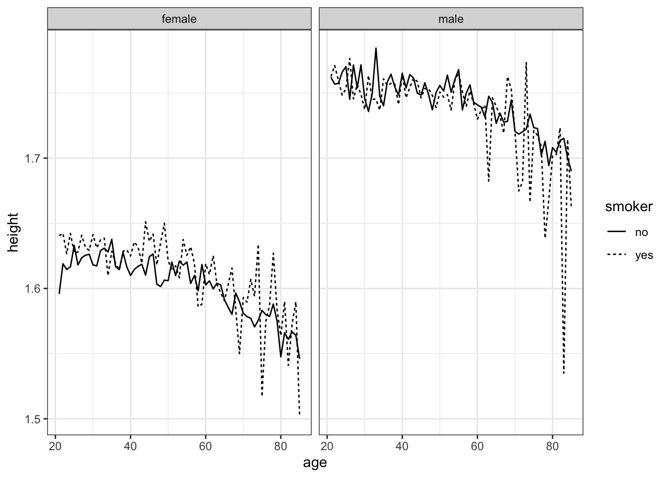
It looks like both female and male height decline with age. For women, smokers tend to be taller than non-smokers, but not for men.
The statistically savvy reader may point out that any causal relationship might go from height to smoking. Perhaps smoking is more common among taller women, rather than non-smoking causing women to be shorter. As well, NCHS does not track individuals over time.1 NCHS is from a “cross-sectional” study rather than a “longitudinal study.” It might be that an individual’s height doesn’t change with age, but the older people in NCHS grew up in a time with poorer nutrition and so are shorter for that reason.
The sharp ups and downs in Figure 8.3 for different ages suggest that there is variation in height that isn’t accounted for by age, sex, and smoking status. Such random variation can be quantified by a statistical technique called a confidence band. These will be introduced in Chapter 15.
8.2 Axes and Labels
By default, the names of the variables used to construct the graphic frame become the labels on the axes. This isn’t always desirable. For instance, it’s conventional for labels in scientific graphics to include the units of the measured quantity. As well, sometimes the default numerical limits are not the best choice: you may want to zoom in on a small region. Or, sometimes, you want to pan out to include anchor values such as zero on the axes.
When the values to be plotted range over several orders of magnitude, it can be appropriate to condense the range using a logarithm transform. Such plots are easier to read when the axis itself has tick marks on a log scale.
With ggplot(), such customization is done with plotting commands such as xlim() and ylab(). Table 8.2 are a few of the most commonly used ggplot() functions for refining. Each one of these can be added (using +) to your plot, just as you would add another layer.
Table 8.2: Some of the axis customization functions used with
| Function | Purpose | Example |
|---|---|---|
xlim()
|
range of x axis |
+ xlim(30, 75)
|
ylim()
|
range of y axis |
+ ylim(1.5, 1.8)
|
xlab()
|
x-axis label |
+ xlab("Age (yrs)")
|
ylab()
|
y-axis label |
+ ylab("Height (m)")
|
scale_x_log10()
|
Log axis for x |
+ scale_x_log()
|
scale_y_log10()
|
Log axis for y |
+ scale_y_log()
|
8.3 Exercises
Problem 8.1: Consider each of the tasks below:
- Construct a graphics frame.
- Add a layer of glyphs.
- Set an axis label.
- Divide the frame into facets.
- Change the scale for the frame.
Match each of the following functions from the ggplot2 graphics package with the task it performs.
geom_point()
geom_histogram()
ggplot()
scale_y_log10()
ylab()
facet_wrap()
geom_segment()
xlim()
facet_grid()
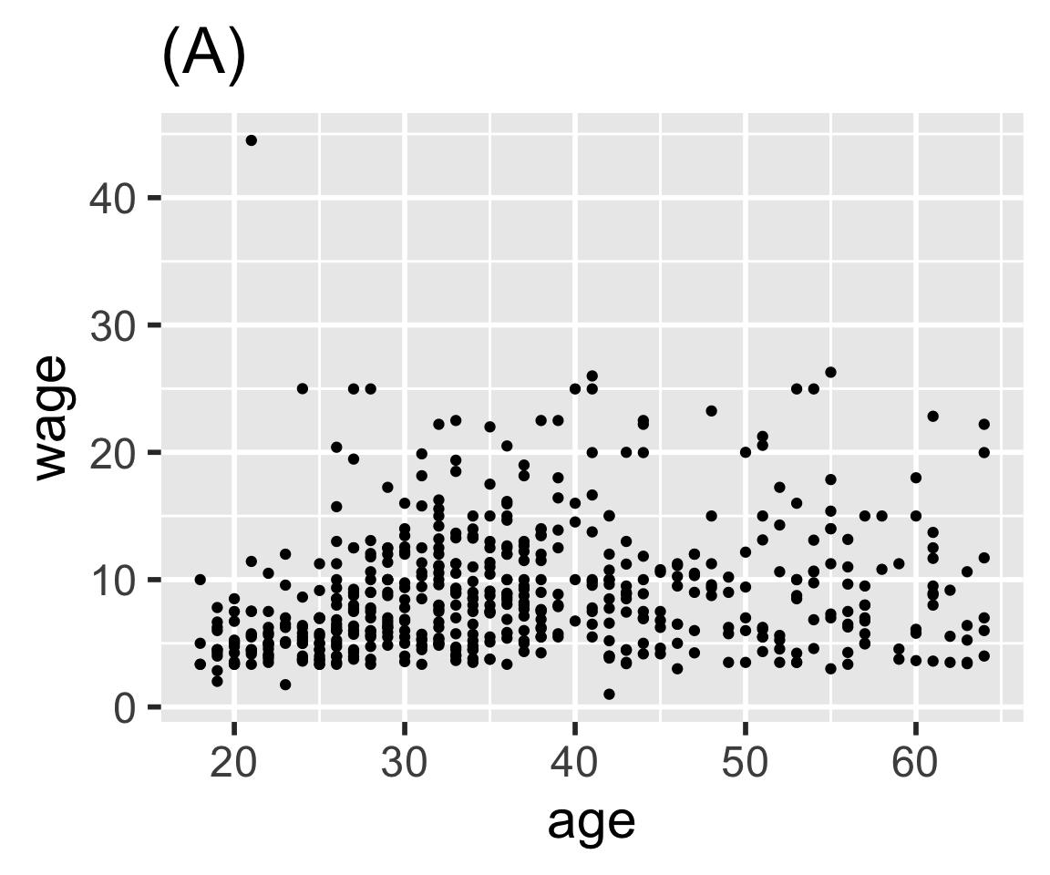
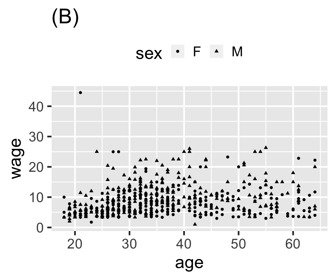
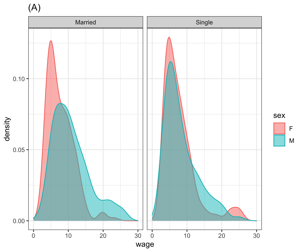
Problem 8.2: Here are several graphics based on the mosaicData::CPS85 data table. Write ggplot2 statements that will construct each graphic.
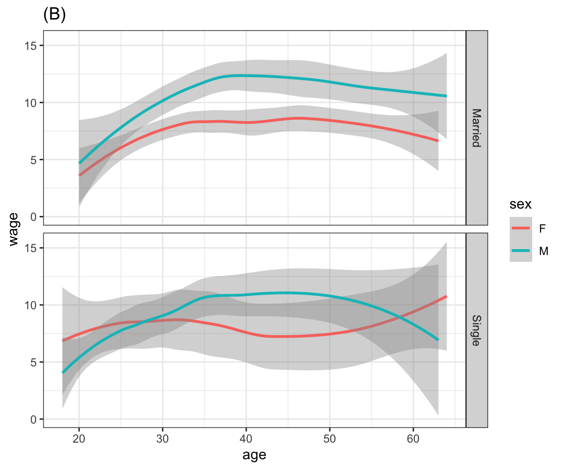
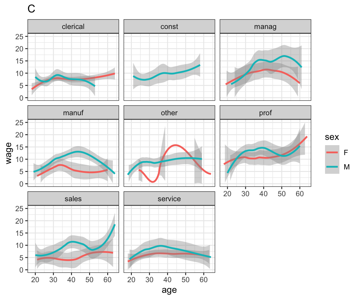
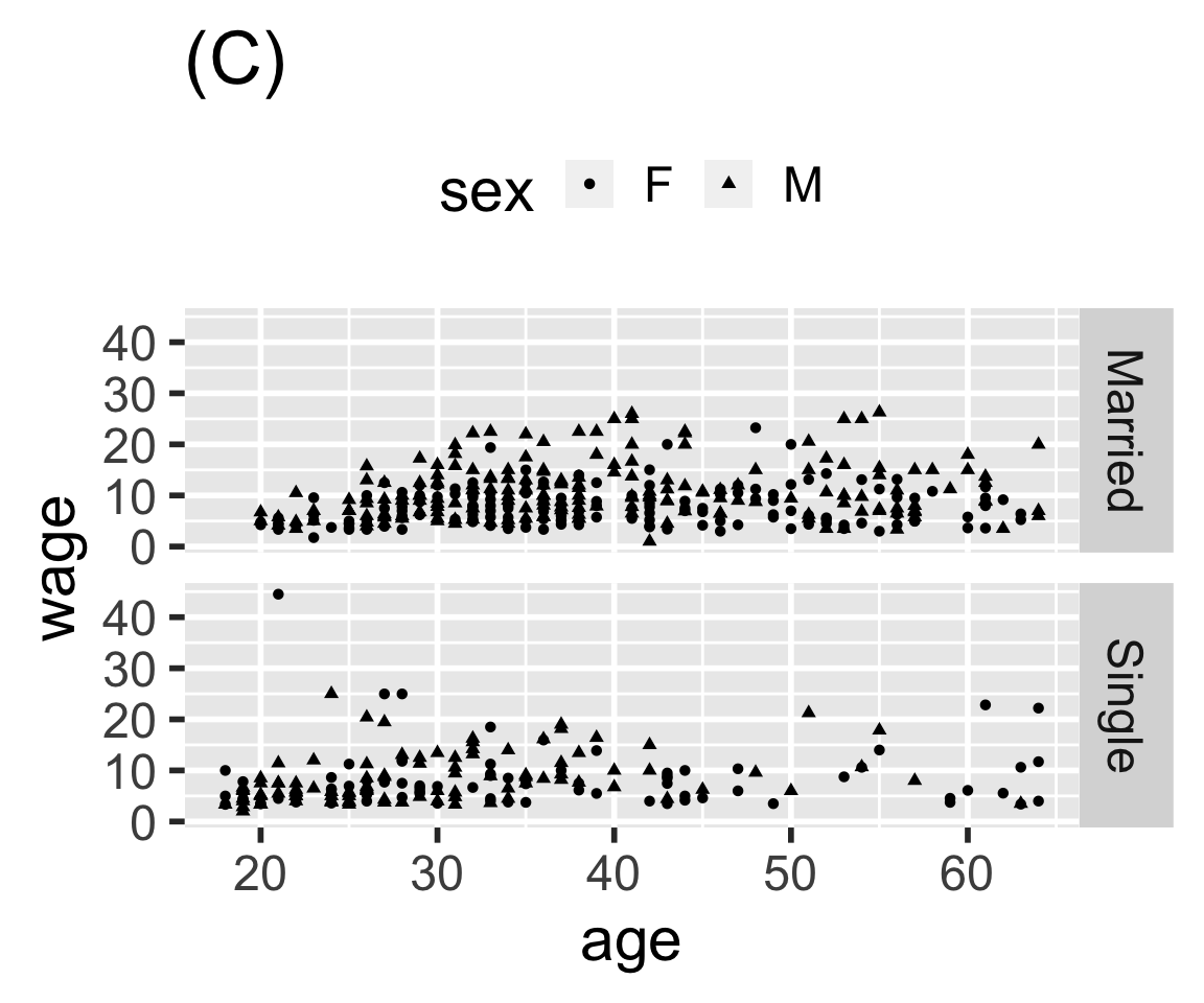
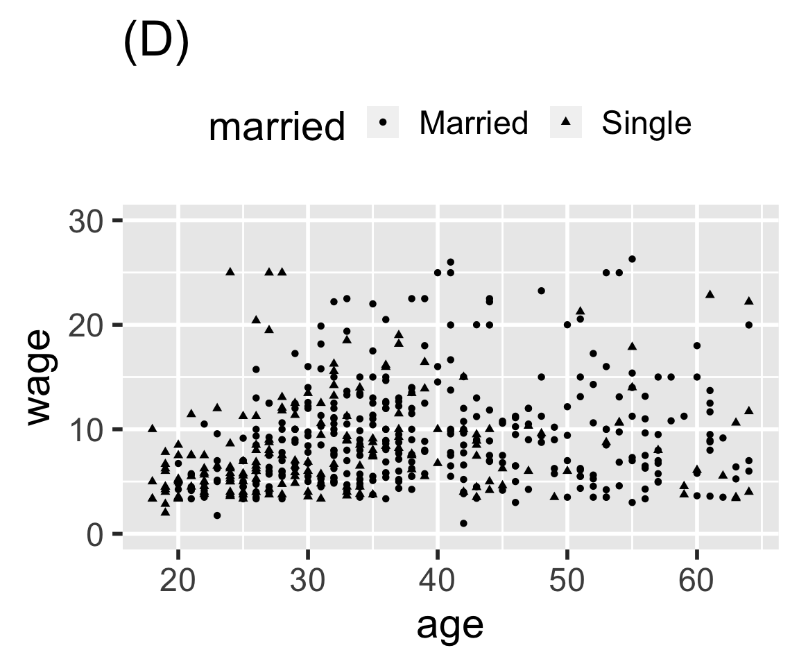
Problem 8.3: Here are four graphics based on the mosaicData::CPS85 data table. Write ggplot() statements that will construct each graphic.