Chapter 15 Statistics
Up to now, the emphasis has been on individual cases. Data graphics, for instance, translate each case into a representation in terms of a glyph’s graphical attributes: position, color, size, shape, etc.
There are many occasions where a different emphasis is called for: representing the collective properties Collective properties: Features of groups of cases. of cases. You’ve seen simple collective properties calculated with summary functions: mean, median, max, etc. The concern here is detailed collective descriptions, aspects of the collective that cannot be summed up in a single number.
15.1 Statistics
Statistics is the area of science concerned with characterizing case-to-case variation and the collective properties of cases, while also quantifying our uncertainty. Statistics provides many important insights into the collection and interpretation of data. “Data science” is a collaboration between statistics and computer science. Although this book is mainly about computing, a solid grasp of statistics is an important foundation for effective work with data.
A central topic in statistics is the precision with which quantities can be calculated from data. This is not precision in the sense of the correctness of calculations, but has to do with the randomness that inevitably comes into play when selecting a sample of cases from a larger set of possibilities.
This chapter will touch on some important ideas from statistics, especially “confidence intervals” and “confidence band.” The techniques by which computers can learn from data, presented in Chapter 18, have embedded in them considerable statistical theory, although statistics itself is not the subject of that chapter.
The main emphasis of this chapter will be the statistical graphics used to display variation among cases, particularly the distribution of values of one variable or several of variables.
15.2 Density distribution of a variable
To start, consider the weight variable in the NCHS data. Of course, weight varies from person to person; there is a distribution of weights from case to case. Sometimes it’s helpful to show this distribution, what values are common, what values are rare, what values never show up.
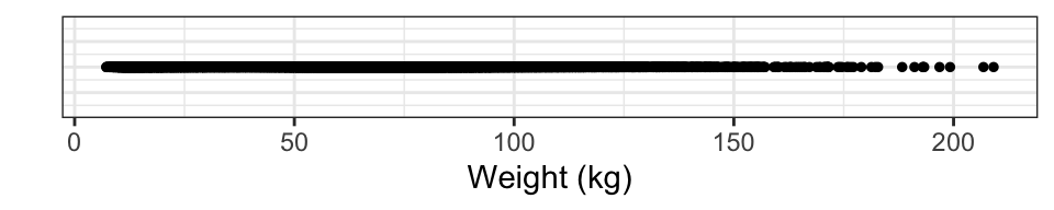
Naïvely, this might be done by drawing a weight axis and putting on it a point for each case, as in Figure 15.1. This graph shows some familiar facts: humans tend not to be lighter than a few kilograms, and tend not to be heavier than about 150 kg. Between these limits, there seems to be no detail.
Figure 15.1: A distribution shown as the density of points on a line. This is not effective.
This is misleading, the result of having so many cases (29375) to plot. All those cases lead to ink saturation. One way to overcome this problem is by using transparency, another is to jitter the individual points. jitter: Moving the position of cases by a small random amount, to alleviate overplotting of multiple cases which otherwise would have the same position. Figure 15.2 shows the result. Note: the R code accompanying several plots in this chapter include additional commands that simply improve the appearance of the plot.
NCHS %>%
  ggplot(aes(x = weight, y = 1)) +
  geom_point(alpha = 0.02, position = "jitter" ) +
  xlab("Weight (kg)") +
  ylab("") + theme_bw() + scale_color_grey()
Figure 15.2: The points which were over-crowded onto a line in Figure 15.1 have been spread out: jittered
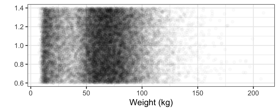
Jittering produces a much more satisfactory display; the ink saturation has been greatly reduced and there is more detail. For instance, the most common weights are between 55 and 90 kg, and that weights less than 20 kg are also pretty common. There aren’t so many people with weights near 30kg, and few over 120 kg.
The visual impression is due to collective properties of the data. Every individual glyph is identical, but for weights where the glyphs have a high density, Density: How tightly cases are bunched together. the impression the glyphs collectively give is of darkness. It’s easy to see how the density of glyphs varies at different weights. This is called the density distribution. Density distribution: The variation in density of cases over different values of a variable
The collective property of density is conventionally displayed as a another kind of glyph, as in Figure 15.3, that displays the collective density property using the height of a function instead of the shade of darkness.
NCHS %>%
  ggplot(aes(x = weight) ) +
  geom_density(color = "gray", fill = "gray", alpha = 0.75) +
  xlab("Weight(kg)") + ylab("Density (1/kg)")
Figure 15.3: A density distribution plot. The scale of the y axis may seem odd; it has units of "inverse kilograms." This scale is arranged so that the area under the entire density curve is 1. This convention facilitates densities for different groups, e.g. male versus female. It also means that narrow distributions tend to have high density.
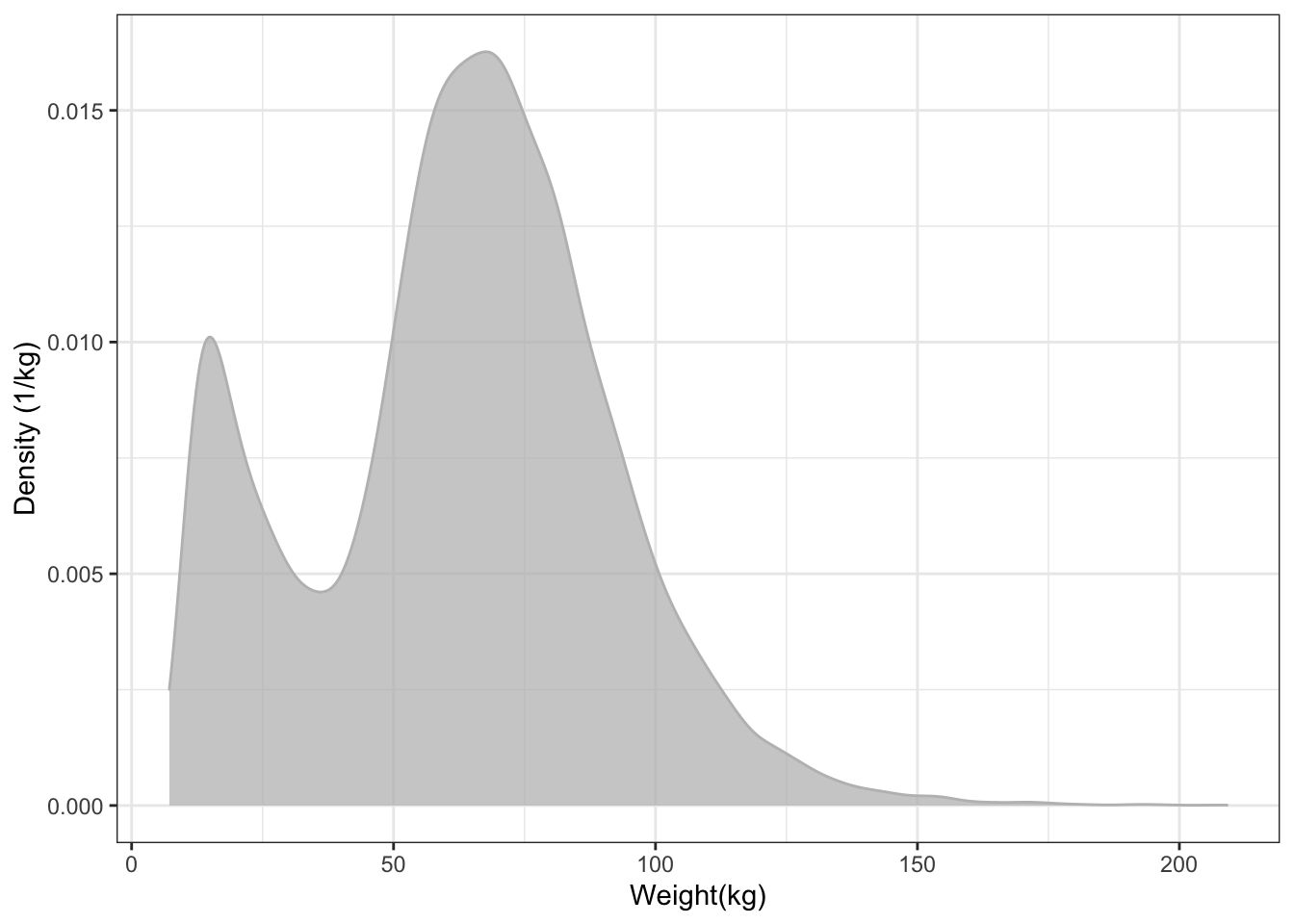
In this format, the height of the band indicates the density of cases. You can’t see individual cases, just the collective property of the density at each weight.
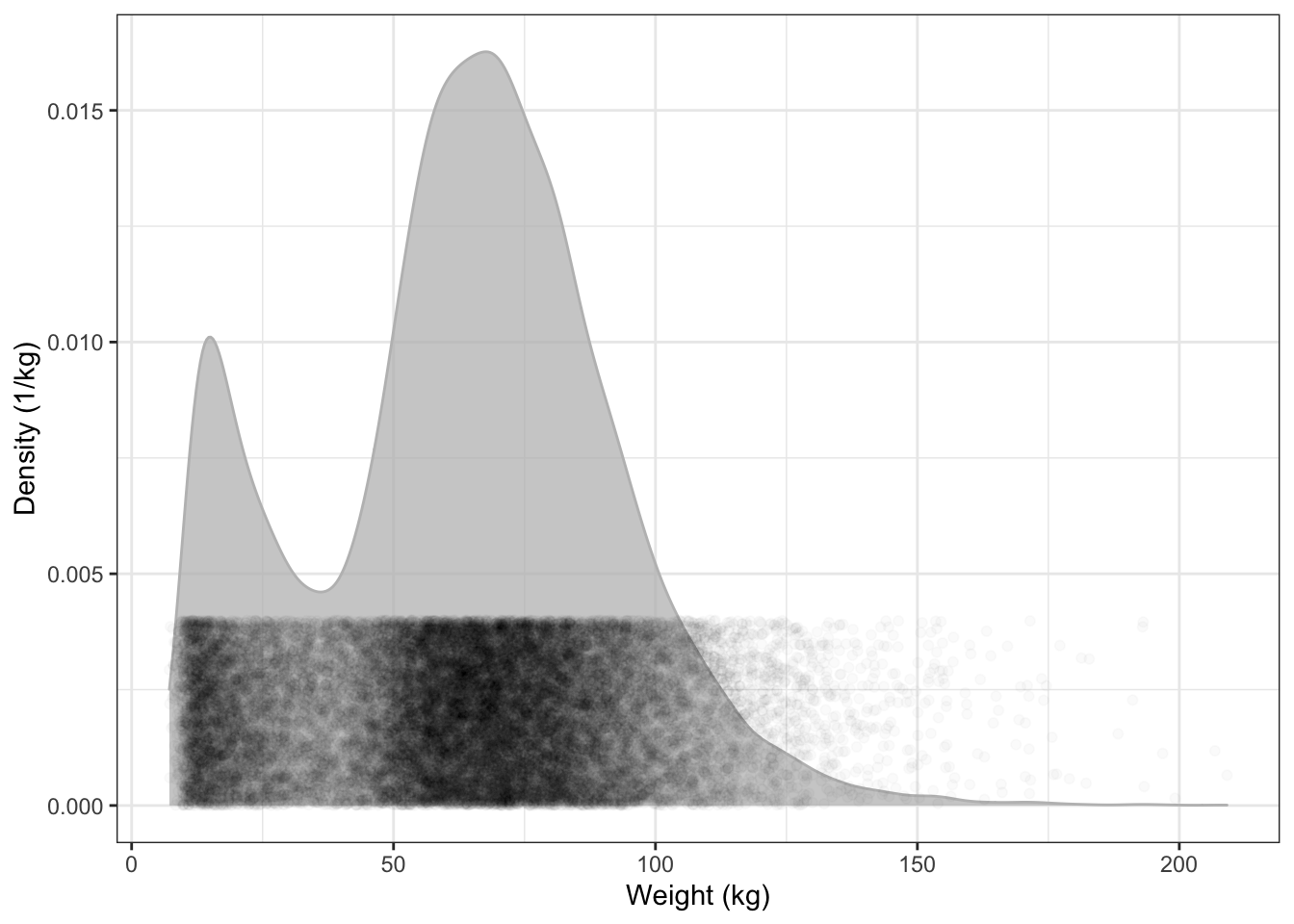
To help you see the translation between the density as vertical position and the density as darkness, Figure 15.4 overlays the two depictions of density in Figures 15.2 and 15.3.
NCHS %>%
ggplot(aes(x = weight)) +
  geom_density(alpha = 0.75, color = "gray", fill = "gray") +
  geom_point(alpha = 0.02, aes(y = 0.002),
             position = position_jitter(height = 0.002)) +
  xlab("Weight (kg)") +
  ylab( "Density (1/kg)")
Figure 15.4: The density distribution function is high where the points are dense.
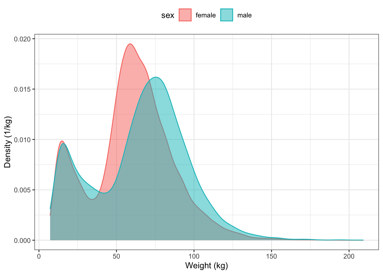
Graphs of the distribution of density can be used to compare different groups. You need merely indicate which variable should be used for grouping. For instance, Figure 15.5 displays the distribution density of body weight for each sex:
ggplot(NCHS, aes(x = weight, group = sex) ) +
  geom_density(aes(color = sex, fill = sex), alpha = 0.5) +
  xlab("Weight (kg)") +
  ylab("Density (1/kg)") +
  theme(legend.position = "top")
Figure 15.5: Comparing the distributions for body weight between males and females in the NCHS data.
Graphs of density distributions often have a simple shape. This allows you to place the distributions side by side for comparison. For instance, suppose you arrange to divide people into age groups.
The age group can be used to define facets for a graphic, as in Figure 15.6.
NCHS %>%
  ggplot( aes(x = weight, group = sex) ) +
  geom_density(aes(color = sex, fill = sex), alpha = 0.75) +
  facet_wrap( ~ ageGroup, nrow = 1 ) +
  xlab("Weight (kg)") +
  ylab( "Density (1/kg)") +
  theme(axis.text.x = element_text(angle = 60, hjust = 1))
Figure 15.6: Using faceting to compare the weight distribution of different age groups.
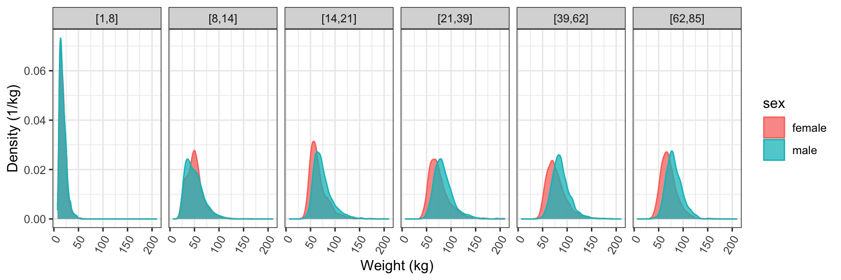
Figure 15.6 tells a rich story. For young children the two sexes have almost identical distributions. For kids from 5 to 13 years, the distributions are still similar, though you can see that some girls have grown faster, producing a somewhat higher density near 50 kg. From the teenage years on, the distribution for men is shifted to somewhat higher weight than for women. This shift stays pretty much constant for the rest of life.
15.3 Other Depictions of Density Distribution
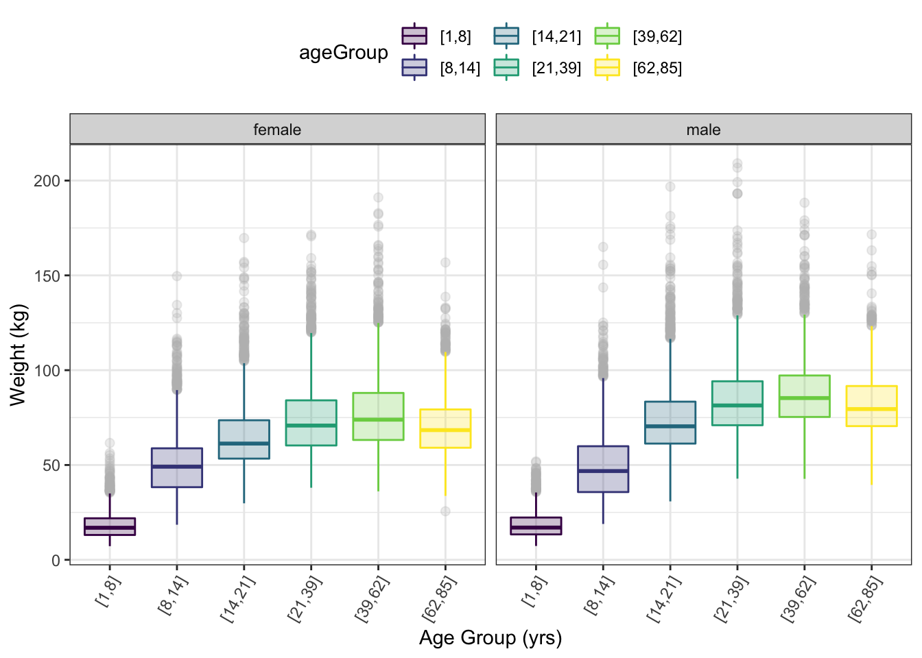
The detail in the density curves can be visually overwhelming: there’s a lot of detail in each density curve. To simplify the graph, sometimes a more stylized depiction of the distribution is helpful. This makes it feasible to put the distributions side-by-side for comparison. (Figure 15.7) The most common such depiction is the box-and-whisker glyph. box-and-whisker: A simple presentation of a distribution showing the median, extremes, and intermediate values (25th, 75th percentiles) of a distribution. 
The box-and-whisker glyph shows the extent of the middle 50% of the distribution as a box. The whiskers show the range of the top and bottom quarter of the distribution. When there are uncommon, extremely high or low values — e.g., “outliers” — they are displayed as individual dots for each of the outlier cases.
NCHS %>%
  ggplot(aes(y = weight, x = ageGroup)) +
  geom_boxplot(aes(color = ageGroup, fill = ageGroup),
               alpha = 0.25, outlier.size = 2, outlier.colour = "gray") +
  facet_wrap( ~ sex ) +
  xlab("Age Group (yrs)") +
  ylab("Weight (kg)") +
  theme(legend.position = "top") +
  theme(axis.text.x = element_text(angle = 60, hjust = 1))
Figure 15.7: Box and whisker glyphs used to show the distribution of weight for different age groups. Faceting by sex.
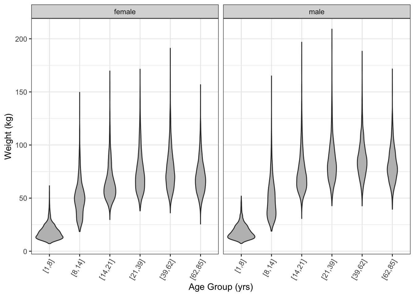
The violin glyph Violin glyph: Shows distributions like a box and whisker glyph but smoother. provides a similar ease of comparison to the box-and-whisker glyph, but shows more detail in the density. (Figure 15.8)
NCHS %>%
  ggplot(aes(y = weight, x = ageGroup)) +
  geom_violin(fill = "gray") +
  facet_wrap( ~ sex ) +
  ylab("Weight (kg)") +
  xlab( "Age Group (yrs)") +
  theme(legend.position = "top") +
  theme(axis.text.x = element_text(angle = 60, hjust = 1))
Figure 15.8: A violin plot of the distribution of weights.
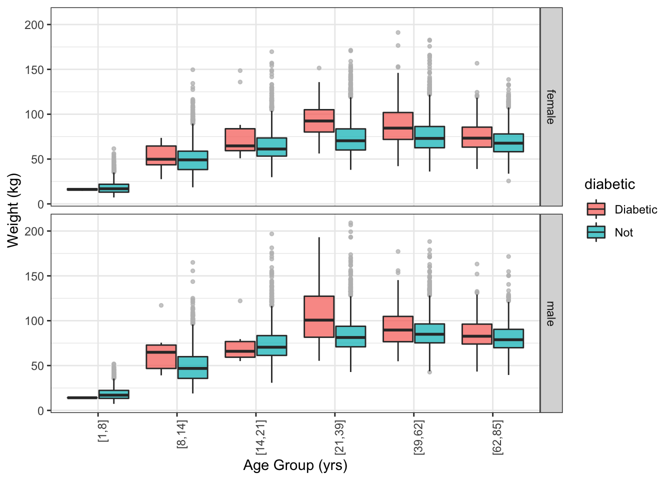
Both the box-and-whisker and violin glyphs use ink efficiently. This allows you to show other data for comparison. For instance, Figure 15.9 compares the weight of people with and without diabetics, broken down by age and sex. You can see that diabetics tend to be heavier than non-diabetics, especially for ages 19+.
NCHS %>%
  ggplot(aes(y = weight, x = ageGroup )) +
  geom_boxplot(aes(fill = diabetic),
               position = position_dodge(width = 0.8),
               outlier.size = 1, outlier.colour = "gray", alpha = 0.75) +
  facet_grid( sex ~ .) +
  ylab("Weight (kg)") +
  xlab( "Age Group (yrs)") +
  theme(axis.text.x = element_text(angle = 90, hjust = 1))
Figure 15.9: Box and whisker plot comparing the weight distribution of diabetics to the rest of the cases.
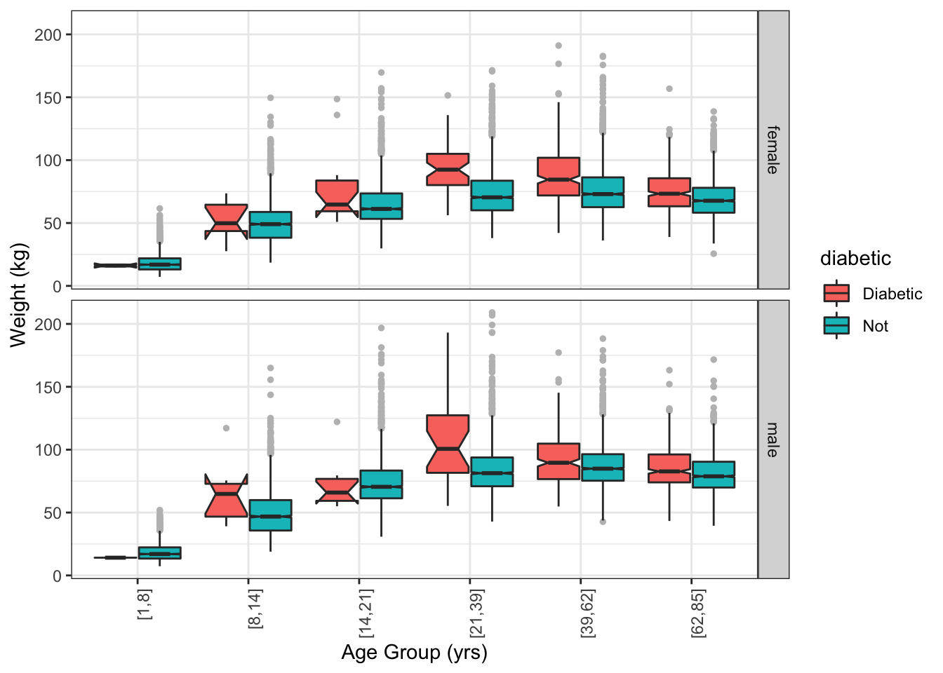
15.4 Confidence Intervals
Statistical inference refers to an assessment of the precision or strength of evidence for a claim. For instance, in interpreting the plot above, it was claimed that diabetics tend to be heavier than non-diabetics. Perhaps this is just an accident. Might it be that there are so few diabetics that their weight distribution is not well known?
The confidence interval of a statistic indicates the uncertainty of an estimate due to the size of the sample. Smaller-sized samples provide weaker evidence and their confidence intervals are broader than those produced by larger-sized samples.
A box-and-whiskers glyph can show the confidence interval of the median by means of a “notch”. (Figure 15.10) Overlap between the notches in two boxes indicates that the evidence for a difference is weak.
NCHS %>%
  ggplot(aes(y = weight, x = ageGroup )) +
  geom_boxplot(aes(fill = diabetic),
               notch = TRUE,
               position = position_dodge(width = 0.8),
               outlier.size = 1, outlier.colour = "gray") +
  facet_grid(sex ~ .) +
  ylab("Weight (kg)") +
  xlab( "Age Group (yrs)") +
  theme(axis.text.x = element_text(angle = 90, hjust = 1))
Figure 15.10: A notched box and whisker plot. The notches show the uncertainty in the median weight for each group.
15.5 Model Functions
A function is one way of describing a relationship between input and output. Often it’s helpful to use a function estimated from data.
For example, consider the relationship between weight and age in the NCHS data. Is it the same for diabetics and non-diabetics?
NCHS %>%
ggplot(aes(x = age, y = weight, color = diabetic)) +
stat_smooth(se = FALSE) +
geom_point(alpha = 0.02) +
ylim(0, 120) +
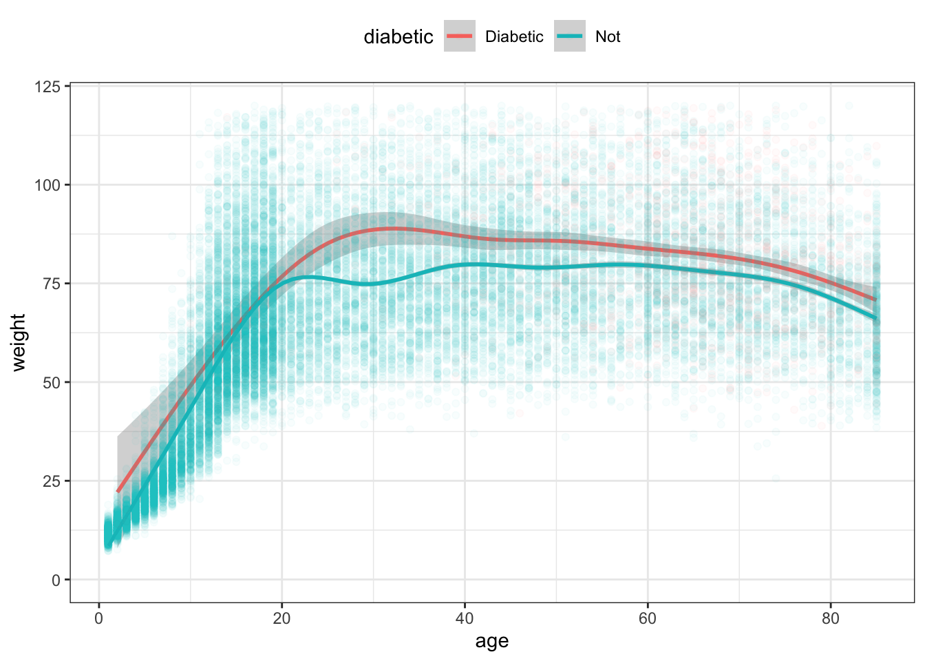
theme(legend.position = "top")Figure 15.11: Smoothers showing typical weight as a function of age.
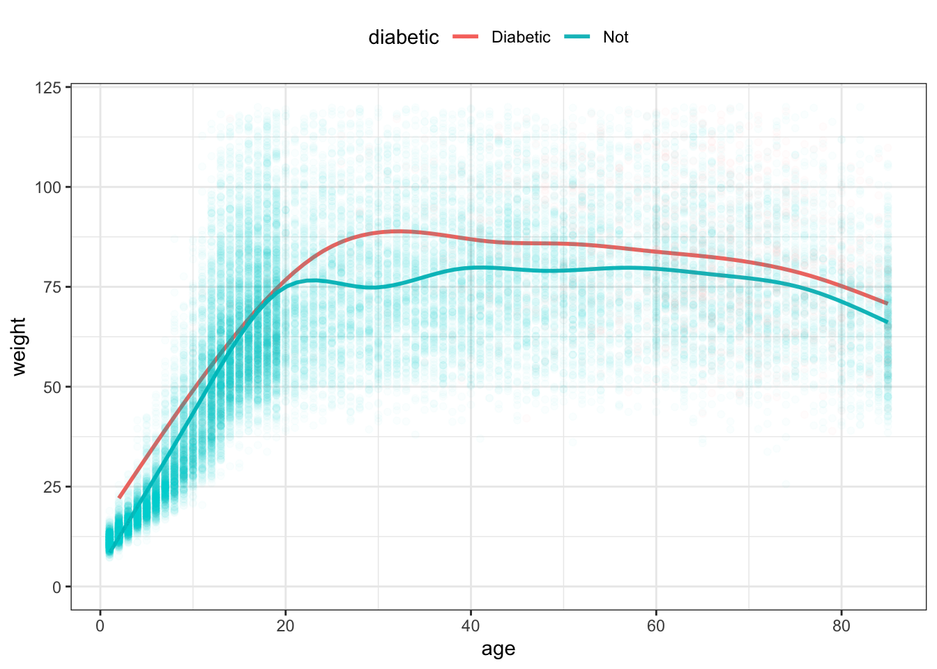
There are two functions in Figure 15.11, each calculated by stat_smooth() from the age and weight variables. One function is for diabetics, the other for non-diabetics. Each function gives just one weight value for each age, rather than the distribution seen in the raw data. That value is more or less the mean weight at each age. From the functions, it seems that the diabetics are consistently heavier than the non-diabetics, at least on average. At age 30, that average difference is more than 20kg; it is less for people near 80.
On it’s face, Figure 15.11 suggests that, for any age, the mean weight of diabetics is higher than that of non-diabetics. Before drawing such a conclusion, however, it’s important to know how precisely the functions can be estimated from the data.
The calculation of the functions are exact, but the specific function produced depends on the particular set of cases in the data. Imagine that the original data frame consisted of cases that had been randomly selected from all possible cases. Suppose a new set of cases were collected, also randomly selected. The function calculated based on that new set would likely differ somewhat from the function calculated from the original data frame. The point of a statistical confidence interval is to provide a quantitative meaning to “somewhat.”
When applying the idea of confidence intervals to a function, one arrives at bands around the function: the confidence bands. Confidence band: A confidence interval around a function Confidence bands are constructed so that they almost always Almost always: With high probability. The value of this probability, called the “confidence level,” is by convention arranged to be 95 percent. contain the function that would have been found if the entire population were used. In this sense, the confidence bands show how much variation in the shape of the function is due to the random selection of the cases that ended up in the original data frame.
The variation that stems from random sampling of cases is so important to interpreting the graphic that the default in stat_smooth() is to calculate and show the confidence band unless the user specifically asks otherwise.
NCHS %>%
  ggplot(aes(x = age, y = weight, color = diabetic )) +
  stat_smooth( ) +
  geom_point(alpha = 0.03) +
  ylim(0, 120) +
  theme(legend.position = "top")
Figure 15.12: The functions in Figure 15.11 with confidence bands drawn around each.
Confidence intervals and bands are widely mis-interpreted. The confidence band does not show the range of cases, it shows the precision with which the statistic or model function is estimated. So it’s wrong to say something like ‘diabetics are heavier than non-diabetics’. Instead, the statement justified by the separation between the confidence bands is ‘the mean weight of diabetics (taking into account age) is greater than that of non-diabetics.’ Long winded? Yes. Maybe that’s why confidence intervals and bands are so widely mis-interpreted.
The function for non-diabetics has a narrow confidence band; you have to look hard to even see the gray zone. The confidence band for diabetics, however, is noticeably wide. For ages below about 20, the non-diabetic and diabetic confidence bands overlap. This means that there is only weak evidence that diabetics as a group in this age group differ in weight from non-diabetics. Around age 20, the two functions’ confidence bands do not overlap. This indicates stronger evidence that the groups in the 20+ age bracket do differ in average weight.
You might ask why the confidence band for the diabetics is so much wider than for the non-diabetics? And why is the diabetic confidence band broad in some places and narrow in others?
The width of a confidence band depends on three things:
- the amount of variation in the value of y at or near the x value.
- the number of cases close to the x value
- the extent to which the function is an extrapolation.
The functions in Figures 15.11 and 15.12 are called smoothers. Smoother: A function that can bend with the data. A smoother bends with the data collectively, but doesn’t try to jump sharply to match individual cases. The smoother is a compromise between matching the data exactly, and remaining smooth. Think of it as a wooden strip that is somewhat stiff, but can still be bent gently.
A much more commonly used function — the “linear” function — is utterly stiff; it can’t bend at all. You can construct this sort of function from the data with method = lm as an argument to stat_smooth().
NCHS %>%
  ggplot(aes(x = age, y = weight,
              color = diabetic, fill = diabetic )) +
  stat_smooth(method = lm) +
  geom_point(alpha = 0.02) +
  ylim(0,120) +
  theme(legend.position = "top")
Figure 15.13: A straight-line model is too stiff and misleadingly suggests a large difference in weight for young people between diabetics and non-diabetics.
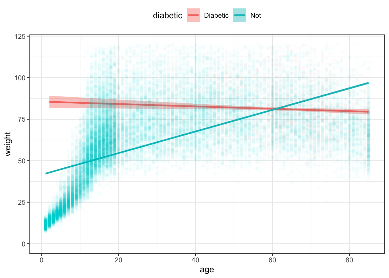
In this situation, a linear function is too stiff. The function for non-diabetics slopes up at high ages not because older non-diabetics in fact weigh less than middle-aged diabetics, but because the line needs to accommodate both the children (light in weight) and the adults (who are heavier).
You’ll often see linear functions in the scientific literature. This is for several reasons, some good and some bad:
- Linear functions generally have tighter confidence bands than smoothers. (A good reason)
- People are familiar with straight-line functions from high school. (A bad reason)
- Many people don’t know about non-linear functions such as a smoother. (A bad reason)
A simple rule of thumb: When in doubt, use a smoother.
15.6 Exercises
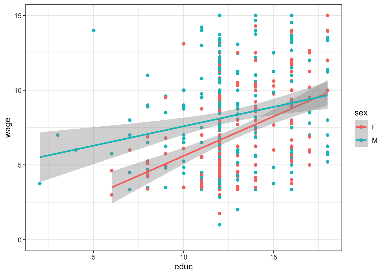
Problem 15.1: Reconstruct this graphic using the ggplot() system and the mosaicData::CPS85 data table.
Problem 15.2: Consider the NCHS data in the dcData package.
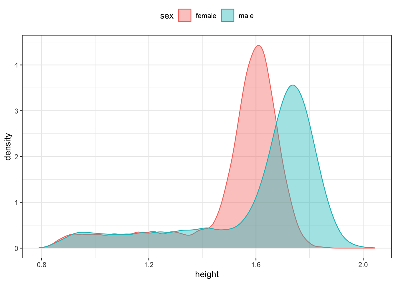
- Judging from the graph, what do you estimate the most likely height among the
NCHSpeople to be? (FYI: The heights are in meters.)
- Based on the following graph, what do you estimate the most likely height for women to be? For men?
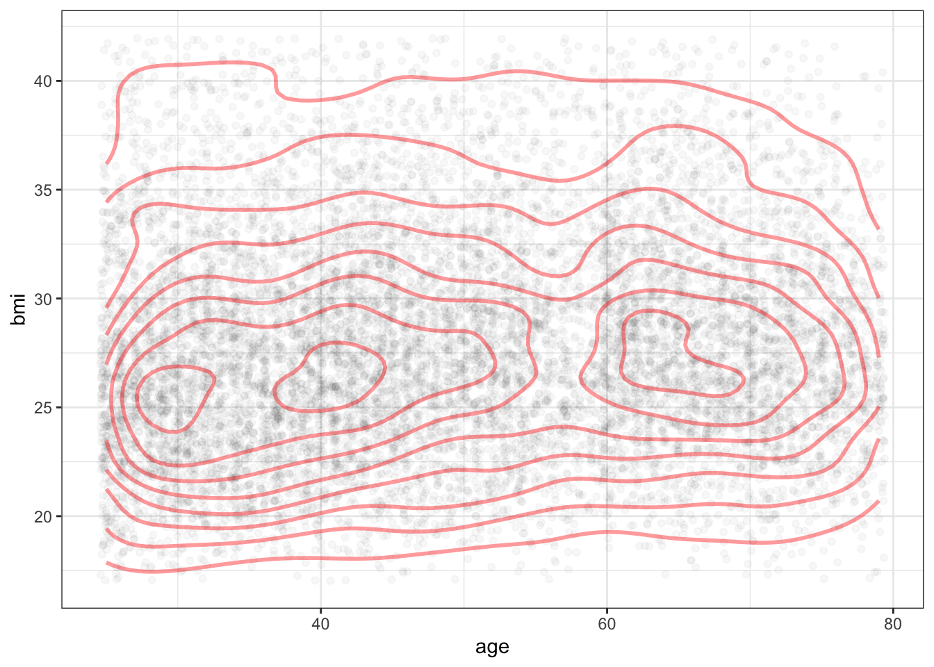
- Below is a plot of the density for
bmiandagesimultaneously. The curved lines display density contours much like a contour map in geography displays elevations. Based on this graph, do you estimate the most likely BMI for a 40-year old to be? For a 70-year old?
Problem 15.3: Reconstruct this graphic using the ggplot() system and the mosaicData::CPS85 data table.
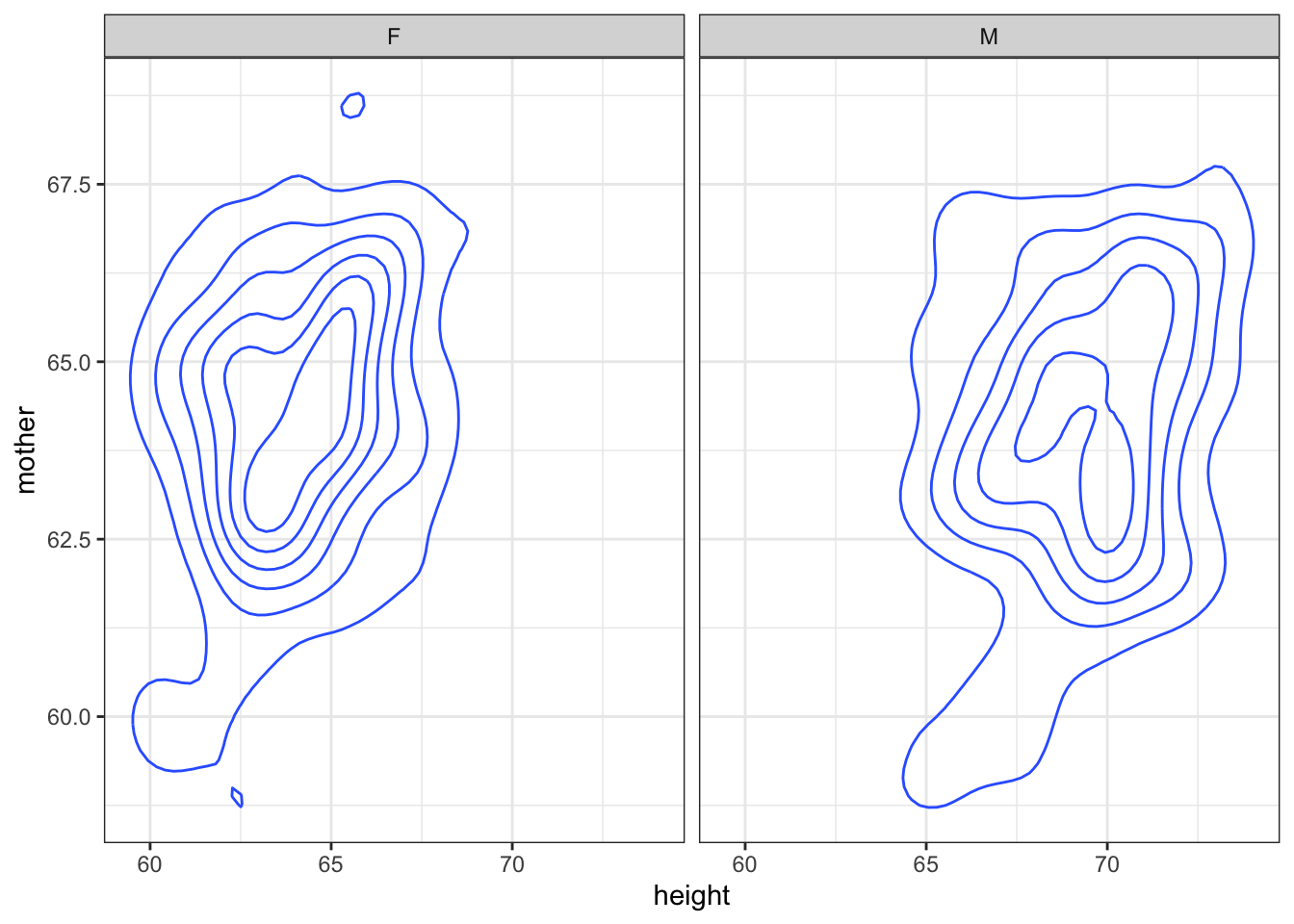
Problem 15.4: Reconstruct this graphic using the ggplot() system and the mosaicData::Galton data table.
Problem 15.5: You’re doing a study of whether grandparents go where the grandkids are. As a first attempt, you look at 20 ZIP codes. You find the relationship between the fraction of people in a ZIP code under 5 years old and the fraction 65 and older, plotted below.
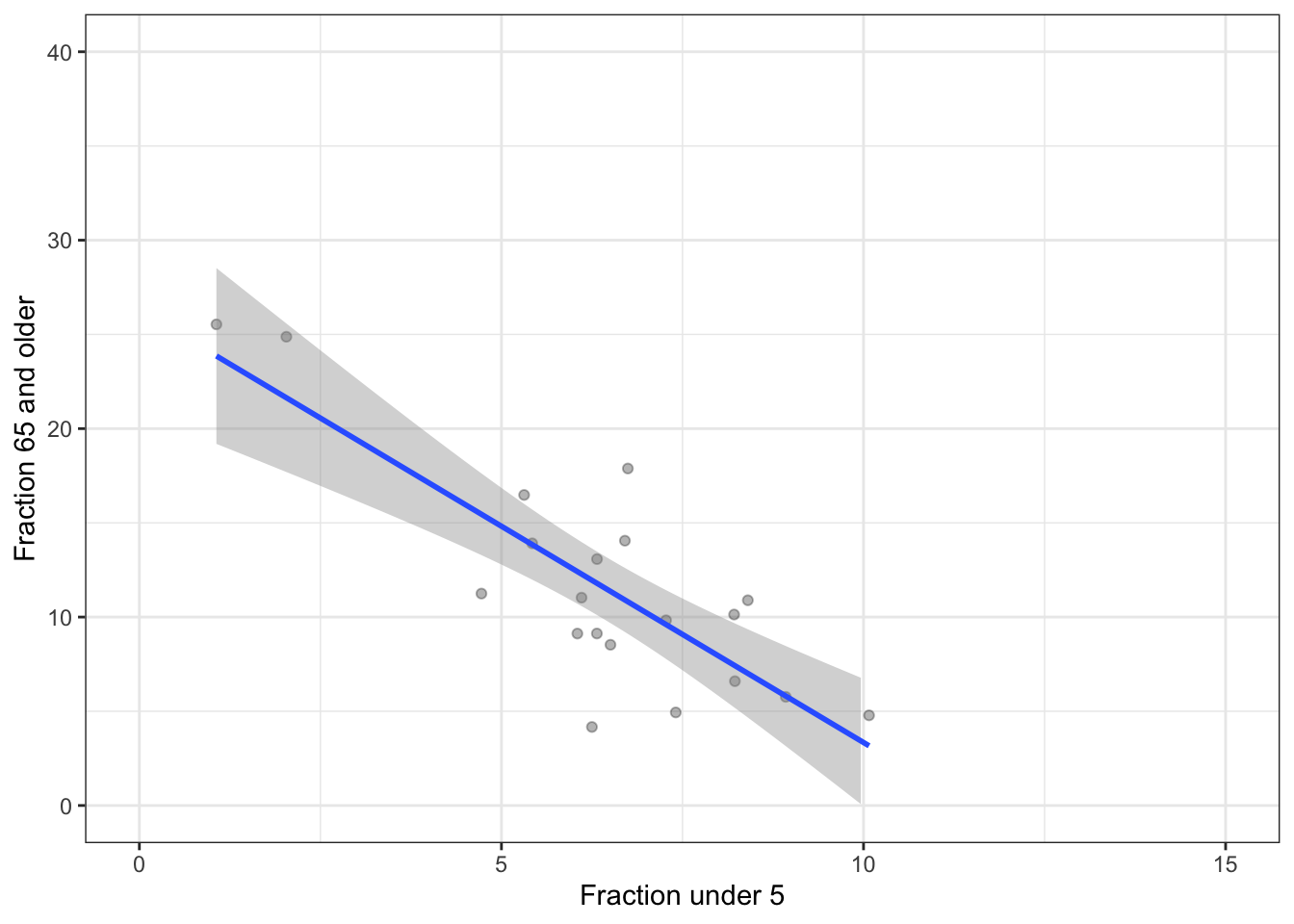
Do the data indicate that ZIP codes with high elderly populations tend to have high child populations?
Looking at the confidence bands, is your data possibly consistent with there being no relationship (that is, a level line) between elderly population and child population?
You decide to get more data: study 80 ZIP codes. Here’s the result.
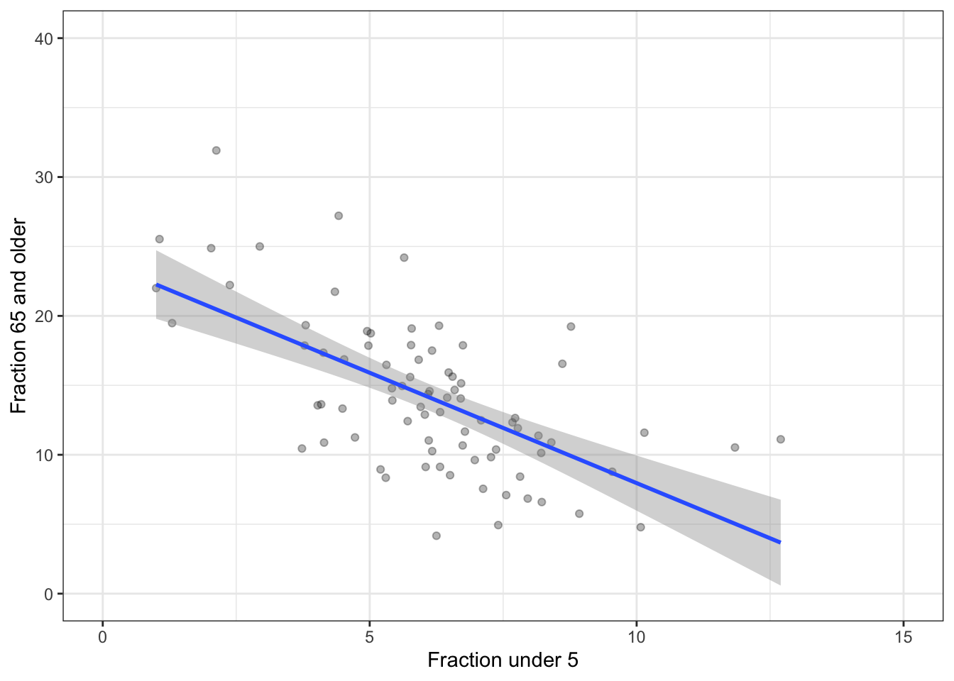
- Is a flat line consistent with the data?
- Compare the height of the confidence band with 20 ZIP codes to the height of the band with 80 ZIP codes: 4 times as much data in the larger sample than the smaller. Roughly, what’s the ratio of confidence band heights?
- Statistical theory indicates that the width of a confidence band based on \(n\) points goes as \(1/\sqrt{n}\). Does this seem about right?
Problem 15.6: Examining a sample of 100 ZIP codes, the following graphic divides ZIP codes into 5 income groups, looking at the fraction of the population that is 65 and older.
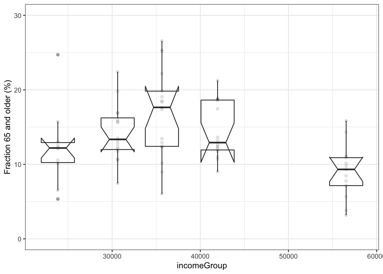
- What relationship do you see between income and the fraction of the population greater than 65? (The notch shows the confidence interval on the median.)
The same analysis, but for a sample 16 times as big as before.
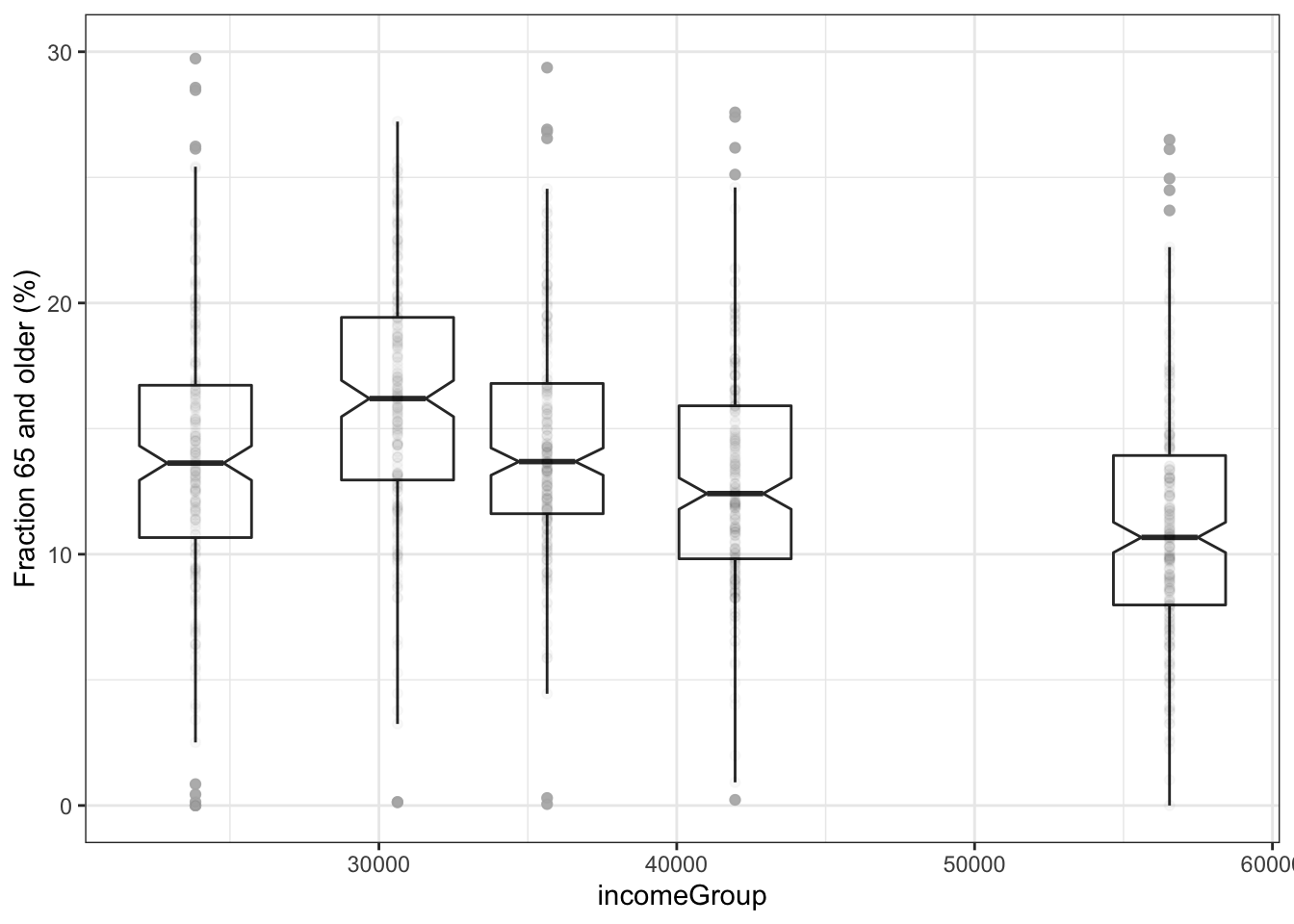
- Statistical theory indicates that the width of a confidence band based on \(n\) points goes as \(1/\sqrt{n}\). Does this seem about right? Do the notch sizes (confidence intervals) follow the \(1/\sqrt{n}\) rule?
Extra information: Often, quantitative variables such as income are divided into groups. Sometimes this reflects a lack of awareness by the data analyst about other possibilities. For instance, smoothers can provide an indication of general trends in the data without dividing into groups. For instance, this graph has income rather than incomeGroup on the x-axis.
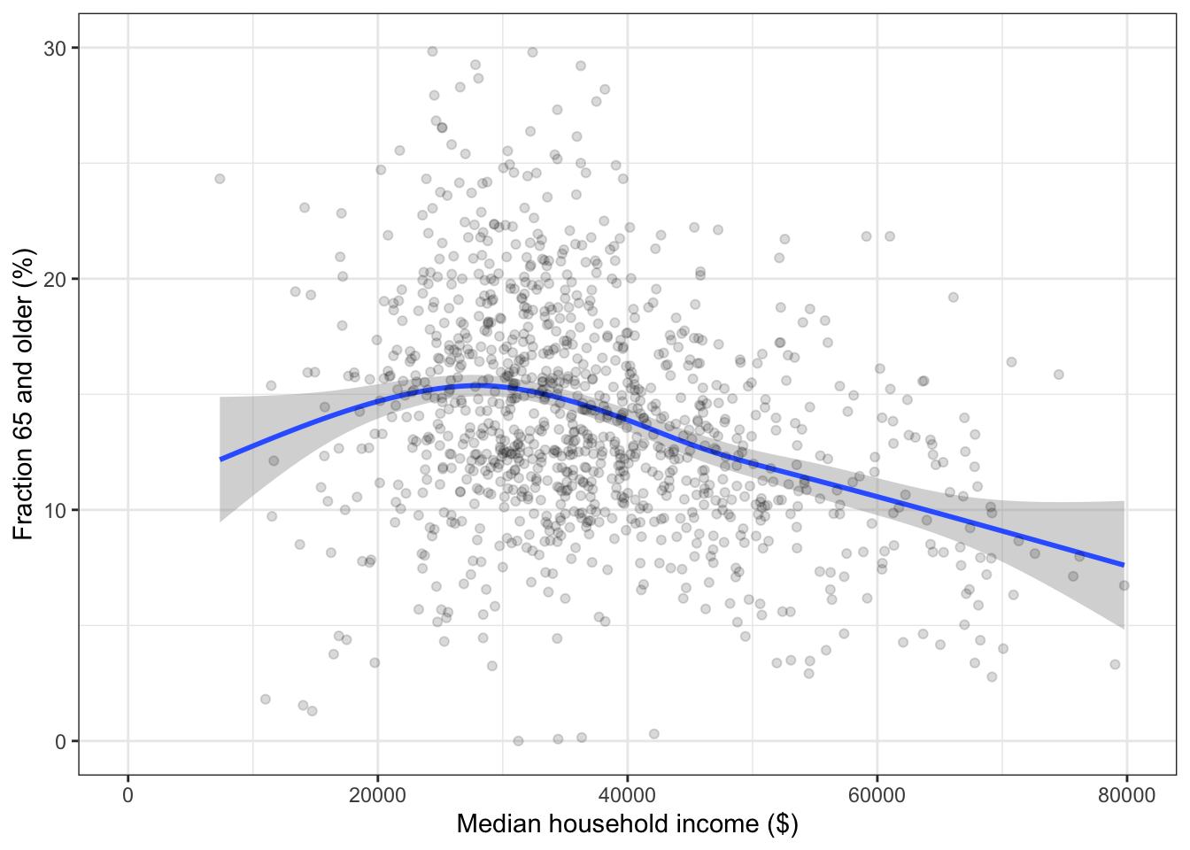
The fraction of people aged 65 and older is larger at the lowest income groups. But since the confidence intervals overlap among all the income groups, this relationship might be illusory: the medians might be roughly the same for all groups.
With more data, the notches are smaller. According to the \(\sqrt{n}\) rule, with 16 times as much data, the notches should be about 1/4 the size of those in the smaller sample. Measuring the notches with a ruler confirms this in the graph.
Problem 15.7: One way to measure the “spread” of values is with the “standard deviation.” The higher the standard deviation, the more spread out the values are. Use sd(), a summary function, to compute the standard deviation.
In the MedicareCharges data table, the drg variable describes billing codes for different types of medical conditions, called “Direct Recovery Groups.” (MedicareCharges is in the dcData package.)
- Taking all the hospitals together, which DRG has the highest standard deviation in Medicare charges?
- Taking all the DRGs together, which hospital has the highest standard deviation in Medicare charges?
Medicare typically pays the hospital less than was charged by the hospital. Calculate the proportion of the charge that was paid (hint: a simple ratio), then find:
- Across all hospitals, which DRG has the lowest proportion? Highest proportion?
- Across all DRGs, which hospital has the lowest proportion? Highest proportion?