slice_plot(stroke_model(bore) ~ bore, domain(bore=0:1000))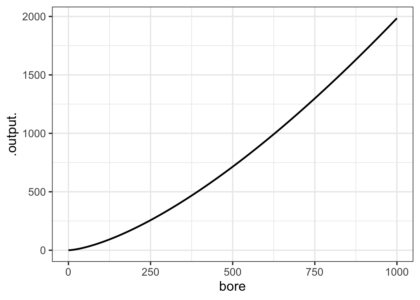
The decade of the 1660s was hugely significant in the emergence of science, although no one realized it at the time. 1665 was a plague year, the last major outbreak of bubonic plague in England. The University of Cambridge closed to wait out the plague.
Isaac Newton, then a 24-year old Cambridge student, returned home to Woolsthorpe where he lived and worked in isolation for two years. Biographer James Gleich wrote: “The plague year was his transfiguration. Solitary and almost incommunicado, he became the world’s paramount mathematician.” During his years of isolation, Newton developed what we now call “calculus” and, associated with that, his theory of Universal Gravitation. He wrote a tract on his work in 1669, but withheld it from publication until 1711.
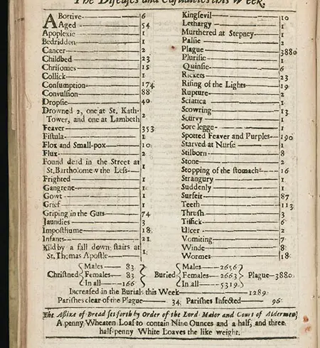
Newton (1642-1726) was elected to the prestigious Royal Society at an early age. There, he may well have met another member of the Society, John Graunt(1620-1674). Graunt was well known for collecting data on causes of death in London. Figure fig-bill-of-mortality shows his data for one week in 1665.
Neither Newton nor Graunt could have anticipated the situation today. Masses of data are collected and analyzed. Mathematical functions are essential to the analysis of complex data. To give one example: Artificial intelligence products such as large-language models (e.g. Chat-GPT) are based on the construction of mathematical functions (called “neural nets”) that take large numbers of inputs and process them into an output. The construction methods are rooted in optimization, one of the topics in Newton’s first calculus book.
Since data is so important, and since Calculus underlies data analysis techniques, it makes sense that a course on Calculus should engage data analysis as a core topic. This book emphasizes data-related aspects of Calculus although traditional books, (even in the 21st century) mainly follow an old, data-free curriculum.
This chapter introduces some basic techniques for working with data. This will enable you to apply important data-oriented methods of Calculus that we will encounter in later chapters.
The organization of data as a table (as in Figure fig-bill-of-mortality) is almost intuitive. However, data science today draws on much more sophisticated structures that are amenable to computer processing.
Data science is strikingly modern. Relational databases, the prime organization of data used in science, commerce, medicine, and government was invented in the 1960s. All data scientists have to master working with relational databases, but we will use only one component of them, the data frame.
Let’s consider what Graunt’s 1665 data might look like in a modern data frame. Remember that the data in Figure fig-bill-of-mortality covers only one week (Aug 15-22, 1665) in only one place (London). A more comprehensive data frame might include data from other weeks and other places:
| condition | deaths | begins | stops | location |
|---|---|---|---|---|
| kingsevil | 10 | 1665-08-15 | 1665-08-22 | London |
| lethargy | 1 | 1665-08-15 | 1665-08-22 | London |
| palsie | 2 | 1665-08-15 | 1665-08-22 | London |
| plague | 3880 | 1665-08-15 | 1665-08-22 | London |
| spotted feaver | 190 | 1665-07-12 | 1665-07-19 | Paris |
| consumption | 219 | 1665-07-12 | 1665-07-19 | Paris |
| cancer | 5 | 1665-07-12 | 1665-07-19 | Paris |
As you can see, the data frame is organized into columns and rows. Each column is called a variable and contains entries that are all the same kind of thing. For example, the location variable has city names. The deaths variable has numbers.
Each row of the table corresponds to a unique kind of thing called a unit of observation. It’s not essential that you understand exactly what this means. It suffices to say that the unit of observation is a “condition of death during a time interval in a place.” Various everyday words are used for a single row: instance, case, specimen (my favorite), tupple, or just plane row. In a data frame, all the rows must be the same kind of unit of observation.
The modern conception of data makes a clear distinction between data and the construction of summaries of that data for human consumption. Such summaries might be graphical, or in the form of model functions, or even in the form of a set of tables, such as seen in the Bill of Mortality. Learning how to generate such summaries is an essential task in statistics and data science. The automatic construction of model functions (without much human intervention) is a field called machine learning, one kind of “artificial intelligence.”
A data scientist would know how to process (or, “wrangle”) such data, for instance to use the begins and stops variables to calculate the duration of the interval covered. She would also be able to “join” the data table to others that contain information such as the population of the city or the mean temperature during the interval.
Technology allows us to store very massive data frames along with allied data. For example, a modern “bill of mortality” might have as a unit of observation the death of an individual person, including date, age, sex, occupation, and so on. Graunt’s bill of mortality encompasses 5319 deaths. Given that the population of the world in the 1660s was about 550 million, a globally comprehensive data frame on deaths covering only one year would have about 20 million rows. (Even today, there is no such globally comprehensive data, and in many countries births and deaths are not uniformly recorded.)
A modern data wrangler would have no problem with 20 million rows, and would easily be able to pull out the data Graunt needed for his Aug. 15-22, 1665 report, summarizing it by the different causes of death and even breaking it down by age group. Such virtuosity is not needed for our purposes.
The basics that you need for our work with data are:
For our work, you can access the data frames we need directly by name in R. For instance, the Engines data frame (Table tbl-engine-table) records the characteristics of several internal combustion engines of various sizes:
Engines has 39 rows; only 8 are seen here.
| Engine | mass | BHP | RPM | bore | stroke |
|---|---|---|---|---|---|
| Webra Speed 20 | 0.25 | 0.78 | 22000 | 16.5 | 16 |
| Enya 60-4C | 0.61 | 0.84 | 11800 | 24.0 | 22 |
| Honda 450 | 34.00 | 43.00 | 8500 | 70.0 | 58 |
| Jacobs R-775 | 229.00 | 225.00 | 2000 | 133.0 | 127 |
| Daimler-Benz 609 | 1400.00 | 2450.00 | 2800 | 165.0 | 180 |
| Daimler-Benz 613 | 1960.00 | 3120.00 | 2700 | 162.0 | 180 |
| Nordberg | 5260.00 | 3000.00 | 400 | 356.0 | 407 |
| Cooper-Bessemer V-250 | 13500.00 | 7250.00 | 330 | 457.0 | 508 |
The fundamental questions to ask first about any data frame are:
The answers to these questions, for the data frames we will be using, are available via R documentation. To bring up the documentation for Engines, for instance, give the command:
When working with data, it is common to forget for a moment what are the variables, how they are spelled, and what sort of values each variable takes on. Two useful commands for reminding yourself are (illustrated here with Engines):
In RStudio, the command View(Engines) is useful for showing a complete table of data in printed format. This may be useful for our work in this book, but is only viable for data frames of moderate size.
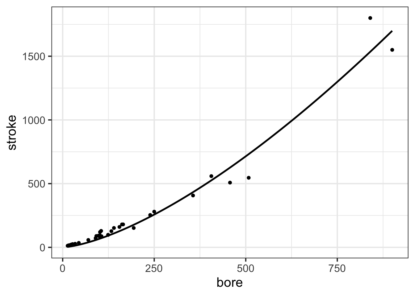
We will use just one graphical format for displaying data: the point plot. In a point plot, also known as a “scatterplot,” two variables are displayed, one on each graphical axis. Each case is presented as a dot, whose horizontal and vertical coordinates are the values of the variables for that case. For instance:
stroke and bore. Each individual point is one row of the data frame
Later in MOSAIC Calculus, we will discuss ways to construct functions that are a good match to data using the pattern-book functions. Here, our concern is graphing such functions on top of a point plot. So, without explanation (until later chapters), we will construct a power-law function, called, stroke(bore), that might be a good match to the data. The we will add a second layer to the point-plot graphic: a slice-plot of the function we’ve constructed.
stroke() fitted to the data.
The second layer is made with an ordinary slice_plot() command. To place it on top of the point plot we connect the two commands with a bit of punctuation called a “pipe”: |>.
The pipe punctuation can never go at the start of a line. Usually, we will use the pipe at the very end of a line; think of the pipe as connecting one line to the next.
slice_plot() is a bit clever when it is used after a previous graphics command. Usually, you need to specify the interval of the domain over which you want to display the function, as with …
slice_plot(stroke_model(bore) ~ bore, domain(bore=0:1000))
You can do that also when slice_plot() is the second layer in a graphics command. But slice_plot() can also infer the interval of the domain from previous layers as in …
In previous chapters, you have seen tilde expressions in use for two purposes:
g <- makeFun(a*x + b ~ x)slice_plot(stroke(bore) ~ bore)This chapter expands the use of tilde expressions to two new tasks:
gf_point(stroke ~ bore)fitModel(stroke ~ A*bore^b, data=Engines)There is an important pattern shared by all these tasks. In the tilde expression, the output is on the left-hand side of ~ while the inputs are on the right-hand side. That is:
function output  input(s)
For historical reasons, mathematics and data science/statistics use different terms. In data science, the terms “response” and “explanatory” are used instead of “input” and “output.”
response variable explanatory variable(s)
In the tilde expression for fitModel() used above, the response variable is stroke while the explanatory variable is named in the RHS of the expression. As it happens, in fitModel() the RHS needs to do double duty: (1) name the explanatory variables (2) specify the formula for the function produced by fitModel().
It is helpful to think of functions, generally, as a sort of data storage and retrieval device that uses the input value to locate the corresponding output and return that output to the user. Any device capable of this, such as a table or graph with a human interpreter, is a suitable way of implementing a function.
To reinforce this idea, we ask you to imagine a long corridor with a sequence of offices, each identified by a room number. The input to the function is the room number. To evaluate the function for that input, you knock on the appropriate door and, in response, you will receive a piece of paper with a number to take away with you. That number is the output of the function.
This will sound at first too simple to be true, but … In a mathematical function each office gives out the same number every time someone knocks on the door. Obviously, being a worker in such an office is highly tedious and requires no special skill. Every time someone knocks on the worker’s door, he or she writes down the same number on a piece of paper and hands it to the person knocking. What that person will do with the number is of absolutely no concern to the office worker.
The reader familiar with floors and corridors and office doors may note that the addresses are discrete. That is, office 321 has offices 320 and 322 as neighbors. But Calculus is mainly about functions with a continuous domain.
Fortunately, it is easy to create a continuous function out of a discrete table by adding on a small, standard calculation called “interpolation.” The simplest form, called “linear interpolation,” works like this: for an input of, say, 321.487… the messenger goes to both office 321 and 322 and collects their respective outputs. Let’s imagine that they are -14.3 and 12.5 respectively. All that is needed is a small calculation, which in this case will look like \[-14.3 \times (1 - 0.487...) + 12.5 \times 0.487...\]
sec-splines introduces a modern, sophisticated form of interpolation that makes smooth functions.