Chapter 7 Model Formulas and Coefficients
All economical and practical wisdom is an extension or variation of the following arithmetical formula: 2 + 2 = 4. Every philosophical proposition has the more general character of the expression a + b = c. We are mere operatives, empirics, and egotists, until we learn to think in letters instead of figures. – Oliver Wendell Holmes, Jr. (1841-1935), jurist
The previous chapter presents models as graphs. The response variable is plotted on the vertical axis and one of the explanatory variables on the horizontal axis. Such a visual depiction of a model is extremely useful, when it can be made. In such a graph, the relationship between the response and explanatory variables can be seen as slopes or differences; interactions can be seen as differences between slopes; the match or mismatch between the data and the model can be visualized easily.
A graph is also a useful mode of communicating; many people have the graph-reading skills needed to interpret the sorts of models in the previous chapter, or, at least, to get an impression of what the models are about.
Presenting models via a graph is, regrettably, very limiting. The sorts of models that can be graphed effectively have only one or two explanatory variables, whereas often models need many more explanatory variables. (There are models with thousands of explanatory variables, but even a model with only three or four explanatory variables can be impossible to graph in an understandable way.) Even when a model is simple enough to be graphed, it’s helpful to be able to quantify the relationships. Such quantification becomes crucial when you want to characterize the reliability of a model or draw conclusions about the strength of the evidence to support the claim of a relationship shown by a model.
This chapter introduces important ways to present models in a non-graphical way as formulas and as coefficients.
7.1 The Linear Model Formula
Everyone who takes high-school algebra encounters this equation describing a straight-line relationship:
y = m x + b
The equation is so familiar to many people that they automatically make the following associations: x and y are the variables, m is the slope of the line, b is the y-intercept – the place the line crosses the y axis.
The straight-line equation is fundamental to statistical modeling, although the nomenclature is a little different. To illustrate, consider this model of the relationship between an adult’s height and the height of his or her mother, based on Galton’s height data.
height = 46.7 + 0.313 mother
The italics around the variable name height is meant to indicate that it is the output of a model.
This is a model represented not as a graph but as a model formula. Just reading the model in the same way as y = mx + b shows that the intercept is 46.7 and the slope is 0.313. That is, if you make a graph of the model values of the response variable height (of the adult child) against the values of the explanatory variable mother, you will see a straight line with that slope and that intercept.
To find the model value given by the formula, just plug in numerical values for the explanatory variable. So, according to the formula, a mother who is 65 inches tall will have children with a typical height of 46.7 + 0.313 × 65, giving height = 67.05 inches.
You can also interpret the model in terms of the relationship between the child’s height and the mother’s height. Comparing two mothers who differ in height by one inch, their children would typically differ in height by 0.313 inches.
In the design language, the model is specified like this:
height ~ 1 + mother
There is a simple correspondence between the model design and the model formula. The model formula takes each of the terms in the model design and multiplies it by a number. The intercept term is multiplied by 46.7 and the mother term is multiplied by 0.313. Such numbers have a generic name: model coefficients. Instead of calling 0.313 the “slope,” it’s called the “coefficient on the term mother.” Similarly, 46.7 could be the “coefficient on the intercept term,” but it seems more natural just to call it the intercept.
Where did these precise values for the coefficients come from? A process called fitting the model to the data finds coefficients that bring the model values from the formula to correspond as closely as possible to the response values in the data. As a result, the coefficients that result from fitting a given model design will depend on the data to which the model is fitted. Chapter 8 describes the fitting process in more detail.
7.2 Linear Models with Multiple Terms
It’s easy to generalize the linear model formula to include more than one explanatory variable or additional terms such as interactions. For each term, just add a new component to the formula. For example, suppose you want to model the child’s height as a function of both the mother’s and the father’s height. As a model design, take
height ~ 1 + mother + father
Here is the model formula for this model design fitted to Galton’s data:
height = 22.3 + 0.283 mother + 0.380 father
As before, each of the terms has its own coefficient. This same pattern of terms and coefficients can be extended to include as many variables as you like.
Interaction terms also fit into this framework. Suppose you want to fit a model with an interaction between the father’s height and the mother’s height. The model design is
height ~ 1 + mother + father + father:mother
For Galton’s data, the formula that corresponds to this design is
height = 132.3 - 1.43 mother - 1.21 father +
0.0247 father × mother
The formula follows the same pattern as before: a coefficient multiplying the value of each term. So, to find the model value of height for a child whose mother is 65 inches tall and whose father is 67 inches tall, multiply the coefficient by the value of corresponding term:
132.34 −1.429 × 65 − 1.206 × 67 + 0.0247 × 65 × 67
giving height = 66.1 inches. The term father × mother may look a little odd, but it just means to multiply the mother’s height by the father’s height.
Aside: Interpreting Interaction Terms
The numerics of interaction terms are easy. You just have to remember to multiply the coefficient by the product of all the variables in the term. The meaning of interaction terms is somewhat more difficult. Many people initially mistake interaction terms to refer to a relationship between two variables. For instance, they would (wrongly) think that an interaction between mother’s and father’s heights means that, say, tall mothers tend to be married to tall fathers. Actually, interaction terms do not describe the relationship between the two variables, they are about three variables: how one explanatory variable modulates the effect of another on the response.
A model like height ~ 1+mother+father captures some of how a child’s height varies with the height of either parent. The coefficient on mother (when fitting this model to Galton’s data) was 0.283, indicating that an extra inch of the mother’s height is associated with an extra 0.283 inches in the child. This coefficient on mother doesn’t depend on the father’s height; the model provides no room for it to do so.
Suppose that the relationship between the mother’s height and her child’s height is potentiated by the father’s height. This would mean that if the father is very tall, then the mother has even more influence on the child’s height than for a short father. That’s an interaction.
To see this sort of effect in a model, you have to include an interaction term, as in the model
height ~ 1+mother+father+mother:father.
The coefficients from fitting this model to Galton’s data allow you to compare what happens when the father is very short (say, 60 inches) to when the father is very tall (say, 75 inches). With a short father, an extra inch in the mother is associated with an extra 0.05 inches in the child. With a tall father, an extra inch in the mother is associated with an extra 0.42 inches in the child.
The interaction term can also be read the other way: the relationship between a father’s height and the child’s height is greater when the mother is taller.
Of course, this assumes that the model coefficients can be taken at face value as reliable. Later chapters will deal with how to evaluate the strength of the evidence for a model. It will turn out that Galton’s data do not provide good evidence for an interaction between mother’s and father’s heights in determining the child’s height.
7.3 Formulas with Categorical Variables
Since quantitative variables are numbers, they can be reflected in a model formula in a natural, direct way: just multiply the value of the model term by the coefficient on that term.
Categorical variables are a little different. They don’t have numerical values. It doesn’t mean anything to multiply a category name by a coefficient.
In order to include a categorical variable in a model formula, a small translation is necessary. Suppose, for example, that you want to model the child’s height by both its father’s and mother’s height and also the sex of the child. The model design is nothing new: just include a model term for sex.
height ~ 1 + mother + father + sex
The corresponding model formula for this design on the Galton data is
height = 15.3 + 0.322 mother + 0.406 father + 5.23 sexM
Interpret the quantitative terms in the ordinary way. The new term, 5.23 sexM, means “add 5.23 whenever the case has level M on sex.” This is a very roundabout way of saying that males tend to be 5.23 inches taller than females, according to the model.
Another way to think about the meaning of sexM is that it is a new quantitative variable, called an indicator variable, that has the numeric value 1 when the case is level M in variable sex, and numeric value 0 otherwise.
A categorical variable will have one indicator variable for each level of the variable. Thus, a variable language with levels Chinese, English, French, German, Hindi, etc. has a separate indicator variable for each level.
For the sex variable, there are two levels: F and M. But notice that there is only one coefficient for sex, the one for sexM. Get used to this. Whenever there is an intercept term in a model, at least one of the indicator variables from any categorical variable will be left out. The level that is omitted is a reference level. Chapter 8 explains why things are done this way.
7.4 Coefficients and Relationships
One important purpose for constructing a model is to study the relationships implied by your data between the explanatory variables and the response. Measurement of the size of a relationship, often called the effect size, is based on comparing changes.
To illustrate, consider again this model of height:
height = 15.3 + 0.322 mother + 0.406 father + 5.23 sexM
What’s the relationship between height and father? One way to answer this question is to pose a hypothetical situation. Suppose that the value of father changed by one unit – that is, the father got taller. How much would this change the model value of height.
Working through the arithmetic of the formula shows that a one-inch increase in father leads to a 0.406 increase in the model value of height. That’s a good way to describe the size of the relationship.
Similarly, the formula indicates that a 1 inch change in mother will correspond to a 0.322 increase in the model value of height.
More generally, the size of a relationship between a quantitative explanatory variable and the quantitative response variable is measured using a concept from calculus: the derivative of the response variable with respect to the explanatory variable. For those unfamiliar with calculus, the derivative reflects the same idea as above: making a small change in the explanatory variable and seeing how much the model value changes.
For categorical explanatory variables, such as sex, the coefficient on each level indicates how much difference there is in the model value between the reference level and the level associated with the coefficient. In the above model, the reference level is F, so the coefficient 5.23 on sexM means that the model value for M is 5.23 inches larger than for F; more simply stated, males are, according to the model, 5.23 inches taller than females. To avoid leading to a mis-interpretation, it’s better to say that the model formula indicates that males are, on average, 5.23 inches taller than females.
The sign of a coefficient tells which way the relationship goes. If the coefficient on sexM had been −5.23, it would mean that males are typically shorter than females. If the coefficient on mother had been −0.322, then taller mothers would have shorter children.
When there is an interaction or a transformation term in a model, the effect size cannot be easily read off as a single coefficient. Those familiar with calculus may recognize the connection to the partial derivative in this approach of comparing model values due to a change of inputs. Chapter 10 will consider the issues in more detail, particularly the matter of holding constant other variables or adjusting for other variables.
7.5 Model Values and Residuals
If you plug in the values of the explanatory variables from your data, the model formula gives, as an output, the model values. It’s rarely the case that the model values are an exact match with the actual response variable in your data. The difference is the residual.
For any one case in the data, the residual is always defined in terms of the actual response variable and the model value that arises when that case’s values for the explanatory variables are given as the input to the model formula. For instance, if you are modeling height, the residuals are
height = height + residuals
The residuals are always defined in terms of a particular data set and a particular model. Each case’s residual would likely change if the model were altered or if another data set were used to fit the model.
7.6 Coefficients of Basic Model Designs
The presentation of a linear model as a set of coefficients is a compact shorthand for the complete model formula. It often happens that for some purposes, interest focuses on a single coefficient of interest. In order to help you to interpret coefficients correctly, it is helpful to see how they relate to some basic model designs. Often, the interpretation for more complicated designs is not too different.
To illustrate how basic model designs apply generally, I will use A to stand for a generic response variable, B to stand for a quantitative explanatory variable, and G for a categorical explanatory variable. As always, 1 refers to the intercept term.
Model A ~ 1
The model A ~ 1 is the simplest of all. There are no explanatory variables; the only term is the intercept. Think of this model as saying that all the cases are the same. In fitting the model, you are looking for a single value that is as close as possible to each of the values in A.
The coefficient from this model is the mean of A. The model values are the same for every case: the mean of all the samples. This is sometimes called the grand mean to distinguish it from group means, the mean of A for different groups.
Example: The mean height of all the cases in Galton’s height data – the “grand mean” – is the coefficient on the model height ~ 1. Fitting this model to Galton’s data gives this coefficient:
| Model term | Coefficient |
|---|---|
| Intercept | 66.7607 |
Thus, the mean height is 66.76 inches.
Example: The mean wage earned by all of the people in the Current Population Survey is given by the coefficient of the model wage ~ 1. Fitting the model to the CPS gives:
| Model term | Coefficient |
|---|---|
| Intercept | 9.024 |
Thus, the mean wage is $9.02 per hour.
Model A ~ 1 + G
The model A ~ 1 + G is also very simple. The categorical variable G can be thought of as dividing the data into groups, one group for each level of G. There is a separate model value for each of the groups.
The model values are the group-wise means: separate means of A for the cases in each group. The model coefficients, however, are not exactly these group-wise means. Instead, the coefficient of the intercept term is the mean of one group, which can be called the reference group or reference level. Each of the other coefficients is the difference between its group’s mean and the mean of the reference group.
Example Calculate the group-wise means of the heights of men and women in Galton’s data by fitting the model height ~ sex.
| Model term | Coefficient |
|---|---|
| Intercept | 64.11 |
sexM |
5.12 |
The mean height for the reference group, women, is 64.11 inches. Men are taller by 5.12 inches. In the standard form of a model report, the identity of the reference group is not stated explicitly. You have to figure it out from which levels of the variable are missing.
By suppressing the intercept term, you change the meaning of the remaining coefficients; they become simple group-wise means rather than the difference of the mean from a reference group’s mean. Here’s the report from fitting the model height ~ sex - 1.
| Model term | Coefficient |
|---|---|
sexF |
64.11 |
sexM |
69.23 |
It might seem obvious that this simple form is to be preferred, since you can just read off the means without doing any arithmetic on the coefficients. That can be the case sometimes, but almost always you will want to include the intercept term in the model. The reasons for this will become clearer when hypothesis testing is introduced in later chapters.
Example: Calculate group-wise means of wages in the different sectors of the economy by fitting the model wage ~ sector:
| Model Term | Coefficient |
|---|---|
| Intercept | 7.42 |
sectorconst |
2.08 |
sectormanag |
4.69 |
sectormanuf |
0.61 |
sectorother |
1.08 |
sectorprof |
4.52 |
sectorsales |
0.17 |
sectorservice |
−0.89 |
There are eight levels of the sector variable, so the model has 8 coefficients. The coefficient of the intercept term gives the group-wise mean of the reference group. The reference group is the one level that isn’t listed explicitly in the other coefficients; it turns out to be the clerical sector. So, the mean wage of clerical workers is $7.42 per hour. The other coefficients give the difference between the mean of the reference group and the means of other groups. For example, workers in the construction sector make, on average $2.08 per hour more than clerical workers. Similarly, service sector works make 89 cents per hour less than clerical workers.
Model A ~ 1 + B
Model A ~ 1 + B is the basic straight line relationship. The two
coefficients are the intercept and the slope of the line. The slope
tells what change in A corresponds to a one-unit change in B.
Example: The model wage ~ 1 + educ shows how workers wages are different for people with different amounts of education (as measured by years in school). Fitting this model to the Current Population Survey data gives the following coefficients:
| Model Term | Coefficient |
|---|---|
| Intercept | −0.69 |
educ |
0.74 |
According to this model, a one-year increase in the amount of education that a worker received is associated with a 74 cents per hour increase in wages. (Remember, these data are from 1985.)
It may seem odd that the intercept coefficient is negative. Nobody is paid a negative wage. Keep in mind that the intercept of a straight line y = m x + b refers to the value of y when x=0. The intercept coefficient −0.69, tells the typical wage for workers with zero years of education. There are no workers in the data set with zero years; only three workers have less than five years. In this data set, the intercept is an extrapolation outside of the range of the data.
Model A ~ 1 + G + B
The model A ~ 1 + G + B gives a straight-line relationship between A and B, but allows different lines for each group defined by G. The lines are different only in their intercepts; all of the lines have the same slope.
The coefficient labeled “intercept” is the intercept of the line for the reference group. The coefficients on the various levels of categorical variable G reflect how the intercepts of the lines from those groups differ from the reference group’s intercept.
The coefficient on B gives the slope. Since all the lines have the same slope, a single coefficient will do the job.
Example: Wages versus educational level for the different sexes:
wage ~ 1 + educ + sex
The coefficients are
| Model term | Coefficient |
|---|---|
| Intercept | −1.92773 |
sexM |
2.27 |
educ |
0.74 |
The educ coefficient tells how education is associated with
wages. The sexM coefficient says that men tend to
make $2.27 more an hour than women when comparing men and women with
the same amount of education. Chapter 10
will explain why the inclusion of the educ term allows this
comparison at the same level of education.
Note that the model A ~ 1 + G + B is the same as the model
A ~ 1 + B + G. The order of model terms doesn’t make a difference.
Model A ~ 1 + G + B + G:B
The model A ~ 1 + G + B + G:B is also a straight-line model, but now the different groups defined by G can have different slopes and different intercepts. (The interaction term G:B says how the slopes differ for the different group. That is, thinking of the slope as effect of B on A, the interaction term G:B tells how the effect of B is modulated by different levels of G.)
Example: Here is a model describing wages versus educational level, separately for the different sexes: wage ~ 1 + sex + educ + sex:educ
| Model term | Coefficient |
|---|---|
| Intercept | −3.10 |
sexM |
4.20 |
educ |
0.83 |
sexM:educ |
−0.15 |
Interpreting these coefficients: For women, an extra year of education is associated with an increase of wages of 83 cents per hour. For men, the relationship is weaker: an increase in education of one year is associated with only an increase of wages of only 0.831 − 0.148 = 68 cents per hour.
7.7 Coefficients have Units
A common convention is to write down coefficients and model formulas without being explicit about the units of variables and coefficients. This convention is unfortunate. Although leaving out the units leads to neater tables and simpler-looking formulas, the units are fundamental to interpreting the coefficients. Ignoring the units can mislead severely.
To illustrate how units come into things, consider the model design wages ~ 1 + educ + sex. Fitting this model design to the Current Population Survey gives this model formula:
wage = −1.93 + 0.742 educ + 2.27 sexM
A first glance at this formula might suggest that sex is more strongly related than educ to wage. After all, the coefficient on educ is much smaller than the coefficient on sexM. But this interpretation is invalid, since it doesn’t take into account the units of the variables or the coefficients.
The response variable, wage, has units of dollars-per-hour. The explanatory variable educ has units of years. The explanatory variable sex is categorical and has no units; the indicator variables for sex are just zeros and ones: pure numbers with no units.
The coefficients have the units needed to transform the quantity that they multiply into the units of the response variable. So, the coefficient on educ has units of “dollars-per-hour per year.” This sounds very strange at first, but remember that the coefficient will multiply a quantity that has units of years, so the product will be in units of dollars-per-hour, just like the wage variable. In this formula, the units of the intercept coefficient and the coefficient on sexM both have units of dollars-per-hour, because they multiply something with no units and need to produce a result in terms of dollars-per-hour.
A person who compares 0.742 dollars-per-hour per year with 2.27 dollars per hour is comparing apples and oranges, or, in the metric-system equivalent, comparing meters and kilograms. If the people collecting the data had decided to measure education in months rather than in years, the coefficient would have been a measly 0.742/12 = 0.0618 even though the relationship between education and wages would have been exactly the same.
Aside: Comparing Coefficients
Coefficients and effect sizes have units. This imposes a difficulty in comparing the effect sizes of different variables. For instance, suppose you want to know whether sex or educ has a stronger effect size on wage. The effect size of sex will have units of dollars per hour, while the effect size of educ has units of dollars per hour per year. To compare the two coefficients 0.742 and 2.27 is meaningless – apples and oranges, as they say.
In order for the comparison to be meaningful, you have to put the effect sizes on a common footing. One approach that might work here is to find the number of years of education that produces a similar size effect of education on wages as is seen with sexM. The answer turns out to be about 3 years. (To see this, note that the wage gain associated with sexM, 2.27 dollars per hour to the wage gain associated with three years of education, 3 × 0.742 = 2.21 dollars per hour.)
Thus, according to the model of these data, being a male is equivalent in wage gains to an increase of 3 years in education.
7.8 Untangling Explanatory Variables
One of the advantages of using formulas to describe models is the way they facilitate using multiple explanatory variables. Many people assume that they can study relationships one variable at a time, even when they know there are influences from multiple factors. Underlying this assumption is a belief that influences add up in a simple way. Indeed model formulas without interaction terms actually do simply add up the contributions of each variable.
But this does not mean that an explanatory variable can be considered in isolation from other explanatory variables. There is something else going on that makes it important to consider the explanatory variables not one at a time but simultaneously, at the same time.
In many situations, the explanatory variables are themselves related to one another. As a result, variables can to some extent stand for one another. An effect attributed to one variable might equally well be assigned to some other variable.
Due to the relationships between explanatory variables, you need to untangle them from one another. The way this is done is to use the variables together in a model, rather than in isolation. The way the tangling shows up is in the way the coefficient on a variable will change when another variable is added to the model or taken away from the model. That is, model coefficients on a variable tend to depend on the context set by other variables in the model.
Example: To illustrate, consider this criticism of spending on public education in the United States from a respected political essayist:
The 10 states with the lowest per pupil spending included four – North Dakota, South Dakota, Tennessee, Utah – among the 10 states with the top SAT scores. Only one of the 10 states with the highest per pupil expenditures – Wisconsin – was among the 10 states with the highest SAT scores. New Jersey has the highest per pupil expenditures, an astonishing $10,561, which teachers’ unions elsewhere try to use as a negotiating benchmark. New Jersey’s rank regarding SAT scores? Thirty-ninth… The fact that the quality of schools… [fails to correlate] with education appropriations will have no effect on the teacher unions’ insistence that money is the crucial variable. – George F. Will, The Washington Post, Sept. 12, 1993, C7. Quoted in (Guber 1999).
The response variable here is the score on a standardized test taken by many students finishing high school: the SAT. The explanatory variable – there is only one – is the level of school spending. But even though the essayist implies that spending is not the “crucial variable,” he doesn’t include any other variable in the analysis. In part, this is because the method of analysis – pointing to individual cases to illustrate a trend – doesn’t allow the simultaneous consideration of multiple explanatory variables. (Another flaw with the informal method of comparing cases is that it fails to quantify the strength of the effect: Just how much negative influence does spending have on performance? Or is the claim that there is no connection between spending and performance?)
You can confirm the claims in the essay by modeling. The SAT dataset contains state-by-state information from the mid-1990s on per capita yearly school expenditures in thousands of dollars, average statewide SAT scores, average teachers’ salaries, and other variables.(Guber 1999)
The analysis in the essay corresponds to a simple model: sat ~ 1 + expend. Fitting the model to the state-by-state data gives a model formula,
sat = 1089 - 20.9 expend
The formula is consistent with the claim made in the essay; the coefficient on expend is negative. According to the model, an increase in expenditures by $1000 per capita is associated with a 21 point decrease in the SAT score. That’s not very good news for people who think society should be spending more on schools: the schools that spend the least per capita have the highest average SAT scores. (A 21 point decrease in the SAT doesn’t mean much for an individual student, but as an average over tens of thousands of students, it’s a pretty big deal.)
Perhaps expenditures is the wrong thing to look at – you might be studying administrative inefficiency or even corruption. Better to look at teachers’ salaries. Here’s the model
sat ~ 1 + salary,
where salary is the average annual salary of public school teachers in $1000s. Fitting the model gives this formula:
sat = 1159 - 5.54 salary
The essay’s claim is still supported. Higher salaries are associated with lower average SAT scores! But maybe states with high salaries manage to pay well because they overcrowd classrooms. So, look at the average student/teacher ratio in each state: sat ~ 1 + ratio
sat = 921 + 2.68 ratio
Finally, a positive coefficient! That means … larger classes are associated with higher SAT scores.
All this goes against the conventional wisdom that holds that higher spending, higher salaries, and smaller classes will be associated with better performance.
At this point, many advocates for more spending, higher salaries, and smaller classes will explain that you can’t measure the quality of an education with a standardized test, that the relationship between a student and a teacher is too complicated to be quantified, that students should be educated as complete human beings and not as test-taking machines, and so on. Perhaps.
Whatever the criticisms of standardized tests, the tests have the great benefit of allowing comparisons across different conditions: different states, different curricula, etc. If there is a problem with the tests, it isn’t standardization itself but the material that is on the test. Absent a criticism of that material, rejections of standardized testing ought to be treated with considerable skepticism.
But there is something wrong with using the SAT as a test, even if the content of the test is good. What’s wrong is that the test isn’t required for all students. Depending on the state, a larger or smaller fraction of students will take the SAT. In states where very few students take the SAT, those students who do are the ones bound for out-of-state colleges, in other words, the high performers.
What’s more, the states which spend the least on education tend to have the fewest students who take the SAT. That is, the fraction of students taking the SAT is entangled with expenditures and other explanatory variables.
To untangle the variables, they have to be included simultaneously in a model. That is, in addition to expend or salary or ratio, the model needs to take into account the fraction of students who take the SAT (variable frac).
Here are three models that attempt to untangle the influences of frac and the spending-related variables:
sat = 994 + 12.29 expend - 2.85 frac
sat = 988 + 2.18 salary - 2.78 frac
sat = 1119 - 3.73 ratio - 2.55 frac
In all three models, including frac has completely altered the relationship between performance and the principal explanatory variable of interest, be it expend, salary, or ratio. Not only is the coefficient different, it is different in sign.
Chapter 10 discusses why adding frac to the model can be interpreted as an attempt to examine the other variables while holding frac constant, as if you compared only states with similar values of frac.
The situation seen here, where adding a new explanatory variable (e.g., frac) changes the sign of the coefficient on another variable (e.g., expend, salary, ratio) is called Simpson’s paradox.
Simpson’s Paradox is an extreme version of a common situation: that the coefficient on an explanatory variable can depend on what other explanatory variables have been included in the model. In other words, the role of an explanatory variable can depend, sometimes strongly, on the context set by other explanatory variables. You can’t look at explanatory variables in isolation; you have to interpret them in context.
But which is the right model? What’s the right context? Do expend, salary, and ratio have a positive role in school performance as the second set of models indicate, or should you believe the first set of models? This is an important question and one that comes up often in statistical modeling. At one level, the answer is that you need to be aware that context matters. At another level, you should always check to see if your conclusions would be altered by including or excluding some other explanatory variable. At a still higher level, the choice of which variables to include or exclude needs to be related to the modeler’s ideas about what causes what.
Aside: Interaction terms and partial derivatives
The mathematically oriented reader may recall that one way to describe the effect of one variable on another is a partial derivative: the derivative of the response variable with respect to the explanatory variable. The interaction – how one explanatory variable modulates the effect of another on the response variable – corresponds to a mixed second-order partial derivative. Writing the response as z and the explanatory variables as x and y, the interaction corresponds to ∂²z/∂x∂y which is exactly equal to ∂²z/∂y∂x. That is, the way that x modulates the effect of y on z is the same thing as the way that y modulates the effect of x on z.
7.9 Why Linear Models?
Many people are uncomfortable with using linear models to describe potentially complicated relationships. The process seems a bit unnatural: specify the model terms, fit the model to the data, get the coefficients. How do you know that a model fit in this way will give a realistic match to the data? Coefficients seem an overly abstract way to describe a relationship. Modeling without graphing seems like dancing in the dark; it’s nice to be able to see your partner.
Return to the example of world record swim times plotted in Figure 6.6. There’s a clear curvature to the relationship between record time and year. Without graphing the data, how would you have known whether to put in a transformation term? How would you know that you should use sex as an explanatory variable? But when you do graph the data, you can see easily that something is wrong with a straight-line model like time ~ 1 + year.
However, the advantages of graphing are obvious only in retrospect, once you have found a suitable graph that is informative. Why graph world record time against year? Why not graph it versus body weight of the swimmer or the latitude of the pool in which the record was broken?
Researchers decide to collect some variables and not others based on their knowledge and understanding of the system under study. People know, for example, that world records can only get better over the years. This may seem utterly obvious but it is nonetheless a bit of expert knowledge. It is expert knowledge that makes year an obvious explanatory variable. In general, expert knowledge comes from experience and education rather than data. It’s common knowledge, for example, that in many sports, separate world records are kept for men and women. This feature of the system, obvious to experts, makes sex a sensible choice as an explanatory variable.
When people use a graph to look at how well a model fits data, they tend to look for a satisfyingly snug replication of the details. In Chapter 6 a model was shown of the relationship between monthly natural gas usage in a home and the average outdoor temperature during the month. Figure 7.1 shows that model along with a straight-line model. Which do you prefer? Look at the model in the top panel. That’s a nice looking model! The somewhat irregular curve seems like a natural shape, not a rigid and artificial straight line like the model in the bottom panel.
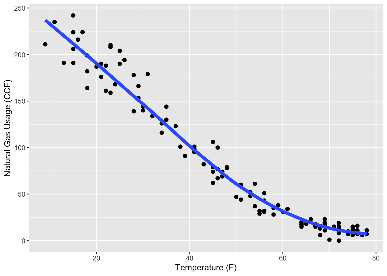
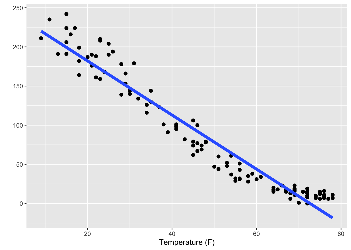
Figure 7.1: Two models of natural gas usage versus outdoor temperature.
Yet how much better is the curved model than the straight-line model? The straight-line model captures an important part of the relationship between natural gas usage and outdoor temperature: that colder temperatures lead to more usage. The overall slopes of the two models are very similar. The biggest discrepancy comes at warm temperatures, above 65°F. But people who know about home heating can tell you that above 65°F, homes don’t need to be heated. At those temperatures gas usage is due only to cooking and water heating: a very different mechanism. To study heating, you should use only data for fairly low temperatures, say below 65°F. To study two different mechanisms – heating at low temperatures and no heating at higher temperatures – you should perhaps construct two different models, perhaps by including an interaction between temperature as a quantitative variable and a categorical variable that indicates whether the temperature is above 65°.
Humans are powerful pattern recognition machines. People can easily pick out faces in a crowd, but they can also pick out faces in a cloud or on the moon. The downside to using human criteria to judge how well a model fits data is the risk that you will see patterns that aren’t warranted by the data.
To avoid this problem, you can use formal measures of how well a model fits the data, measures based on the size of residuals and that take into account chance variations in shape. Much of the rest of the book is devoted to such measures.
With the formal measures of fit, a modeler has available a strategy for finding effective models. First, fit a model that matches, perhaps roughly, what you know about the system. The straight-line model in the right panel of Figure 7.1 is a good example of this. Check how good the fit is. Then, try refining the model, adding detail by including curvy transformation terms. Check the fit again and see if the improvement in the fit goes beyond what would be expected from chance.
A reasonable strategy is to start with model designs that include only main terms for your explanatory variables (and, of course, the intercept term, which is to be included in almost every model). Then add in some interaction terms, see if they improve the fit. Finally, you can try transformation terms to capture more detail.
Most of the time you will find that the crucial decision is which explanatory variables to include. Since it’s difficult to graph relationships with multiple explanatory variables, the benefits of making a snug fit to a single variable are illusory.
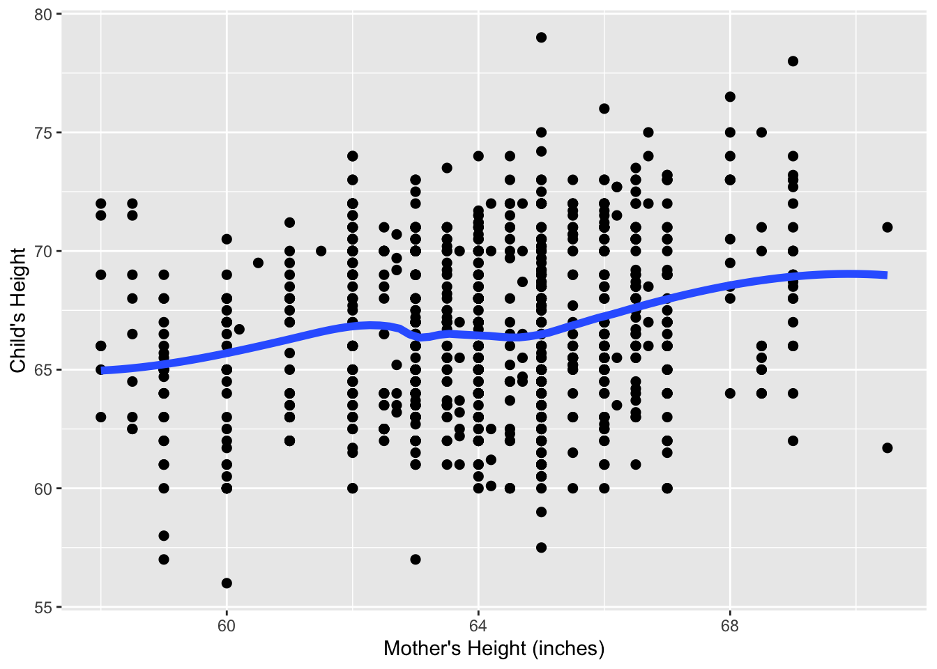
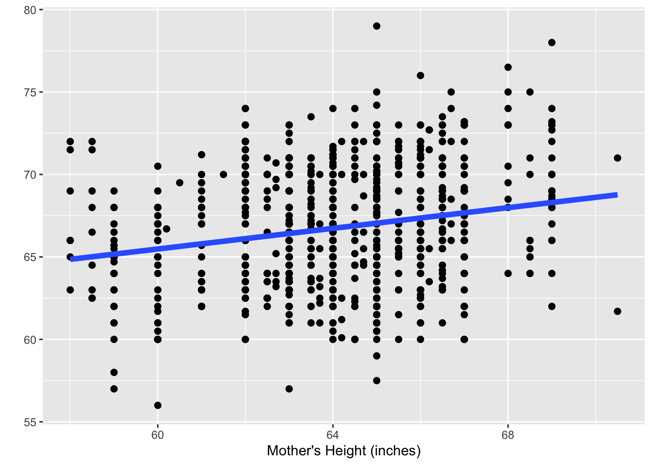
Figure 7.2: Two models of child’s height as an adult versus mother’s height.
Often the relationship between an explanatory variable and a response is rather loose. People, as good as they are at recognizing patterns, aren’t effective at combining lots of cases to draw conclusions of overall patterns. People can have trouble seeing for forest for the trees. Figure 7.2 shows Galton’s height data: child’s height plotted against mother’s height. It’s hard to see anything more than a vague relationship in the cloud of data, but it turns out that there is sufficient data here to justify a claim of a pretty precise relationship. Use your human skills to decide which of the two models in Figure 7.2 is better. Pretty hard to decide, isn’t it! Decisions like this are where the formal methods of linear models pay off. Start with the straight-line terms then see if elaboration is warranted.
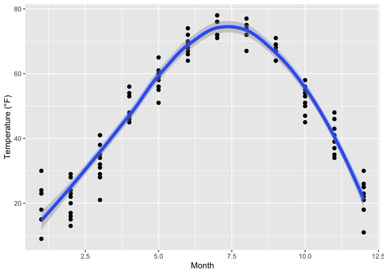
Figure 7.3: Temperature usage versus Month has a relationship that can’t be captured by a straight-line model.
There are, however, some situations when you can anticipate that straight-line model terms will not do the job. For example, consider temperature versus month in a strongly seasonal climate: temperature goes up and then down as the seasons progress. Or consider the relationship between college grades and participation in extra-curricular activities such as school sports, performances, the newspaper, etc. There’s reason to believe that some participation in extra-curricular activities is associated with higher grades. This might be because students who are doing well have the confidence to spend time on extra-curriculars. But there’s also reason to think that very heavy participation takes away from the time students need to study. So the overall relationship between grades and participation might be Λ-shaped. Relationships that have a V- or Λ-shape won’t be effectively captured by straight-line models; transformation terms and interaction terms will be required.