Chapter 9 Correlation and Partitioning of Variance
The invalid assumption that correlation implies cause is probably among the two or three most serious and common errors of human reasoning. – Stephen Jay Gould (1941-2002), paleontologist and historian of science
“Co-relation or correlation of structure” is a phrase much used … but I am not aware of any previous attempt to define it clearly, to trace its mode of action in detail, or to show how to measure its degree. – Francis Galton (1822-1911), statistician
Chapters 4 and 8 introduced the idea of partitioning the variance of the response variable into two parts: the variance of the fitted model values and the variance of the residuals. This partitioning is at the heart of a statistical model; the more of the variation that’s accounted for by the model, the less is left in the residuals.
The partition property of the variance offers a simple way to summarize a model: the proportion of the total variation in the response variable that is accounted for by the model. This description is called the R² (“R-Squared”) of the model. It is a ratio:
\[ R^2 = \frac{\mbox{variance of fitted model values}}{\mbox{variance of response values}}.\]
Another name for R² is the coefficient of determination , but this is not a coefficient in the same sense used to refer to a multiplier in a model formula.
9.1 Properties of R²
R² has a nice property that makes it easy to interpret: its value is always between zero and one. When R² = 0, the model accounts for none of the variance of the response values: the model is useless. When R² = 1, the model captures all of the variance of the response values: the model values are exactly on target. Typically, R² falls somewhere between zero and one, meaning that the model accounts for some, but not all, of the variance in the response values.
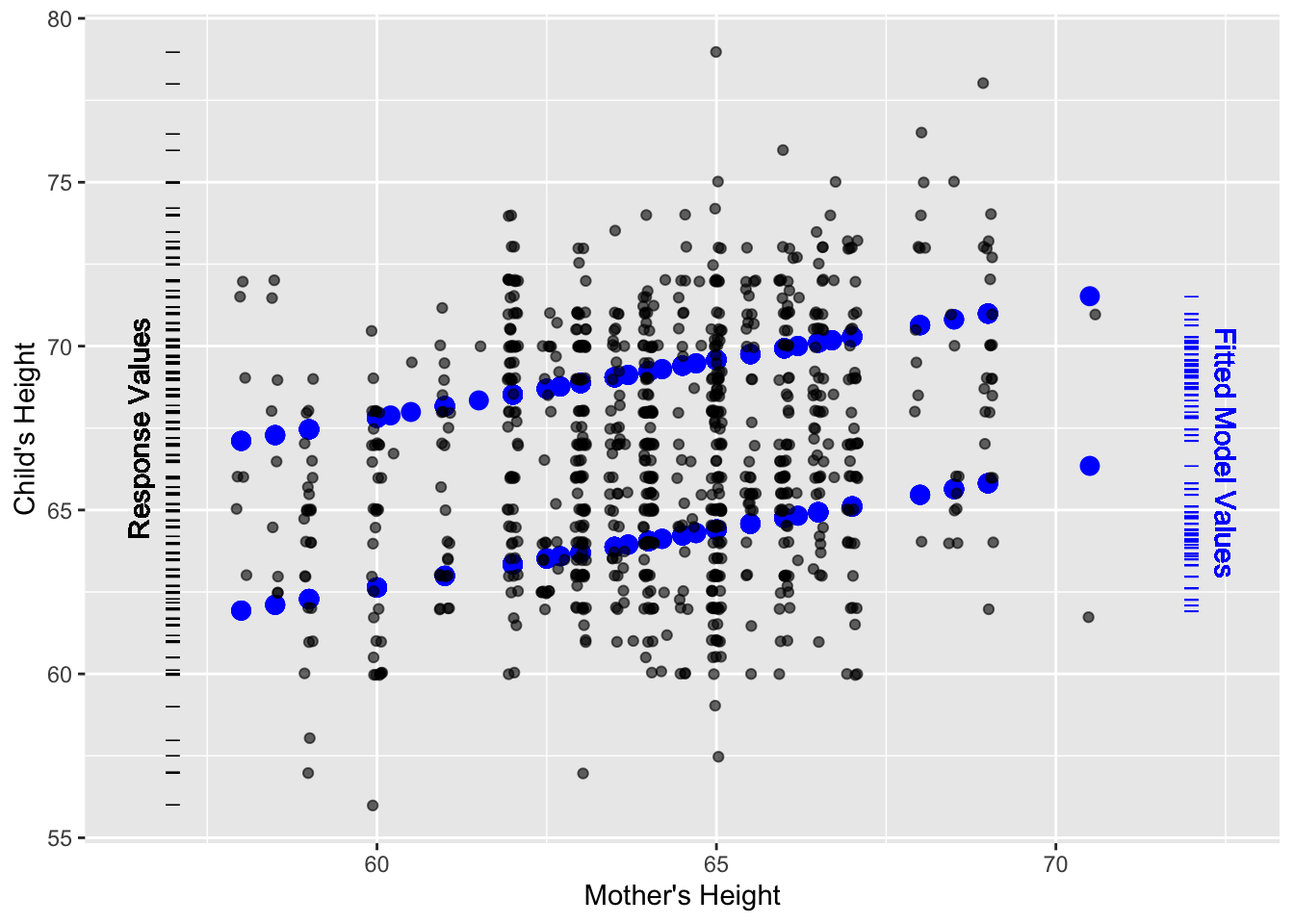
Figure 9.1: The small dots show child’s height versus mother’s height from Galton’s data. The bigger symbols show the fitted model values from the linear model height ~ 1 + mother + sex that includes both mother’s height and child’s sex as explanatory variables.
The history of R² can be traced to a paper(Galton 1888) presented to the Royal Society in 1888 by Francis Galton. It is fitting to illustrate R² with some of Galton’s data: measurements of the heights of parents and their children.
Figure 9.1 shows a scatter plot of the children’s height versus mother’s height. Also plotted are the fitted model values for the model height ~ mother + sex. The model values show up as two parallel lines, one for males and one for females. The slope of the lines shows how the child’s height typically varies with the mother’s height.
Two rug plots have been added to the scatter plot in order to show the distribution of the response values (child’s height) and the fitted model values (the output of the model). The rug plots are positioned vertically because each of them relates to the response variable height, which is plotted on the vertical axis.
The spread of values in each rug plot gives a visual indication of the variation. It’s evident that the variation in the response variable is larger than the variation in the fitted model values. The variance quantifies this. For height, the variance is 12.84 square-inches. (Recall that the units of the variance are always the square of the units of the variable.) The fitted model values have a variance of 7.21 square-inches. The model captures a little more than half of the variance; the R² statistic is
\[ R^2 = \frac{7.21}{12.84} = 0.56\]
One nice feature of R² is that the hard-to-interpret units of variance disappear; by any standard, square-inches is a strange way to describe height! Since R² is the ratio of two variances, the units cancel out. R² is unitless.
Example: Quantifying the capture of variation
Back in Chapter 6, a model of natural gas usage and a model of wages were presented. It was claimed that the natural gas model captured more of the variation in natural gas usage than the wage model captured in the hourly wages of workers. At one level, such a claim is absurd. How can you compare natural gas usage to hourly wages? If nothing else, they have completely different units.
R² is what enables this to be done. For any model, R² describes the fraction of the variance in the response variable that is accounted for by the model. Here are the R² for the two models:
wage~sex×married: R² = 0.07ccf~temp: R² = 0.91
Sex and marital status explain only a small fraction of the variation in wages. Temperature explains the large majority of the variation in natural gas usage (ccf).
9.2 Simple Correlation
The idea Galton introduced in 1888 is that the relationship between two variables – “co-relation” as he phrased it – can be described with a single number. This is now called the correlation coefficient , written r and pronounced r.
The correlation coefficient is still very widely used. Part of the reason for this is that the single number describes an important mathematical aspect of the relationship between two variables: the extent to which they are aligned or collinear .
The correlation coefficient r is the square root of R² for the simple straight-line model: response ~ explanatory variable. As with all square roots, there is a choice of negative or positive. The sign of the r is chosen to indicate the positive or negative slope of the model line.
It may seem very limiting, in retrospect, to define correlation in terms of such a simple model. But Galton was motivated by a wonderful symmetry involved in the correlation coefficient: the R² from the straight-line model of A versus B is the same as that from the straight-line model of B versus A. In this sense, the correlation coefficient describes the relationship between the two variables and not merely the dependence of one variable on another. Of course, a more modern perspective on relationships accepts that additional variables can be involved as well as interaction and transformation terms.
Example: Relationships without Correlation
Consider how the temperature varies over the course of the year. In most places, temperature changes predictably from month to month: a very strong relationship. Figure 9.2 shows data for several years of the average temperature in St. Paul, Minnesota (in the north-central US). Temperature is low in the winter months (January, February, December, months 1, 2, and 12) and high in the summer months (June, July, August, months 6, 7, and 8).
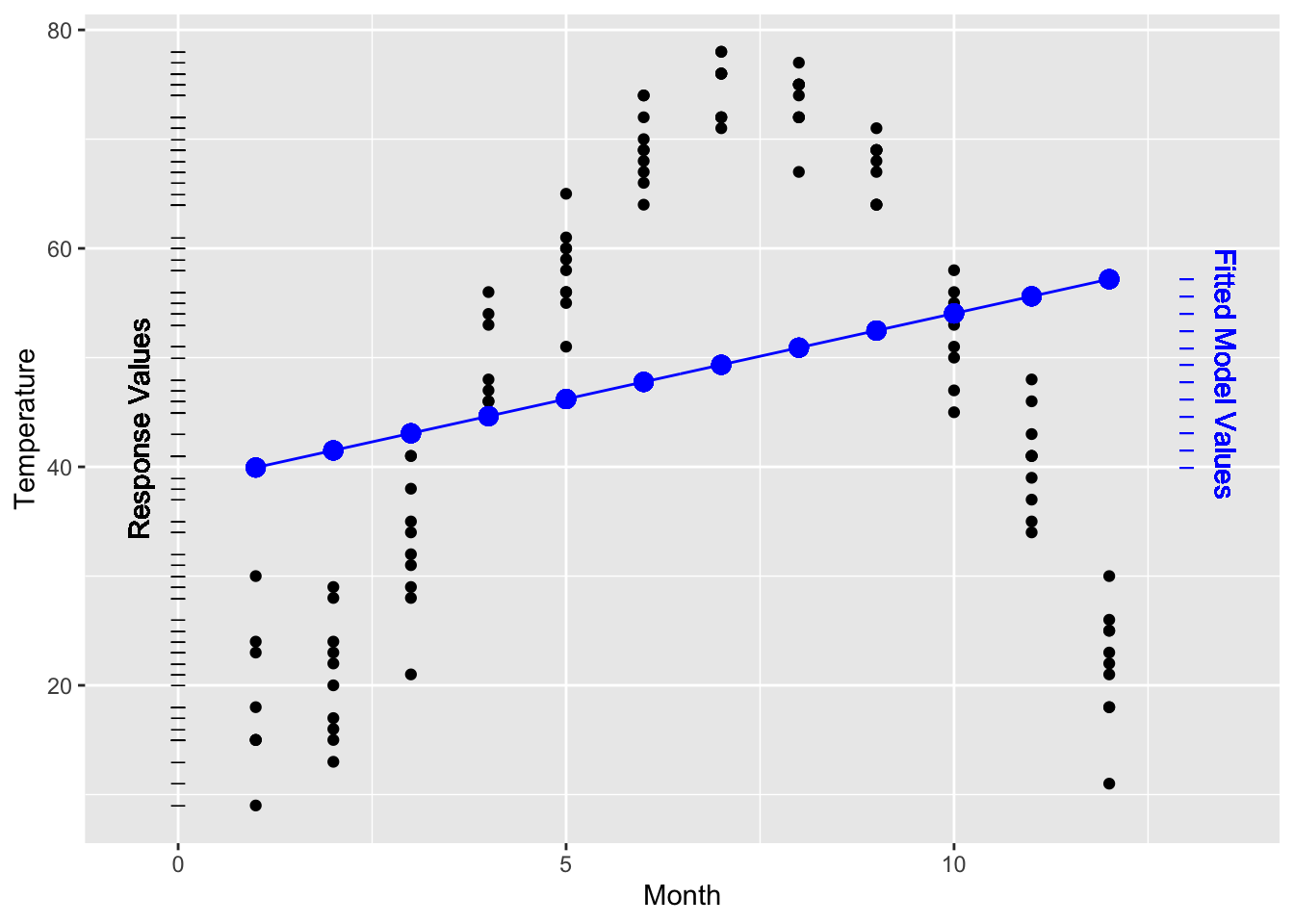
Figure 9.2: Temperature versus month in St. Paul, Minnesota, from the utilities dataset and a linear model of the data. The variance of the fitted model values is much smaller than the variance of the response values, producing a low R² = 0.0624.
The Figure also shows a very simple straight-line model: temperature ~ month. This model doesn’t capture very well the relationship between the two variables. Still, like any model, it has an R². Since the response values have a variance of 409.3°F² and the fitted model values have a variance of 25.6°F² the R² value works out to be R² = 25.6 / 409.3 = 0.0624.
As a way to describe the overall relationship between variables, r is limited. Although r is often described as measuring the relationship between two variables, it’s more accurate to say that r quantifies a particular model rather than “the relationship” between two variables.
But not all relationships are linear. The simple correlation coefficient r does not reflect any nonlinear relationship in the data.
If you want to describe a relationship, you need to choose a model appropriately. For the temperature versus month data, the straight line model isn’t appropriate. A nonlinear model, as in Figure 9.3, does a much better job. The R² of this model is 0.946. This value confirms the very strong relationship between month and temperature.
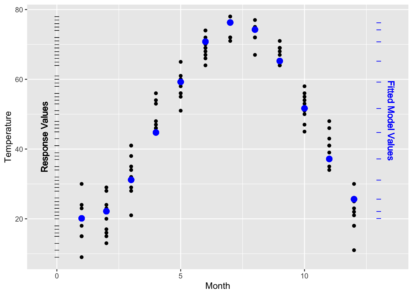
Figure 9.3: Temperature versus month fitted to a nonlinear model. R = 0.946². The variance of the fitted model values is almost as large as the variance of the response values.
Example: R versus R²
The correlation coefficient r is often reported in squared form: r². However, the coefficient of determination is R². You will occasionally see reports of the square root of the coefficient of determination: R = √R². Perhaps this is because it seems unnatural to report squares, just as the variance seem less natural than standard deviation. It’s hard to claim that R² is right and R is wrong, but do make sure that you know what you are reading about. What’s wrong is to read an R value and interpret it as R².
To illustrate, consider the relationship between standardized college admissions tests and performance in college. A widely used college admissions test in the US is the SAT, administered by the College Board. The first-year grade-point average is also widely used to reflect a student’s performance in college. The College Board publishes its studies that relate students’ SAT scores to their first-year GPA.(Board 2008) The reports present results in terms of R – the square-root of R². A typical value is about R = 0.40.
Translating this to R² gives 0.40² = 0.16. Seen as R², the connection between SAT scores and first-year GPA does not seem nearly as strong! Of course, R = 0.40 and R² = 0.16 are exactly the same thing. Just make sure that when you are reading about a study, you know which one you’re dealing with.
Whether an R² of 0.16 is “large” depends on your purpose. It’s low enough to indicate that SAT provides little ability to predict GPA for an individual student. But 0.16 is high enough – as you’ll see in Chapter 14 – to establish that there is indeed a link between SAT score and college performance when averaged over lots of students. Consequently, there can be some legitimate disagreement about how to interpret the R². In reporting on the 2008 College Board report, the New York Times headlined, “Study Finds Little Benefit in New SAT” (June 18, 2008) while the College Board press release on the previous day announced, “SAT Studies Show Test’s Strength in Predicting College Success.” Regretably, neither the news reports nor the press release stated the R².
9.3 The Geometry of Correlation
The correlation coefficient r was introduced in 1888. It was an early step in the development of modeling theory, but predates the ideas of model vectors. It turns out that r has a very simple interpretation using model vectors: correlation is an angle between vectors.
Recall that for quantitative variables, the variable itself is a vector. (In contrast, categorical variables are transformed into a set of indicator vectors, one for each level of the categorical variable.) The correlation coefficient r is the cosine of the angle between the two quantitative variable vectors, after the mean of each variable has been subtracted.
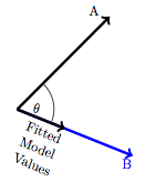
Figure 9.4: The correlation coefficient between A and B compares the length of the fitted model values vector to the length of the vector A. Trigonometrically, this ratio is cos(ϑ).
This means that a perfect correlation, r = 1 corresponds to exact alignment of A and B: the angle ϑ = 0. No correlation at all, r = 0 corresponds to A and B being at right angles: ϑ = 90°. A negative correlation, r < 0, corresponds to A and B pointing in opposite directions. Figure 9.5 shows some examples.
Vectors that are perpendicular are said to be orthogonal .
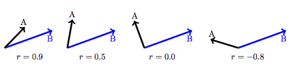
Figure 9.5: The correlation coefficient corresponds to the angle between vectors.
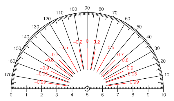
Figure 9.6: Measure correlation with a protractor! Each value of the correlation coefficient r corresponds to an angle between vectors. This protractor is marked both in degrees and in the corresponding values of r. Notice that moderate values of r correspond to angles that are close to 90°.
9.4 Nested Models
Models are often built up in stages; start with an existing model and then add a new model term. This process is important in deciding whether the new term contributes to the explanation of the reponse variable. If the new, extended model is substantially better than that old one, there’s reason to think that the new term is contributing.
You can use R² to measure how much better the new model is than the old model. But be careful. It turns out that whenever you add a new term to a model, R² can increase. It’s never the case that the new term will cause R² to go down. Even a random variable, one that’s utterly unrelated to the response variable, can cause an increase in R² when it’s added to a model.
This raises an important question: When is an increase in R² big enough to justify concluding that the added explanatory term is genuinely contributing to the model? Answering this question will require concepts that will be introduced in later chapters.
An important idea is that of nested models. Consider two models: a “small” one and a “large” one that includes all of the explanatory terms in the small one. The small model is said to be nested in the large model.
To illustrate, consider a series of models of the Galton height data. Each model will take child’s height as the response variable, but the different models will include different variables and model terms constructed from these variables.
- Model A:
height~ 1 - Model B:
height~ 1 +mother - Model C:
height~ 1 +mother+sex - Model D:
height~ 1 +mother+sex+mother:sex
Model B includes all of the explanatory terms that are in Model A. So, Model A is nested in Model B. Similarly, A and B are both nested in Model C. Model D is even more comprehensive; A, B, and C are all nested in D.
When one model is nested inside another, the variance of the fitted model values from the smaller model will be less than the variance of the fitted model values from the larger model. The same applies to R², since R² is proportional to the variance of the fitted model values.
In the four nested models listed above, for example, the increase in fitted variance and R² is this:
| Model | A | B | C | D |
|---|---|---|---|---|
| Variance of model values | 0.00 | 0.52 | 7.21 | 7.22 |
| R² | 0.00 | 0.0407 | 0.5618 | 0.5621 |
Notice that the variance of the fitted model values for Model A is exactly zero. This is because Model A has only the intercept term 1 as an explanatory term. This simple model treats all cases as the same and so there is no variation at all in the fitted model values: the variance and R² are zero.
Example: R² Out of the Headlines
Consider this headline from the BBC News: “Finger length `key to aggression.’” The length of a man’s fingers can reveal how physically aggressive he is.
Or, from Time magazine, a summary of the same story: “The shorter a man’s index finger is relative to his ring finger, the more aggressive he is likely to be (this doesn’t apply to women).”
These news reports were based on a study examining the relationship between finger-length ratios and aggressiveness.(Bailey and Hurd 2005) It has been noticed for years that men tend to have shorter index fingers compared to ring fingers, while women tend the opposite way. The study authors hypothesized that a more “masculine finger ratio” might be associated with other masculine traits, such as aggressiveness. The association was found and reported in the study: R² = 0.04. The underlying data are shown in this figure from the original report:
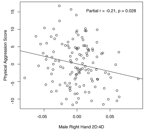
As always, R² gives the fraction of the variance in the response variable that is accounted for by the model. This means that of all the variation in aggressiveness among the men involved in the study, 4% was accounted for, leaving 96% unexplained by the models. This suggests that finger length is no big deal.
Headline words like “key” and “reveal” are vague but certainly suggest a strong relationship. The news media got it wrong.
9.5 The Geometry of R²
Recall from Section 9.3 that the correlation r corresponds to the cosine of the angle between two vectors.
R² for models has a similar interpretation. Consider the model A ~ B + C. Since there are two explanatory vectors involved, there is an ambiguity: which is the angle to consider: the angle A to B or the angle A to C?
Figure 9.7 shows the situation. Since there are two explanatory vectors, the response is projected down onto the space that holds both of them, the model subspace. There is still a vector of fitted model values and a residual vector. The three vectors taken together – response variable, fitted model values, and residual – form a right triangle. The angle between the response variable and the fitted model values is the one of interest. R is the cosine of that angle.
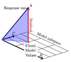
Figure 9.7: Projecting A onto the subspace defined by a set of two model vectors, B and C. The model triangle is shaded.
Because the vectors B and C could be oriented in any direction relative to one another, there’s no sense in worrying about whether the angle is acute (less than 90°) or obtuse. For this reason, R² is used – there’s no meaning in saying that R is negative.