Chapter 17 Causation
If the issues at hand involve responsibilities or decisions or plans, causal reasoning is necessary. – Edward Tufte (1942 - ) statistician and information artist
Knowing what causes what makes a big difference in how we act. If the rooster’s crow causes the sun to rise we could make the night shorter by waking up our rooster earlier and make him crow - say by telling him the latest rooster joke. – Judea Pearl (1936 - ) computer scientist
Starting in the 1860s, Europeans expanded rapidly westward in the United States, settling grasslands in the Great Plains. Early migrants had passed through these semi-arid plains, called the Great American Desert, on the way to habitable territories further west. But unusually heavy rainfall in the 1860s and 1870s supported new migrants who homesteaded on the plains rather than passing through.
The homesteaders were encouraged by a theory that the act of farming would increase rainfall. In the phrase of the day, “Rain follows the plow.”
The theory that farming leads to rainfall was supported by evidence. As farming spread, measurements of rainfall were increasing. Buffalo grass, a species well adapted to dry conditions, was retreating. Other grasses more dependent on moisture were advancing. The exact mechanism of the increasing rainfall was uncertain, but many explanations were available. In a phrase-making book published in 1881, Charles Dana Wilber wrote,
- Suppose now that a new army of frontier farmers … could, acting in concert, turn over the prairie sod, and after deep plowing and receiving the rain and moisture, present a new surface of green, growing crops instead of the dry, hard-baked earth covered with sparse buffalo grass. No one can question or doubt the inevitable effect of this cool condensing surface upon the moisture in the atmosphere as it moves over by the Western winds. A reduction in temperature must at once occur, accompanied by the usual phenomena of showers. The chief agency in this transformation is agriculture. To be more concise. Rain follows the plow. (Wilber 1881)
Seen in the light of subsequent developments, this theory seems hollow. Many homesteaders were wiped out by drought. The most famous of these, the Dust Bowl of the 1930s, rendered huge areas of US and Canadian prairie useless for agriculture and led to the displacement of hundreds of thousands of families.
Wilber was correct in seeing the association between rainfall and farming, but wrong in his interpretation of the causal connection between them. With a modern perspective, you can see clearly that Wilber got it backwards; there was indeed an association between farming and rainfall, but it was the increased rainfall of the 1870s that lead to the growth of farming. When the rains failed, so did the farms.
The subject of this chapter is the ways in which data and statistical models can and cannot appropriately be used to support claims of causation. When are you entitled to interpret a model as signifying a causal relationship? How can you collect and process data so that such an interpretation is justified? How can you decide which covariates to include or exclude in order to reveal causal links?
The answers to these questions are subtle. Model results can be interpreted only in the context of the researcher’s beliefs and prior knowledge about how the system operates. And there are advantages when the researcher becomes a participant, not just collecting observations but actively intervening in the system under study as an experimentalist.
17.1 Interpreting Models Causally
Interpreting statistical models in terms of causation is done for a purpose. It is well to keep that purpose in mind so you can apply appropriate standards of evidence. When causation is an issue, typically you have in mind some intervention that you are considering performing. You want to use your models to estimate what will be the effect of that intervention.
For example, suppose you are a government health official considering the approval of flecainide, a drug intended for the treatment of overly fast heart rhythms such as atrial fibrillation. Your interest is improving patient outcomes, perhaps as measured by survival time. The purpose of your statistical models is to determine whether prescribing flecainide to patients is likely to lead to improved outcomes and how much improvement will typically be achieved.
Or suppose you are the principal of a new school. You have to decide how much to pay teachers but you have to stay within your budget. You have three options: pay relatively high salaries but make classes large, pay standard salaries and make classes the standard size, pay low salaries and make classes small. Your interest is in the effective education of your pupils, perhaps as measured by standardized test scores. The purpose of your statistical models is to determine whether the salary/class-size options will differ in their effects and by how much.
Or suppose you are a judge hearing a case involving a worker’s claim of sex discrimination against her employer. You need to decide whether to find for the worker or the employer. This situation is somewhat different. In the education or drug examples, you planned to take action to change the variable of interest – reduce class sizes or give patients a drug – in order to produce a better outcome. But you can’t change the worker’s sex to avoid the discrimination. Even if you could, what’s past is past. In this situation, you are dealing with a counterfactual: you want to find out how pay or working conditions would have been different if you changed the worker’s sex and left everything else the same. This is obviously a hypothetical question. But that doesn’t mean it isn’t a useful one to answer or that it isn’t important to answer the question correctly.
Example: Greenhouse Gases and Global Warming
Global warming is in the news every day. [Update: As the understanding of the changes has become more nuanced, the term has become “climate change.” For an update of the following graph, see the end of the chapter.] Warming is not a recent trend, but one that extends over decades, perhaps even a century or more, as shown in Figure 17.1. The cause of the increasing temperatures is thought to be the increased atmospheric concentration of greenhouse gases such as CO₂ and methane. These gases have been emitted at a rapidly growing rate with population growth and industrialization.
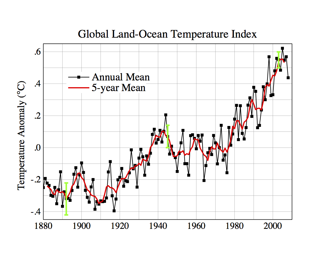
Figure 17.1: Global temperature since 1880 as reported by NASA. http://data.giss.nasa.gov/gistemp/graphs/ accessed on July 7, 2009.
In the face of growing consensus about the problem, skeptics note that such temperature data provides support but not proof for claims about greenhouse-gas induced global warming. They point out that climate is not steady; it changes over periods of decades, over centuries, and over much longer periods of time. And it’s not just CO₂ that’s been increasing over the last century; lots of other variables are correlated with temperature. Why not blame global warming, if it does exist, on them?
Imagine that you were analyzing the data in Figure 17.1 without any idea of a possible mechanism of global temperature change. The data look something like a random walk; a sensible null hypothesis might be exactly that. The typical year-to-year change in temperature is about 0.05°, so the expected drift from a random walk over the 130 year period depicted in the graph is about 0.6°, roughly the same as that observed.
The data in the graph do not themselves provide a compelling basis to reject the null hypothesis that global temperatures change in a random way. However, it’s important to understand that climatologists have proposed a physical mechanism that relates CO₂ and methane concentration in the atmosphere to global climate change. At the core of this mechanism is the increased absorption of infra-red radiation by greenhouse gases. This core is not seriously in doubt: it’s solidly established by laboratory measurements. The translation of that absorption mechanism into global climate consequences is somewhat less solid. It’s based on computer models of the physics of the atmosphere and the ocean. These models have increased in sophistication over the last couple of decades to incorporate more detail: the formation of clouds, the thermohaline circulation in the oceans, etc. It’s the increasing confidence in the models that drives scientific support for the theory that greenhouse gases cause global warming.
It’s not data like Figure 17.1 that lead to the conclusion that CO₂ is causing global warming. It’s the data insofar as they support models of mechanisms.
NOTE added to online edition, 2019. It has been ten years since the previous section was written, when the most recent data point was 2008. Every one of the more recent ten yearly global temperature is larger than the 2008 point. Seven of the most recent ten points show temperature greater than any in the historical record. The rate of temperature increase in the last decade is 0.036 ± 0.010 degrees C per year.
17.2 Causation and Correlation
It’s often said, “Correlation is not causation.” True enough. But it’s an odd thing to say, like saying, “A movie is not a train.”
In the earliest days of the cinema, a Lumière brothers film showing a train arriving at a station caused viewers to rise to their feet as if the train were real. Reportedly, some panicked from fear of being run over.(Schmidt, Warner, and Levine 2002)
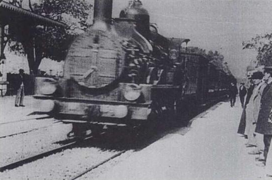
Figure 17.2: A frame from the 1895 film, “L’Arrivée d’un train en gare de La Ciotat”
Modern viewers would not be fooled; we know that a movie train is incapable of causing us harm. The Lumière movie authentically represented a real train – the movie is a kind of model, a representation for a purpose – but the representation is not the mechanical reality of the train itself. Similarly, correlation is a representation of the relationship between variables. It captures some aspects of that relationship, but it is not the relationship itself and it doesn’t fully reflect the mechanical realities, whatever they may be, of the real relationships that drive the system.
Correlation, along with the closely related idea of model coefficients, is a concept that applies to data and variables. The correlation between two variables depends on the data set, and how the data were collected: what sampling frame was used, whether the sample was randomly taken from the sampling frame, etc.
In contrast, causation refers to the influence that components of a system exert on one another. I write “component” rather than “variable” because the variables that are measured are not necessarily the active components themselves. For example, the score on an IQ test is not intelligence itself, but a reflection of intelligence.
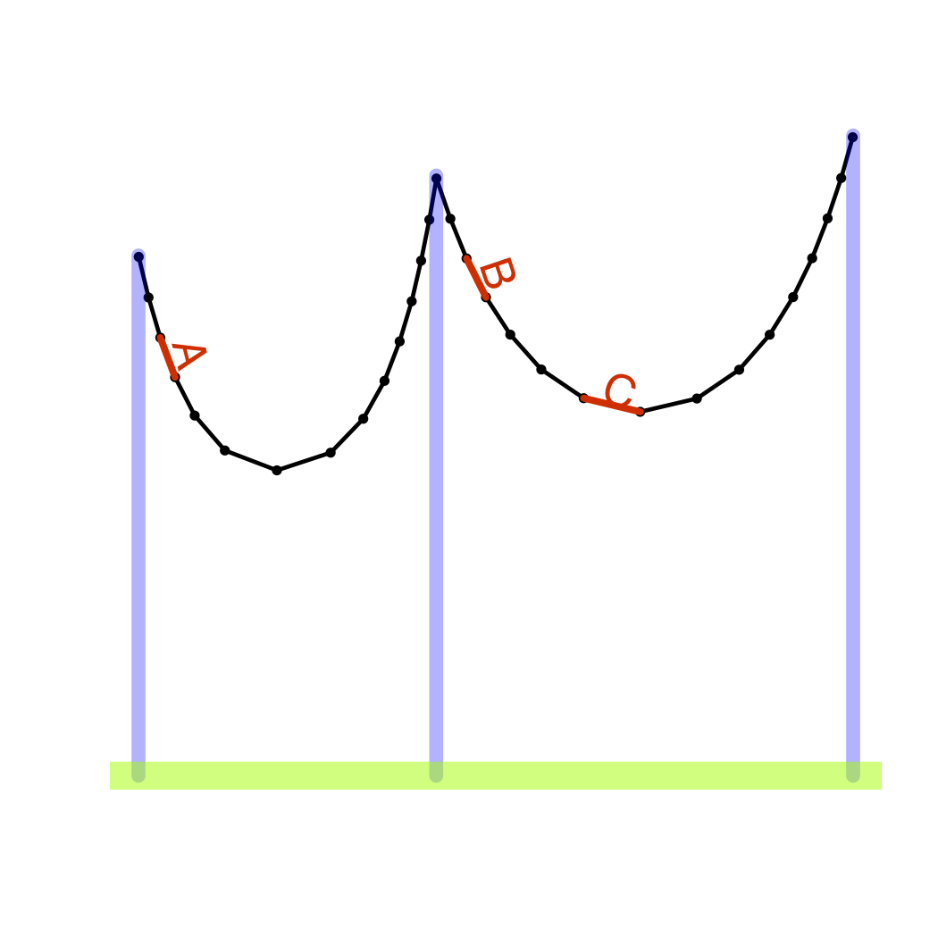
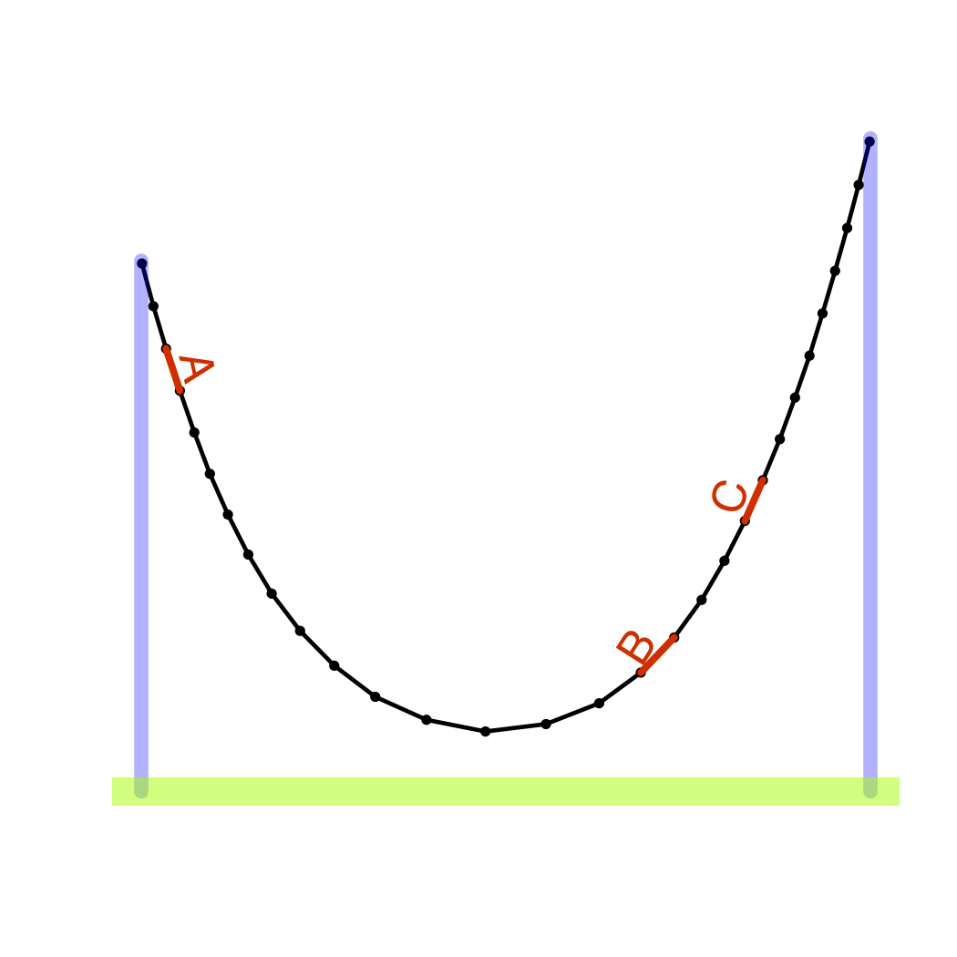
Figure 17.3: A metaphor for causation and correlation: the links of a chain with external supports. It’s the same chain in both pictures but supported differently. The relationship between link orientations – links A and B are aligned in the picture on the left, but not in the picture on the right – depends both on the mechanical connections between links and on the external forces at work. So the alignment itself (correlation) is not a good signal for the mechanical connections (causation).
As a metaphor for the differences between correlation and causation, consider a chain hanging from supports. (Figure 17.3.) Each link of the chain is mechanically connected to its two neighbors. The chain as a whole is a collection of such local connections. Its shape is set by these mechanical connections together with outside forces: the supports, the wind, etc. The overall system – both internal connections and outside forces – determines the global shape of the chain. That overall shape sets the correlation between any two links in the chain, whether they be neighboring or distant.
In this metaphor, the shape of the chain is analogous to correlation; the mechanical connections between neighboring links is causation.
One way to understand the shape of the chain is to study its overall shape: the correlations in it. But be careful; the lessons you learn may not apply in different circumstances. For example, if you change the location of the supports, or add a new support in the middle, the shape of the chain can change completely as can the correlation between components of the chain.
Another way to understand the shape of the chain is to look at the local relationships between components: the causal connections. This does not directly tell you the overall shape, but you can use those local connections to figure out the global shape in whatever circumstances may apply. It’s important to know about the mechanism so that you can anticipate the response to actions you take: actions that might change the overall shape of the system. It’s also important for reasoning about counterfactuals: what would have happened had the situation been different (as in the sex discrimination example above) even if you have no way actually to make the system different. You can’t change the plaintiff’s sex, but you can play out the consequences of doing so through the links of causal connections.
One of the themes of this book has been that correlation, as measured by the correlation coefficient between two variables, is a severely limited way to describe relationships. Instead, the book has emphasized the use of model coefficients. These allow you to incorporate additional variables – covariates – into your interpretation of the relationship between two variables. Model coefficients provide more flexibility and nuance in describing relationships than does correlation. They make it possible, for instance, to think about the relationship between variables A and B while adjusting for variable C.
Even so, model coefficients describe the global properties of your data. If you want to use them to examine the local, mechanistic connections, there is more work to be done. Presumably, what people mean in saying “correlation is not causation” is that correlation is not on its own compelling evidence for causation.
An example of the difference between local causal connections and global correlations comes from political scientists studying campaign spending. Analysis of data on election results and campaign spending in US Congressional elections shows that increased spending by those running for re-election – incumbents – is associated with lower vote percentages. This finding is counter-intuitive. Can it really be that an incumbent’s campaign spending causes the incumbent to lose votes? Or is it that incumbents spend money in elections that are closely contested for other reasons? When the incumbent’s election is a sure thing, there is no need to spend money on the campaign. So the negative correlation between spending and votes, although genuine, is really the result of external forces shaping the election and not the mechanism by which campaign spending affects the outcome.(Jacobson 1978)
17.3 Hypothetical Causal Networks
In order to think about how data can be used as evidence for causal connections, it helps to have a notation for describing local connections. The notation I will use involves simple, schematic diagrams. Each diagram depicts a hypothetical causal network: a theory about how the system works. The diagrams consist of nodes and links. Each node stands for a variable or a component of the system. The nodes are connected by links that show the connections between them. A one-way arrow refers to a causal mechanistic connection. To illustrate, Figure 17.4 shows a hypothetical causal network for campaign spending by an incumbent.

Figure 17.4: A hypothetical causal network describing how campaign spending by an incumbent candidate for political office is related to the vote outcome.
The hypothetical causal network in Figure 17.4 consists of four main components: spending and the vote outcome are the two of primary interest, but the incumbent candidate’s popularity and the pre-election poll results are also included. According to the network, an incumbent’s popularity influences both the vote outcome and the pre-election polls. The polls indicate how close the election is and this shapes the candidate’s spending decisions. The amount spent influences the vote total.
A complete description of the system would describe how the various influences impinging on each node shape the value of the quantity or condition represented by the node. This could be done with a model equation, or less completely by saying whether the connection is positive or negative (as in the above diagram). For now, however, focus on the topology of the network: what’s connected to what and which way the connection runs.
Nodes in the diagrams are drawn in two shapes. A square node refers to a variable that can be measured: poll results, spending, vote outcomes. Round nodes are for unmeasured quantities. For example, it seems reasonable to think about a candidate’s popularity, but how to measure this outside of the context set by a campaign? So, in the diagram, popularity itself is not directly measured. Instead, there are poll results and the vote outcome itself. Specific but unmeasured variables such as “popularity” are sometimes called latent variables .
Often the round, unmeasured nodes will be drawn  , which stands for the idea the something is involved, but no description is being given about what that something is; perhaps it’s just random noise.
The links connecting nodes indicate causal influence. Note that every line has a arrow that tells which way causation works. The diagram
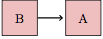
means that B causally influences A. The diagram
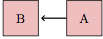
is the opposite: A is causally influencing B.
It’s possible to have links running both ways between nodes. For instance, A causes B and B causes A. This is drawn as two different links. Such two way causation produces loops in the diagrams, but it is not necessarily illogical circular reasoning. In economics, for instance, it’s conventional to believe that price influences production and that production influences price.
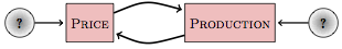
Why two causal links? When some outside event intervenes to change production, price is affected. For example, when a factory is closed due to a fire, production will fall and price will go up. If the outside event changes price – for instance, the government introduces price restrictions – production will change in response. Such outside influences are called exogenous. The stands for an unknown exogenous input.
A hypothetical causal network is a model: a representation of the connections between components of the system. Typically, it is incomplete, not attempting to represent all aspects of the system in detail. When an exogenous influence is marked as , the modeler is saying, “I don’t care to try to represent this in detail.” But even so, by marking an influence with , the modeler is making an affirmative claim that the influence, whatever it be, is not itself caused by any of the other nodes in the system: it’s exogenous. In contrast, nodes with a causal input – one or more links pointing to them – are endogenous, meaning that they are determined at least in part by other components of the system.
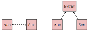
Figure 17.5: A non-causal link and its expansion into a diagram with causal links.
Often modelers decide not to represent all the links and components that might causally connect two nodes, but still want to show that there is a connection. Such non-causal links are drawn as double-headed dashed lines as in Figure 17.5. For instance, in many occupations there is a correlation between age and sex: older workers tend to be male, but the population of younger workers is more balanced. It would be silly to claim a direct causal link from age to sex: a person’s sex doesn’t change as they age! Similarly, sex doesn’t determine age. Instead, women historically were restricted in their professional options. There is an additional variable – entry into the occupation – that is determined by both the person’s age and sex. The use of a non-causal link to indicate the connection between age and sex allows the connection to be displayed without including the additional variable.
It’s important not to forget the word “hypothetical” in the name of these diagrams. A hypothetical causal network depicts a state of belief. That belief might be strongly informed by evidence, or it might be speculative. Some links in the network might be well understood and broadly accepted. Some links, or the absence of some links, might be controversial and disputed by other people.
17.4 Networks and Covariates
Often, you are interested in only some of the connections in a causal network; you want to use measured data to help you determine if a connection exists and to describe how strong it is. For example, politicians are interested to know how much campaign spending will increase the vote result. Knowing this would let them decide how much money they should try to raise and spend in an election campaign.
It’s wrong to expect to be able to study just the variables in which you have a direct interest. As you have seen, the inclusion of covariates in a model can affect the coefficients on the variables of interest.
For instance, even if the direct connection between spending and vote outcome is positive, it can well happen that using data to fit a model vote outcome ~ spending will produce a negative coefficient on spending.
There are three basic techniques that can be used to collect and analyze data in order to draw appropriate conclusions about causal links.
- Experiment, that is, intervene in the system to set or influence certain variables and then examine how your intervention relates to the observed outcomes.
- Include covariates in order to adjust for other variables.
- Exclude covariates in order to prevent those variables from unduly influencing your results.
Experimentation provides the strongest form of evidence. Indeed, many statisticians and scientists claim that experimentation provides the only compelling evidence for a causal link. As the expression goes, “No causation without experimentation.”
This may be so, but in order to explain why and when experimentation provides compelling evidence, it’s helpful to examine carefully the other two techniques: including and excluding covariates. And, in many circumstances where you need to draw conclusions about causation, experimentation may be impossible.
Previous chapters have presented many examples of Simpson’s paradox: the coefficient on an explanatory variable changing sign when a covariate is added to a model. Indeed, it is inevitable that the coefficient will change – though not necessarily change in sign – whenever a new covariate is added that is correlated with the explanatory variable.
An important question is this: Which is the right thing to do, include the covariate or not?
To answer this question, it helps to know the right answer! That way, you can compare the answer you get from a modeling approach to the known, correct answer, and you can determine which modeling approaches work best, which rules for including covariates are appropriate. Unfortunately, it’s hard to learn such lessons from real-world systems. Typical systems are complex and the actual causal mechanisms are not completely known. As an alternative, however, you can use simulations: made-up systems that let you test your approaches and pick those that are appropriate for the structure of the hypothetical causal network that you choose to work with.
To construct a simulation, you need to add details to the hypothetical causal networks. What’s left out of the notation for the networks is a quantitative description of what the link arrows mean: how the variable at the tail of the link influences the variable at the arrowhead. One way to specify this is with a formula. For instance, the formula
vote ← 0.75 popularity + 0.25 spending + Normal(0,5)
says that the vote outcome can be calculated by adding together weighted amounts of the level of popularity and spending and the exogenous random component (which is set to be a normal random variable with mean 0 and standard deviation 5).
Notice that I’ve used ← instead of = in the formula. The formula isn’t just a statement that vote is related to popularity and spending but a description of what causes what. Changing popularity changes vote, but not vice versa.
Usually, modelers are interested in deducing the formula from measured data. In a simulation, however, the formula is pre-specified and used to create the simulated data.
Such a simulation can’t directly tell you about real campaign spending. It can, however, illuminate the process of modeling by showing how the choice of covariates shapes the implications of a model. Even better, the simulations can guide you to make correct choices, since you can compare the results of your modeling of the simulated data to the known relationships that were set up for the simulation.
A simulation can be set up for the campaign spending hypothetical network. Here’s one that accords pretty well with most people’s ideas about how campaign spending works:
- popularity is endogenous, simulated by a random variable with a uniform distribution between 15 and 85 percent, indicating the amount of support the incumbent has.
polls echo popularity, but include a random exogenous component as well:
polls←popularity+Normal(0,3).spending is set based on the poll results. The lower the polls, the more the incumbent candidate spends:
spending← 100 -polls+Normal(0,10)vote is the result of popularity, spending, and an exogenous random input:
vote← 0.75popularity+ 0.25spending+Normal(0,5)
Remember, these formulas are hypothetical. It’s not claimed that they represent the mechanics of actual campaign spending in any detailed way, or that the coefficients reflect the real world (except, perhaps, in sign), or that the size of the random, exogenous influences are authentic. But by using the formulas you can generate simulated data that allows you to test out various approaches to modeling. Then you can compare your modeling results with the formulas to see which approaches are best.
The simulation outlined above was used to generate data on polls, spending, and vote. Then, this simulated data was used to fit two different models: one with covariates and one without them. Here are the results from a simulation with n=1000:
| Model | Coef. on spending |
|
|---|---|---|
| 1 | vote ~ spending |
−0.33 ± 0.02 |
| 2 | vote ~ spending+ polls |
0.23 ± 0.03 |
In the first model, vote ~ spending, the fitted coefficient on spending is negative, meaning that higher spending is associated with lower `vote. This negative coefficient correctly summarizes the pattern shown by the data but it is incorrect causally. According to the formulas used in the simulation, higher spending leads to higher vote outcome.
On the other hand, the model vote ~ spending + polls that incorporates polls as a covariate gets it right: the coefficient on spending is positive (as it should be) and is even the right size numerically: about 0.25.
It’s tempting to draw this conclusion: always add in covariates. But this general rule is premature and, in fact, wrong. To see why, consider another simulation based on another hypothetical causal network.
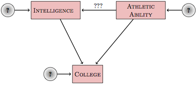
Figure 17.6: A hypothetical causal network about college admissions and athletics.
Figure 17.6 shows a simple hypothetical causal network that might be used to describe college admissions. This network depicts the hypothesis that whether or not a student gets into college depends on both the intelligence and athletic ability of the applicant. But, according to the hypothetical causal network, there may also be a link between intelligence and athletic ability.
Suppose someone wants to check whether the link marked ??? in Figure 17.6 actually exists, that is, whether athletic ability affects intelligence. An obvious approach is to build the simple model
intelligence ~ athletic ability.
Or, should the covariate college be included in the model?
A simulation was set up with no causal connection at all between between athletic ability and intelligence. However, both athletic ability and intelligence combine to determine whether a student gets into college.
Using data simulated from this network (again, with \(n=1000\)), models with and without covariates were fit.
| Model | Coef. on spending |
|
|---|---|---|
| 1 | IQ ~ Athletic |
0.03 ± 0.30 |
| 2 | IQ~ Athletic+ College |
−1.33 ± 0.24 |
The first model, without college as a covariate, gets it right. The coefficient, 0.03 ± 0.30, shows no connection between athletic and intelligence. The second model, which includes the covariate, is wrong. It falsely shows that there is a negative relationship between athletic ability and intelligence. Or, rather, the second model is false in that it fails to reproduce the causal links that were present in the simulation. The coefficients are actually correct in showing the correlations among athletic, intelligence, and college that are present in the data generated by the simulation. The problem is that even though college doesn’t cause intelligence, the two variables are correlated.
The situation is confusing. For the campaign spending system, the right thing to do when studying the direct link between spending and vote outcome was to include a covariate. For the college admissions system, the right thing to do when studying the direct link between intelligence and athletic ability was to exclude a covariate.
The heart of the difficulty is this: In each of the examples you want to study a single link between variables, for instance these:
But the nature of networks is that there is typically more than one pathway that connects two nodes. What’s needed is a way to focus on the links of interest while avoiding the influence of other connections between the variables.
17.5 Pathways
A hypothetical causal network is like a network of roads. The causal links are one-way roads where traffic flows in only one direction. In hypothetical causal networks, as in road networks, there is often more than one way to get from one place to another.
A pathway between two nodes is a route between them, a series of links that connects one to another, perhaps passing through some other nodes on the way.
It’s helpful to distinguish between two kinds of pathways:
Correlating pathways follow the direction of the causal links.
Non-correlating pathways don’t.
To help develop a definition of the two kinds of pathways, consider a simple network with three nodes, A, B, and C, organized with A connected to C, and C connected to B.
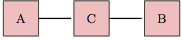
There is a pathway connecting A to B, but in order to know whether it is correlating or non-correlating, you need to know the causal directions of the links. If the links flow as A ⥤ C ⥤ B, then the pathway connecting A to B is correlating. Similarly if the pathway is A ⥢ C ⥢ B. Less obviously, the pathway connecting A to B in the network A ⥢ C ⥤ B is correlating, since from node C you can get to both A and B. But if the flows are A ⥤ C ⥢ B, the pathway connecting A and B is non-correlating.
The general rule is that a pathway connecting two variables A and B is correlating if there is some node on the pathway from which you can get to both A and B by following the causal flow. So, in A ⥤ C ⥤ B, you can start at A and reach B. Similarly, in A ⥢ C ⥢ B you can start at B and reach A. In A ⥢ C ⥤ B you can start at C and reach both A and B. But in A ⥤ C ⥢ B, there is no node you can start at from which the flow leads both to A and B.
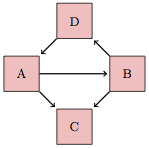
Figure 17.7: A hypothetical causal network with three pathways connecting nodes A and B.
A non-correlating pathway is one where it is not possible to get from one of the nodes on the pathway to the end-points by following the causal links. So, A ⥤ C ⥢ B is a non-correlating pathway: Although you can get from B to C by following the causal link, you can’t get to A. Similarly, starting at A will get you to C, but you can’t get from C to B.
Hypothetical causal networks often involve more than one pathway between variables of interest. To illustrate, consider the network shown in Figure 17.7. There are three different pathways connecting A to B:
- The direct pathway A ⥤ B. This is a correlating pathway. Starting at A leads to B.
- The pathway through C, that is, A ⥤ C ⥢ B. A non-correlating pathway. There is no node where you can start that leads to both endpoints A and B by following the causal flows.
- The pathway through D, that is, A ⥢ D ⥢ B This is a correlating pathway – start at B and the flow leads to A.
Of course, correlating pathways can be longer and can involve more intermediate nodes. For instance A ⥢ C ⥢ D ⥤ B is a correlating pathway connecting A and B. Starting at D, the flow leads to both A and B.
Pathways can also involve links that display correlation and not causation. When correlations are involved (shown by a double-headed arrow: ⥢⥤ ), the test of whether a pathway is correlating or non-correlating is still the same: check whether there is a node from which you can get to both end-points by following the flows. For the correlation link, the flows go in both directions. So A ⥢⥤ C ⥤ D ⥤ B is correlating; starting at C, the flow leads to both endpoints A and B.
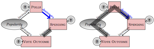
Figure 17.8: Two distinct pathways connecting spending to vote outcome, shaded with a thick line. Both of these are correlating pathways.
Some hypothetical causal networks include pathways that are causal loops, that is, pathways that lead from a node back to itself following only the direction of causal flow. These are called recurrent networks. The analysis of recurrent networks requires more advanced techniques that are beyond the scope of this introduction. Judea Pearl gives a complete theory.(Pearl 2000)
17.6 Pathways and the Choice of Covariates
Understanding the nature of the pathways connecting two variables helps in deciding which covariates to include or exclude from a model. Suppose your goal is to study the direct relationship between two nodes, say between A and B in Figure 17.7. To do this, you need to block all the other pathways between those variables. So, to study the direct relationship A ⥤ B, you would need to block the "backdoor’’ pathways A ⥢ D ⥢ B and A ⥤ C ⥢ B.
The basic rules for blocking a pathway are simple:
For a correlating pathway, you must include at least one of the interior nodes on the pathway as a covariate.
For a non-correlating pathway, you must exclude all the interior nodes on the pathway; do not include any of them as covariates.
Typically, there are some pathways in a hypothetical causal network that are of interest and others that are not. Suppose you are interested in the direct causal effect of A on B in the network shown in Figure 17.7. This suggests the model B ~ A. But which covariates to include in order to block the two backdoor pathways A ⥢ D ⥢ B and A ⥤ C ⥢ B? Including D as a covariate will block the correlating pathway A ⥢ D ⥢ B, so you should include D in your model. On the other hand, in order to block A ⥤ C ⥢ B you need to exclude C from your model. The correct model is B ~ A + D.
Returning to the campaign spending example, there are two pathways between spending and vote outcome. The pathway of interest is vote ⥢ spending. The backdoor pathway,
pathway vote ⥢ popularity ⥤ polls ⥤ spending
is not of direct interest to those concerned with the causal effect of spending on the vote outcome. This backdoor pathway is correlating; starting at node popularity leads to both endpoints of the pathway, spending and vote. To block it, you need to include one of the interior nodes, either polls or popularity. The obvious choice is polls, since this is something that can be measured and used as a covariate in a model. So, an appropriate model for studying the causal connection between vote and spending is the model vote ~ spending + polls.
In the college admission network shown in Figure 17.6, there are two pathways connecting athletic ability to intelligence. The direct one is of interest. The backdoor route (intelligence ⥤ college ⥢ athletic) is not directly of interest. Because the backdoor pathway is non-correlating: there is no node from which the flow leads to both intelligence and athletic. In order to block this non-correlating pathway, you must avoid including any interior node, so college cannot be used as a covariate.
Example: Learning about Learning
Suppose you want to study whether increasing expenditures on education will improve outcomes. You’re going to do this by comparing different districts that have different policies. Of course, they likely also have different social conditions. So there are covariates. Which ones should be included in your models?
Figure 17.9 shows what’s actually a pretty simple hypothetical causal network. It suggests that there is a link between family income and parents’ education, and between parents’ education the test scores of their children. It also suggests that school expenditures and policy variables such as class size relate to family income and parents’ education. Perhaps this is because wealthier parents tend to live in higher-spending districts, or because they are more active in making sure that their children get personalized attention in small classes.
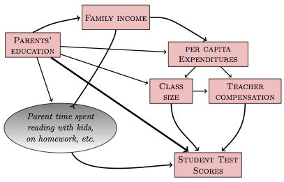
Figure 17.9: A hypothetical causal network relating student test scores to various educational policies and social conditions.
It hardly seems unreasonable to believe that things work something like the way they are shown in Figure 17.9. So reasonable people might hold the beliefs depicted by the network.
Now imagine that you want to study the causal relationship between per capita expenditures and pupil test scores. In order to be compelling to the people who accept the network in Figure 17.9, you need to block the backdoor pathways between expenditures and test scores. Blocking those backdoor pathways, which are correlating pathways, means including both parents' education and family income as covariates in your models. That, in turn, means that data relating to these covariates need to be collected.
Notice also that both class size and teacher compensation should not be included as covariates. Those nodes lie on correlating pathways that are part of the causal link between expenditures and test scores. They are not part of a backdoor correlating pathway; they are the actual means by which the variable expenditures does it’s work. You do not want to block those pathways if you want to see how expenditures connects causally to test scores.
In summary, a sensible model, consistent with the hypothetical causal network in Figure 17.9, is this:
test scores ~ expenditures + family income + parents education.
17.7 Sampling Variables
Sometimes a variable is used to define the sampling frame when collecting data. For example, a study of intelligence and athletic ability might be based on a sampling frame of college students. This seems innocent enough. After all, colleges can be good sources of information about both variables. Of course, your results will only be applicable to college students; you are effectively holding the variable college constant. Note that this is much the same as would have happened if you had included both college and non-college students in your sample and then included college as a covariate, the standard process for adjusting for a covariate when building a model. The implication is that sampling only college students means that the variable college will be implicitly included as a covariate in all your models based on that data. A variable that is used to define your sampling frame is called a sampling variable .
In terms of blocking or unblocking pathways, using data based on a sampling variable is equivalent to including that variable in the model. To see this, recall that in the model B ~ A + C, the presence of the variable C means that the relationship between A and B can be interpreted as a partial relationship: how B is related to A while holding C constant. Now imagine that the data have been collected using C as a sampling variable, that is, with C constant for all the cases. Fitted to such data, the model B ~ A still shows the relationship between B and A while holding C constant.
In drawing diagrams, the use of a sampling variable to collect data will implicitly change the shape of the diagram. For example, consider the correlating pathway A ⥤ C ⥤ D ⥤ B}. Imagine that the data used to study the relationship between A and B were collected from a sampling frame where all the cases had the same value of C. Then the model A ~ B is effectively giving a coefficient on B with C held constant at the level in the sampling frame. That is, A ~ B will give the same B coefficient as A ~ B + C. Since C is an interior variable on the pathway from A to B, and since the pathway is correlating, the inclusion of C as a sampling variable blocks the entire pathway. This effectively disconnects A from B.
Now consider a non-correlating backdoor pathway like A ⥤ F ⥢ G ⥤ B When F is used as a sampling variable, this pathway is unblocked. Effectively, this translates the pathway into A ⥢⥤ G ⥤ B which is a correlating pathway. (You can get to both endpoints A and B by starting either at G or at A.) So, a sampling variable can unblock a backdoor pathway that you might have wanted to block.
You need to be careful in thinking about how your sampling frame is based on a sampling variable that might be causally connected to other variables of interest. For instance, sampling just college students when studying the link between intelligence and athletic ability in the network shown in Figure 17.6 opens up the non-correlating, backdoor pathway via college. Thus, even if there were no relationship between intelligence and athletic ability, your use of college as a sampling variable could create one.
17.8 Disagreements about Networks
The appropriate choice of covariates to include in a model depends on the particular hypothetical causal network that the modeler accepts. The network reflects the modeler’s beliefs, and different modelers can have different beliefs. Sometimes this will result in different modelers drawing incompatible conclusions about which covariates to include or exclude. What to do about this?
One possible solution to this problem is for you to adopt the other modeler’s network. This doesn’t mean that you have to accept that network as true, just that you reach out to that modeler by analyzing your data in the context set by that person’s network. Perhaps you will find that, even using the other network, your data don’t provide support for the other modeler’s claims. Similarly, the other modeler should try to convince you by trying an analysis with your network.
It’s particularly important to be sensitive to other reasonable hypothetical causal networks when you are starting to design your study. If there is a reasonable network that suggests you should collect data on some covariate, take that as a good reason to do so even if the details of your own network do not mandate that the covariate be included. You can always leave out the covariate when you analyze data according to your network, but you will have it at hand if it becomes important to convince another modeler that the data are inconsistent with his or her theory.
Sometimes you won’t be able to agree. In such situations, being able to contrast the differing networks can point to origins of the dispute and can help you to figure out a way to resolve them.
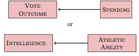
Example: Sex Discrimination in Salary
The college where I work is deeply concerned to avoid discrimination against women. To this end, each year it conducts an audit of professors’ salaries to see if there is any evidence that the college pays women less than men.
Regrettably, there is such evidence; female faculty earn on average less than male faculty. However, there is a simple explanation for this disparity. Salaries are determined almost entirely by the professor’s rank: instructors earn the least, assistant professors next, then associate professors and finally “full” professors. Until recently, there have been relative few female full professors and so relatively few women earning the highest salaries.
Why? It takes typically about 12 years to move from being a starting assistant professor to being a full professor, and another 25 years or so until retirement. It takes five to ten years to go from a college graduate to being a starting assistant professor. Thus, the population of full professors reflects the opportunities for entering graduate students 20 to 45 years ago.
I am writing this in 2009, so 45 years ago was the mid 1960s. This was a very different time from today; women were discouraged even from going to college and certainly from going to graduate school. There was active discrimination against women. The result is that there are comparatively few female full professors. This is changing because discrimination waned in the 1970s and many women are rising up through the ranks.
In analyzing the faculty salary data, you need to make a choice of two simple models. Salary is the response variable and sex is certainly one of the explanatory variables. But should you include rank?
Here’s one possible hypothetical causal network:
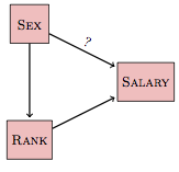
This hypothetical network proposes that there is a direct link between sex and salary – that link is marked with a question mark because the question is whether the data provide support for such a link. At the same time, the network proposes that sex is linked with rank and the network shows this as a causal link.
The consequence of this diagram is that to understand the total effect of sex on salary, you need to include both of the pathways linking the two variables: sex ⥤ salary} as well as the pathway sex ⥤ rank ⥤ salary. In order to avoid blocking the second pathway, we should not include rank as an explanatory variable. Result: The data do show that being female has a negative impact on salary.
In the above network, the causal direction has been drawn from sex to rank. This might be simply because it’s hard to imagine that a person’s rank can determine their sex. Besides, in the above comments I already stipulated that there have been historical patterns of discrimination on the basis of sex that determine the population of the different ranks.
On the other hand, discrimination against people in the past doesn’t mean that there is discrimination against the people who currently work at the institution. So imagine some other possibilities.
What would happen if the causal direction were reversed? I know this sounds silly, that rank can’t cause sex, but suspend your disbelief for a moment. If rank caused sex, there is no causal connection from sex to salary via rank. As such, the pathway from sex to salary via rank ought to be blocked in your models. This is a correlating pathway, so you would block it by including rank as a covariate. Result: The data show that being female does not have a negative impact on salary.
Unfortunately, this means that the result of the modeling depends strongly on your assumptions. If you imagine that sex does not influence rank, then there is no evidence for salary discrimination. But if you presume that sex does influence rank, then the model does provide evidence for salary discrimination. Stalemate.
Fortunately, there is a middle ground. Perhaps rank and sex are not causally related, but are merely correlated. In this situation, too, you would want to block the indirect correlating pathway because it does not tell you about the causal effect of sex on salary. The result would remain that sex does not have a negative impact on salary.
Is your intuition kicking at you? Sex is determined at conception, it can’t possibly be caused by anything else in this network. If it can’t be caused by anything, it must be the cause of things. Right? Well, not quite. The reason is that all of the people being studied are professors, and this selection can create a correlation.
Here’s a simple causal network describing who becomes a professor:
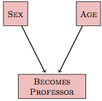
Whether a person became a professor depends on both sex and age. Putting aside the question of whether there is still sex discrimination in graduate studies and hiring, there is no real dispute that there was a relationship in the past. Perhaps this could be modeled as an interaction between sex and age in shaping who becomes a professor. There might be main effects as well.
With this in mind, an appropriate hypothetical causal network might look like this:
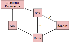
In this network, which people on both sides of the dispute would find reasonable, there is a new backdoor pathway linking sex and salary. This is the pathway sex ⥤ becomes professor ⥢ age ⥤ rank ⥤ salary. This pathway is not about our present mechanisms for setting salary, it’s about how people became professors in the past. Since the pathway is not of direct interest to studying sex discrimination in today’s salaries, it should be blocked when examining the relationship between sex and salary.
The backdoor pathway sex ⥤ becomes professor ⥢ age ⥤ rank ⥤ salary is a non-correlating pathway. There is no node on the pathway that flows to the two endpoints. (Of course you can reach salary from sex directly – there is a sex ⥤ salary pathway – but that is not involved in the backdoor pathway that is under consideration here.)
Here’s the catch. Since the data used for the salary audit include only the people working at the college, the variable becomes professor is already included implicitly as a sampling variable. This means that the backdoor pathway is unblocked in the model sex ~ salary. That is, the use of becomes professor as a sampling variable creates a correlation between sex and age. The pathway then is equivalent to sex⥢⥤ age ⥤ rank ⥤ salary. This is a correlating pathway, since you can get from sex to salary by following the flows.
To block the correlating pathway, you need to include as a covariate one of the variables on the pathway. Age offers some interesting possibilities here. Including age as a covariate blocks the backdoor pathway but allows you to avoid including rank. By leaving rank out of the model, it becomes possible for the model to avoid making any assumption about whether there is sex discrimination in setting rank. Thus, it’s possible to build a model that will be satisfactory both to those who claim that rank is not the product of sex discrimination and those who claim it is.