Chapter 3 Describing Variation
Variation itself is nature’s only irreducible essence. Variation is the hard reality, not a set of imperfect measures for a central tendency. Means and medians are the abstractions. – Stephen Jay Gould (1941-2002), paleontologist and historian of science
A statistical model partitions variation. People describe the partitioning in different ways depending on their purposes and the conventions of the field in which they work: explained variation versus unexplained variation; described variation versus undescribed; predicted variation versus unpredicted; signal versus noise; common versus individual. This chapter describes ways to quantify variation in a single variable. Once you can quantify variation, you can describe how models divide it up.
To start, consider a familiar situation: the variation in human heights. Everyone is familiar with height and how heights vary from person to person, so variation in height provides a nice example to compare intuition with the formal descriptions of statistics. Perhaps for this reason, height was an important topic for early statisticians. In the 1880s, Francis Galton, one of the pioneers of statistics, collected data on the heights of about 900 adult children and their parents in London. Figure 3.1 shows part of his notebook.(Hanley 2004)
Galton was interested in studying the relationship between a full-grown child’s height and his or her mother’s and father’s height. One way to study this relationship is to build a model that accounts for the child’s height – the response variable – by one or more explanatory variables such as mother’s height or father’s height or the child’s sex. In later chapters you will construct such models. For now, though, the objective is to describe and quantify how the response variable varies across children without taking into consideration any explanatory variables.
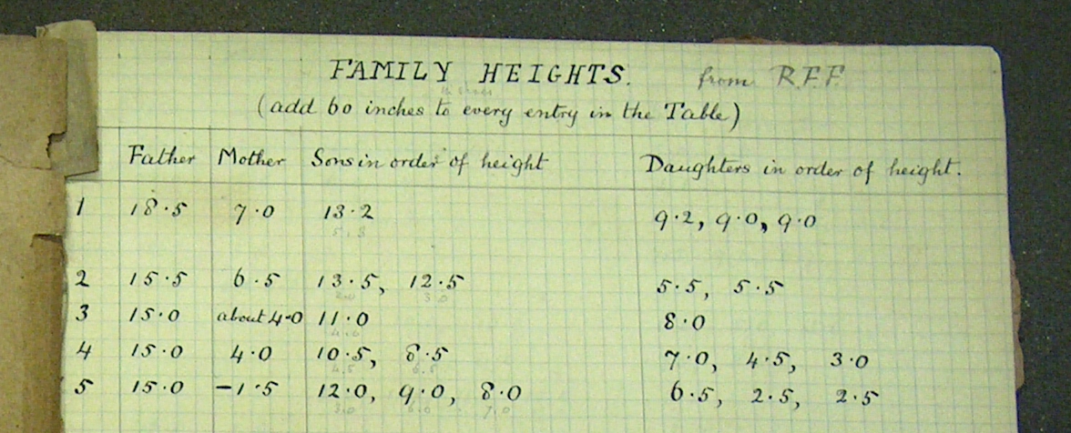
Figure 3.1: Part of Francis Galton’s notebook recording the heights of parents and their adult children.
Galton’s height measurements are from about 200 families in the city of London. In itself, this is an interesting choice. One might think that the place to start would be with exceptionally short or tall people, looking at what factors are associated with these extremes.
Adult humans range in height from a couple of feet to about nine feet. (See Figure 3.2.) One way to describe variation is by the range of extremes: an interval that includes every case from the smallest to the largest.
What’s nice about describing variation through the extremes is that the range includes every case. But there are disadvantages. First, you usually don’t always have a census, measurements on the entire population. Instead of a census, you typically have only a sample, a subset of the population. Usually only a small proportion of the population is included in a sample. For example, of the millions of people in London, Galton’s sample included only 900 people. From such a sample, Galton would have had no reason to believe the either the tallest or shortest person in London, let alone the world, happened to be included.
A second disadvantage of using the extremes is that it can give a picture that is untypical. The vast majority of adults are between 4½ feet and 7 feet tall. Indeed, an even narrower range – say 5 to 6½ feet – would give you a very good idea of typical variation in heights. Giving a comprehensive range – 2 to 9 feet – would be misleading in important ways, even if it were literally correct.
A third disadvantage of using the extremes is that even a single case can have a strong influence on your description. There are about six billion people on earth. The discovery of even a single, exceptional 12-foot person would cause you substantially to alter your description of heights even though the population – minus the one new case – remains unchanged.
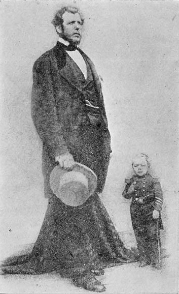
Figure 3.2: Some extremes of height. Angus McAskill (1825-1863) and Charles Sherwood Stratton (1838-1883). McAskill was 7 feet 9 inches tall. Stratton, also known as Tom Thumb, was 2 feet 6 inches in height.
It’s natural for people to think about variation in terms of records and extremes. People are used to drawing conclusions from stories that are newsworthy and exceptional; indeed, such anecdotes are mostly what you read and hear about. In statistics, however, the focus is usually on the unexceptional cases, the typical cases. With such a focus, it’s important to think about typical variation rather than extreme variation.
3.1 Coverage Intervals
One way to describe typical variation is to specify a fraction of the cases that are regarded as typical and then give the coverage interval or range that includes that fraction of the cases.
Imagine arranging all of the people in Galton’s sample of 900 into order, the way a school-teacher might, from shortest to tallest. Now walk down the line, starting at the shortest, counting heads. At some point you will reach the person at position 225. This position is special because one quarter of the 900 people in line are shorter and three quarters are taller. The height of the person at position 225 – 64.0 inches – is the 25th percentile of the height variable in the sample.
Continue down the line until you reach the person at position 675. The height of this person – 69.7 inches – is the 75th percentile of height in the sample.
The range from 25th to 75th percentile is the 50% coverage interval : 64.0 to 69.7 inches in Galton’s data. Within this interval is 50% of the cases.
For most purposes, a 50% coverage interval excludes too much; half the cases are outside of the interval.
Scientific practice has established a convention, the 95-percent coverage interval that is more inclusive than the 50% interval but not so tied to the extremes as the 100% interval. The 95% coverage interval includes all but 5% of the cases, excluding the shortest 2.5% and the tallest 2.5%.
To calculate the 95% coverage interval, find the 2.5 percentile and the 97.5 percentile. In Galton’s height data, these are 60 inches and 73 inches, respectively.
There is nothing magical about using the coverage fractions 50% or 95%. They are just conventions that make it easier to communicate clearly. But they are important and widely used conventions.
To illustrate in more detail the process of finding coverage intervals, let’s look at Galton’s data. Looking through all 900 cases would be tedious, so the example involves just a few cases, the heights of 11 randomly selected people:
Table: (#tab:sorted-heights)Steps in finding a coverage interval: original data (left); in sorted order (middle); appending evenly spaced numbers between 0 and 100%.
|| || || ||
| The original data | … in sorted order … | then add evenly spaced numbers |
|---|---|---|
height |
height |
height percentile |
1 70.7 |
1 62.5 |
1 62.5 0 |
2 66.0 |
2 63.0 |
2 63.0 10 |
3 68.5 |
3 63.0 |
3 63.0 20 |
4 63.0 |
4 66.0 |
4 66.0 30 |
5 70.0 |
5 66.0 |
5 66.0 40 |
6 70.5 |
6 67.0 |
6 67.0 50 |
7 62.5 |
7 68.5 |
7 68.5 60 |
8 63.0 |
8 70.0 |
8 70.0 70 |
9 70.0 |
9 70.0 |
9 70.0 80 |
10 66.0 |
10 70.5 |
10 70.5 90 |
11 67.0 |
11 70.7 |
11 70.7 100 |
Table 3.1 puts these 11 cases into sorted order and gives for each position in the sorted list the corresponding percentile. For any given height in the table, you can look up the percentile of that height, effectively the fraction of cases that came previously in the list. In translating the position in the sorted list to a percentile, convention puts the smallest case at the 0th percentile and the largest case at the 100th percentile. For the kth position in the sorted list of n cases, the percentile is taken to be (k-1)/(n-1).
With n=11 cases in the sample, the sorted cases themselves stand for the 0th, 10th, 20th, …, 90th, and 100th percentiles. If you want to calculate a percentile that falls in between these values, you (or the software) interpolate between the samples. For instance, the 75th percentile would, for n=11, be taken as half-way between the values of the 70th and 80th percentile cases.
Coverage intervals are found from the tabulated percentiles. The 50% coverage interval runs from the 25th to the 75th percentile. Those exact percentiles happen not be be in the table, but you can estimate them. Take the 25th percentile to be half way between the 20th and 30th percentiles: 62.5 inches. Similarly, take the 75th percentile to be half way between the 70th and 80th percentiles: 70.5 inches.
Thus, the 50% coverage interval for this small subset of N=11 cases is 62.5 to 70.5 inches. For the complete set of N=900 cases, the interval is 64 to 69 inches – not exactly the same, but not too much different. In general you will find that the larger the sample, the closer the estimated values will be to what you would have found from a census of the entire population.
This small N=11 subset of Galton’s data illustrates a potential difficulty of a 95% coverage interval: The values of the 2.5th and 97.5th percentiles in a small data set depend heavily on the extreme cases, since interpolation is needed to find the percentiles. In larger data sets, this is not so much of a problem.
A reasonable person might object that the 0th percentile of the sample is probably not the 0th percentile of the population; a small sample almost certainly does not contain the shortest person in the population. There is no good way to know whether the population extremes will be close to the sample extremes and therefore you cannot demonstrate that the estimates of the extremes based on the sample are valid for the population. The ability to draw demonstrably valid inferences from sample to population is one of the reasons to use a 50% or 95% coverage interval rather than the range of extremes.
Different fields have varying conventions for dividing groups into parts. In the various literatures, one will read about quintiles (division into 5 equally sized groups, common in giving economic data), stanines (division into 9 unevenly sized groups, common in education testing), and so on.
In general-purpose statistics, it’s conventional to divide into four groups: quartiles . The dividing point between the first and second quartiles is the 25th percentile. For this reason, the 25th percentile is often called the “first quartile.” Similarly, the 75th percentile is called the “third quartile.”
The most famous percentile is the 50th: the median, which is the value that half of the cases are above and half below. The median gives a good representation of a typical value. In this sense, it is much like the mean: the average of all the values.
Neither the median nor the mean describes the variation. For example, knowing that the median of Galton’s sample of heights is 66 inches does not give you any indication of what is a typical range of heights. In the next section, however, you’ll see how the mean can be used to set up an important way of measuring variation: the typical distance of cases from the mean.
Aside: What’s Normal?
You’ve just been told that a friend has hypernatremia. Sounds serious. So you look it up on the web and find out that it has to do with the level of sodium in the blood:
“For adults and older children, the normal range [of sodium] is 137 to 145 millimoles per liter. For infants, the normal range is somewhat lower, up to one or two millimoles per liter from the adult range. As soon as a person has more than 145 millimoles per liter of blood serum, then he has hypernatremia, which is too great a concentration of sodium in his blood serum. If a person’s serum sodium level falls below 137 millimoles per liter, then they have hyponatremia, which is too low a concentration of sodium in his blood serum.” [From http://www.ndif.org/faqs.]
You wonder, what do they mean by “normal range?” Do they mean that your body stops functioning properly once sodium gets above 145 millimoles per liter? How much above? Is 145.1 too large for the body to work properly? Is 144.9 fine?
Or perhaps “normal” means a coverage interval? But what kind of coverage interval: 50%, 80%, 95%, 99%, or somethings else? And in what population? Healthy people? People who go for blood tests? Hospitalized people?
If 137 to 145 were a 95% coverage interval for healthy people, then 19 of 20 healthy people would fall in the 137 to 145 range. Of course this would mean that 1 out of 20 healthy people would be out of the normal range. Depending on how prevalent sickness is, it might even mean that most of the people outside of the normal range are actually healthy.
People frequently confuse “normal” in the sense of “inside a 95% coverage interval” with “normal” in the sense of “functions properly.” It doesn’t help that publications often don’t make clear what they mean by normal. In looking at the literature, the definition of hypernatremia as being above 145 millimoles of sodium per liter appears in many places. Evidently, a sodium level above 145 is very uncommon in healthy people who drink normal amounts of water, but it’s hard to find out from the literature just how uncommon it is.
3.2 The Variance and Standard Deviation
The 95% and 50% coverage intervals are important descriptions of variation. For constructing models, however, another format for describing variation is more widely used: the variance and standard deviation.
To set the background, imagine that you have been asked to describe a variable in terms of a single number that typifies the group. Think of this as a very simple model, one that treats all the cases as exactly the same. For human heights, for instance, a reasonable model is that people are about 5 feet 8 inches tall (68 inches).
If it seems strange to model every case as the same, you’re right. Typically you will be interested in relating one variable to others. To model height, depending on your purposes, you might consider explanatory variables such as age and sex as pediatricians do when monitoring a child’s growth. Galton, who was interested in what is now called genetics, modeled child’s height (when grown to adulthood) using sex and the parents’ heights as explanatory variables. One can also imagine using economic status, nutrition, childhood illnesses, participation in sports, etc. as explanatory variables. The next chapter will introduce such models. At this point, though, the descriptions involve only a single variable – there are no other variables that might distinguish one case from another. So the only possible model is that all cases are the same.
Any given individual case will likely deviate from the single model value. The value of an individual can be written in a way that emphasizes the common model value shared by all the cases and the deviation from that value of each individual:
individual case = model value + deviation of that case
Writing things in this way partitions the description of the individual into two pieces. One piece reflects the information contained in the model. The other piece – the deviation of each individual – reflects how the individual is different from the model value.
As the single model value of the variable, it’s reasonable to choose the mean. For Galton’s height data, the mean is 66.7 inches. Another equally good choice would be the median, 66.5 inches. (Chapter 8 deals with the issue of how to choose the “best” model value, and how to define “best.”)
Once you have chosen the model value, you can find how much each case deviates from the model. For instance, Figure 3.3 shows a group of nine brothers. Each brother’s height differs somewhat from the model value; that difference is the deviation for that person.
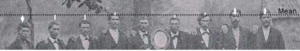
Figure 3.3: The heights of nine brothers were recorded on a tintype photograph in the 1880s. The version here has been annotated to show the mean height and the individual deviations from the mean.
In the more interesting models of later chapters, the model values will differ from case to case and so part of the variation among individual cases will be captured by the model. But here the model value is the same for all cases, so the deviations encompass all of the variation.
The word “deviation” has a negative connotation: a departure from an accepted norm or behavior. Indeed, in the mid-1800s, early in the history of statistics, it was widely believed that “normal” was best quantified as a single model value. The deviation from the model value was seen as a kind of mistake or imperfection. Another, related word from the early days of statistics is “error.” Nowadays, though, people have a better understanding that a range of behaviors is normal; normal is not just a single value or behavior.
| Height | Model Value | Residual | Square-Residual |
|---|---|---|---|
| (inch) | (inch) | (inch) | (inch²) |
| 72.0 | 66.25 | 5.75 | 33.06 |
| 62.0 | 66.25 | −4.25 | 17.06 |
| 68.0 | 66.25 | 1.75 | 3.05 |
| 65.5 | 66.25 | −0.75 | 0.56 |
| 63.0 | 66.25 | −3.25 | 10.56 |
| 64.7 | 66.25 | −1.55 | 2.40 |
| 72.0 | 66.25 | 5.75 | 33.06 |
| 69.0 | 66.25 | 2.75 | 7.56 |
| 61.5 | 66.25 | −4.75 | 22.56 |
| 72.0 | 66.25 | 5.75 | 33.06 |
| 59.0 | 66.25 | −7.25 | 52.56 |
| Sum of Squares: | 216.5 |
|| || || ||
The word residual provides a more neutral term than “deviation” or “error” to describe how each individual differs from the model value. It refers to what is left over when the model value is taken away from the individual case. The word “deviation” survives in statistics in a technical terms such as standard deviation, and deviance. Similarly, “error” shows up in some technical terms such as standard error.
Any of the measures from Section 3.1 can be used to describe the variation in the residuals. The range of extremes is from −10.7 inches to 12.3 inches. These numbers describe how much shorter the shortest person is from the model value and how much taller the tallest. Alternatively, you could use the 50% interval (−2.7 to 2.8 inches) or the 95% interval (−6.7 to 6.5 inches). Each of these is a valid description.
In practice, instead of the coverage intervals, a very simple, powerful, and perhaps unexpected measure is used: the mean square of the residuals. To produce this measure, add up the square of the residuals for the individual cases. This gives the sum of squares of the residuals as shown in Table 3.2. Such sums of squares will show up over and over again in statistical modeling.
It may seem strange to square the residuals. Squaring the residuals changes their units. For the height variable, the residuals are naturally in inches (or centimeters or meters or any other unit of length). The sum of squares, however is in units of square-inches, a bizarre unit for relating information about height. A good reason to compute the square is to emphasize the interest in how far each individual is from the mean. If you just added up the raw residuals, negative residuals (for those cases below the mean) would tend to cancel out positive residuals (for those cases above the mean). By squaring, all the negative residuals become positive square-residuals. It would also be reasonable do this by taking an absolute value rather than squaring, but the operation of squaring captures in a special way important properties of the potential randomness of the residuals.
Finding the sum of squares is an intermediate step to calculating an important measure of variation: the mean square. The mean square is intended to report a typical square residual for each case. The obvious way to get this is to divide the sum of squares by the number of cases, N. This is not exactly what is done by statisticians. For reasons that you will see later, they divide by N−1 instead. (When N is big, there is no practical difference between using N and N−1.) For the subset of the Galton data in Table 3.2, the mean square residual is 21.65 square-inches.
Later in this book, mean squares will be applied to all sorts of models in various ways. But for the very simple situation here – the every-case-the-same model – the mean square has a special name that is universally used: the variance.
The variance provides a compact description of how far cases are, on average, from the mean. As such, it is a simple measure of variation. It is undeniable that the unfamiliar units of the variance – squares of the natural units – make it hard to interpret. There is a simple cure, however: take the square root of the variance. This is called, infamously to many students of statistics, the standard deviation. For the Galton data in Table 3.2, the standard deviation is 4.65 inches (the square-root of 21.65 square-inches).
The term “standard deviation” might be better understood if “standard” were replaced by a more contemporary equivalent word: “typical.” The standard deviation is a measure of how far cases typically deviate from the mean of the group.
Historically, part of the appeal of using the standard deviation to describe variation comes from the ease of calculating it using arithmetic. Percentiles require more tedious sorting operations. Nowadays, computers make it easy to calculate 50% or 95% intervals directly from data. Still, standard deviations remain an important way of describing variation both because of historical convention and, more important for this book, because of its connection to concepts of modeling and randomness encountered in later chapters.
3.3 Displaying Variation
One of the best ways to depict variation is graphically. This takes advantage of the human capability to capture complicated patterns at a glance and to discern detail. There are several standard formats for presenting variation; each has its own advantages and disadvantages.
A simple but effective display plots out each case as a point along a number line. This rug plot is effectively a graphical listing of the values of the variable, case-by-case.
From the rug plot of Galton’s heights in Figure 3.4, you can see that the shortest person is about 56 inches tall, the tallest about 79 inches. You can also see that there is a greater density in the middle of the range. Unfortunately, the rug plot also suppresses some important features of the data. There is one tick at each height value for which there is a measurement, but that one tick might correspond to many individuals. Indeed, in Galton’s data, heights were rounded off to a quarter of an inch, so many different individuals have exactly the same recorded height. This is why there are regular gaps between the tick marks.
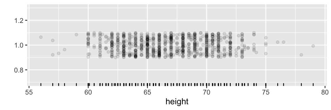
Figure 3.4: A rug plot of Galton’s height data. Each case is one tick mark.
Another simple display, the histogram, avoids this overlap by using two different axes. As in the rug plot, one of the axes shows the variable. The other axis displays the number of individual cases within set ranges, or “bins,” of the variable.
![A histogram arrangement published in 1914 of the student body of Connecticut Agricultural College (now the Univ. of Connecticut) grouped by height. [@blakesly-1914]](images/Blakely-histogram.png)
Figure 3.5: A histogram arrangement published in 1914 of the student body of Connecticut Agricultural College (now the Univ. of Connecticut) grouped by height. (Blakeslee 1914)
Figure 3.5 shows a “living histogram,” made by arranging people by height. The people in each “bar” fall into a range of values, the bin range, which in Figure 3.5 is one inch wide. If a different bin width had been chosen, say 1 cm, the detailed shape of the histogram would be different, but the overall shape – here, peaked in the center, trailing off to the extremes – would be much the same.
Histograms have been a standard graphical format for more than a century, but even so they are often not interpreted correctly. Many people wrongly believe that variation in the data is reflected by the uneven height of the bars. Rather, the variation is represented by the width of the spread measured from side to side, not from bottom to top.
The histogram format tends to encourage people to focus on the irregularity in bar height, since so much graphical ink is devoted to distinguishing between the heights of neighboring bars. The graphically busy format also makes it difficult to compare the distribution of two groups, especially when the groups are very different in size.
A more modern format for displaying distributions is a density plot. To understand a density plot, start with the idea of a rug plot, as in Figure 3.4. The “density” of points in the rug plot reflects how close together the cases are. In places where the cases are very close, the density is high. Where the cases are spread out far from one another, the density is low. In the density plot, a smooth curve is used to trace how the density varies from place to place. Unlike the histogram, the density plot does not divide the cases into rigid bins.
The height of the density-plot curve is scaled so that the overall area under the curve is always exactly 1. This choice makes it possible to interpret the area under a part of the curve as the fraction of cases that lie in that plot.
Since the density plot is a smooth curve, and since the area is scaled to 1, it’s feasible to compare different groups. Consider, for example, a dataset reflecting the ages of employees at a national firm. Due to an economic slowdown, the firm “terminated” about 10% of its employees. Some of those who were terminated felt that they were being discriminated against on the basis of age. One way to examine this issue is to compare the distribution of ages of those who were terminated to those who were not. Figure 3.6 overlays density plots of age for the two groups. Note that the densities are similar for the two groups, even though the number of people in the two groups is very different.
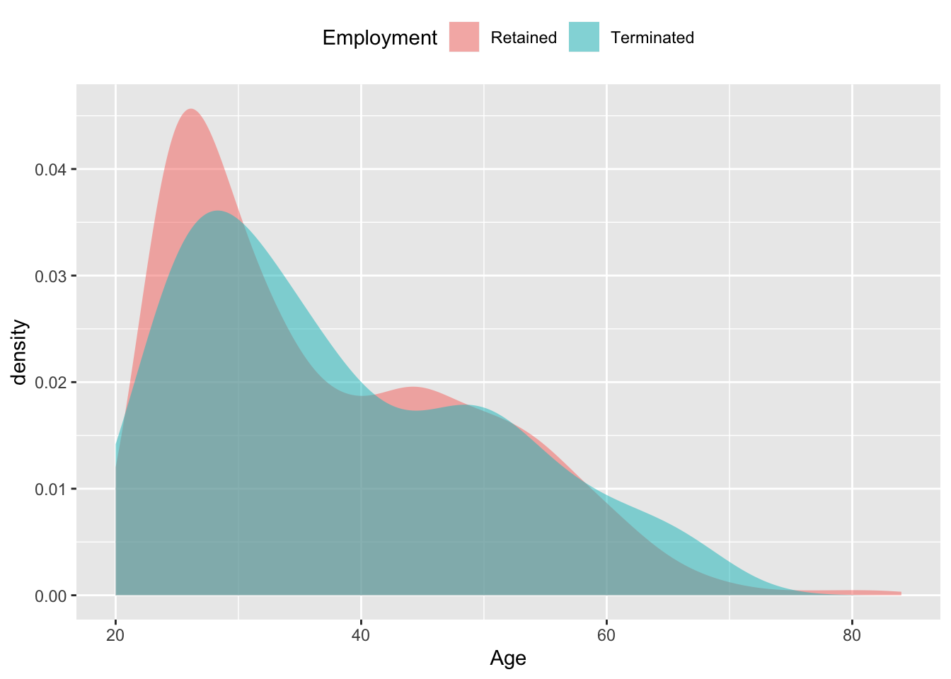
Figure 3.6: The age distribution of employees at a national firm whose employment was terminated, compared to the age distribution for those who were retained.
The first thing to notice about the density distribution in Figure 3.6 is that in both groups there are many more employees in their 20s than older employees – the density falls off fairly steadily with age. This sort of distribution is called skew right, since the long “tail” of the distribution runs to the right. In contrast, the histogram of heights (Figure 3.5 is symmetric, peaked in the center and falling off similarly both to the left and the right. The density plots also shows that employees range in age from about 20 years to 80 years – consistent with what we know about people’s career patterns.
The densities of the terminated and retained groups are roughly similar, suggesting that there is no night-and-day difference between the two groups. The graph does suggest that the retained employees are somewhat more likely to be in their 20s than the fired employees, and that the fired employees are more likely to be in their 60s than the retained employees. There seems to be a hump in the age distribution of the retained employees in their 40s, and a corresponding dip in the terminated employees in their 40s. Later chapters will deal with the question of whether such “small” differences are consistent or inconsistent with the inevitable random fluctuations that appear in data, or whether they are strong enough to suggest a systematic effect. It takes a bit of thought to understand the units of measuring density. In general, the word “density” refers to an amount per unit length, or area, or volume. For example, the mass-volume density of water is the mass of water per unit of volume, typically given as kilograms per liter. The sort of density used for density plots is the fraction-of-cases per unit of the measured variable.
To see how this plays out in Figure 3.6, recall that the unit of the measured variable, age, is in years, so the units of the density axis is “per year”. The area of each of the large grid rectangles in the plot is 10 years × 0.01 per year = 0.1. If you count the number grid rectangles under each of the curves, taking the fractional part of each rectangle that is covered in part, you will find approximately 10 covered rectangles, giving an overall area of 0.1 × 10 = 1.0. Indeed, the units on the “density” axis are always scaled so that the area under the density curve is exactly 1.
3.4 Shapes of Distributions
A very common form for the density of variables is the bell-shaped pattern seen in Figure 3.5: the individuals are distributed with most near the center and fewer and fewer near the edges. The pattern is so common that a mathematical idealization of it is called the normal distribution.
Don’t be mislead by the use of the word “normal.” Although the bell-shaped distribution is common, other shapes of distributions also often occur, such as the right skew distribution seen in the age distribution of employees in Figure 3.6. It’s easy to imagine how such a distribution arose for ages of employees: a company starts with a few employees and hires younger employees as it grows. The growing company hires more and more employees each year, creating a large population of young workers compared to the small group of old-timers who started with the company when it was small.
It’s tempting to focus on the details of a distribution, and sometimes this is appropriate. For example, it’s probably not a coincidence that there is a dip in the terminated employee age distribution just after age 40; the U.S. the Age Discrimination in Employment Act of 1967 prohibits discrimination against those 40 and older, so a company seeking to stay in compliance with the Act would understandably be more likely to fire a 39-year old than a 41-year old.
Usually, distributions are examined for their gross or coarse characteristics: the location of their center, their width, whether they are skew or symmetric, etc. A nice graphical device for emphasizing such broad characteristics is the violin plot. The violin plot puts displays of density side by side. Within the “violin”, the lines show the first quartile, median, and third quartile. Figure 3.7 shows a violin plot of the employee age versus termination data. Note that the variable itself is being plotted on the vertical axis, contrasting with the other graphical depictions where the variable has been plotted on the horizontal axis.
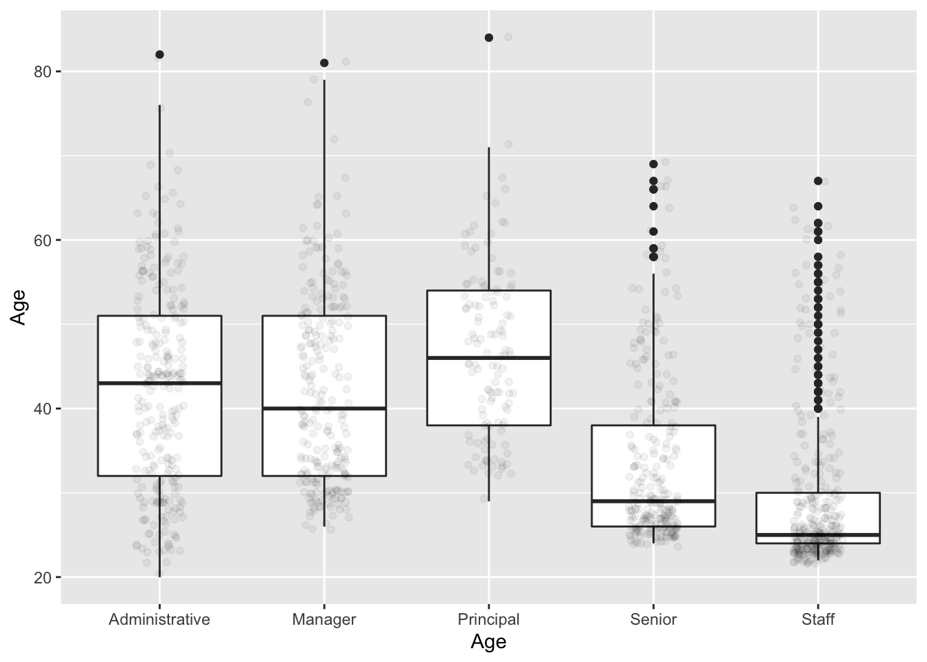
Figure 3.7: Side-by-side boxplots comparing the ages of the terminated and retained employees of different levels of employees.
The stylized display of the box plot is most useful when comparing the distribution of a variable across two or more different groups, as in Figure 3.7. In that bar plot, you can see that employees at the “Principal” level tend to be somewhat older than other employees, that “Staff” tend to be the youngest, and that “Senior” employees are not so senior. You can also see that the age distribution for Staff is skewed toward higher ages, meaning that while most Staff are young – the median age is only 25, and three-quarters of staff are 30 or younger – there are several staff aged 40 and above, marked as individual dots to indicate that they fall quite far from the typical pattern: they are outliers. Notice also that a 50-year old is regarded as an outlier among the Staff, but is quite in the middle for Principals.
3.4.1 Categorical Variables
All of the measures of variation encountered so far are for quantitative variables; the kind of variable for which it’s meaningful to average or sort.
Categorical variables are a different story. One thing to do is to display the variation using tables and bar charts. For example, in the employment data, the number of employees at each level can be shown concisely with a table as in Table 3.3.
| Level | Freq |
|---|---|
| Staff | 337 |
| Administrative | 266 |
| Senior | 261 |
| Manager | 245 |
| Principal | 121 |
The same information, in graphical form, takes up more space, and should perhaps be considered a decorative technique rather than an efficient way to inform.
3.4.2 Quantifying Categorical Variation
For a quantitative variable, such as Age in the employment data, there are several good choices for describing the variation:
- The standard deviation, 12.3 years.
- The variance, 151.833 square-years, which is just the square of the standard deviation.
- The interquartile interval, 19
But when it comes to categorical variables, giving a numerical summary for variation is a more difficult matter. Recall that for quantitative variables, one can define a “typical” value, e.g., the mean or the median. It makes sense to measure residuals as how far an individual value is from the typical value, and to quantify variation as the average size of a residual. This led to the variance and the standard deviation as measures of variation.
For a categorical variable like sex, concepts of mean or median or distance or size don’t apply. Neither F nor M is typical and in-between doesn’t really make sense. Even if you decided that, say, M is typical – there are somewhat more of them in Galton’s data – how can you say what the “distance” is between F and M?
Statistics textbooks hardly ever give a quantitative measure of variation in categorical variables. That’s understandable for the reasons described above. But it’s also a shame because many of the methods used in statistical modeling rely on quantifying variation in order to evaluate the quality of models.
There are quantitative notions of variation in categorical variables. You won’t have use for them directly, but they are used in the software that fits models of categorical variables.
Solely for the purposes of illustration, here is one measure of variation in categorical variables with two levels, say F and M as in sex in Galton’s data. Two-level variables are important in lots of settings, for example diagnostic models of whether or not a patient has cancer or models that predict whether a college applicant will be accepted.
Imagine that altogether you have N cases, with k being level F and N-k being level M. (In Galton’s data, N is 898, while k=433 and N-k=465.) A simple measure of variation in two-level categorical variables is called, somewhat awkwardly, the unalikeability. This is
\[\mbox{unalikeability} = 2 \frac{k}{N} \frac{N-k}{N}.\]
Or, more simply, if you write the proportion of level F as p_F, and therefore the proportion of level M as 1 - p_F, \[\mbox{unalikeability} = 2 p_F (1-p_F).\]
For instance, in the variable sex, p_F = 433 / 898 = 0.482. The unalikeability is therefore 2 × 0.482 × 0.518 = 0.4993.
Some things to notice about unalikeability: If all of the cases are the same (e.g., all are F), then the unalikeability is zero – no variation at all. The highest possible level of unalikeability occurs when there are equal numbers in each level; this gives an unalikeability of 0.5.
Where does the unalikeability come from? One way to think about unalikeability is as a kind of numerical trick. Pretend that the level F is 1 and the level M is 0 – turn the categorical variable into a quantitative variable. With this transformation, sex looks like 0 1 1 1 0 0 1 1 0 1 0 and so on. Now you can quantify variation in the ordinary way, using the variance. It turns out that the unalikeability is exactly twice the variance.
Here’s another way to think about unalikeability: although you can’t really say how far F is from M, you can certainly see the difference. Pick two of the cases at random from your sample. The unalikeability is the probability that the two cases will be different: one an M and the other an F.
There is a much more profound interpretation of unalikeability that is introduced in Chapter 16, which covers modeling two-level categorical variables. For now, just keep in mind that you can measure variation for any kind of variable and use that measure to calculate how much of the variation is being captured by your models.