Chapter 6 Language of Models
I do not believe in things. I believe only in their relationships. – Georges Braque (1882-1963) cubist painter
Mathematicians do not study objects, but relations among objects. – Henri Poincarè (1854-1912) mathematician
Chapter 4 is concerned with model forms based on division into groups. Those models are very common, but their utility is limited: the models can be misleading because they fail to take into concern multiple factors that can shape outcomes, not just simple membership in a group. This chapter starts down the path toward more sophisticated models. The point of departure will be a set of concepts and a notation for describing models that are more general and therefore more flexible than simple group-wise models.
One October I received a bill from the utility company: $52 for natural gas for the month. According to the bill, the average outdoor temperature during October was 49°F (9.5°C).
I had particular interest in this bill because two months earlier, in August, I replaced the old furnace in our house with a new, expensive, high-efficiency furnace that’s supposed to be saving gas and money. This bill is the first one of the heating season and I want to know whether the new furnace is working.
To be able to answer such questions, I keep track of my monthly utility bills. The gasbill variable shows a lot of variation: from $3.42 to $240.90 per month. The 50% coverage interval is $21.40 to $117.90. The mean bill is $77.85. Judging from this, the $52 October bill is low. It looks like the new furnace is working!
Perhaps that conclusion is premature. My new furnace is just one factor that can influence the gas bill. Some others: the weather, the price of natural gas (which fluctuates strongly from season to season and year to year), the thermostat setting, whether there were windows or doors left open, how much gas we use for cooking, etc. Of all the factors, I think the weather and the price of natural gas are the most important. I’d like to take these into account when judging whether the $52 bill is high or low.
Rather than looking at the bill in dollars, it makes sense to look at the quantity of gas used. After all, the new furnace can only reduce the amount of gas used, it doesn’t influence the price of gas. According to the utility bill, the usage in October was 65 ccf. (“ccf” means cubic feet, one way to measure the quantity of gas.) The variable ccf gives the historical values from past bills: the range is 0 to 242 ccf, so 65 ccf seems perfectly reasonable, but it’s higher than the median monthly usage, which is 51 ccf. Still, this doesn’t take into account the weather.
Now it is time to build a model: a representation of the utility data for the purpose of telling whether 65 ccf is low or high given the temperature. The variable temperature contains the average temperature during the billing period.
A simple graph of ccf versus temperature will suffice. (See Figure 6.1.) The open point shows the October bill (49 deg. and 65 ccf). The gray line indicates which points to look at for comparison, those from months near 49 degrees.
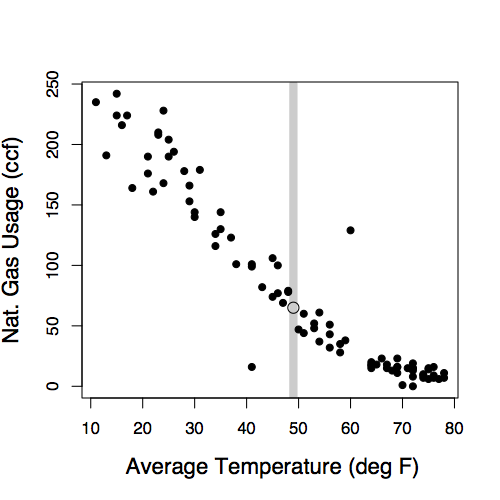
Figure 6.1: Monthly natural gas usage versus average outdoor temperature during the month.
The graph suggests that 65 ccf is more or less what to expect for a month where the average temperature is 49 degrees. The new furnace doesn’t seem to make much of a difference.
6.1 Models as Functions
Figure 6.1 gives a pretty good idea of the relationship between gas usage and temperature.
The concept of a function is very important when thinking about relationships. A function is a mathematical concept: the relationship between an output and one or more inputs. One way to talk about a function is that you plug in the inputs and receive back the output. For example, the formula y = 3x + 7 can be read as a function with input x and output y. Plug in a value of x and receive the output y. So, when x is 5, the output y is 22.
One way to represent a function is with a formula, but there are other ways as well, for example graphs and tables. Figure 6.2 shows a function representing the relationship between gas usage and temperature. The function is much simpler than the data. In the data, there is a scatter of usage levels at each temperature. But in the function there is only one output value for each input value.
Some vocabulary will help to describe how to represent relationships with functions.
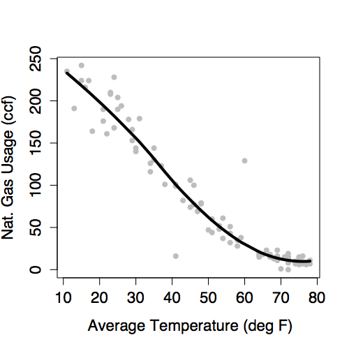
Figure 6.2: A model of natural gas usage versus outdoor temperature.
The response variable is the variable whose behavior or variation you are trying to understand. On a graph, the response variable is conventionally plotted on the vertical axis.
The explanatory variables are the other variables that you want to use to explain the variation in the response. Figure 6.1 shows just one explanatory variable,
temperature. It’s plotted on the horizontal axis.Conditioning on explanatory variables means taking the value of the explanatory variables into account when looking at the response variables. When in Figure 6.1 you looked at the gas usage for those months with a temperature near 49°, you were conditioning gas usage on temperature.
The model value is the output of a function. The function – called the model function – has been arranged to take the explanatory variables as inputs and return as output a typical value of the response variable. That is, the model function gives the typical value of the response variable conditioning on the explanatory variables. The function shown in Figure 6.2 is a model function. It gives the typical value of gas usage conditioned on the
temperature. For instance, at 49°, the typical usage is 65 ccf. At 20°, the typical usage is much higher, about 200 ccf.The residuals show how far each case is from its model value. For example, one of the cases plotted in Figure 6.2 is a month where the
temperaturewas 13° and the gas usage was 191 ccf. When the input is 13°, the model function gives an output of 228 ccf. So, for that case, the residual is 191 - 228 = -37 ccf. Residuals are always “actual value minus model value.”
Graphically, the residual for each case tells how far above the model function that case is. A negative residual means that the case is below the model function.
The idea of a function is fundamental to understanding statistical models. Whether the function is represented by a formula or a graph, the function takes one or more inputs and produces an output. In the statistical models in this book, that output is the model value, a “typical” or “ideal” value of the response variable at given levels of the inputs. The inputs are the values explanatory variables.
The model function describes how the typical value of the response variable depends on the explanatory variables. The output of the model function varies along with the explanatory variables. For instance, when temperature is low, the model value of gas usage is high. When temperature is high, the model value of gas usage is low. The idea of “depends on” is very important. In some fields such as economics, the term dependent variable is used instead of “response variable.” Other phrases are used for this notion of “depends on,” so you may hear statements such as these: “the value of the response given the explanatory variables,” or “the value of the response conditioned on the explanatory variables.”
The model function describes a relationship. If you plug in values for the explanatory variables for a given case, you get the model value for that case. The model value is usually different from one case to another, at least so long as the values of the explanatory variables are different. When two cases have exactly the same values of the explanatory values, they will have exactly the same model value even though the actual response value might be different for the two cases.
The residuals tell how each case differs from its model value. Both the model values and the residuals are important. The model values tell what’s typical or average. The residuals tell how far from typical an individual case is likely to be. This might remind you of the mean and standard deviation.
As already said, models partition the variation in the response variable. Some of the variability is explained by the model, the remainder is unexplained. The model values capture the “deterministic” or “explained” part of the variability of the response variable from case to case. The residuals represent the “random” or “unexplained” part of the variability of the response variable.
6.2 Model Functions with Multiple Explanatory Variables
Historically, women tended to be paid less than men. To some extent, this reflected the division of jobs along sex lines and limited range of jobs that were open to women – secretarial, nursing, school teaching, etc. But often there was simple discrimination; an attitude that women’s work wasn’t as valuable or that women shouldn’t be in the workplace. Over the past thirty or forty years, the situation has changed. Training and jobs that were once rarely available to women – police work, management, medicine, law, science – are now open to them.
Surveys consistently show that women tend to earn less than men: a “wage gap.” To illustrate, consider data from one such survey, the Current Population Survey (CPS) from 1985. CPS In the survey data, each case is one person. The variables are the person’s hourly wages at the time of the survey, age, sex, marital status, the sector of the economy in which they work, etc.
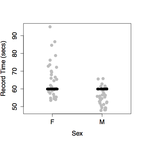
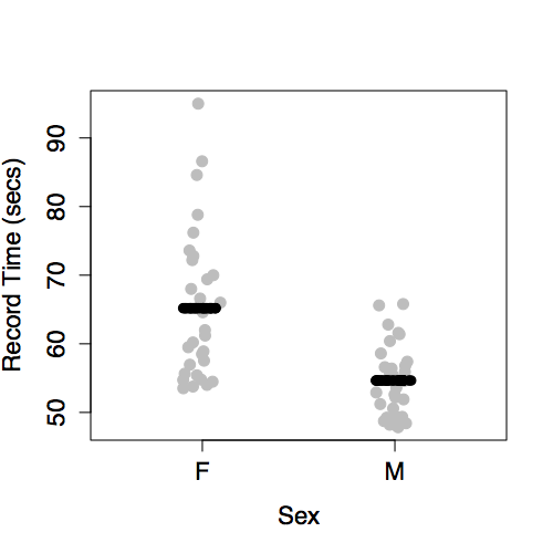
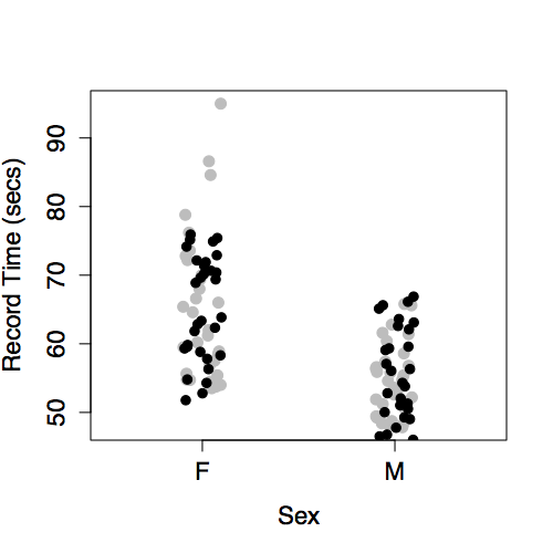
One aspect of these data is displayed by plotting wage versus sex, as in Figure 6.3. The model plotted along with the data show that typical wages for men are higher than for women.
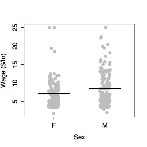
Figure 6.3: Hourly wages versus sex from the Current Population Survey data of 1985.
The situation is somewhat complex since the workforce reflected in the 1985 data is a mixture of people who were raised in the older system and those who were emerging in a more modern system. A woman’s situation can depend strongly on when she was born. This is reflected in the data by the age variable.
There are other factors as well. The roles and burdens of women in family life remain much more traditional than their roles in the economy. Perhaps marital status ought to be taken into account. In fact, there are all sorts of variables that you might want to include – job type, race, location, etc.
A statistical model can include multiple explanatory variables, all at once. To illustrate, consider explaining wage using the worker’s age, sex, and marital status.
In a typical graph of data, the vertical axis stands for the response variable and the horizontal axis for the explanatory variable. But what do you do when there is more than one explanatory variable? One approach, when some of the explanatory variables are categorical, is to use differing symbols or colors to represent the differing levels of the categories. Figure 6.4 shows wages versus age, sex, and marital status plotted out this way.
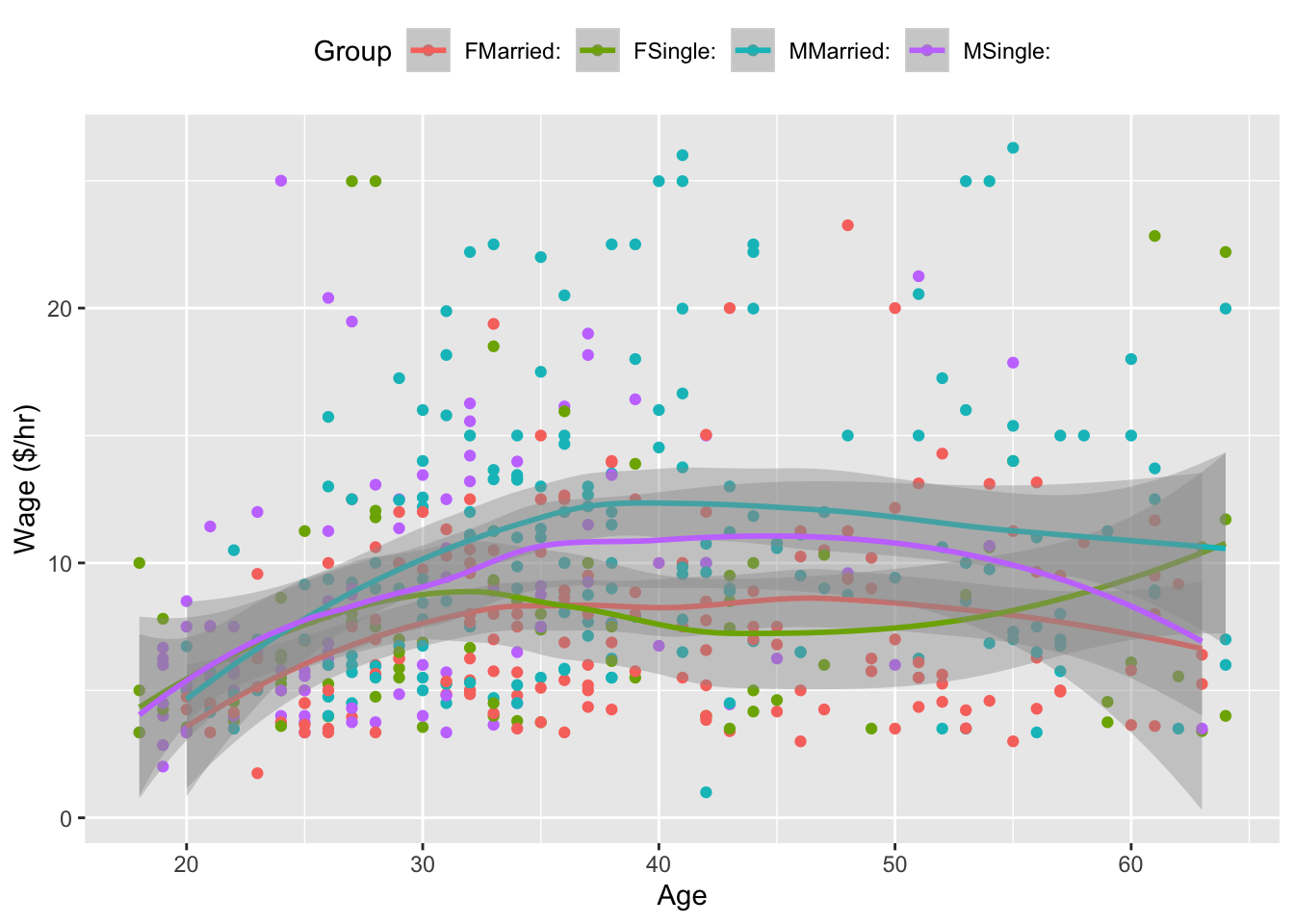
Figure 6.4: Hourly wages versus age, sex, and marital status. It’s hard to see a pattern among the data points; the models (shown as smooth curves) suggest that wages increase until age 40, then level off.
The first thing that might be evident from the scatter plot is that not very much is obvious from the data on their own. There does seem to be a slight increase in wages with age, but the cases are scattered all over the place.
The model, shown as the continuous curves in the figure, simplifies things. The relationships shown in the model are much clearer. You can see that wages tend to increase with age, up until about age 40, and they do so differently for men and for women and differently for married people and single people.
Models can sometimes reveal patterns that are not evident in a graph of the data. This is a great advantage of modeling over simple visual inspection of data. There is a real risk, however, that a model is imposing structure that is not really there on the scatter of data, just as people imagine animal shapes in the stars. A skeptical approach is always warranted. Much of the second half of the book is about ways to judge whether the structure suggested by a model is justified by the data.
There is a tendency for those who first encounter models to fix attention on the clarity of the model and ignore the variation around the model. This is a mistake. Keep in mind the definition of statistics offered in the first chapter:
Statistics is the explanation of variation in the context of what remains unexplained.
The scatter of the wage data around the model is very large; this is a very important part of the story. The scatter suggests that there might be other factors that account for large parts of person-to-person variability in wages, or perhaps just that randomness plays a big role.
Compare the broad scatter of wages to the rather tight way the gas usage in Figure 6.1 is modeled by average temperature. The wage model is explaining only a small part of the variation in wages, the gas-usage model explains a very large part of the variation in those data.
Adding more explanatory variables to a model can sometimes usefully reduce the size of the scatter around the model. If you included the worker’s level of education, job classification, age, or years working in their present occupation, the unexplained scatter might be reduced. Even when there is a good explanation for the scatter, if the explanatory variables behind this explanation are not included in the model, the scatter due to them will appear as unexplained variation. (In the gas-usage data, it’s likely that wind velocity, electricity usage that supplements gas-generated heat, and the amount of gas used for cooking and hot water would explain a lot of the scatter. But these potential explanatory variables were not measured.)
6.3 Reading a Model
There are two distinct ways that you can read a model.
Read out the model value. Plug in specific values for the explanatory variables and read out the resulting model value. For the model in Figure 6.1, an input temperature of 35° produces a predicted output gas usage of 125 ccf. For the model in Figure 6.4 a single, 30-year old female has a model value of $8.10 per hour. (Remember, the model is based on data from 1985!)
Characterize the relationship described by the model. In contrast to reading out a model value for some specific values of the explanatory variables, here interest is in the overall relationship: how gas usage depends on temperature; how wages depend on sex or marital status or age.
Reading out the model value is useful when you want to make a prediction (What would the gas usage be if the temperature were 10° degrees?) or when you want to compare the actual value of the response variable to what the model says is a typical value. (Is the gas usage lower than expected in the 49° month, perhaps due to my new furnace?).
Characterizing the relationship is useful when you want to make statements about broad patterns that go beyond individual cases. Is there really a connection between marital status and wage? Which way does it go?
The “shape” of the model function tells you about such broad relationships. Reading the shape from a graph of the model is not difficult.
For a quantitative explanatory variable, e.g., temperature or age, the model form is a continuous curve or line. An extremely important aspect of this curve is its slope. For the model of gas usage in Figure 6.2, the slope is down to the right: a negative slope. This means that as temperature increases, the gas usage goes down. In contrast, for the model of wages in Figure 6.4, the slope is up to the right: a positive slope. This means that as age increases, the wage goes up.
The slope is measured in the usual way: rise over run. The numerical size of the slope is a measure of the strength of the relationship, the sign tells which way the relationship goes. Some examples: For the gas usage model in Figure 6.2 in winter-like temperatures, the slope is about -4 ccf/degree. This means that gas usage can be expected to go down by 4 ccf for every degree of temperature increase. For the model of wages in Figure 6.4, the slope for single females is about 0.20 dollars-per-hour/year: for every year older a single female is, wages typically go up by 20 cents-per-hour.
Slopes have units. These are always the units of the response variable divided by the units of the explanatory variable. In the wage model, the response has units of dollars-per-hour while the explanatory variable age has units of years. Thus the units of the slope are dollars-per-hour/year.
For categorical variables, slopes don’t apply. Instead, the pattern can be described in terms of differences. In the model where wage is explained only by sex, the difference between typical wages for males and females is 2.12 dollars per hour.
When there is more than one explanatory variable, there will be a distinct slope or difference associated with each.
When describing models, the words used can carry implications that go beyond what is justified by the model itself. Saying “the difference between typical wages” is pretty neutral: a description of the pattern. But consider this statement: “Typical wages go up by 20 cents per hour for every year of age.” There’s an implication here of causation, that as a person ages his or her wage will go up. That might in fact be true, but the data on which the model is based were not collected in a way to support that claim. Those data don’t trace people as they age; they are not longitudinal data. Instead, the data are a snapshot of different people at different ages: cross-sectional data. It’s dangerous to draw conclusions about changes over time from cross-sectional data of the sort in the CPS data set. Perhaps people’s wages stay the same over time but that the people who were hired a long time ago tended to start at higher wages than the people who have just been hired.
Consider this statement: “A man’s wage rises when he gets married.” The model in Figure 6.4 is consistent with this statement; it shows that a married man’s typical wage is higher than an unmarried man’s typical wage. But does marriage cause a higher wage? It’s possible that this is true, but that conclusion isn’t justified from the data. There are other possible explanations for the link between marital status and wage. Perhaps the men who earn higher wages are more attractive candidates for marriage. It might not be that marriage causes higher wages but that higher wages cause marriage.
To draw compelling conclusions about causation, it’s important to collect data in an appropriate way. For instance, if you are interested in the effect of marriage on wages, you might want to collect data from individuals both before and after marriage and compare their change in wages to that over the same time period in individuals who don’t marry. As described in Chapter 18, the strongest evidence for causation involves something more: that the condition be imposed experimentally, picking the people who are to get married at random. Such an experiment is hardly possible when it comes to marriage.
6.4 Choices in Model Design
The suitability of a model for its intended purpose depends on choices that the modeler makes. There are three fundamental choices:
- The data.
- The response variable.
- The explanatory variables.
The Data
How were the data collected? Are they a random sample from a relevant sampling frame? Are they part of an experiment in which one or more variables were intentionally manipulated by the experimenter, or are they observational data? Are the relevant variables being measured? (This includes those that may not be directly of interest but which have a strong influence on the response.) Are the variables being measured in a meaningful way? Start thinking about your models and the variables you will want to include while you are still planning your data collection.
When you are confronted with a situation where your data are not suitable, you need to be honest and realistic about the limitations of the conclusions you can draw. The issues involved will be discussed starting in Chapter 17.
The Response Variable
The appropriate choice of a response variable for a model is often obvious. The response variable should be the thing that you want to predict, or the thing whose variability you want to understand. Often, it is something that you think is the effect produced by some other cause.
For example, in examining the relationship between gas usage and outdoor temperature, it seems clear that gas usage should be the response: temperature is a major determinant of gas usage. But suppose that the modeler wanted to be able to measure outdoor temperature from the amount of gas used. Then it would make sense to take temperature as the response variable.
Similarly, wages make sense as a response variable when you are interested in how wages vary from person to person depending on traits such as age, experience, and so on. But suppose that a sociologist was interested in assessing the influence of income on personal choices such as marriage. Then the marital status might be a suitable response variable, and wage would be an explanatory variable.
Most of the modeling techniques in this book require that the response variable be quantitative. The main reason is that there are straightforward ways to measure variation in a quantitative variable and measuring variation is key to assessing the reliability of models. There are, however, methods for building models with a categorical response variable. (One of them, logistic regression, is the subject of Chapter 16)
Explanatory Variables
Much of the thought in modeling goes into the selection of explanatory variables and later chapters in this book describes several ways to decide if an explanatory variable ought to be included in a model.
Of course, some of the things that shape the choice of explanatory variables are obvious. Do you want to study sex-related differences in wage? Then sex had better be an explanatory variable. Is temperature a major determinant of the usage of natural gas? Then it makes sense to include it as an explanatory variable.
You will see situations where including an explanatory variable hurts the model, so it is important to be careful. (This will be discussed in Chapter 12.) A much more common mistake is to leave out explanatory variables. Unfortunately, few people learn the techniques for handling multiple explanatory variables and so your task will often need to go beyond modeling to include explaining how this is done.
When designing a model, you should think hard about what are potential explanatory variables and be prepared to include them in a model along with the variables that are of direct interest.
6.5 Model Terms
Once the modeler has selected explanatory variables, a choice must be made about model terms.
Notice that the various models have graphs of different shapes. The gas-usage model is a gentle curve, the wage-vs-sex model is just two values, and the more elaborate wage model is four lines with different slopes and intercepts.
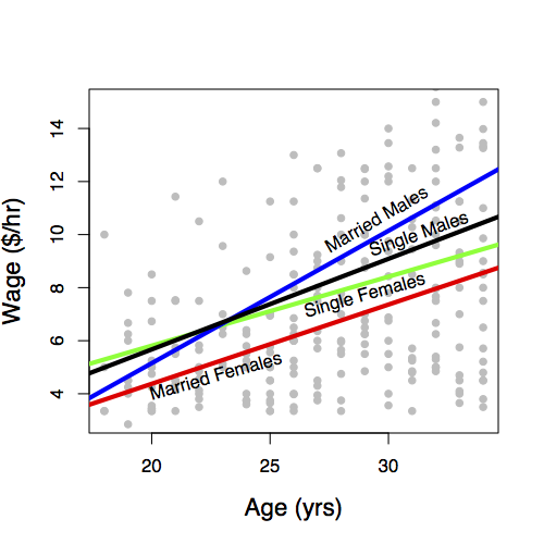
Figure 6.5: (Top) Gas usage vs temperature; (middle) Wages vs sex; (Bottom) Wages vs age, sex, and marital status
The modeler determines the shape of the model through his or her choice of model terms. The basic idea of a model term is that explanatory variables can be included in a model in more than one way. Each kind of term describes a different way to include a variable in the model.
You need to learn to describe models using model terms for several reasons. First, you will communicate in this language with the computers that you will use to perform the calculations for models. Second, when there is more than one explanatory variable, it’s hard to visualize the model function with a graph. Knowing the language of model terms will help you “see” the shape of the function even when you can’t graph it. Third, model terms are the way to talk about “parts” of models. In evaluating a model, statistical methods can be used to take the model apart and describe the contribution of each part. This analysis – the word “analysis” literally means to loosen apart – helps the modeler to decide which parts are worth keeping.
There are just a few basic kinds of models terms. They will be introduced by example in the following sections
- intercept term: a sort of “baseline” that is included in almost every model.
- main terms: the effect of explanatory variables directly.
- interaction terms how different explanatory variables modulate the relationship of each other to the response variable.
- transformation terms: simple modifications of explanatory variables.
Models almost always include the intercept term and a main term for each of the explanatory variables. Transformation and interaction terms can be added to create more expressive or flexible shapes.
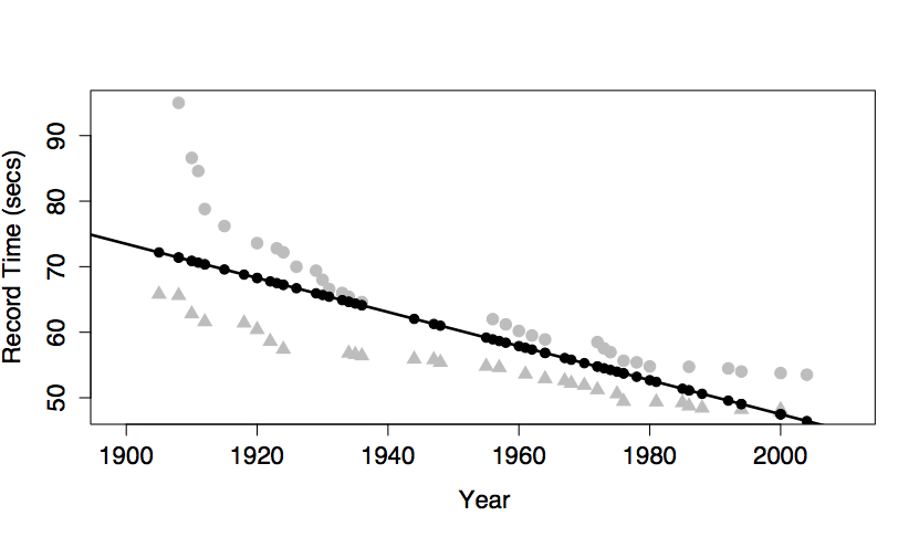
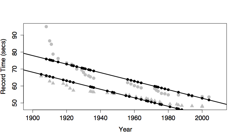
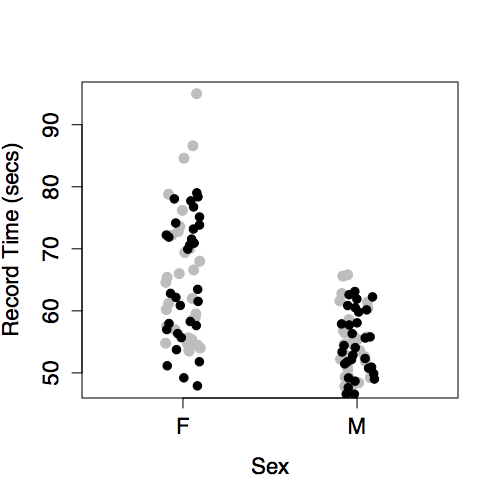
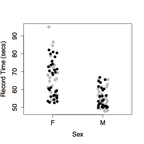
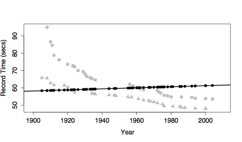
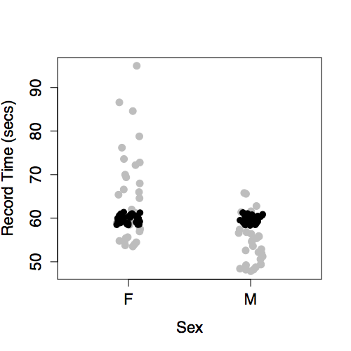
To form an understanding of how different kinds of terms contribute to the overall “shape” of the model function, it’s best to look at the differently shaped functions that result from including different model terms. The next section illustrates this. Several differently shaped models are constructed of the same data plotted in Figure 6.6. The data are the record time (in seconds) for the 100-meter freestyle race along with the year in which the record was set and the sex of the swimmer. The response variable will be time, the explanatory variables will be year and sex.
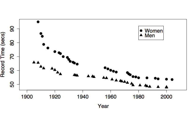
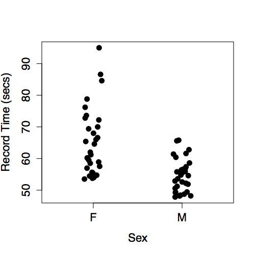
Figure 6.6: World record swimming times in the 100-meter freestyle.
Figure 6.6 shows some obvious patterns, seen most clearly in the plot of time versus year. The record time has been going down over the years. This is natural, since setting a new record means beating the time of the previous record. There’s also a clear difference between the men’s and women’s records; men’s record times are faster than women’s, although the difference has decreased markedly over the years.
The following models may or may not reflect these patterns, depending on which model terms are included.
The Intercept Term (and no other terms)
The intercept term is included in almost every statistical model. The intercept term is a bit strange because it isn’t something you measure; it isn’t a variable. (The term “intercept” will make sense when model formulas are introduced in the next chapter.)
The figure below shows the swimming data with a simple model consisting only of the intercept term.
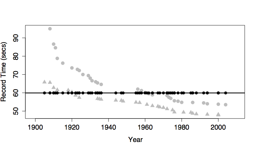
The model value for this model is exactly the same for every case. In order to create model variation from case to case, you would need to include at least one explanatory variable in the model.
Intercept and Main Terms
The most basic and common way to include an explanatory variable is as a main effect. Almost all models include the intercept term and a main term for each of the explanatory variables. The figures below show three different models each of this form:
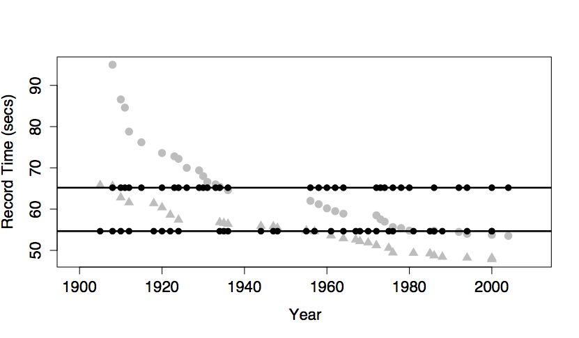
The intercept and a main term from year. This produces model values that vary with year, but show no difference between the sexes. This is because sex has not been included in the model.
The model values have been plotted out as small black dots. The model pattern is evident in the left graph: swim time versus year. But in the right graph – swim time versus sex – it seems to be all scrambled. Don’t be confused by this. The right-hand graph doesn’t include year as a variable, so the dependence of the model values on year is not at all evident from that graph. Still, each of the model value dots in the left graph occurs in the right graph at exactly the same vertical coordinate.
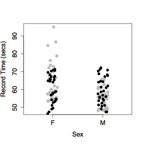
The intercept and a main term from sex. This produces different model values for each level of sex.
There is no model variation with year because year has not been included in the model.
The intercept and main terms from sex and from year. This model gives dependence on both sex and year.
Note that the model values form two parallel lines in the graph of time versus year: one line for each sex.
Interaction Terms
Interaction terms combine two other terms, typically two main terms. An interaction term can describe how one explanatory variable modulates the role of another explanatory variable in modeling the relationship of both with the response variable.
In the graph, including the interaction term between sex and year produces a model with two non-parallel lines for time versus year. (The model also has the main terms for both sex and year and the intercept term, as always.)
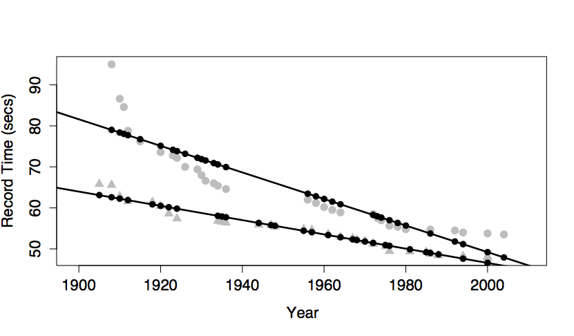
One way to think about the meaning of the interaction term in this model is that it describes how the effect of sex changes with year. Looking at the model, you can see how the difference between the sexes changes over the years; the difference is getting smaller. Without the interaction term, the model values would be two parallel lines; the difference between the lines wouldn’t be able to change over the years.
Another, equivalent way to put things is that the interaction term describes how the effect of year changes with sex. The effect of year on the response is reflected by the slope of the model line. Looking at the model, you can see that the slope is different depending on sex: steeper for women than men.
For most people, it’s surprising that one term – the interaction between sex and year – can describe both how the effect of year is modulated by sex, and how the effect of sex is modulated by year. But these are just two ways of looking at the same thing.
A common misconception about interaction terms is that they describe how one explanatory variable affects another explanatory variable. Don’t fall into this error. Model terms are always about how the response variable depends on the explanatory variables, not how explanatory variables depend on one another. An interaction term between two variables describes how two explanatory variables combine jointly to influence the response variable.
Once people learn about interaction terms, they are tempted to include them everywhere. After all, it’s natural to think that world record swimming times would depend differently on year for women than for men. Of course wages might depend differently on age for men and women! Regretably, the uncritical use of interaction terms can lead to poor models. The problem is not the logic of interaction, the problem is in the data. Interaction terms can introduce a problem called multi-collinearity which can reduce the reliability of models. (See Chapter 12.) Fortunately, it’s not hard to detect multi-collinearity and to drop interaction terms if they are causing a problem. The model diagnostics that will be introduced in later chapters will make it possible to play safely with interaction terms.
Transformation Terms
A transformation term is a modification of another term using some mathematical transformation. Transformation terms only apply to quantitative variables. Some common transformations are x² or √x or log(x), where the quantitative explanatory variable is x.
A transformation term allows the model to have a dependence on \(x\) that is not a straight line. The graph shows a model that includes these terms: an intercept, main effects of sex and year, an interaction between sex and year, and a year-squared transformation term.
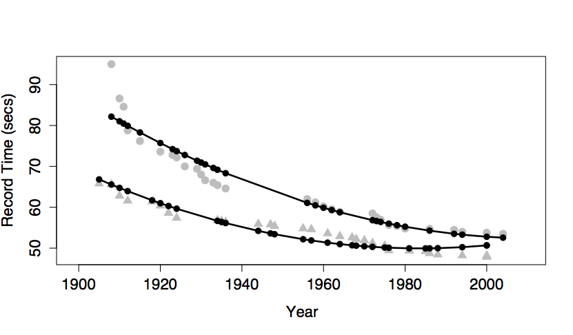
Adding in the year-squared term provides some curvature to the model function.
Aside: Are swimmers slowing down?
Look carefully at the model with a year-squared transformation term. You may notice that, according to the model, world record times for men have been getting worse since about year 1990. This is, of course, nonsense. Records can’t get worse. A new record is set only when an old record is beaten. The model doesn’t know this common sense about records – the model terms allow the model to curve in a certain way and the model curves in exactly that way. What you probably want out of a model of world records is a slight curve that’s constrained never to slope upward. There is no elementary way to do this. Indeed, it is an unresolved problem in statistics how best to include in a model additional knowledge that you might have such as “world records can’t get worse with time.”
Main Effects without the Intercept
It’s possible to construct a model with main terms but no intercept terms. If the explanatory variables are all quantitative, this is almost always a mistake. The figure, which plots the model function for swim time modeled by age with no intercept term, shows why.
The model function is sloping slightly upward rather than falling as the data clearly indicate. This is because, without an intercept term, the model line is forced to go through the origin. The line is sloping upward so that it will show a time of zero in the hypothetical year zero! Silly. It’s no wonder that the model function fails to look anything like the data.
Never leave out the intercept unless you have a very good reason. Indeed, statistical software typically includes the intercept term by default. You have to go out of your way to tell the software to exclude the intercept.
6.6 Notation for Describing Model Design
There is a concise notation for specifying the choices made in a model design, that is, which is the response variable, what are the explanatory variables, and what model terms to use. This notation, introduced originally in (Chambers and Hastie 1992), will be used throughout the rest of this book and you will use it in working with computers.

Figure 6.7: The tilde character.
To illustrate, here is the notation for some of the models looked at earlier in this chapter:
ccf~ 1 +temperaturewage~ 1 +sextime~ 1 +year+sex+year:sex
The ~ symbol (pronounced “tilde”) divides each statement into two parts. On the left of the tilde is the name of the response variable. On the right is a list of model terms. When there is more than one model term, as is typically the case, the terms are separated by a + sign.
The examples show three types of model terms:
- The symbol 1 stands for the intercept term.
- A variable name (e.g.,
sexortemperature) stands for using that variable in a main term. - An interaction term is written as two names separated by a colon, for instance
year:sex.
Although this notation looks like arithmetic or algebra, IT IS NOT. The plus sign does not mean arithmetic addition, it simply is the divider mark between terms. In English, one uses a comma to mark the divider as in “rock, paper, and scissors.” The modeling notation uses + instead: “rock + paper + scissors.” So, in the modeling notation 1 + age does not mean “arithmetically add 1 to the age.” Instead, it means “two model terms: the intercept and age as a main term.”
Similarly, don’t confuse the tilde with an algebraic equal sign. The model statement is not an equation. So the statement wage ~ 1 + age does not mean “wage equals 1 plus age.” Instead it means, wage is the response variable and there are two model terms: the intercept and age as a main term."
In order to avoid accidentally leaving out important terms, the modeling notation includes some shorthand. Two main points will cover most of what you will do:
You don’t have to type the 1 term; it will be included by default. So,
wage~ageis the same thing aswage~ 1 +age. On those very rare occasions when you might want to insist that there be no intercept term, you can indicate this with a minus sign:wage~age- 1.Almost always, when you include an interaction term between two variables, you will also include the main terms for those variables. The * sign can be used as shorthand. The model
wage~ 1 +sex+age+sex:agecan be written simply aswage~sex*age.