Recap: Models and effect sizes
In Thursday’s session, we covered several suggested practices:
- Make graphics about data, with variables on the axes and individual “rows” or “units of observation” situating each dot.
- Rather than calculating statistics such as the mean, proportion, median, … use a two-stage process:
- “Fit” a model to the data in (1) either with pen on paper or with a computer. Display the model on the same axes as in (1).
- Calculate an effect size, that is the change in output of the odel in (a) when one of the inputs is changed (holding the others constant at some value of interest.)1 You can do this by measuring rise over run (for a quantitative explanatory variable) or group-to-group differences (for a categorical variable).
- Toward the end of the session, and rather rushed, we looked at a method for inference which involves only simple calculations.
The perspective I used in the first session was that of someone looking back on statistics from a point of broad familiarity with the field. And so I threw a bunch of different “settings” at you, each correponding to one of the canonical settings of intro-stats, e.g. difference in two means, difference in two proportions, slope of a regression line, as well as more advanced settings, e.g. ANOVA, ANCOVA, multiple regression, logistic regression, etc.
In this recap, I want to take a different perspective: that of a student who knows little about statistics. I’ll write it as a kind of class lesson ….
Welcome to Stats 101. The main questions in stats are how do we extract information from data and how do we take care that we do not read something into data that isn’t really there. Let’s start with some data on the number of births each day in the US.2
Here’s what the data look like, shown in standard format for storing data, much like a spreadsheet.
- Scroll through the table and try to make some meaning of the numbers. (Hint: It’s hard.)
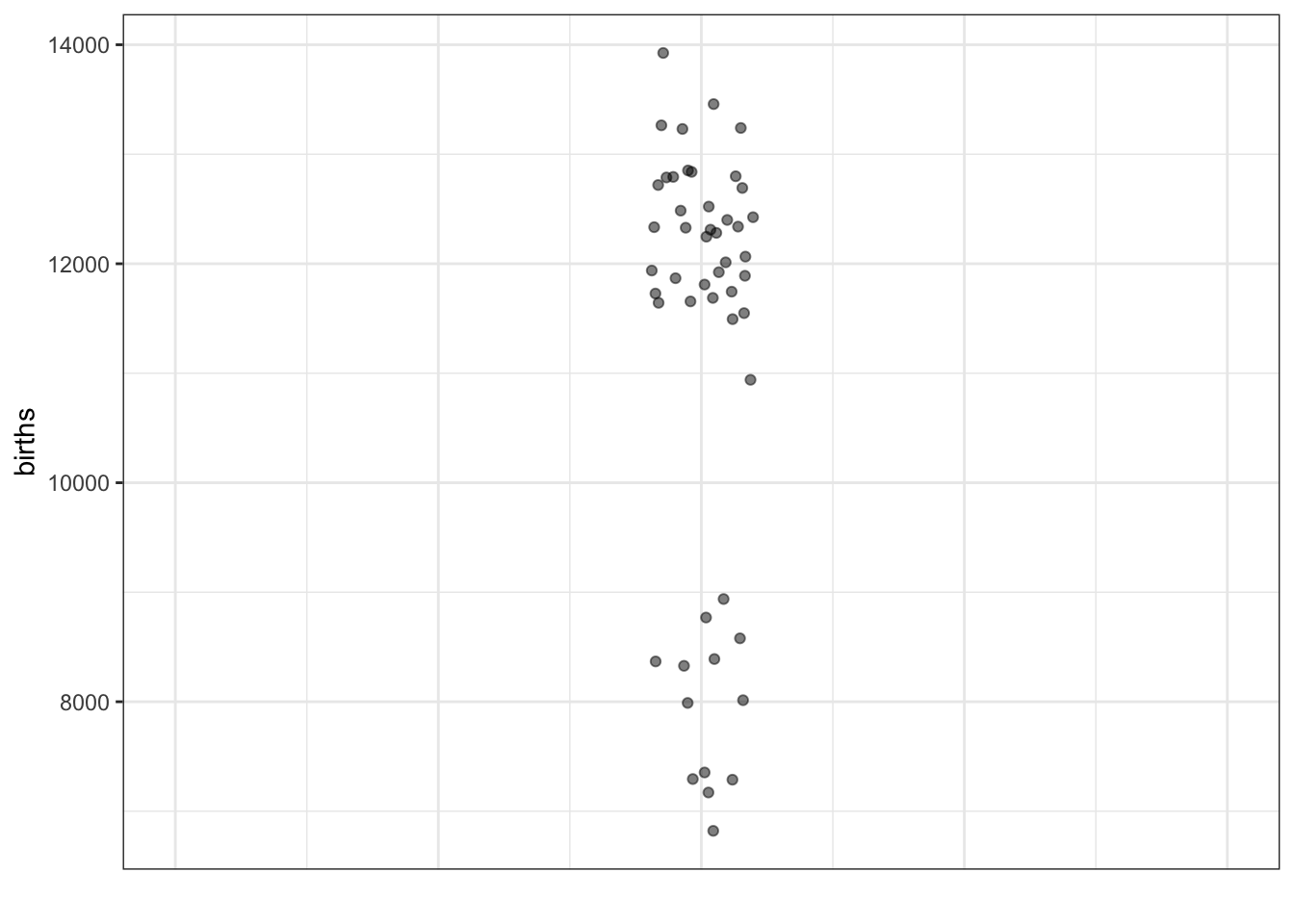
In statistics you’ll learn about different ways of displaying and summarizing data that makes it easier to see information. Here’s one simple display of just the second column from the data, the number of births in that day.

It’s easy to see some interesting things from the graphic than from the table, but hard to see others. For instance, the table makes it clear that our data cover only 100 days. But you would be hard pressed to figure this out from the graph above.
- There are some clear patterns shown by the graphic about day-to-day variation in the number of births. Give two examples of such patterns.
As I said before, in this statistics class you’re going to learn some techniques for making sense of data. Using a graph like the above is one such technique. But we can improve on it by using other techniques.
One is called jittering, which randomly moves the dots a small amount horizontally so that you can more easily see how many there are. Another technique is to make the dots somewhat transparent.
- What does this new graph show that you couldn’t see clearly in the previous graph?
[Note, we might introduce the violin plot here, but we don’t really need it.]
Making sense of data requires that we connect it in some what to what we are interested in finding out.
Perhaps an obvious question raised by these data is: Why are there lots of days with about 12,000 births, and quite a lot with about 8,000 births, but none around 10,000 births?
- Think of a real-world explanation for the bi-modality of the data.
[I’ll skip the discussion intended to lead students to suspect that there’s another factor involved. Perhaps day of the week or time of year.]
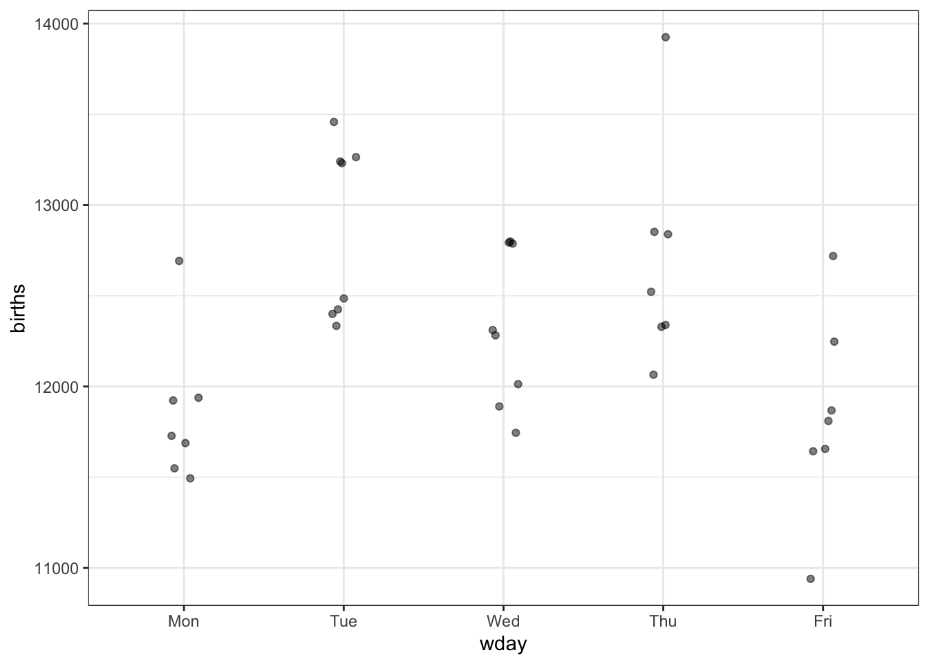
It’s often the case that we seek to explain the variation in one variable by using another variable. A first step is to put that other variable, the explanatory variable, on the graph. We’ll put it on the X axis, leaving the Y axis to represent the quantity we’re trying to explain, which we call the response variable.
Here’s a graph with day-of-the-week on the X axis.

- Is there something about this graphic that explains the bi-modality we saw in the previous graphics?
[More discussion. Seem obvious that weekends are different from weekday. Less obvious that Sunday and Saturday are different, or that the individual working weekdays are different from one another.]
Let’s compare Monday through Friday. Here’s the graph, redrawn to exclude the weekends.
- What do you think: are the weekdays different from one another?
[Discussion. What if the outlier on Friday had happened on Thursday, etc.]
Reasonable people can disagree about whether there is a day-to-day pattern in the data. Is seeing differences like seeing animal shapes in clouds. (Hint: Clouds aren’t really animals!) Or is there something we can put our finger on. Said another way: How would you and a person with the opposite opinion try to convince one another? What would cause you to give up your opinion?
Many tasks in statistics are about not having to rely entirely on personal judgement about whether there is a real pattern. The techniques by which these tasks are accomplished have been worked out over the last century, and are used almost universally in science, commerce, government and any other setting where data is used to draw conclusions.
We’re going to work through one of the most widely used such techniques, explaining it with reference to a graphic rather than with mathematical algorithms. (We can leave it to the computer to carry out the algorithm precisely, but you’ll see that you get more or less the same answer just by looking at the graph.)
Here are the steps.
Step 1. On the graph, draw a mathematical function that takes day-of-week as the input and puts out a single number which is representative of the data for that day of the week.
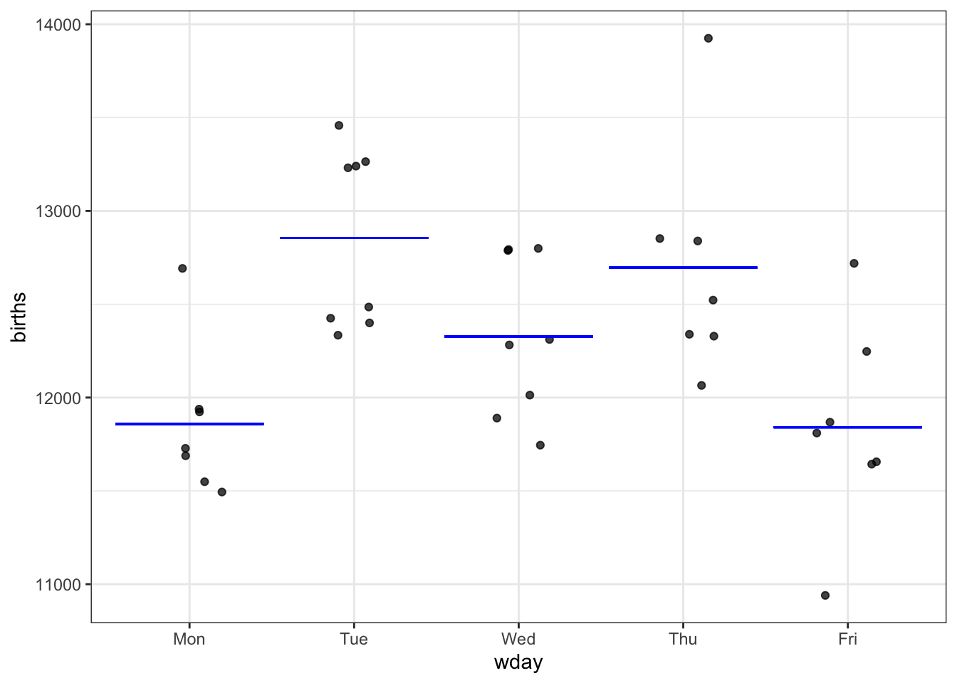
Question: You might disagree about the precise position of the bars showing the function output for each day. What would you look for in a “good” position? It happens that statistics has techniques for deciding where to draw the bars that, like the overall method, are universally used.
Step 2. Measure how much variation in the response variable there is.
[This is where we introduce summary intervals and variance.]
Step 3. Imagine that each of the actual values in the response variable was replaced by the corresponding model value. That is, imagine what a graph of blue dots would look like if each black dot were moved horizontally down to the corresponding function output value. [An effective way to show this is with one of the StatPREP Little Apps: here]. Measure how much variation there is among the blue dots.
The result of Step 3 is the amount of variation that’s explained by the model.
In understanding Steps 2 and 3, it can help to make a graph on the side, showing the vertical spread of the response variable and of the model values, like this:

[Discussion about the blue dots, the meaning of the bars shown in the right graphic, how to calculate the variance, etc.]
Step 4. Now to do some calculations. The quantity we are going to calculate is called F, named after its inventor, Ronald Fisher. He invented it in 1925, an invention that marked the start of the pre-computer modern era in statistics.
We have some numbers:
- $n=$50
- Variance of the response variable: \(v_r\) = 3.9810^{5}
- Variance of the model values: \(v_m\) = 1.7710^{5}
In terms of these numbers, F is
\[\mbox{F} = \frac{n-5}{4}\frac{v_m}{v_r - v_m}\] You would be right to wonder where this formula comes from. What are the 4 and the 5 about? Will it always be 4 and 5 or does it depend on something in the specific situation? Why do we use variance instead of its square root. Why \(n-1\) and not \(n\). Why not just use \(v_m / v_r\) to simplify things? There are answers to all these questions, those will be clearer when we have the concepts to describe precisely what we mean by a “real” or an “accidental” pattern.
Still, notice that F is bigger:
- When \(n\) is bigger. That is, more data gives bigger F.
- When \(v_m\) is bigger. That is, a model that explains more of the variation gives bigger F.
Plugging in our numbers here:
\[\mbox{F} = (\frac{50 - 5}{4}) \frac{177000}{398000 - 177000} = 7.8\]
The standard in science is that F > 4 means that you’re entitled to claim that the data point to a day-to-day difference in birth numbers.
Why 4? Again, we’ll be able to see why 4 was selected as the threshold when we understand precisely what is the difference between a “real” and “accidental” pattern.
Another example. [I would interleaf examples stage by stage, leaving the “is the pattern accidental?” question toward the end.]
There’s an urban legend that pregnant women who are older are more likely to have conceived a boy than younger women. [Notice the conditioning in this statement. It’s only about pregnant women.]
Let’s go to the data. We’ll use the Centers for Disease Control data on individual births. Here, we have $n=$4,000,000 so we can anticipate that F is likely to be large. But so that you can see the individual dots in the graph, we’ll use a sample of just 1000 births selected at random. Once you feel comfortable with the idea of a function describing the relationship between the response and explanatory variables, we’ll work with larger datasets.
That’s not a very good graph. Let’s use jittering and transparency?

First … there’s nothing obvious. But let’s go through the formalities of the steps to find F. [Discussion about how to draw function and what the output should be.]
For linear models with no interaction terms, you don’t have to worry about choosing a value of interest.↩
The Centers for Disease Control publishes data on each of the roughly 4,000,000 births that happen in the US each year. It’s very detailed, and for privacy reasons they only tell you the month of birth, not the day of the month. But before they implemented that privacy policy, you could find the actual day for each birth. The data we have are from 2015.↩