2 Prediction and classification
computing
R
prediction
classification
residuals
Brier score
Remember to hand in your work …
At any point, you can submit your answers by collecting them and uploading them to the class site.
No answers yet collected
If the answers that have been loaded automatically are not yours, press this button before starting your work:
The reading associated with this tutorial is Chapter 6 of Spiegelhalter’s The Art of Statistics: “Algorithms, Analytics, and Prediction.”
2.1 Objectives
Understand the mechanism by which statistical predictions or classifications are made: Feeding appropriate inputs to a model built from training data.
Understand the proper format for a statistical prediction or classification: A probability (or the equivalent, such as a prediction interval) associated with each possible outcome.
Be able to quantify the performance of a prediction model or classifier.
- Understand the issue of in-sample versus out-of-sample performance.
- Use of Brier Score for probability forecasts. (Spiegelhalter, p. 164)
- Correctly interpret appropriate measures of classifier performance: sensitivity, specificity, false-positive and false-negative rates.
Be able to translate prediction performance for a model or classifier into terms that are relevant for an individual. (Example settings: medical screening, college entrance exams.)
2.2 Introduction
Many day-to-day situations involve making predictions or classifying situations. Getting to work by car or bus? You need to predict how long it will take so that you can arrive on time. About to pass a car backing out of a driveway? You need to establish whether the other driver sees you coming.
Such predictions and classifications are made based on experience and observation of the present situation. If you have been commuting for a year, you have a pretty good idea of how long it takes and how often things go wrong. Similarly, with experience seeing both safe and reckless driving by others, you have developed an intuition for the signs that something bad is about to happen.
Statistical predictions and classifications are also based on experience, both of the relevant conditions and the eventual outcome from these experiences. One aspect of a statistical prediction is that the experience has been recorded as data: so called training data. A statistically minded commuter would note on each day some relevant facts—the time of leaving home, the day of the week, weather conditions, etc.—and record these alongside outcome: the time it took to make the journey that day. Each historical trip becomes one specimen in a data frame.
The mechanism for making a statistical prediction is a statistical model whose inputs (explanatory variables) are the conditions and whose output (response variable) is the outcome. To make the prediction for a new day, put in the input facts and receive back from the computer the predicted outcome.
Note 2.1: Correct format for a statistical prediction
An essential feature of a statistical prediction is the way the predicted outcome is reported. Rather than a single value for the outcome variable, each possible outcome is listed and assigned a probability. One advantage of this format is that the prediction can be used in decision-making. For instance, if the bus journey is predicted to have a substantial risk of being overlong, the commuter can arrange to leave earlier. The probability format has a more technical advantage, as you will see, in assessing the value of a prediction and the performance of the prediction model.
Note: In everyday speech, “prediction” usually refers to anticipating what will happen in the future. The statistical use is broader and the future need have nothing to do with it. For instance, statistical “prediction” can be made of past, present, or future situations; any situation where the outcome is yet unknown. By convention, prediction models for a categorical outcome (e.g. diseased ore healthy) are called classifiers.
2.3 Building a prediction model
To illustrate the process of building and using a prediction model, let’s consider a simple but silly situation. Suppose you have been set up with a blind date by the date’s parents. Having met them, you know their heights, let’s say 66 inches for the father and 70 inches for the mother. You don’t (yet) know the height of their child but you do know his or her sex. Let’s assume M for the example. Using the techniques from the previous tutorial, you can build a model of a child’s full-grown height, as in Active R chunk lst-galton-model-2-1:
The depiction in Active R chunk lst-galton-model-2-1 shows more information than strictly necessary to predict your particular date’s height. It also shows the predicted height for parents of any height and a date of either sex. To find the prediction for your particular date, read off the values for the relevant inputs: male child, mother 70 inches (the rightmost tick on the x-axis), father 66 inches (the black band: result 71 inches.
What’s missing in the above is the assignment of a probability to each possible height outcome. A very common misconception is that the thickness of the bands gives such a probability assignment, but this is seriously misleading. The proper use of the sorts of bands—called confidence bands—shown in Active R chunk lst-galton-model-2-1 is to characterize a model’s precision (Block 4 of QR2), not to make a prediction.
If we want to draw a picture relevant to the task of prediction, we need to display prediction bands. This is easily done, as illustrated in Active R chunk lst-galton-model-2-2, but the results are hard to make sense of because the bands overlap almost entirely.
The difficulty with Active R chunk lst-galton-model-2-2 is that it is trying to do more than can be visually assimilated: give a prediction band not just for your particular dates but for all possible sex and parent-height combinations.
Things are made dramatically more simple if we ask the computer to make a prediction just for your particular dating prospect. To do this, we move from graphical to numerical reporting. Instead of point_plot() to both build and display the model, we split the action into two parts. First, use model_train() to build the model. Second, evaluate the model at the relevant inputs (sex M, mother 70”, father 66”) using model_eval().
Model_eval() is constructed so that the output repeats the input values but adds on to them three quantities corresponding to the output from the model. That output is on the same scale as the response variable in the model-training step. In this example, that’s inches of height.
.lwr, the lower bound of the prediction interval. Here, 65.6 inches of height..output, the output value that has the greatest probability. This corresponds to the center of the relevant band in Active R chunk lst-galton-model-2-1; 69.9 inches..upr, the upper bound of the prediction interval: 74.1 inches for this example.
In Note nte-prob-format we said that the correct format for a statistical prediction is to list every possible output, assigning each a probability. That is not what you’re getting from Active R chunk lst-height-pred-2-3. Instead, model_eval() gives the lower and upper bounds of an interval. Skilled quantitative reasoners understand this to be shorthand for a probability distribution. Figure fig-prob-dist-2 shows the translation of the prediction interval into the corresponding probability distribution.
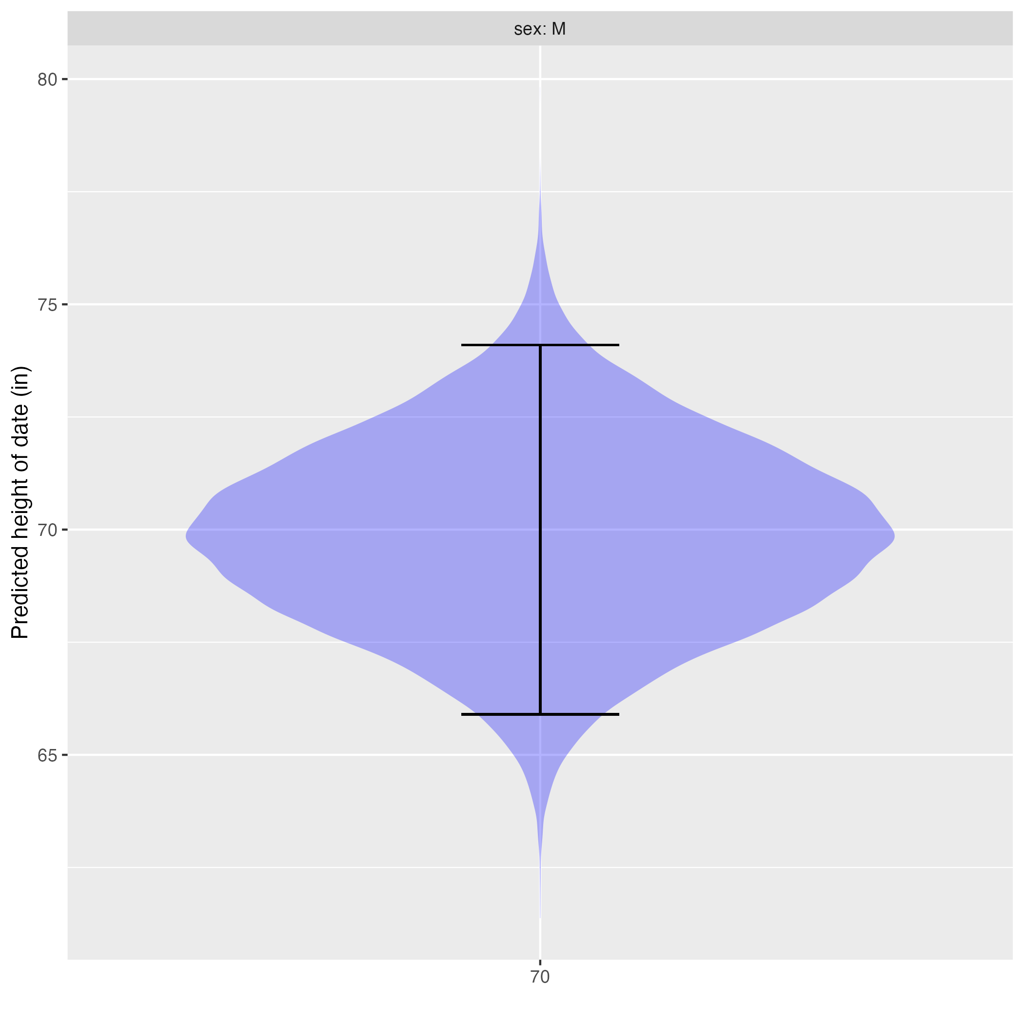
The violin in Figure fig-prob-dist-2 shows the relative probability of each possible prediction output. Where the violin is wide, that output has been assigned a high probability. Where the violin is narrow, the output has been assigned a low probability.
The prediction interval is shown as an “I”-shaped annotation on top of the violin. The relationship: the area of the violin in the region spanned by the interval covers 95% of the assigned probability. The probability assigned to being outside of the “I” region is 5%, split evenly between the top and the bottom.
2.4 Prediction uncertainty and model residuals
A fundamental aspect of statistical technique is describing the uncertainty to be associated with any conclusion drawn from data. For a prediction, the uncertainty mainly stems from the difficulty (or impossibility!) of capturing every factor that is involved with the system. In the prediction of height, such factors include nutrition and illness and perhaps even unknown environmental conditions that might affect growth hormone production and signaling. Not to have to take on the fool’s errand of listing and measuring every possible factor, we simply imagine them as random influences. Quantifying uncertainty then amounts to describing the amount of additional variation in the response variable introduced by the
We can’t know what the influences are nor can we measure them directly. Instead, we measure them indirectly by observing their residual in the training data. The indirect measurement makes use of the .output component produced by model_eval(). The .output is the value assigned highest probability by the prediction. Graphically, it is where the violin is widest in Figure fig-prob-dist-2, exactly bisecting the confidence interval. This model .output is a good candidate for what the value of the response variable would have been if not for the random influences that we are trying to measure.
Consider asking model_eval() to make a prediction of the training data. We’re assuming that the .output is the value without noise. By subtracting this .output from the actual response value for each specimen, we can estimate the amount of noise in that specimen. This difference—response value minus model .output—is called the residual for that specimen.
To display the residuals clearly in an example graphic, we’ll use a simpler model and arrange to show the residuals for only a handful of specimens. (Press “Run code” in Active R chunk lst-galton-model-resids-2 to see a different set of specimens. )
Residuals for the model height ~ mother + sex. For each specimen, the residual is shown by an arrow connecting the model value and the specimen. Up-pointing arrows are positive, down-pointing negative. To avoid overplotting, only a handful of residuals are shown. Re-run the code to see the residuals for a different random sample of specimens.
Our goal is to describe the amount of variation introduced by the random influences. As usual, we measure variation with the variance. Active R chunk lst-resid-variance shows the calculation, where we use for convenience the .resid column produced by model_eval() when the response variable is available along with the prediction inputs.
The residuals are denominated in the same units as the response variable; that’s why it is possible to display them on the same axis as the response variable in Active R chunk lst-resid-variance. The unit of the response variable in this example is “inches” (of height), so the unit of the variance is square-inches.
2.5 Predicting categorical outcomes
The previous sections focused on quantitative response variables. For instance, the residual for a specimen is defined as the arithmetic difference between the specimen’s response value and the predicted .output when the specimen’s explanatory values are used as inputs to the prediction model.
Recall that the levels of a categorical variable are the possible values it can take. To illustrate, data about socio-economic status of people often includes their highest educational level. On a categorical scale, the levels might be: primary school, high school, high-school grad, some college, college grad, and so on. Note that these levels are interpreted as mutually exclusive. If a person is a high-school grad, then they aren’t “high-school” or “some college” etc.
The word “classifier” is used for prediction models where the output is categorical. In many cases, classifiers select from among a large number of levels. For instance, an AI that looks for animals in photographs selects from levels like “cat,” “dog,” “horse,” “iquana,” “crow,” and so on.
For simplicity in this tutorial we will work with simpler situations where there are only two levels for a categorical response variable. This is not as severe a restriction as it might seem, since many important contexts are life-or-death, sick-or-healthy, success-or-failure, yes-or-no, and the like. Spiegelhalter refers to such two-level variables as “binary variables.”
A prediction of a binary-variable outcome takes the form, as with all other statistical predictions, of assigning a probability to each of the two levels. For instance, in clinical cancer research, a widely accepted endpoint is “five-year survival.” A prediction would look like this:
- survived: 70%; died: 30%
Since a binary variable has only two possible levels, the probability assigned to one level must be one minus the probability assigned to the other level, as in 70% vs 30%, or 5% versus 95%, and so on.
Building a classifier involves a similar framework to what we saw for quantitative outcome variables.
- Training data where the outcome is already known
- Constructing a model that takes explanatory inputs and outputs a prediction.
What’s different for a classifier of binary data is that the model output will be in the form of a probability for one of the two levels. One of the most commonly used techniques is called “logistic regression.” It involves some clever mathematics that makes it possible to combine many explanatory factors while still keeping the model output between zero and one. This mathematics centers on the use of “odds” and “odds ratios” as a format for expressing probability and change in probability. (Just FYI: the name “logistic” is from the Greek λόγος, “logos.” A logistic curve describes the transform from the logarithm of odds into the equivalent format of probability.)
Our model_train() function automatically identifies situations where logistic regression is appropriate, so you can train models for binary outputs just as you do for quantitative outputs. To illustrate, consider the Whickham data frame drawn from the records of a health and lifestyle survey of nurses in the 1970s. We will work with three variables:
outcome: whether the nurse survived to a 20-year follow-up, with levels “Alive” or “Dead”agein years at the time of the initial interviewsmoker: whether the nurse smoked at the time of the initial interview, with levels “Yes” or “No”
For reasons that will be evident when we turn to the Brier score, it’s convenient to transform the output variable in zeros and ones. The zero_one() function lets us be explicit about which of the two levels is coded as 1.
Active R chunk lst-survive-model-pred the prediction for a 40-year old who smoked.
So the survival probability is 92% for a 40-year-old smoker, according to the model.
2.6 Performance for classifiers
The Brier score provides a way to assess whether Survive_model performs well or poorly. As always, the assessment is based on data for which the outcome variable is available. But there is a twist. Recall that in looking at the performance for quantitative outcomes, we looked at the residual: the difference between the value of the response variable and the model output, that is, the center of the prediction interval.
Here, we do the same thing, but we use the zero-one encoding of the binary response variable and compare that to the model .output. In the above example, we have nothing to compare the .output to, but if we run model_eval() on the training data, we will know the actual outcome.
Looking at the first six of the 1314 rows … Person number 3 did not survive. Her predicted probability of survival was low, at 20%. Her residual, using the Brier method, is 0 - 0.2. In contrast, person number 4 did survive. Nonetheless, the predicted survival was low at 33%, giving a residual of 1 - 0.33 = 0.67.
The Brier score is simply the variance of the residuals:
As Spiegelhalter describes (p. 64) this score is hard to interpret except by comparison to a trivial “Null” model with no explanatory variables. We’ll do this calculation in the Activity exr-brier-skill.
2.7 Medical screening tests
Most of us have encountered medical screening tests, which attempt to identify whether we may have a clinical condition. Various modalities are used, depending on the context. For instance:
Blood assays: coronavirus for COVID-19, cholesterol (controversially) for atherosclerosis, prostate specific antigen (even more controversial) for prostate cancer;
X-rays: mammograph and breast cancer (also controversial) and osteoporosis
Tissue or fluid collection: cervical cancer, drug use, genetic mutation
Questionnaires: family history of disease, detection of depression
Many patients and doctors mis-interpret screening tests as being diagnostic. For instance, many people interpret a positive mammogram as an almost-sure sign of breast cancer, or a high PSA as a clear sign of prostate cancer. This is unfortunate. A screening test is not meant to be a diagnosis but an input to a prediction.
To illustrate, imagine a screening test for death within 20 years. The test consists of asking the patient’s current age and whether or not the patient smokes. We use this scenario to provide us with ready data for the illustration: the Whichkam data frame.
As you know, the results from medical screening tests are often reported as “positive” or “negative,” with positive meaning bad news. Behind the scenes, however, was a research study where the blood assay, X-ray, questionnaire or whatever was applied to each person in a group of experimental subjects, the results being recorded along with the eventual outcome for each subject. The Whickham data is an example.
The clinical researchers build a statistical model based on the data with the response variable being the recorded outcome. So far, this is just ordinary prediction or classifier modeling. The output of the model is a probability, just as we have seen. But for medical screening, the Brier score or a “skill” is too blunt an instrument to fit well with the situation.
Instead, the output of the model (a probability) is compared to a numerical threshold to generate a “positive” or “negative” result. #lst-threshold does this for the model we built earlier based on the Whickham data frame, using a threshold of 40% on the predictions from #lst
All together, there were 1314 subjects in Predictions. The thresholding has split these into four groups. By far the biggest group is people who got a negative test result and actually did survive to the 20-year follow-up.
Here are the two groups for whom the test result matched the eventual outcome.
- True negative: the test result was negative and the person survived. 69% of the subjects.
- True positive: the test result was positive and the person did not survive: 16% of the subjects
Correspondingly, there are two groups where the test result mis-matched the outcome.
- False negative: despite a negative test result, the person did not survive: 12% of the subjects
- False positive: a positive test result, but the person dodged the proverbial bullet: 3% of the subjects
There are various ways of putting together the numbers in Active R chunk lst-threshold. First, consider one with a very persuasive name but which is in reality not useful: the accuracy.
- Accuracy (don’t use, despite the name!): The fraction of subjects for whom the test result was a match to the outcome: 69% + 16% = 85%. This might sound impressive, but it is no such thing.
More obscure-sounding summaries are in fact much more informative:
- Sensitivity: Of the clinicaln subjects who had the condition (died), the fraction who had a positive test. 212 / (212 + 157) = 57%
- Specificity: Of the clinical subjects who did not have the condition (that is, survived), the fraction got a negative test result.: 904 / (904 + 157) = 85% [Erratum: An earlier version got this backward. Even experts get things wrong sometimes!]
- Training prevalence: The fraction of clinical subjects who had the condition: (212 + 157) / 1314 = 28%
These numbers relate to the clinical subjects and the performance of the screening test. In the activities, we will see how to use them to provide useful information for a patient whose outcome is unknown and to make medical policy in different settings.
No answers yet collected