Data, variation, visualization, and trends
computing
R
Remember to hand in your work …
At any point, you can submit your answers by collecting them and uploading them to the class site.
No answers yet collected
If the answers that have been loaded automatically are not yours, press this button before starting your work:
Objectives
Understand the structure of a data frame. Vocabulary: data frame, variable, specimen, unit of observation, quantitative, categorical,
head(),nrow(),names().Use wrangling operations to construct new data frames from an existing one. Vocabulary: “pipe,”
filter(),mutate(),summarize(),arrange(),select(), grouping (with.by=).Calculate the amount of variation in a quantitative variable. Vocabulary: variance,
var(), “standard deviation.”Construct and interpret annotated point plots from a data frame. Vocabulary:
point_plot(), tilde expression, response variable, explanatory variable, covariate, facet, trend, model, mapping, violin.
Introduction
Software and commands. The software we will be using is based on R, a professional-level system widely used in data science. But you will be using only a very small subset of R.
Your window into R computing will be provided by “interactive R chunks,” editors such as Active R chunk 1 that are embedded in these computational essays. Within these chunks, you can write, modify, and run R commands and view the output. provides a example.
Sometimes, very often at first, you will write commands that violate rules of grammar or syntax for the R language. When you do this, running the code will generate an “error.” A better name for this would be “advisory” since the point is to help you form your commands correctly. But they are often cryptic to the newcomer.
As an example, modify Active R chunk 1 so that the command is 3 + 2 +. This command is incomplete and therefore erroneous, just as the English phrase, “Tom, Dick, and” begs for completion.
Data frames
Data frames. There are many types of data, for instance text, sound recordings, video, and so on. A simple definition of “data” is “recorded observations of facts.”
One widely-used data-storage form—the data frame—is dominant in the general analysis, summarization, and modeling of data. We will be working with this form exclusively in QR2. In these computational essays, you will access data frames by their individual names.
Active R chunk 2 involves a data frame named Galton which contains data on human heights recorded in the 1880s. These data played a historically important role in the development of statistics; we use them just for fun.
The output from head() is printed below the chunk. The purpose of head() is to show a few rows from the start of the data frame given as input.
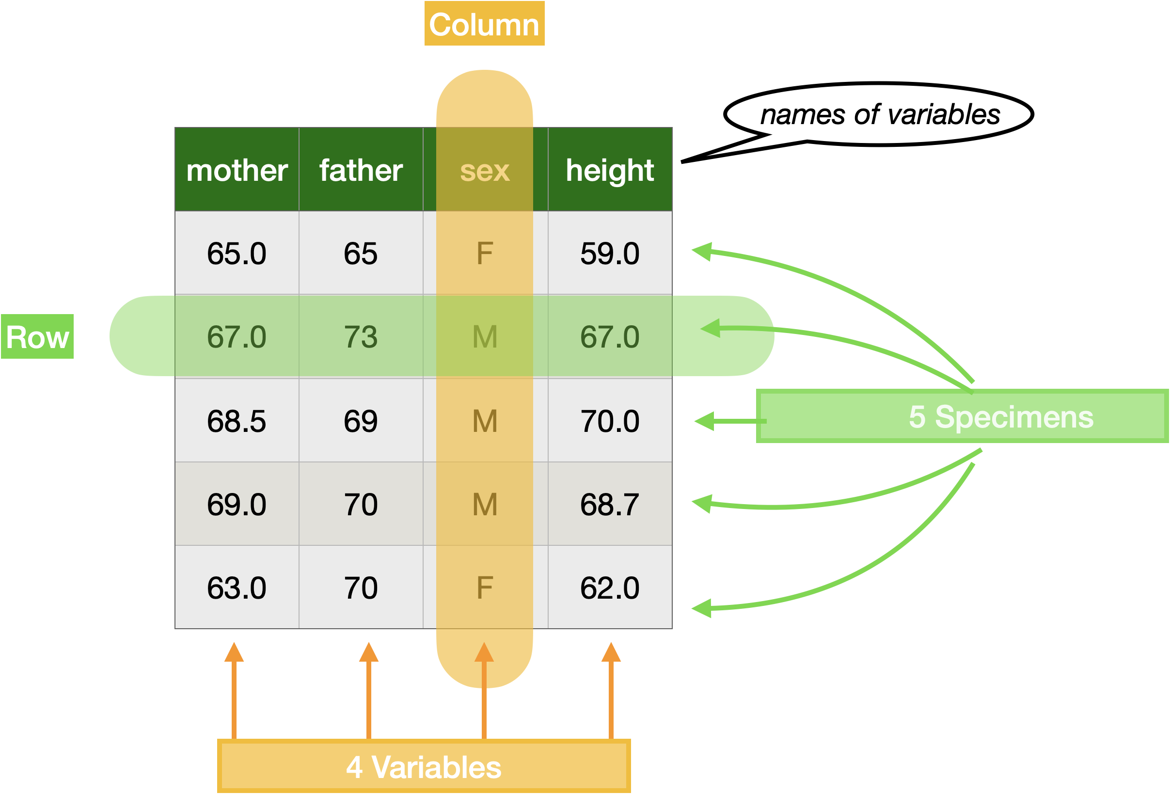
All data frames consist of rows and columns. Figure 1 shows subset of Galton annotated to identify some terms routinely used in talking about data frames: “specimen,” “variable,” “column,” “row,” and “variable name.”
We will return to the topic of data frames in Section 0.4. First, however, let’s examine the stucture of computer commands in the R language.
The R command in Active R chunk 2 is typical of the structure of commands you will be using in this course. Read it from left to right, like English. It starts by naming the data frame to work with. The name is followed by a bit of punctuation, |>, called a “pipe.” The point of the pipe is to direct the object on the left-hand side into the function named on the right-hand side.
You will need only about 30 such named functions. The syntax of invoking a function is a name (head in Active R chunk 2) followed by a pair of parentheses. The parentheses mean, “do this!”
Every function takes an input and creates an output. The input is specified on the left-hand side of the pipe. The output from the function is, in this case, printed. In other cases it will be passed on to yet another function. Such chains of operations are called “pipelines.” The flow of information in a pipeline goes only one way: left to right. The head() function—like all functions—cannot modify the input itself; Galton remains unchanged after the command is run. Instead, the output of a function is an entirely a new object.
In addition to an input, most operations involve other specifications called “arguments.” The arguments are always placed inside the parentheses following the operation name. When there is more than one argument to an operation, they are always separated by commas. (There is no other use for the comma in R other than to identify that another argument is about to follow.)
- Four simple, widely used functions for describing a data frame are
nrow(),names(),head(), andtail(). Using Active R chunk 3, apply each of these functions toGalton, one at a time. Figure out what information each of the four functions produces.
Neither
nrow()nornames()takes any arguments. That is, all the information they need to produce their result is in the data frame being piped into them. However, most functions you will use do need additional information. This information is provided by the arguments you give to the function. Bothhead()andtail()take an (optional) argument: an integer (such as 3 or 8).- Using Active R chunk 3 try out a couple of different integers as the argument to
head()andtail(). What aspect of the output does the argument specify. - The argument to
head()ortail()is optional. It has a default value that will be used if you do not specify your own. What is the default value?
- Using Active R chunk 3 try out a couple of different integers as the argument to
Specimens and Variables
Every data frame can be seen from two perspectives: as a collection of named variables or as a collection of specimens. For each specimen, there is a value for each of the variables. For every variable, there is a value for each specimen. Depending on the variable, each value we will use in these tutorials might be a word or abbreviation, a number, or a time/date.
Looking down a column of a data frame, that is, within a variable, the values for the various specimens are always of the same type. For instance, if the value is a person’s height, it will be a height in the same units (say, inches or cm) for every specimen.
Looking across a row of a data frame, that is, sithin a specimen, the variables are generally of different types. In Galton, for instance, every specimen (which in Galton means every person) is associated with a mother’s height, a father’s height, their own height, and a sex.
Within a data frame, every specimen must always be the same kind of thing. In Galton, that “thing” is a full-grown person. The term “unit of observation” refers to the “kind of thing.”
It suffices for the majority of work, even at a professional level, to divide variables up into two types:
- quantitative, which appears as a numerical value. The height variables—
height,mother,fatherinGaltonare all quantitative. - categorical, which is usually text. In
Galton, thesexvariable is categorical.
The levels of a categorical variable is the set of all legitimate values. For instance, the sex variable in Galton has levels F and M. The levels are not a statement about the world in general, but a choice made by the people who assembled the data based on the specimens tabulated by them.
As regards quantitative variables, by convention only the numerical part of the quantity is stored in the data frame. The units of the quantity—say inches or cm—are given in another object, called variously “documentation,” the “codebook,” or “metadata.” This saves space, since all the values within a variable must always have the same unit.
Conveniently, the data frames we will work with have documentation that can be easily accessed by preceeding the data frame’s name with a ?. For instance:
When you are working with a data frame, make sure that you are aware of …
- The unit of observation.
- The names and types of the variables.
- The meaning of each variable. This is not always evident from the name. For instance, in
Galtonthe variable namenkidsdoes not tell us what the variable refers to. This information is provided by the documentation.
- Use
head()to look at the first few specimens in thePenguinsdata frame. Which variables are quantitative and which are categorical?
- Similarly, look at the first few rows in the
Boston_marathondata. Also, look at the last few rows usingtail().- Using common sense, and your expert knowledge that two hours is a world-class time in a marathon, figure out what is the unit of observation
- Did
sexfigure into your answer to (i)? Should it? - Did
countryfigure into your answer to (i)? Should it?
Briefly explain your answers.
Look at the first few rows of
Grades. Grades is an excerpt from one data frame in a college-registrar’s database.i The variable
sidcontains student identification numbers. Is it quantitative or categorical.- The variable
sessionIDrefers to a course section offering in one semester. Is it categorical or quantitative. - From what you can see, what is the unit of observation of
Grades.
- The variable
- A “database”—or, more precisely, a “relational database”—is a collection of related data frames. The data frames can be cross referenced, using a “key.” For instance,
sessionIDis a key that refers to theSessionsdata frame. Similarly,sidis a key to a data frame describing students:Students.
- What is the unit of observation of
Sessions? - For privacy reasons, the
Studentsdata frame has be withheld. Use your imagination to construct a sensible list of variables that you would expect to see in theStudentsdata frame.
Statistical graphics
In a conventional introductory statistics course the student encounters many different types of graphics, for instance “histograms,” “pie charts,” “box-and-whisker plots.” Most of these are historical relics. They are in wide use, but only because they were in wide use in the previous generation. Some, like the “stem-and-leaf plot,” were designed to work with equipment like typewriters that is now obsolete. Modern forms of graphics make use of modern computational and display technology.
In QR2, we will work with only one type of graphic: the “annotated point plot.” In a point plot, each ink mark (“glyph”) refers to an individual specimen from a data frame. There is one glyph for each of the rows in the data frame. The annotations, in contrast, refer to the collective properties of the specimens.
Active R chunk 6 shows the command to make a point plot of child’s height versus mother’s height:
Let’s consider the components of the command in Active R chunk 6. The start of it, Galton |> point_plot() follows exactly the same pattern we have already encountered: a data frame being piped as the input to a function. Admittedly, the name of the function, point_plot()—is new to you, but the pipeline structure of the command should be familiar.
Point_plot() takes one or more arguments. The first, mandatory argument to point_plot() is a “tilde expression.” The name comes from the use of the tilde character (~). This character is very special in R and tilde expressions like height ~ mother are the first argument for many of the various functions we will be using in QR2.
Even at this very early point in QR2, we will adopt a convention that stems from a powerful analysis technique called statistical modeling. In a statistical model, one variable in the data frame under consideration is selected by the human modeler to be the response variable. Each of the other variables is a potential explanatory variable. The point of modeling is to “explain” the variation in the response variable in terms of the variations in one or more explanatory variables. (In some fields, different phrases are used to make the same distinction in roles. For example, in economics it’s common to refer to a “dependent variable” and one or more “independent variables.”)
The point of the tilde expressions used in point_plot() is to name which variable is to be placed in the response role, and which variables are to be used as explanatory variables. The response variable name goes on the left-hand side of ~. The variables named on the right-hand side are to be used as explanatory variables.
A common graphical convention is to associate the response variable with the vertical axis. For short, we say that the response variable is “mapped to y.” In a point plot, it’s typical to use the x-axis for one of the explanatory variables. In Active R chunk 6, height is mapped to y and mother is mapped to x.
Life is complicated and often we will be working with multiple explanatory variables at the same time. In a graphic, we accomplish this by introducing other graphical properties, particularly
color and facet. To illustrate, consider the graphic created by Active R chunk 7.
Point_plot() takes the first explanatory variable from the right-hand side of the tilde expression and maps it to x. The second explanatory variable (if any) is mapped to color, the third mapped to “facet.”
Many people are tempted to expand things to include additional graphical properties such as the size of glyph, shape of glyph, transparency of glyph. Experience and research on human perception shows that these other properties impose a high cognitive load on the human viewer, making a graphic less comprehensible. So we will not be using these.
- Sometimes we will map a categorical variable to x. For instance, use Active R chunk 8 to try a point plot with the graphical specification
height ~ sex. In mappingsexto x, each of the levels of x (F and M) is assigned to a specific location on the x axis. Yet, in the resulting point plot, most of the glyphs are slightly displaced from the F and M locations. This is a graphical technique called jittering. You can turn jittering off by giving a second argument after the tilde expression,jitter = "none". Do you think jittering helps or hinders your ability to interpret the graph?
- A person’s height is determined by both “nature” and “nurture,” that is, by genetics and by other influences. The variables
mother(that is, mother’s height),father, andsex(of the child) correspond to genetic influences; all three contribute to the child’s eventual adult height. Make a point plot using all three ofmother,father, andsexas explanatory variables. What patterns do you see among the glyphs that supports or refutes the conventional wisdom that taller parents tend to produce taller children of either sex, and that males tend to be taller than females?
- Plot out the
Penguinsdata using the specificationmass ~ flipper + species + sex.- From the graph, tell the best story you can about how
massdepends on the three explanatory variables. - Consider the role of
flipperlength in explainingmass. There are two seemingly contradictory claims that can properly be made from the graph: flipper length doesn’t much determine body mass versus flipper length and body mass are closely related. Do the best you can at this point to make sense of the contradiction. (Later in QR2, you’ll learn some terminology that can help! But for now, do what you can.)
- From the graph, tell the best story you can about how
Graphical annotations
There are two main types of annotations that you will be laying on top of the specimen-by-specimen glyphs: a “model” or a “violin.”
To add a model annotation layer to a graphic, specify a second argument to point_plot(), as in Active R chunk 9:
Notice the comma used to separate the tilde expression argument from the argument named annot=. Model annotations are intended to show patterns in the data. The annotation in Active R chunk 9 is a gently sloping increase of height with mother. Or, to use causal language, “taller mothers have taller children.” Such causal language is often not justified; this will be an important topic in due course.
Point_plot() imposes a good habit; it always shows the data, specimen by specimen. This allows the reader to put in context the pattern indicated by the annotation. For instance, Active R chunk 9 shows that taller mothers do not always produce children who are taller than the children of short mothers.
Sometimes, however, there are so many specimens the the graphics frame is filled up with glyphs and it becomes hard to discern patterns. To avoid this, you can optionally set the transparency of the ink used for the points. Do this by giving an additional argument to point_plot(): point_ink = 0.1. Any value between 0 and 1 is valid for point_ink.
The variables used thusfar have been mainly numerical. But you can equally well use categorical variables in any or all of the graphical roles. The logic is self evident when a categorical variable is mapped to color or facet. But categorical variables can also be mapped to x or y. Active R chunk 10 gives an example where sex is mapped to x.
Notice in Active R chunk 10 that the axis conveying the categorical variable is broken into regions, one for each level of the categorical variable. Within each region, the points are shifted slightly at random. This graphical technique, called “jittering” helps in avoiding points obscuring one another.
The model annotation from Active R chunk 10 is shown in blue. It has a different from the model in Active R chunk 9. We’ll talk about the why of this later, but it may be evident to you already.
The advantage to showing the data behind the annotation is illustrated in Active R chunk 10. The model annotation shows that females “tend” to be shorter in height than males. (Sometimes the phrase “on average” is used rather than “tend,” but both are vague.) With the data behind the annotation, you can see the facts of the matter, that many females are taller than many males and that the person-to-person spread in height is larger than the vertical difference between the two annotations.
When a categorical variable is mapped to x, another form of annotation, a “violin,” can be used. Try it out in Active R chunk 10. It’s likely that you’ll want to darken the point ink and lighten (a lot!) the model ink for the violins to be easily seen.
- The statement is made in this section that, “Active R chunk 9 shows that taller mothers do not always produce children who are taller than the children of short mothers.” What is the pattern in the Active R chunk 9 graph that justifies this statement?
Two arguments to
point_plot()allow you to control the density of the ink;point_ink=is for the dots;model_ink=is for the annotation. Bothpoint_ink=andmodel_ink=work with values between zero and one.Use Active R chunk 10 with an
annot="violin"argument. Play with thepoint_inkandmodel_inkvalues until you have a mostly transluscent violin behind which individual data glyphs are readily seen.A “violin” annotation only make sense when the explanatory variable mapped to x is categorical. What happens if you put a violin annotation on the model
height ~ mother?
Wrangling
Note: Considering the amount of time we can devote to wrangling, it is unreasonable to expect you be able to construct wrangling commands yourself. Instead, aim for being able to read simple commands and develop a good idea what’s going on.
“Wrangling” is not just for cattle. Data wrangling means putting the data into another form or layout. This is almost always done as a step to revealing more clearly the information latent in the data.
Remarkably, it was as recently as the 1960s that it was realized that a small set of simple wrangling operations can accomplish almost any re-arrangement of data. This realization led to the invention of “relational databases,” which play a huge role in the information economy. Here, we will simply name some common operations. We’ll elaborate on them when they come up naturally in our work.
- arrange: put the specimens in a sorted order
- filter: filter our any specimens that do not meet a stated criterion.
- mutate: create a new variable from a calculation on existing variables.
- select: keep some variables and discard others
- summarize: reduce multiple specimens into a single one that summarizes in some way those specimens.
.by =: Do any of the preceeding operations separately for each group of specimens.
And one more …
- join: merge two data frames (in a very clever way which you have to see to believe). This is the most advanced of the relational operations and is the only one that’s not intuitive.
The wrangling operations are cleverly designed so that both the input and the output are data frames. This makes it straightforward to apply operations in series; first re-arrange in one way, then in another way, and so on. Re-arranging the operations in such a series provides great flexibility in the kinds of tasks that can be accomplished by the wrangling operations.
To illustrate a wrangling operation, we’ll calculate a simple summary of a variable, say, the mean flipper length of the Penguins. (Flipper length is measured in mm.)
- The unit of observation in
Penguinsis an individual animal. What is the unit of observation in the output from Active R chunk 11?
- Modify Active R chunk 11 to add a second argument to
summarize(), namely,.by = species. Until you get used to seeing the nested parentheses in computer commands it’s easy to make a mistake. The.by = speciesargument is intended forsummarize(), notmean(). So it must go after the closing parenthesis formean()but before the closing parenthesis forsummarize(). Like this:summarize(mean(flipper), .by = species). Note the comma used to separate the two arguments given tosummarize(). Also note that.by=has a leading period: \(\bullet\)by.
What is the unit of observation in the output of Active R chunk 11 when the .by = species argument is used? Is it different than in (1)?
Measuring variation
Variables are called such because the values vary from one specimen to another. This is not to say that every specimen must have a unique value, but if there is any variation at all at least two of the specimens must have different values for that variable.
When we speak of “explaining” a response variable using one or more explanatory variables, we have this variation in mind. For instance, the variation in height from person-to-person is to some extent explained by genetics that are manifest in the height of the parents.
The key here is “to some extent.” It is extremely helpful to be able to quantify that extent from “none at all” to “everything.” For this, we need to measure the variation in a variable.
You can see the root “vary” in many related words: variation, variety, variable. The numerical measure of variation is named by one of these related words: variance. When you hear variance in referring to data, you can be sure the subject is the amount of variation.
The variance is a number. It has units corresponding to those of the variable being considered. We’ll get to those units later. It seems reasonable to say that a variance of zero means that there is absolutely no variation; all the values are the same. The larger the variation, the larger the variance. There’s no such thing as a negative variance.
Let’s start with the simplest possible situation, a variable that has only two values (say, from a data frame with two specimens). The natural way to measure the difference between the values is to subtract one from the other. The result can be positive or negative, depending on which value is bigger. The two obvious ways to guarantee that it is positive are to take the absolute value of the difference or two square the difference. These two possibilities were in competition with one another in the late 18th and early 19th century. The eventual winner was squaring. There are strong mathematical reasons for this which are related to the logic embedded in the Pythagorean Theorem.
To make a numerical example, consider the variation in height of the first two specimens in the Galton data frame. Since variance involves just a single, selected variable, in Active R chunk 12 we use the select() relational operation.
Galton |>
  select(height) |>
  head(2)  # Show just a few
height
1 73.2
2 69.2Clearly, the difference in height between the two “specimens” is 4 inches. (We need to refer to the documentation to know the units for height.) Squaring this produces 16 square-inches. This is the amount of variation in this very small sample of size n=2.
Almost everyone is initially surprised by the units of the variation in height: square inches. Shouldn’t it be just plain inches? But keep in mind that “variation in height” is not itself a height. The funny units for variation relate to the mathematics of lengths and the Pythagorean Theorem.
Extending our sample just a little, consider the variation in height for the first three specimens in Galton.
Galton |>
  head(3) |>
  select(height)
height
1 73.2
2 69.2
3 69.0To calculate the amount of variation, we average all of the pairwise square differences. In this simple example, that will be the average of \((73.2-69.2)^2, (73.2 - 69.0)^2, and (69.2 - 69.0)^2\), that is, 11.2 square inches.
The careful reader may have noticed in the above few paragraphs that I’ve said “amount of variation” rather than variance. For obscure historical reasons, the average of square differences was originally called the “modulus.” When the word “variance” was introduced, a factor of 2 was snuck in, so that the variance is officially defined as one-half the average of the pairwise square differences.
The computer function var() calculates the variance of a variable. Using var() involves wrangling, in particular the summarize() function. After all, the variance is one of many possible summaries of a variable. Here’s the calculation for all the heights in Galton:
Galton |>
  summarize(var(height))
var(height)
1 12.8373If you’ve studied statistics before, you are familiar with other summary functions, for instance, mean(), median(), sd(), and so on. The function name sd() is short for “standard deviation.” The standard deviation is simply the square root of the variance. Regrettably, when statistical formulas are stated in terms of the standard deviation, you often end up squaring it for the calculations. Better, I think, just to stick with the variance and avoid this dance of square roots undone by squaring.
Penguins |>
  summarize(mean(flipper),
            var(flipper))
# A tibble: 1 × 2
`mean(flipper)` `var(flipper)`
<dbl> <dbl>
1 201. 196.Penguins |>
summarize(mean(flipper),
var(flipper),
.by = species)# A tibble: 3 × 3
species `mean(flipper)` `var(flipper)`
<fct> <dbl> <dbl>
1 Adelie 190. 42.5
2 Gentoo 217. 43.4
3 Chinstrap 196. 50.9Active R chunk 11 calculates the mean and variance of the flipper variable both for the Penguins as a whole and for the Penguins broken down by species.
- What is the physical unit of measurement for the
mean(flipper)? How about forvar(flipper)? Briefly explain why different units are used for the two summary statistics.
- The first calculation in Active R chunk 11 give the variance of the
flippervariable. This is the total amount of variation inflipper. The second calculation looks at each species individually. Is the variation within a species similar to the variation across all species? Speculate on what this might have to say about the relationship between species and flipper length.
No answers yet collected