Chapter 2 Graphing functions
In this lesson, you will learn how to use R to graph mathematical functions.
It’s important to point out at the beginning that much of what you will be learning – much of what will be new to you here – actually has to do with the mathematical structure of functions and not R.
2.1 Graphing mathematical functions
Recall that a function is a transformation from an input to an output. Functions are used to represent the relationship between quantities. In evaluating a function, you specify what the input will be and the function translates it into the output.
In much of the traditional mathematics notation you have used, functions have names like \(f\) or \(g\) or \(y\), and the input is notated as \(x\). Other letters are used to represent parameters. For instance, it’s common to write the equation of a line this way \[ y = m x + b .\] In order to apply mathematical concepts to realistic settings in the world, it’s important to recognize three things that a notation like \(y = mx + b\) does not support well:
Real-world relationships generally involve more than two quantities. (For example, the Ideal Gas Law in chemistry, \(PV = n R T\), involves three variables: pressure, volume, and temperature.) For this reason, you will need a notation that lets you describe the multiple inputs to a function and which lets you keep track of which input is which.
Real-world quantities are not typically named \(x\) and \(y\), but are quantities like “cyclic AMP concentration” or “membrane voltage” or “government expenditures”. Of course, you could call all such things \(x\) or \(y\), but it’s much easier to make sense of things when the names remind you of the quantity being represented.
Real-world situations involve many different relationships, and mathematical models of them can involve different approximations and representations of those relationships. Therefore, it’s important to be able to give names to relationships, so that you can keep track of the various things you are working with.
For these reasons, the notation that you will use needs to be more general than the notation commonly used in high-school algebra. At first, this will seem odd, but the oddness doesn’t have to do so much with the fact that the notation is used by the computer so much as for the mathematical reasons given above.
But there is one aspect of the notation that stems directly from the use of the keyboard to communicate with the computer. In writing mathematical operations, you’ll use expressions like a * b and 2 ^ n and a / b rather than the traditional \(a b\) or \(2^n\) or \(\frac{a}{b}\), and you will use parentheses both for grouping expressions and for applying functions to their inputs.
In plotting a function, you need to specify several things:
- What is the function. This is usually given by an expression, for instance
m * x + borA * x ^ 2orsin(2 * t)Later on, you will also give names to functions and use those names in the expressions, much likesinis the name of a trigonometric function. - What are the inputs. Remember, there’s no reason to assume that \(x\) is always the input, and you’ll be using variables with names like
GandcAMP. So you have to be explicit in saying what’s an input and what’s not. The R notation for this involves the~(“tilde”) symbol. For instance, to specify a linear function with \(x\) as the input, you can writem * x + b ~ x - What range of inputs to make the plot over. Think of this as the bounds of the horizontal axis over which you want to make the plot.
- The values of any parameters. Remember, the notation
m * x + b ~ xinvolves not just the variable inputxbut also two other quantities,mandb. To make a plot of the function, you need to pick specific values formandband tell the computer what these are.
There are three graphing functions in {mosaicCalc} that enable you to graph functions, and to layer those plots with graphs of other functions or data. These are:
slice_plot()for functions of one variable.contour_plot()for functions of two variables.interactive_plot()which produces an HTML widget for interacting with functions of two variables.
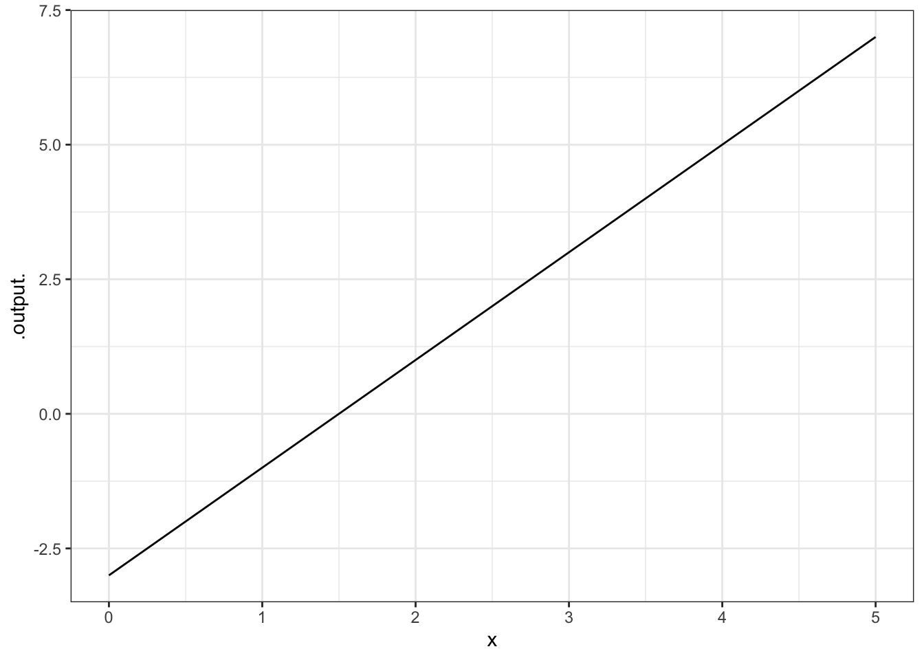
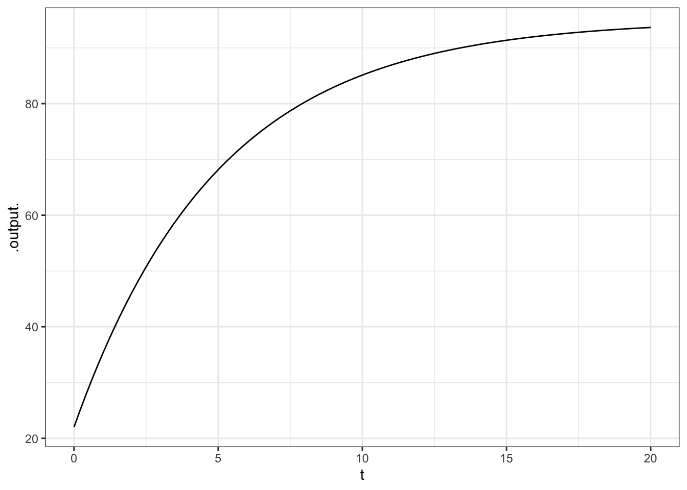
All three are used in very much the same way. Here’s an example of plotting out a straight-line function:
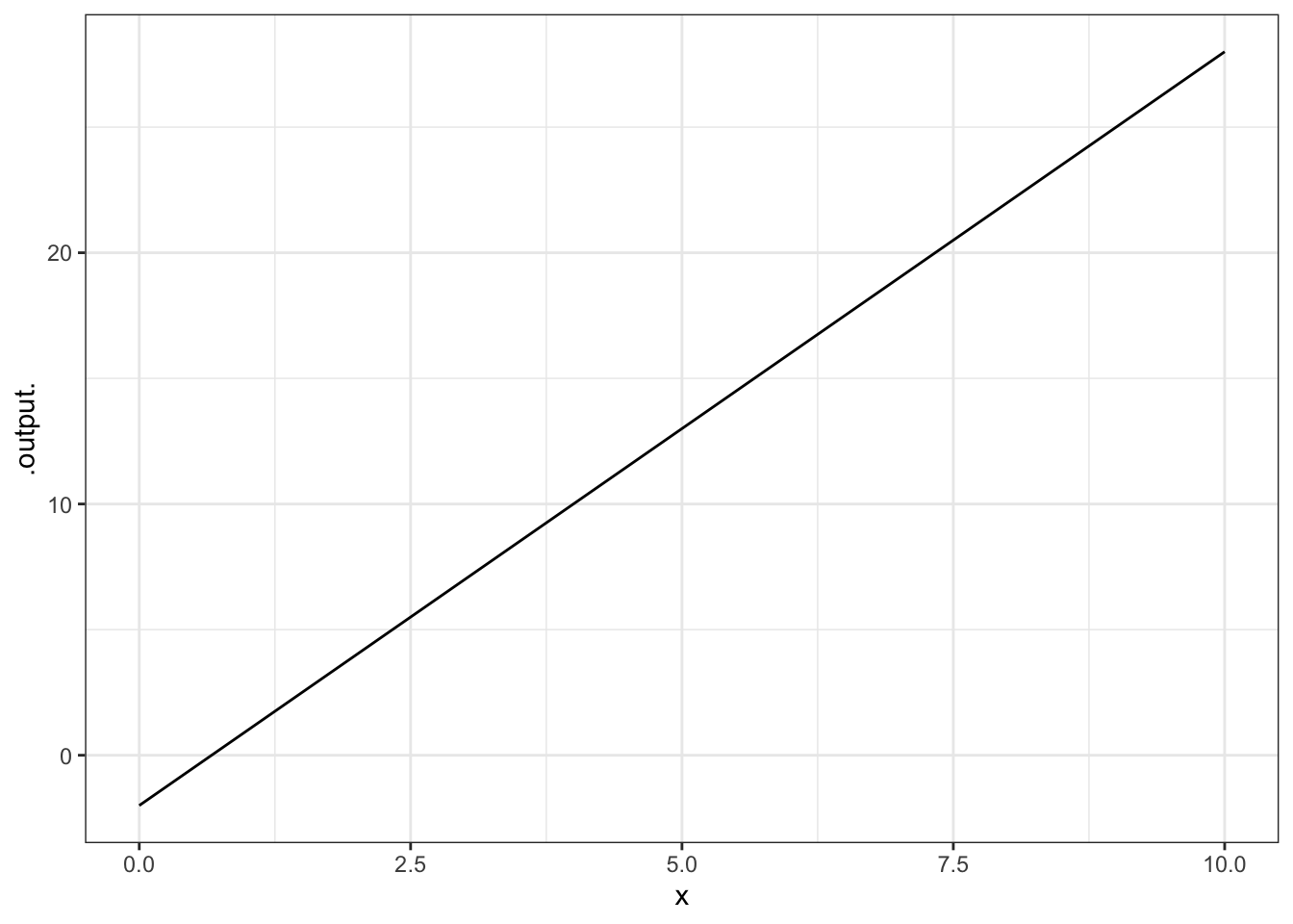
Often, it’s natural to write such relationships with the parameters represented by symbols. (This can help you remember which parameter is which, e.g., which is the slope and which is the intercept. When you do this, remember to give a specific numerical value for the parameters, like this:
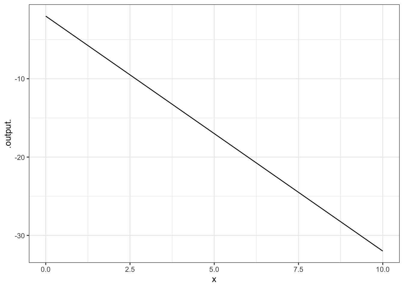
Try these examples:
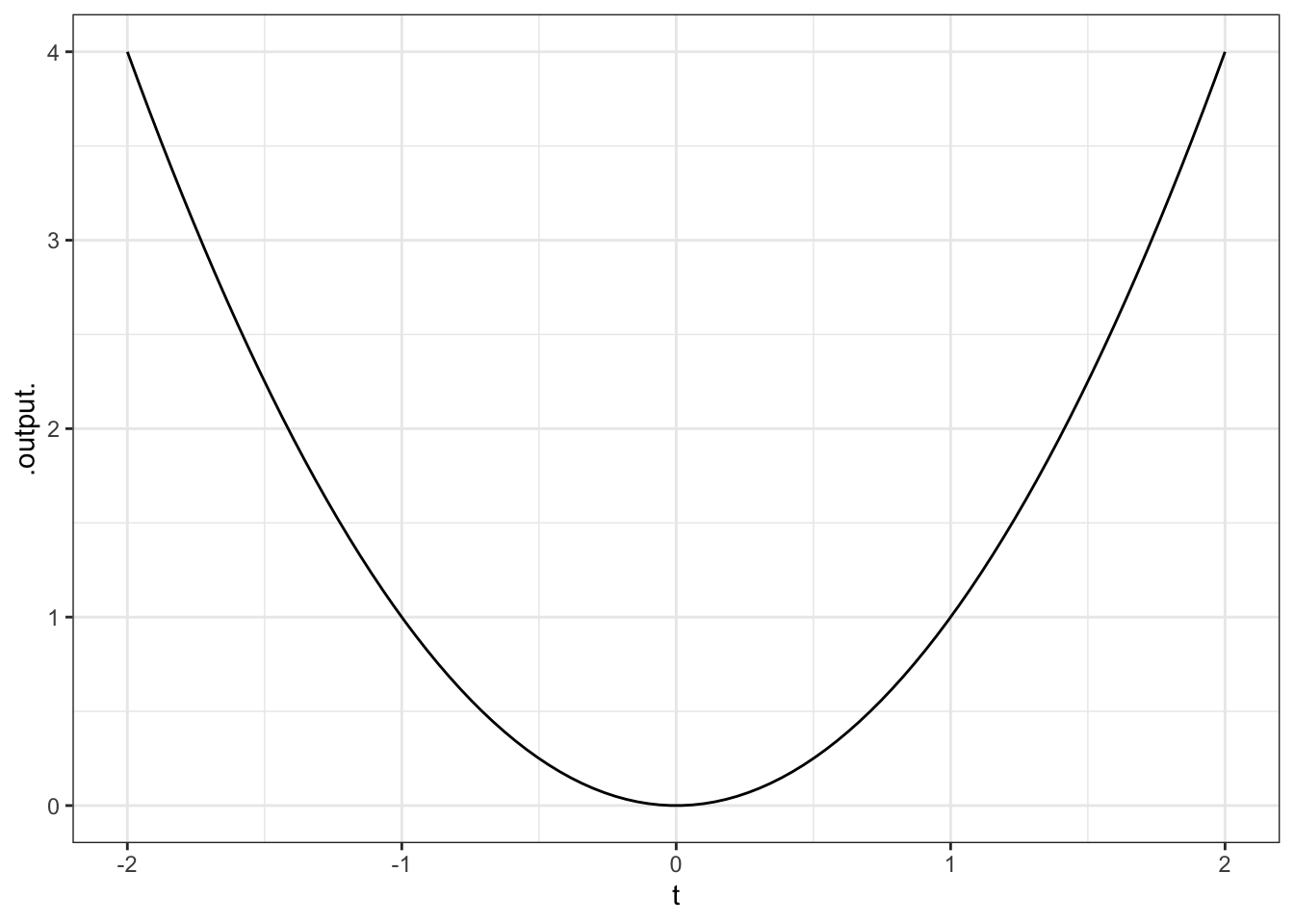
A = 100
slice_plot( A * x ^ 2 ~ x, domain(x = range(-2, 3)))
A = 5
slice_plot( A * x ^ 2 ~ x, domain(x = range(0, 3)), color="red" )
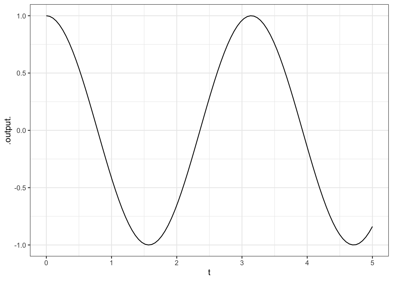
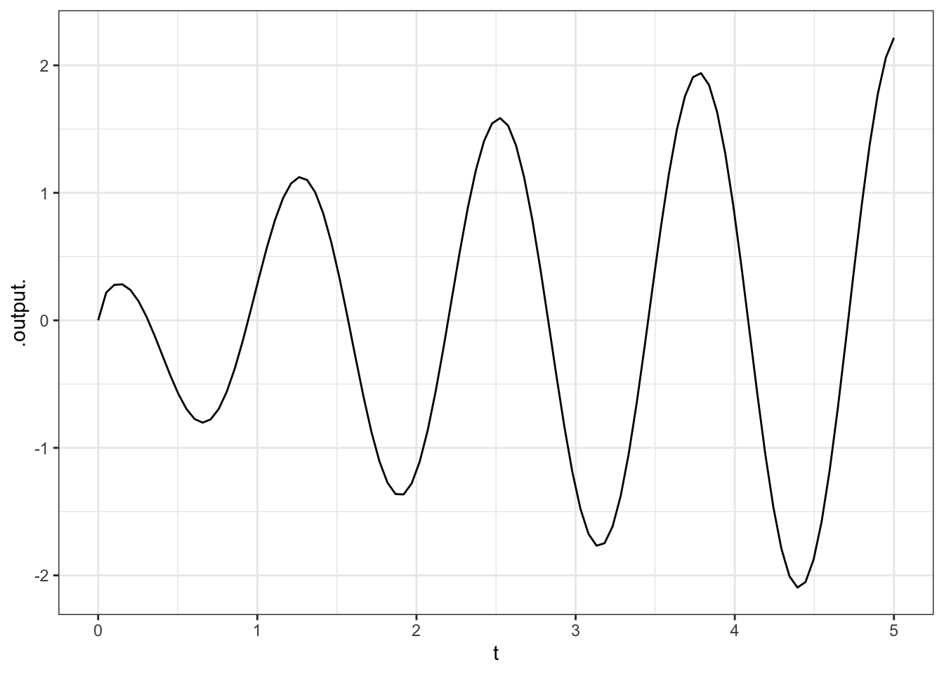
slice_plot( cos(t) ~ t, domain(t = range(0,4*pi) ))You can use makeFun( ) to give a name to the function. For instance:
Once the function is named, you can evaluate it by giving an input. For instance:
## [1] 0## [1] 27Of course, you can also construct new expressions from the function you have created. Try this somewhat complicated expression:
2.1.1 Exercises
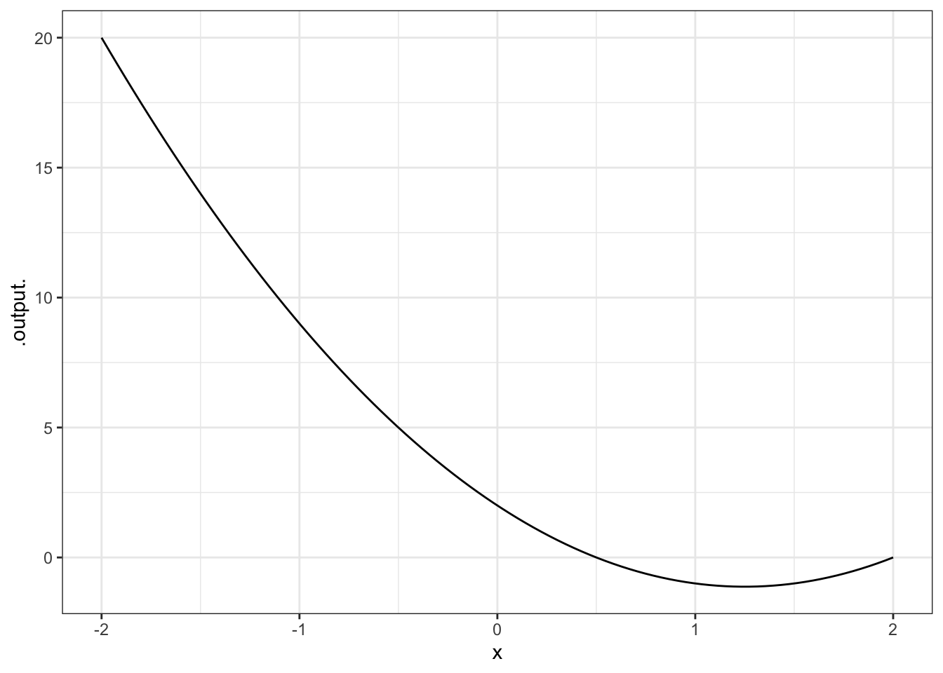
2.1.1.1 Exercise 1
Try out this command:
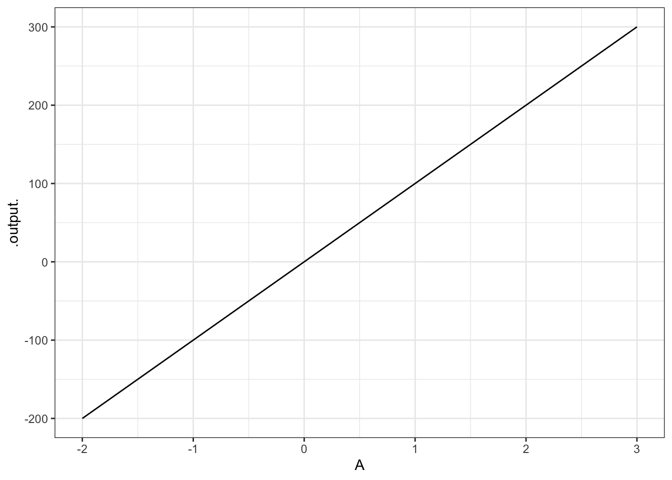
Explain why the graph doesn’t look like a parabola, even though it’s a graph of \(A x^2\).
ANSWER:
Notice that the input to the function is A, not x. The value of x has been set to 10 — the graph is being made over the range of A from \(-2\) to 3.
2.1.1.2 Exercise 2
Translate each of these expressions in traditional math notation into a plot. Hand in the command that you gave to make the plot (not the plot itself).
\(4 x - 7\) in the window \(x\) from 0 to 10.
ANSWER:
\(\cos 5x\) in the window \(x\) from \(-1\) to \(1\).
ANSWER:
- \(\cos 2t\) in the window \(t\) from 0 to 5.
ANSWER:
- \(\sqrt{t} \cos 5t\) in the window \(t\) from 0 to 5. (Hint: \(\sqrt(t)\) is
sqrt(t).)
ANSWER:
2.1.1.3 Exercise 3
Find the value of each of the functions above at \(x = 10.543\) or at \(t = 10.543\). (Hint: Give the function a name and compute the value using an expression like g(x = 10.543) or f(t = 10.543).)
Pick the closest numerical value
- 32.721, 34.721, 35.172, 37.421, 37.721
- -0.83, -0.77, -0.72, -0.68, 0.32, 0.42, 0.62
- -0.83, -0.77, -0.72, -0.68, -0.62, 0.42, 0.62
- -2.5, -1.5, -0.5, 0.5, 1.5, 2.5
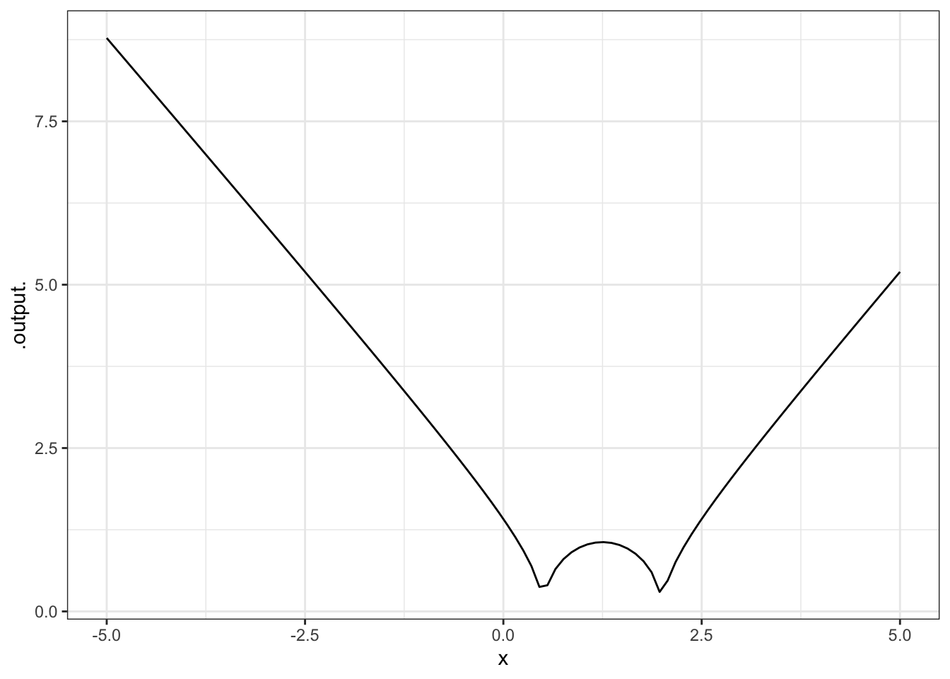
2.1.1.4 Exercise 4
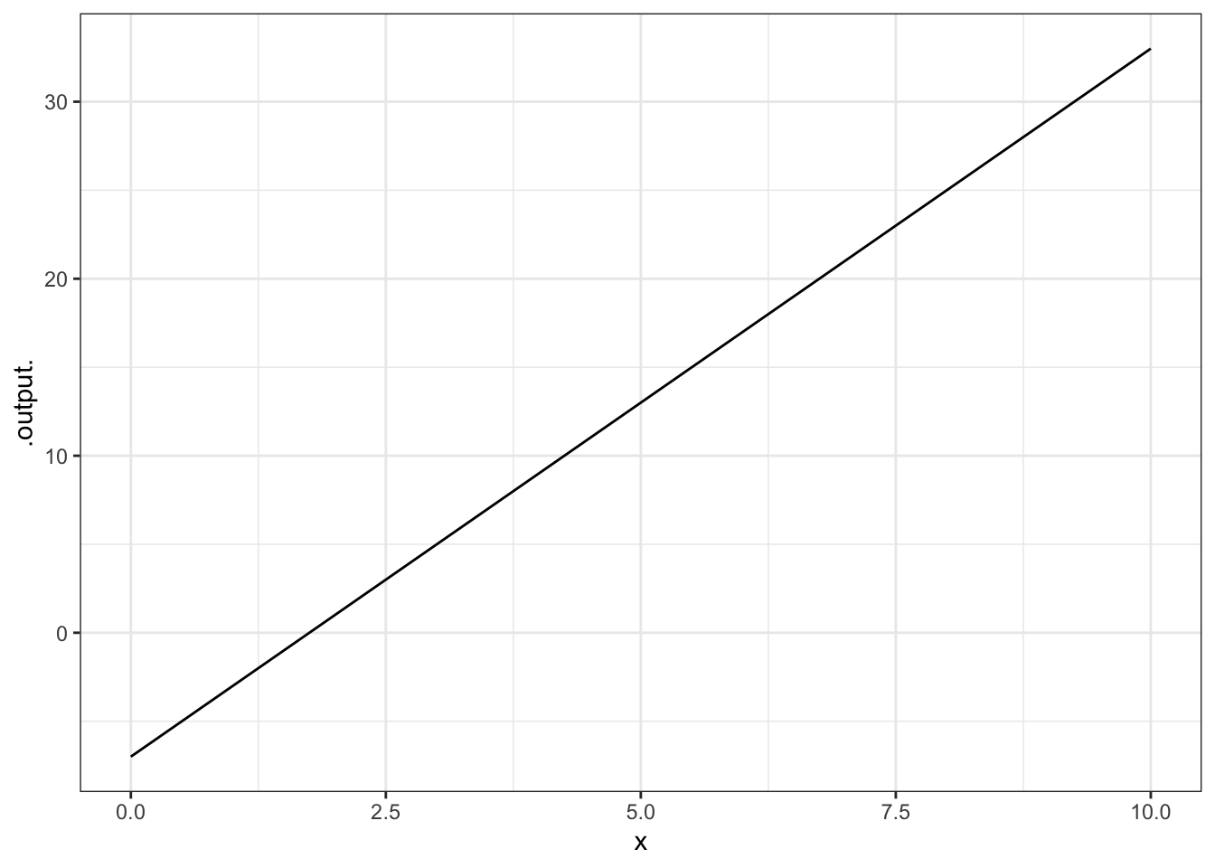
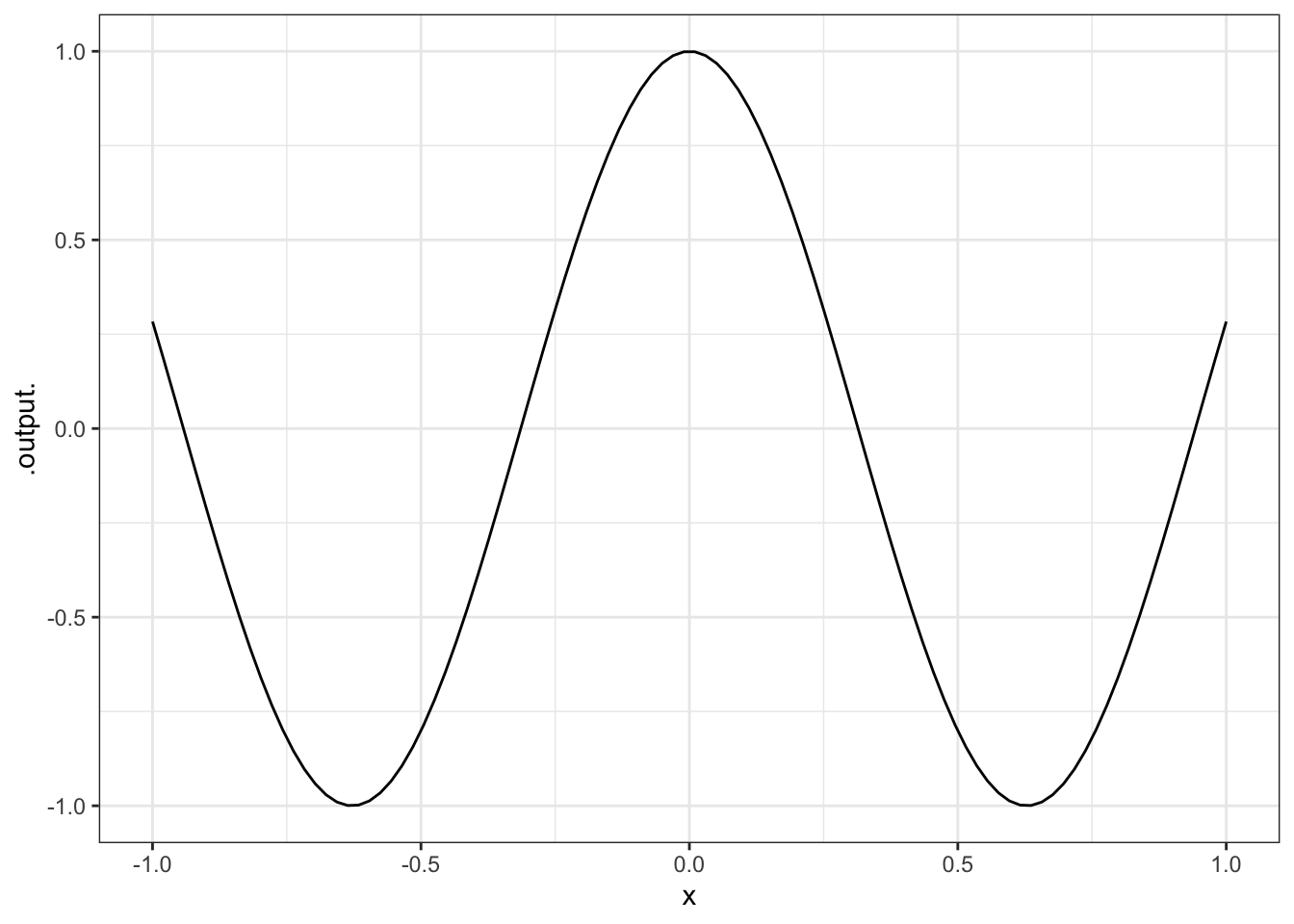
Reproduce each of these plots. Hand in the command you used to make the identical plot:

ANSWER:

ANSWER:
2.1.1.5 Exercise 5
What happens when you use a symbolic parameter (e.g., m in m*x + b ~ x, but try to make a plot without selecting a specific numerical value for the parameter?
ANSWER: You get an error message saying that the “object is not found”.
2.1.1.6 Exercise 6
What happens when you don’t specify a range for an input, but just a single number, as in the second of these two commands:
slice_plot(3 * x ~ x, domain(x= range(1,4))
slice_plot(3 * x ~ x, domain(x = 14))
slice_plot(3 * x ~ x)
Give a description of what happened and speculate on why.
ANSWER:
If no domain is specified or if the domain has only one number rather than a range, slice_plot() an error message is generated.
2.2 Making scatterplots
Often, the mathematical models that you will create will be motivated by data. For a deep appreciation of the relationship between data and models, you will want to study statistical modeling. Here, though, we will take a first cut at the subject in the form of curve fitting, the process of setting parameters of a mathematical function to make the function a close representation of some data.
This means that you will have to learn something about how to access data in computer files, how data are stored, and how to visualize the data. Fortunately, R and the mosaic package make this straightforward.
The data files you will be using are stored as spreadsheets on the Internet. Typically, the spreadsheet will have multiple variables; each variable is stored as one column. (The rows are “cases,” sometimes called “data points.”) To read the data in to R, you need to know the name of the file and its location. Often, the location will be an address on the Internet.
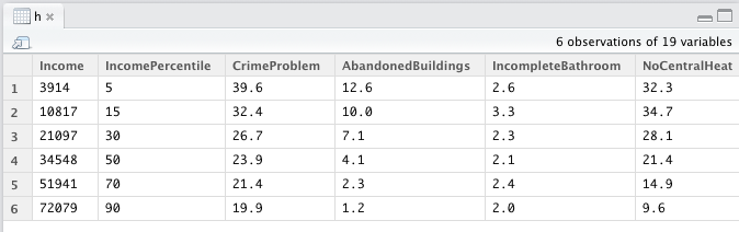
Here, we’ll work with "Income-Housing.csv", which is located at "http://www.mosaic-web.org/go/datasets/Income-Housing.csv". This file gives information from a survey on housing conditions for people in different income brackets in the US. (Source: Susan E. Mayer (1997) What money can’t buy: Family income and children’s life chances Harvard Univ. Press p. 102.)
Here’s how to read it into R:
There are two important things to notice about the above statement. First, the read.csv() function is returning a value that is being stored in an object called housing. The choice of Housing as a name is arbitrary; you could have stored it as x or Equador or whatever. It’s convenient to pick names that help you remember what’s being stored where.
Second, the name "http://www.mosaic-web.org/go/datasets/Income-Housing.csv" is surrounded by quotation marks. These are the single-character double quotes, that is, " and not repeated single quotes ' ' or the backquote ` . Whenever you are reading data from a file, the name of the file should be in such single-character double quotes. That way, R knows to treat the characters literally and not as the name of an object such ashousing`.
Once the data are read in, you can look at the data just by typing the name of the object (without quotes!) that is holding the data. For instance,
##   Income IncomePercentile CrimeProblem AbandonedBuildings
## 1   3914                5         39.6               12.6
## 2  10817               15         32.4               10.0
## 3  21097               30         26.7                7.1
## 4  34548               50         23.9                4.1
## 5  51941               70         21.4                2.3
## 6  72079               90         19.9                1.2
All of the variables in the data set will be shown (although just four of them are printed here).
You can see the names of all of the variables in a compact format with the names( ) command:
##  [1] "Income"              "IncomePercentile"    "CrimeProblem"
##  [4] "AbandonedBuildings"  "IncompleteBathroom"  "NoCentralHeat"
##  [7] "ExposedWires"        "AirConditioning"     "TwoBathrooms"
## [10] "MotorVehicle"        "TwoVehicles"         "ClothesWasher"
## [13] "ClothesDryer"        "Dishwasher"          "Telephone"
## [16] "DoctorVisitsUnder7"  "DoctorVisits7To18"   "NoDoctorVisitUnder7"
## [19] "NoDoctorVisit7To18"
When you want to access one of the variables, you give the name of the whole data set followed by the name of the variable, with the two names separated by a $ sign, like this:
## [1] 3914 10817 21097 34548 51941 72079## [1] 39.6 32.4 26.7 23.9 21.4 19.9Even though the output from names( ) shows the variable names in quotation marks, you won’t use quotations around the variable names.
Spelling and capitalization are important. If you make a mistake, no matter how trifling to a human reader, R will not figure out what you want. For instance, here’s a misspelling of a variable name, which results in nothing (NULL) being returned.
## NULLSometimes people like to look at datasets in a spreadsheet format, each entry in a little cell. In RStudio, you can do this by going to the “Workspace” tab and clicking the name of the variable you want to look at. This will produce a display like the following:
You probably won’t have much use for this, but occasionally it is helpful.
Usually the most informative presentation of data is graphical. One of the most familiar graphical forms is the scatter-plot, a format in which each “case” or “data point” is plotted as a dot at the coordinate location given by two variables. For instance, here’s a scatter plot of the fraction of household that regard their neighborhood as having a crime problem, versus the median income in their bracket.
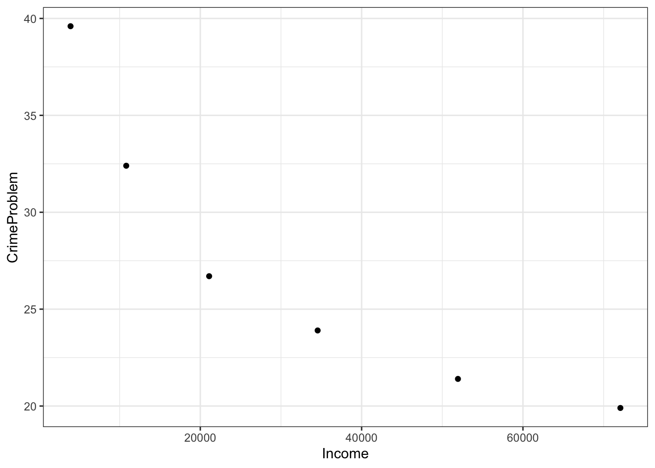
The R statement closely follows the English equivalent: "plot as points CrimeProblem versus (or, as a function of) Income, using the data from the housing object.
Graphics are constructed in layers. If you want to plot a mathematical function over the data, you’ll need to use a plotting function to make another layer. Then, to display the two layers in the same plot, connect them with the %>% symbol (called a “pipe”). Note that %>% can never go at the start of a new line.
gf_point(
  CrimeProblem ~ Income, data=Housing ) %>%
  slice_plot(
    40 - Income/2000 ~ Income, color = "red")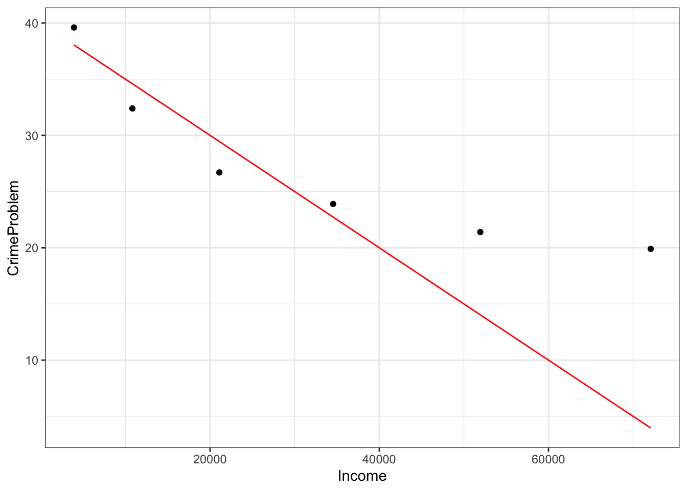
The mathematical function drawn is not a very good match to the data, but this reading is about how to draw graphs, not how to choose a family of functions or find parameters!
If, when plotting your data, you prefer to set the limits of the axes to something of your own choice, you can do this. For instance:
gf_point(
  CrimeProblem ~ Income, data = Housing) %>%
  slice_plot(
    40 - Income / 2000 ~ Income, color = "blue") %>%
  gf_lims(
    x = range(0,100000),
    y=range(0,50))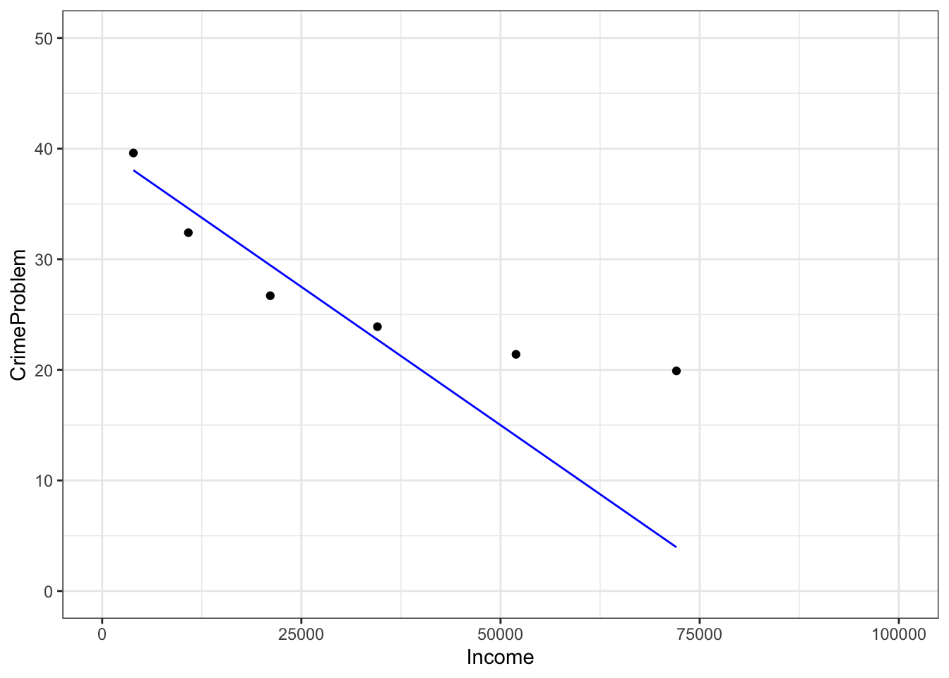
Properly made scientific graphics should have informative axis names. You can set the axis names directly using gf_labs:
gf_point(
  CrimeProblem ~ Income, data=Housing) %>%
  gf_labs(x= "Income Bracket ($US per household)/year",
          y = "Fraction of Households",
          main = "Crime Problem") %>%
  gf_lims(x = range(0,100000), y = range(0,50))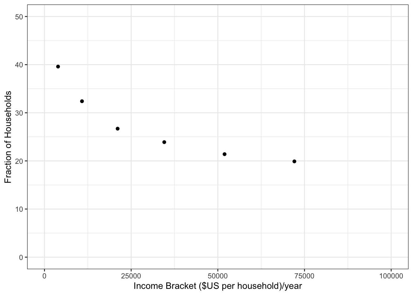
Notice the use of double-quotes to delimit the character strings, and how \(x\) and \(y\) are being used to refer to the horizontal and vertical axes respectively.
2.2.1 Exercises
2.2.1.1 Exercise 1
Make each of these plots:
- Prof. Stan Wagon (see http://stanwagon.com) illustrates curve fitting using measurements of the temperature (in degrees C) of a cup of coffee versus time (in minutes):
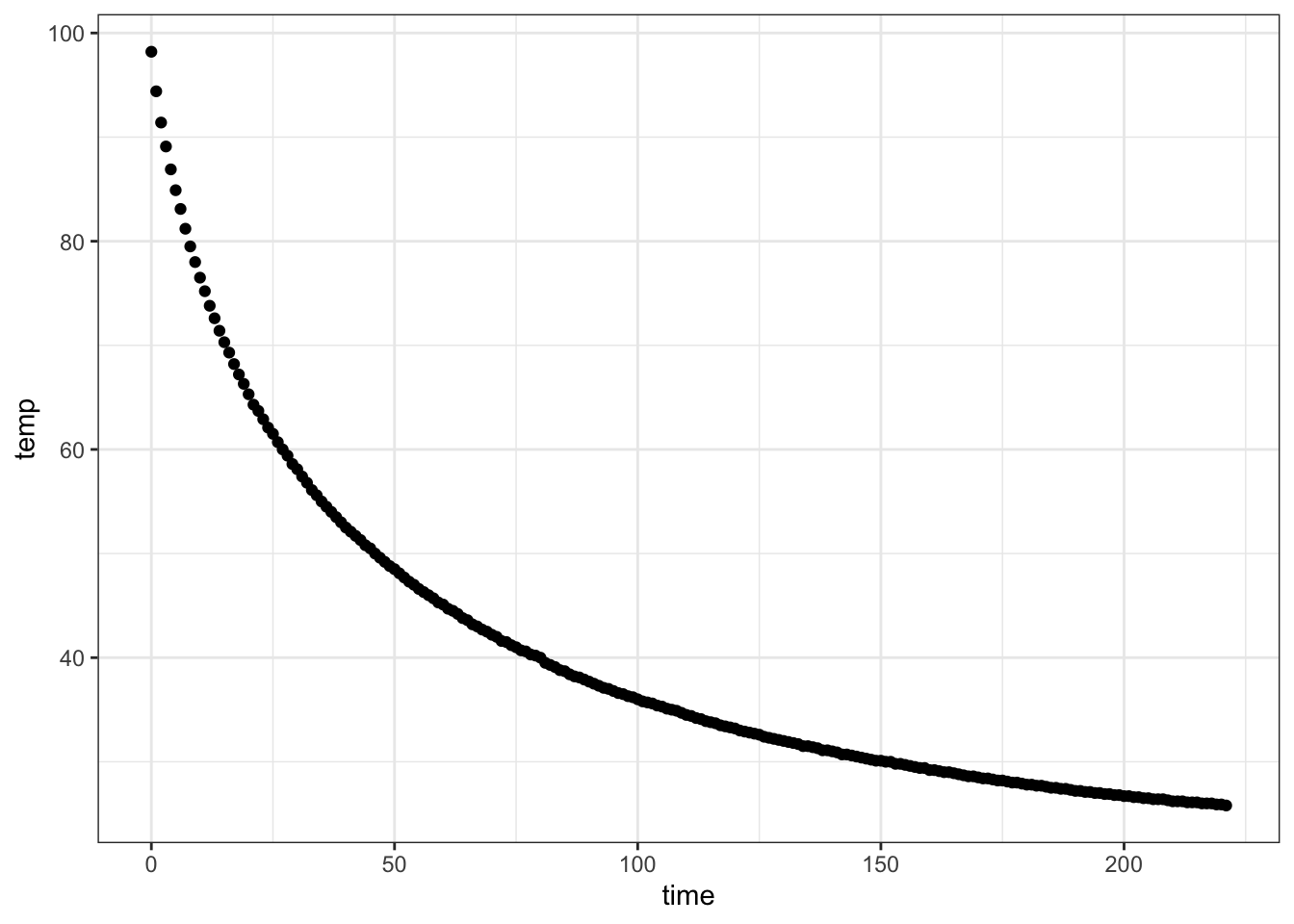
- Describe in everyday English the pattern you see in coffee cooling:
- Here’s a record of the tide level in Hawaii over about 100 hours:
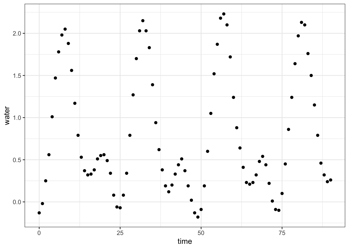
- Describe in everyday English the pattern you see in the tide data:
2.2.1.2 Exercise 2
Construct the R commands to duplicate each of these plots. Hand in your commands (not the plot):
- The data file
"utilities.csv"has utility records for a house in St. Paul, Minnesota, USA. Make this plot, including the labels:

ANSWER:
Utilities <- read.csv(
  "http://www.mosaic-web.org/go/datasets/utilities.csv")

gf_point(
  temp ~ month, data=Utilities) %>%
  gf_labs(x = "Month (Jan=1, Dec=12)",
          y = "Temperature (F)",
          main = "Ave. Monthly Temp.")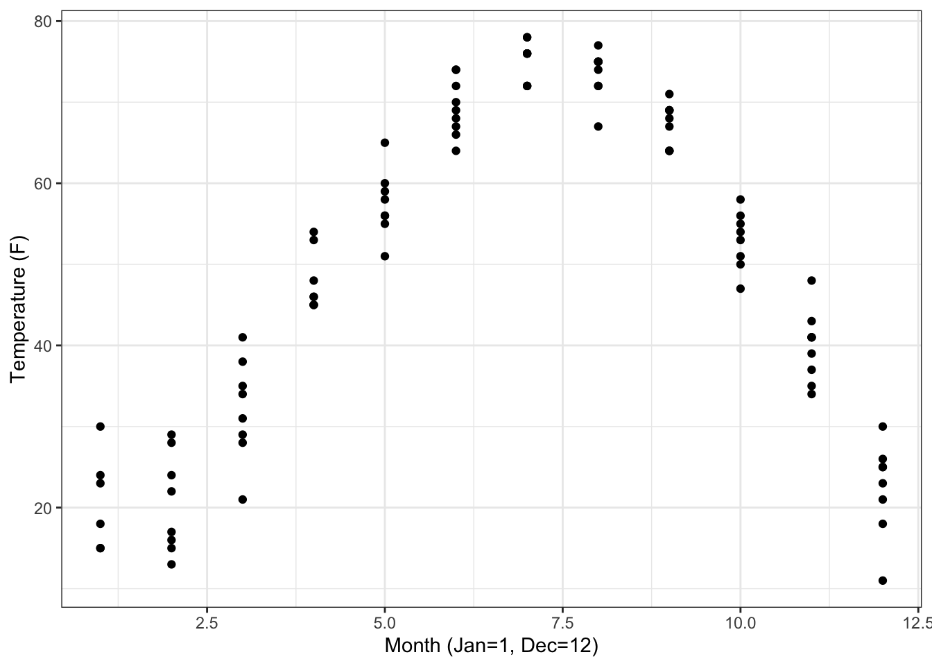
b.From the "utilities.csv" data file, make this plot of household monthly bill for natural gas versus average temperature. The line has slope \(-5\) USD/degree and intercept 300 USD.
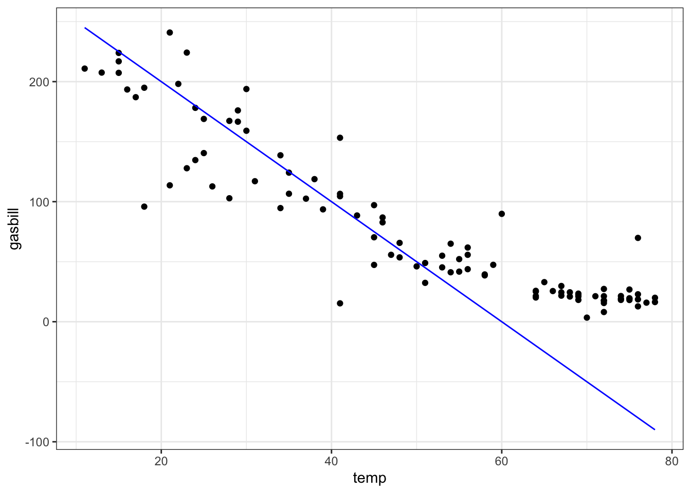
ANSWER:
gf_point(
  gasbill ~ temp, data=Utilities) %>%
  gf_labs(xlab = "Temperature (F)",
          ylab = "Expenditures ($US)",
          main = "Natural Gas Use") %>%
  slice_plot( 300 - 5*temp ~ temp, color="blue")
2.3 Graphing functions of two variables
You’ve already seen how to plot a graph of a function of one variable, for instance:
This lesson is about plotting functions of two variables. For the most part, the format used will be a contour plot.
You use contour_plot() to plot with two input
variables. You need to list the two variables
on the right of the + sign, and you need to give a range for
each of the variables. For example:

Each of the contours is labeled, and by default the plot is filled with color to help guide the eye. If you prefer just to see the contours, without the color fill, use the tile=FALSE argument.

Occasionally, people want to see the function as a surface, plotted in 3 dimensions. You can get the computer to display a perspective 3-dimensional plot by using the interactive_plot() function. As you’ll see by mousing around the plot, it is interactive.
It’s very hard to read quantitative values from a surface plot — the contour plots are much more useful for that. On the other hand, people seem to have a strong intuition about shapes of surfaces. Being able to translate in your mind from contours to surfaces (and vice versa) is a valuable skill.
To create a function that you can evaluate numerically, construct the function with makeFun(). For example:
g <- makeFun(
  sin(2*pi*t/10)*exp(-.2*x) ~ t & x)
contour_plot(
  g(t, x) ~ t + x,
  domain(t=0:20, x=0:10))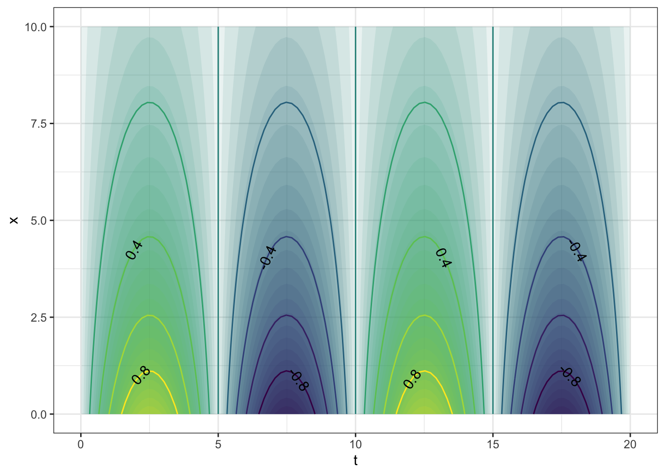
## [1] -0.4273372Make sure to name the arguments explicitly when inputting values. That way you will be sure that you haven’t reversed them by accident. For instance, note that this statement gives a different value than the above:
## [1] 0.1449461The reason for the discrepancy is that when the arguments are given without names, it’s the position in the argument sequence that matters. So, in the above, 4 is being used for the value of t and 7 for the value of x. It’s very easy to be confused by this situation, so a good practice is to identify the arguments explicitly by name:
## [1] -0.42733722.3.1 Exercises
2.3.1.1 Exercise 1
Refer to this contour plot:
Approximately what is the value of the function at each of these \((x,t)\) pairs? Pick the closest value
- \(x=4, t=10\): {-6,-5,-4,-2,0,2,4,5,6}
- \(x=8, t=10\): {-6,-5,-4,-2,0,2,4,5,6}
- \(x=7, t=0\): {-6,-5,-4,-2,0,2,4,5,6}
- \(x=9, t=0\): {-6,-5,-4,-2,0,2,4,5,6}
ANSWER:
## [1] -2.195187## [1] -4.88548## [1] 4.0552## [1] 6.0496472.3.1.2 Exercise 2
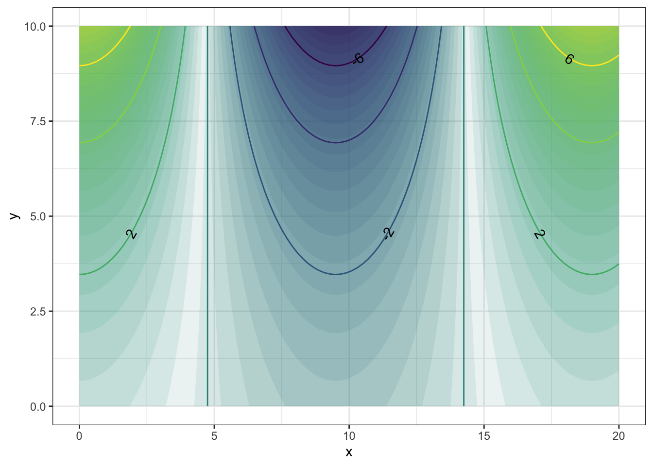
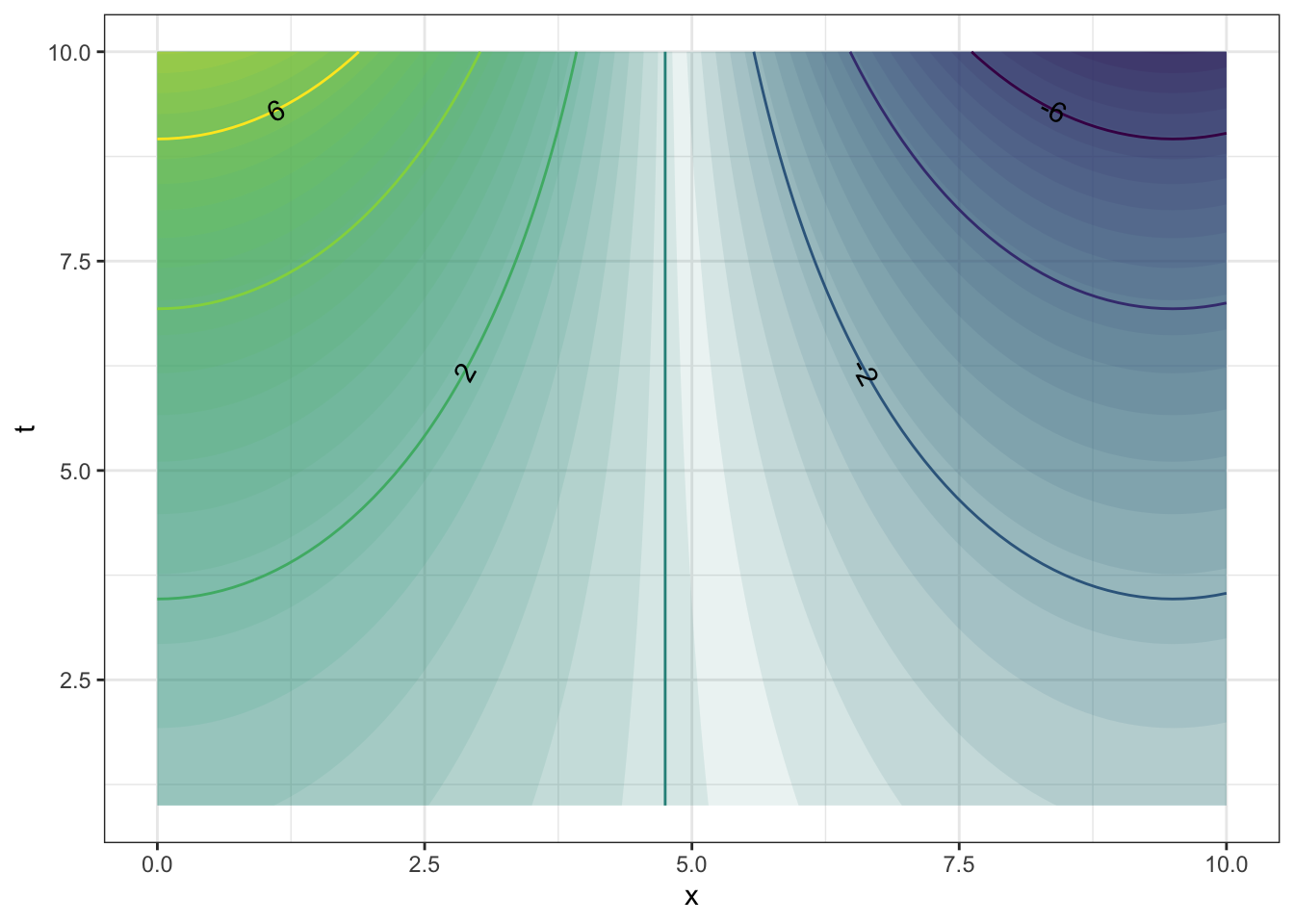
Describe the shape of the contours produced by each of these functions. (Hint: Make the plot! Caution: Use the mouse to make the plotting frame more-or-less square in shape.)
The function
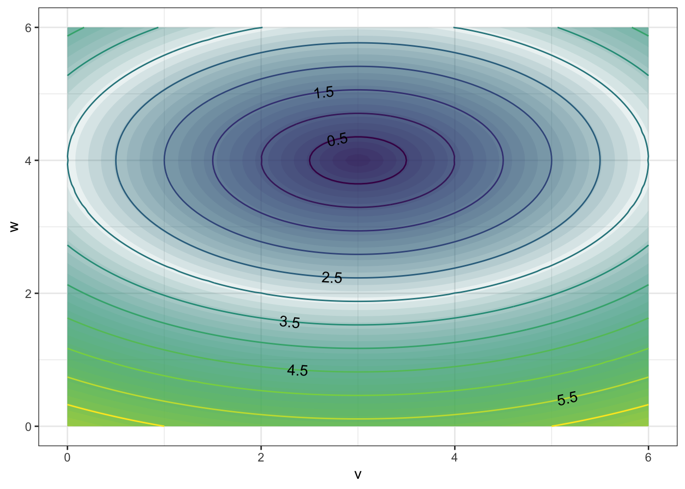 has contours that are {Parallel Lines,Concentric Circles,Concentric Ellipses,X Shaped}
The function
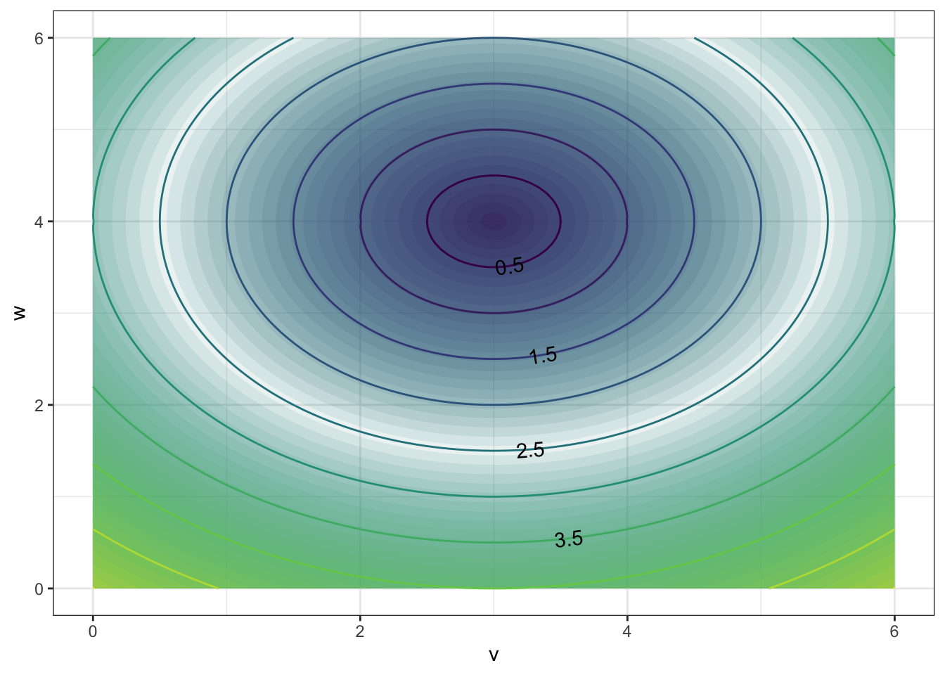
has contours that are {Parallel Lines,Concentric Circles, Concentric Ellipses, X Shaped}
- The function
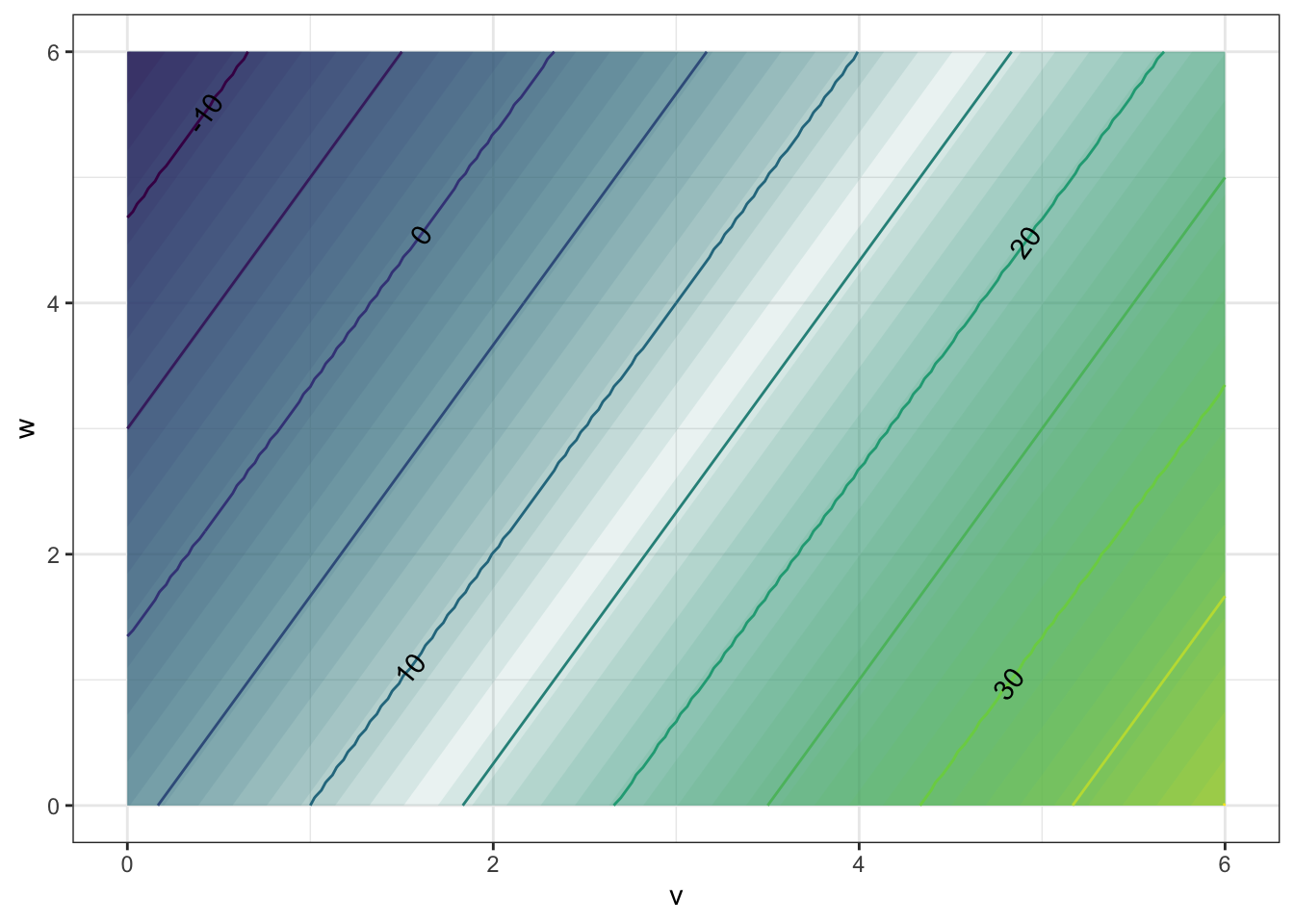 has contours that are:{Parallel Lines,Concentric Circles,Concentric Ellipses,X Shaped}}