Chapter 6 Fitting functions to data
Often, you have an idea for the form of a function for a model and you need to select parameters that will make the model function a good match for observations. The process of selecting parameters to match observations is called model fitting.
To illustrate, the data in the file “utilities.csv” records the average temperature each month (in degrees F) as well as the monthly natural gas usage (in cubic feet, ccf). There is, as you might expect, a strong relationship between the two.
Utils <- read.csv("http://www.mosaic-web.org/go/datasets/utilities.csv")
gf_point(ccf ~ temp, data = Utils) %>%
  gf_labs(y = "Natural gas usage (ccf/month)",
          x = "Average outdoor temperature (F)")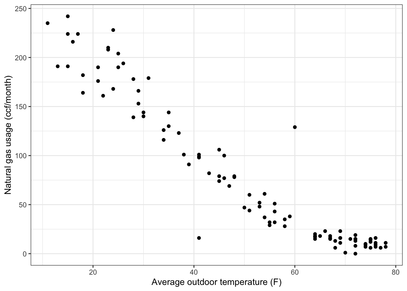
Many different sorts of functions might be used to represent these data. One of the simplest and most com- monly used in modeling is a straight-line function \(f(x) = A x + B\). In function \(f(x)\), the variable \(x\) stands for the input, while A and B are parameters. It’s important to remember what are the names of the inputs and outputs when fitting models to data – you need to arrange for the name to match the corresponding data.
With the utilities data, the input is the temperature, temp. The output that is to be modeled is ccf. To fit the model function to the data, you write down the formula with the appropriate names of inputs, parameters, and the output in the right places:
The output of fitModel() is a function of the same form mathematical form as you specified in the first argument (here, ccf ~ A * temp + B) with specific numerical values given to the parameters in order to make the function best match the data. How does fitModel() know which of the quantities in the mathematical form are variables and which are parameters? Anything contained in the data used for fitting is a variable (here temp); other things (here, A and B) are parameters.

You can add other functions into the mix easily. For instance, you might think that sqrt(temp) works in there somehow. Try it out!
f2 <- fitModel(
  ccf ~ A * temp + B + C *sqrt(temp),
  data = Utils)
gf_point(
  ccf ~ temp, data = Utils) %>%
  slice_plot(f2(temp) ~ temp)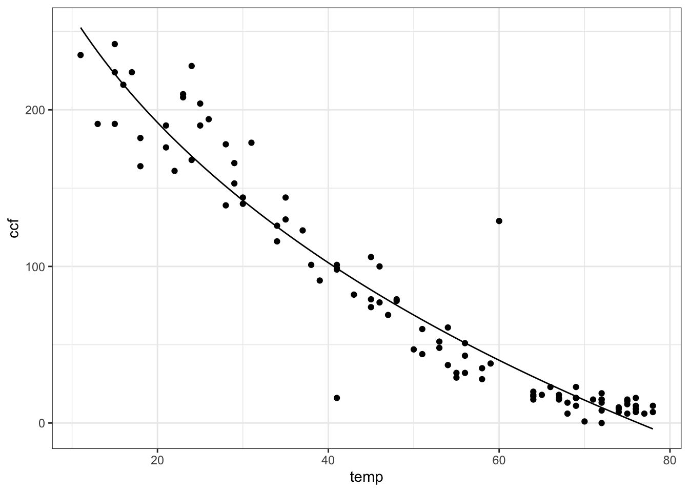
This example has involved just one input variable. Throughout the natural and social sciences, a very important and widely used technique is to use multiple variables in a projection. To illustrate, look at the data in "used-hondas.csv" on the prices of used Honda automobiles.
##   Price Year Mileage Location Color Age
## 1 20746 2006   18394  St.Paul  Grey   1
## 2 19787 2007       8  St.Paul Black   0
## 3 17987 2005   39998  St.Paul  Grey   2
## 4 17588 2004   35882  St.Paul Black   3
## 5 16987 2004   25306  St.Paul  Grey   3
## 6 16987 2005   33399  St.Paul Black   2
As you can see, the data set includes the variables Price, Age, and Mileage. It seems reasonable to think that price will depend both on the mileage and age of the car. Here’s a very simple model that uses both variables:
You can plot the fitted function out:
contour_plot(
  carPrice1(Age = age, Mileage = miles) ~ age + miles,
  domain(age=2:8, miles=range(0, 60000)))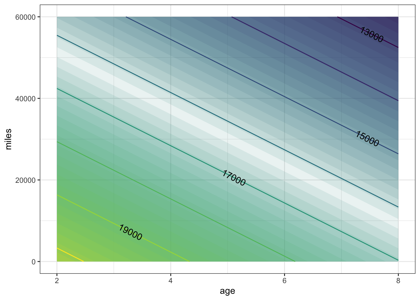
Consider now another way of reading a contour plot. For the example, let’s focus on the contour at $17,000. Any combination of age and miles that falls on this contour produces the same car price: $17,000. The slope of the contour tells you the trade-off between mileage and age. Look at two points on the contour that differ by 10,000 miles. The corresponding difference in age is about 1.5 years. So, when comparing two cars at the same price, a decrease in mileage by 10,000 is balanced by an increase in age of 1.5 miles.
A somewhat more sophisticated model might include what’s called an interaction between age and mileage, recognizing that the effect of age might be different depending on mileage.
Again, once the function has been fitted to the data, you can plot it in the ordinary way:
contour_plot(
  carPrice2(Age=age, Mileage=miles) ~ age + miles,
  domain(age = range(0, 8), miles = range(0, 60000)))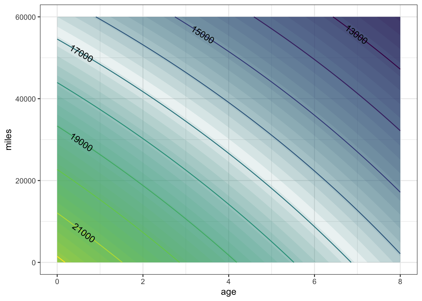
The shape of the contours is slightly different than in carPrice1(); they bulge upward a little. interpreting such contours requires a bit of practice. Look at a small region on one of the contours. The slope of the contour tells you the trade-off between mileage and age. To see this, look at the $17,000 contour where it passes through age = 6 years and mileage = 10,000 miles. Now look at the $ 17,000 contour at zero mileage. In moving along the contour, the price stays constant. (That’s how contours are defined: the points where the price is the same, in this case $17,000.) Lowering the mileage by 10,000 miles is balanced out by increasing the age by just under one year. (The $17,000 contour has a point at zero mileage and 6.8 years.) Another way to say this is that the effect of an age increase of 0.8 years is the same as a mileage decrease of 10,000 miles.
Now look at the same $17,000 contour at zero age (that is, at the left extreme of the graph). A decrease in mileage by 10,000 increasecorresponds to an in age by 1.6 years. In other words, according to the model, for newer cars the relative importance of mileage vs. age is less than for older cars. For cars aged zero, 10,000 miles is worth 1.6 years, but for six-year old cars, 10,000 miles is worth only 0.8 years.
The interaction that was added in priceFun2() is what produces the different effect on price of mileage for different age cars.
The fitModel() operator makes it very easy to find the parameters in any given model that make the model most closely approximate the data. The work in modeling is choosing the right form of the model (Interaction term or not? Whether to include a new variable or not?)
and interpreting the result. In the next section, we’ll look at some different choices in model form (linear vs. nonlinear) and some of the mathematical logic behind fitting.
6.0.1 Exercises
6.0.1.1 Exercise 1
The text of the section describes a model carPrice1() with Age and Mileage as the input quantities and price (in USD) as the output. The claim was made that price is discernably a function of both Age and Mileage. Let’s make that graph again.
contour_plot(
  carPrice1(Age = age, Mileage = miles) ~ age + miles,
  domain(age = range(0, 8), miles = range(0, 60000)))
In the above graph, the contours are vertical.
What do the vertical contours say about price as a function of
AgeandMileage?- Price depends strongly on both variables.
- Price depends on
Agebut notMileage. - Price depends on
Mileagebut notAge. - Price doesn’t depend much on either variable.
ANSWER:
Each contour corresponds to a different price. As you track horizontally with Age, you cross from one contour to another. But as you track vertically with Mileage, you don’t cross contours. This means that price does not depend on Mileage, since changing Mileage doesn’t lead to a change in price. But price does change with Age.
The graph of the same function shown in the body of the text has contours that slope downwards from left to right. What does this say about price as a function of
AgeandMileage?- Price depends strongly on both variables.
- Price depends on
Agebut notMileage. - Price depends on
Mileagebut notAge. - Price doesn’t depend much on either variable.
ANSWER:
As you trace horizontally, with Age, you move from contour to contour: the price changes. So price depends on Age. The same is true when you trace vertically, with Mileage. So price also depends on Mileage.
- The same function is being graphed both in the body of the text and in this exercise. But the graphs are very different! Explain why there is a difference and say which graph is right.
ANSWER:
Look at the tick marks on the axes. In the graph in the body of the text, Age runs from two to eight years. But in the exercise’s graph, Age runs only from zero to one year. Similarly, the graph in the body of the text has Mileage running from 0 to 60,000 miles, but in the exercise’s graph, Mileage runs from 0 to 1.
The two graphs show the same function, so both are “right.” But the exercise’s graph is visually misleading. It’s hardly a surprise that price doesn’t change very much from 0 miles to 1 mile, but it does change (somewhat) from 0 years to 1 year.
The moral here: Pay careful attention to the axes and the range that they display. When you draw a graph, make sure that you set the ranges to something relevant to the problem at hand.
6.0.1.2 Exercise 2
Economists usually think about prices in terms of their logarithms. The advantage of doing this is that it doesn’t matter what currency the price is in; an increase of 1 in log price is the same proportion regardless of the price or its currency.
Consider a model of \(\log_10 \mbox{price}\) as a function of miles and age.
logPrice2 <- fitModel(
  logPrice ~ A + B * Age + C * Mileage + D * Age * Mileage,
  data = Hondas %>% mutate(logPrice = log10(Price)))
This model was defined to include an interaction between age and mileage. Of course, it might happen that the parameter D will be close to zero. That would mean that the data don’t provide any evidence for an interaction.
Fit the model and look at the contours of log price. What does the shape of the contours tell you about whether the data give evidence for an interaction in log price?
ANSWER:
contour_plot(
  logPrice2(Age=age, Mileage=miles) ~ age + miles,
  domain(age = range(0, 8), miles = range(0, 60000)))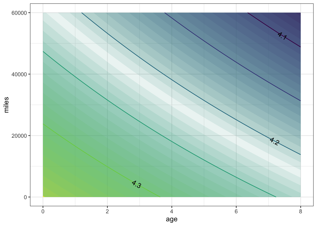
The contours are pretty much straight, which suggests that there is little interaction. When interpreting log prices, you can think about a increase of, say, 0.05 in output as corresponding to the same proportional increase in price. For example, an increase in log price from 4.2 (which is \(10^{4.2}\) = 15,849) to 4.25 (which is \(10^{4.25}\) = 17,783) is an increase by 12% in actual price. A further increase in log price to 4.3 (which is, in actual price, \(10^{4.3}\) = 19,953) is a further 12% increase in actual price.
6.0.1.3 Exercise 3: Stay near the data
Fitting functions to data is not magic. Insofar as the data constrains the plausible forms of the model, the model will be a reasonable match to the data. But for inputs for which there is no data (e.g. 0 year-old cars with 60,000 miles) a model can do crazy things. This is particularly so if the model is complicated, say including powers of the variable, as in this one:
carPrice3 <- fitModel(
  Price ~ A + B * Age + C * Mileage + D * Age * Mileage +
    E * Age^2 + F * Mileage^2 + G * Age^2 * Mileage +
    H * Age * Mileage^2,
  data = Hondas)
gf_point(Mileage ~ Age, data = Hondas, fill = NA) %>%
contour_plot(
  carPrice3(Age=Age, Mileage=Mileage) ~ Age + Mileage)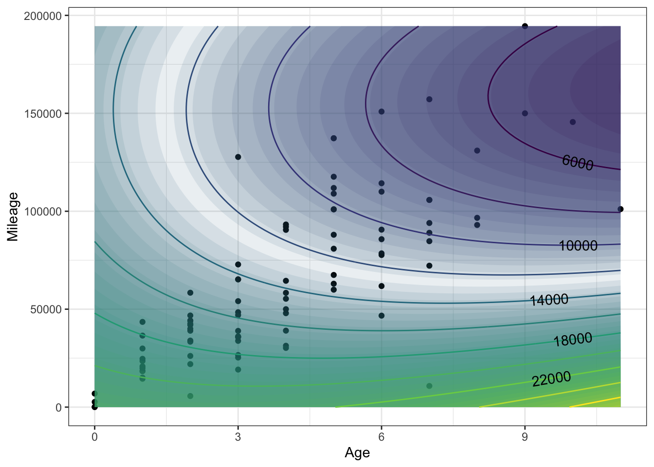
For cars under 3 years old or older cars with either very high or very low mileage, the contours are doing some crazy things! Common sense says that higher mileage or greater age results in higher price. In terms of the contours, common sense translates to contours that have a negative slope. But the slope of these contours is often positive.
It helps to consider whether there are regions where there is little data. As a rule, a complicated model like carPrice3() is unreliable for inputs where there is little or no data.
Focus just on the regions of the plot where there is lots of data. Do the contours have the shape expected by common sense?
ANSWER: Where there is lots of data, the local shape of the contour is indeed gently sloping downward from left to right, as anticipated by common sense.
6.1 Curves and linear models
At first glance, the terms “linear” and “curve” might seem contradictory. Lines are straight, curves are not.
The word linear in “linear models” refers to “linear combination,” not “straight line.” As you will see, you can construct complicated curves by taking linear combinations of functions, and use the linear algebra projection operation to match these curves as closely as possible to data. That process of matching is called “fitting.”
To illustrate, the data in the file "utilities.csv" records the average temperature each month (in degrees F) as well as the monthly natural gas usage (in cubic feet, ccf). There is, as you might expect, a strong relationship between the two.
Utilities = read.csv("http://www.mosaic-web.org/go/datasets/utilities.csv")
gf_point(ccf ~ temp, data = Utilities)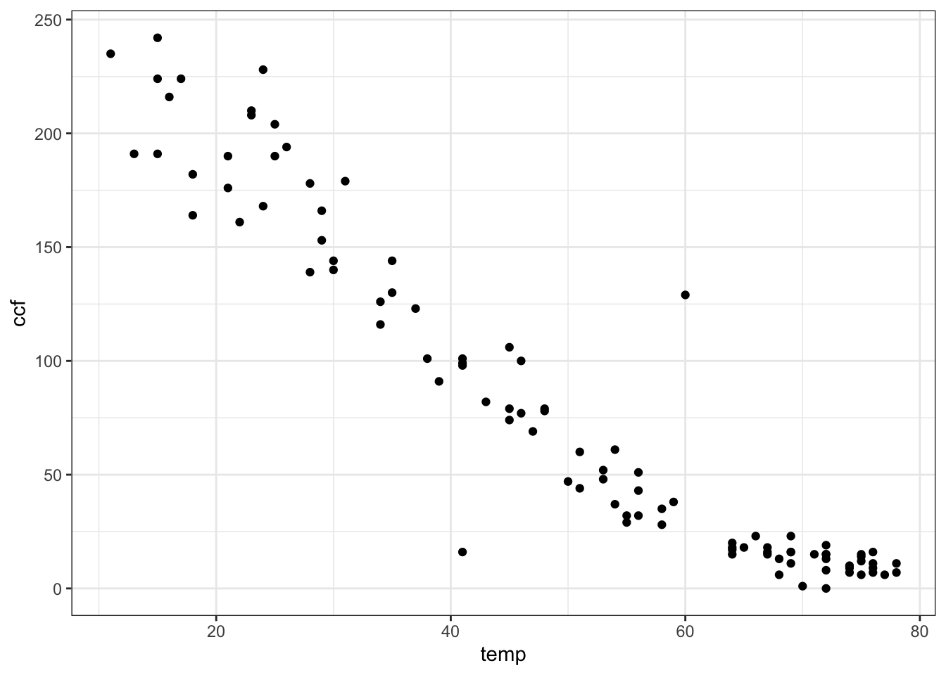
Many different sorts of functions might be used to represent these data. One of the simplest and most commonly used in modeling is a straight-line function. In terms of linear algebra, this is a linear combination of the functions \(f_1(T) = 1\) and \(f_2(T) = T\). Conventionally, of course, the straight-line function is written \(f(T) = b + m T\). (Perhaps you prefer to write it this way: \(f(x) = m x + b\). Same thing.) This conventional notation is merely naming the scalars as \(m\) and \(b\) that will participate in the linear combination. To find the numerical scalars that best match the data — to “fit the function” to the data — can be done with the linear algebra project( ) operator.
## (Intercept)        temp
##  253.098208   -3.464251
The project( ) operator gives the values of the scalars. The best fitting function itself is built by using these scalar values to combine the functions involved.
model_fun = makeFun( 253.098 - 3.464*temp ~ temp)
gf_point(ccf ~ temp, data=Utils) %>%
  slice_plot(model_fun(temp) ~ temp)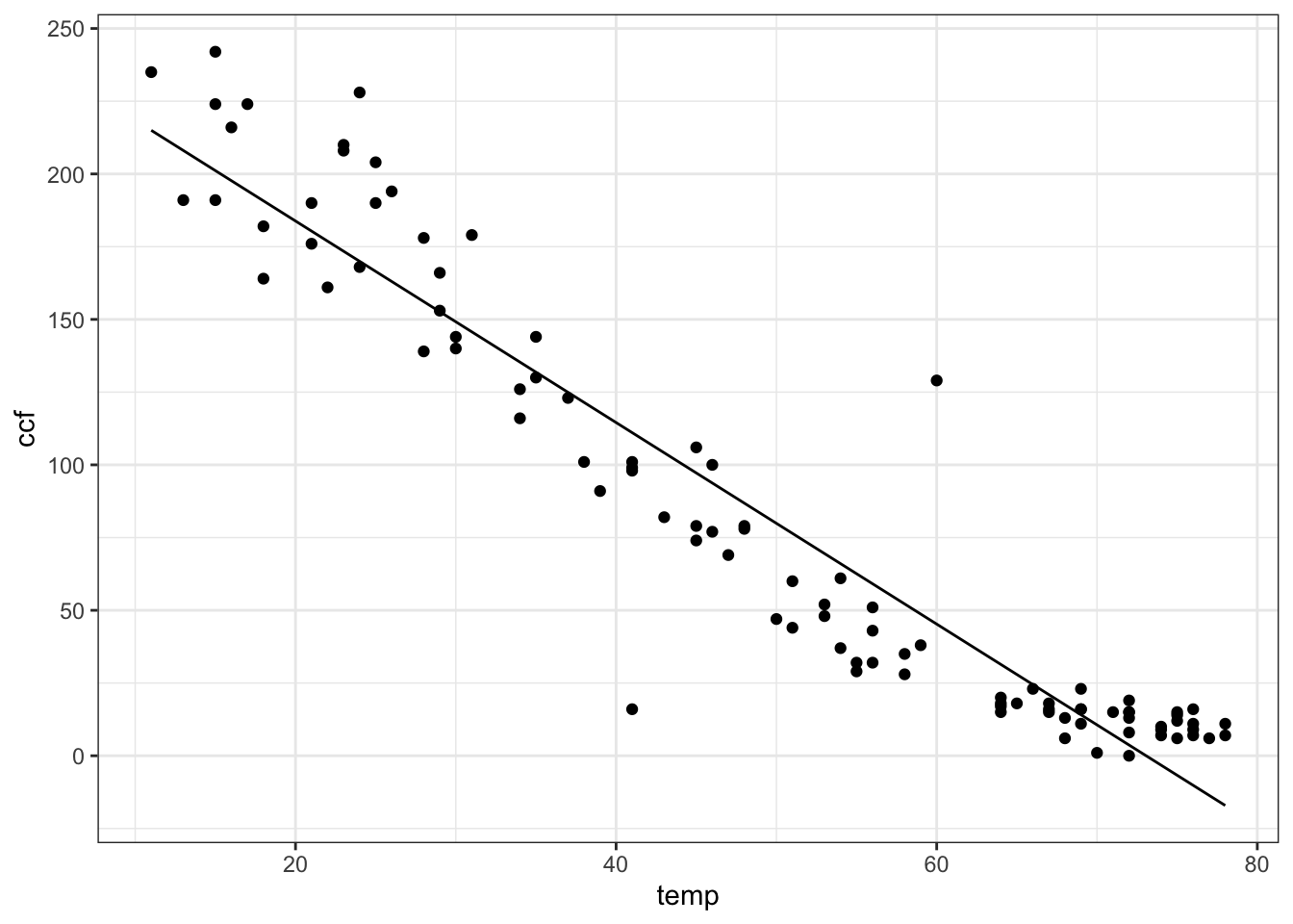
You can add other functions into the mix easily. For instance, you might think that sqrt(T) works in there somehow. Try it out!
## (Intercept)        temp  sqrt(temp)
##  447.029273    1.377666  -63.208025
mod2 <- makeFun(447.03 + 1.378*temp - 63.21*sqrt(temp) ~ temp)
gf_point(ccf ~ temp, data=Utils) %>% # the data
slice_plot(mod2(temp) ~ temp) %>%
gf_labs(x = "Temperature (F)",
y = "Natural gas used (ccf)")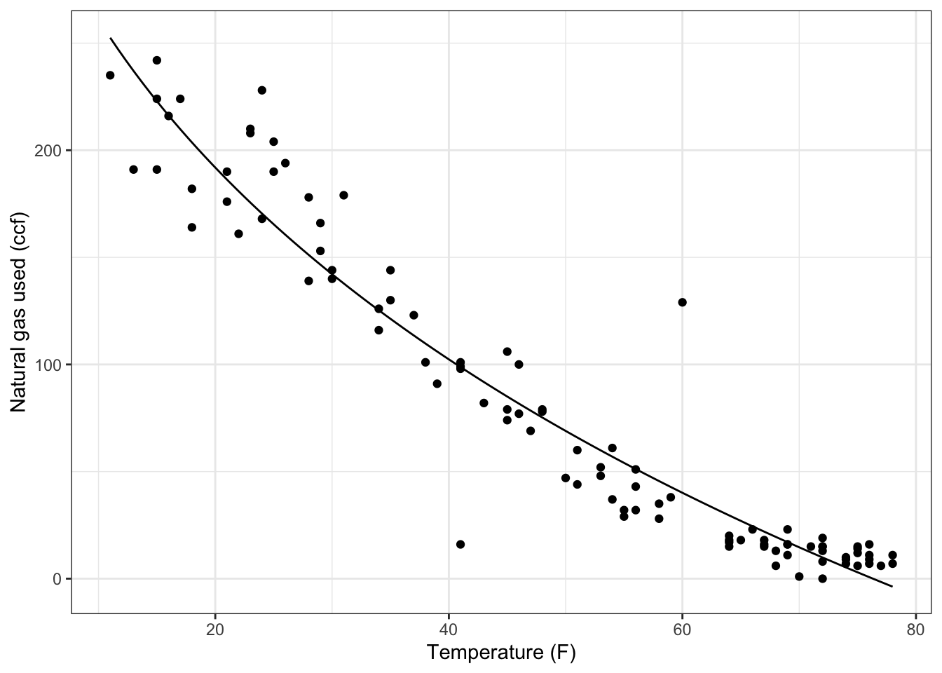
Understanding the mathematics of projection is important for using it, but focus for a moment on the notation being used to direct the computer to carry out the linear algebra notation.
The project( ) operator takes a series of vectors. When fitting a function to data, these vectors are coming from a data set and so the command must refer to the names of the quantities as they appear in the data set, e.g., ccf or temp. You’re allowed to perform operations on those quantities, for instance the sqrt in the above example, to create a new vector. The ~ is used to separate out the “target” vector from the set of one or more vectors onto which the projection is being made. In traditional mathematical notation, this operation would be written as an equation involving a matrix \(\mathbf A\) composed of a set of vectors \(\left( \vec{v}_1, \vec{v}_2, \ldots, \vec{v}_p \right) = {\mathbf A}\), a target vector \(\vec{b}\), and the set of unknown coefficients \(\vec{x}\). The equation that connects these quantities is written \({\mathbf A} \cdot \vec{x} \approx \vec{b}\). In this notation, the process of “solving” for \(\vec{x}\) is implicit. The computer notation rearranges this to
\[ \vec{x} = \mbox{\texttt{project(}} \vec{b} \sim \vec{v}_1 +
\vec{v}_2 + \ldots + \vec{v}_p \mbox{\texttt{)}} .\]
Once you’ve done the projection and found the coefficients, you can construct the corresponding mathematical function by using the coefficients in a mathematical expression to create a function. As with all functions, the names you use for the arguments are a matter of personal choice, although it’s sensible to use names that remind you of what’s being represented by the function.
The choice of what vectors to use in the projection is yours: part of the modeler’s art.
Throughout the natural and social sciences, a very important and widely used technique is to use multiple variables in a projection. To illustrate, look at the data in "used-hondas.csv" on the prices of used Honda automobiles.
##   Price Year Mileage Location Color Age
## 1 20746 2006   18394  St.Paul  Grey   1
## 2 19787 2007       8  St.Paul Black   0
## 3 17987 2005   39998  St.Paul  Grey   2
## 4 17588 2004   35882  St.Paul Black   3
## 5 16987 2004   25306  St.Paul  Grey   3
## 6 16987 2005   33399  St.Paul Black   2
As you can see, the data set includes the variables Price, Age, and Mileage. It seems reasonable to think that price will depend both on the mileage and age of the car. Here’s a very simple model that uses both variables:
##   (Intercept)           Age       Mileage
##  2.133049e+04 -5.382931e+02 -7.668922e-02
You can plot that out as a mathematical function:
car_price <- makeFun(21330-5.383e2*age-7.669e-2*miles ~ age & miles)
contour_plot(car_price(age, miles) ~ age + miles,
  domain(age=range(2, 8), miles=range(0, 60000))) %>%
  gf_labs(title = "Miles per gallon")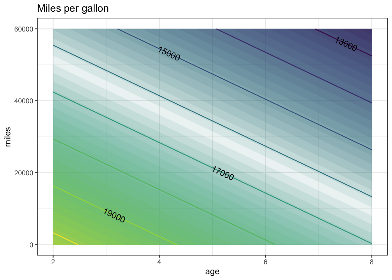
A somewhat more sophisticated model might include what’s called an “interaction” between age and mileage, recognizing that the effect of age might be different depending on mileage.
##   (Intercept)           Age       Mileage   Age:Mileage
##  2.213744e+04 -7.494928e+02 -9.413962e-02  3.450033e-03
car_price2 <- makeFun(22137 - 7.495e2*age - 9.414e-2*miles +
3.450e-3*age*miles ~ age & miles)
contour_plot(
car_price2(Age, Mileage) ~ Age + Mileage,
domain(Age = range(0, 10), Mileage = range(0, 100000))) %>%
gf_labs(title = "Price of car (USD)")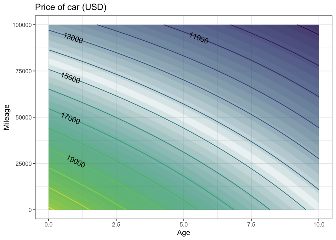
6.1.1 Exercises
6.1.1.1 Exercise 1: Fitting Polynomials
Most college students take a course in algebra that includes a lot about polynomials, and polynomials are very often used in modeling. (Probably, they are used more often than they should be. And algebra teachers might be disappointed to hear that the most important polynomials models are low-order ones, e.g., \(f(x,y) = a + bx + cy + dx y\) rather than being cubics or quartics, etc.) Fitting a polynomial to data is a matter of linear algebra: constructing the appropriate vectors to represent the various powers. For example, here’s how to fit a quadratic model to the ccf versus temp variables in the "utilities.csv" data file:
Utilities = read.csv("http://www.mosaic-web.org/go/datasets/utilities.csv")
project(ccf ~ 1 + temp + I(temp^2), data = Utilities)
## (Intercept) temp I(temp^2)
## 317.58743630 -6.85301947 0.03609138You may wonder, what is the I( ) for? It turns out that there are different notations for statistics and mathematics, and that the ^ has a subtly different meaning in R formulas than simple exponentiation. The I( ) tells the software to take the exponentiation literally in a mathematical sense.
The coefficients tell us that the best-fitting quadratic model of ccf versus temp is:
ccfQuad <- makeFun(317.587 - 6.853*T + 0.0361*T^2 ~ T)
gf_point(ccf ~ temp, data = Utilities) %>%
slice_plot(ccfQuad(temp) ~ temp) 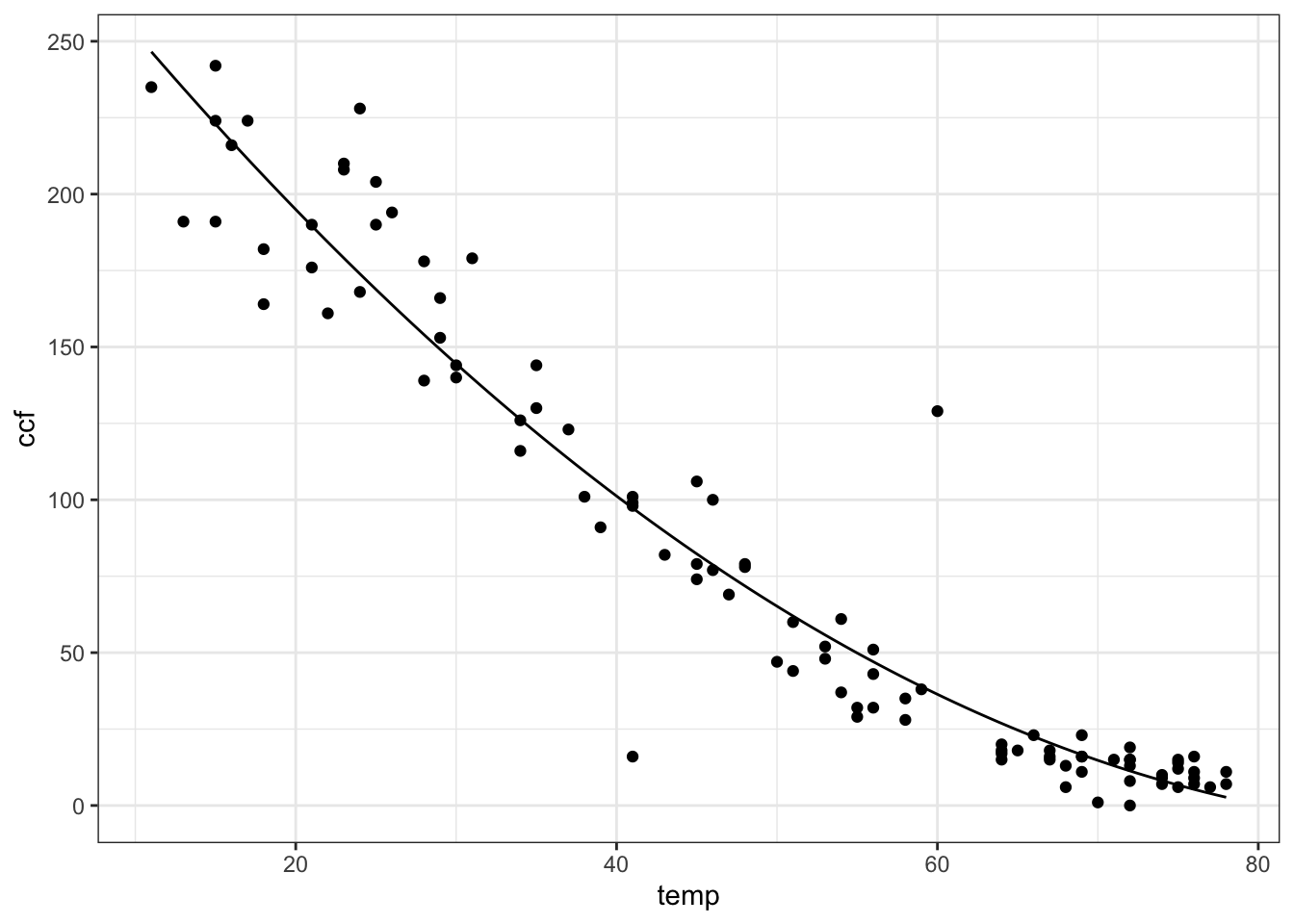
To find the value of this model at a given temperature, just evaluate the function. (And note that ccfQuad( ) was defined with an input variable T.)
## [1] 11.3134- Fit a 3rd-order polynomial of versus to the utilities data. What is the value of this model for a temperature of 32 degrees? {87,103,128,142,143,168,184}
ANSWER:
##   (Intercept)          temp     I(temp^2)     I(temp^3)
##  2.550709e+02 -1.427408e+00 -9.643482e-02  9.609511e-04
ccfCubic <-
makeFun(2.551e2 - 1.427*T -
9.643e-2*T^2 + 9.6095e-4*T^3 ~ T)
gf_point(ccf ~ temp, data = Utils) %>%
slice_plot(ccfCubic(temp) ~ temp) 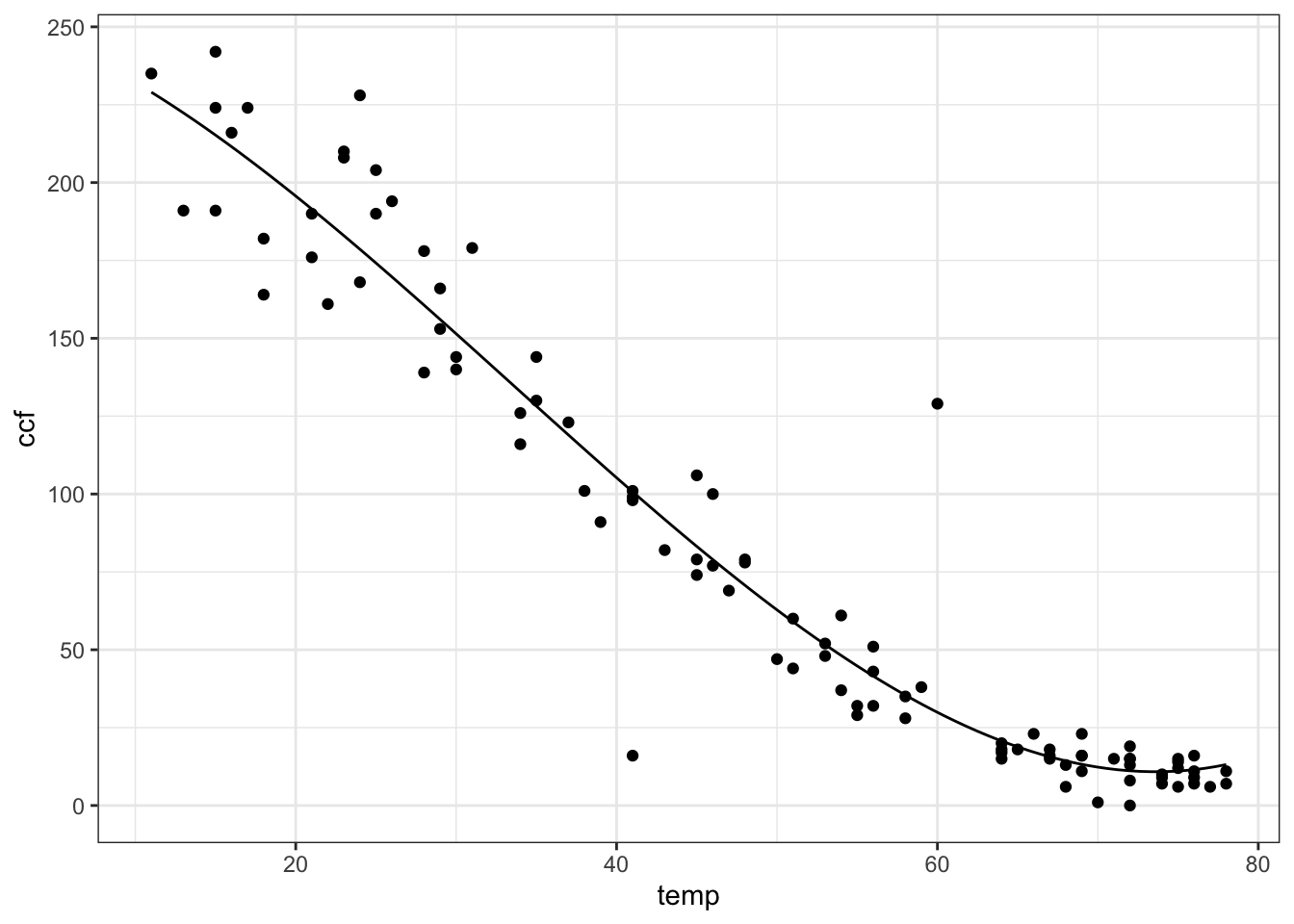
## [1] 142.1801- Fit a 4th-order polynomial of
ccfversustempto the utilities data. What is the value of this model for a temperature of 32 degrees? {87,103,128,140,143,168,184}
ANSWER:
##   (Intercept)          temp     I(temp^2)     I(temp^3)     I(temp^4)
##  1.757579e+02  8.225746e+00 -4.815403e-01  7.102673e-03 -3.384490e-05
ccfQuad <- makeFun(1.7576e2 + 8.225*T -4.815e-1*T^2 +
7.103e-3*T^3 - 3.384e-5*T^4 ~ T)
gf_point(ccf ~ temp, data = Utils) %>%
slice_plot(ccfQuad(temp) ~ temp) %>%
gf_labs(y = "Natural gas use (ccf)", x = "Temperature (F)")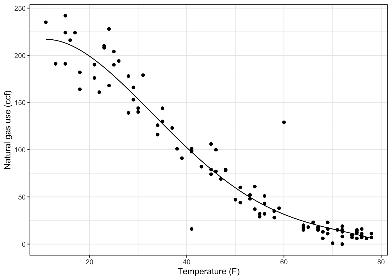
## [1] 143.1713Make a plot of the difference between the 3rd- and 4th-order models over a temperature range from 20 to 60 degrees. What’s the biggest difference (in absolute value) between the outputs of the two models?
- About 1 ccf.
- About 4 ccf.
- About 8 ccf.
- About 1 degree F.
- About 4 degrees F.
- About 8 degress F.
ANSWER: The output of the models is in units of ccf.
The difference between the two models is always within about 4 ccf.
\end{enumerate}
6.1.1.2 Exercise 2: Multiple Regression
In 1980, the magazine Consumer Reports studied 1978-79 model cars to explore how different factors influence fuel economy. The measurement included fuel efficiency in miles-per-gallon, curb weight in pounds, engine power in horsepower, and number of cylinders. These variables are included in the file "cardata.csv".
##    mpg  pounds horsepower cylinders tons constant
## 1 16.9 3967.60        155         8  2.0        1
## 2 15.5 3689.14        142         8  1.8        1
## 3 19.2 3280.55        125         8  1.6        1
## 4 18.5 3585.40        150         8  1.8        1
## 5 30.0 1961.05         68         4  1.0        1
## 6 27.5 2329.60 95 4 1.2 1- Use these data to fit the following model of fuel economy (variable
mpg): \[ \mbox{\texttt{mpg}} = x_0 + x_1 \mbox{\texttt{pounds}}. \] What’s the value of the model for an input of 2000 pounds? {14.9,19.4,21.1,25.0,28.8,33.9,35.2}
ANSWER:
##  (Intercept)       pounds
## 43.188646127 -0.007200773## [1] 28.7886- Use the data to fit the following model of fuel economy (variable
mpg): \[ \mbox{\texttt{mpg}} = y_0 + y_1 \mbox{\texttt{pounds}} + y_2 \mbox{\texttt{horsepower}}. \]
- What’s the value of the model for an input of 2000 pounds and 150 horsepower? {14.9,19.4,21.1,25.0,28.8,33.9,35.2}
- What’s the value of the model for an input of 2000 pounds and 50 horsepower? {14.9,19.4,21.1,25.0,28.8,33.9,35.2}
ANSWER:
##  (Intercept)       pounds   horsepower
## 46.932738241 -0.002902265 -0.144930546## [1] 33.888- Construct a linear function that uses
pounds,horsepowerandcylindersto modelmpg. We don’t have a good way to plot out functions of three input variables, but you can still write down the formula. What is it?
6.1.1.3 Exercise 3: The Intercept
Go back to the problem where you fit polynomials to the ccf versus temp data. Do it again, but this time tell the software to remove the intercept from the set of vectors. (You do this with the notation -1 in the project( ) operator.)
Plot out the polynomials you find over a temperature range from -10 to 50 degrees, and plot the raw data over them. There’s something very strange about the models you will get. What is it?
- The computer refuses to carry out this instruction.
- All the models show a constant output of
ccf. - All the models have a
ccfof zero whentempis zero.
- All the models have a
- All the models are exactly the same!
6.2 fitModel()
6.3 Functions with nonlinear parameters
The techniques of linear algebra can be used to find the best linear combination of a set of functions. But, often, there are parameters in functions that appear in a nonlinear way. Examples include \(k\) in \(f(t) = A \exp( k t ) + C\) and \(P\) in \(A \sin(\frac{2\pi}{P} t) + C\). Finding these nonlinear parameters cannot be done directly using linear algebra, although the methods of linear algebra do help in simplifying the situation.
Fortunately, the idea that the distance between functions can be measured works perfectly well when there are nonlinear parameters involved. So we’ll continue to use the “sum of square residuals” when evaluating how close an function approximation is to a set of data.
6.4 Exponential functions
To illustrate, consider the "Income-Housing.csv" data which
shows an exponential relationship between the fraction of families
with two cars and income:
Families <- read.csv("http://www.mosaic-web.org/go/datasets/Income-Housing.csv")
gf_point(TwoVehicles ~ Income, data = Families)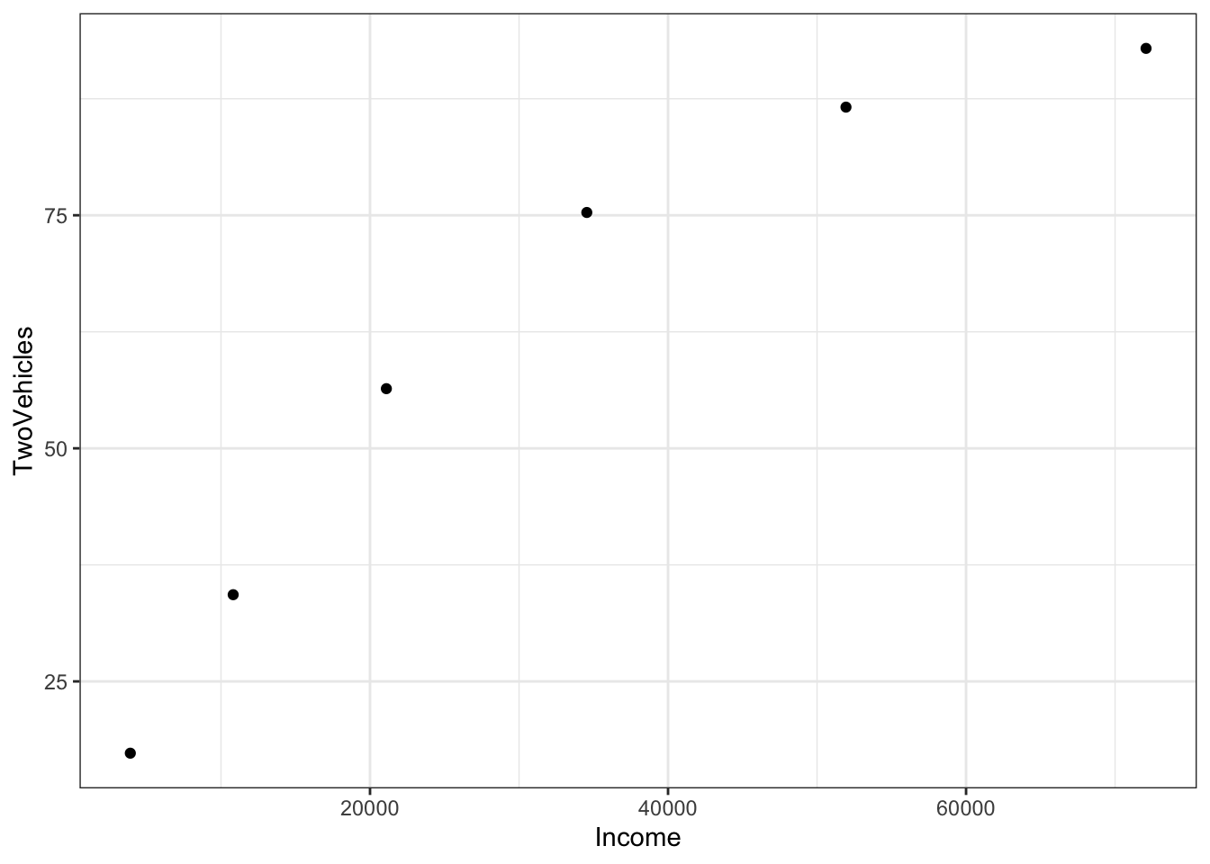
The pattern of the data suggests exponential “decay” towards close to 100% of the families having two vehicles. The mathematical form of this exponential function is \(A exp(k Y) + C\). A and C are unknown linear parameters. \(k\) is an unknown nonlinear parameter – it will be negative for exponential decay. Linear algebra allows us to find the best linear parameters \(A\) and \(C\) in order to match the data. But how to find \(k\)?
Suppose you make a guess at \(k\). The guess doesn’t need to be completely random; you can see from the data themselves that the “half-life” is something like $25,000. The parameter \(k\) is corresponds to the half life, it’s \(\ln(0.5)/\mbox{half-life}\), so here a good guess for \(k\) is \(\ln(0.5)/25000\), that is
## [1] -2.772589e-05Starting with that guess, you can find the best values of the linear parameters \(A\) and \(C\) through linear algebra techniques:
##          (Intercept) exp(Income * kguess)
##             110.4263            -101.5666
Make sure that you understand completely the meaning of the above statement. It does NOT mean that TwoVehicles is the sum \(1 + \exp{-\mbox{Income} \times \mbox{kguess}}\). Rather, it means that you are searching for the linear combination of the two functions \(1\) and \(\exp{-\mbox{Income} \times\mbox{kguess}}\) that matches TwoVehicles as closely as possible. The values returned by tell you what this combination will be: how much of \(1\) and how much of \(\exp{-\mbox{Income}\times\mbox{kguess}}\) to add together to approximate TwoVehicles.
You can construct the function that is the best linear combination by explicitly adding together the two functions:
f <- makeFun( 110.43 - 101.57*exp(Income * k) ~ Income, k = kguess)
gf_point(TwoVehicles ~ Income, data = Families) %>%
slice_plot(f(Income) ~ Income) 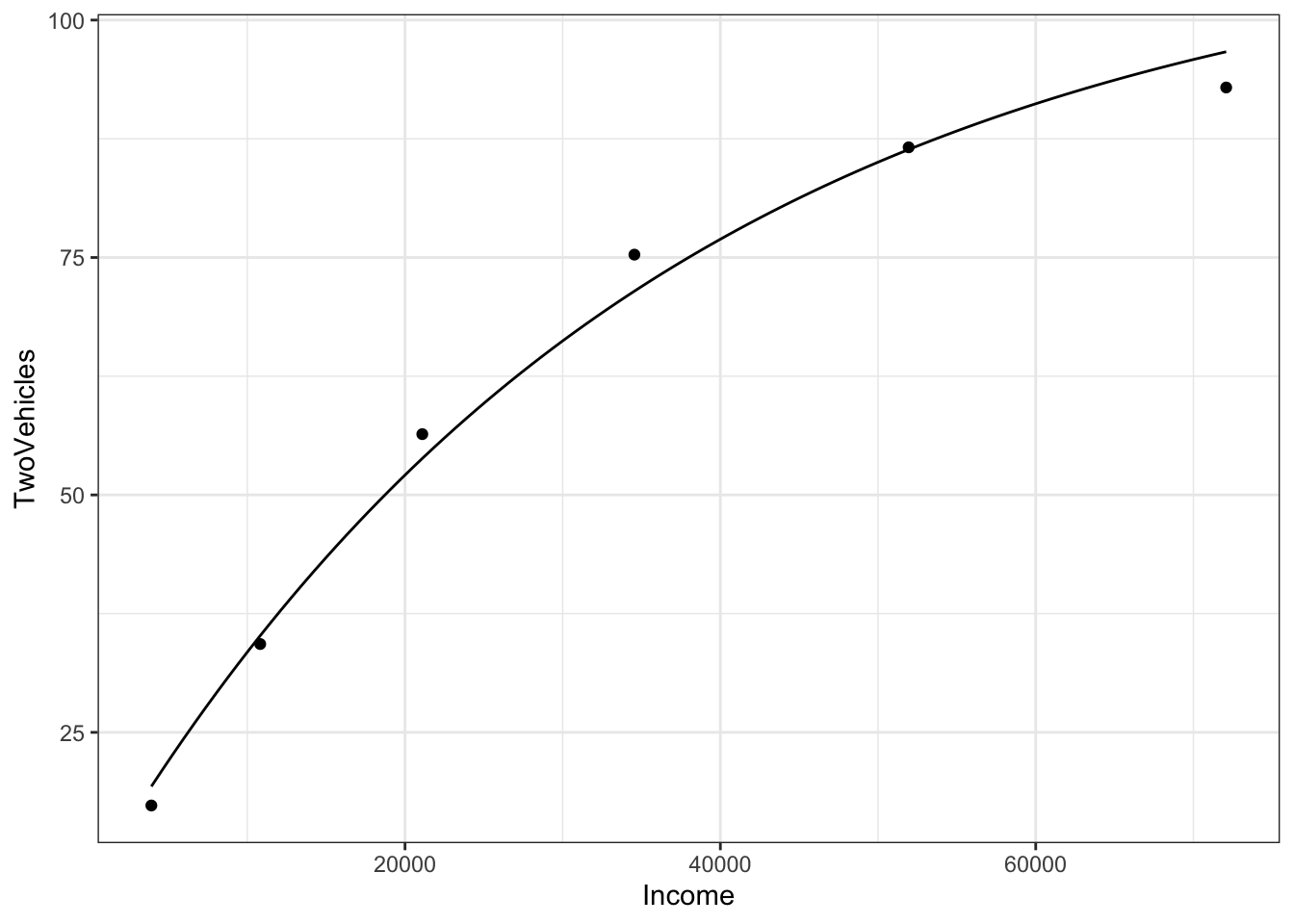
The graph goes satisfyingly close to the data points. But you can also look at the numerical values of the function for any income:
## [1] 33.45433## [1] 85.0375It’s particularly informative to look at the values of the function
for the specific Income levels in the data used for fitting,
that is, the data frame Families:
Results <- Families %>%
  dplyr::select(Income, TwoVehicles) %>%
  mutate(model_val = f(Income = Income),
         resids = TwoVehicles - model_val)
Results
## Income TwoVehicles model_val resids
## 1 3914 17.3 19.30528 -2.0052822
## 2 10817 34.3 35.17839 -0.8783904
## 3 21097 56.4 53.84097 2.5590313
## 4 34548 75.3 71.45680 3.8432013
## 5 51941 86.6 86.36790 0.2320981
## 6 72079 92.9 96.66273 -3.7627306The residuals are the difference between these model values and the
actual values of TwoVehicles in the data set.
The resids column gives the residual for each row. But you can also think of the resids column as a vector. Recall that the square-length of a vector
is the sum of squared residuals
## [1] 40.32358This square length of the resids vector is an important way to quantify how well the model fits the data.
6.5 Optimizing the guesses
Keep in mind that the sum of square residuals is a function of \(k\). The above value is just for our particular guess $k = $kguess. Rather than using just one guess for \(k\), you can look at many different possibilities. To see them all at the same time, let’s plot out the sum of squared residuals as a function of \(k\). We’ll do this by building a function that calculates the sum of square residuals for any given value of \(k\).
sum_square_resids <- Vectorize(function(k) {
  sum((Families$TwoVehicles - f(Income=Families$Income, k)) ^ 2)
})
slice_plot(
   sum_square_resids(k) ~ k,
   domain(k = range(log(0.5)/40000,log(0.5)/20000)))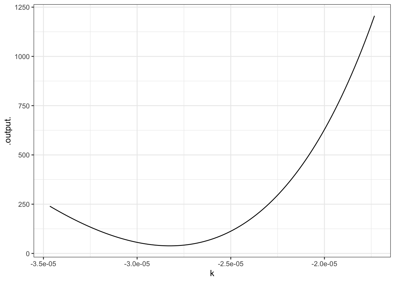
This is a rather complicated computer command, but the graph is straightforward. You can see that the “best” value of \(k\), that is, the value of \(k\) that makes the sum of square residuals as small as possible, is near \(k=-2.8\times10^{-5}\) — not very far from the original guess, as it happens. (That’s because the half-life is very easy to estimate.)
To continue your explorations in nonlinear curve fitting, you are going to use a special purpose function that does much of the work for you while allowing you to try out various values of \(k\) by moving a slider.
6.5.1 Exercises
NEED TO WRITE A SHINY APP FOR THESE EXERCISES and change the text accordingly.
To continue your explorations in nonlinear curve fitting, you are going to use a special purpose function that does much of the work for you while allowing you to try out various values of \(k\) by moving a slider.
To set it to work on these data, give the following commands, which you can just cut and paste from here:
Families = read.csv("http://www.mosaic-web.org/go/datasets/Income-Housing.csv")
Families <- Families %>%
  mutate(tens = Income / 10000)
mFitExp(TwoVehicles ~ tens, data = Families)
You should see a graph with the data points, and a continuous function drawn in red. There will also be a control box with a few check-boxes and a slider, like this:
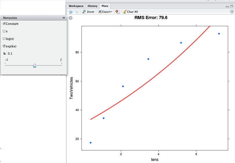
The check-boxes indicate which functions you want to take a linear combination of. You should check “Constant” and “exp(kx)”, as in the figure. Then you can use the slider to vary \(k\) in order to make the function approximate the data as best you can. At the top of the graph is the RMS error — which here corresponds to the square root of the sum of square residuals. Making the RMS error as small as possible will give you the best \(k\).
You may wonder, what was the point of the line that said
This is just a concession to the imprecision of the slider. The slider works over a pretty small range of possible \(k\), so this line constructs a new income variable with units of tens of thousands of dollars, rather than the original dollars. The instructions will tell you when you need to do such things.
6.5.1.1 Exercise 1
The data in "stan-data.csv" contains measurements made by Prof. Stan Wagon of the temperature of a cooling cup of hot water. The time was measured in seconds, which is not very convenient for the slider, so translate it to minutes. Then find the best value of \(k\) in an exponential model.
water = read.csv("http://www.mosaic-web.org/go/datasets/stan-data.csv")
water$minutes = water$time/60
mFitExp( temp ~ minutes, data=water)- What’s the value of \(k\) that gives the smallest RMS error? {-1.50,-1.25,-1.00,-0.75}
- What are the units of this \(k\)? (This is not an R question, but a mathematical one.)
- seconds
- minutes
- per second
- per minute
- Move the slider to set \(k=0.00\). You will get an error message from the system about a “singular matrix.” This is because the function \(e^{0x}\) is redundant with the constant function. What is it about \(e^{kx}\) with \(k=0\) that makes it redundant with the constant function?
6.5.1.2 Exercise 2
The "hawaii.csv" data set contains a record of ocean tide levels in Hawaii over a few days. The time variable is in hours, which is perfectly sensible, but you are going to rescale it to “quarter days” so that the slider will give better results. Then, you are going to use the mFitSines( ) program to allow you to explore what happens as you vary the nonlinear parameter \(P\) in the linear combination \(A \sin(\frac{2 \pi}{P} t) + B \cos(\frac{2 \pi}{P} t) + C\).
Hawaii = read.csv("http://www.mosaic-web.org/go/datasets/hawaii.csv")
Hawaii$quarterdays = Hawaii$time/6
mFitSines(water~quarterdays, data=Hawaii)
Check both the \(\sin\) and \(\cos\) checkbox, as well as the “constant.” Then vary the slider for \(P\) to find the period that makes the RMS error as small as possible. Make sure the slider labeled \(n\) stays at \(n=1\). What is the period \(P\) that makes the RMS error as small as possible (in terms of “quarter days”)?
- 3.95 quarter days
- 4.00 quarter days
- 4.05 quarter days
- 4.10 quarter days
You may notice that the “best fitting” sine wave is not particularly close to the data points. One reason for this is that the pattern is more complicated than a simple sine wave. You can get a better approximation by including additional sine functions with different periods. By moving the \(n\) slider to \(n=2\), you will include both the sine and cosine functions of period \(P\) and of period \(P/2\) — the “first harmonic.” Setting \(n=2\) will give a markedly better match to the data.
What period \(P\) shows up as best when you have \(n=2\): {3.92,4.0,4.06,4.09,4.10,4.15}