In this Worksheet you will draw the prediction and confidence intervals called for in the Intervals by Eye class activity.
But here you will draw the intervals by software. We will be using DAGs to generate the data. The three DAGs for the three models will be called dag_one, dag_two, and dag_three. They are defined in the next chunk, but the definitions are not important for your work, which will be based on data generated from the DAGs by sample().
Code
dag_one <-dag_make( x ~unif(), y ~4-2.5*x +exo())dag_two <-dag_make( x ~unif(0, 10), y ~3+4*sin(x) +exo())dag_three <-dag_make( x ~unif(0, 10), group ~binom(0, labels=c("group A", "group B")), y ~1+10*(group=="group A") +2* x +exo(1.5))
Here we generate the three data frames. There is one for each of the three DAGs. You can read off the size of the samples from the size argument.
set.seed(102) # make samples reproducible from run to runSamp_one <-sample(dag_one, size=100)Samp_two <-sample(dag_two, size=400)Samp_three <-sample(dag_three, size=200)
What’s set.seed()?
The sample() function will draw a random sample from the DAG. Randomness is realistic. But when developing and debugging computer commands, it can be handy to be able to work with the same “random” sample each time. And in writing the answers to this Worksheet, I want to be able to refer to exactly the same data that you will work with. The set.seed() command makes this possible.
You are not expected to master the use of set.seed(). It’s just a tool for developing code and narration.
Model One
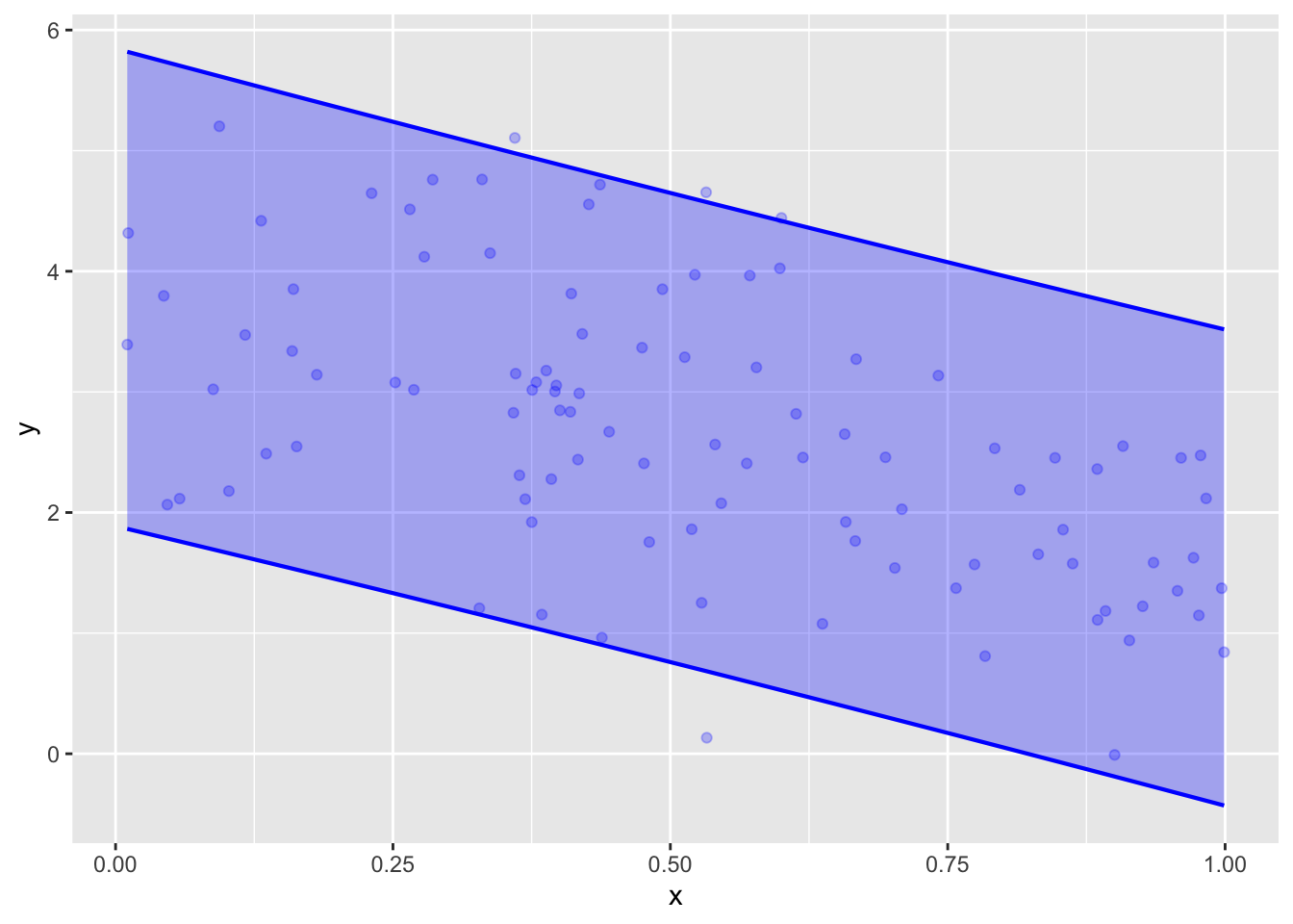
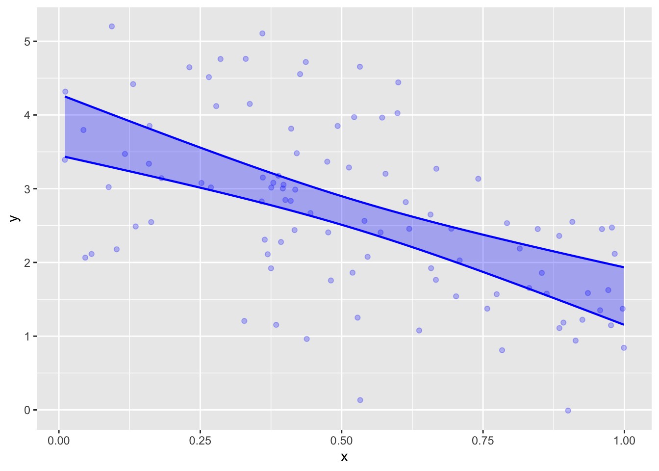
The data in Samp_one represent a straight-line relationship between y and x. An appropriate model specification is therefore y ~ x.
Train y ~ x model on Samp_one. Then plot out the model using model_plot() with the argument interval="prediction". Make another similar plot with interval="confidence".
# for your use
How many points are excluded from the prediction band? Since the prediction is being made at a 95% level, only about 5% of the points should be left out. Is this working.
Compare the width of the confidence band at its narrowest point to the width of the prediction band. A rule of thumb is that these widths should be related by \(1/\sqrt{n}\). Are they?
There are four data points excluded from the prediction interval. Since the sample size is \(n=100\), this is indeed close to the theoretical 5%. (If you repeat the analysis using a different value in set.seed(), you may get a different number.)
The “width” (actually, the height, since the interval is always in terms of the response variable) of the confidence interval is about 0.4 at its narrowest point. The width of the prediction interval is about 4. These are indeed related by \(1/\sqrt{n=100}\).
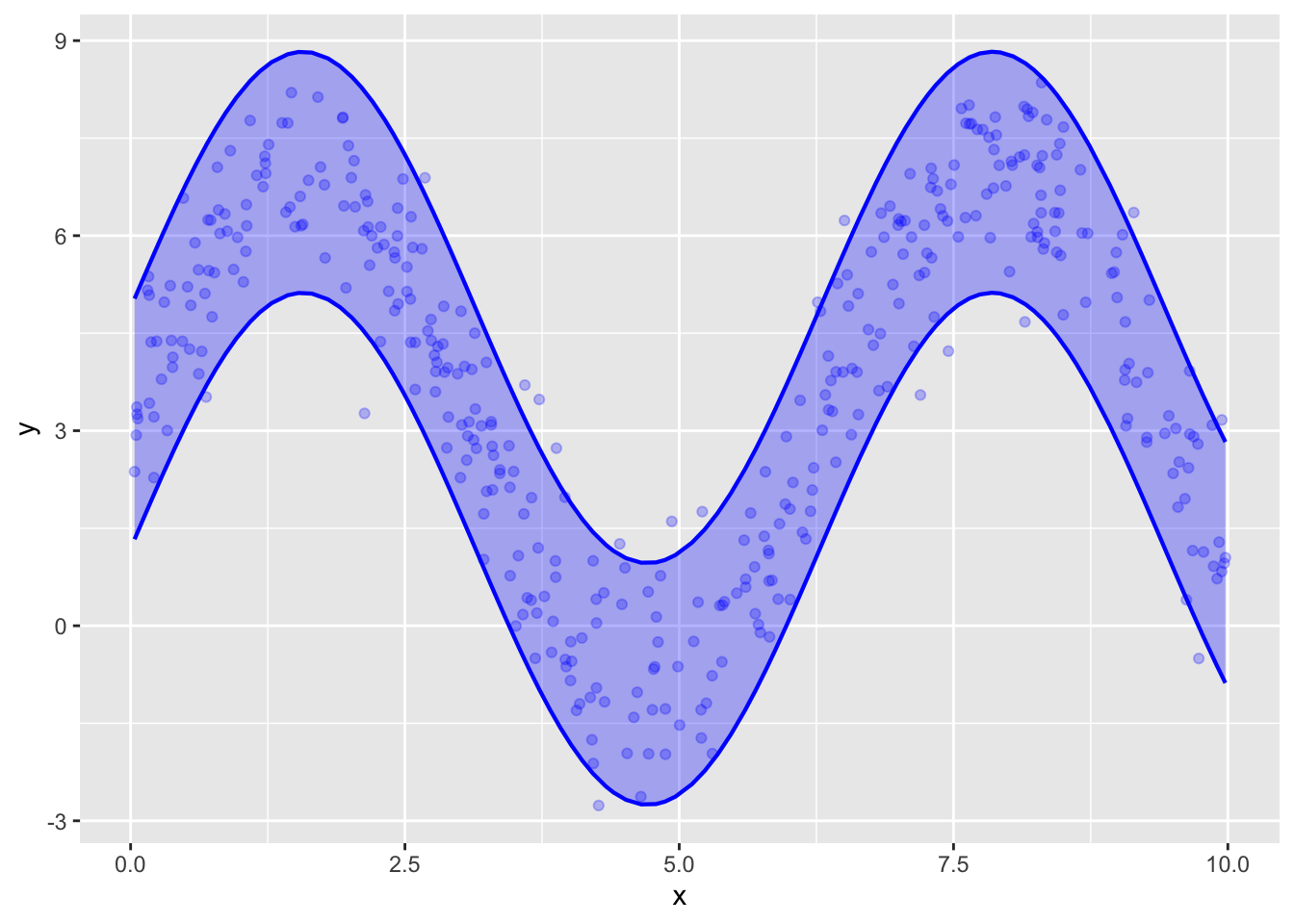
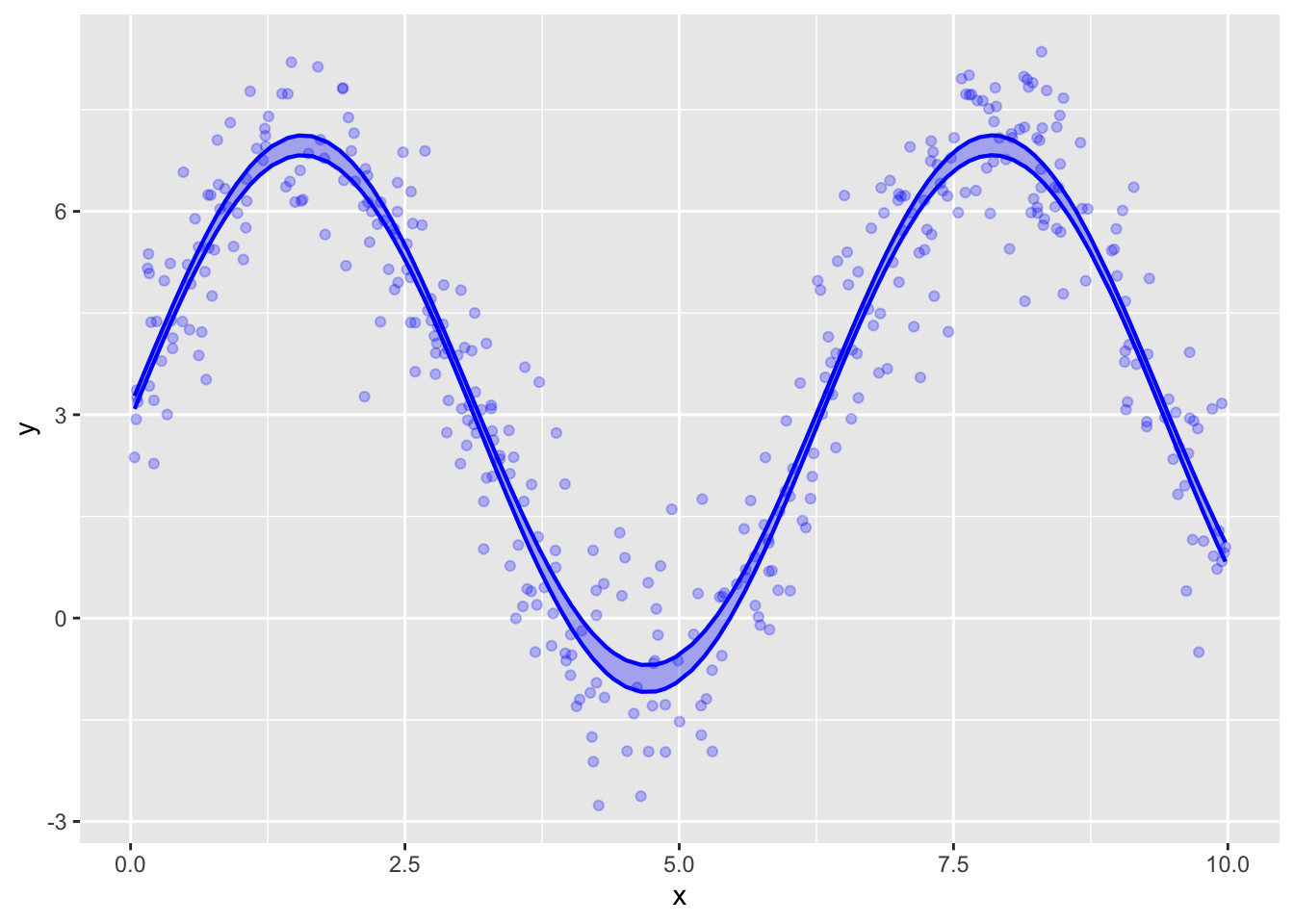
Model 2: A sine wave
The data in Samp_two have a sine-wave pattern. We will not study models for such patterns in detail, even though they are important in a number of areas. For our purposes, use the model specification y ~ cos(x) + sin(x).
As in the previous section, train the model on the Samp_two data and use model_plot() to show both the prediction and confidence intervals.
Are about 5% of the points excluded from the prediction band?
Does the width of the confidence interval (at it’s narrowest point) have the rule-of-thumb \(1/\sqrt{n}\) relationship to the width of the prediction interval?
I count 18 points outside the prediction interval, although there are a few cases where it’s hard to tell. The sample has size \(n=400\). 5% of 400 is 20, which is very close to the number observed.
The “width” of the prediction interval is a little more than 3. It’s hard to read from the graph the width of the confidence interval at its narrowest point, but it is much less than one.
We can calculate the width by using model_eval(). The x value at the narrowest point is \(\mathtt{x}=\pi\).
model_eval(mod_two, x=pi, interval="confidence")
x
.output
.lwr
.upr
3.14
3.04
2.94
3.14
model_eval(mod_two, x=pi, interval="prediction")
x
.output
.lwr
.upr
3.14
3.04
1.19
4.89
The prediction interval has width 3.7, the confidence interval has width 0.2. This is quite close to the value suggested by the rule of thumb, which gives \(3.7/\sqrt{400} = 0.185\).
Model three
Use the model specification y ~ x + group for your model. Train the model using Samp_three then answer the same questions about the number of excluded points from the prediction interval and the relative width of the prediction and confidence intervals.
Answer
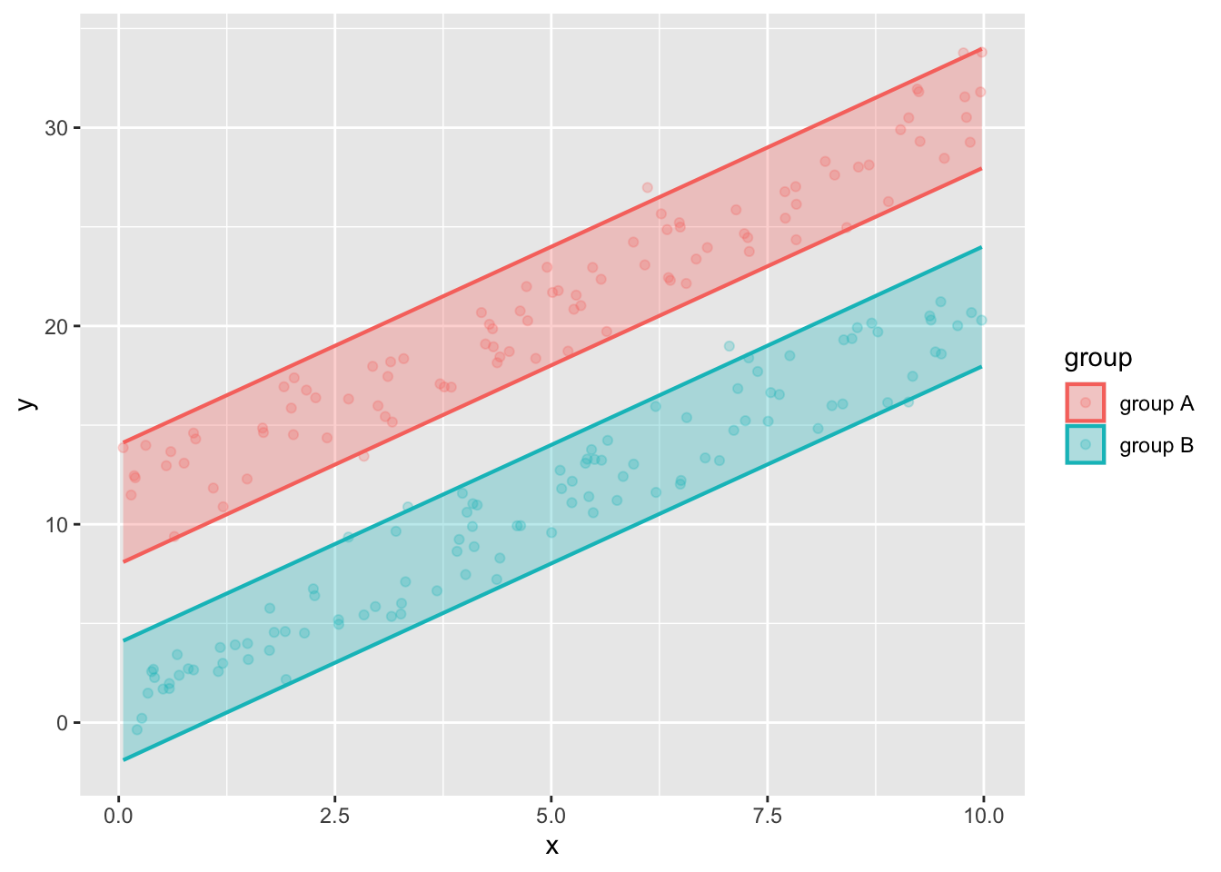
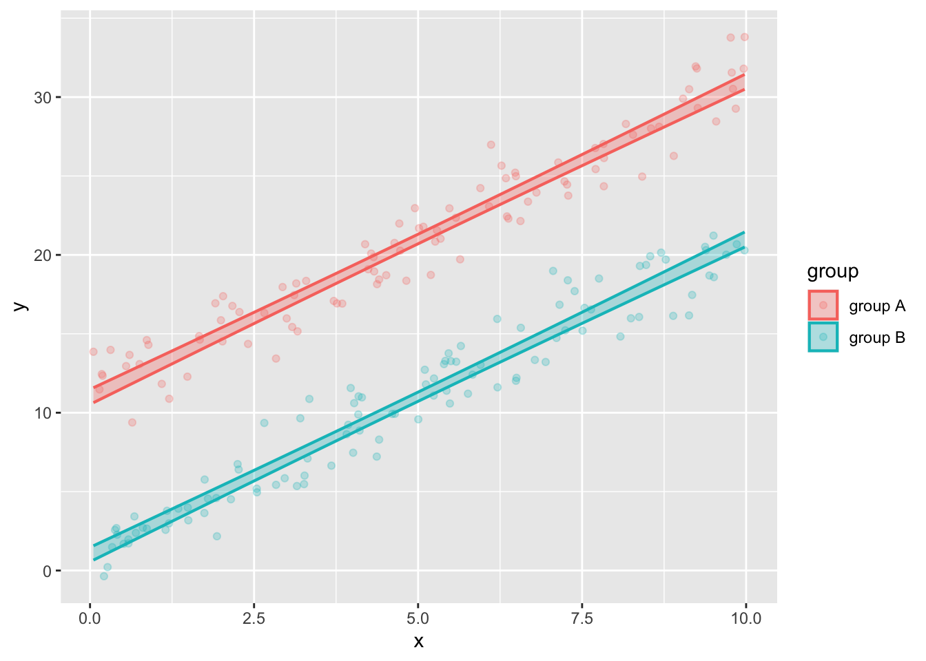
mod_three <-lm(y ~ x + group, data=Samp_three)model_plot(mod_three, interval="prediction")model_plot(mod_three, interval="confidence")
The count of excluded points needs to be made separately for the points in group A and the points in group B. It looks like about 4 group A points have been exclude and 3 group B points. Since there are 100 points in each group, this is roughly 5%.
The “width” of the prediction interval is about 5.6. (See the calculations below.) The width of the confidence intervals is about 0.5-0.6. With 100 points in each group, this is consistent with the rule of thumb.
The prediction interval has width 6, the confidence interval has width 0.6. This is quite close to the value suggested by the rule of thumb, which gives \(3.7/\sqrt{100} = 0.185\).