In this blog post on a first-day-of-class lesson, we considered the changes in the number of births in the US from day to day. One pattern we observed is that the number of births is lower on weekends than weekdays.
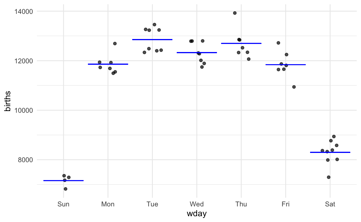
Figure 1: The graphic from the Little App showing number of births as a function of day of the week.
Aside from innate skepticism that I’m playing a trick, I suspect most people would accept this graph as evidence that the weekend count of births is lower than the work-week count. You don’t really need formal statistics to interpret data as clear as these.
Let’s ask a slightly different question.
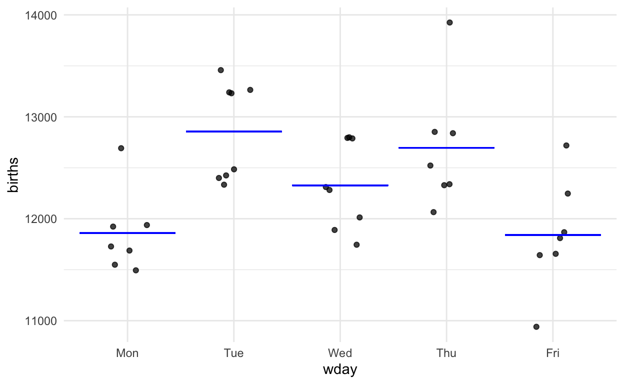
Is there reason to believe that counts are systematically different between the days of the working week, Monday through Friday?

Figure 2: The birth-count data for Monday through Fridays.
As statistics instructors, we know that an ANOVA test is appropriate here. ANOVA is included in some introductory courses but for many the end of the semester comes before it can be covered.
There is a pattern shown by the data–Monday and Fridays are lower than Tuesdays and Thursdays–but it’s hard to know whether the pattern is just shifting shapes in the fog of random sampling or is really there. As Jeff Witmer puts it in his 2019 editorial in the Journal of Statistical Education, the question is whether the pattern is discernible through the fog of randomness.
Reasonable people can disagree about whether there is a day-to-day pattern in the data. Is seeing differences like seeing animal shapes in clouds or canals on Mars? What we need are methods that would allow people with different opinions to come to an agreement.
With the Little Apps, you can simulate random sampling to see if the pattern evidenced by the sample is shared by most other potential samples. Or you can erase any genuine pattern by random shuffling and see whether such data produces patterns of similar magnitude. These are great pedagogical techniques and also mainstream research techniques.
But I’m going to go in a different direction and address specifically instructors who feel that resampling and randomization are not “fundamental” techniques, or that depend too much on the computer, or that a “real” technique has a formula and a corresponding table of probability, such as the t-distribution, z-distribution, chi-squared distribution, etc.
Quantifying discernibility
I want to show a single, simple method that enables us to quantify discernibility.
It covers many of the settings for inference used in research as well as the simple settings found in canonical intro stats:
- Difference between two proportions
- Difference between two means
- Slope of a regression line
- Logistic regression
- ANOVA
- Multiple linear regression
The method requires no probability tables and can be reasonably approximated by eye. It’s described in detail in the Compact Guide to Classical Inference
But it’s simple enough that I can illustrate it briefly now:
Step 1. On the graph of the data, draw a mathematical function that takes day-of-week as the input and puts out a single number which is representative of the data for that day of the week.
Step 2. Measure how much variation in the response variable there is.
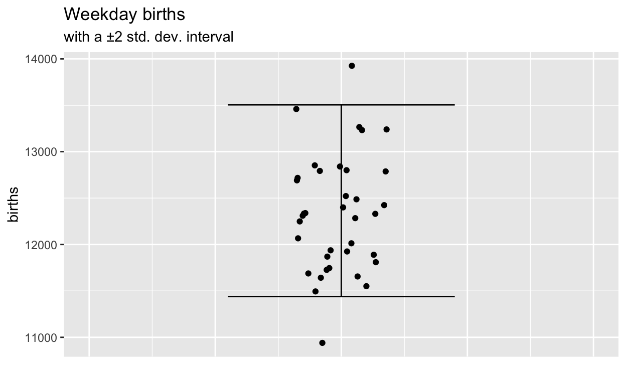
Step 3. Imagine that each of the actual values in the response variable was replaced by the corresponding model value. That is, imagine what a graph of blue dots would look like if each black dot were moved horizontally down to the corresponding function output value.
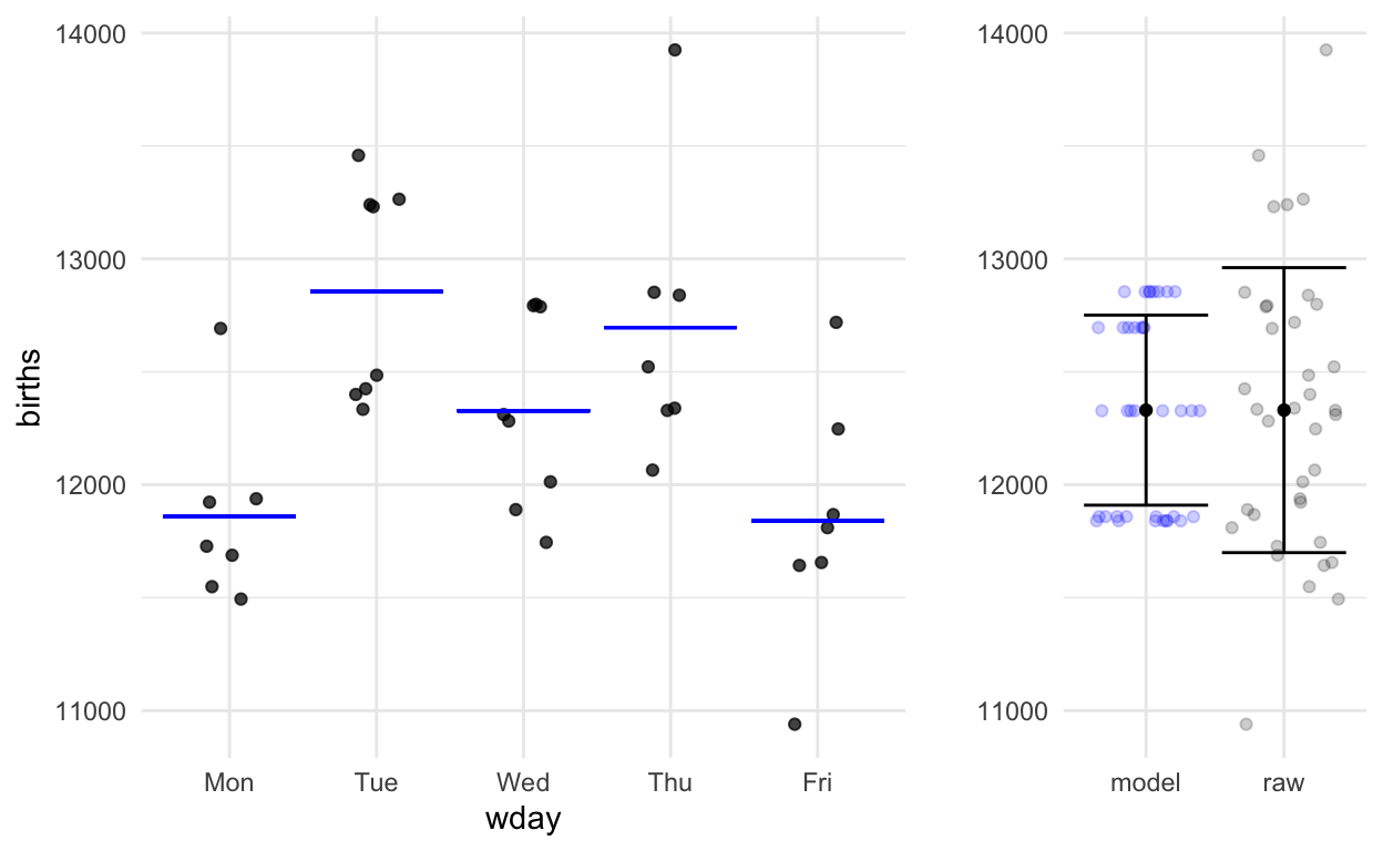
By eye, you can see that the variation in the model values is about 2/3 that in the raw data. The precise calculations give:
- Raw response variable: sd = 631
- Model values: sd = 421
Step 4. Now to do some calculations. The quantity we are going to calculate is called F and is a number between 0 and \(\infty\).
Settings typical in a canonical intro stats course,
- difference of two means
- difference of two proportions
- slope of a regression line
The formula for F in these settings is
\[\mbox{F} = (n-2) \frac{v_m}{v_r - v_m}\] Also, you’re interested in the confidence interval of the difference between two means, two proportions, slope …. F helps us here, too.
Suppose that the difference or slope is denoted B. Then the 95% confidence interval on B is
\[B (1 \pm \sqrt{4 / F}).\]
Degrees of Flexibility
The “degrees of flexibility” \(^\circ\!\cal{F}\) of a function measures how much flexibility the functional form gives.
- A straight line has 1 degree of flexibility.
- Differences between two means or proportions also have 1 degree of flexibility.
- More complicated functions, such as those with multiple explanatory variables, have more degrees of flexibility.
For our weekday births example, there are five workdays and the function has 4 degrees of flexibility. For such functions, F is written in terms of \(^\circ\!\cal{F}\):
\[\mbox{F} = \frac{n-(1+^\circ\!\cal{F})}{^\circ\!\cal{F}}\frac{v_m}{v_r - v_m}\]
We have some numbers:
- n =37
- Variance of the response variable: \(v_r\) = 3.9785^{5}
- Variance of the model values: \(v_m\) = 1.76957^{5}
- \(^\circ\!\cal{F}\) = 4
Plugging in our numbers here:
\[\mbox{F} = (\frac{37 - 5}{4}) \frac{177000}{398000 - 177000} = 6.4\]
The standard in science is that F > 4 means that you’re entitled to claim that the data point to a day-to-day difference in birth numbers.
Justifying F > 4 with the Little App
Randomly shuffle and see how big F is over many trials.
Wrapping up
- A more complete explanation of the F method is given in the Compact Guide to Classical Inference.
- More Little Apps are available here.
Aside: Larger \(n\) for birth numbers?
Here’s US birth-count data over about 20 years. Does having 100 times as much data make the weekday pattern clear?
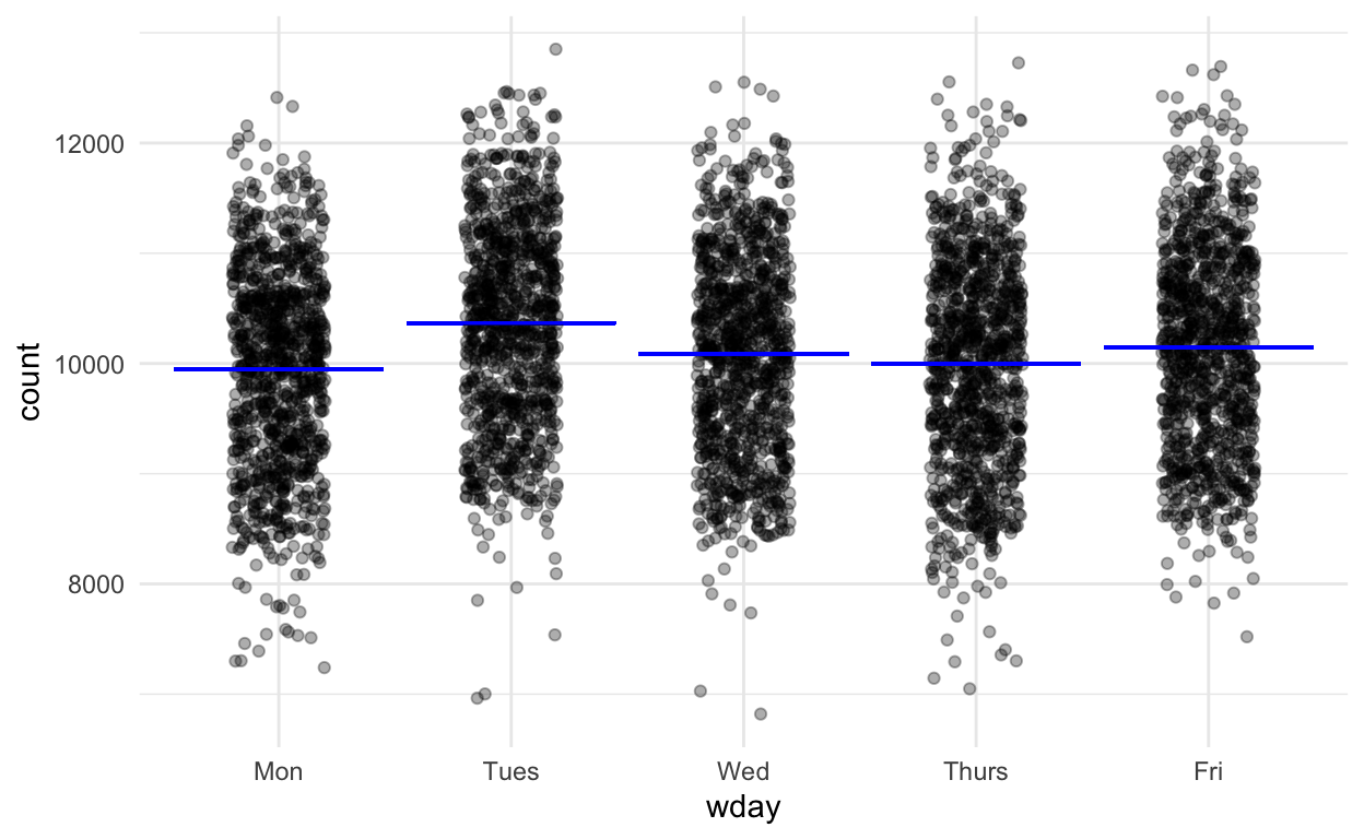
Figure 3: 20 years of data.