Welcome to Stats 101
The main questions in stats are:
- How do we inform ourselves from data?
- How do we take care that we do not read something into data that isn’t really there?
Let’s start with some data on the number of births each day in the US.1
Here’s what the data look like, shown in standard format for storing data, much like a spreadsheet.
- Scroll through the table and try to make some meaning of the numbers. (Hint: It’s hard.)
In statistics you’ll learn about different ways of displaying and summarizing data that makes it easier to see information. Here’s one simple display of just the second column from the data, the number of births each day.
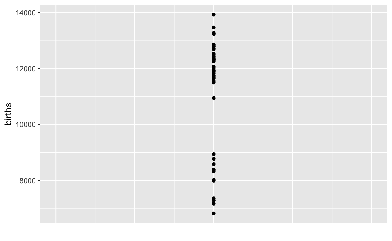
It’s easy to see some interesting things from the graphic than from the table, but hard to see others. For instance, the table makes it clear that our data cover only 100 days. But you would be hard pressed to figure this out from the graph above.
- There are some clear patterns shown by the graphic about day-to-day variation in the number of births. Give two examples of such patterns.
As I said before, in this statistics class you’re going to learn some techniques for making sense of data. Using a graph like the above is one such technique. But we can improve on it by using other techniques.
One is called jittering, which randomly moves the dots a small amount horizontally so that you can more easily see how many there are. Another technique is to make the dots somewhat transparent.
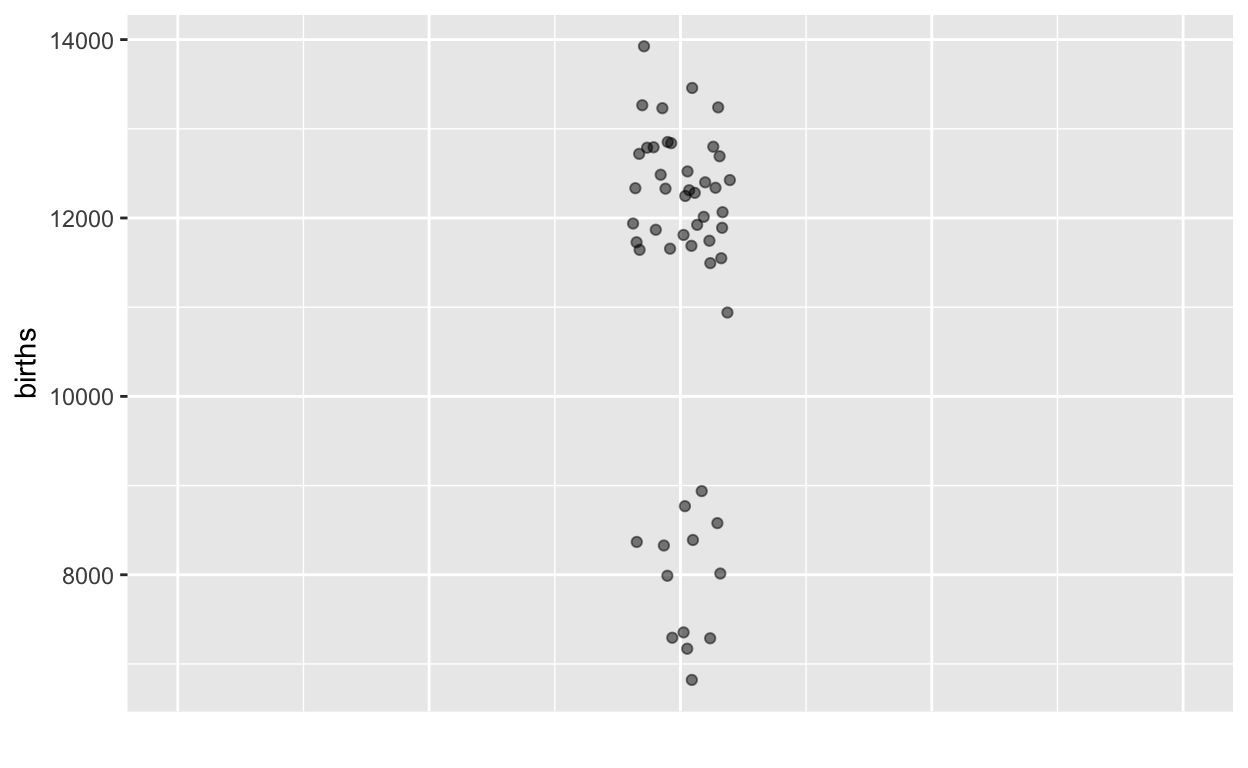
- What does this new graph show that you couldn’t see clearly in the previous graph?
Making sense of data requires that we connect it in some what to what we are interested in finding out.
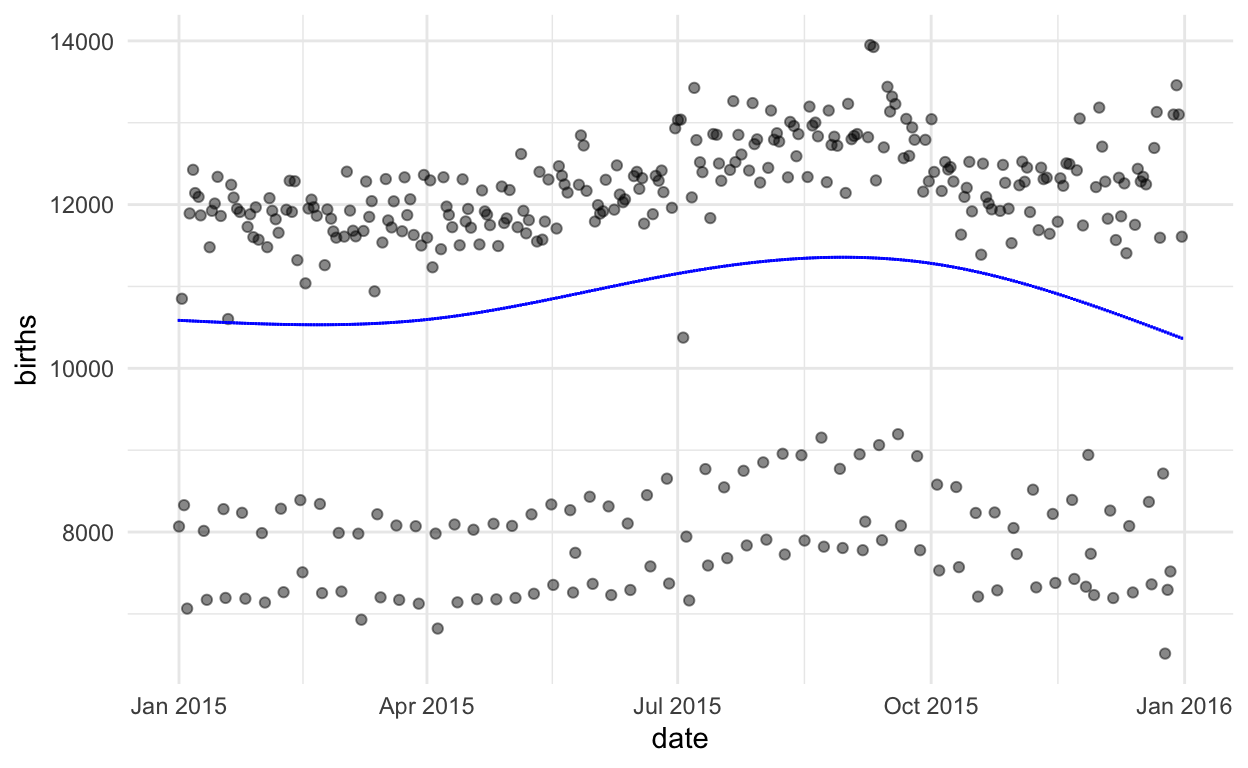
Perhaps an obvious question raised by these data is: Why are there lots of days with about 12,000 births, and quite a lot with about 8,000 births, but none around 10,000 births?
- Think of a real-world explanation for the bi-modality of the data.
[I’ll skip the discussion intended to lead students to suspect that there’s another factor involved. Perhaps there is a reduction of births in Fall to prepare for winter.]
It’s often the case that we seek to explain the variation in one variable by using another variable. A first step is to put that other variable, the explanatory variable, on the graph. We’ll put it on the X axis, leaving the Y axis to represent the quantity we’re trying to explain, which we call the response variable.
Time of year is an obvious explanatory variable, so let’s introduce that into our graph.
A tool for exploring data
Making sense of data often involves a cycle:
- Look at the data in some way that you think might be informative.
- Consider the pattern shown by the data and figure out what makes sense and what remains mysterious to you.
- Think about what might explain or illuminate the mystery.
- Figure out how you might display the data in order to produce a better explanation. Then, back to (a).
The description of the cycle uses only everyday words. But there will be a lot to learn. For instance:
- What do we mean by “pattern in the data”?
- How can we know if a given pattern explains a lot about the data or just a little?
- How do we avoid reading a pattern into data that really isn’t there? What does it mean to say, “really isn’t there?”
You’re going to be working with a tool for displaying data and pattern s that will let you explore data as you think best. The tool is oriented around learning statistics so it includes features to explore some basic questions:
- What would happen if more data were available? How much data do we need to see a pattern clearly?
- Suppose there were no actual pattern in the data. Could we be tricked into seeing a pattern that isn’t there?
The tool is called a “Little App.” You run it in an ordinary web browser, just by going to this site.
I’m going to show you how it works and then you’ll be all set up to use it.
- Starts with a splash page of instructions and explanations. You should read these. I’m going to be summarizing it now, so we’ll just dismiss the splash page by clicking outside it.
- We start on a tab called “Data.” This is where you choose a source of data and the variables you want to look at. For fun, the data set and the variables are selected at random at first, but you choose the ones you want.
- Since the amount of data is an important consideration in statistics, there’s a control to let you look at just a little data or a lot of data.
- The graphic always shows both the data and a pattern. You have some control over the type of pattern that’s being displayed. We’ll learn more about this later.
The Centers for Disease Control publishes data on each of the roughly 4,000,000 births that happen in the US each year. We’ll look at that data later in the course. It’s very detailed, and for privacy reasons they only tell you the month of birth, not the day of the month. But before they implemented that privacy policy, you could find the actual day for each birth. The data we have are from 2015.↩︎