PIDD <- PIDD |> mutate(developed_diabetes = zero_one(diabetes, one="yes"))Lesson 34: Worksheet
In this worksheet, you are going to use the math300::PIDD data frame. “PIDD” stands for “Pima Indian Diabetes Database” as you can see by giving the ?PIDD command.
Your objective is to choose explanatory variables that give a good stratification of the risk of developing diabetes. First, let’s turn the diabetes categorical variable into a zero-one variable:
The commands building and displaying each model follow:
model <- glm(developed_diabetes ~ bmi + insulin, data=PIDD, family="binomial" )
model_plot(model, show_data=FALSE)
Warning: Ignoring unknown aesthetics: fill
Change the explanatory variables (use at most three) to get a model specification that stratifies the risk nicely. Once you have a model that you are satisfied with, let’s look at it a bit more technically.
Scores <- model_eval(model, interval="none") |>
  mutate(diabetes = PIDD$diabetes)
Using training data as input to model_eval().The variance of the model output is a nice measure of how much stratification of risk your model gives.
Scores |> summarize(vrisk = var(.output)) vrisk
1 0.02199098Choose a threshold for a positive result from your model. This graph will help a lot:
ggplot(Scores, aes(x=diabetes, y=.output)) +
  geom_jitter(alpha=0.3) +
  geom_violin(fill="blue", alpha=0.2, color=NA)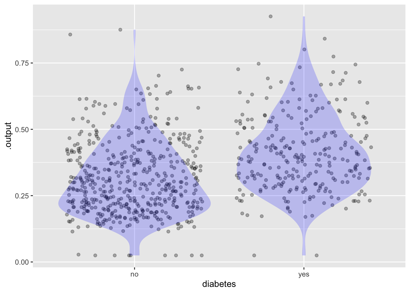
Using the threshold you just selected, construct the report on false-positives and false-negatives.
threshold <- 0.6 # just demonstrating, but probably not the best choice
Scores |>
  mutate(test_result = ifelse(.output > threshold, "positive", "negative")) |>
  group_by(diabetes, test_result) |>
  tally()
# A tibble: 4 × 3
# Groups: diabetes [2]
diabetes test_result n
<chr> <chr> <int>
1 no negative 480
2 no positive 20
3 yes negative 235
4 yes positive 33From this report, find the sensitivity and specificity of your model/threshold.