Code
Clock_auction <- Clock_auction |> mutate(nbidders = ifelse(bidders >= 10, "10 or more", "9 or fewer"))
Stats <- Clock_auction |> group_by(nbidders) |>
summarize(mp = mean(price), mage = mean(age))These are two graphs of the data from Clock_auction showing the relationship between the winning price and the number of bidders. (I’ve simplified the number of bidders to two categories.) The age of the clock is a covariate. The large dots show the mean age and mean price of the clocks in those auctions with 10 or more bidders versus 9 or fewer bidders.
Clock_auction <- Clock_auction |> mutate(nbidders = ifelse(bidders >= 10, "10 or more", "9 or fewer"))
Stats <- Clock_auction |> group_by(nbidders) |>
summarize(mp = mean(price), mage = mean(age))mod1 <- lm(price ~ nbidders, data=Clock_auction)
model_plot(mod1, x=age, color=nbidders) |>
gf_point(mp ~ mage, color=~nbidders, data=Stats, size=3)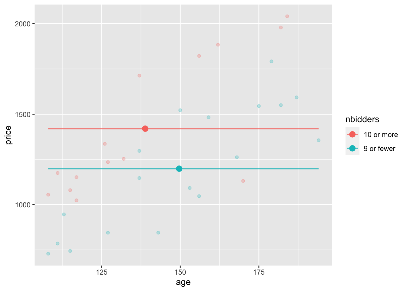
Part A. In the model without age as a covariate, what is the difference in mean prices for the 10-or-more-bidders group versus the 9-or-fewer-bidders group?
Part B. Now the picture when including age as a covariate. Adjusting for age, what is the difference in mean prices for the 10-or-more-bidders group versus the 9-or-fewer-bidders group?
mod2 <- lm(price ~ nbidders + age, data=Clock_auction)

model_plot(mod2, x=age, color=nbidders) |>
  gf_point(mp ~ mage, color=~nbidders, data=Stats, size=3)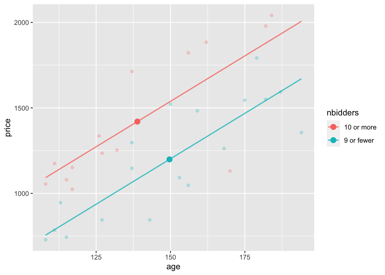
Part C. Here are confidence intervals for the two models graphed above. Explain what about these coefficients matches the conclusions you got in Parts (A) and (B)?
mod1 |> conf_interval()# A tibble: 2 × 4
term .lwr .coef .upr
<chr> <dbl> <dbl> <dbl>
1 (Intercept) 1226. 1420 1614.
2 nbidders9 or fewer -479. -221. 37.1mod2 |> conf_interval()# A tibble: 3 × 4
term .lwr .coef .upr
<chr> <dbl> <dbl> <dbl>
1 (Intercept) -467. -56.3 354.
2 nbidders9 or fewer -490. -336. -182.
3 age 7.79 10.6 13.5This activity was inspired by schematic diagrams in Milo Schield’s Statistical Literacy: Seeing the story behind the statistics, 2011, pp. 224-5.