Exercises for Tutorial 1
Remember to hand in your work …
At any point, you can submit your answers by collecting them and uploading them to the class site.
No answers yet collected
If the answers that have been loaded automatically are not yours, press this button before starting your work:
Activity 1.1 Use Active R chunk 1.1 to look at the documentation for the penquins data frame. Then answer these questions in the essay box. (Note that the documentation uses the words “tibble” and “factor”, which are synonyms for “data frame” and “categorical variable” respectively.)
In which archipelago were the data recorded?
Which of the variables are categorical?
What are the levels of the
islandvariable?In what units is body mass recorded?
Activity 1.2 The US Social Security administration publishes a data frame listing how many babies were given each name each year, starting in 1880. Here is a brief excerpt:
| year | sex | name | n | prop |
|---|---|---|---|---|
| 1880 | F | Abigail | 12 | 0.00012294 |
| 1881 | F | Abigail | 8 | 0.00008093 |
| 1882 | F | Abigail | 14 | 0.00012101 |
| 1880 | M | Andy | 58 | 0.00048986 |
| 1881 | M | Andy | 58 | 0.00053564 |
| 1882 | M | Andy | 51 | 0.00041793 |
| 1880 | F | Betty | 117 | 0.00119871 |
| 1881 | F | Betty | 112 | 0.00113297 |
| 1882 | F | Betty | 123 | 0.00106314 |
Based on what you can see in the excerpt, what is the unit of observation in the data frame? Explain briefly the thinking behind your answer.
Activity 1.3 The Births78 data frame lists the number of babies born (births) each day of 1978 (date). Run the code in Active R chunk 1.2 to see the seasonal pattern.
- In which season is the typical number of daily births the largest?
birth-season
- There is a funny pattern in the graph of
birthsvs.date. There seem to be two parallel bands: a high band and a low band. Speculate on how this might have come about. - Add another explanatory variable to the plot:
wday. Does this help to explain the pattern from (2)? Say why or why not?
- There are a few points in the lower band that aren’t there for the usual reason. Hypothesize what’s going on with these outliers.
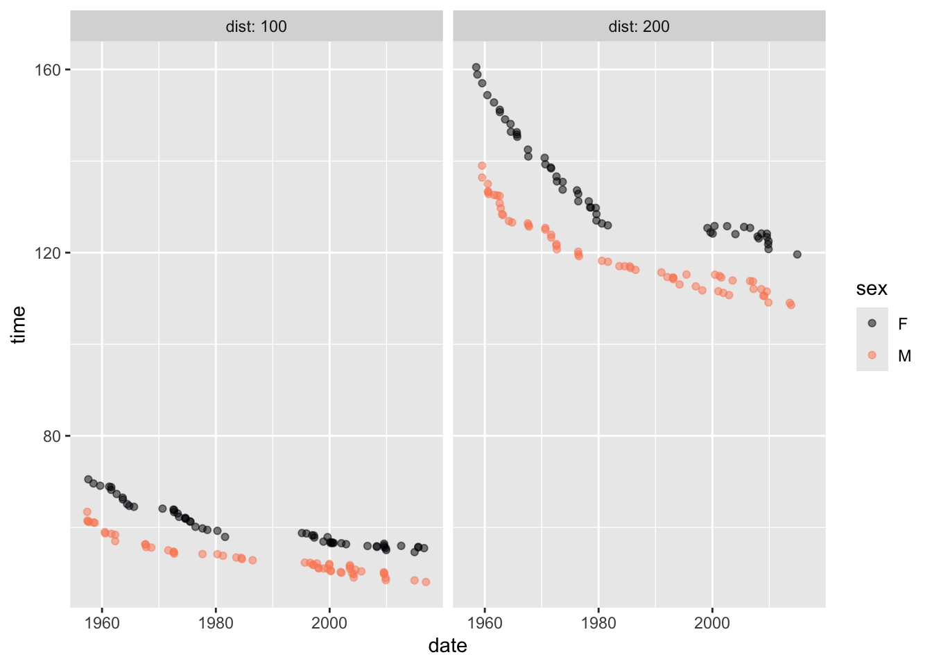
Activity 1.4 Using Active R chunk 1.3, recreate this graphic based on the Butterfly data frame. Butterfly contains records in the 100m and 200m swimming race.
Activity 1.5 Penguins is a data frame covering 344 penguins near Palmer Station, Antarctica. One of the variables is mass, measured in grams. Use Active R chunk 1.4 to do the computations needed to answer the following questions. You’ll have to replace __wrangling_verb__ with the correct wrangling operation, and replace min() with the function appropriate for each question.
- What is the maximum body mass across all of the penguins? (Hint: the opposite of
min().)
penguins-2-a
- What is the mean body mass for all penguins?
penguins-2-b
- Find the variance of the body mass variable. Explain why the number is so much bigger than the answers to (1) and (2). Also, say what are the units of the variance of mass.
Activity 1.6 Each of the following graphics commands has a mistake. Fix them so that they all work:
Activity 1.7 Using Active R chunk 1.5, answer the following questions.
- Which island has the largest penguins?
penguins-var-1
- Perhaps you’re wondering, what about the conditions on the islands determines whether the penguins are large or small? It is a good idea, first, to see what other variables have to say about the matter. Color the points using
speciesand facet withsex. In this new plot, does it seem that one of the islands is particularly favorable for high penguin mass?
Activity 1.8 Active R chunk 1.6 is initialized with wrangling code to count the number of penguins of each species and sex.
Modify Active R chunk 1.6 to answer each of these questions in turn.
- Which island has 80 female penguins?
simple-wrangling-1
- Which species inhabits all three islands?
simple-wrangling-2
- In which year were there 57 male penguins?
simple-wrangling-3
In-class demonstration
Activity 1.9 When using point_plot(), the order of specimens in the data frame doesn’t matter. Each specimen is assumed to be independent of every other one. But many situations involve connections between the specimens. One subtle situation arises in clinical trials or other situations where the survival of specimens over time is of interest. You have likely heard of cancer studies of drugs where summary statistics like “median survival times” are compared between a control group and a group given the drug.
To illustrate the way that wangling can use a small set of action types to create specialized calculations, let’s look at survival in a study, named PREDIMED, of diet and risk of coronary heart disease. In this study, about two-thirds of the subjects were assigned to follow a “Mediterranean” diet; the other third, called the “Control” group, were not instructed to follow any particular diet. (In addition, the Mediterranean dieters were all given one of two supplements: extra-virgin olive oil (EVOO) or nuts.)
The Predimed data frame1 has the subject characteristics and results for the 6324 subjects whose outcome—serious cardiac event or not—could be determined at the end of the 7-year study. First, to orient ourselves, let’s look at the documentation:
Records from a 2003-2009 study of about 7000 people looking at the possible link between the Mediterranean diet and risk of coronary heart disease. The study name was PREDIMED (Prevención con Dieta Mediterránea) Format: Data frame with 6324 rows and 15 variables -
groupassigned experimental group: control, MedDiet + extra virgin olive oil, MedDiet + nuts -sex-age-smokeformer, current, or never smoker -bmibody mass index -waistwaist circumference (cm) -wthwaist to height ratio (cm/cm) -htndoes the subject have hypertension -diabdoes the subject have type 2 diabetes -hypercholdoes the subject have high LDL cholesterol -famhistfamily history of coronary heart disease in a first-degree relative before age 55 (for male relatives) or 65 (for women) -hormofor females, is the subject on hormone replacement therapy -p14score on a 14-item dietary questionnaire to assess adherence to the Mediterranean diet. Scores lower than 10 indicate poor adherence to the Mediterranean diet. -toeventfollow up time for the subject (years) -eventdid the subject have a “major cardiac event” in the follow-up period (median: 4.8 yrs) Published report
Except for toevent and event, all measurements were made when the subject first enrolled in the study.
Active R chunk 1.7 prints a few rows and columns from Predimed
Predimed |>
  select(age, sex, group, event, toevent) |>
  head()
# A tibble: 6 × 5
age sex group event toevent
<dbl> <chr> <chr> <chr> <dbl>
1 58 Male Control Yes 5.37
2 77 Male Control No 6.10
3 72 Female MedDiet + VOO No 5.95
4 71 Male MedDiet + Nuts Yes 2.91
5 79 Female MedDiet + VOO No 4.76
6 63 Male Control Yes 3.15Of the six people displayed, three had significant cardiac events. The event for the 71 year-old male happened 2.9 years after he enrolled in the study. In contrast, the 79 year-old female did not have a cardiac event. Or, more precisely, she had not had an event by the end of follow-up, 4.76 years after she entered the study. We don’t know what happened to her subsequently.
The PREDIMED study examined the “survival” of the subjects over time. At the start, 100% of the study participants had survived. At whatever time (toevent) that a subject had an event, the survival proportion goes down. For instance, restricting things for simplicity to the 6 people shown in Active R chunk 1.7, the survival was 100% up to 2.9 years. At that point, the surviving fraction was 5/6 (that is, 83.3%). The next event occurred at time 3.25 years. At this time, the survival went from 83.3% to 63.3%.
A mathematical nicety: If two of the six people at time 3.25 years have had events, shouldn’t the survival be 4/6 or 66.7%? Statisticians calculate the survival differently, recognizing that just before the event a time 3.25 years there were only 5 participants in the study, so the one event involves 20% of the surviving population.
In reality, people fall away from the study for reasons that are not cardiac events. For instance, a subject might move without providing a forwarding address.
Active R chunk 1.8 wrangles Predimed to produce a new column, prop_surviving.
There are five wrangling statements in Active R chunk 1.8: select(), arrange(), and three mutate()s.
The select() merely discards variables that will not be needed for the calculation. This is purely for convenience, in case we want to debug the overall calculation.
- What is the
arrange()doing?
The first mutate() command calculates the number still surviving up to the current event.
- What is the second
mutate()doing?
The third mutate() uses a function cumsum() which gives the cumulative (or “running”) sum. For example, the cumulative sum of the series 2, 3, 1 is 2, 5, 6. After that, a specialized plot is made. (You are not expected to master gf_line(), other than to observe that it connects points with lines. You can switch to point_plot() if you like. Connecting with lines emphases the drops in survival.)
What two functions in the overall calculation indicate that the order of the rows of the data frame being plotted is important?
Toward the end of the time covered, the downward steps in survival become larger. Why?
The overall survival of the study participants is important, but for the purposes of the study, it’s important to look at things separately for the three different groups. Here, we are also interested in whether the sexes have different responses to the diet. Active R chunk 1.9 does the wrangling and makes an appropriate plot.
- Using the graphic from Active R chunk 1.9, summarize the results from the study.
No answers yet collected