It’s typical for conventional introductory statistics courses to use the early part of the course to handle descriptive statistics (means, medians, sd, etc.) and graphical modes intended to show the distribution of a single variable: bar charts for categorical variables and histograms, dot plots, box-and-whisker plots, stem-and-leaf plots for quantitative variables. Graphics for pairs of variables—scatter plots—are covered later. There’s not much emphasis at all on graphics for multiple variables.
In contrast, Lessons introduces only a single, basic graphical modality—the point plot—to handle both categorical and quantitative variables and for displaying single variables, pairs of variables, and multiple variables. Why leave out the other modes?
Lessons tries to make clear an important distinction; there is (raw) data and there are summaries of data. We don’t want students to confuse a summary with the (raw) data itself. Graphically, data are shown as dots that have a direct relationship to the data frame being graphed: one dot for each row of the data frame (“specimen,” as we call it). Summaries of data are shown in a different graphical modalities, all of which are readily identified as shading regions rather than dots.
Code
Galton |> pointplot(height ~ mother + sex)
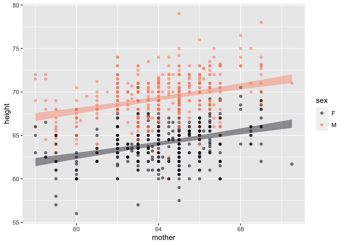
Galton |> pointplot(height ~ mother + sex, annot="model")
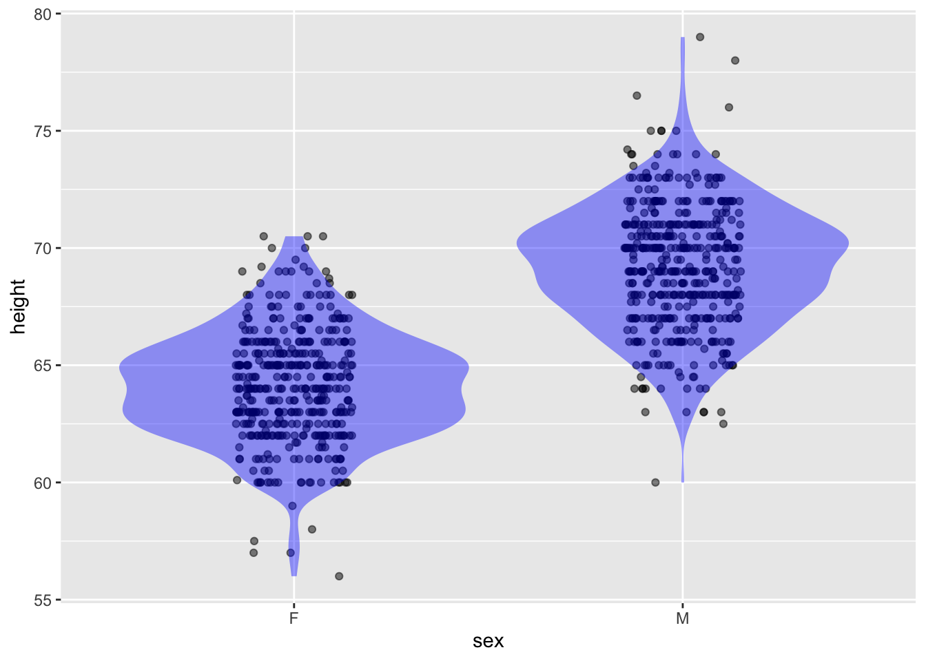
Galton |> pointplot(height ~ sex, annot = "violin")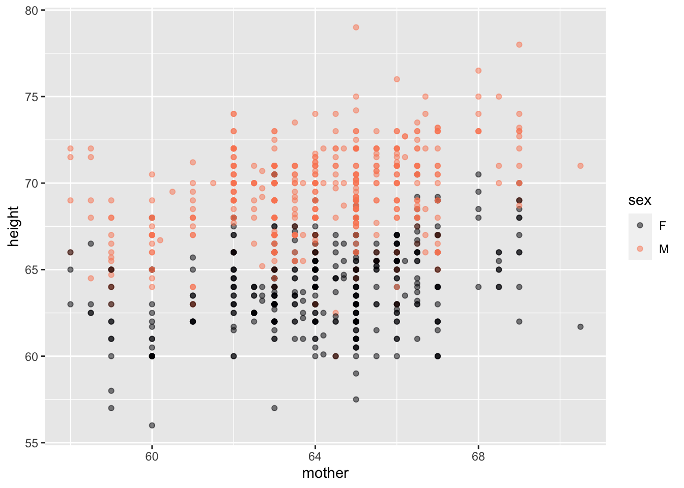
```
Indeed, we avoid single-variable graphical modes mentioned in the previous paragraph.