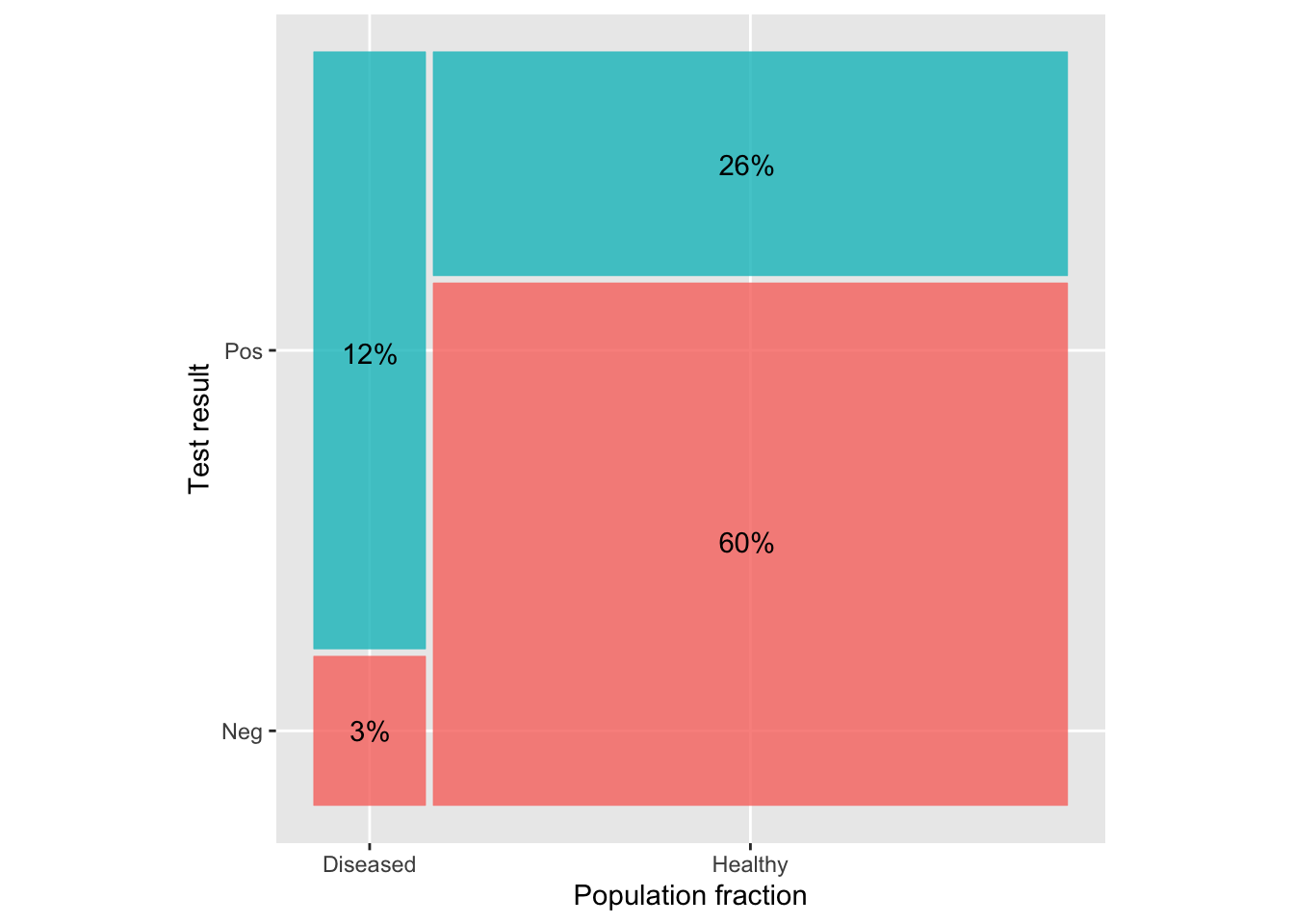
In Lesson 35, in the context of medical screening tests, we presented diagrams like this one.
This diagram is based on only three basic numbers—sensitivity, specificity, and prevalence. Exactly the same information could be presented in a 2x2 table:
| Test result | Sick patients | Healthy patients |
|---|---|---|
| \(\mathbb P\) | 12% (true positives) | 26% (false positives) |
| \(\mathbb N\) | 3% (false negatives) | 60% (true negatives) |
The four numbers necessarily add up to 100%, so one of the numbers is redundant. To generate the table we only need the three basic numbers:
- prevalence: 15%, that is, true positives + false negatives
- sensitivity: 12%/(12%+3%) = 80%, that is, true positives divided by prevalence
- specificity: 70.6%, that is, true negatives/(1-prevalence). Filling in the numbers 60%/(1-15%) = 70.6%.
Usually in statistical graphics, we place the scales on the horizontal and vertical axes, which is not the case with the above diagram. Sticking with the scales-on-axes convention, here is a streamlined graph:
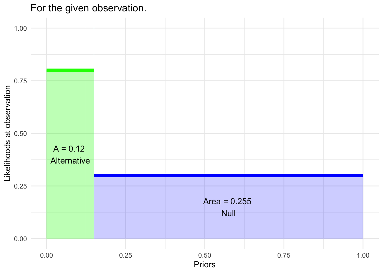
We’ve generalized the notation a bit and emphasized (1-specificity) rather than the specificity itself.
- Prior(Alternative) = width of “Alternative” box.
- Likelihood for Alternative hypothesis, that is, p(\(\mathbb P\) | Alternative) (corresponds to sensitivity)
- Likelihood for Null hypothesis, p(\(\mathbb P\) | Null) (corresponds to 1-specificity.)
The area of each box is, as expected, the width times the height. The two areas printed on the graph are the ingredients for the calculation of the posterior:
posterior(Alternative | \(\mathbb P\)) = 0.12/(0.12 + 0.255) = 32%