DCF: Data and Computing Fundamentals at Macalester

Danny Kaplan & Libby Shoop
June 12, 2013

Our Objectives

  • Provide a quick foundation in the techniques covered in DCF
  • Inspire topics for data-oriented modules in your own courses
  • Solicit your input for revisions to DCF
  • Start the process of collaboration to develop modules and revise DCF

DCF Design Goals and Constraints

Provide meaningful data processing display and analysis skills

  • do productive work
  • applicable to diverse disciplines
  • forward looking: seriously multivariable

Fits in early, with minimal alterations to a student's schedule *Time budget: 10 class hours, 20 out-of-class hours

No pre-requisites

Fun, not a slog

Five Components

  1. Graphical Displays

  2. Workflow

  3. Relational Operations

  4. Transformations

  5. Modeling

Presenting at CVC Kickoff

Class organized around case studies data settings.

Wednesday

  • Examples of Data settings & Graphical displays
  • Skills: RStudio, R patterns, Workflow

Thursday

  • Relational operations, data transformations
  • Skills: Making graphics

Friday

Data Settings

By a data setting, we mean:

  • One or more related data files
  • At least one data organization, processing, modeling or visualization example.
  • A set of questions for the students to investigate using the data.

Your task: Think about a data setting that you would like to have in your course(s). Meanwhile, we'll show some examples …

Data Settings in DCF

We chose some data sets for the prototype course to illustrate various aspects of data organization and display.

Criteria:

  • Potentially of interest to students
  • Topics generally accessible: biologists, chemists, economists, physicists, etc.
  • Illustrates an important aspect of data organization, data processing, modeling, and/or data visualization

Some Data Settings in DCF

  • Data from the UN Food and Agriculture Organization
  • Gapminder country-by-country
  • Bird observations at Ordway
  • NHANES 1999-2004 health-outcomes
  • Centers for Medicare Hospital cost comparison
  • Voters in Wake County, North Carolina

Gapminder.Org

Hans Rosling's well-known project

514 country-by-country, year-by-year “indicators”. Examples:

Fertility, Alcohol consumption, Liver cancer incidence, paved roads, …

gapminder

Gapminder as a Data Setting

Data Organization/Processing

  • Wide versus narrow formats
  • Grouping of data (by country)
  • Combining data from different sources

Visualization

  • Scatter plots
  • Maps

Modeling

  • Clustering: Are there different country types?

Bird Observations at Ordway

Birds captured and released at the Katharine Ordway Natural History Study Area, a 278-acre preserve in Inver Grove Heights, Minnesota, owned and managed by Macalester College. Source: Jerald Dosch, the manager of the Study Area. Currently 15829 cases in 23 variables.

Error: object 'OrdwayBirdsOrig' not found

Bird Observations as a Data Setting

  • Data cleaning
    • Species names are not-standardized
    • Inconsistent formatting of quantitative data
  • Patterns in season and time-of-day
    • Discover what birds are migratory
  • Discovering classification criteria

NHANES Body Shape and linked mortality data

Age, sex, height, wgt, etc. along with

  • cholesterol, systolic blood pressure
  • BMI, and other derived measures
  • smoking status, diabetic, mortality,

31126 people.

NHANES as a data setting

  • Simple depictions of relationships, e.g. height and age
  • Comparison of models — Can we see the difference between girls' and boys' growth curves.
  • Modeling of risk for diabetes

Wake County Voters

500,000 registered voters from Wake County North Carolina.

Use as a Data Setting

  • Orientation to tabulation in a familiar context
  • Simple transformations (e.g. age groups)

Visualization Modalities in DCF

We chose what we think are the major categories of accessible visualization modalities:

  • scatter plots
  • bar charts
  • maps
  • parallel coordinates
  • trees

Your task: Think about what modalities are important to you.

Scatter Plots

Error: object 'nhanes' not found
Error: could not find function "ggplot"

Age, BMI, and Diabetes from the NHANES data

Bar Charts

Wake County

What's different about younger voters?

Source

Maps

alcohol

Which regions have the highest alcohol consumption?

Maps in two Variables

alcohol-traffic

Alcohol consumption indicated by color.

Vehicle-related deaths (per 100,000 per year) indicated by size.

Is alcohol an evident factor in the differing rate of vehicle-related deaths across countries?

Does this mean that alcohol isn't a factor in vehicle-related deaths?

Geometry, not just Geography

seedlings

A chloropleth map assigns a color to a region. What the region refers to is up to you.

In addition to “world map”, we could produce “seed map” or “campus map” or “brain map”.

Parallel Coordinates

Car data

  • Which cars are exceptions to the rule that lighter weight means better gas mileage?
  • Which car is the sports-car?
  • Which are the econo-boxes?

Source

Trees

car dendrogram

Grouping cars based on similarity in performance/design measures.

Source

Some Missing Graphical Modalities

Heat maps

heat map

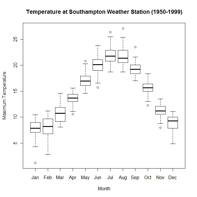
Histograms, Densities, Box-and-Whisker Plots

bwplot

Regression Curves and Confidence Intervals

Height v Age.

height-v-age

We'll talk about this under modeling.

From Data to Graph

  • What's the story told by this graph?
  • How would you need to reorganize the data?
  • What other display choices would be informative?
  • Does this graph inform the story you want to tell?
  • If not, what graph would you want to make?

Example with Ordway Bird Data

birds by month

“Raw” Data

Case: Individual bird captures
Variables: Month, species, etc.

Plotted Data

Case: ???
Variables: ???

Work-Flow Skills

We all have preferred ways of working:

  • How we store and arrange files.
  • How we write up reports.
  • How we keep track of what we do.

Sophisticated use of the computer is difficult.